Q-Selection Visual Identity and Branding
Get yourself a top-class branding like this! 👆

We’re building more than just a label.
Q-Selection is becoming an identity in itself — one that stands for quality, conscious choice, and progress. Refurbished products that perform like new while leaving a lighter footprint. This isn’t just a transaction — it’s the beginning of a meaningful partnership. We’re shaping a brand experience that feels like something you want to be part of. A culture. A community. A stage for pioneers in sustainability — where organizations connect with pride and create real impact.
It’s for those who don’t just participate, but lead the way — and who are proud to share it.

Instead of a classic score system — bronze, silver, gold — we are building a visual journey.
The stages Aware, Engaged, Leader are not judgments, but invitations.
Each step carries its own atmosphere, designed so that the viewer intuitively feels where an organization stands — and where it is heading. Through the conscious use of visual elements tied to brand psychology, progress becomes something you can see and sense.
By approaching this as world-building, we create more than just a brand structure. We create an ecosystem — one in which companies can measure themselves against their own sustainable ambition.
At the heart of this movement stands Q-Selection: a quality mark for sustainable, refurbished electronic products. A symbol of trust that unites performance, responsibility, and progress.
You don’t just participate. You step in.
You become part of the movement of pioneers in sustainability.
The journey from Aware to Engaged to Leader is told through landscapes of nature — each stage carrying its own atmosphere, textures, and symbolism.

Aware begins in stillness. Cool tones of stone, ice, and mist set the stage for organizations taking their first conscious steps. The imagery feels pure and honest: raw rock, quiet ridges, and floating ice. It communicates integrity and responsibility without noise — a visual language of clarity and care.
With Engaged, the world becomes alive. Stone softens under layers of moss, green spreads across surfaces, and growth becomes visible. The textures feel fertile and hopeful, evoking harmony, trust, and collective progress. This is where commitment takes root — sustainability is no longer just chosen, but actively lived.
At Leader, nature reveals its power. Deep, rich tones and bold, expansive landscapes convey ambition, strength, and prestige. Here, the imagery carries weight — golden light, commanding textures, and monumental forms. It radiates quiet confidence and represents the highest level of sustainable impact.
Together, these images form more than a visual system. They create a world in which organizations can recognize themselves, grow, and take pride in the path they walk toward leadership in sustainability.


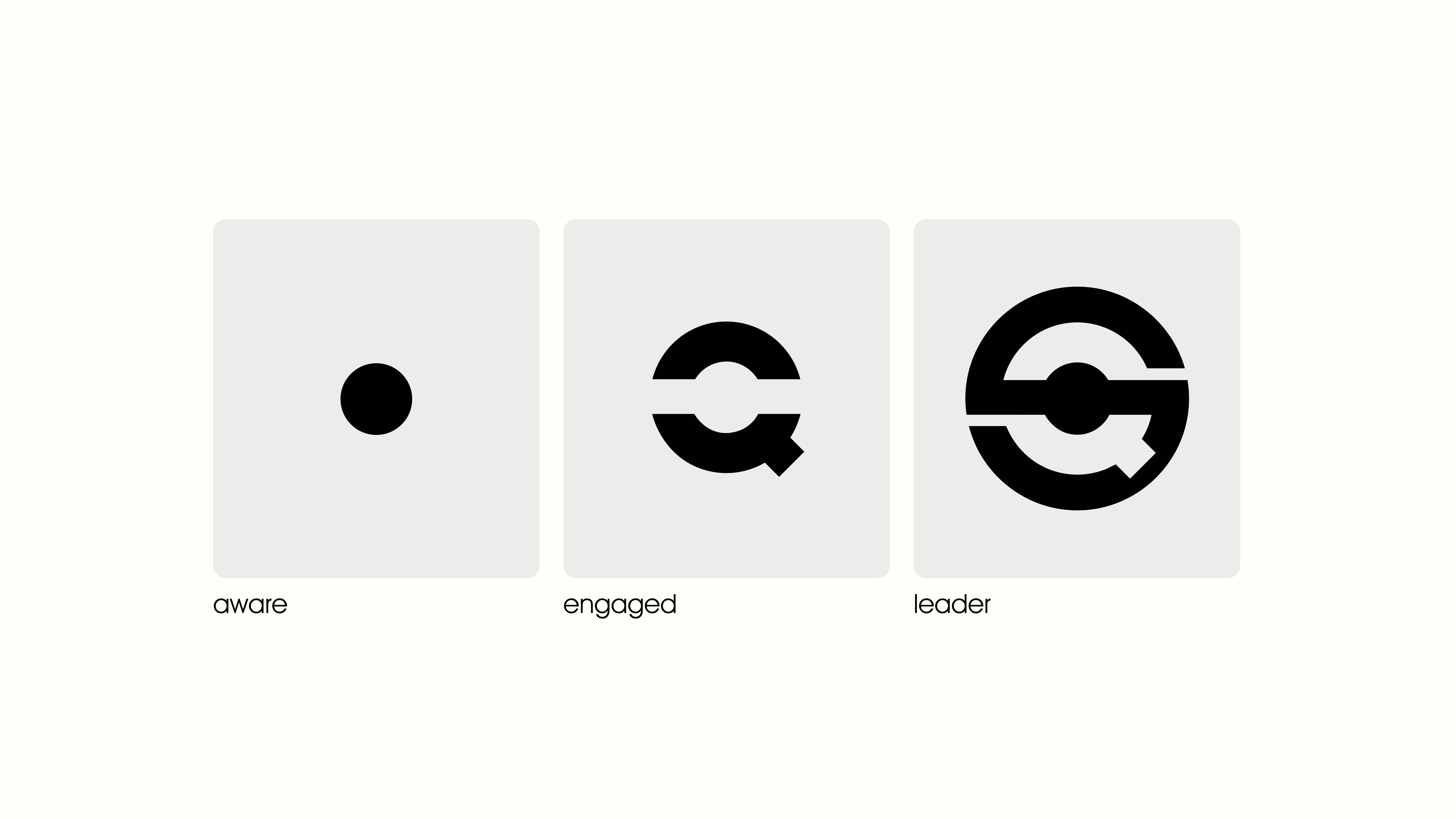
Within Q-Selection, every partner category is given a visual anchor — a symbol that reflects the depth of their commitment.
It begins with the conscious core of Aware, grows into the active movement of Engaged, and culminates in Leader: a fully closed system that radiates strength, consistency, and direction. Together, these stages embody the spirit of Q-Selection as a whole.
Each form is graphically derived from the Q-logo, ensuring that the identity remains unmistakable at every level. Not a collection of separate labels, but a visual progression — a structure that builds into something greater.

The physical labels become more than just markers — they are tangible carriers of the Q-Selection quality mark. Each one is crafted to seamlessly reflect the visual world of its partner category: the mysterious deep blue of Aware, the vibrant green of Engaged, and the warm, earthy gold of Leader.
They do more than signal a choice; they make sustainability visible and tangible. Subtle in form yet powerful in meaning, the labels embody a refined kind of branding — one that inspires trust and reassures the end user: this is a conscious decision.


The Q-Selection website is more than a platform — it’s the digital face of the quality mark.
Clear design, open space, and natural textures create an atmosphere of trust and transparency, while the Q-logo anchors the brand throughout the journey.
Visitors move seamlessly from certainty about refurbished products, to the meaning of the label, to the partner programs — Aware, Engaged, Leader. Each stage has its own visual world, inviting organizations to see not only where they stand, but where they can grow.
It’s a site that doesn’t just inform, but inspires — showing that sustainability can be clear, beautiful, and within reach.
Thank you for checking out the Q-Selection project
Looking for a branding that goes further than just a logo? Send me a message, you can also book a call via:
Thank you for checking out the project. It would help a lot if you can like this project and follow my Contra profile.
If you read this: Have an amazing day 🤩
Like this project
Posted Sep 28, 2025
Rebrand for Q-Selection, a sustainable label for electronic refurbished products. We built a branding that you want to be apart of via world-building.
Likes
17
Views
176
Timeline
Jun 2, 2025 - Jul 31, 2025


