Premium Label Redesign for Belizean Bronze

BIbek Bhusal


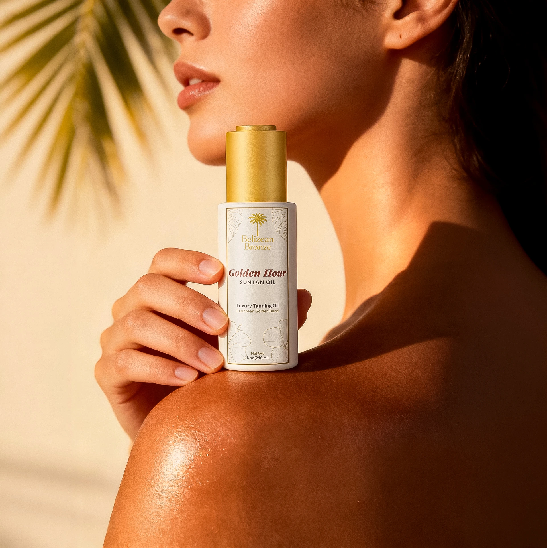
There is a specific kind of woman this product is designed for. She treats body care as a ritual, not a routine. She chooses products that feel intentional on the shelf and even more beautiful in the hand. She knows the difference between something that simply performs and something that makes her feel something before she even opens it.
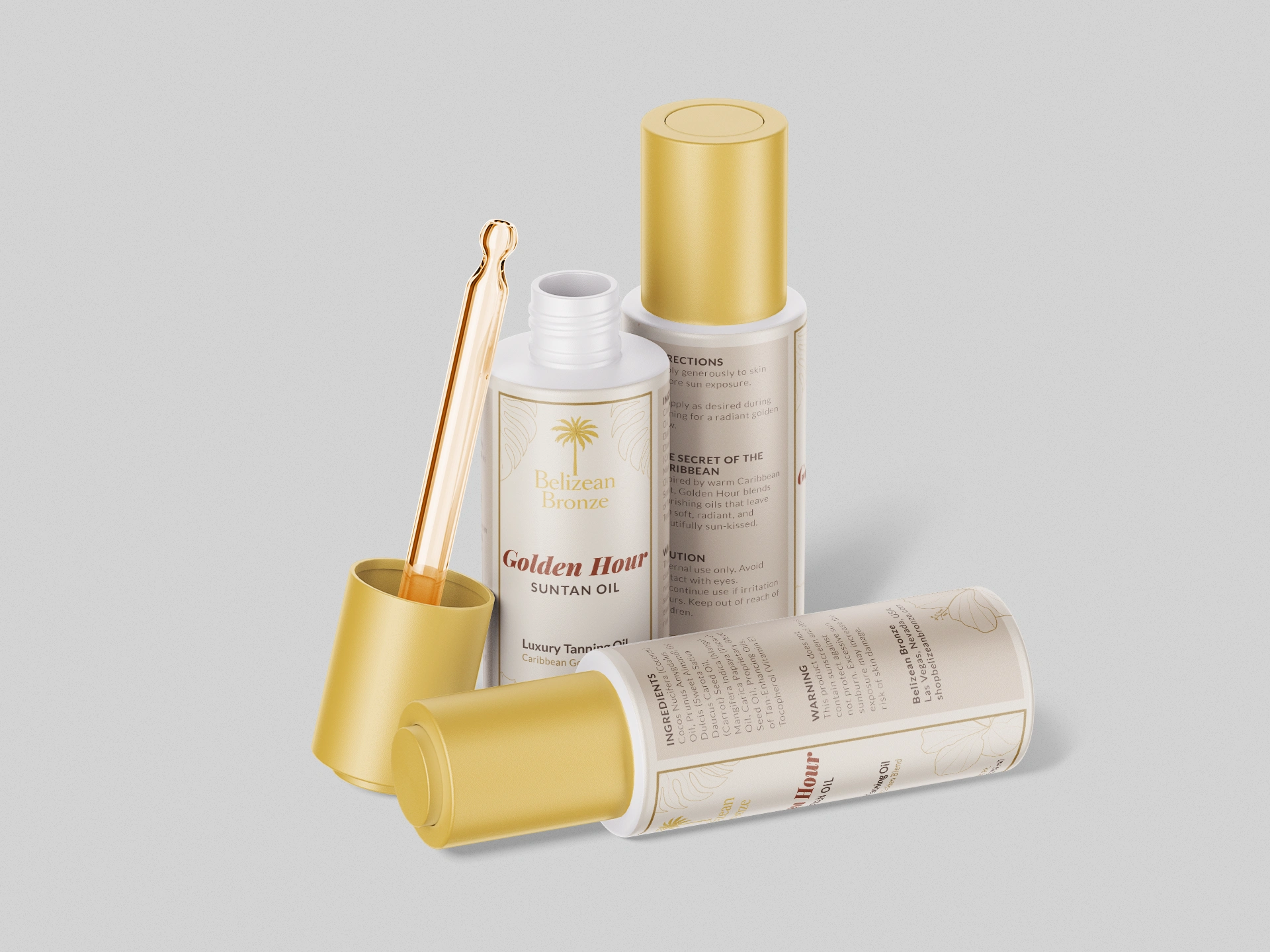
Golden Hour is a premium suntan oil for Belizean Bronze, a Caribbean-inspired beauty brand built around warm golden light, sun-kissed skin, and effortless resort living. This is the label that had to earn its place in that world.

About the Brand and the World It Lives In
Belizean Bronze is a premium body care brand inspired by the warmth and natural beauty of the Caribbean coast. Their product range sits at the intersection of wellness and self-care, built for beauty-conscious women who shop at boutique spas, resort gift shops, and premium online beauty retailers.
Golden Hour Suntan Oil is their hero product. A nourishing blend of coconut, sweet almond, mango, papaya and carrot seed oils formulated for skin that feels genuinely soft, radiant and sun-kissed from the inside out. This is not a mass market tanning product. It belongs next to your body serums, your facial oils, your carefully chosen wellness shelf.
The brand was relaunching across five products and needed a label system that reflected that premium positioning from the ground up, not just for one product but as a scalable design system.
The Problem
The existing design was working against the brand. Busy background textures, generic tropical graphics, and competing visual elements communicated tropical but not refined. It had energy but no elegance. For a brand positioning itself in premium wellness and resort retail, the gap between how the product looked and where it actually belonged was the core problem.
The new design needed to close that gap completely without losing the warmth and Caribbean identity the brand was built around. And it needed to function as a system, not just a single label, with consistent rules that extended cleanly across five SKUs.
The Approach
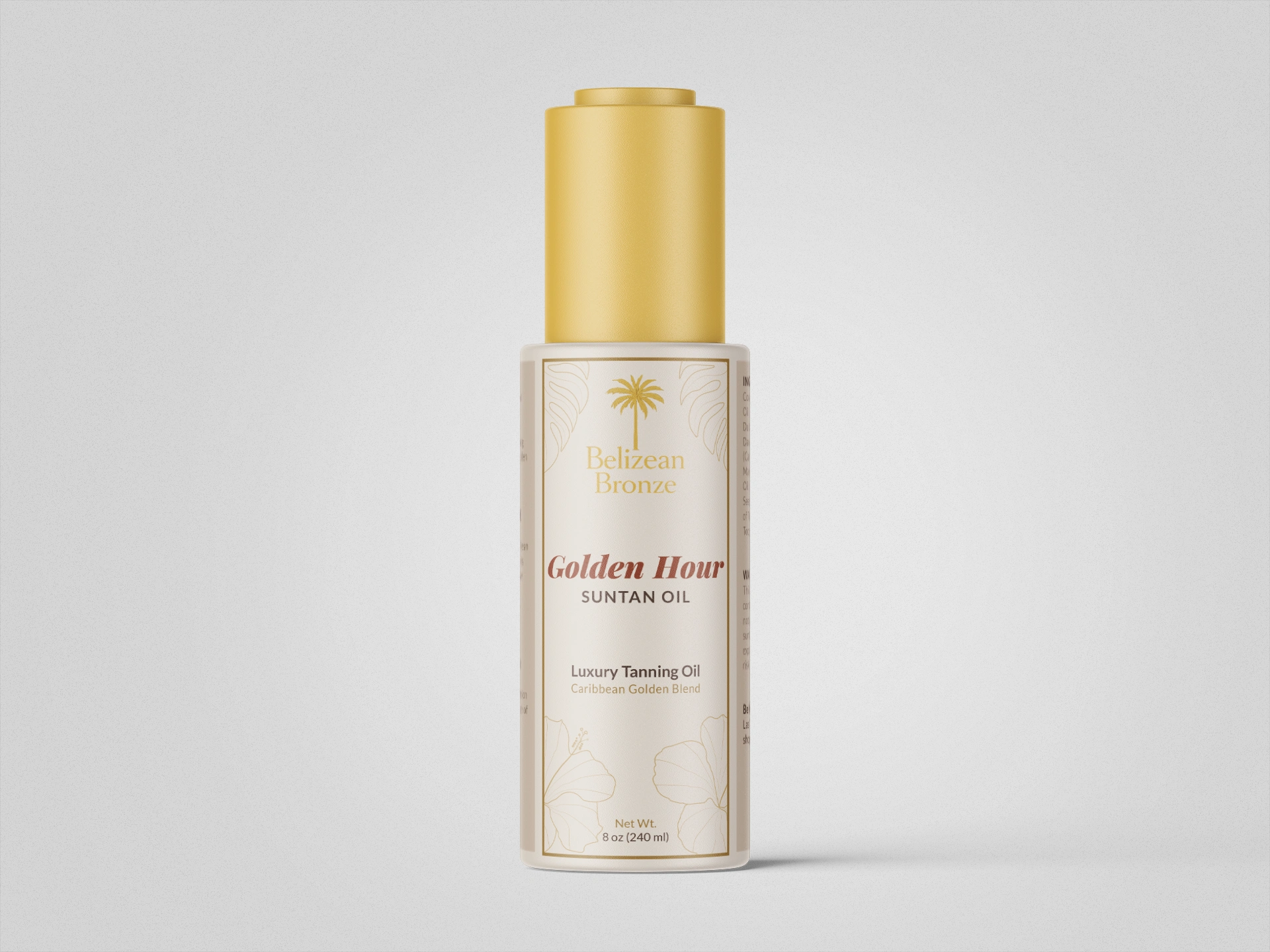
The direction was deliberate restraint. Not minimalism as emptiness but minimalism as confidence. Every element on this label exists because it earns its place.
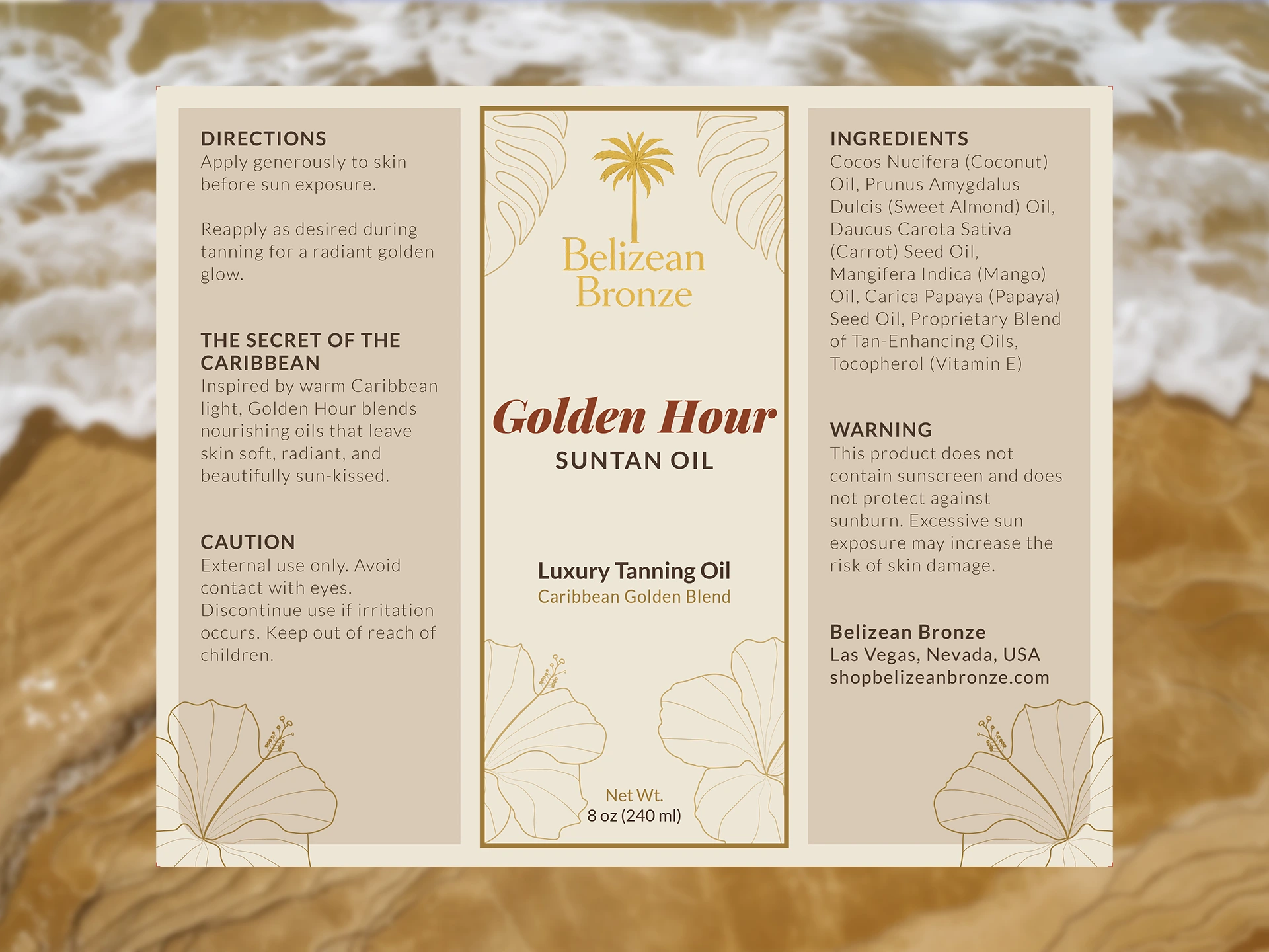
The starting point was illustration. A hand-drawn botanical hibiscus was created specifically for this brand from scratch, used as both a refined foreground element and a subtle background texture to give the label depth without clutter. The hibiscus was chosen over generic tropical graphics because it reads botanical and intentional. That distinction matters at the premium level.
The color system worked directly from the brand's established palette. Warm cream base, antique gold accents, deep warm brown for body copy, and the signature bronze-red reserved specifically for the Golden Hour title. Four colors, each doing a defined job, none competing with the others.
Typography was the most considered decision. Sizing, weight and tracking were structured on golden ratio proportions as a foundation, with intentional breaks where optical balance required it. The Golden Hour title was pushed to Black weight with wide tracking, creating typographic presence that reads as premium before the brain consciously processes why. One clear hierarchy from brand name to product name to descriptor, no confusion about where the eye goes first.
The three panel label architecture was designed from the start as a system. Consistent illustration placement, consistent color use, consistent typographic rules across every panel. Built to extend across five SKUs without redesigning from zero each time.
The Result
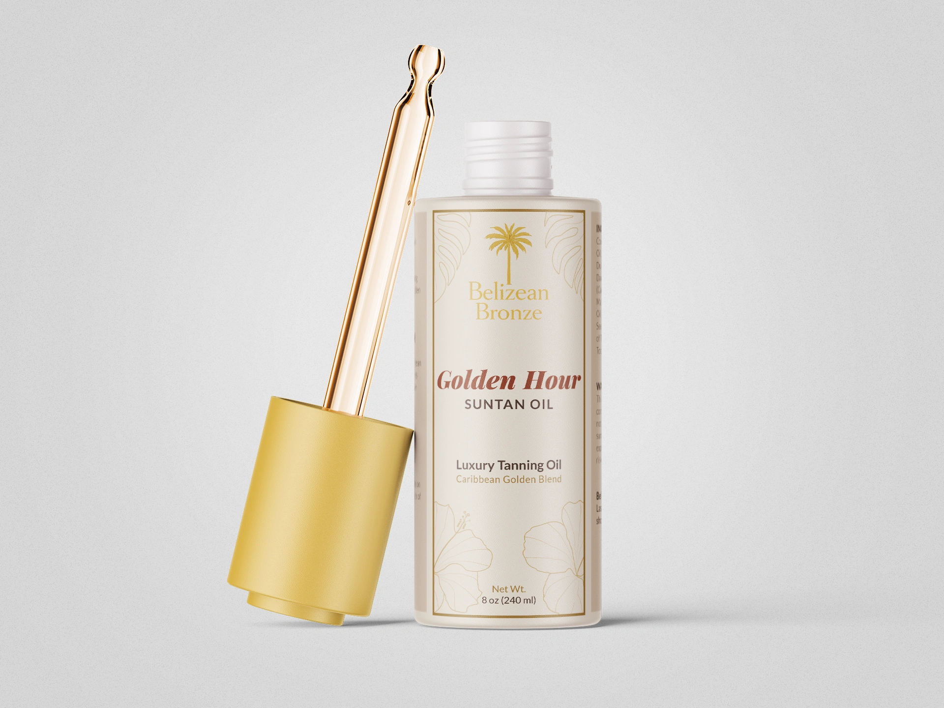
A label system that belongs next to premium body serums and spa products without trying to announce it. Clean, warm, feminine and minimal in the way that actually takes more decisions, not fewer.
The hand-drawn illustration gives the brand a visual signature that stock graphics never could. The typographic system creates immediate shelf presence and unambiguous hierarchy. The three panel architecture gives the brand a scalable foundation their full collection can grow into consistently.
This is packaging that a woman picks up, feels something, and decides before she reads a single word.
Premium packaging is not about adding more. It is about knowing exactly what to remove and having the confidence to let what remains carry full weight. Restraint is a skill. Knowing when a composition is resolved rather than just finished is what separates a label that looks designed from one that feels inevitable.
I work with brands in wellness, beauty, food, lifestyle and specialty retail that want packaging built to earn its place on a premium shelf. If that sounds like your project, I would like to hear about it.
Like this project
Posted Sep 13, 2026
Premium label and packaging design for Belizean Bronze, a Caribbean-inspired body care brand.