Packaging Design for Snaxy Fitness Bars

BIbek Bhusal


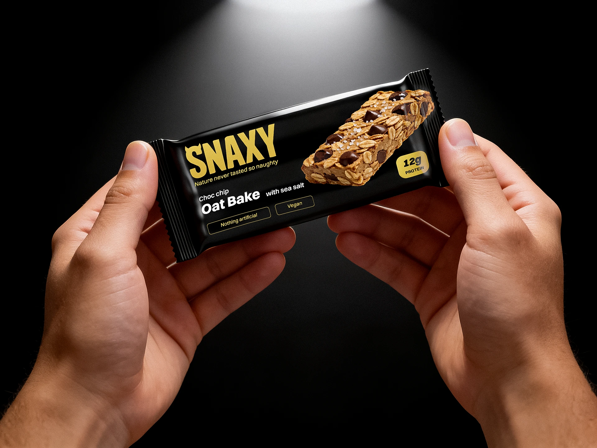
The Brief
Snaxy came in with one clear tension built into the brand. A fitness bar that needed to feel genuinely indulgent, not just healthy. Most brands pick one side and commit. Snaxy wanted both, and the packaging had to hold that without looking confused.
The brief called for bold logo placement, a premium feel, strong shelf presence, and a design that didn't fall into the usual fitness category clichés. No clinical whites. No loud neon. Something that could stop someone mid-aisle and make them reach for it before they'd even read the label.
Design Direction
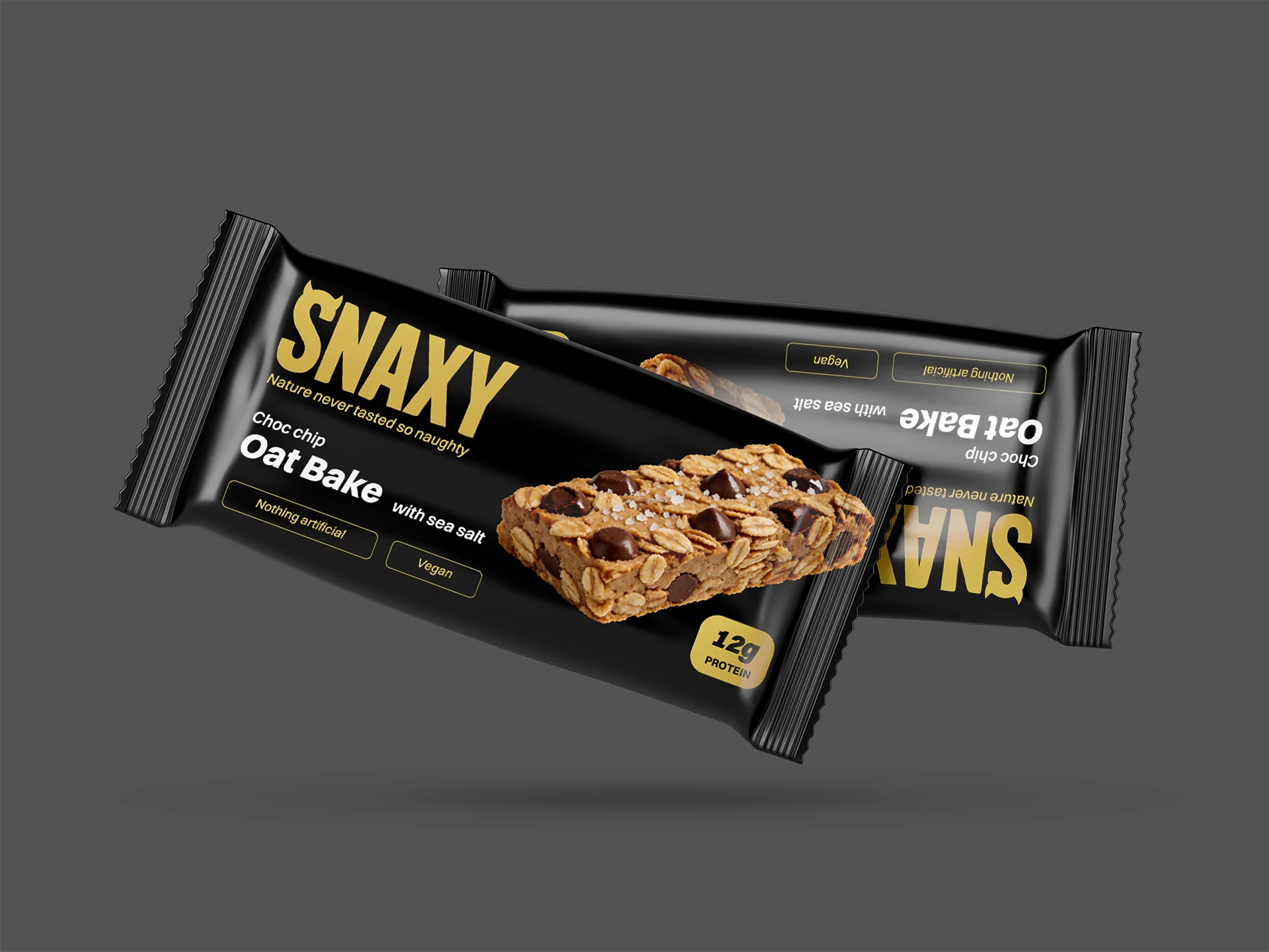
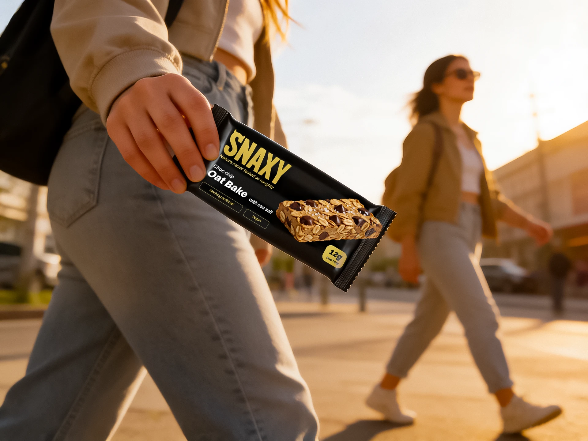
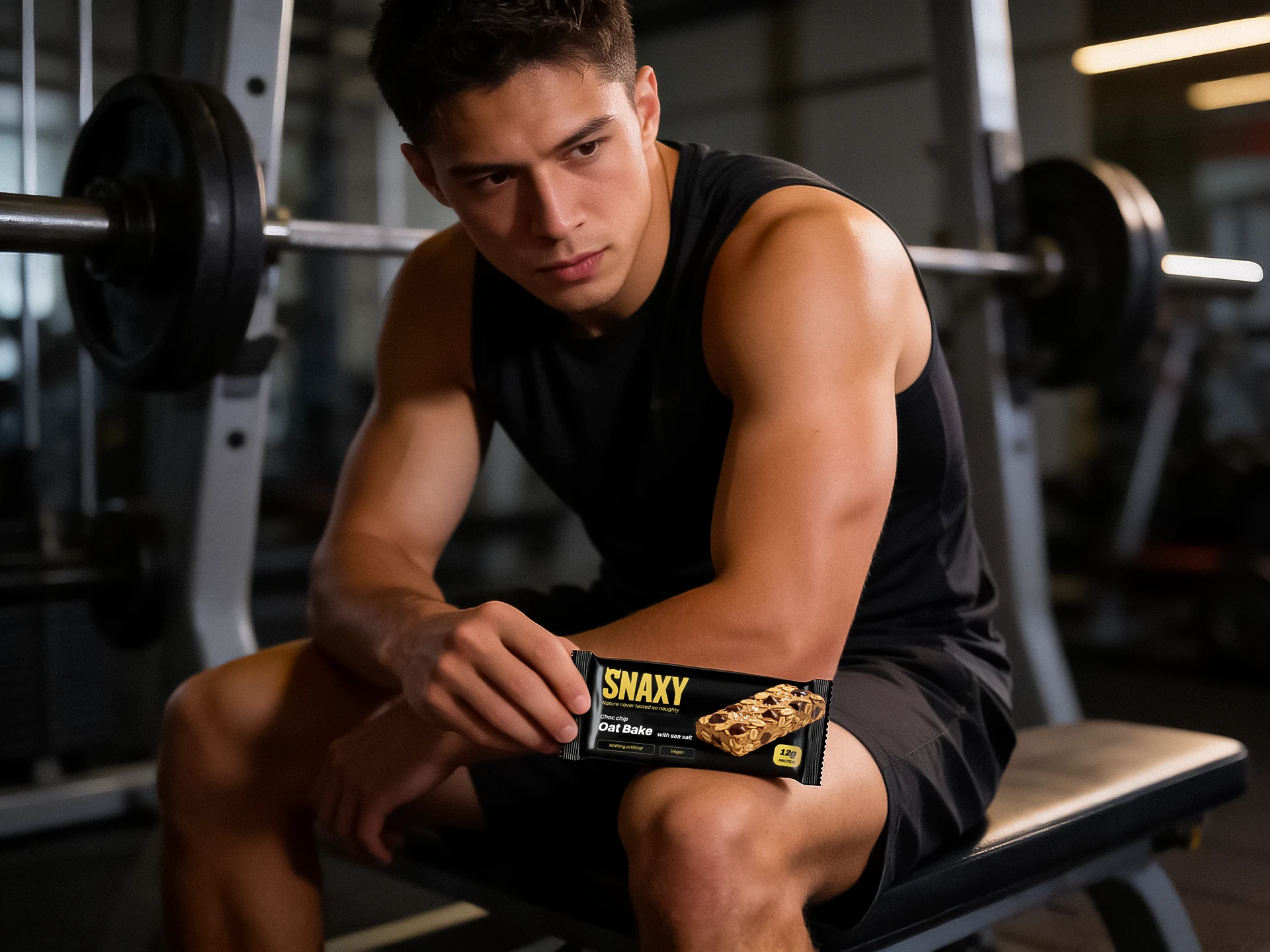
Black was the foundation. Not because it's safe, but because it immediately separates Snaxy from everything else on a fitness shelf. The category defaults to white, green, or loud colour. Black with gold reads premium and confident without trying too hard.
The logo takes up real space in the top left. The devil horn detail in the S gives it personality, something that ties directly into the tagline "Nature never tasted so naughty." That line was already doing the heavy lifting. The design just had to be worthy of it.
Typography hierarchy moves your eye from brand to product name to supporting claims, in that order, without you noticing it's happening. The product image sits on the right, doing the appetite work that copy can't.
The Outcome
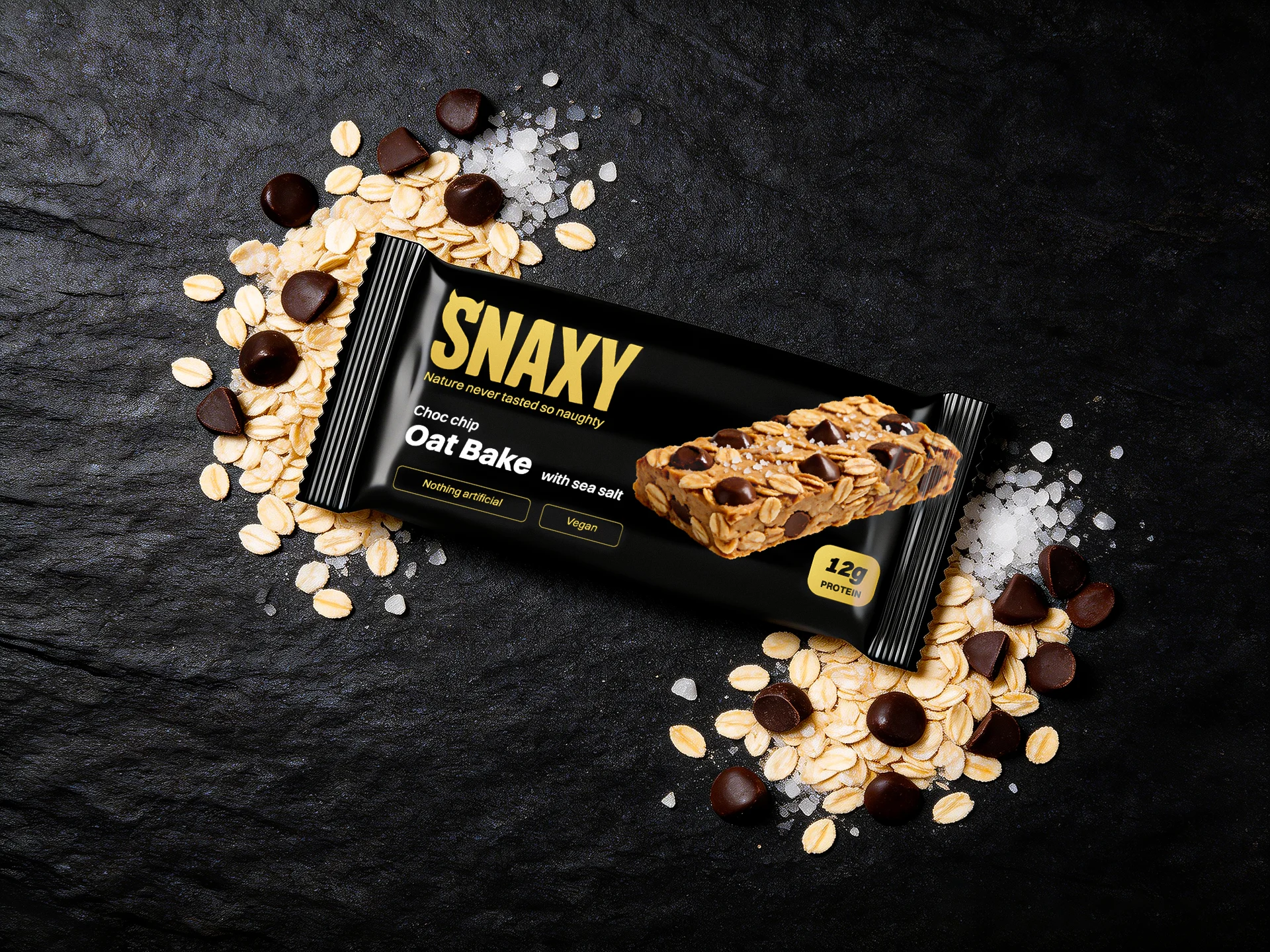
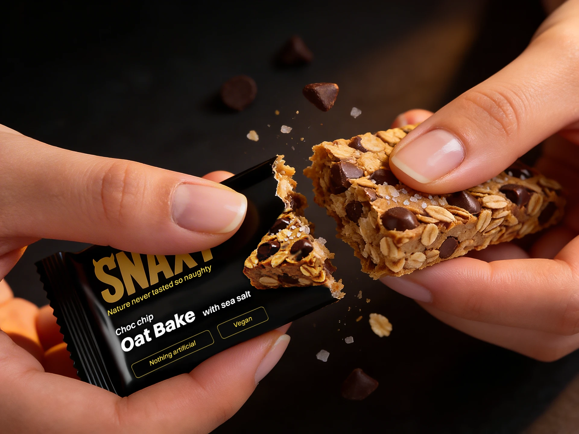
A packaging system that feels premium without feeling cold. Bold without being loud. Indulgent without losing the health credentials. Every decision on that wrapper pointing in the same direction.
Working on a food, wellness, or lifestyle brand and need packaging that earns its place on the shelf? I'd like to hear about it.
Like this project
Posted Sep 13, 2026
Packaging design for a fitness bar, a bold fitness bar brand built around the idea that healthy and indulgent don't have to be opposites.