AI-based Travel Web-App | Shadcn UI Product Design + Prototype
Project Overview
Genealogy Tourism (Heritage Travel) and Travel Tech: Product Design • Design System Creation • Variable Component System • Prototype
Client: Screen Pilot
_____________________________________________________________________________________
Industry: Travel Tech
_____________________________________________________________________________________
Project Type: Product Design + Prototype
_____________________________________________________________________________________
Tech Stack:
Design & Prototyping: Figma
_____________________________________________________________________________________
Prototype Video
Objectives
Develop a functional UI/UX prototype to simulate how users can engage with the platform.
Create an intuitive and clean design, influenced by Shadcn UI and Airbnb.
Ensure the user experience flows seamlessly from uploading genetic data to receiving personalized itineraries.
_____________________________________________________________________________________
Process
1. User Flow Design
To ensure clarity and a smooth user experience, we first mapped out the following key steps in the user journey:
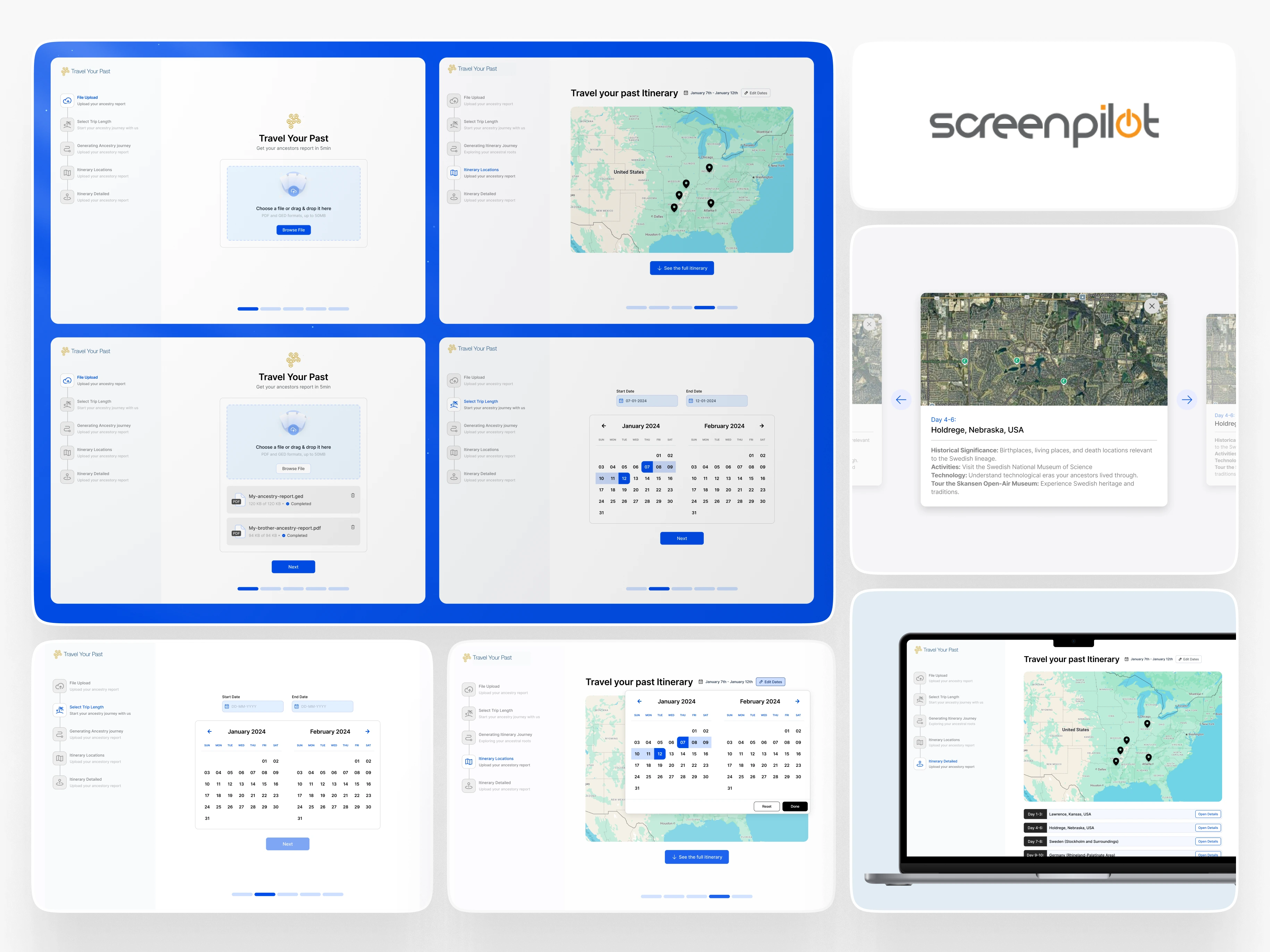
Upload Ancestry Data: The user uploads their genetic results from Ancestry.com or 23andMe.
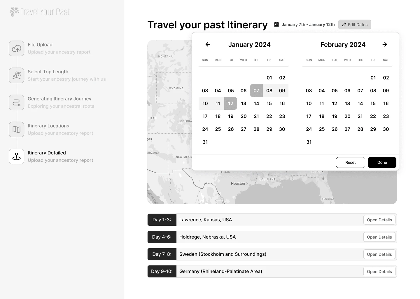
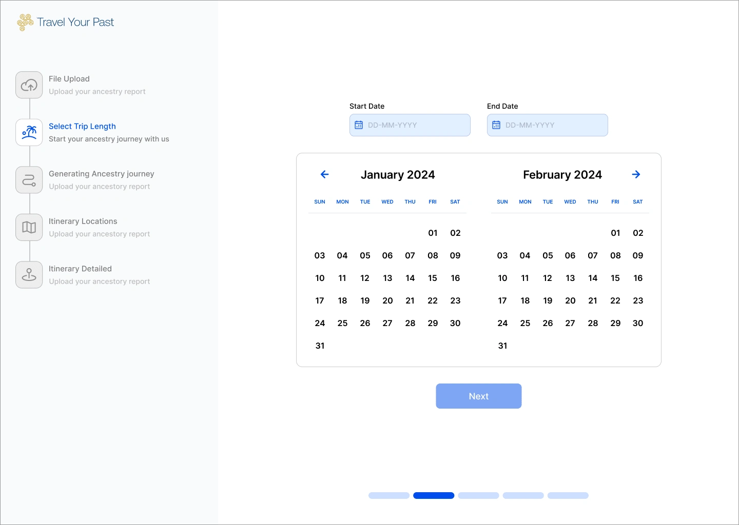
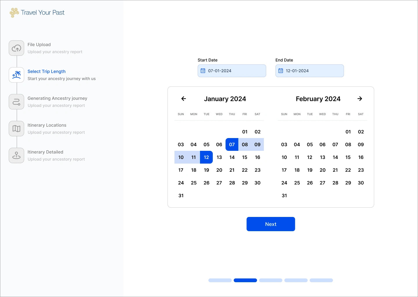
Select Trip Preferences: The user inputs their desired trip length and travel months.
Submit & Receive Itinerary: The user submits the information and receives a personalized itinerary.
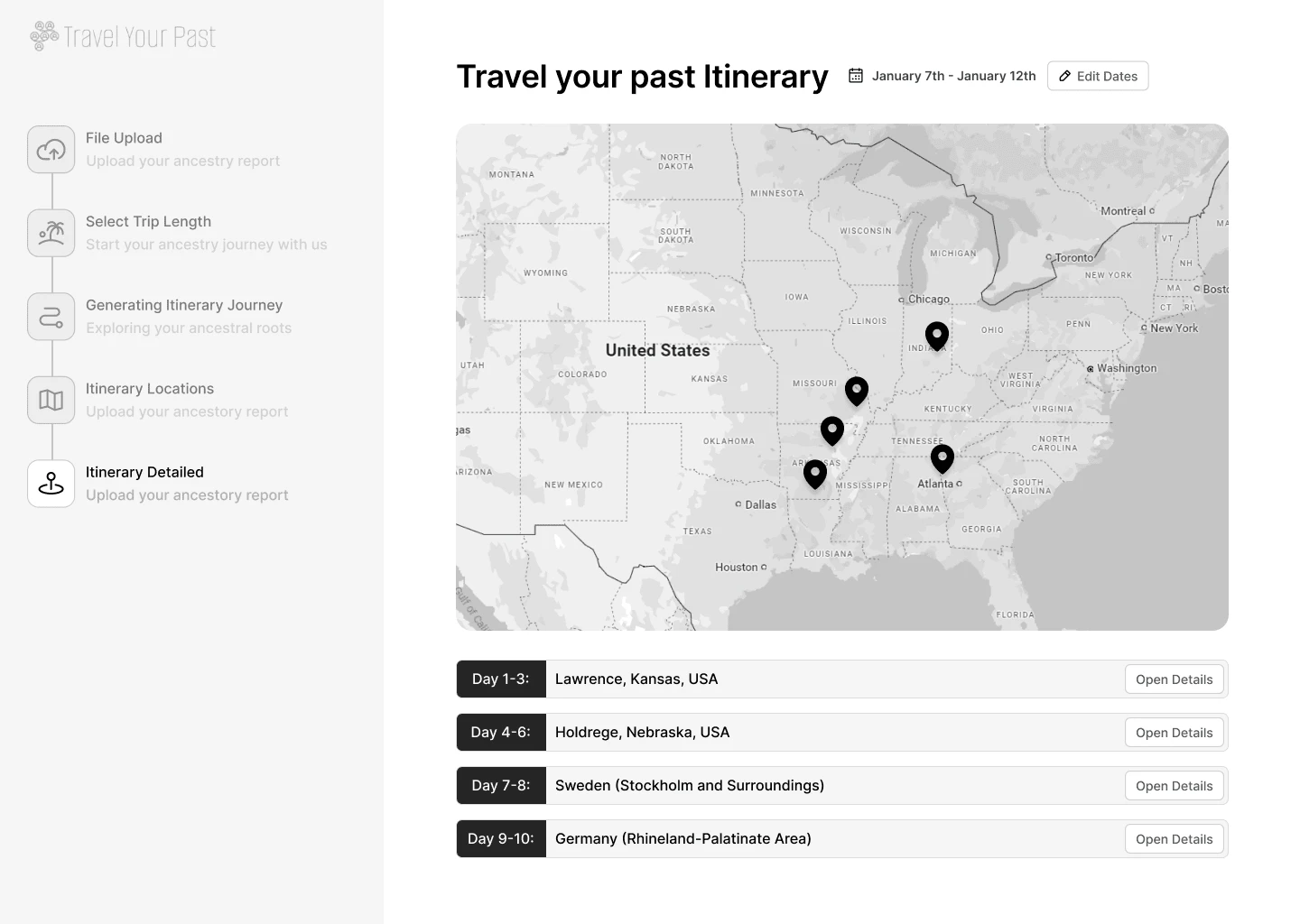
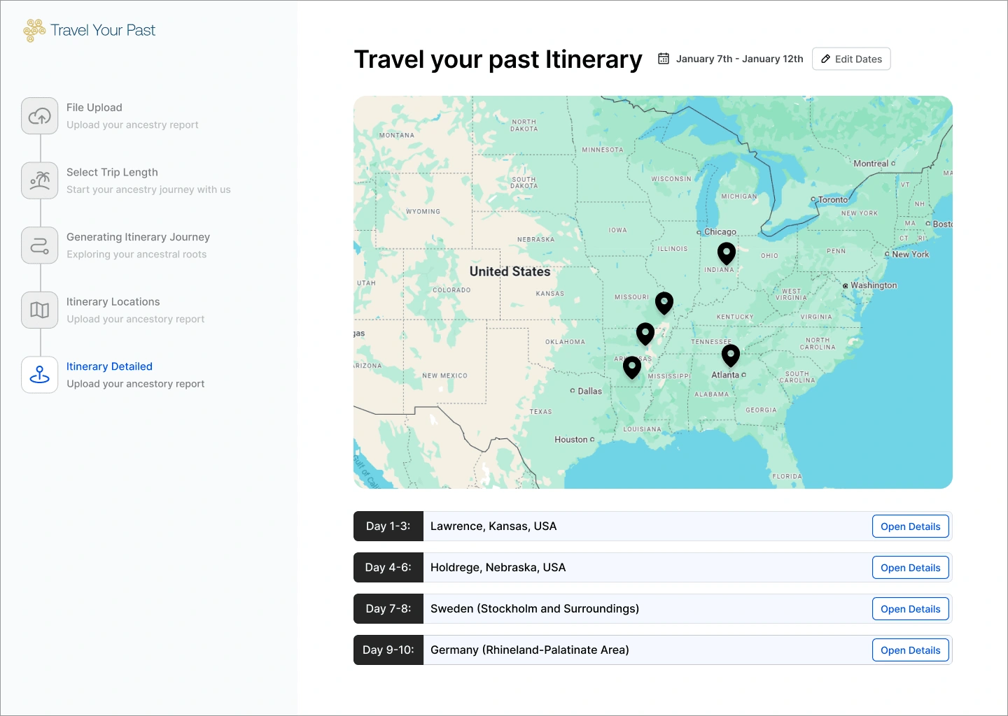
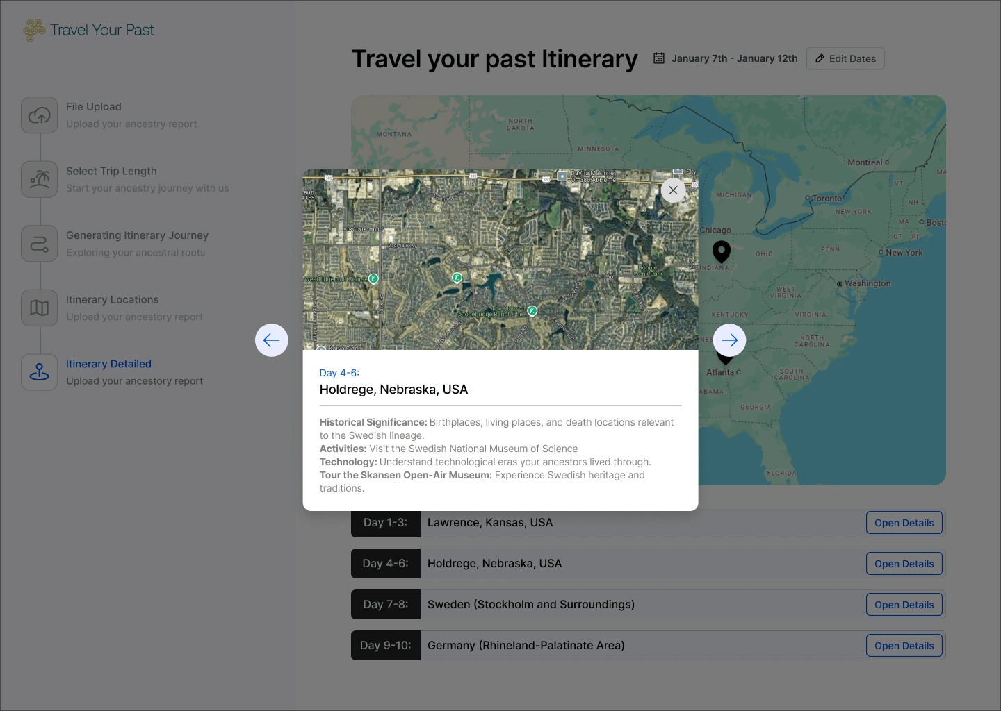
Itinerary Overview: The itinerary includes a timeline of activities and a map with location pins related to their ancestral history.
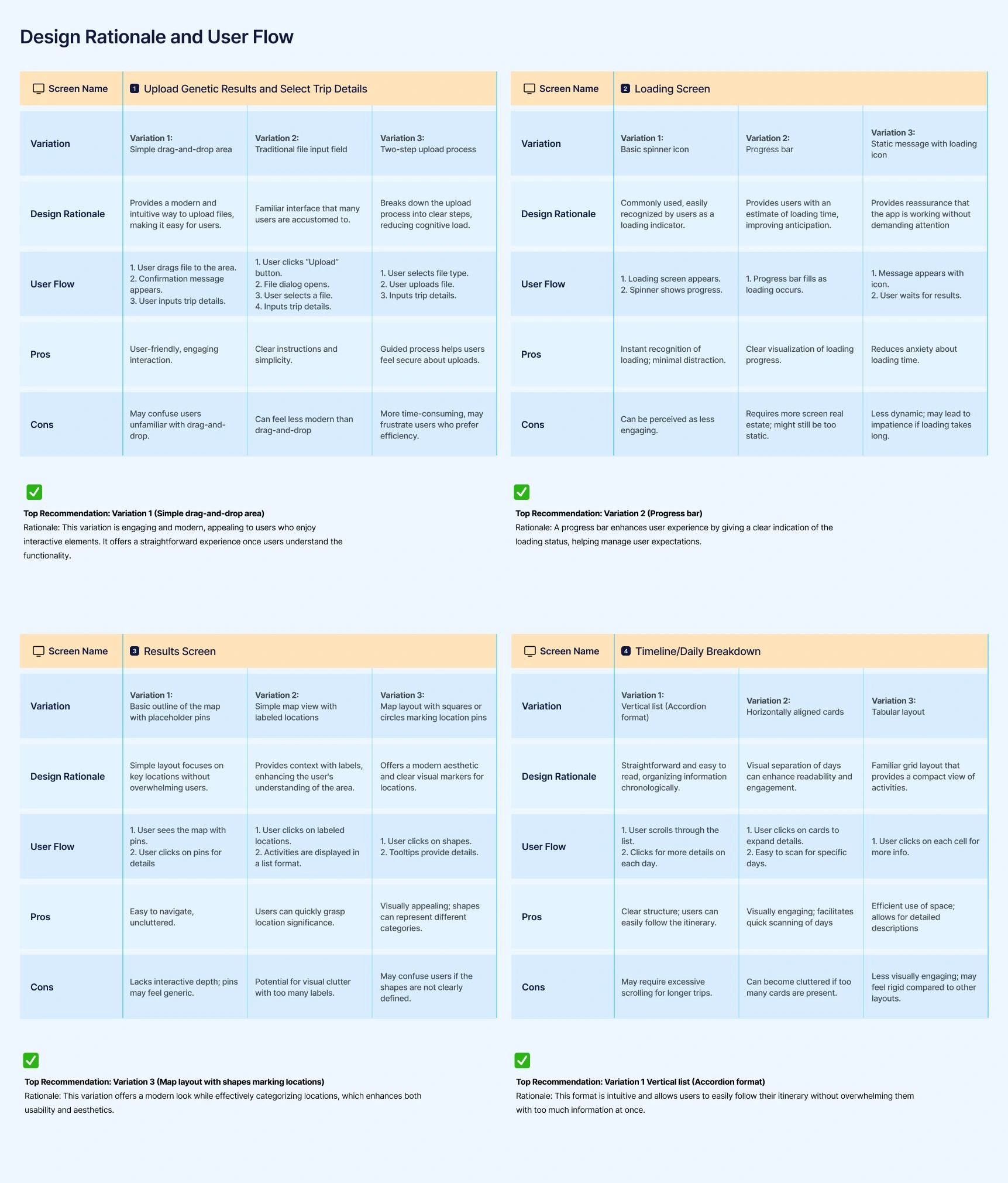
2. Screen Wireframes
We developed mid-fidelity wireframes for three core screens:
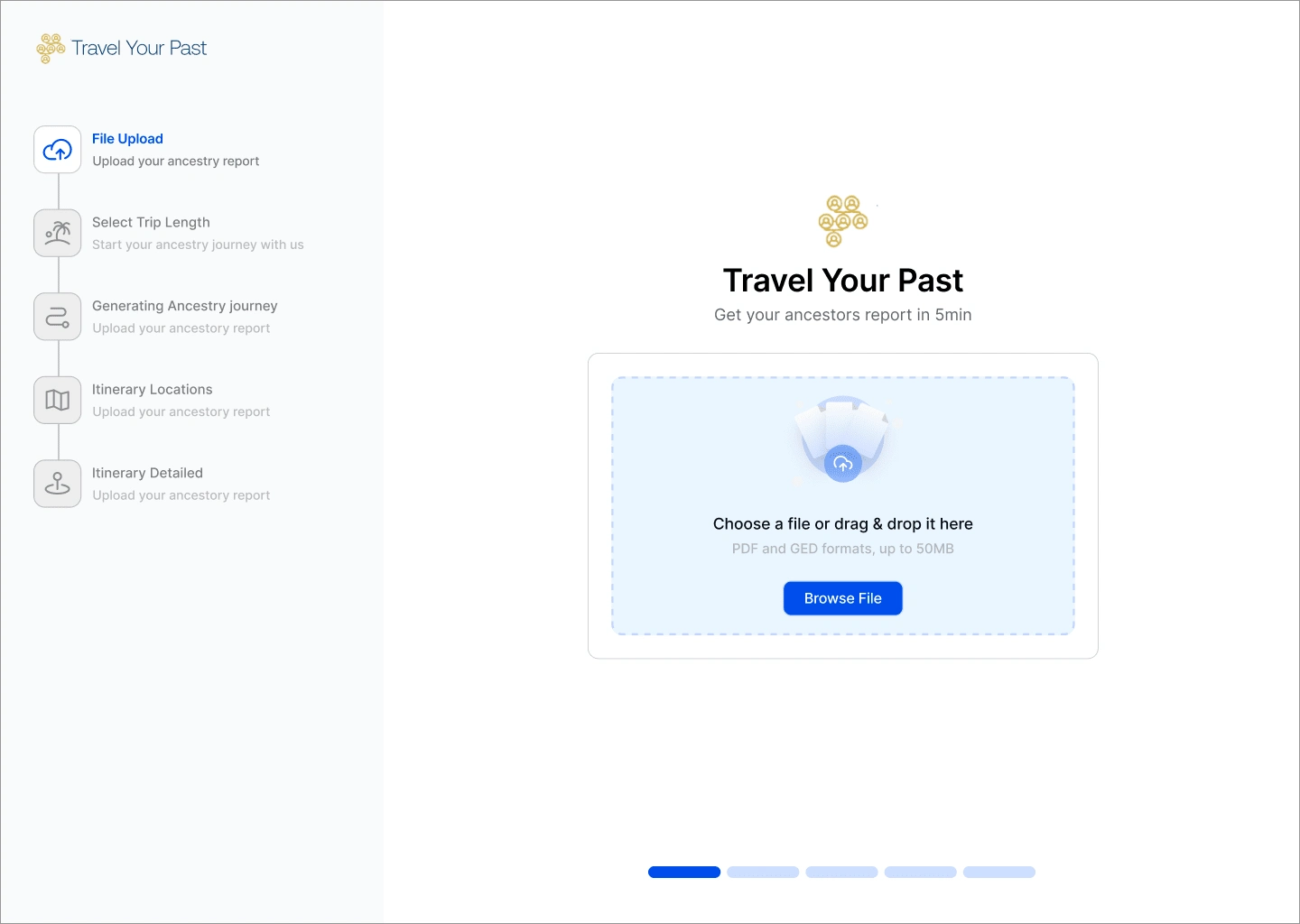
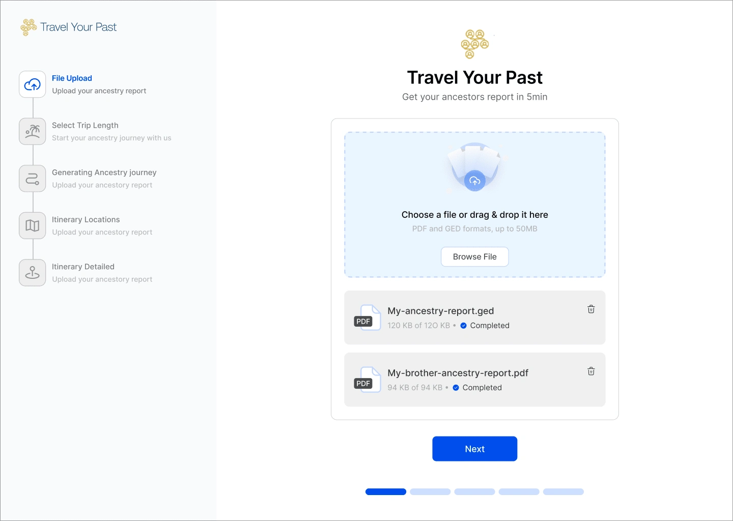
Upload Genetic Results & Select Trip Details: This screen allows users to upload their genetic data and choose their travel preferences.
Loading Screen: A simple screen to show progress while the personalized itinerary is being generated.
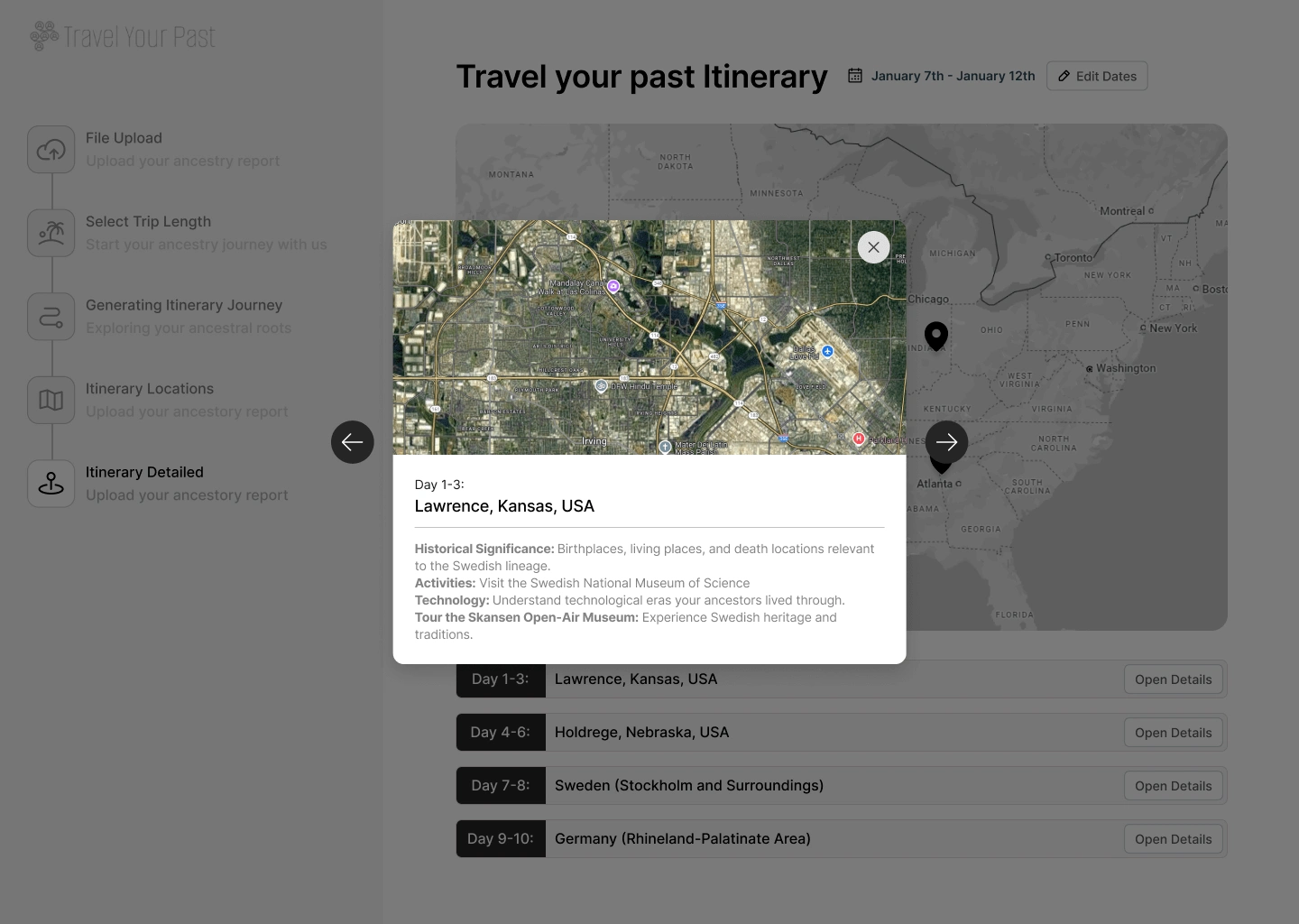
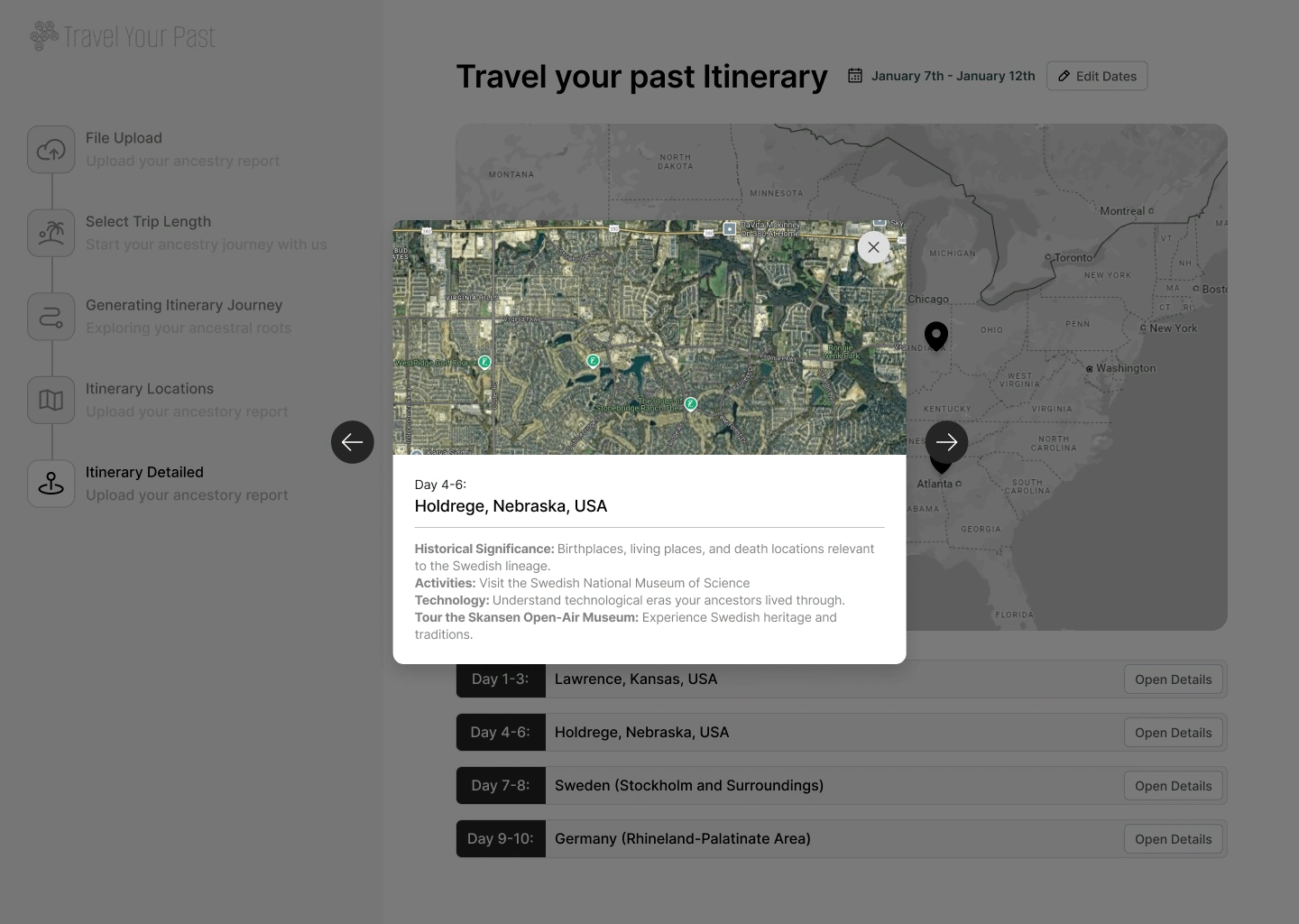
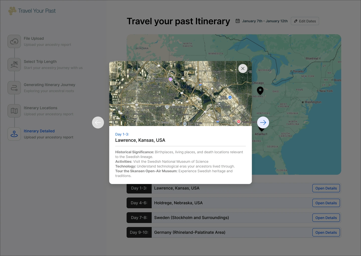
Results Screen: This displays a map with location pins for ancestral locations, along with a day-by-day breakdown of activities, including transportation details.
_____________________________________________________________________________________
Wireframes
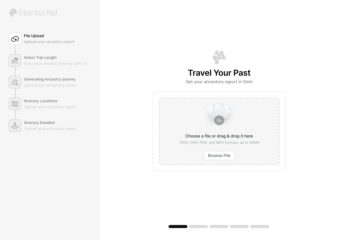
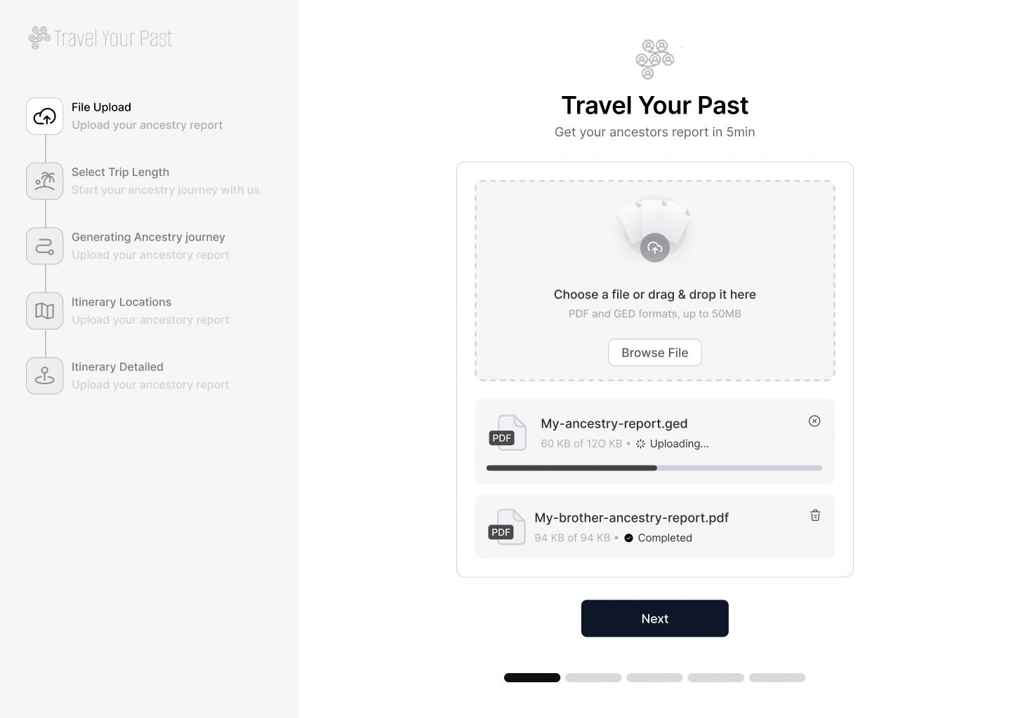
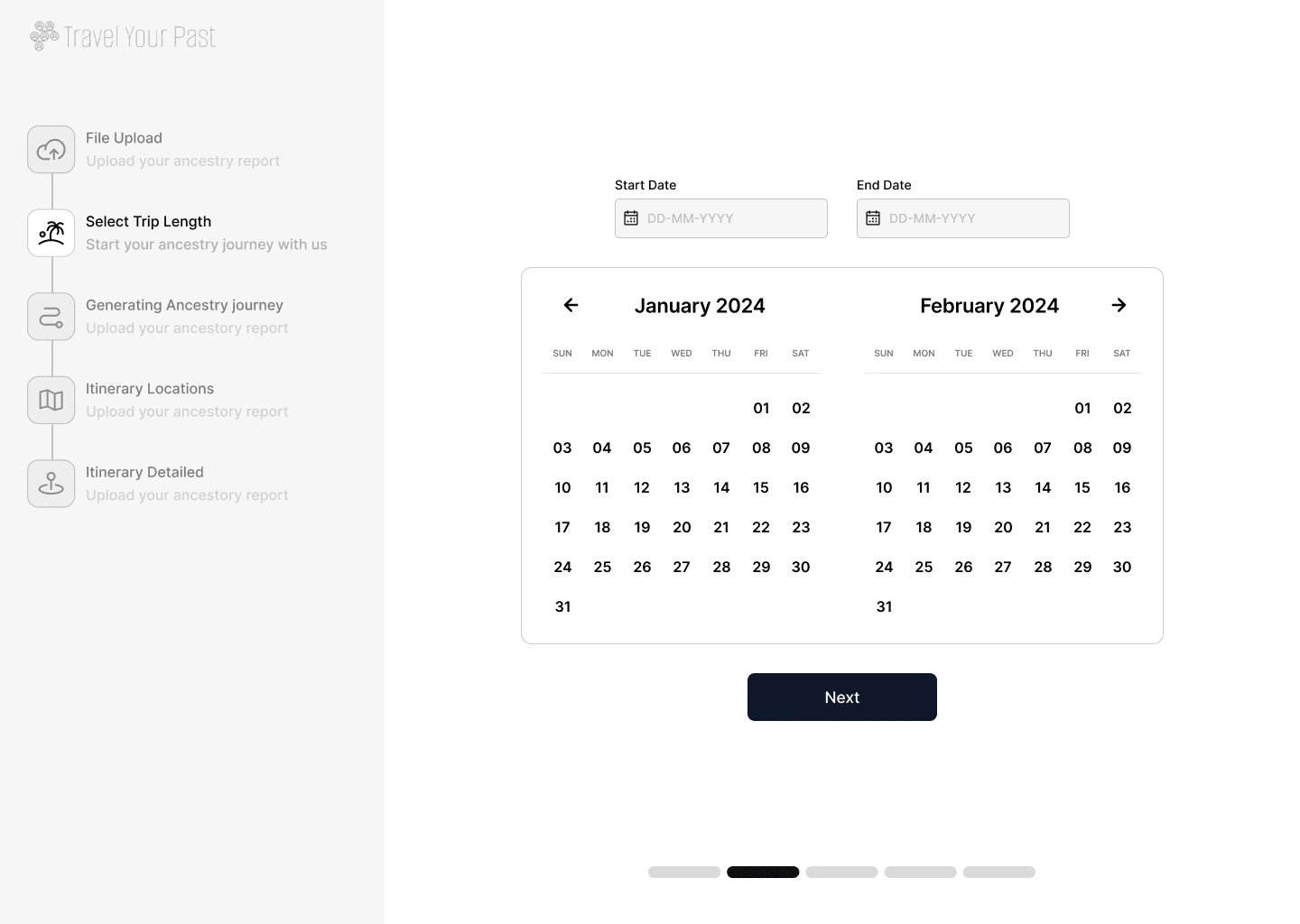
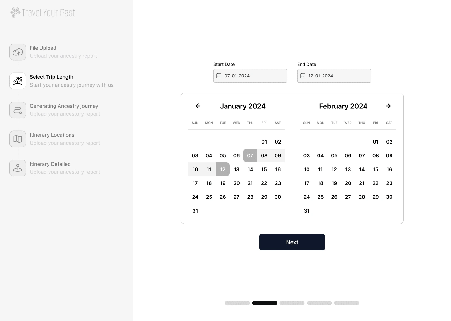
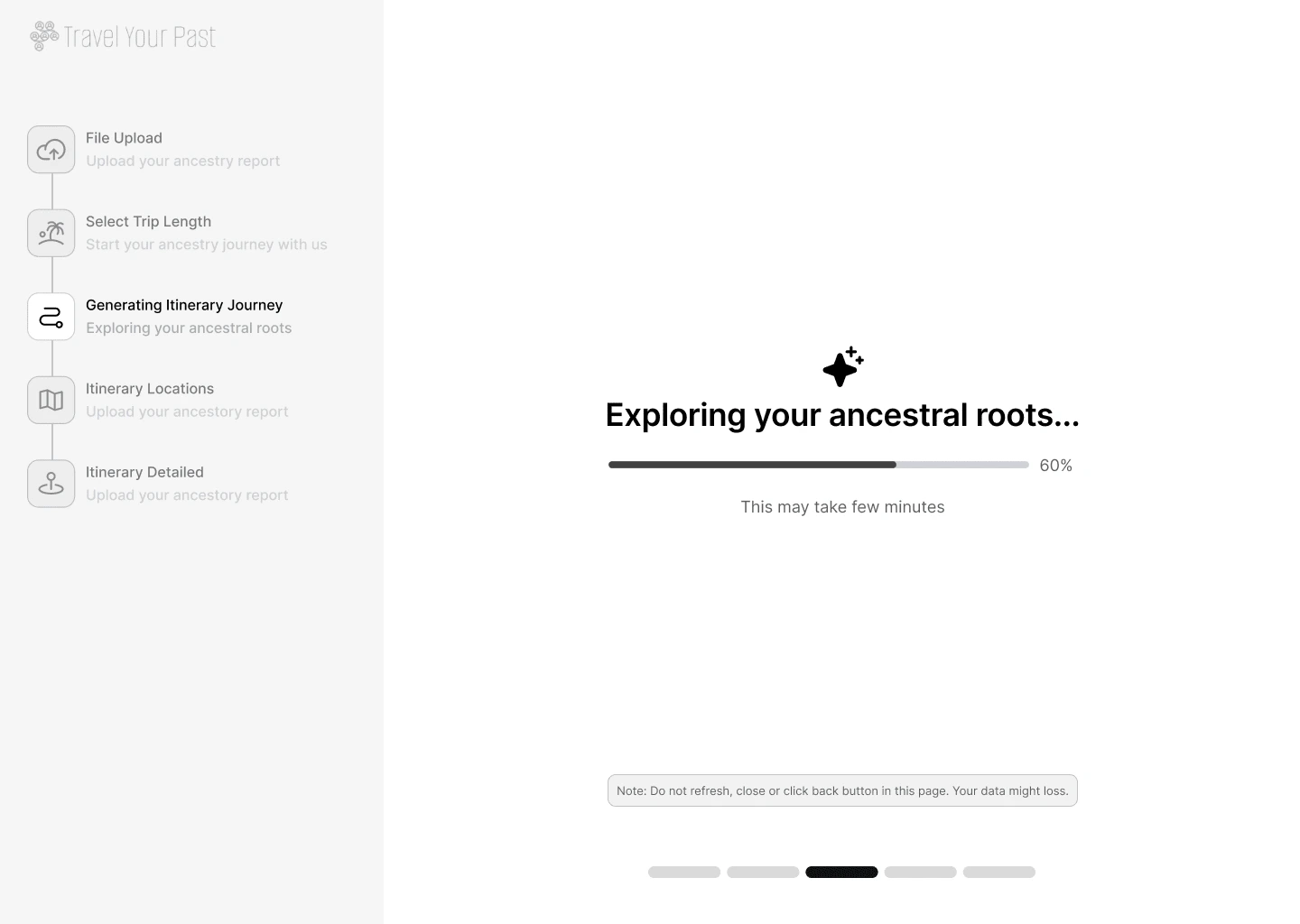
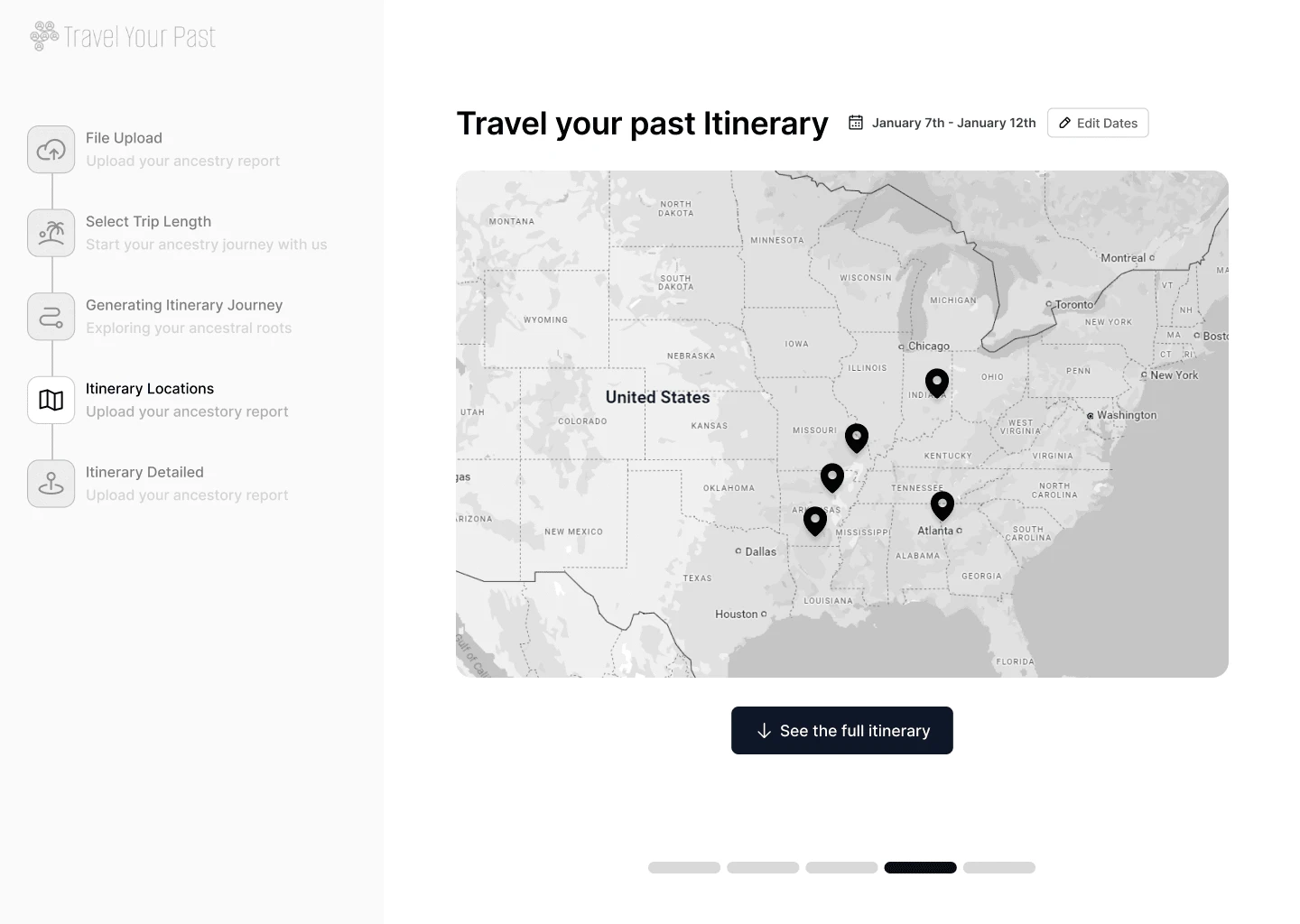
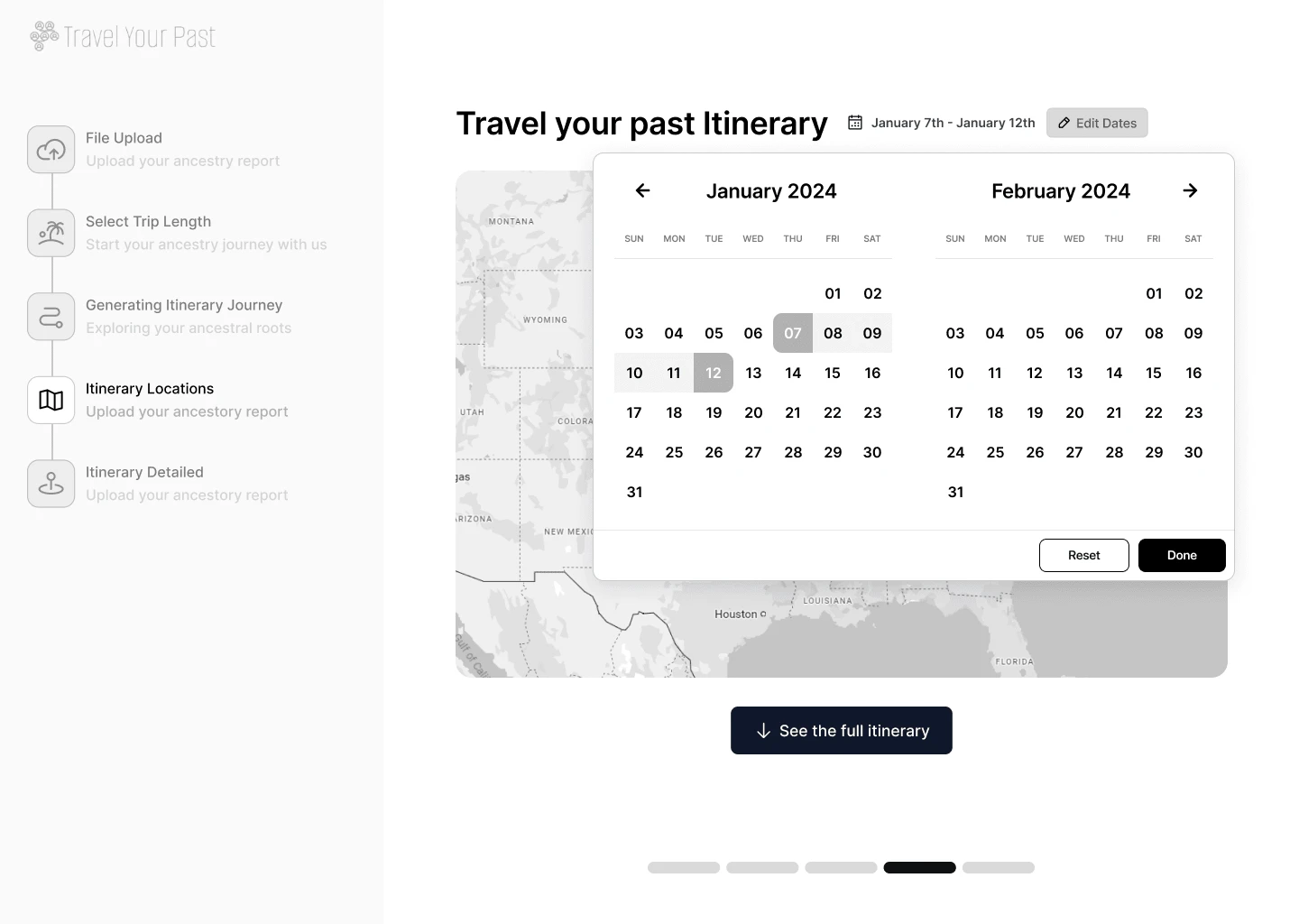
3. Design Approach
We focused on a SAAS-oriented design style, emphasizing clarity, simplicity, and modernity:
Minimalist UI: Clean interfaces influenced by Shadcn UI and Airbnb’s design philosophies.
Placeholders & Mock Data: To simulate functionality, we incorporated placeholder content and mock data to fill the screens.
Responsive Design: The wireframes were built with desktop-first considerations to ensure optimal user experience.
_____________________________________________________________________________________
UI Design
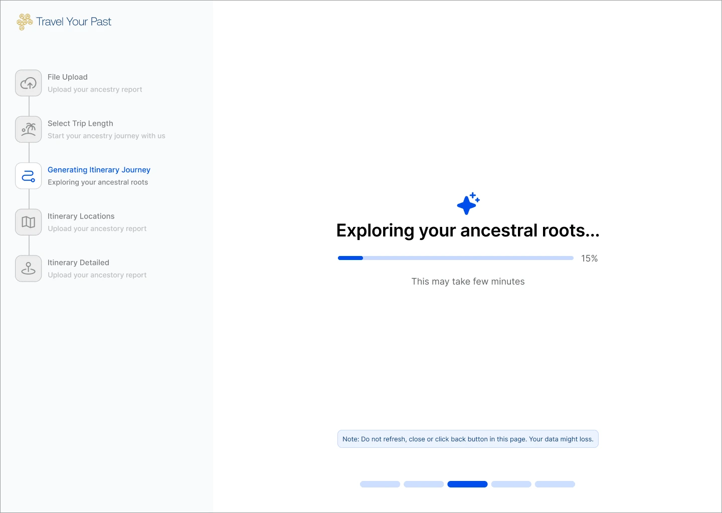
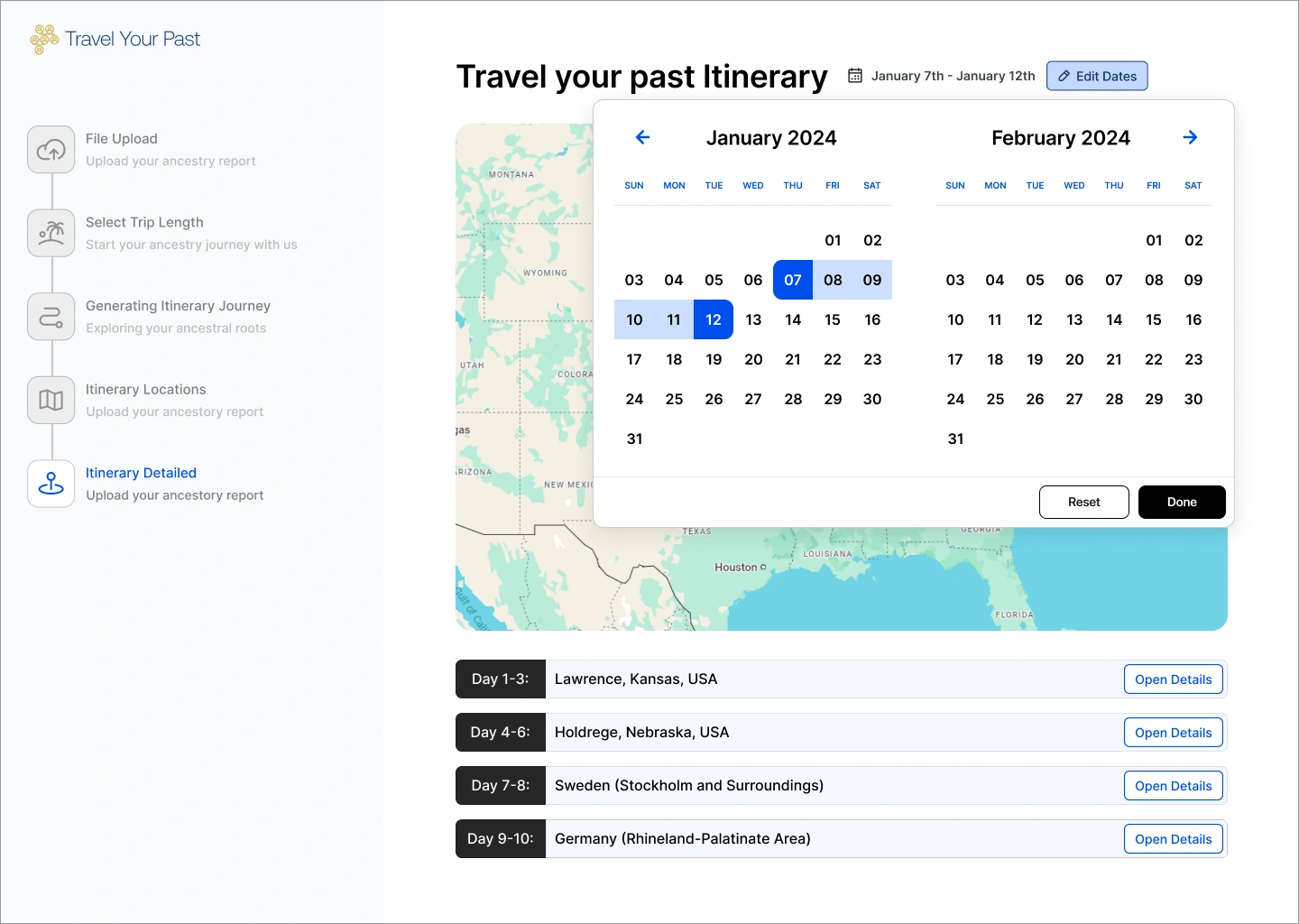
4. Prototype Interaction
The interactive prototype was developed using Figma, where users can:
Upload Data: Interact with the upload process by simulating the selection of genetic data.
Navigate the Itinerary: Engage with the results screen, which includes interacting with the map and navigating the daily timeline.
This interactivity allowed for a closer simulation of how the final product would function, making it easy to identify potential UX improvements early on.
_____________________________________________________________________________________
Challenges & Solutions
Challenge 1: Designing for Multiple Data Inputs
The primary challenge was to ensure the UI supported varied inputs such as genetic results and travel preferences. We kept the interface clean, allowing users to easily upload files and input preferences without overwhelming them.
Solution: By implementing clear labeling, concise instructions, and visual cues, we streamlined the upload process, minimizing confusion and enhancing ease of use.
Challenge 2: Presenting Complex Itineraries Clearly
Displaying a personalized itinerary with multiple locations and activities across several days posed a challenge in ensuring readability and accessibility.
Solution: The itinerary screen was designed with a split layout, combining a map with location pins and a day-by-day timeline to allow users to easily navigate between locations and activities.
_____________________________________________________________________________________
Outcomes
The final product delivered:
Interactive Prototype: A functional, clickable prototype simulating the end-to-end user experience.
UI Design: Wireframes for all core screens were developed to reflect the user flow and interactions.
Documentation: Comprehensive documentation explaining the design rationale, user flow, and interactions within the prototype.
Client Feedback Iteration: The prototype went through iterative refinement based on client feedback, ensuring the final product aligned with expectations.
_____________________________________________________________________________________
Conclusion
The “Travel Your Past” project delivered a fully functional, mid-fidelity prototype that successfully simulated the user experience. The clean, modern design allowed for easy navigation through the various steps of generating a personalized itinerary based on genetic data. While the project excluded high-fidelity design and backend development, it laid a solid foundation for future iterations, incorporating final design assets and data integration.
_____________________________________________________________________________________
Building a Web App?
From design to development, I create high-performing web apps that engage users and drive results. Let’s bring your vision to life—get in touch today!
Like this project
What the client had to say
Anush was excellent! I'd definitely work with him again for my design needs. He took the time to understand my project and delivered in a timely fashion with great communication. Now I have a great POC to show my team.
Brett Perry, Screen Pilot
Oct 8, 2024, Client
Posted Oct 8, 2024
Travel Web App : A high-fidelity clickable prototype for "Travel Your Past," offering personalized travel itineraries based on genetic data, with Shadcn UI
Likes
1
Views
173
Timeline
Oct 2, 2024 - Oct 8, 2024
Clients
Screen Pilot

