Gopay Top Up Improvements — UX Case Study

Only a few of Gojek users that already knew that we could top-up Gopay balance on the apps itself. No, not on your mobile banking. It’s only on the Gojek app!
⚠️ Disclaimer: Please remember that any fonts, colors, and contents are belonging to Gojek Company (PT. Aplikasi Karya Anak Bangsa). I used those stuff only for learning materials.
UX Workflow

1 — Define
Before we’re getting through, we select the specific competitor to find the goods & bads from their apps, as usually, we call this as competitive analysis. For selecting the competitor we have to know what’s Gojek’s competitor in the present market.
And we find the diagram that helps us to define which brand that competes with the Gojek. Each intersects on the figure below means,
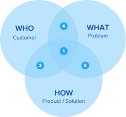
Direct Competitor
Different Problem
Different Customer
Different Product Category
After that, we defined the Gojek preposition and then compare it on each payment wallet player and sort which one segment is the same or not.
Gojek Preposition & Comparison on Its Competitor


As we determine above, we have the sort listed competitor. And we find OVO, DANA, and LinkAja as the closest competitor.

What’s The Competitor Has?
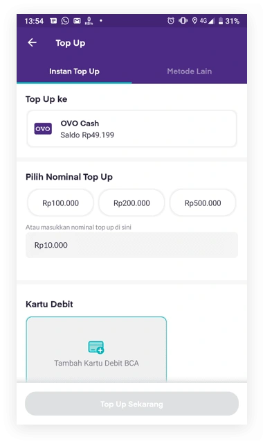
1. OVO
OVO’s interface looks similar to Gopay, from layout until its information structure is quite same as Gopay.
From this interface, we didn’t have any points that could improve the Gopay top-up page.
2. DANA
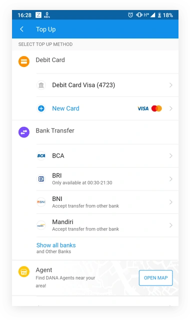
DANA has a different approach by showing the available payment methods and showing the instruction on each option.
We think by giving information by merchants/banks, it could ease the user to find the information quickly.
This might be good for the future design of the payment instruction list.
3. LinkAja
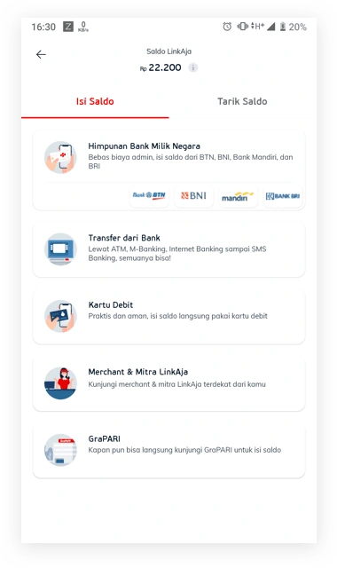
Same with DANA but at LinkAja, they do not have a feature to top-up from BCA OneKlik, LinkAja shows the top-up instruction at the front page.
But the uniques from LinkAja is they show their feature for withdrawing money to user’s bank account on the next tab.
What do We Get from Them?
DANA page that showing instructions by merchants/banks. It could ease the user to navigate where they want to find instruction for ATM and Mobile Banking on the same page.
Following LinkAja & DANA, we want to add a credit/debit card as a new payment method.
Heuristic Evaluation
After inspecting the competitor’s products, we evaluate each app with Heuristic Evaluation. We picked which one of the page elements that violate the 10 heuristics. In this section, we only focus to evaluate on Gopay interface.
The 10 Heuristic
Visibility of system status
Match between system and the real world
User control and freedom
Consistency and standards
Error prevention
Recognition rather than recall
Flexibility and efficiency of use
Aesthetic and minimalist design
Help users recognize, diagnose, and recover from errors
Help and documentation
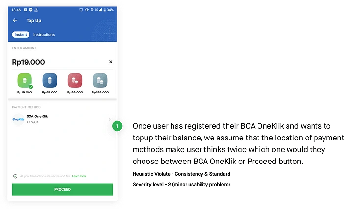
HE 1 — Top-Up Landing Page
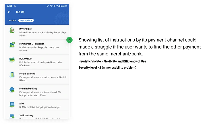
HE 2 — Payment Instruction List
HE 3 — Payment Instruction Details
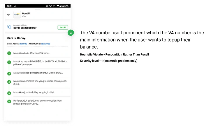
2 — Solution Design
From Stage 1 — Define, we summarize that we have to

User Flow
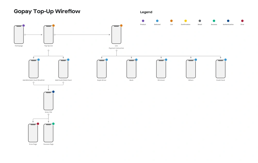
To analyze deeper, I recreate the user flow and adding some changes such as New Payment with Credit/Debit Card and List Topup Instructions by merchants/banks. All changes are figured below.
3 & 4 — Prototype & Evaluation
Following our plan, we do a validating at the end of the process to escalate the flow and have a valid data comparison from our users. To get the user data, we use Google Forms to fill a questionnaire and screen recording to identify their behavior during the testing sessions. To have a good data pattern and finding from user problems, we have to get at least 5 users to involve in the testing.
User Criteria
We define for the criteria of our user that has
Male/female
18 yo or above
Has good communication
Has a smartphone
Has or never used GoPay before
Has or never top-up balance on Gojek app
Currently not working in e-wallet company
Research Scenario

Introduction
Q&A Session
1st Usability Testing Session (existing apps)
2nd Usability Testing Session (proposed solution)
Post-test Questions
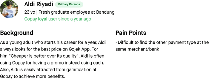
User Persona

Research Findings
From our evaluation activity, we find that
Users often use mobile banking or ATM to top-up their balances.
Evidently, users just found out that they could top-up from Gopay apps instead.
On the payment instruction list, our users feel comfortable with the search bar and chips to navigate the content.
Some of them said that placing the button “Payment Instruction” at the bottom of the landing page could change their behavior to navigate the menu.
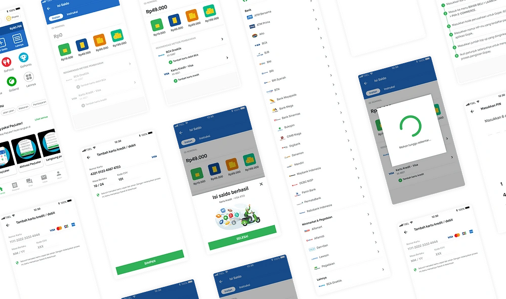
Interface Design
Usability Metrics
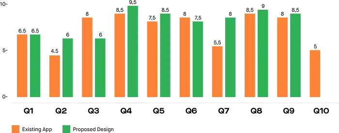
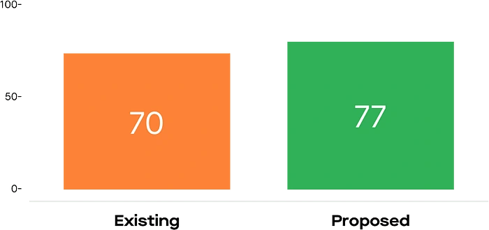
To measure if our proposed design is the ideal solution, we set a questionnaire to our user for the before-after design and the user will decide which one is the better solution to their problems with 2 usability metrics, System Usability Scale (SUS) and Singe Ease Question (SEQ).

SUS Result
SEQ Result

Key Takeaways
From our research, we conclude that

Like this project
Posted Nov 10, 2023
An exploration for UX Case Study from my early-stage in UI/UX Design
Likes
0
Views
50

