Built with Framer
Amari AI Website Refresh and Thought Leadership Foundation
Andrey Kichigin
Verified
Website creation case study – Amari AI (San Francisco)
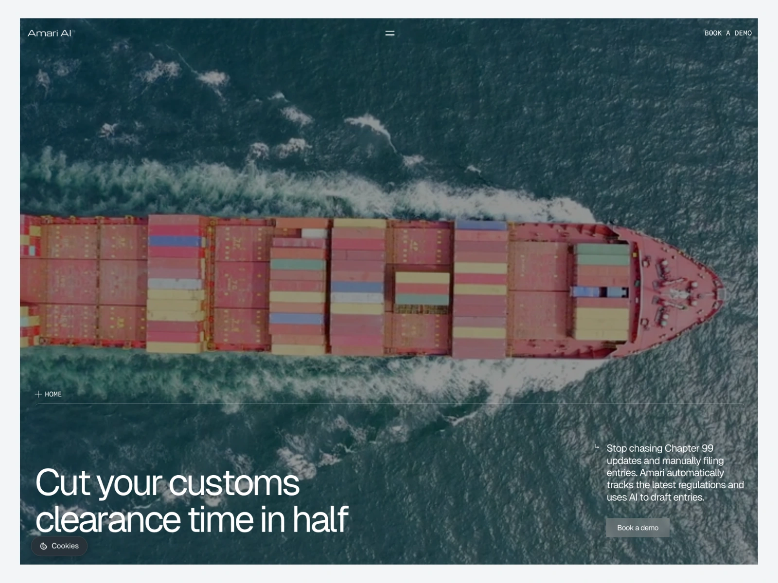
Amari AI — a fast refresh that made the product clear and the company investment-ready
Industry: AI / SaaS
Engagement: Framer website refresh + thought leadership foundation
Timeline: ~1 month
Context: Active growth phase with limited founder bandwidth
The situation
Amari AI is a San Francisco company moving at startup speed. The business was developing fast, but the website was holding the story back. It still carried older structure and older messaging, and that gap was getting more expensive every week. Users, partners, and potential investors were all landing on the same page, and it was no longer doing the company justice.
The brief looked simple on paper. Refresh the existing site, reuse what could be reused, and ship in about a month. The real brief was different. The website needed to make the product understandable in seconds and make the company feel ready for the next stage.
The real challenge
The hardest constraint was not design. It was time, specifically founder time.
In most projects like this, the bottleneck is not building. It is decisions. With a busy founder, every long document, every open-ended option, and every slow review cycle becomes a tax on the project. The work had to move forward without becoming another thing that stole attention from the business.
On top of that:
A short timeline of around one month
An existing system to evaluate, where some elements were worth keeping and others were quietly creating confusion
Three audiences to serve at once: users who needed clarity on the product, partners who needed credibility, and investors who needed a company that looked ready for the next round
How we worked
The project stayed on track by removing ambiguity early and keeping feedback loops short.
Context and constraints. We mapped what was working in the current site, what was outdated, and where the real communication gaps lived before touching the design.
Rapid prototype. A first directional version went up quickly so the founder could react to something real instead of approving abstract ideas. That cut decision time in half.
System design. We made deliberate reuse decisions, kept what was strong, and rebuilt what was creating drag. New components, a refined type system, and clear page patterns gave the site room to scale without losing consistency.
Framer build. Responsive across breakpoints, optimized for performance, with SEO hygiene built in from the start.
Launch and handover. QA across devices, a clean structure, and a setup the team can keep updating without a designer in the loop.
Because founder availability was the main constraint, we ran the project on a single board with a single source of truth. Decisions, assets, and feedback lived in one place, which made every short review window count.
What we built
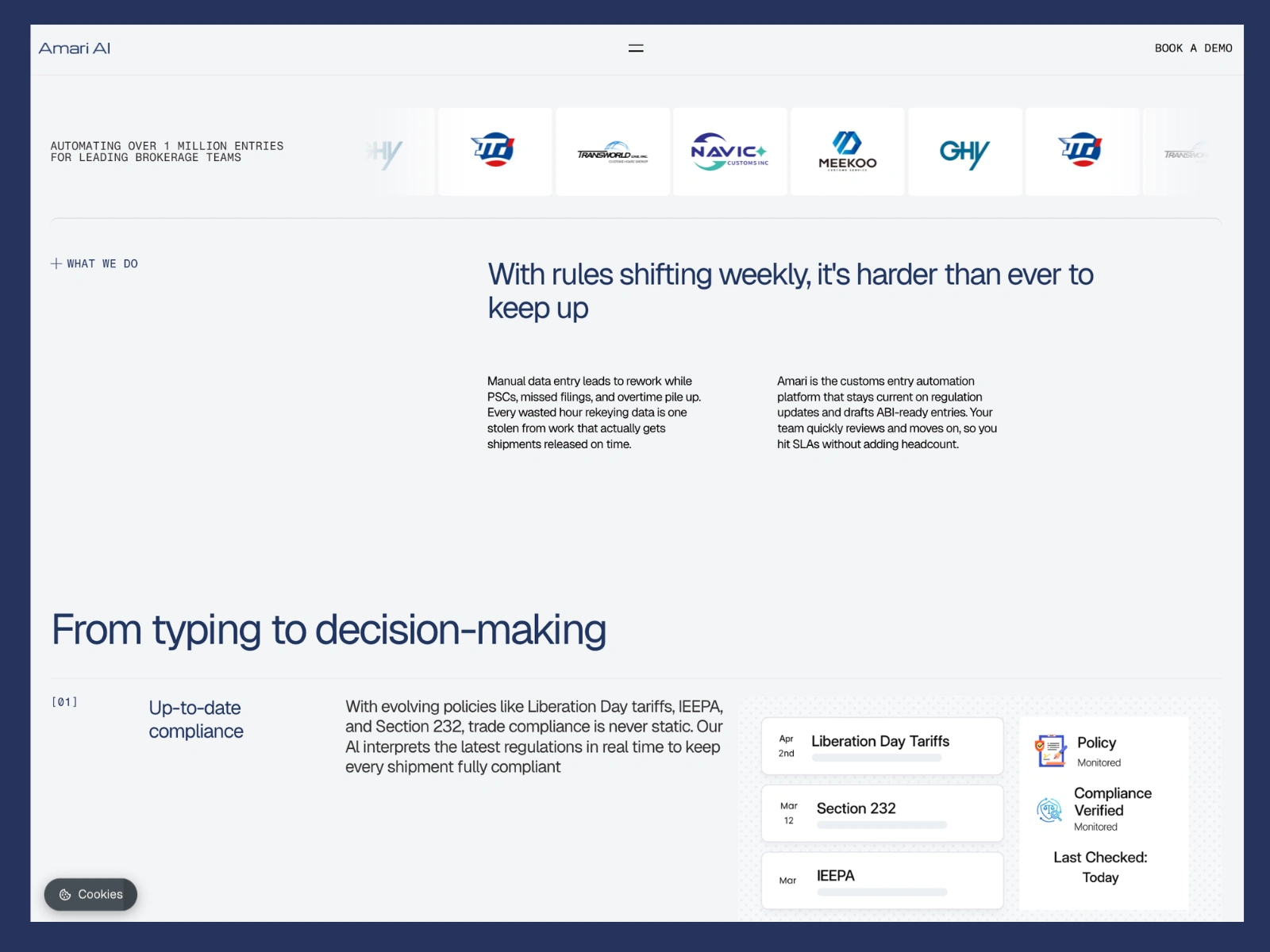
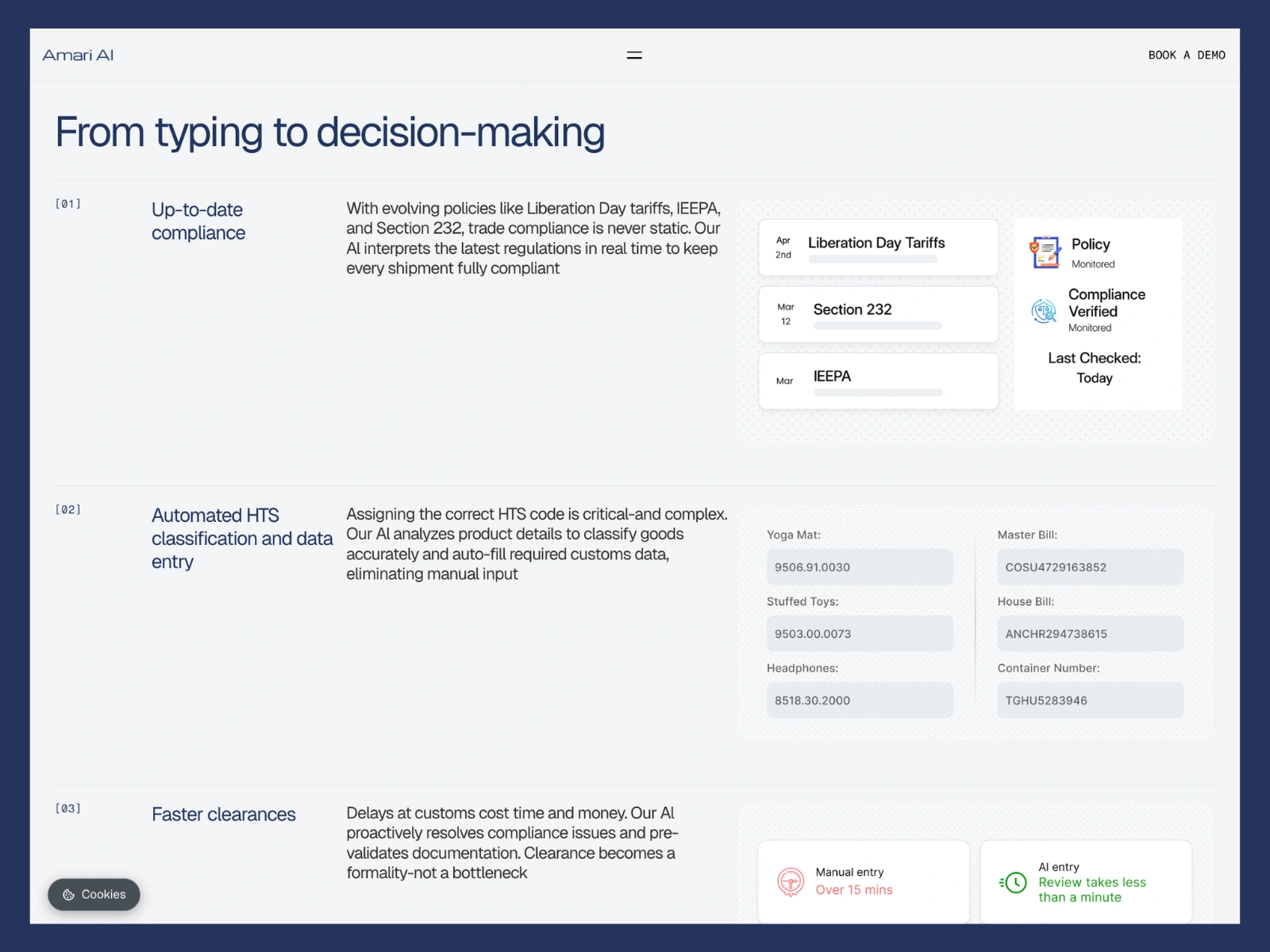
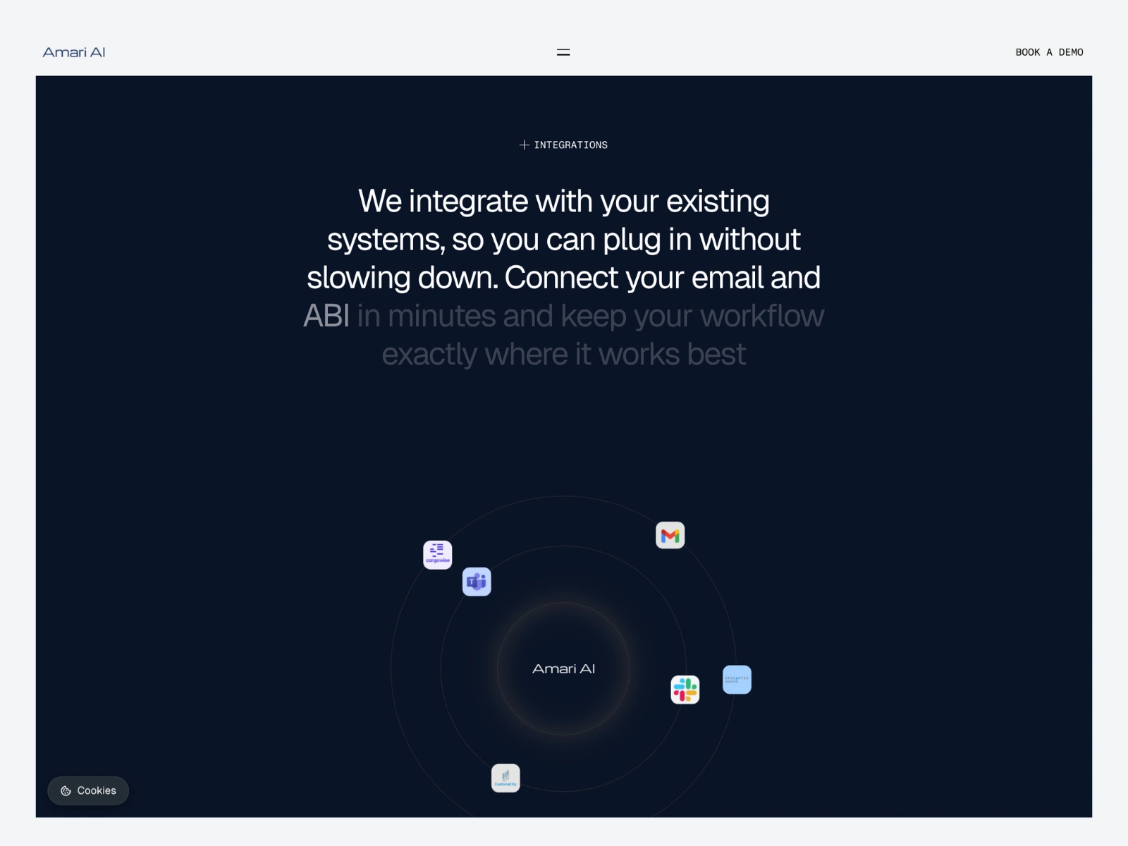
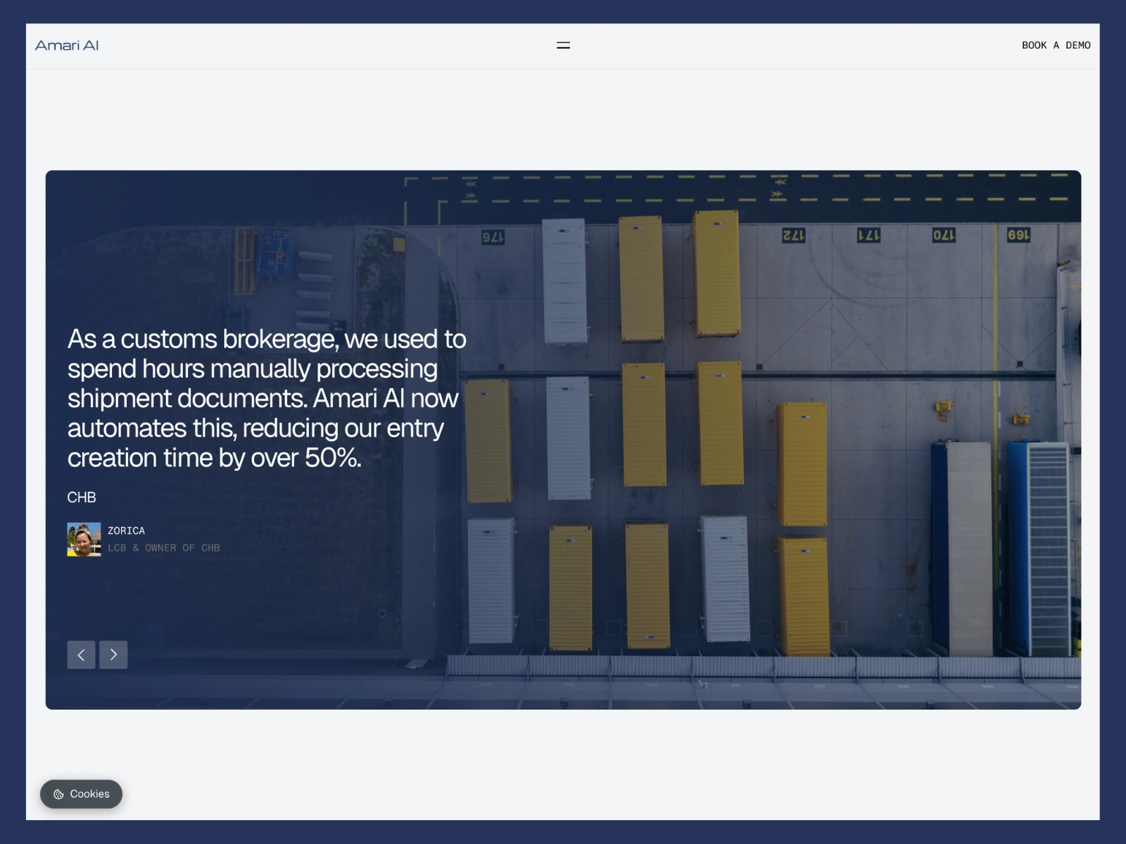
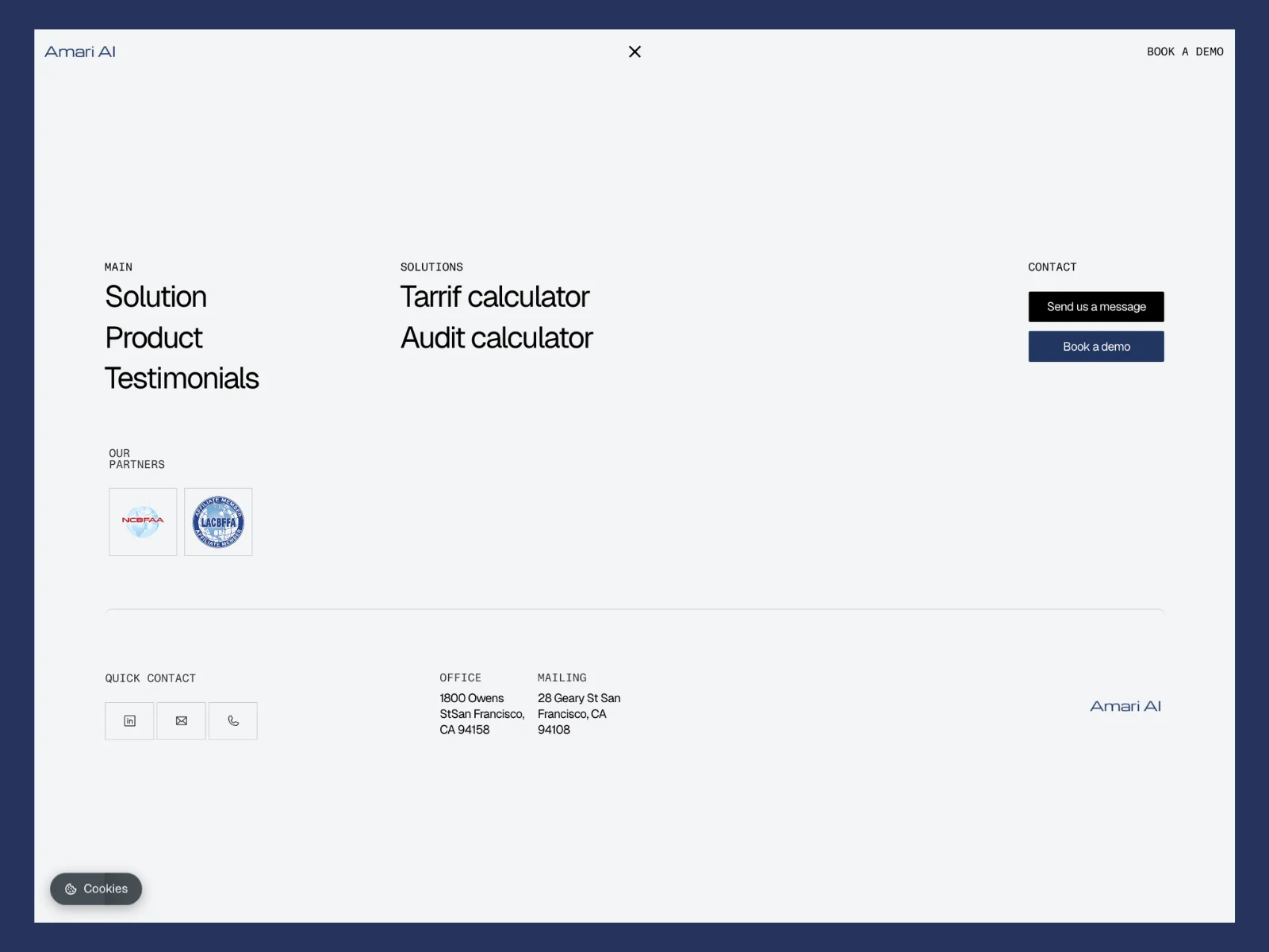
A refreshed multi-page Framer website with a clearer narrative and stronger product communication
A new visual system and improved navigation that translates the brand into a working product, not just a skin
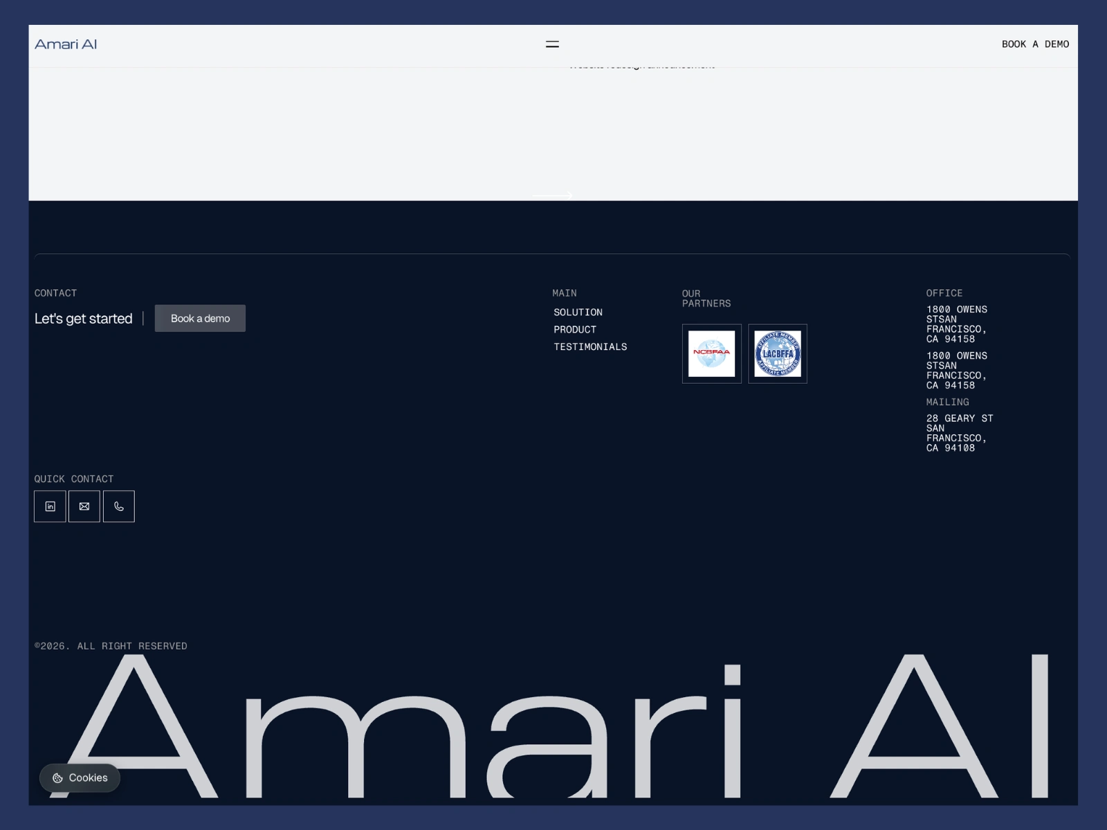
A blog and thought leadership foundation so the team can keep publishing without a redesign
A component and content system designed for reuse across future pages and campaigns
Full responsive behavior across desktop and mobile
Craft and technical detail
A few things mattered more than usual on this project.
Reuse with judgment. We carried over what was working in the original site and rebuilt the parts that were quietly hurting the story. The result feels like an evolution, not a reset.
Responsive precision. Hierarchy and spacing hold up at every breakpoint. The product communication is just as clear on a phone as on a laptop, which matters for an audience that often opens the site between meetings.
Performance discipline. Asset optimization, image handling, and lazy loading were built in from the start. Speed reads as credibility, especially for an AI company where users instinctively judge quality from the first interaction.
Intentional motion. Animations support reading and navigation. Nothing decorative, nothing that slows the page down.
Scalable content system. The blog and thought leadership setup is built to grow. The team can publish, structure, and link content without rebuilding pages.
SEO hygiene. Metadata, structure, and page architecture were treated as part of the build, not as a final checklist.
Outcome
The refreshed site communicates the product clearly to the three audiences that matter, users, partners, and investors. The company looks like what it actually is: a serious team moving fast. The thought leadership foundation gives Amari AI a place to keep building authority over time, and the content system means the website stops being a brochure and starts working as a growth asset.
Why this case is representative
This is the kind of project Kichigin Studio is built for.
A real business with real momentum, where the website is a sales and clarity tool, not decoration.
A tight timeline absorbed by a fast prototype, a single board, and short decision cycles that respect founder time.
Reuse decisions made with judgment, so the new system feels intentional instead of cosmetic.
A finished product that is responsive, fast, and easy for the team to maintain and extend after launch.
Like this project
Posted Apr 29, 2026
One-month Framer refresh for Amari AI: clearer product story, investor-ready presence, and a scalable content system built around limited founder time
Likes
3
Views
10
Timeline
Jan 12, 2026 - Feb 23, 2026
Clients
Amari