IRCTC Website UX Redesign
Aimaan Khan
IRCTC Redesign
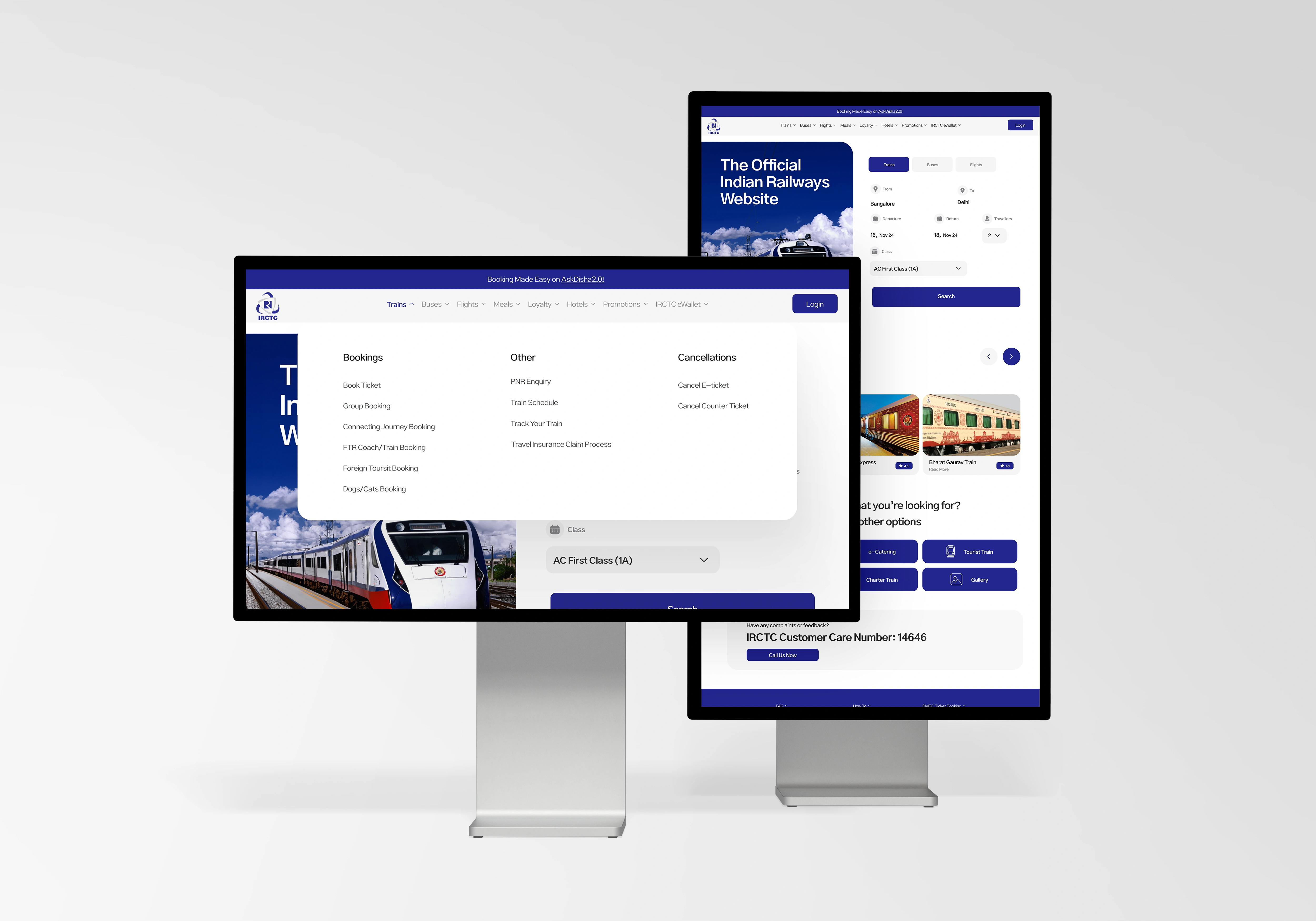
IRCTC is the lifeline of Indian travel — yet ironically, navigating it feels like solving a Rubik’s Cube blindfolded. Booking a train shouldn’t feel like an endurance sport.
The Process
This redesign was a self-imposed challenge. I wanted to see how far I could stretch my design muscles by tackling a site notorious for bad UX. I began by mapping out the existing flows, identifying every friction point from visual overload to poor information hierarchy. I cut the clutter, simplified the booking journey, and made critical actions easy to find. No user testing was involved in this one, but design intuition and pattern recognition carried the weight. My aim: make it feel like less of a hassle and more of a flow.
Insights
Essential ≠ Clear
Even important information becomes noise when everything is screaming at once.
Hierarchy is holy
You can't guide a user if you don't guide their eyes first.d technical feasibility. Implemented AI algorithms to analyze user behavior and optimize scheduling recommendations.
Design ≠ Decoration
A redesign that doesn’t improve usability is just lipstick on chaos.
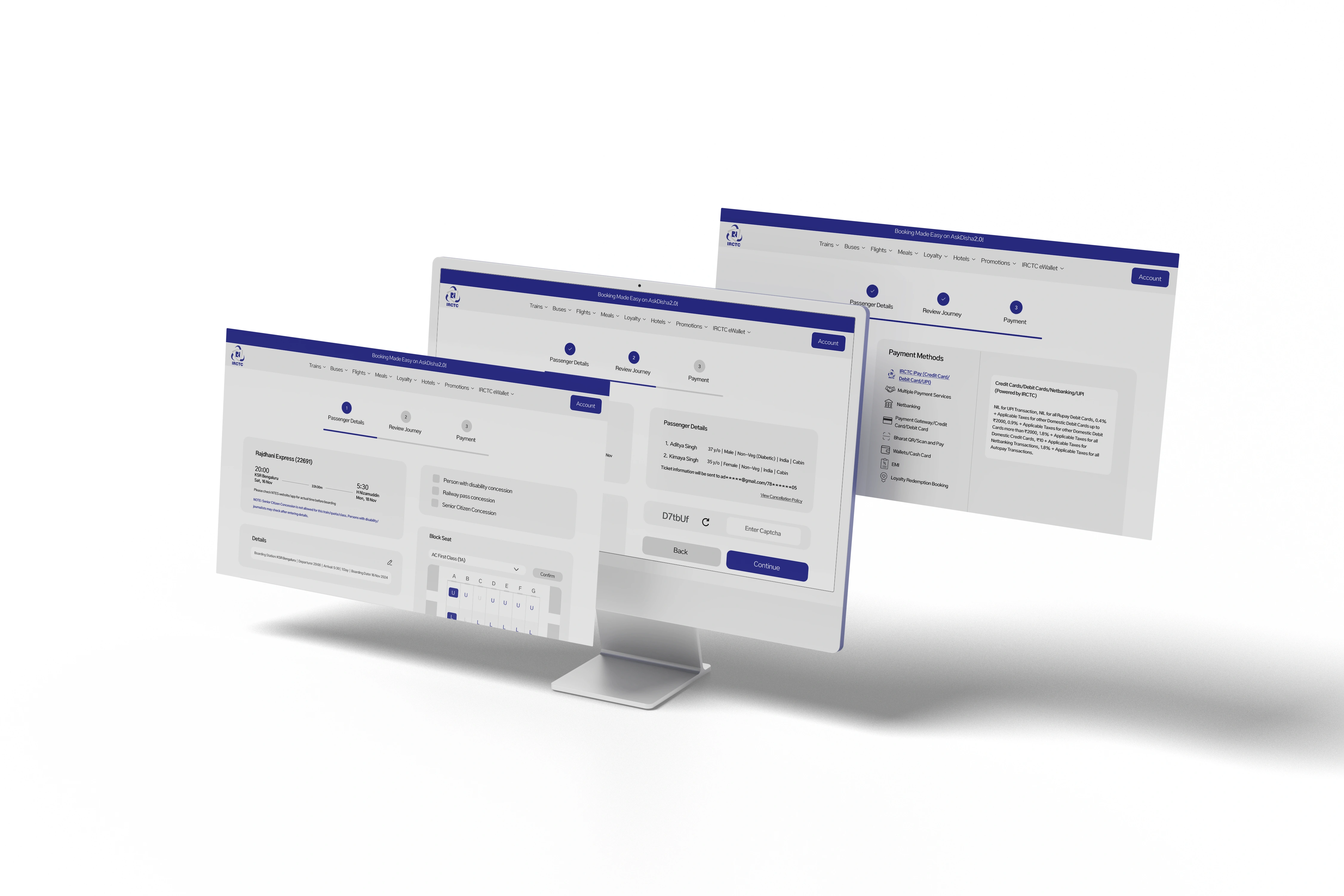
Solution
The final design simplifies the experience into clean, bite-sized flows from search to payment. I focused on accessibility, clarity, and speed. The new UI leans on strong visual grouping, bold CTAs, and reduced visual fatigue. The site now feels more human, less like government paperwork. While I didn’t conduct usability tests, initial feedback from seasoned IRCTC users was unanimously positive. “finally, I understand where to click!"
Results
A functional, frictionless redesign of one of India’s most chaotic web experiences.
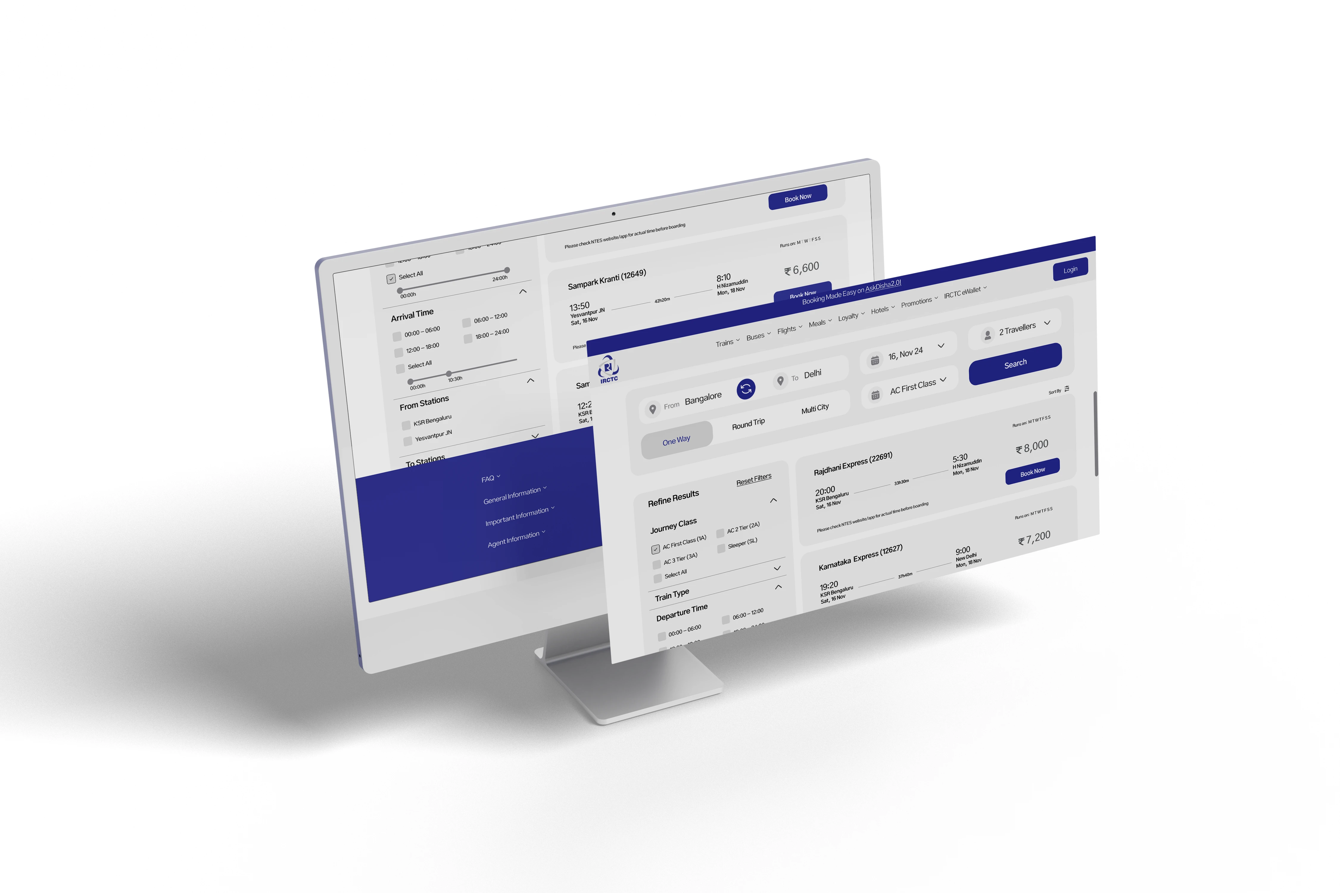
Visual Hierarchy
Grouped related elements and trimmed visual noise to spotlight what matters.
Streamlined Flow
Reduced cognitive load by simplifying the steps to book a train.
User First
Prioritized clarity, making the interface feel more intuitive even to first-time users.
Like this project
Posted Jun 7, 2025
Redesigned IRCTC for improved UX, focusing on clarity and simplicity.
Likes
0
Views
2
Timeline
Dec 4, 2024 - Dec 26, 2024