Built with Framer
Redesigning the Pieces Homepage | Design & Framer Development
Thay C
Redesigning the Pieces Website
Simplifying the Message. Elevating the Value. Driving Trust and Conversion.
Background
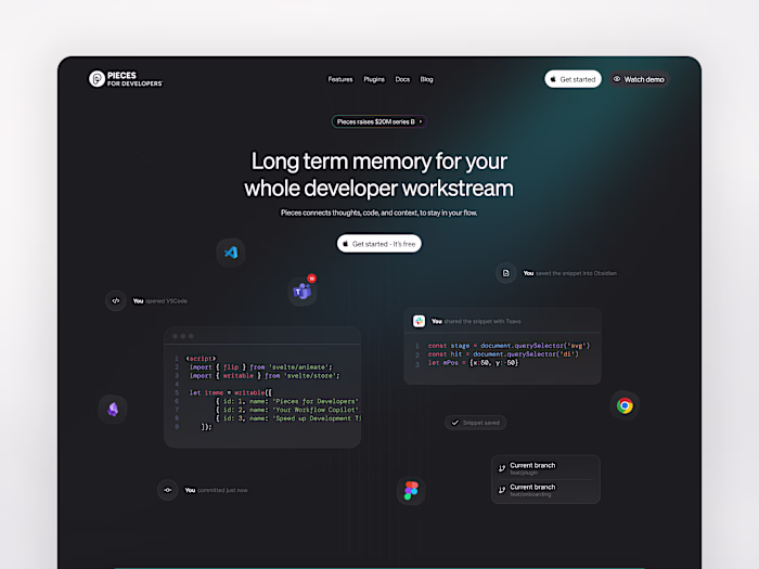
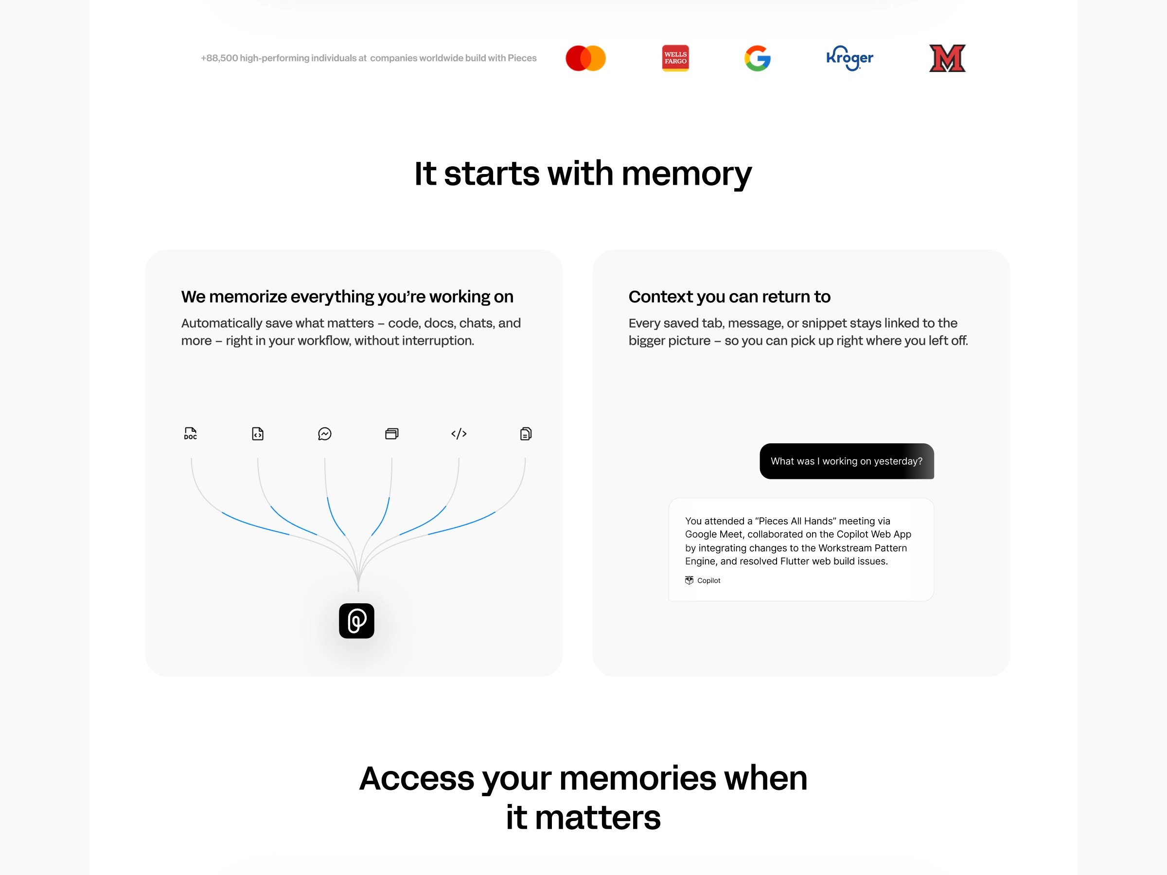
Pieces helps users build long-term memory by passively saving and resurfacing the important fragments of their work — across tools, conversations, tabs, and code. While the product had matured significantly, the homepage had not evolved in parallel to reflect the clarity, value, and polish the product now delivers.
Leadership set clear goals:
Simplify the homepage to a single, focused narrative
Center the messaging on memory-first (not Copilot-first)
Highlight privacy, integrations, and outcome-driven use cases
Ensure visual polish and brand clarity across devices
Approach
1. Messaging and Narrative Shift
Rather than focusing on features or technical specs, the new homepage leads with a clear, outcome-first message:
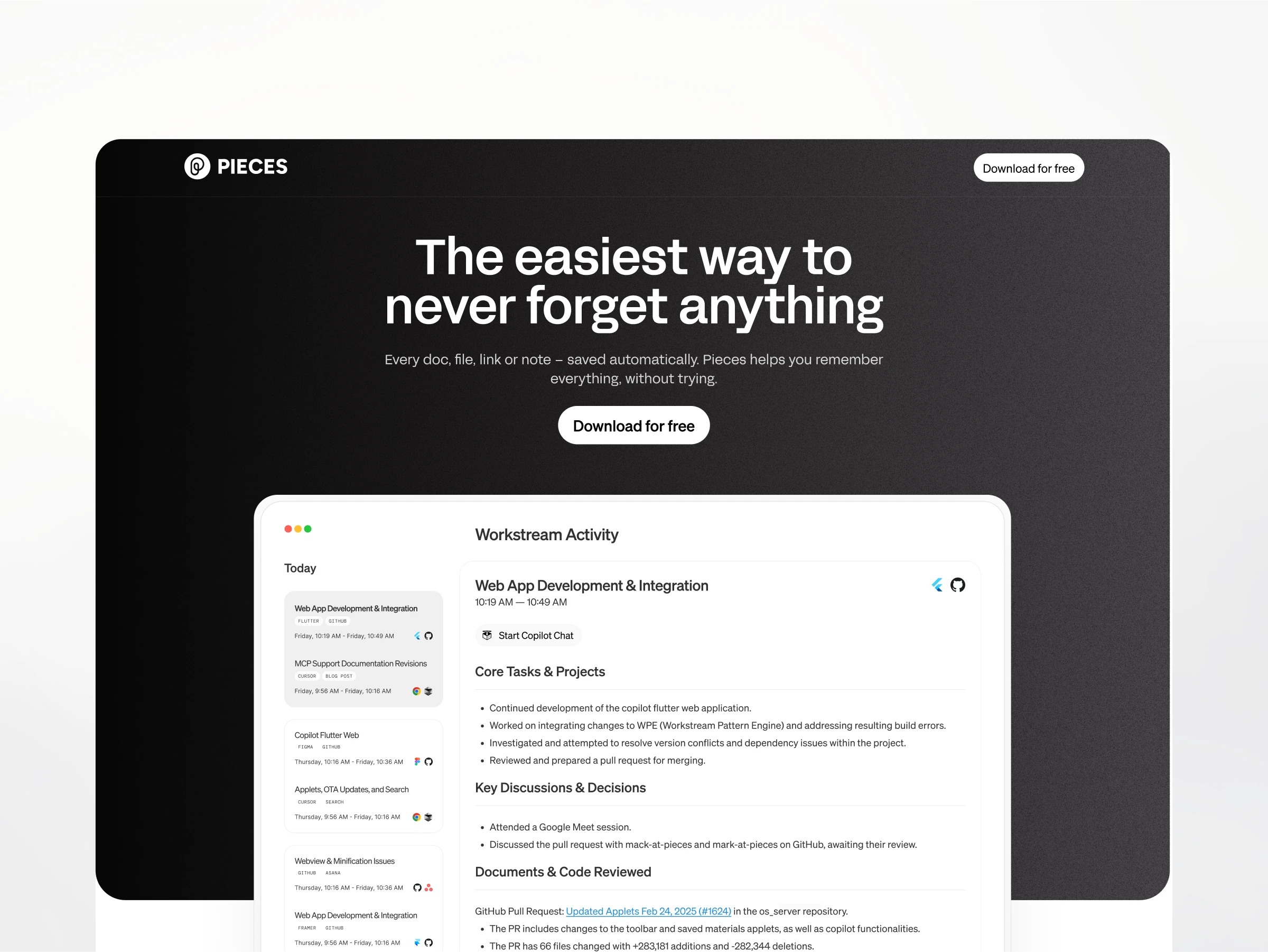
“The easiest way to never forget anything.”
This establishes the emotional and functional value upfront.
We restructured the narrative to follow the actual user journey:
Build memory passively
Access and resurface when needed
Works across your tools
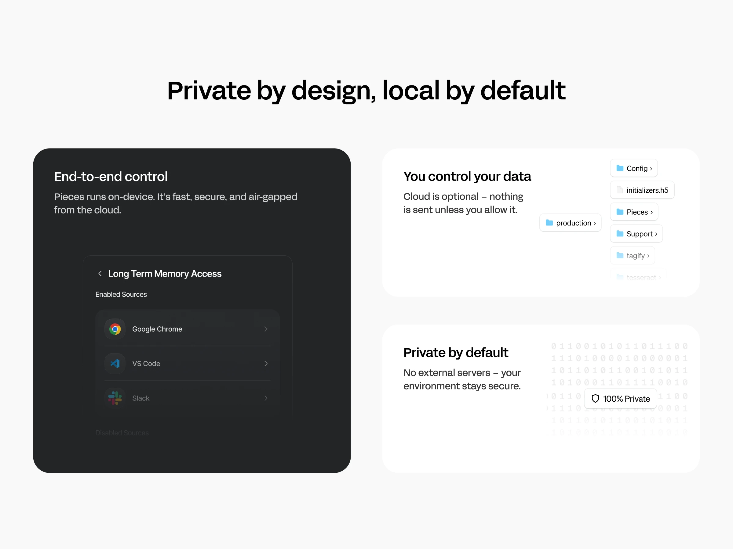
Everything stays local and secure
See it in action across real-world use cases
2. Layout & Content Hierarchy
Simplified navigation bar with one primary CTA (Download)
Sections now follow a clear flow:
It starts with memory
Access your memories when it matters
Available where you already work
Private by default, local by design
Where Pieces changes everything (use cases)
Trusted by anyone who uses a computer (testimonials)
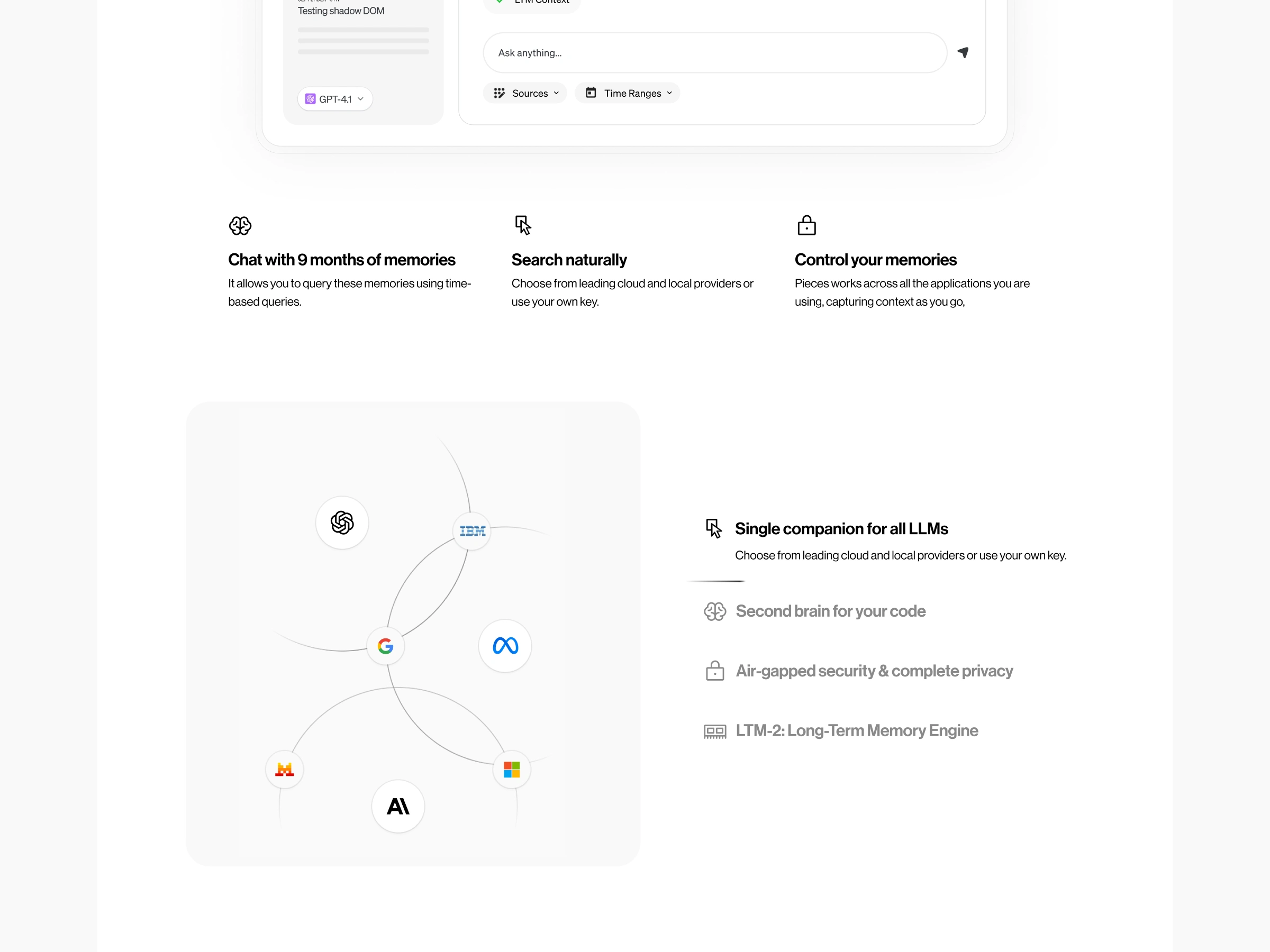
3. Integrations & Deeper System Features
To clearly distinguish between third-party plugin integrations and Pieces’ internal engine, we split them into two side-by-side sections:
Plugins: Browser, VS Code, Slack, JetBrains
MCP (Managed Code Patterns): Highlights deeper memory access like GitHub issue mentions, Slack threads, commit trails
Each has its own visual identity to avoid confusion.
4. Design & Branding Updates
Refined the hero with a more premium black & white aesthetic and subtle gradient overlays
Increased CTA button sizes for better engagement
Removed “for developers” from the logo to align with our broader positioning
Updated mobile spacing and typography for better legibility (60px spacing vs 80px desktop)
Outcomes
Clarity: Messaging is now aligned with the product’s core value: helping users build and recall memory
Trust: Emphasis on privacy, local-first architecture, and user control
Conversion: Download CTAs are more visible and tied to clear outcomes
Scalability: The structure supports testing of future use cases and deeper features like Workstream Activity
Like this project
Posted Jul 11, 2025
Redesigned Pieces website to enhance clarity, trust, and conversion.
Likes
2
Views
101
Timeline
Jun 13, 2025 - Jun 27, 2025