Nexo

Josue Perez

Problem Space
The Problem
International relocation creates a specific and underserved form of isolation. You leave behind a built social infrastructure — friendships, routines, community spaces — and arrive somewhere where everything has to be rebuilt from scratch. The practical challenges of relocation (housing, healthcare, legal status) get design attention. The human challenges — loneliness, disconnection, loss of identity — mostly do not.
The existing solutions fall into two categories: general-purpose social apps (not designed for the relocation context) and expat-specific forums and groups (fragmented, passive, no integration with lived experience). Neither closes the gap between landing in a new country and actually feeling at home in it.
Nexo's premise: design an app that meets the expat where they actually are — still connected to people and platforms from their home country, slowly building something in the new one — and creates a single place where both kinds of life can coexist and grow toward each other.
Design
What I Designed
Cross-platform aggregation — "Stay Connected"
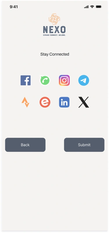
The first insight driving the architecture: an expat doesn't want to abandon their existing social graph. They want to stay connected to the people and communities they already have, while simultaneously building new ones. Nexo connects to eight platforms — Facebook, Instagram, Telegram, WhatsApp, LinkedIn, Strava, Eventbrite, and X — in a single onboarding step.
This is the highest-leverage design decision: by meeting the user in their existing social infrastructure, Nexo avoids the empty-network problem that kills most community apps before they get started. There's always someone here, because "here" is everywhere you already are.
Map-first local discovery
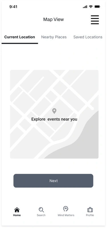
The map is the heart of Nexo's local connection layer. Three tabs — Current Location, Nearby Places, Saved Locations — give users an expanding radius of exploration. The key design bet: location-based event discovery is more emotionally accessible for someone new to a city than algorithmic recommendations. "Things happening near me" is grounded. "Things you might like" is abstract. For someone still orienting to a new place, the map closes the gap between knowing a neighborhood exists and having a reason to go there.
Mind Matters — mental health as first-class navigation
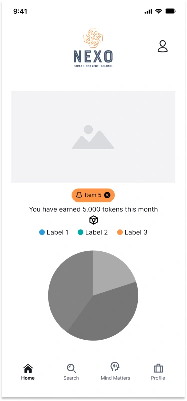
The bottom navigation has four tabs: Home, Search, Mind Matters, Profile. Mind Matters is not buried in a menu. It is at navigation parity with the core product — because the mental and emotional experience of relocation is not a secondary feature, it is the primary context in which every other feature exists.
The Mind Matters section includes dedicated wellbeing tools, mindfulness content, and resources specific to the expat experience — loss, grief for a former life, identity negotiation, loneliness. Designing this at the navigation level is a statement about what the app thinks you are: not a productivity unit optimizing your new city, but a person managing a genuinely hard life transition.
Token rewards — behavioral design for connection
A token system rewards engagement — attending events, completing wellbeing check-ins, making new connections. The design intent is specific: make the behaviors that combat isolation feel rewarding in themselves, not just instrumentally useful. The token layer provides short-term positive reinforcement while the long-term benefit (community, belonging) takes time to build. This is a common challenge in social product design; the token system is Nexo's answer to the low-engagement risk in the period between "just arrived" and "actually connected."
Registration and account creation
A deliberately minimal registration flow — name, email, phone, date of birth — with the platform integrations as the immediately following step. The design bets that connecting existing accounts is higher-value early friction than collecting demographic data: it gives the app something to show you on day one, and it tells the user immediately what kind of product Nexo is.
Rationale
Key Decisions
Aggregate before originate
Most community apps ask you to build your network from scratch. Nexo's architecture starts from the networks you already have and integrates them. This solves the cold-start problem that kills most social products — and it's the honest design choice for an expat app, because the person's social life doesn't disappear when they relocate. It gets split. Nexo holds both halves.
Mental health in the nav, not in settings
Wellbeing features in apps are usually buried — a toggle in settings, a link at the bottom of a menu. Putting Mind Matters in the primary navigation is a deliberate stance: if the mental experience of relocation is real (and research says it is, strongly), the design should acknowledge it at the top level. This is a values decision, not an information architecture decision. It tells the user what Nexo thinks is important about what they're going through.
Eight platforms, one step
Connecting eight platforms during onboarding could read as friction. The design bets it reads as power — as immediate evidence that Nexo does something no single platform can do. The selection interface (platform icons in a grid, tap to connect) is designed to feel like selecting, not filling out a form. The user is composing their social world, not answering questions about it.
Map as emotional grounding
For someone new to a city, a map is more than navigation — it's a way of building spatial familiarity before social familiarity exists. "Events near me" means something different when you don't know the neighborhood yet. The map is designed to be a first relationship with the city — something that makes the unfamiliar feel explorable rather than overwhelming.
Outcome
Outcome
A mid-fidelity prototype covering the full expat journey: onboarding and account creation, cross-platform aggregation, home dashboard with token rewards, location-based event discovery via map, and the Mind Matters wellbeing section. The full flow is available in the Figma file for review.
Nexo demonstrates two design capabilities that transfer directly to any social or community product: solving the cold-start problem (how do you make an app valuable before its community exists?), and designing for a user in emotional transition (how do you build product experiences for someone whose circumstances are changing faster than their sense of self?).
What I Learned
Reflection
The strongest thing in Nexo isn't any individual screen — it's the information architecture decision to treat mental health as a core function. That decision was made during the research phase, not the design phase, because the research was clear: expats don't primarily struggle with logistics. They struggle with grief, loneliness, identity, and the cognitive load of building everything twice.
If I were to take Nexo further: the aggregation layer needs much more careful design around data ownership — who owns the unified social graph Nexo creates? What happens to it if a user leaves? These questions are more important now than when the project was designed, and a hi-fi version would need to answer them at the architecture level, the same way JAY Astral answers privacy questions in its build.
The token system is the area I'd most scrutinize in a revisit. Gamification that incentivizes connection can slide into compulsion design. The line between "rewarding the behaviors that combat isolation" and "making isolation feel immediately better so the person stays in the app" is narrow. That's a design ethics question worth designing carefully, not just carefully avoiding.
Continue reading
Product Design · Mobile · Health Tech
Like this project
Posted Jul 14, 2026
Mid-fidelity prototype for an expat wellbeing and community app: cross-platform aggregation, map-first discovery, token rewards, and 'Mind Matters' wellbeing nav.
Likes
0
Views
0
Tags