Fit'sMe — Fitness & Lifestyle App

Josue Perez


Context
The Problem
Fitness apps overwhelmingly assume access to a gym, motivation that doesn't wane, and a diet that accommodates cooking for a household. The users who most need support — people working out alone at home, managing sleep debt, planning meals for one, looking for community to stay accountable — are underserved by the mainstream options.
Fit'sMe started from a research question: what does a fitness lifestyle app look like if it's designed around the friction points that actually stop people, rather than the ideal user who would use any app?
Discovery
Research
Secondary research
Desk research established the landscape — existing fitness apps, their feature sets, and their implicit user assumptions. Key finding: the market clusters around gym-goers and performance athletes. Home-based, lifestyle-focused fitness is treated as a secondary use case, if at all.
Affinity mapping
User data was synthesized through affinity mapping — organizing insights into clusters to identify patterns in what people struggle with, what they already do, and where existing tools fail them. Recurring themes: motivation and accountability, the desire for social proof without gym access, sleep as a fitness variable (not just a wellness add-on), and the loneliness of solo meal planning.
Empathy maps
Two empathy maps — one for each primary persona — mapping what users say, think, do, and feel around their fitness and lifestyle goals. The maps surfaced a key tension: users say they want a structured program, but feel overwhelmed when they try to follow one. The design implication was significant: structure needs to be available without being mandatory.
Definition
Personas
Martha Pujols
Wants to stay active but dislikes the gym. Looks to Instagram for fitness inspiration. Struggles with motivation when working out alone. Wants sleep tracking as a proxy for health, not just steps. Interested in meal planning but finds cooking for one person discouraging.
Jennifer Young
Prefers home workouts for flexibility. Follows a vegetarian diet and wants meal suggestions that reflect it — not afterthoughts. Values community accountability without needing to show up in person. Uses fitness as stress management, not performance.
These two personas set the design constraints: the app needs to work without a gym, support social motivation without requiring in-person presence, accommodate dietary preferences without treating them as niche, and track sleep as a first-class metric rather than a badge.
Design
Design Process
User stories and site map
User stories from both personas drove the feature set — and more importantly, the feature hierarchy. Sleep tracking and community forums surfaced as higher-priority than training catalogs and nutrition guides, which reversed the typical fitness-app order. The site map was organized around this revised priority, keeping sleep and community closer to the core navigation.
User flows
Full user flows for the primary journeys: onboarding and goal-setting, logging a workout, planning a meal, checking sleep data, joining a community challenge, and the Travel Mode flow — a key differentiator allowing users to maintain their routines while traveling without access to their usual home setup.
NAVIGATION ARCHITECTURE — PRIMARY USER FLOW Onboarding Sign up · fitness profile Goal Setting Fitness · sleep · diet prefs Dashboard Central hub · quick access Workouts Home · catalog · log Nutrition Meal plan · diet prefs Sleep Log · patterns · insights Community Feed · challenges Travel Mode Adapted · equipment-free key differentiator
Sketches → wireframes
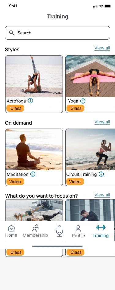
Paper sketches across all primary screens, then digital wireframes. The wireframe stage resolved the navigation architecture: a bottom tab bar with five zones (Dashboard, Workouts, Nutrition, Sleep, Community) — each mode accessible in one tap from anywhere in the app, reflecting the research finding that users move between modes frequently in a single session.
Brand platform and style guide
The brand concept: accessible, warm, social — not clinical, not aspirational. The fitness app aesthetic typically skews toward performance and intensity (dark themes, bold type, neon accents). Fit'sMe goes the other direction: lighter, warmer palette, a typeface that reads as friendly rather than authoritative. The style guide covers color system, typography, component library (cards, inputs, icons), and the Instagram-inspired feed pattern for the community module.
Prototype & Testing
Hi-Fi Prototype and Testing
High-fidelity UI
Full hi-fi screens built from the wireframe foundations — covering dashboard, workout catalog, exercise detail, nutrition planning, sleep dashboard, community feed, and the Travel Mode modal. The prototype was built in ProtoPie for user testing.
Interactive prototype
Click through the full hi-fi prototype — onboarding, dashboard, workouts, sleep, and community.
Remote moderated usability testing
Remote moderated sessions — participants completing scenarios with the prototype while thinking aloud. Testing revealed three issues not visible in the wireframe stage:
Navigation confusion at the Nutrition tab. Users expected meal planning and nutrition tracking to be separate — the tab label "Nutrition" was too broad and created uncertainty about what it contained. Resolved in the redesign with clearer sub-navigation.
Sleep data entry friction. The manual sleep log required more taps than users expected. Redesigned to a two-tap entry: start time and end time, duration calculated automatically.
Community feed discovery. New users didn't find the community challenges in the feed — they were below the fold and not surfaced in onboarding. Added a challenge prompt to the onboarding flow and elevated challenges above the general feed.
Redesign
Each testing finding produced a specific change. The redesign round was constrained to the three identified issues — not a wholesale revision. This was the most useful discipline from the testing process: fixing what's broken, not re-doing what works.
Rationale
Key Decisions
Sleep as a first-class metric, not a badge
The research showed sleep is how both personas manage their energy and measure their wellbeing. Treating it as a performance badge (sleep score, trend lines, comparisons) felt wrong for this audience. Sleep in Fit'sMe is personal data, not social data — it doesn't appear in the community feed, it doesn't generate achievements, it just helps you understand your patterns.
Structure available, not mandatory
The personas said they want structure but feel overwhelmed by it. The design answer: workout plans and nutrition programs are discoverable but not the default. The app opens to a summary dashboard, not a plan to follow. Structure is there when you want it; it doesn't assert itself when you don't.
Travel Mode as a first-class feature
Travel Mode adapts workouts and meal suggestions to a context where users are away from their usual equipment and local grocery options. This was a user-story finding that became a differentiating feature — most fitness apps have no answer for "I'm traveling." Fit'sMe treats travel as a recognized mode, not an interruption.
Warm, not intense — brand as design stance
The brand decision to go warm and accessible rather than performance-oriented was a statement about who the app is for. It attracted different creative choices at every level — typography, color, illustration, copy tone. Brand decisions are product decisions: they set who will feel welcome here.
Outcome
Outcome
A complete end-to-end UX project: research (secondary, affinity mapping, empathy maps) → definition (personas, user stories, site map) → design (flows, sketches, wireframes) → build (brand system, hi-fi UI, prototype) → test (remote moderated sessions) → iterate (three targeted redesign changes). The full artifact set is available for review.
Note: This is an Avocademy UX bootcamp project. Full case study materials including the ProtoPie prototype, wireframe set, and brand system are available on request.
Like this project