Designing for Impact Redesign of KOZE
Melvin Saracin
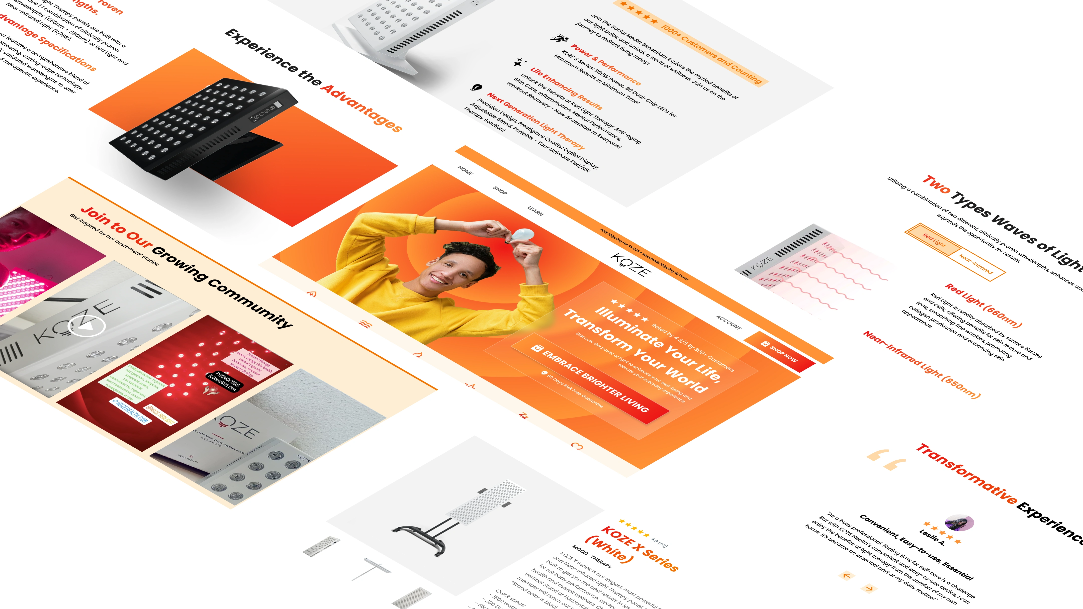
Sales Driven Homepage and Product Page Redesign Concept
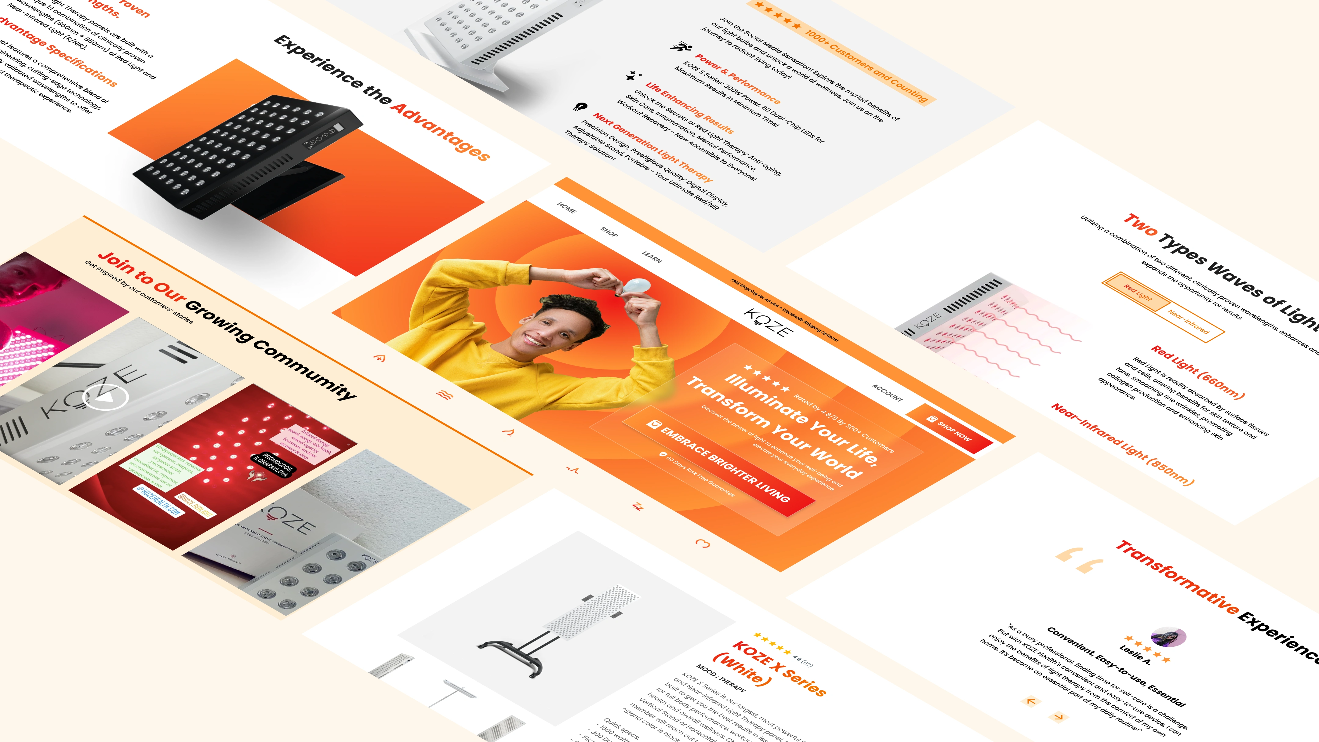
The primary objective of this project is to create a visually captivating and conversion-focused redesign for the homepage and product page of Koze website. The aim is to increase user engagement and drive sales by incorporating eye catching design elements and intuitive user experiences.
What is the Problem Statement?
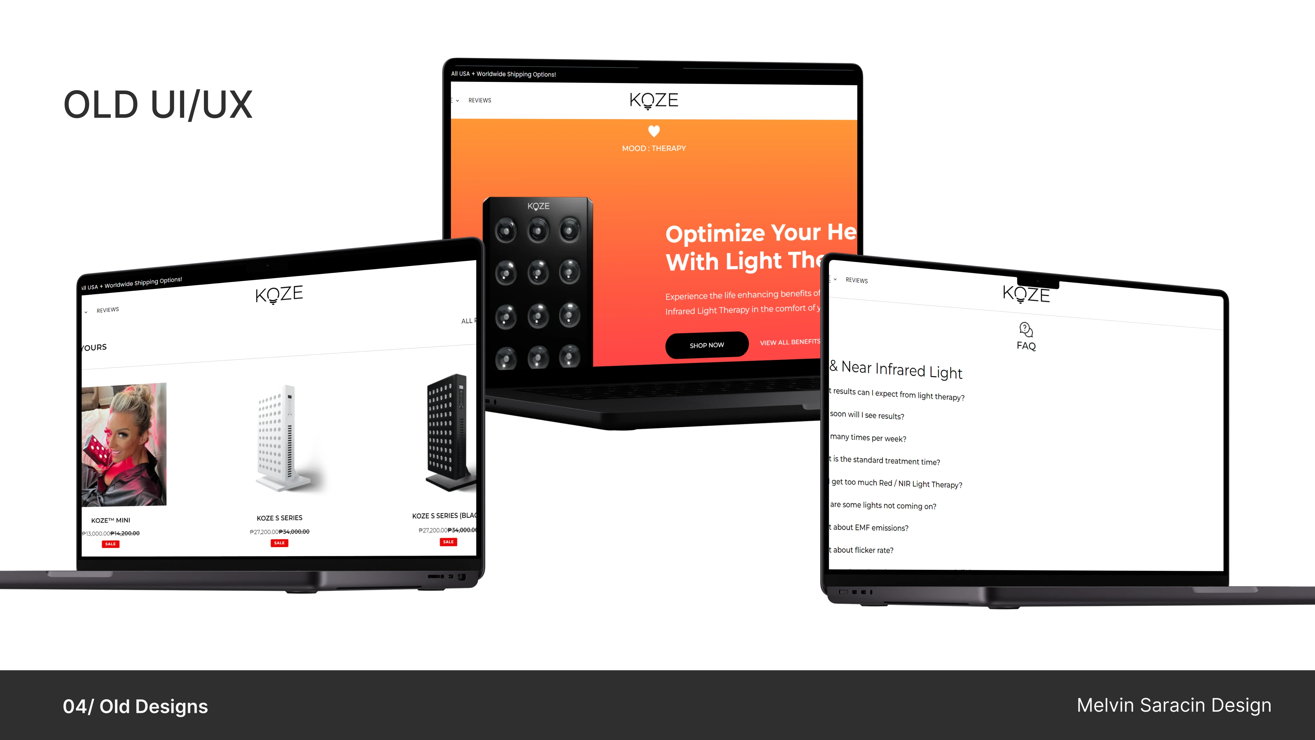
The existing design of the Koze website suffers from significant usability issues, hindering user engagement and click-through rates. Key problems include:
Poor user experience due to an unfriendly interface, resulting in frustration and difficulty navigating the site.
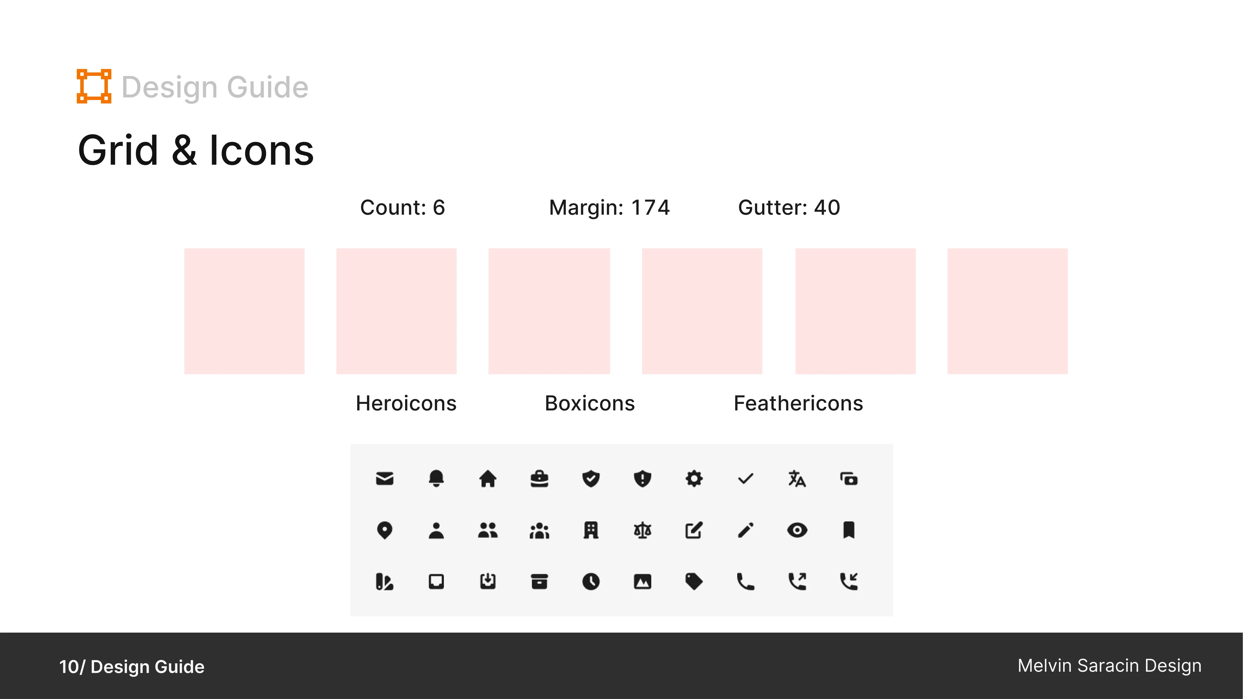
Inconsistent icons and a lack of a cohesive grid system lead to confusion and detract from the overall user experience.
Minimalist design elements contribute to a lack of visual interest and fail to effectively highlight important content.
Sections are disorganized, making it challenging for users to find relevant information quickly
Unclear navigational cues exacerbate the usability issues, causing users to feel lost within the site.
The absence of a hero section diminishes the website s ability to make a strong first impression and engage users effectively
Inconsistent text sizes further compound the design inconsistencies, detracting from readability and overall visual coherence.
My work flow
Throughout the design process for Koze, I began with extensive research to understand user needs and market trends, followed by defining clear goals for the redesign. Next, I engaged in ideation sessions to generate creative concepts before translating them into tangible designs, which were then tested rigorously to ensure optimal usability and effectiveness in achieving the established goals.
Research
Define Goals
Ideation
Design
Presentation
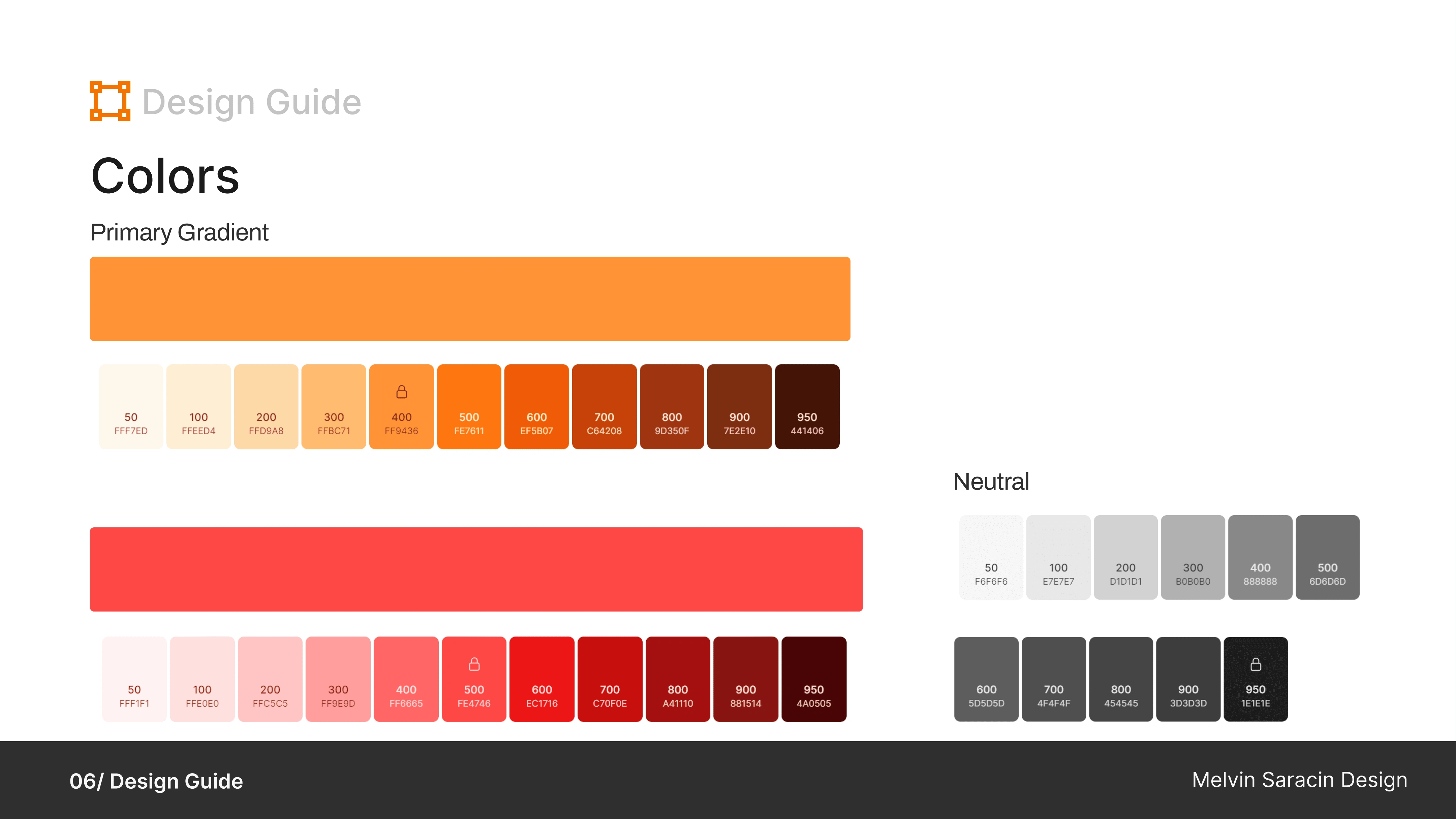
Colors
In the new redesign concept for the Koze website, I opted for gradient orange and red hues. These colors were chosen to inject vitality and warmth into the interface while maintaining professionalism. By blending seamlessly with the brand's existing color palette, the redesign ensures a harmonious transition while enhancing visual appeal and user engagement.
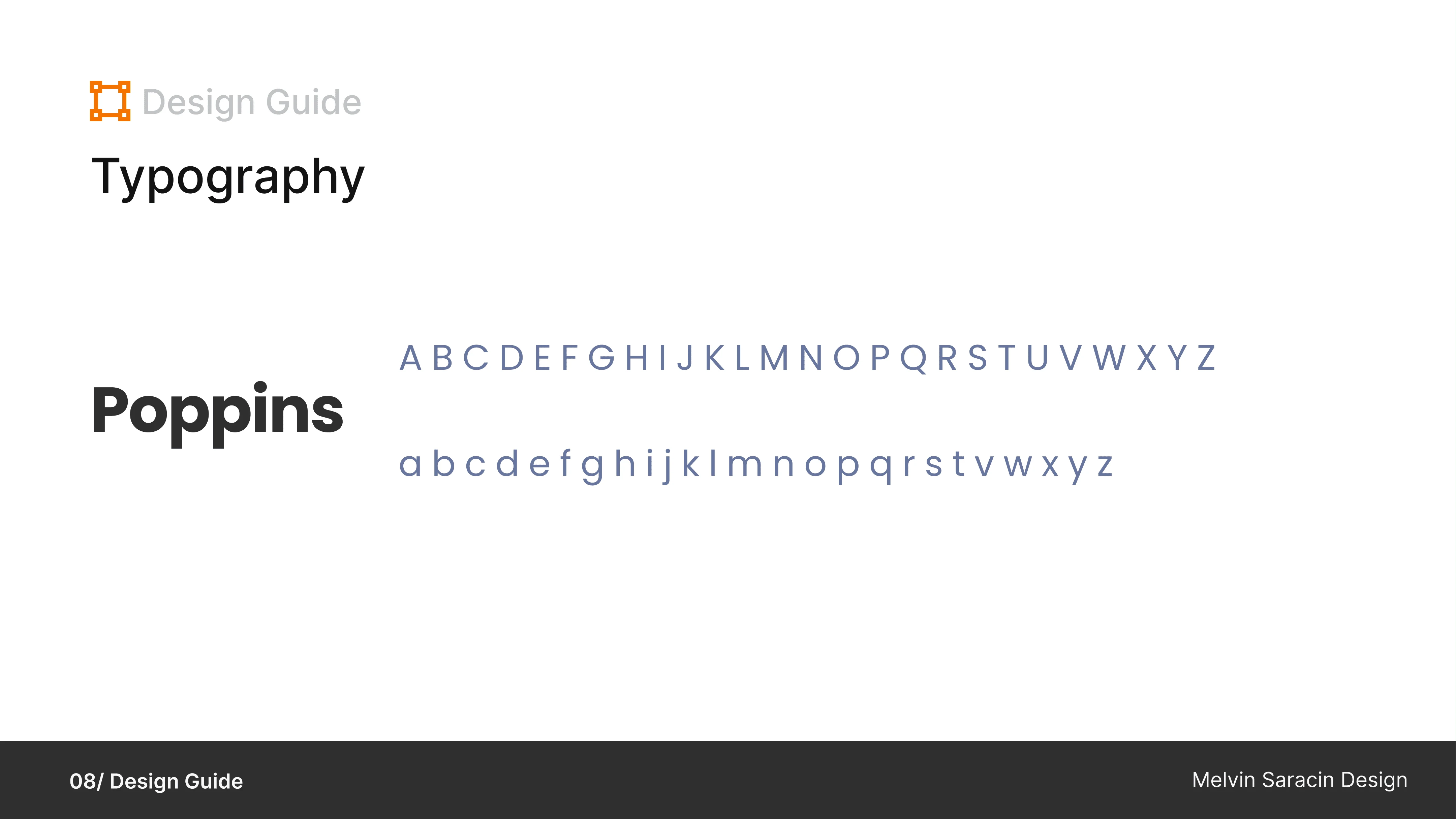
Typography
In selecting Poppins as the typography for the new redesign concept of the Koze website, we aimed to achieve a modern, clean, and versatile look that aligns seamlessly with the brand's values and identity. Poppins offers a perfect balance of readability and style, making it suitable for both headlines and body text across various screen sizes and devices.
Additionally, Poppins' wide range of font weights and styles provides flexibility in design while ensuring consistency and coherence with the brand's established aesthetic. By integrating Poppins into the new redesign, we maintain a sense of continuity with the previous UI while infusing a fresh and contemporary feel. Furthermore, the typography choice complements the existing brand colors, ensuring a cohesive and unified visual experience for users throughout the website.
My main takeaway in the Redesign
Prioritizing the needs and preferences of users is paramount.
Maintaining consistency with the brand's identity and values is essential. By aligning design elements, such as color palette, typography, and imagery, with the established brand guidelines, we ensured a cohesive and recognizable brand identity across all touchpoints.
By incorporating strategic enhancements while preserving familiar aspects, we created a website that feels fresh and innovative yet remains true to the brand's essence.
Redesign projects require adequate time and resources to be successful.
In conclusion, the redesign of the Koze website has been a valuable learning experience. I discovered the importance of user-centered design and maintaining brand consistency throughout the process. By combining innovative enhancements with familiar elements, I achieved a website that is both visually appealing and functional. Moving forward, I am committed to continuously refining and improving the Koze website to better serve our users and meet their evolving needs while staying true to the brand's identity. Given more time, I could further enhance the design and incorporate additional UI improvements to elevate the user experience even further.
Also, you can access the Figma file here if you want to see all the details of this redesign file.
Like this project
Posted Nov 23, 2024
Web design tailored to your brand, blending clean aesthetics with seamless functionality to create a site that stands out and connects with your audience!