A Journey Through the Website Redesign
Melvin Saracin
Landing page Design Concept
Realtor Empress is a reputable agency specializing in assisting homeowners in selling their properties. With a commitment to optimizing home value, they offer tailored guidance and recommendations for pre-sale updates, all aimed at maximizing returns for their clients. The overall aesthetic sought is bright, modern, and airy, reflecting professionalism and a sense of openness.
What is the Key Points?
Specializes in helping individuals sell their homes by optimizing value
Offers guidance and recommendations for pre-sale updates.
Focuses on maximizing returns for clients.
Desired style: Bright, modern, and airy.
Color Palette
Utilize a vibrant and inviting color scheme with #016450 as the primary color, complemented by soft neutrals and pops of energetic hues. This combination reflects a modern and fresh approach while conveying professionalism and optimism.
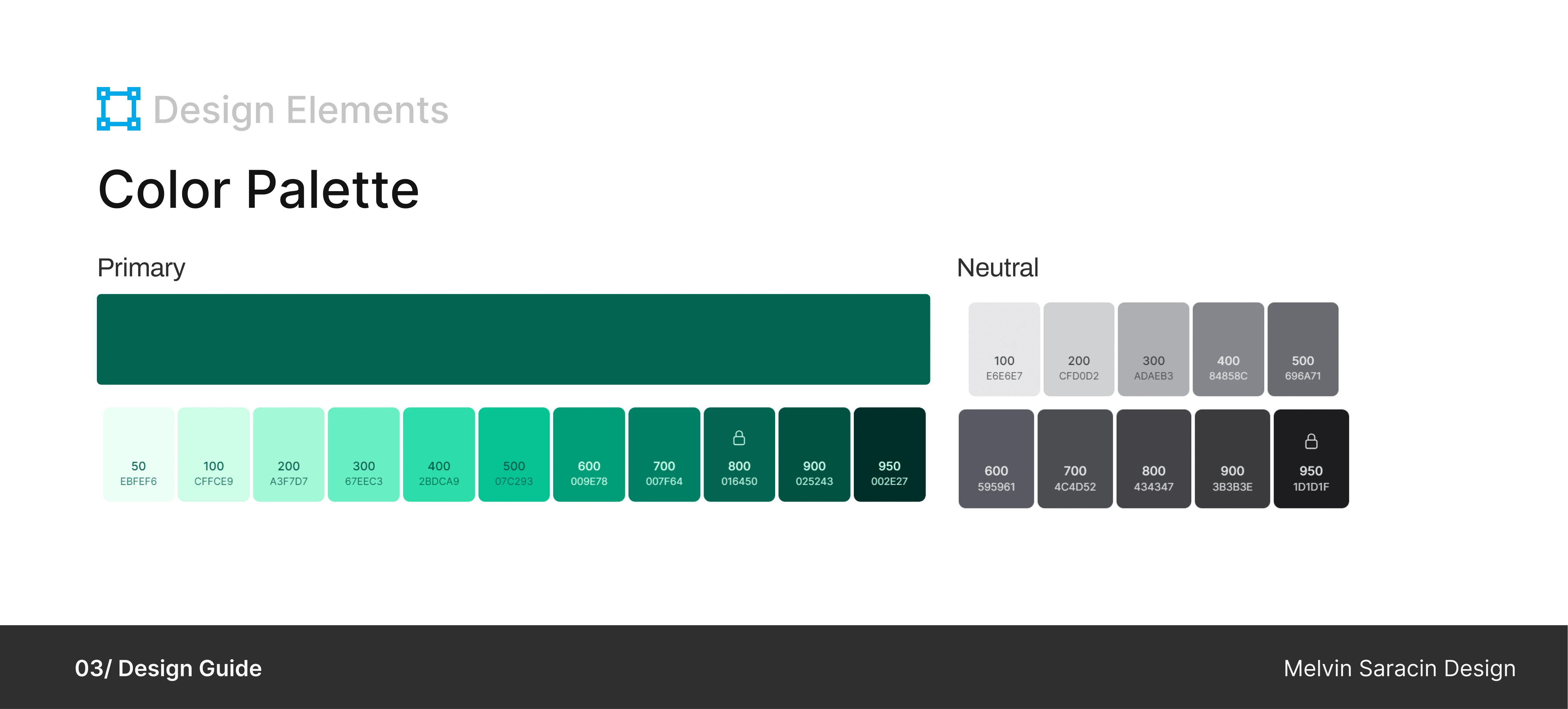
Why Blister Green?
I chose Blister Green as the primary color for Realtor Empress because it symbolizes growth and stability, which are essential in real estate. This shade of green also connects with nature, giving a fresh and calming feel. It's versatile and will work well across different designs. Ultimately, it helps create a trustworthy and professional brand identity for Realtor Empress.
Typography
Implement the Raleway font family to maintain consistency and enhance readability. Raleway's clean and contemporary style aligns well with the desired aesthetic, striking a balance between modernity and sophistication.
Why Raleway?
We chose the Raleway font family for Realtor Empress because it strikes a balance between modernity and sophistication. Its clean and contemporary style enhances readability, making it easy for visitors to navigate the website and absorb information effortlessly. Raleway's versatility allows for consistent branding across various platforms, ensuring a cohesive and professional look for Realtor Empress.
Here’s how it happened
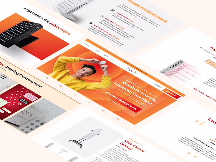
Navigation
Simplified the navigation menu by reducing the list to essential categories.
Adopted a minimalist approach to streamline the user experience.
Placed the "Contact" option prominently as a call-to-action (CTA) button, encouraging users to take action easily.
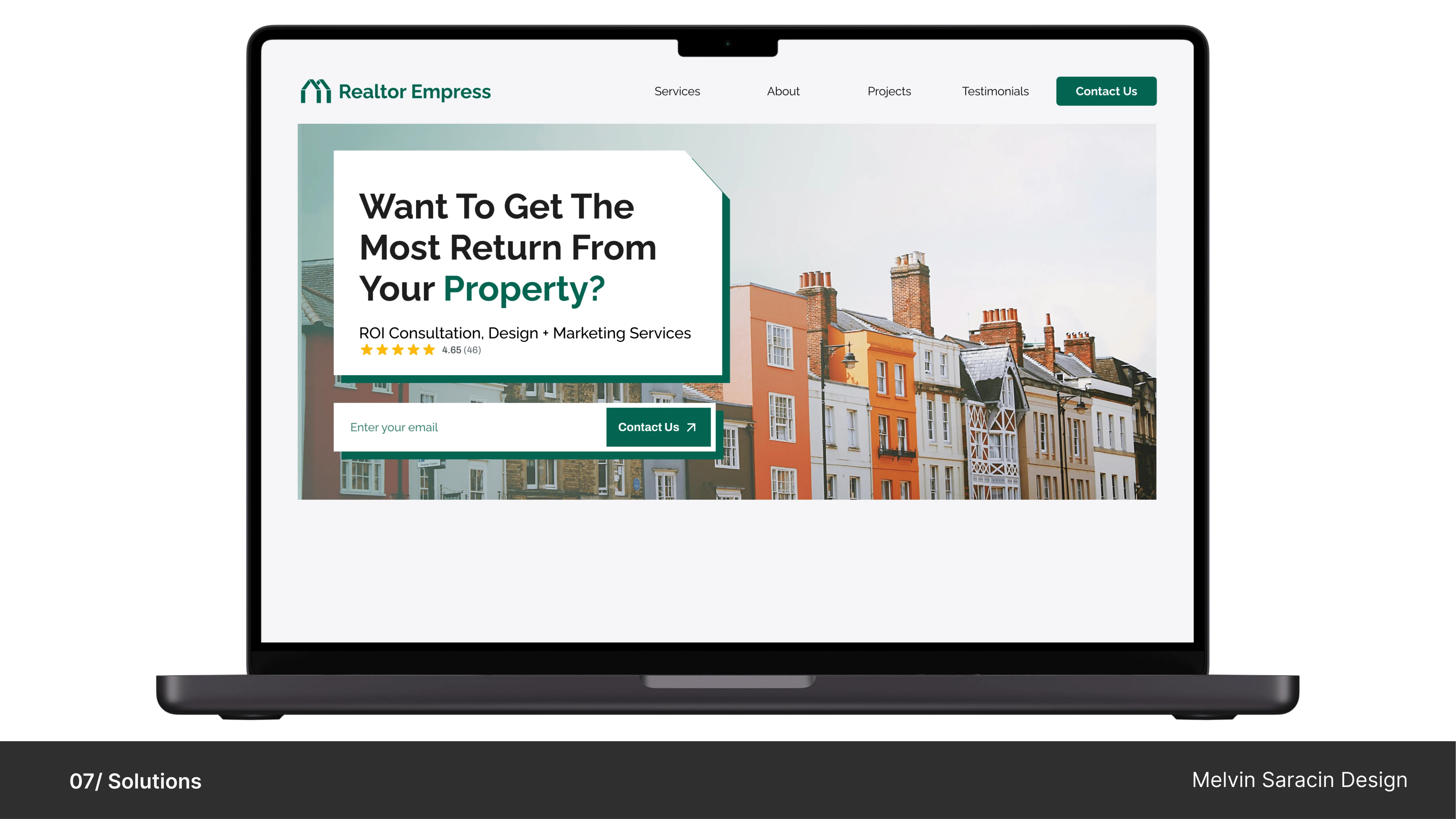
Hero Section
Incorporated an engaging image of houses that aligns with the Realtor Empress brand identity, evoking a sense of home and real estate.
Implemented a simple, compelling, and professional title with a subheading to communicate the core message effectively.
Introduced a clear CTA button to prompt users to take the desired action, such as contacting Realtor Empress for assistance.
About 1 Section
Introduced a collage of high-quality images featuring various houses to visually engage users and reinforce the real estate theme.
Ensured that the collage maintains a clean and organized layout, avoiding clutter and maintaining visual appeal.
Implemented a clear text hierarchy to effectively communicate key information about Realtor Empress.
Positioned the CTA button strategically within the About section, ensuring it's easily accessible and stands out to users.
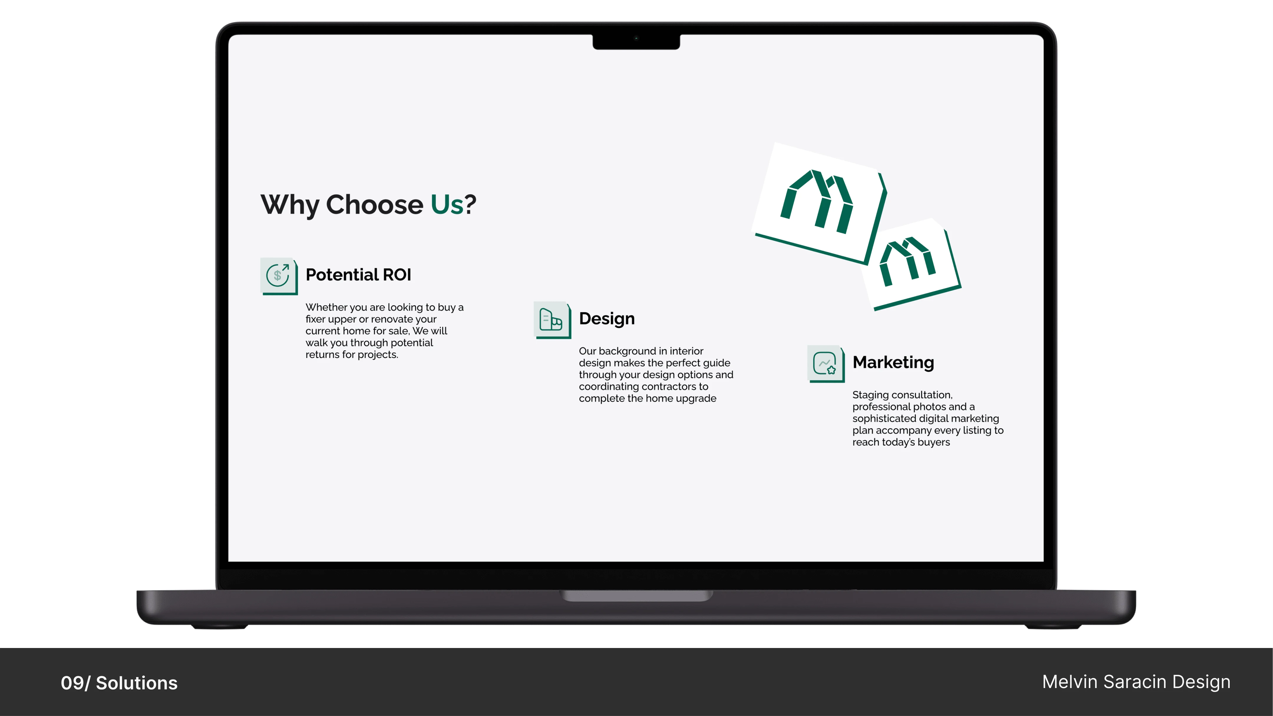
Why us Section
Utilized simple icons to visually represent key features or benefits offered by Realtor Empress.
Ensured that the layout maintains a clean and uncluttered design, allowing users to easily digest information.
Incorporated a clear text hierarchy to emphasize the benefits of choosing Realtor Empress.
Crafted concise and persuasive messaging to convey the agency's strengths and advantages.
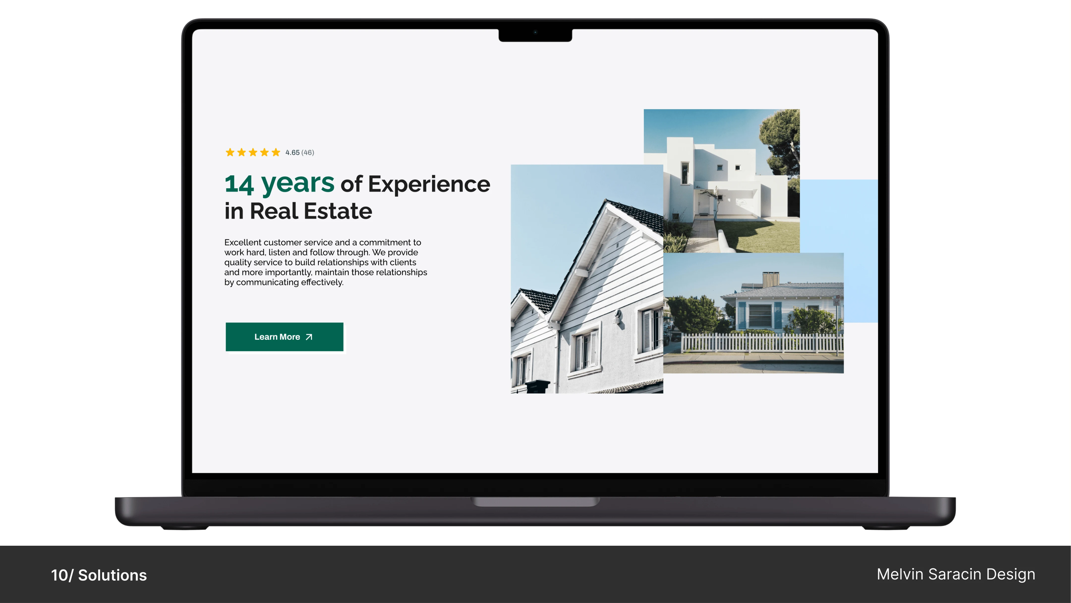
About 2 Section
Stacked high-quality images of houses to create a visually appealing backdrop that reinforces Realtor Empress's focus on real estate.
Ensured that the layout maintains a clean and organized design, allowing the images to complement the text without overwhelming it.
Added a user trust rating section prominently above the text hierarchy to instill confidence and credibility in Realtor Empress's services.
Positioned the user trust ratings strategically to capture users' attention and reinforce Realtor Empress's reputation as a trusted real estate partner.
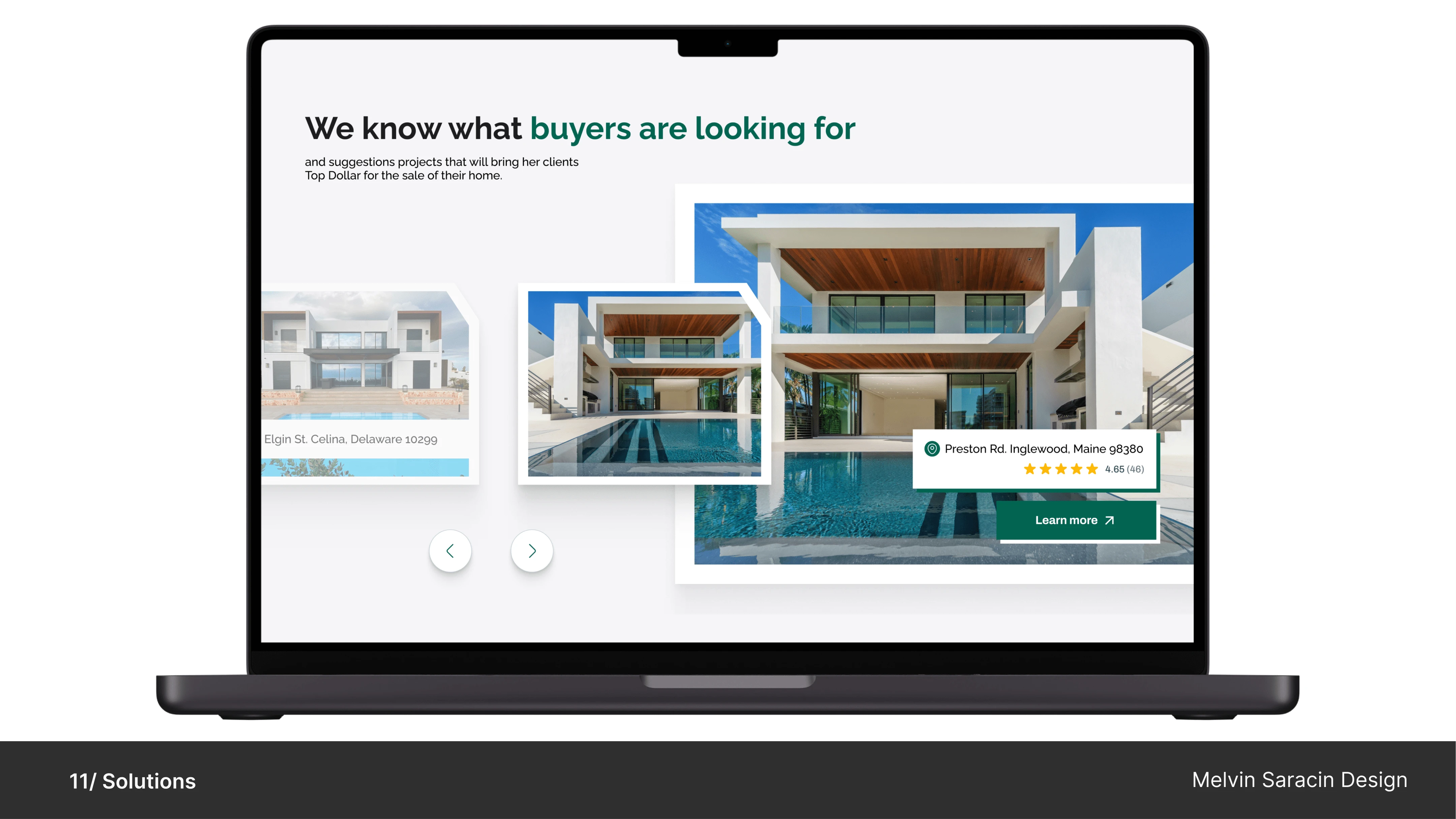
Gallery Section
Introduced a carousel-style gallery to showcase a variety of high-quality images of properties.
Designed the carousel to slide smoothly between images when the navigation buttons are clicked, providing a seamless browsing experience.
Included a prominent CTA button within the gallery section to encourage user interaction.
Positioned the CTA button strategically, such as below the carousel or beside the title, to ensure it is easily accessible to users.
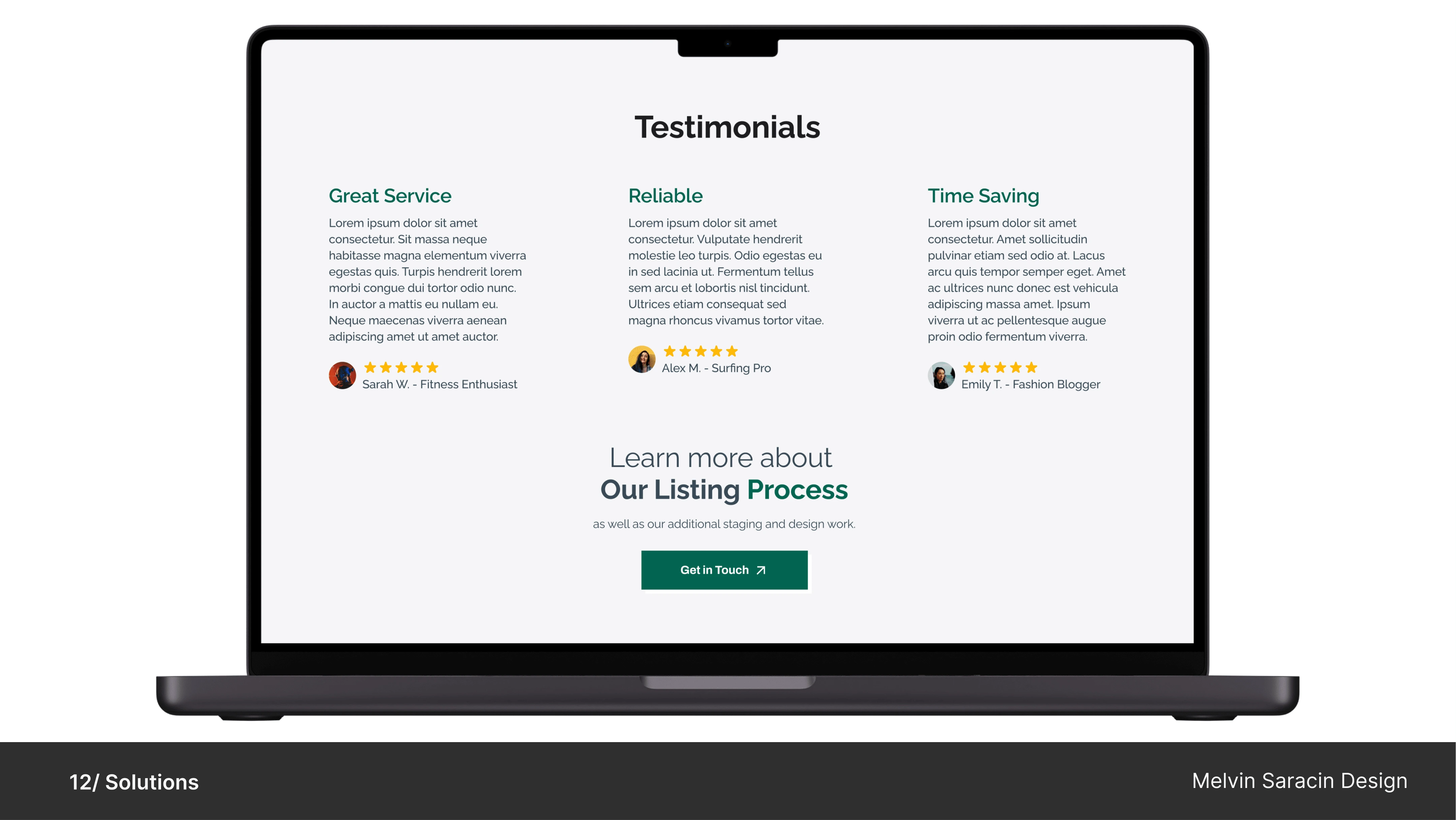
Testimonials Section
Designed the testimonial section with a consistent color scheme and typography to maintain visual coherence with the rest of the website.
Utilized white space and appropriate margins to enhance readability and focus users' attention on the testimonial content.
Designed a clean and visually appealing layout to highlight each testimonial individually.
Added a title above or below the testimonials to indicate the section's purpose and provide context for users.
Included the text of each testimonial along with the name and picture of the client who provided it.
Integrated a rating system to accompany each testimonial, providing an additional layer of credibility and trust.

Like this project
Posted Nov 23, 2024
Modern landing page for Realtor Empress, showcasing their expertise in helping homeowners sell with tailored advice to maximize property value and returns.