For One Wellness
DESCRIPTION
Emily M. is a personal trainer who was in need of a logo for her new gig. For One Wellness' mission is to empower women through fitness & nutritional habits.
In The Beginning
She's high maintenance and wants the best for everyone; she wants you to glow! A lot of the inspiration for the logo came from organic design & pastel tones.
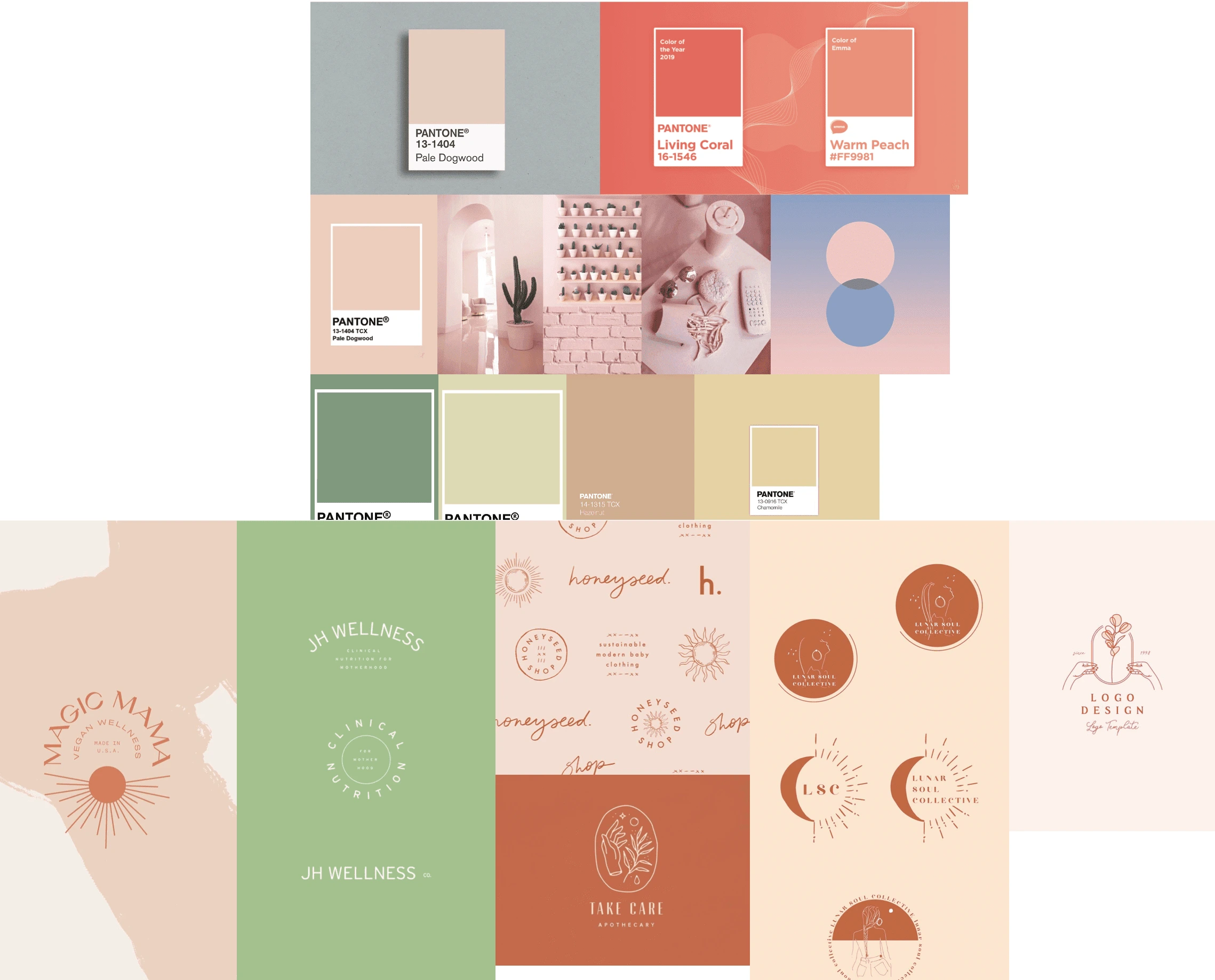
Mood Board
Process
Here's a look at the beginning stages of the logo. We decided to go with a light to medium mark to show growth.
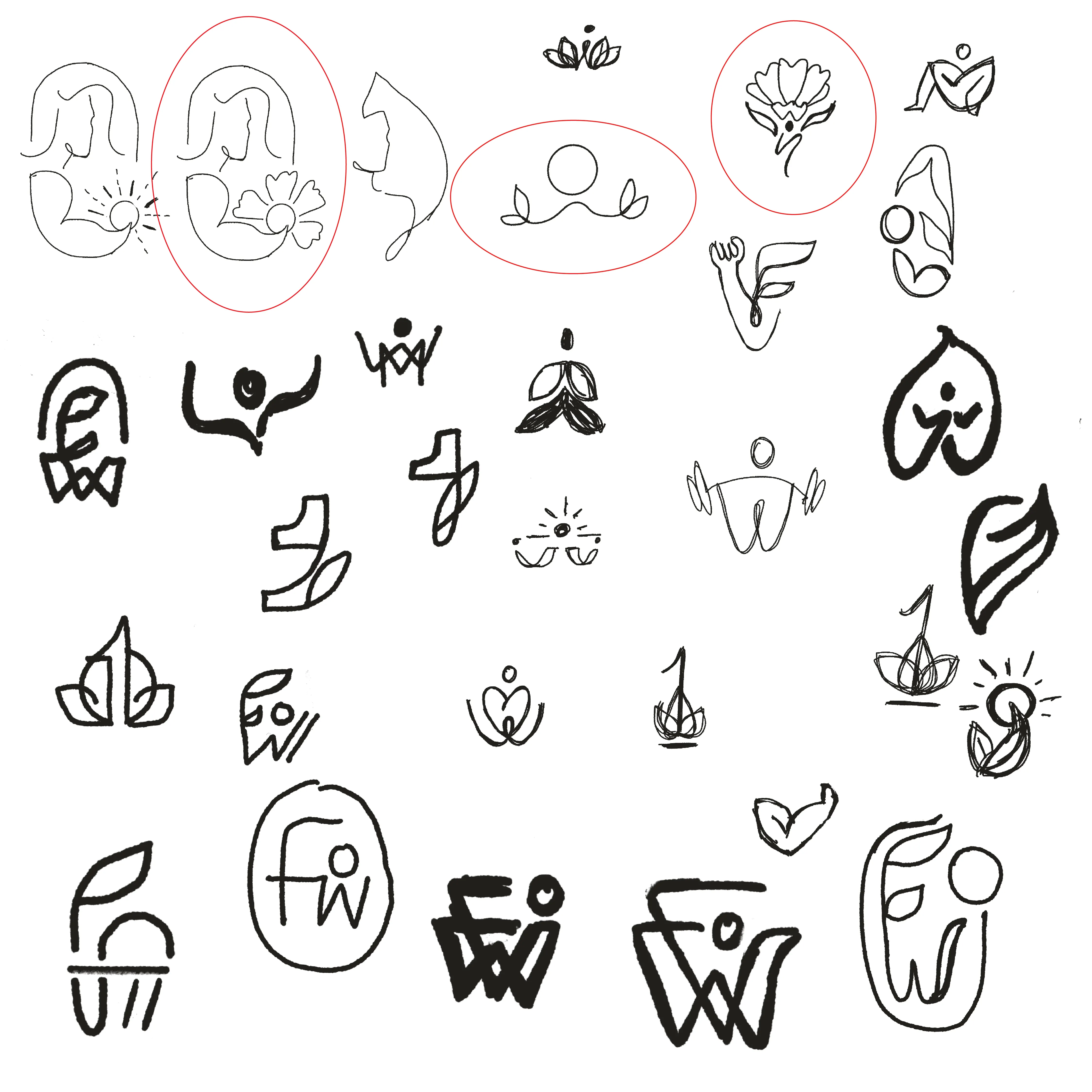
Initial Sketches
Setting the Mood
We decided that these colors would work best to show mental and physical strength in an organic way.
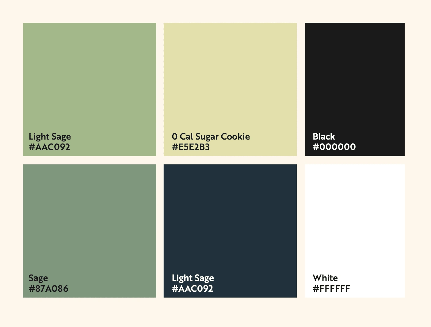
Color Palette
The typography, line weight, and color palette brings out her style and helps to stand out as an overall brand.
Logos that moved on to the next stage:
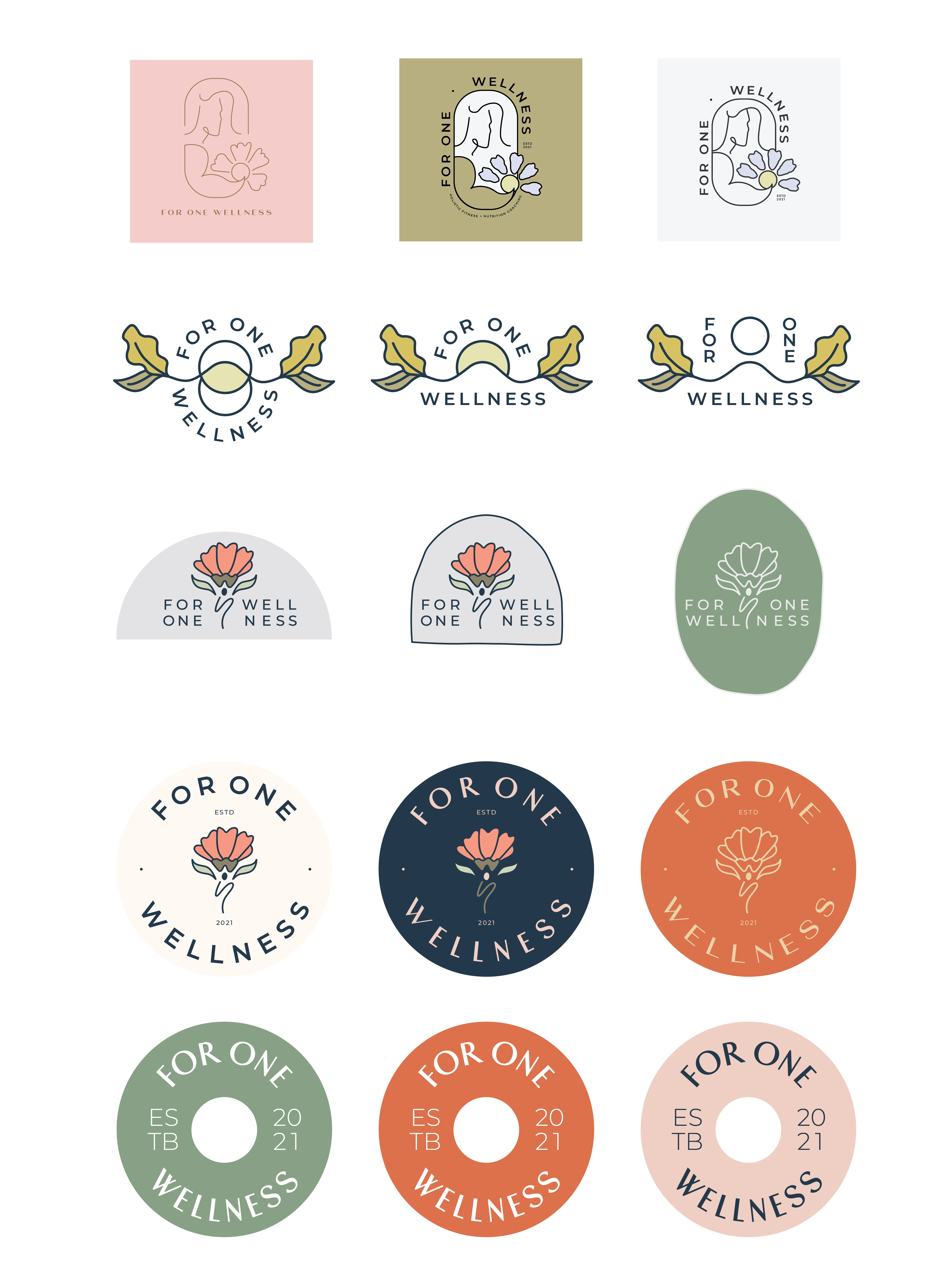
Logos Brought To Life
The final mission was to capture the three main elements: the gym, women, and nutrition.
After narrowing it down to four, she decided that this logo best encompassed the overall meaning of For One Wellness through color, structure, and balance.
Final Logo
A little extra love
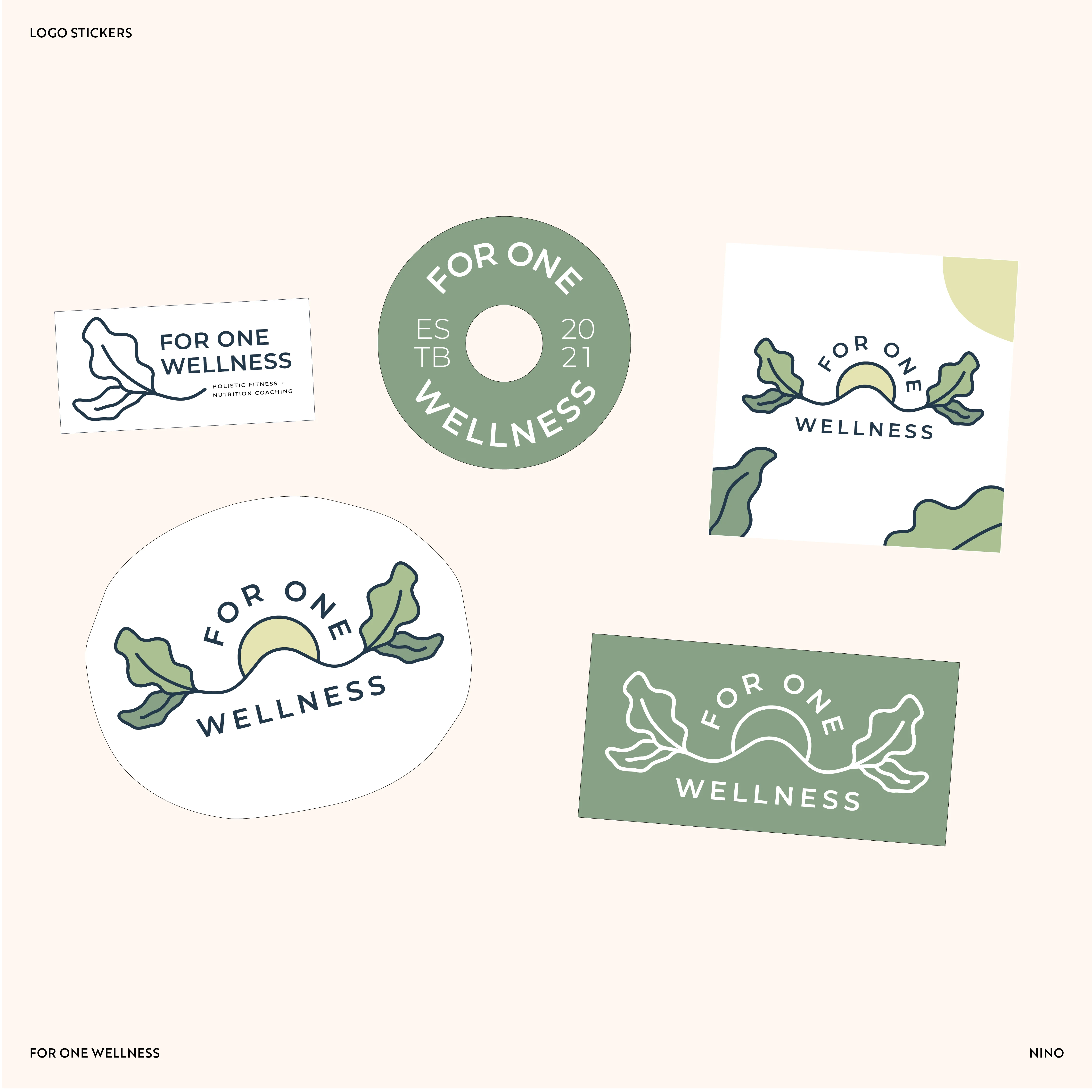
I created a sticker sheet which recycled from a few logos that were not chosen. Going from very simple colors to edgy shapes, I wanted Emily to have the opportunity to print from anywhere even if that meant using one color and have a variety of options.
Like this project
Posted Jul 28, 2023
Logo design for a personal trainer. Strives to improve the overall heath of women throught fitness and nutritional habits.
Likes
0
Views
13

