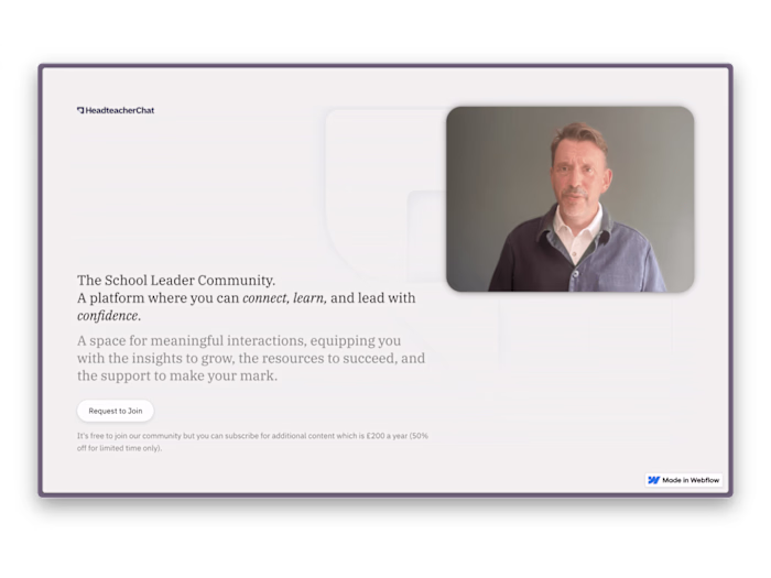
HeadteacherChat
James Coy
Background & Objectives
HeadteacherChat is a small startup focused on making senior leaders within schools feel more supported. There was a huge gap between teachers and the solutions which could really change their school, and with no way to really find these and no way to verify them, teachers were left clueless. HeadteacherChat has been working to bridge that gap for a few years now and is a small family team made up of the founders, Mum and Dad, the designers, my brother Tim, and myself. Because of this our resources and potential were limited, however as technology grew more accessible and my brother and I grew more into the world of UX/UI design and web development we began to realise that there was potential here to build the tool that the teachers want us to be. So after surveying, interviewing, and designing multiple different solutions, we have finally launched the newest site in HeadteacherChat's latest chapter.
Problem Statement
The goal we're zeroing in on is simple but powerful:
The teacher needs a resource/template/wellbeing boost ——> Headteacherchat ——> The ideal resource.
That's the fundamental user journey we need to streamline. We're focusing on the 'Headteacherchat' part – it's our task to transform this middle step into a frictionless, rapid, and instinctive process.
How do we bridge the gap between a teacher who's in need and their perfect resource, and do so effortlessly, without any unnecessary distractions or steps? When we delved into this question, we found a few immediate answers:
No cookies banners – they get in the way and make the internet that little bit more annoying.
No obligatory sign-ups – we don't want to impose barriers on our users before they can even begin to explore what we offer.
No sales pop-ups – we're here to help teachers, not inundate them with sales pitches.
Less emphasis on selling ourselves – we need to let new users understand who we are, sure, but we're committed to not overshadowing the tools they've come for.
Now, let's bring in the context. We're catering to teachers who are often overworked and under-resourced, making it crucial for us to serve their diverse needs in a fast, accessible, and user-friendly way. Currently, there's no centralized platform that efficiently curates and provides access to a broad range of resources, from wellness support to products & services. This forces teachers to invest precious time and energy searching for resources, which exacerbates the feeling of unsupported-ness in an already stressful profession. Our updates and newsletters, while beneficial, can't keep up with the dynamic daily needs of teachers. Moreover, technical issues like slow, bug-ridden functionality and a lack of intuitive search features hinder the journey on our current platform.
Therefore, the challenge we're facing is creating a streamlined, accessible, and responsive resource hub that not only caters to the diverse needs of teachers but also fosters a sense of community and support. In doing so, we also aim to enhance the user experience and interface, so that finding the right resource becomes as natural and effortless as it can be.
Discovery
The foundation of our research was built on three pillars: competitive benchmarking, surveying, and user interviews. Our methods were both qualitative and quantitative, designed to unearth the core needs of our users and to understand the competitive landscape.
During the competitive benchmarking phase, we utilized heuristic evaluation testing against common UX laws and accessibility guidelines. We also provided opinionated suggestions based on our design experience, often highlighting elements such as clutter. The scope included not only our direct competitors, but we also found inspiration in resources designed for designers. Our key findings included:
Search functionality is often under-prioritized in website design, leading to a lack of context in results pages.
The lack of context in results reduces users' trust in the website and necessitates a 'leap of faith.'
Collections can provide structure to large databases and aid in discovery.
Google-like interfaces lead to faster searches but may limit discovery.
Determining the right amount of data to display to users is crucial to maintaining engagement.
A blog-type layout can inhibit deep-diving into specific resources.
Our surveying efforts extended to both users and our network members (companies who pay to be a part of our verified products). We obtained valuable insights, with an impressive 90% affirming that HeadteacherChat is helpful. However, feedback indicated a need to:
Highlight our hand-picked selection of resources.
Balance enhanced usefulness without alienating new users.
Provide regular, bite-sized updates.
Offer diverse information without sign-ups or paywalls.
Demonstrate relevancy to the daily realities of teachers.
User interviews echoed many of these findings. Notable comments included a preference for our inspirational quotes on social media, a strong need for reliable search functionality, and an overwhelming demand for speed and simplicity, as teachers often have limited time and operate in stressful environments. For instance, one user stated: "Search needs to be watertight, otherwise I'll go elsewhere", reinforcing the importance of a seamless search experience.
This discovery phase guided our focus towards creating a user-friendly, reliable, and intuitive platform that prioritizes teachers' needs and fosters their trust.
Design Process
Ideation
Our ideation phase was rooted in the desire to create an engaging and dynamic platform for our users. We needed a space where teachers could find resources, connect, and stay updated with the latest news. This requirement translated into the creation of an 'explorations' page in Figma. It served as a creative sandbox to investigate new ideas, inspirations, and design elements, and to prototype the concept of 'Daily Updates.'
Simultaneously, we conceptualized a Notion 'wireframe' of the website. This space allowed us to iterate on the structure, and initial copy ideas, while also allowing the founders to contribute their insights.
Prototyping
Prototyping revolved around the concept of 'cards' to present various resources and the important 'Daily Updates' section. We had to maintain a careful balance in creating a distinct hierarchy within the card that would blend seamlessly with the context of its placement. We resolved this challenge through the mindful use of colour and typography, which ensured that the hierarchy could adjust according to the surrounding elements.
Similarly, the design of buttons, given their omnipresence, had to be simple and clutter-free. After a few iterations, we arrived at a minimalist design, thus ensuring that users would not feel overwhelmed, especially with the ever-changing Daily Updates.
Testing
During the testing phase, we realized that our users were browsing the website differently than we had anticipated. They preferred to read blogs on their phones, but when it came to searching for products and services or checking the Daily Updates, they turned to their desktops. This unexpected insight highlighted the need for an adaptable design that offered a satisfying experience across all devices.
Iteration
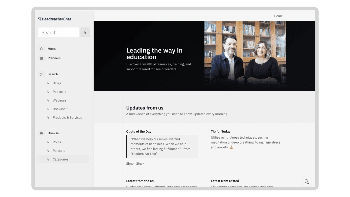
This significant insight led to a thorough re-evaluation of our design strategy. We began to remodel the design, keeping both mobile and desktop users in mind, leading to the creation of a design resembling a dashboard or a community app with different channels.
The introduction of the Daily Updates section became a cornerstone of our design process. This feature was designed to serve as a fresh, constantly updating source of relevant news, making the website a platform teachers would want to visit daily.
Our new design has a solid and easy-to-navigate structure, which encourages users to explore the website, stay updated with Daily Updates, and navigate efficiently to their desired resources. During the build process, we leaned on repeating elements and Airtable formulas to ensure a smooth and efficient development phase. This allowed us to focus on creating an engaging, dynamic, and user-friendly design, making our website a daily destination for our users.
Reflecting on this Project
This project has been a journey marked by steady evolution, learning, and adaptation. As a team, we've tackled challenges, seized opportunities, and expanded our abilities throughout the project. This process, while long and often demanding, has proven to be an enriching experience that constantly pushed our boundaries.
One of the significant insights that we gleaned from this project is the indispensable role our users play. As a startup heavily dependent on headteachers, it was crucial to incorporate their input into shaping our product's evolution. This approach underscored the importance of empathy in design and the need to create a solution that truly resonates with our users' needs and experiences.
Another crucial learning point was the appreciation for time. The project was a labour of love, stretched over an extended period, allowing for thoughtful design and development. If we'd pursued a hastier approach, we might not have achieved the same level of results or been able to future-proof our design. It’s a good reminder that design is never really 'done' - it needs to evolve in tandem with the community's needs and the landscape it operates within.
We're currently in the 'beta' phase, with a handful of users interacting with the website, and are excitedly preparing for a broader launch. The anticipation is high, and we're keen to observe how the website will be received. We hope to see a marked increase in users employing the search function, as well as a spike in users accessing wellness resources - both metrics that will indicate successful alignment with our users' needs.
We've shared our progress with a community called 10x designers, whose insights and perspectives have been instrumental in refining the project towards its final stages. Receiving positive feedback from designers I admire has been particularly gratifying:
> Ozan Öztaskiran - Looks great Tim! As an addition to Fons Mans's comment. Good job! 👏
> Fons Mans - Big upgrade from v1! Well done Tim 💪
It's incredibly fulfilling to see our progress and growth as designers mirrored in this project. If you'd like to stay updated or have any questions, feel free to reach out to me at james.coy.design@gmail.com or simply revisit this website soon. This project is a testament to our evolving journey, and we're eager to share the next chapters with you as we continue to learn, innovate, and grow.
Like this project
Posted Jun 26, 2023
Orchestrated a User-Centric Relaunch with Design System for Web, Print, and Social
Likes
0
Views
21

![[capture]](https://media.contra.com/image/upload/c_fill,w_700/a0gzpq4b69vnvn2hznsu.avif)