Elevating User Experience: Moniger Mobile App & Website
Introduction
Moniger is a Fintech solution that simplifies financial management through various features, from account to subscription management. The big idea was to emphasize the pain points of users who had to manage multiple bank accounts and struggled with tracking their expenses, budgeting, or managing third-party app subscriptions.
I was tasked with conveying this unique selling proposition without frustrating users with the technical complexities of financial management.
I Began By...
Collecting responses received from the survey and user interview
Creating empathy maps to further synthesize research findings and design the information architecture of the site.
Mapping a content-first approach that guided the design team's initial wireframes and low-fidelity prototypes
Utilizing the data in crafting the raw and unfiltered microcopy across the site.
Conducting A/B Testing rounds with the UX copy while creating a feedback loop for further iteration.
Creating a content style guide that influenced the tone, voice and messaging across all touchpoints.
My Thought Process for the Website
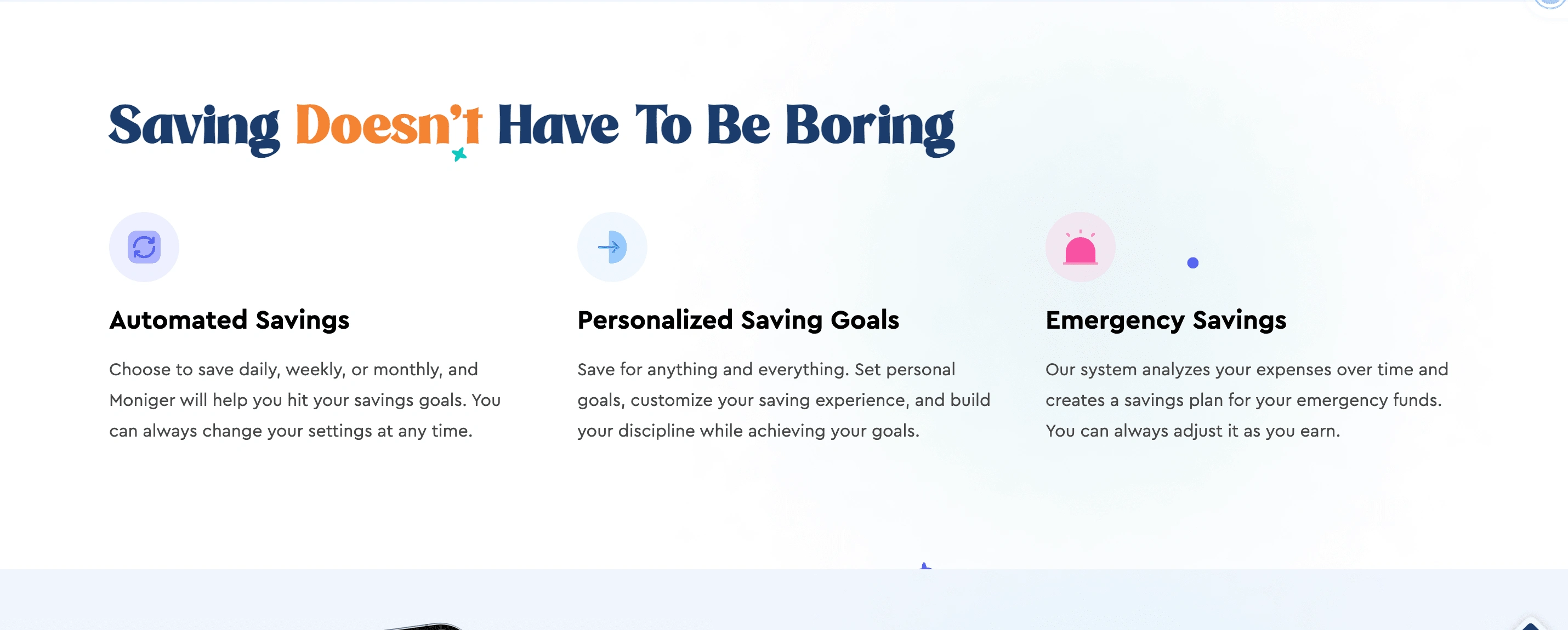
Hero sections are an integral part of every functional website. The hero section for all web pages inclusive of the home page has one thing in common; a simplified voice! The goal was to simplify financial jargon and I did just that; fueled by research findings.
My Gem: Clear, concise, and consistent microcopy!
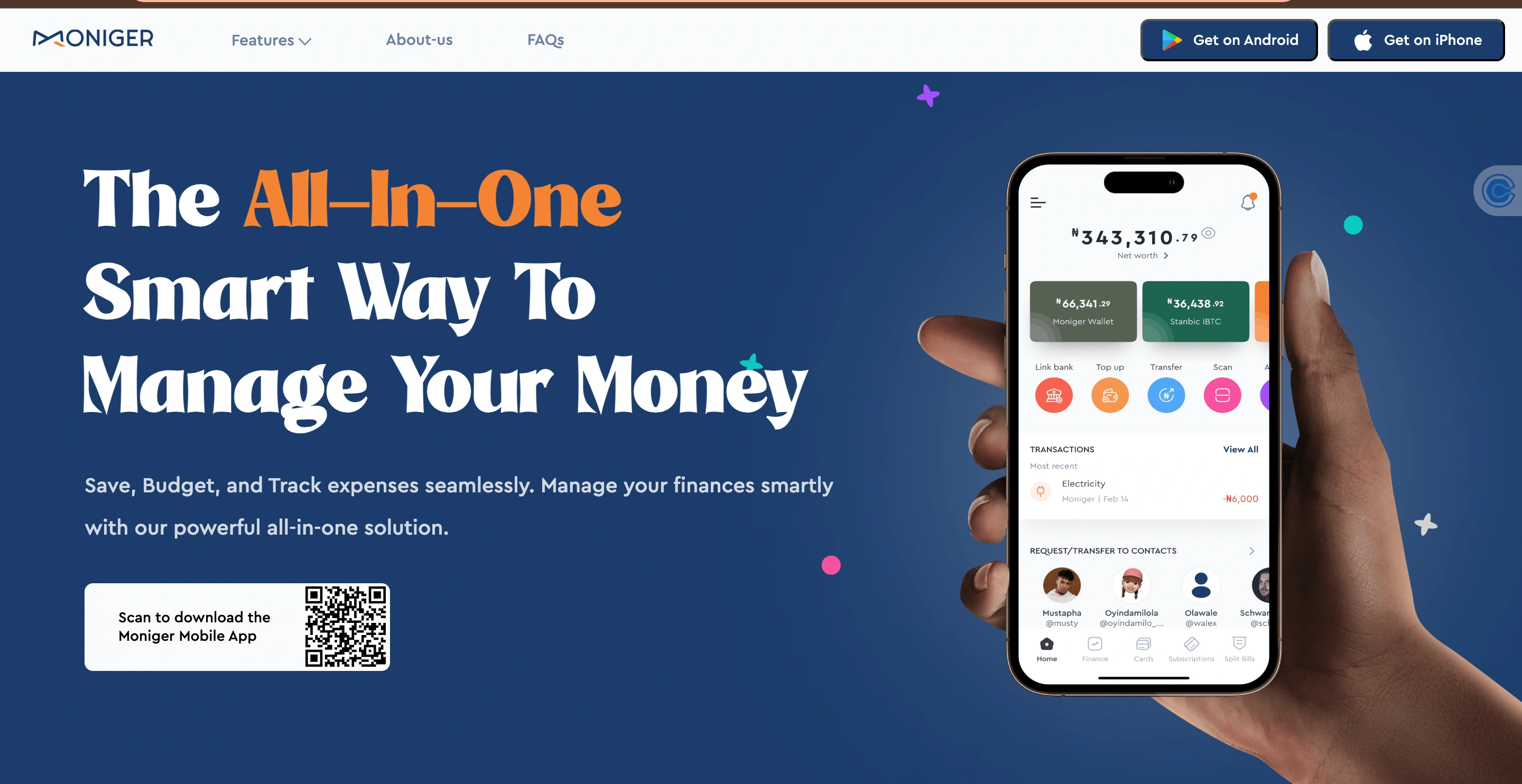
Hero Section for the Home Page
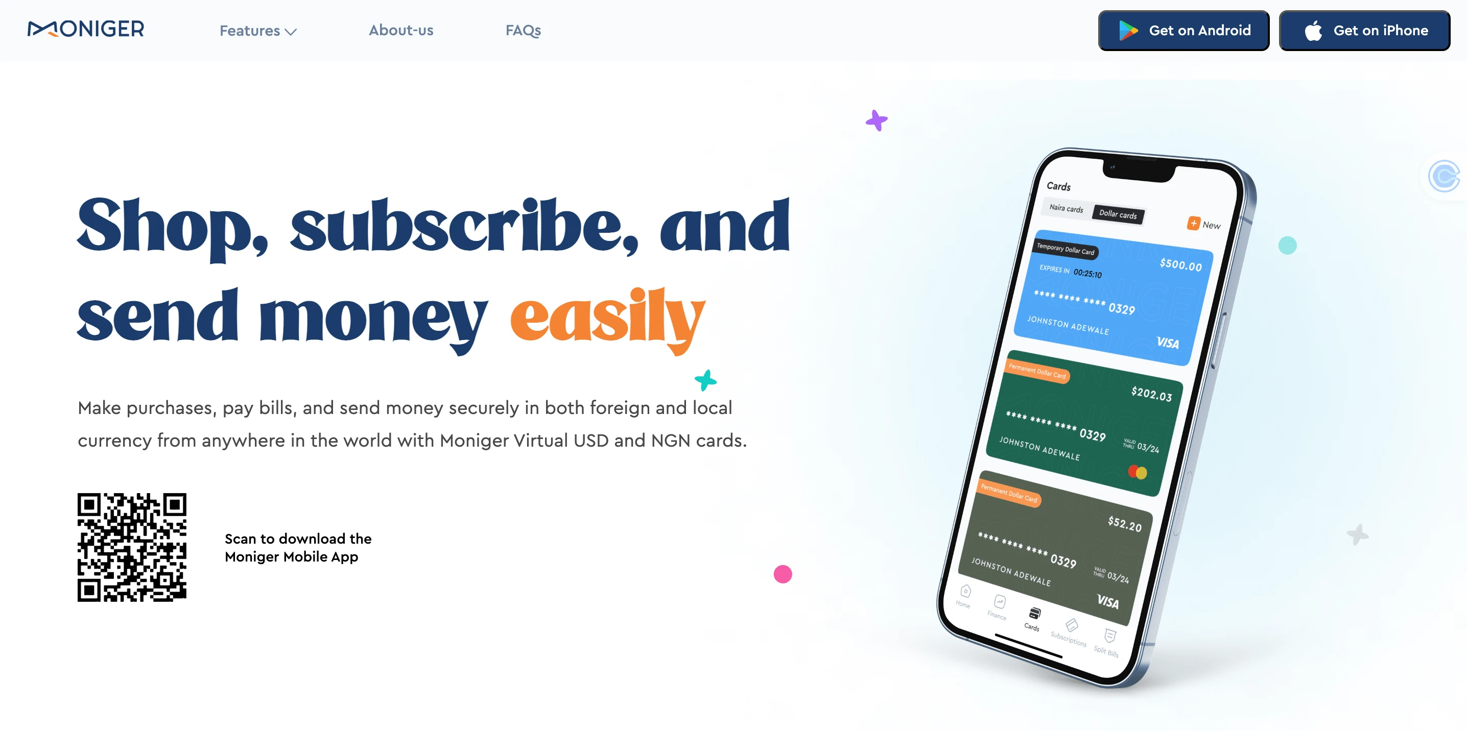
Hero Section for the Virtual Cards Web Page
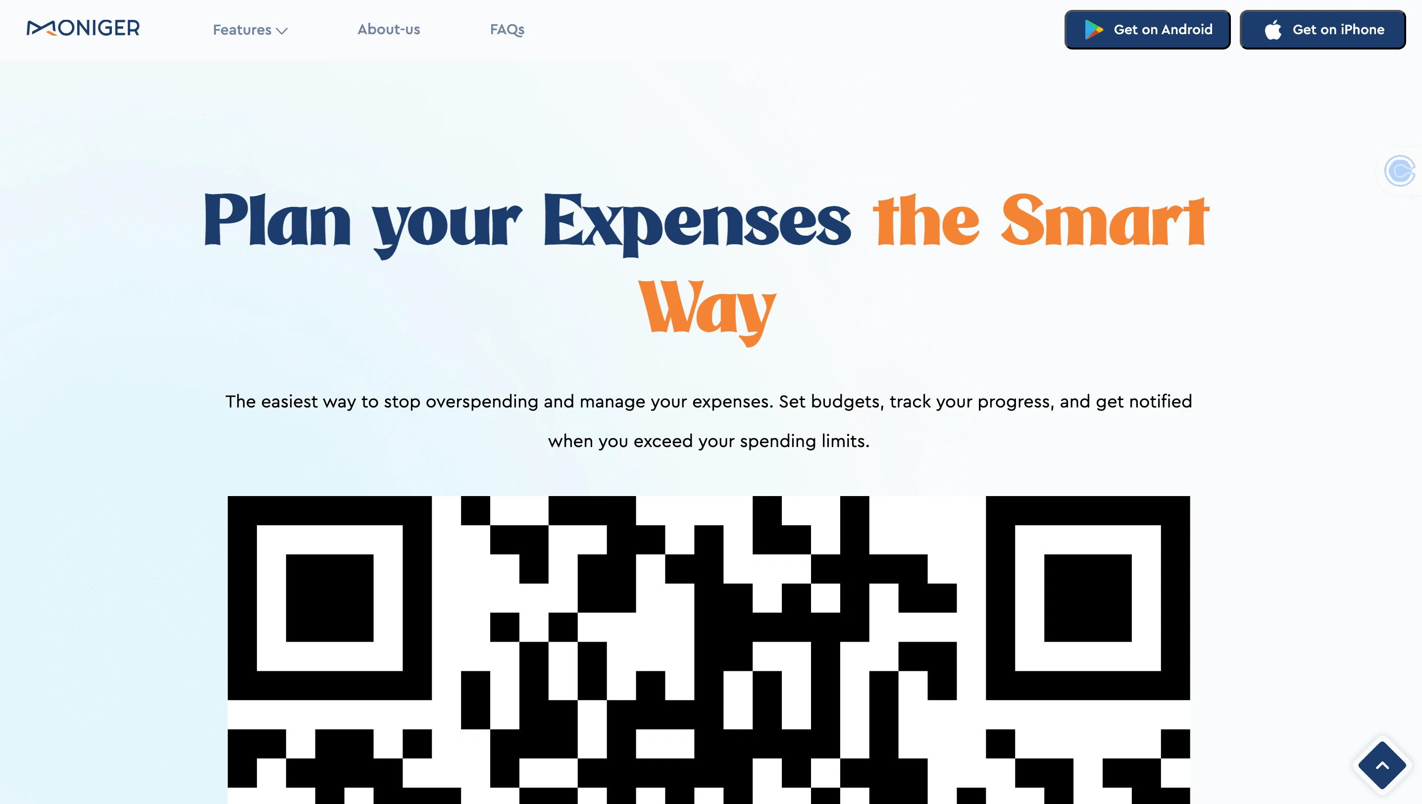
Hero Section for the Budgeting Web Page
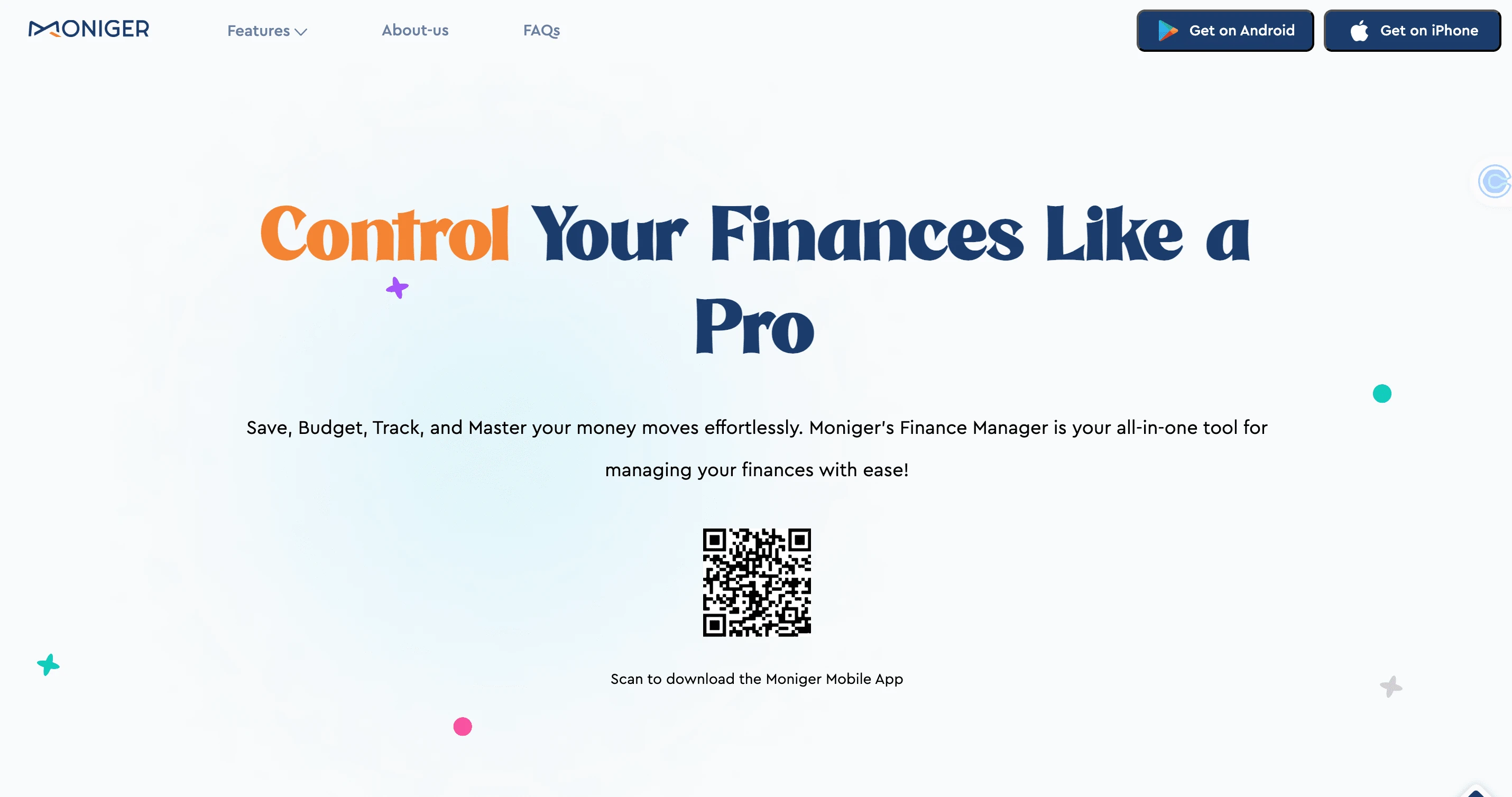
Hero Section for the Finance Manager Page
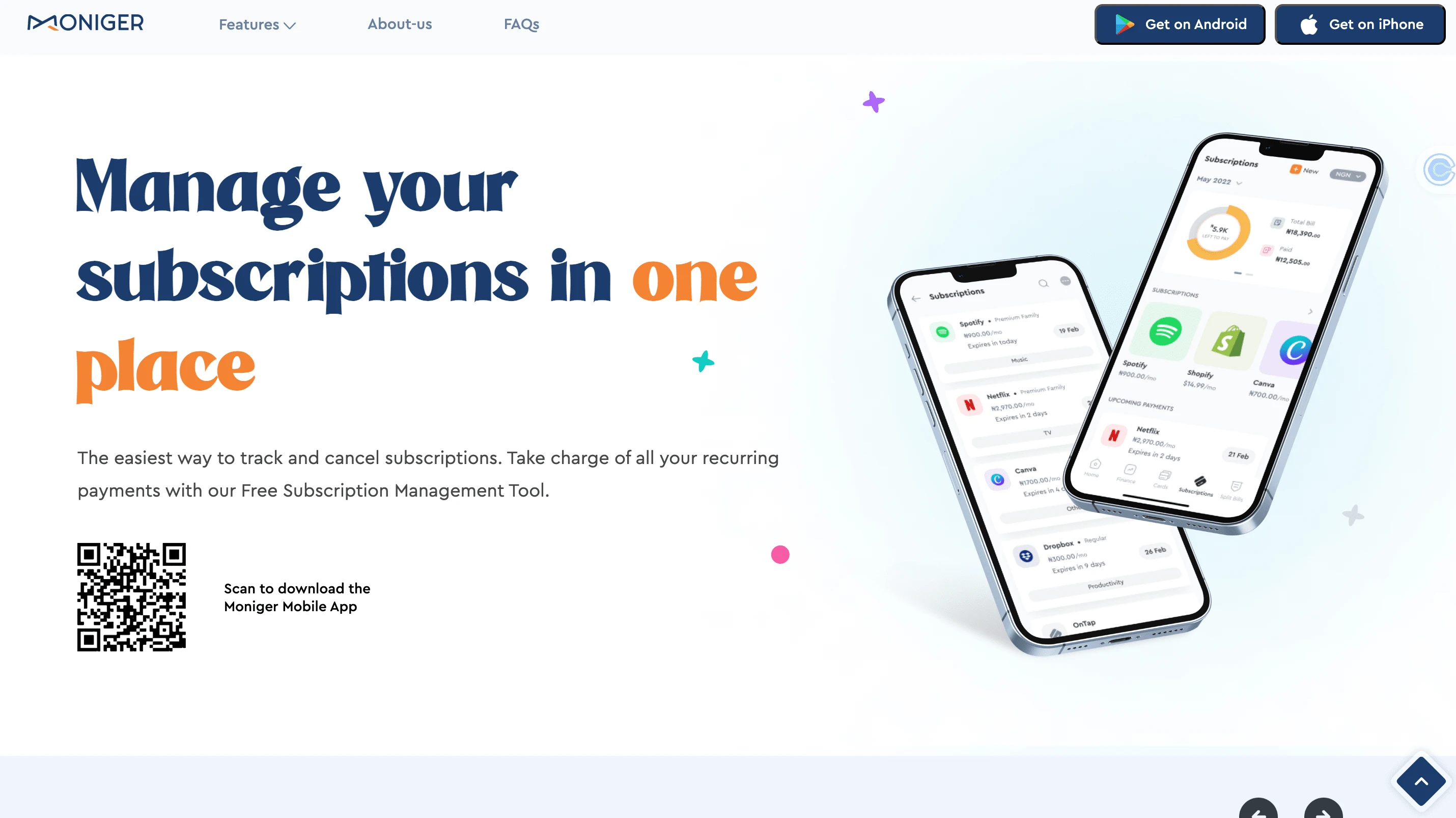
Hero Section for the Subscriptions Management Page
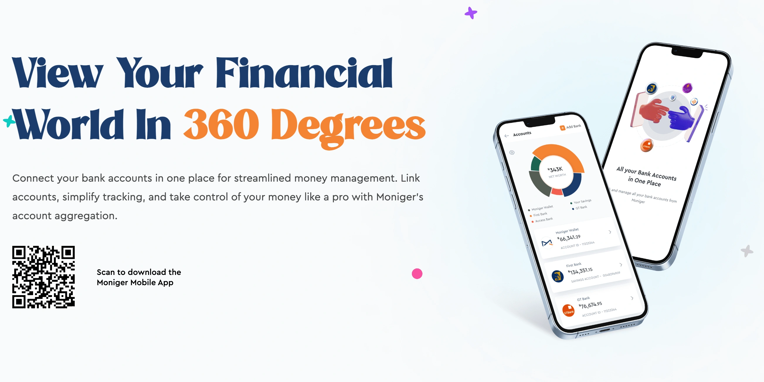
Hero section for the account aggregation page
Information Architecture is a big deal...
Beyond implementing a content-first approach, I used a closed card sorting method to determine content hierarchy and influence the information architecture of the website.
How do you communicate the variety of features in a concise yet consistent flow? Here's how I did that;
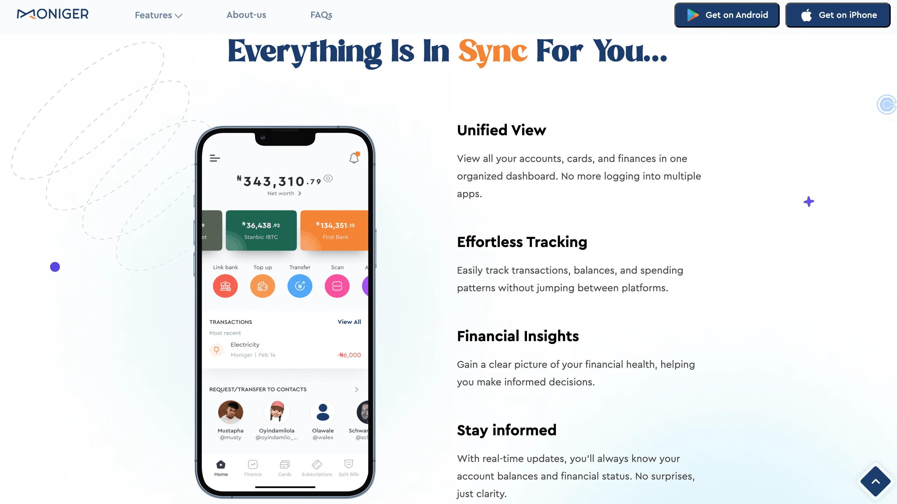
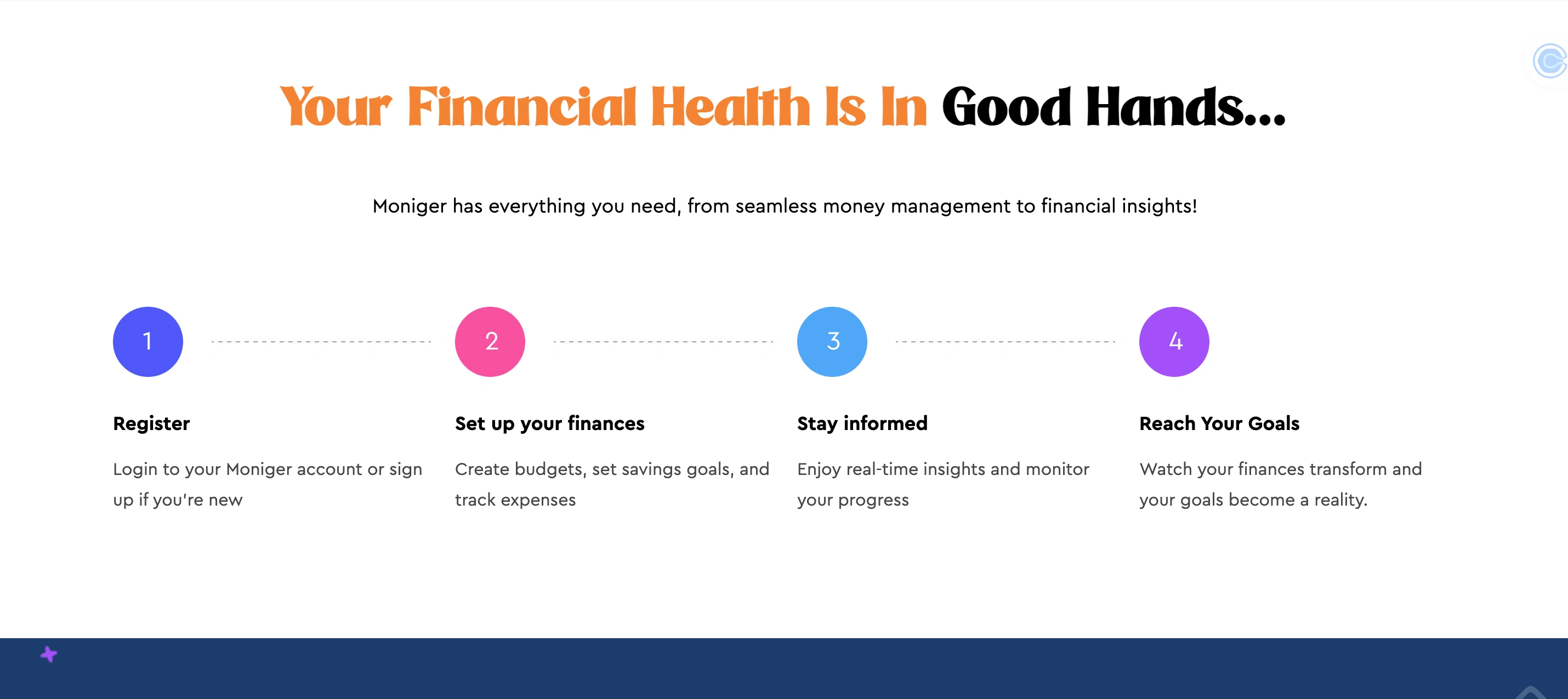
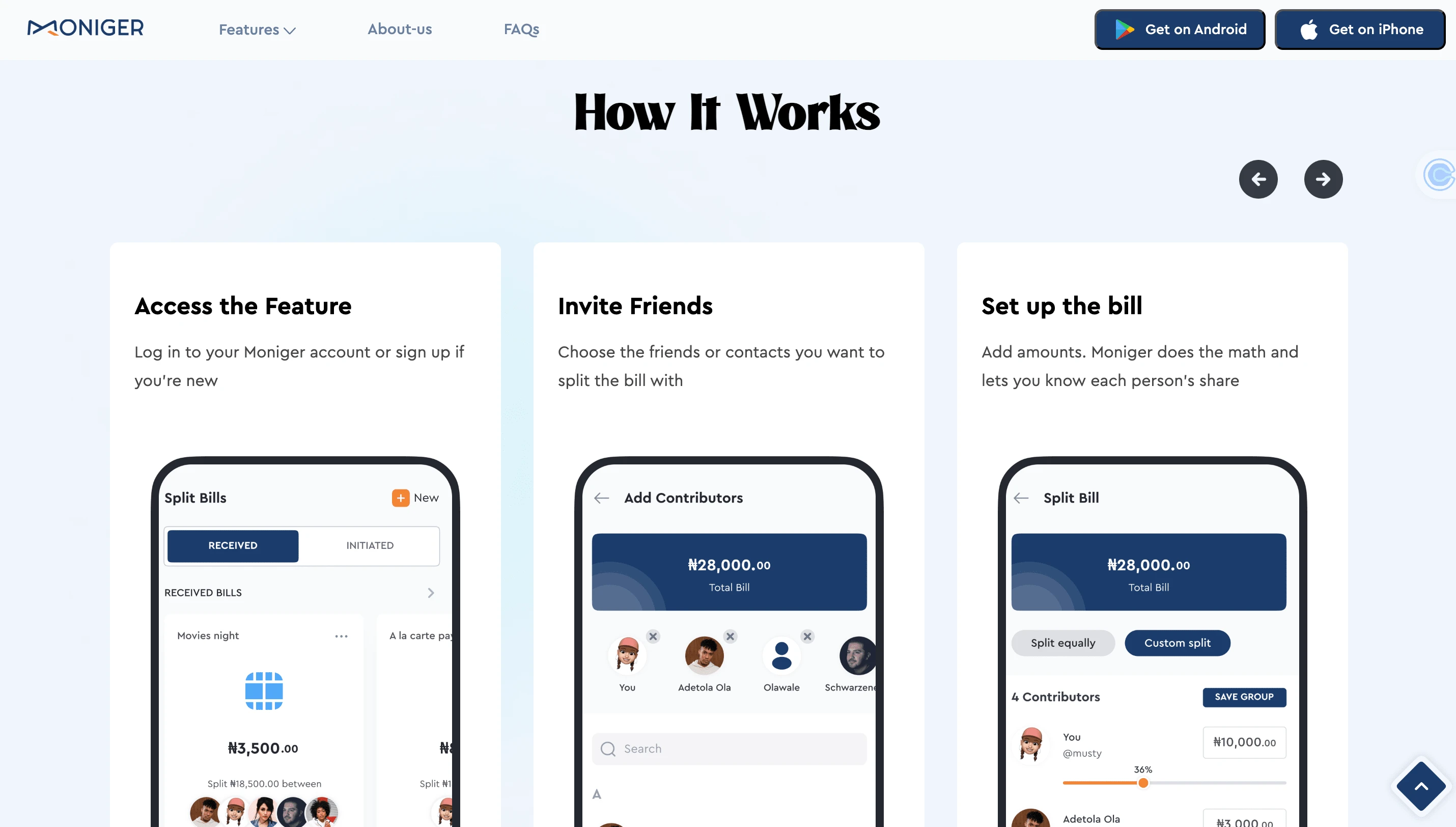
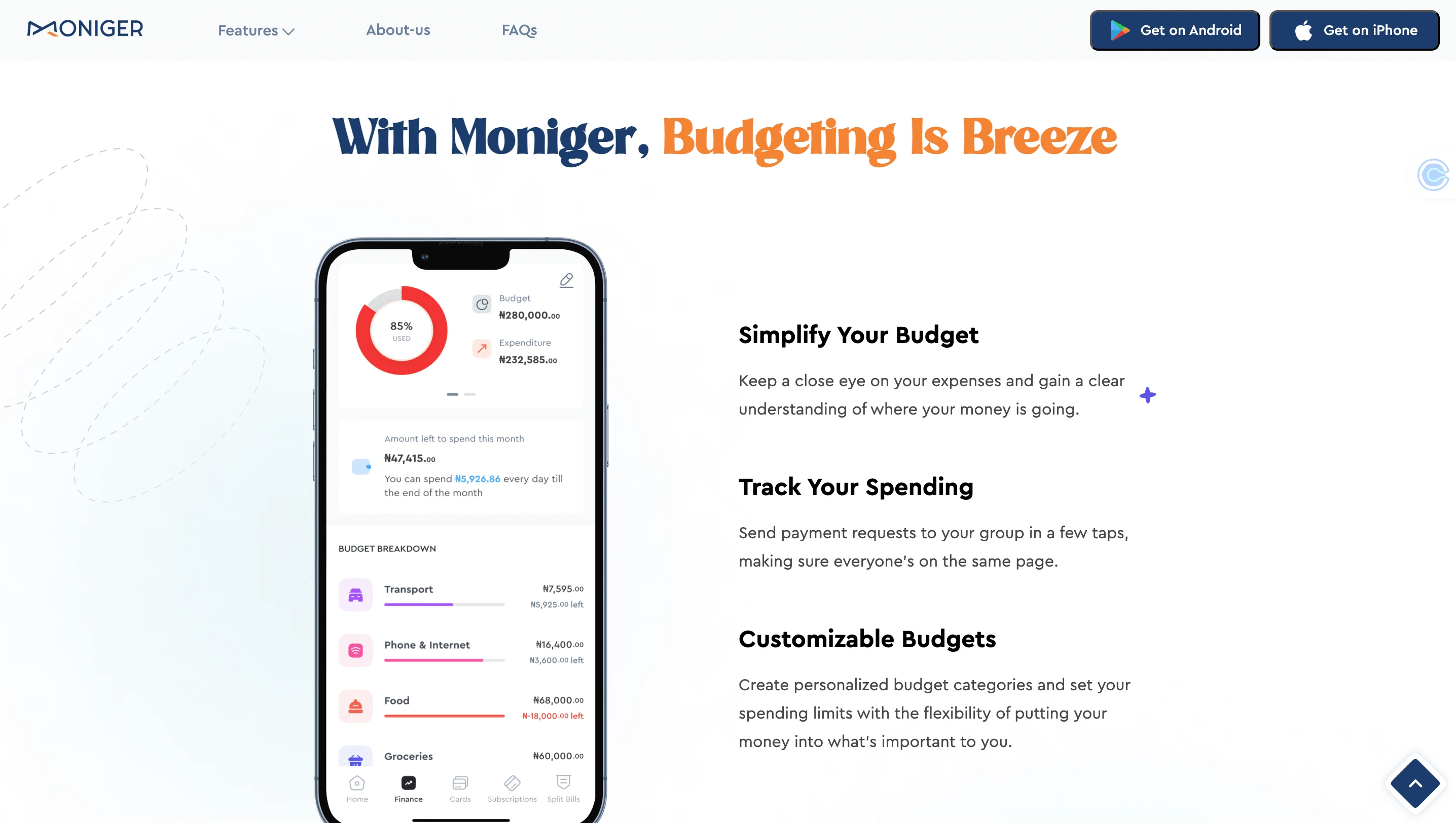
Moniger Mobile App
The Problem
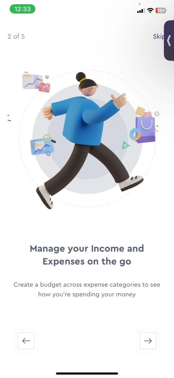
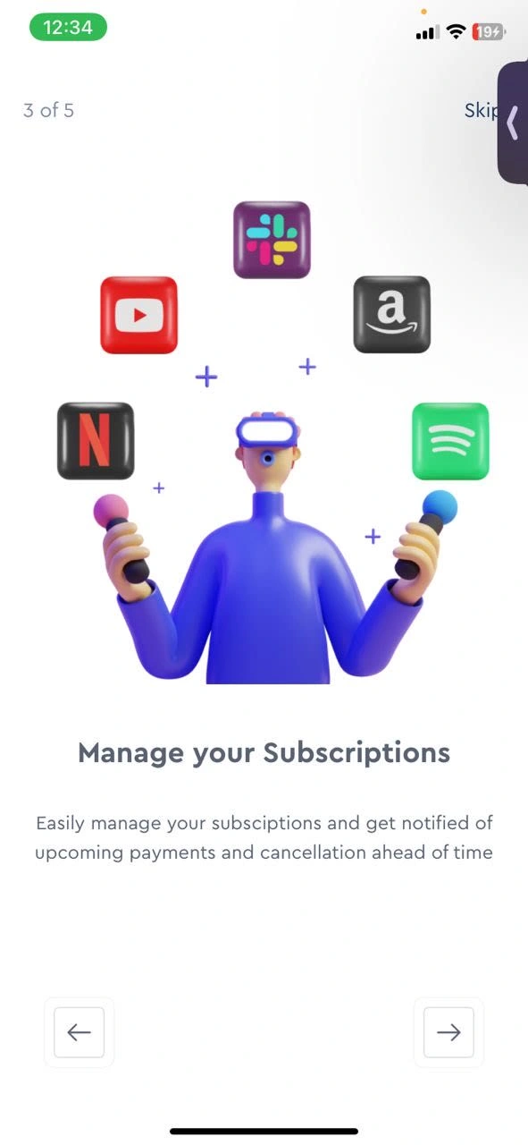
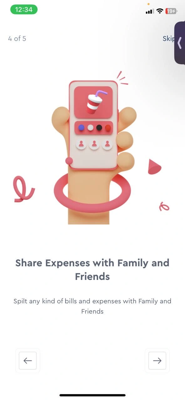
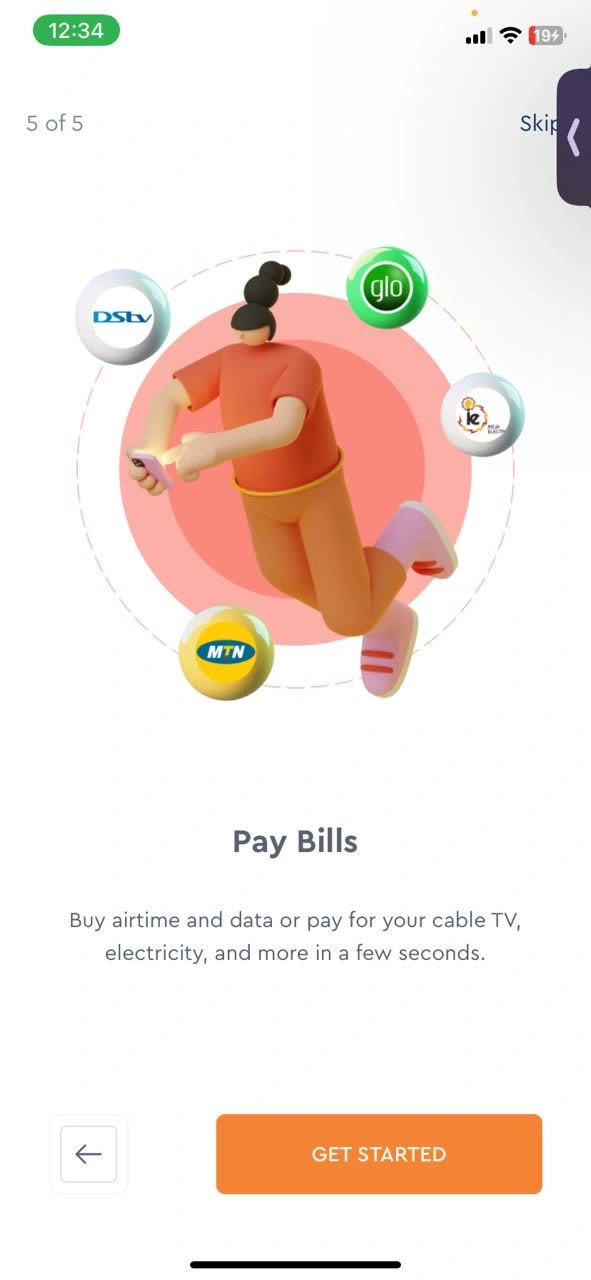
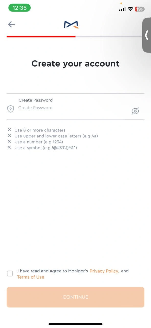
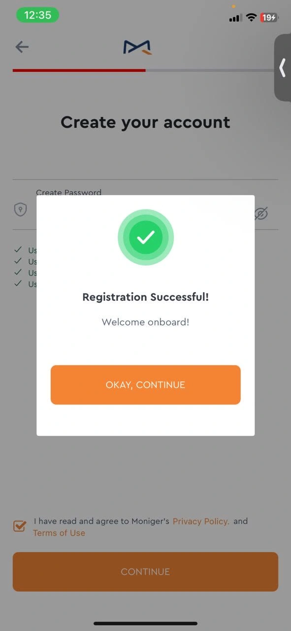
The Mobile app had so many moving parts and one of the goals was to put all the moving parts in a simplified, consistent flow. I began by introducing a splash screen and using the NICKEL TOUR approach to design the onboarding pages with a multi-step progress indicator that shows users where they are at every stage in the onboarding process
My Approach
User Research: I spent hours speaking to individuals who had multiple bank accounts and were seeking ways to manage all their moving parts. Another segment of users needed a simplified way to share and manage their expenses without having to draw up an Excel sheet. They wanted a solution that works "on the go".
Content Design: To do this, I took research findings and stripped each response for the exact words users described their needs and pain points with. I added each word consistently and strategically around the mobile app to create a personalized experience.
Copy Testing: I created a feedback loop for further iteration by testing each copy with users to ensure that each word reflected the user intent and guided them through their journey seamlessly.
Onboarding and Sign-Up Flow

Moniger's splash screen
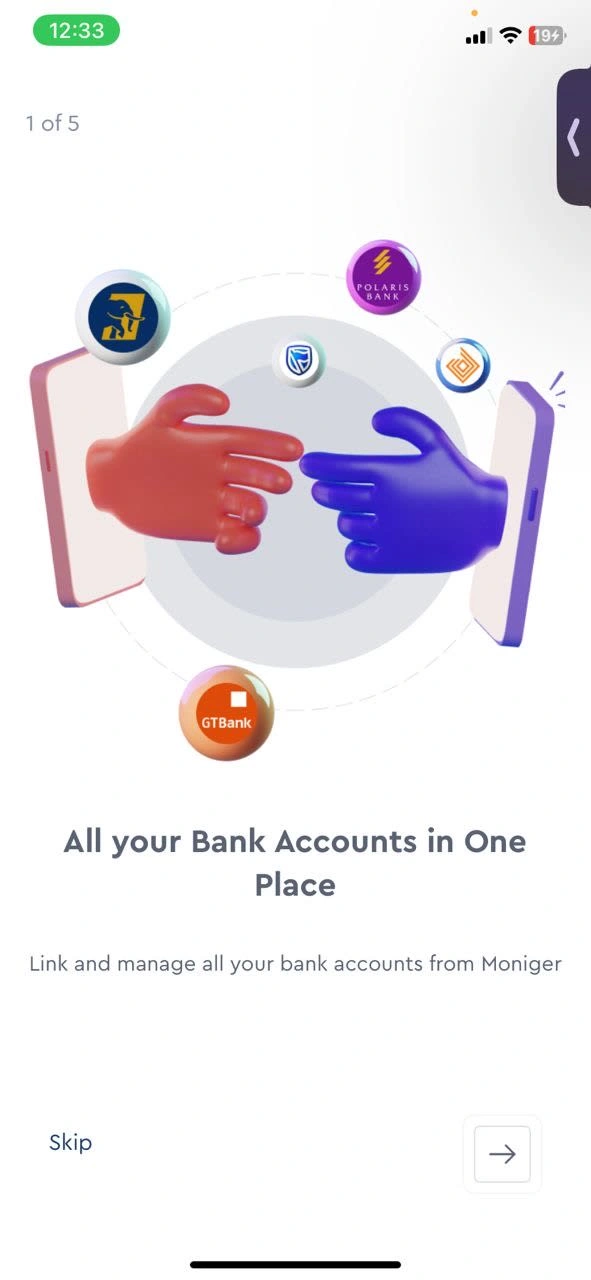
My Takeaway
This project taught me to sit at the intersection of functionality and usability while engaging user intent to create an immersive experience for the various user needs presented. To prepare this product for the market, I tested every copy intending to ensure there was no information overload because of the variety of features.
Like this project
Posted Jul 25, 2024
I had fun designing content for the Moniger app and website. I switched up the user experience and conversion rates with human-centered UX Copy!
Likes
0
Views
48

