Natural with a touch of masculinity
Henrik Rosendal von Essen
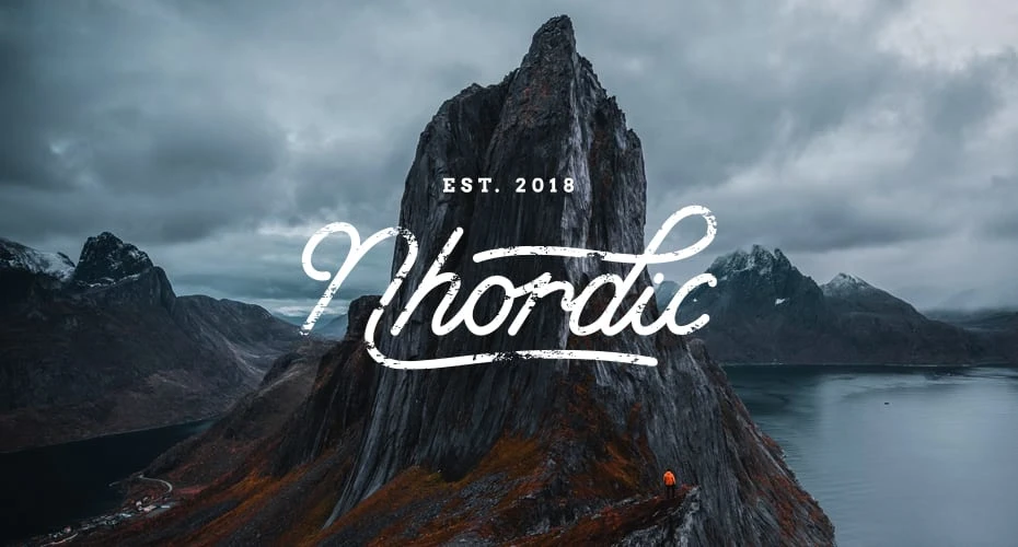
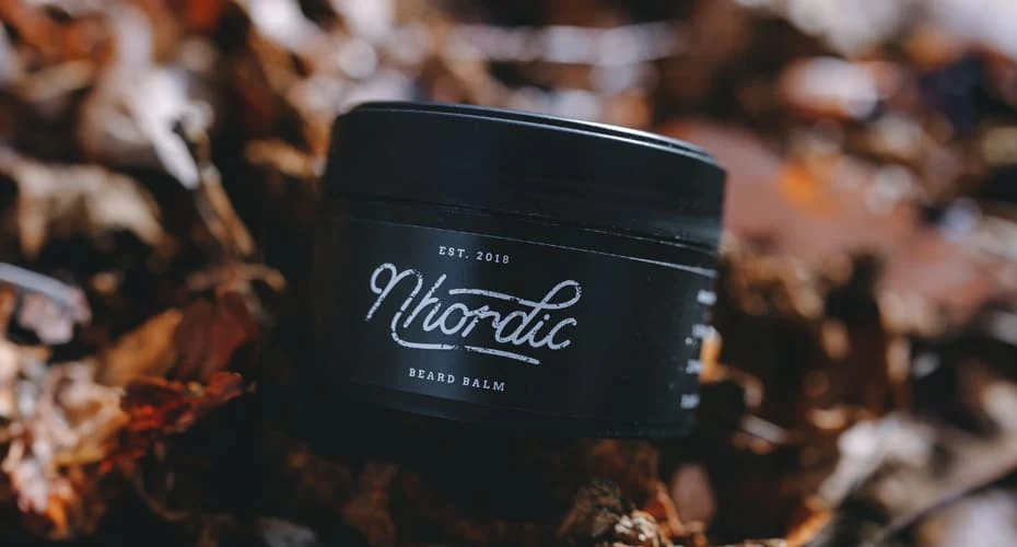
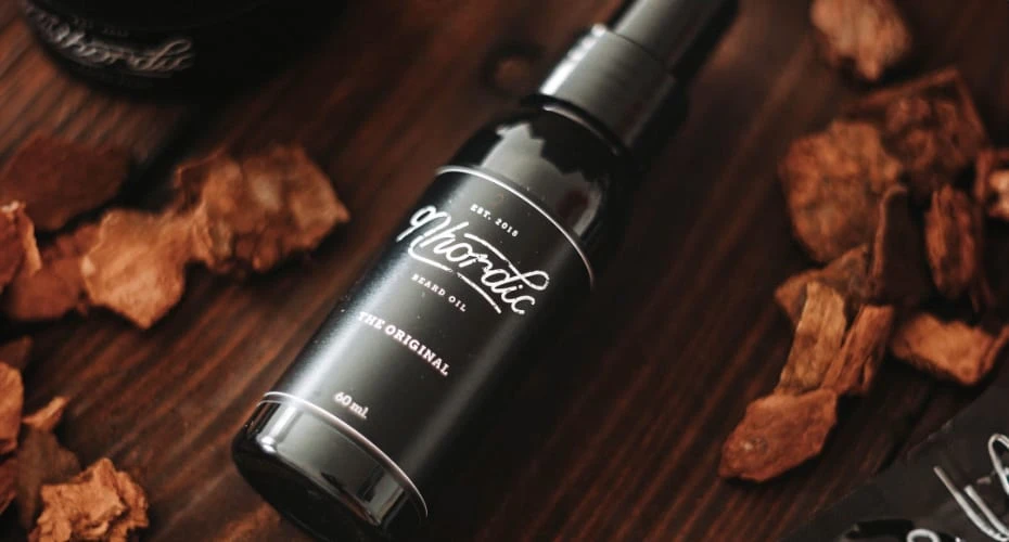
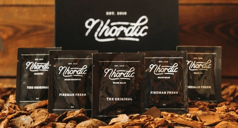
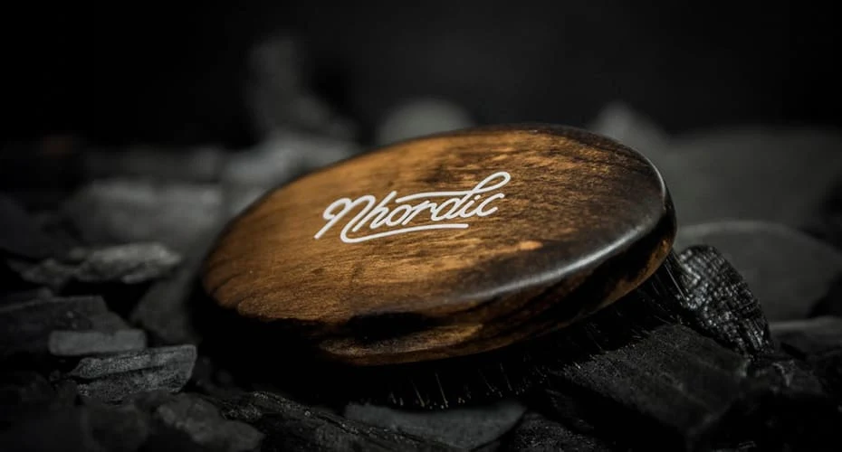
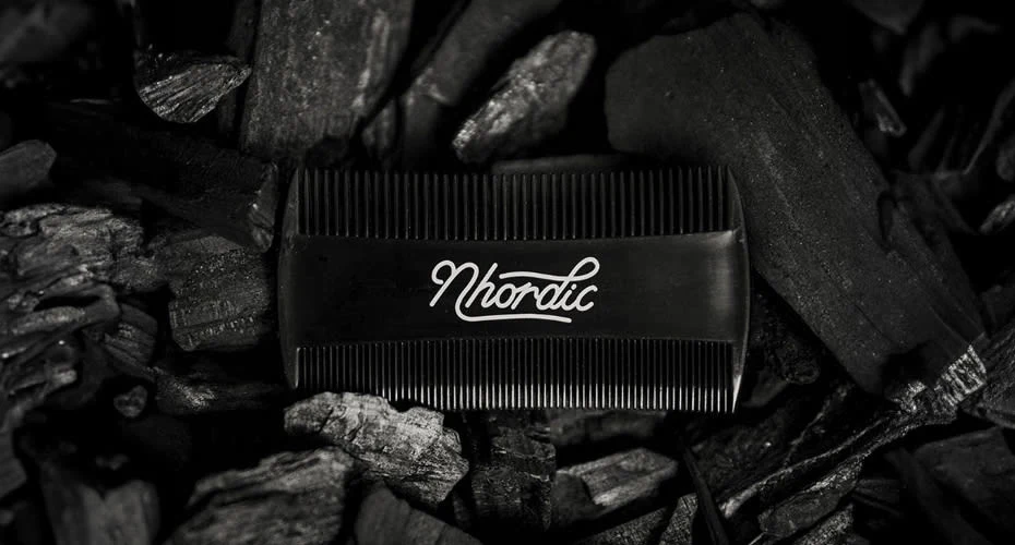
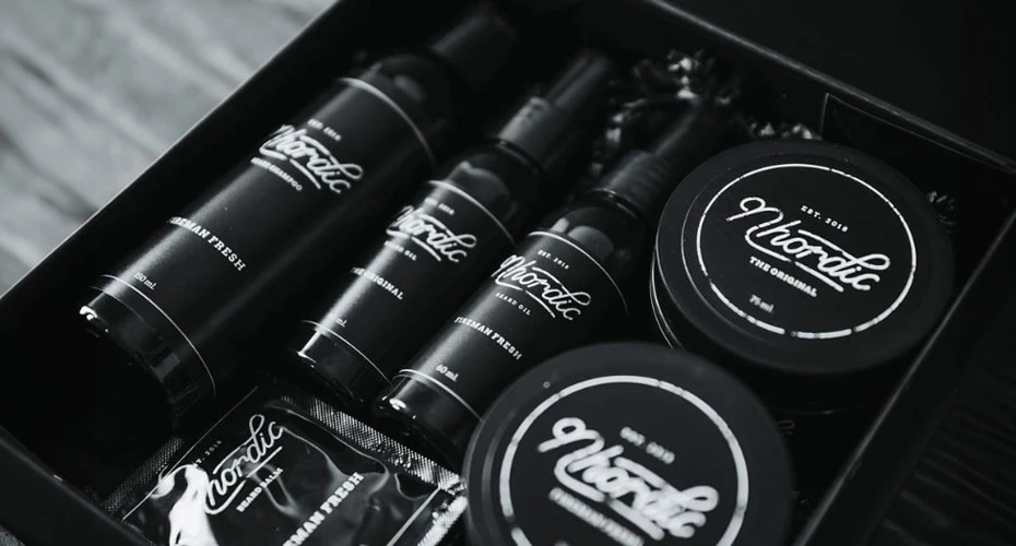
The founder of Nhordic, a company specializing in beard care products, reached out to me prior to launching his startup and asked me to design a logo that captured the simplicity known from Scandinavian design, whilst also making it look natural and, if possible, a little rough. While we initially played around with the idea of both a lettermark and a pictorial mark, a wordmark just felt more honest and natural and captured the brand values far better than any of the initial concepts that were developed for the logo.
The hand-lettered type has an organic and natural flow, and using a monoline stroke rather than a calligraphy brush stroke makes the logo look simplistic and non-feminine. To apply a touch of masculinity and make it a bit more rough, as initially requested by the client, a grunge effect was added, and a slab serif font was used for the additional lettering.
Like this project
Posted Apr 9, 2024
Nhordic is a Danish company specializing in beard care products. They wanted a logo with a Scandinavian vibe, capable of capturing their male audience.
Likes
0
Views
1