Transforming Brand Perception
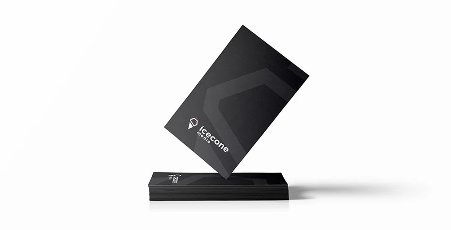
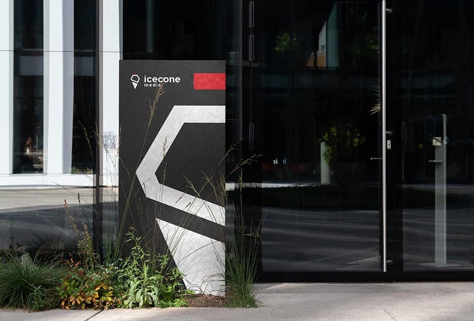
Icecone Media, a dynamic creative agency specializing in content creation for social media platforms, approached me with a unique challenge. Morten Elsborg, the visionary owner, recognized a misalignment between their old logo and the company's actual focus. Survey results clearly showed that the existing branding inadvertently conveyed a child-centric theme, contrary to Icecone Media's diverse range of services. My mission was to craft a new logo that resonated with their primary audience while retaining the iconic ice cream motif, and the symbolism it represents that is what the company is build upon.
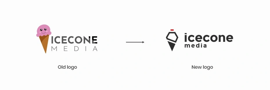
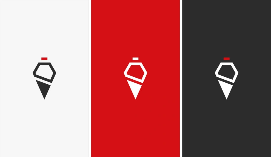
To address the misinterpretation, I adopted a more abstract and sophisticated design approach. The resulting logo consists of three distinct elements, combined to form the recognizable silhouette of an ice cream. This reimagining shifted the percetion of the company from sweet and child-centric to professional and creative with an edge, thus steering clear of any unintended associations.

To make a quick breakdown of the logo, the company’s geographical location is known as the "Triangle-area," which is represented as the base of the logo, serving as a subtle nod to its local roots. Icecone Media extends beyond its core services by offering office space to like-minded small companies and freelancers. The middle part of the logo takes on the shape of a house, symbolizing the company's commitment to fostering a collaborative and creative community. And finally the cherry on top, quite literally, depicts the shutter-release button on a camera. This final element ties the logo back to Icecone Media's photography and videography expertise, serving as a visual cue for their commitment to delivering top-notch visual content. It's a lucky coincidence that a cherry and a recording light share the same red color.

Like this project
Posted Apr 8, 2024
Logo design for Icecone Media's rebrand aiming to reach their target audience and align their visual identity with their brand values.
Likes
0
Views
2

