Logo Design & Brand Foundations for Design studio
Miracle Ndem
Studio Window – Logo Design & Brand Foundations
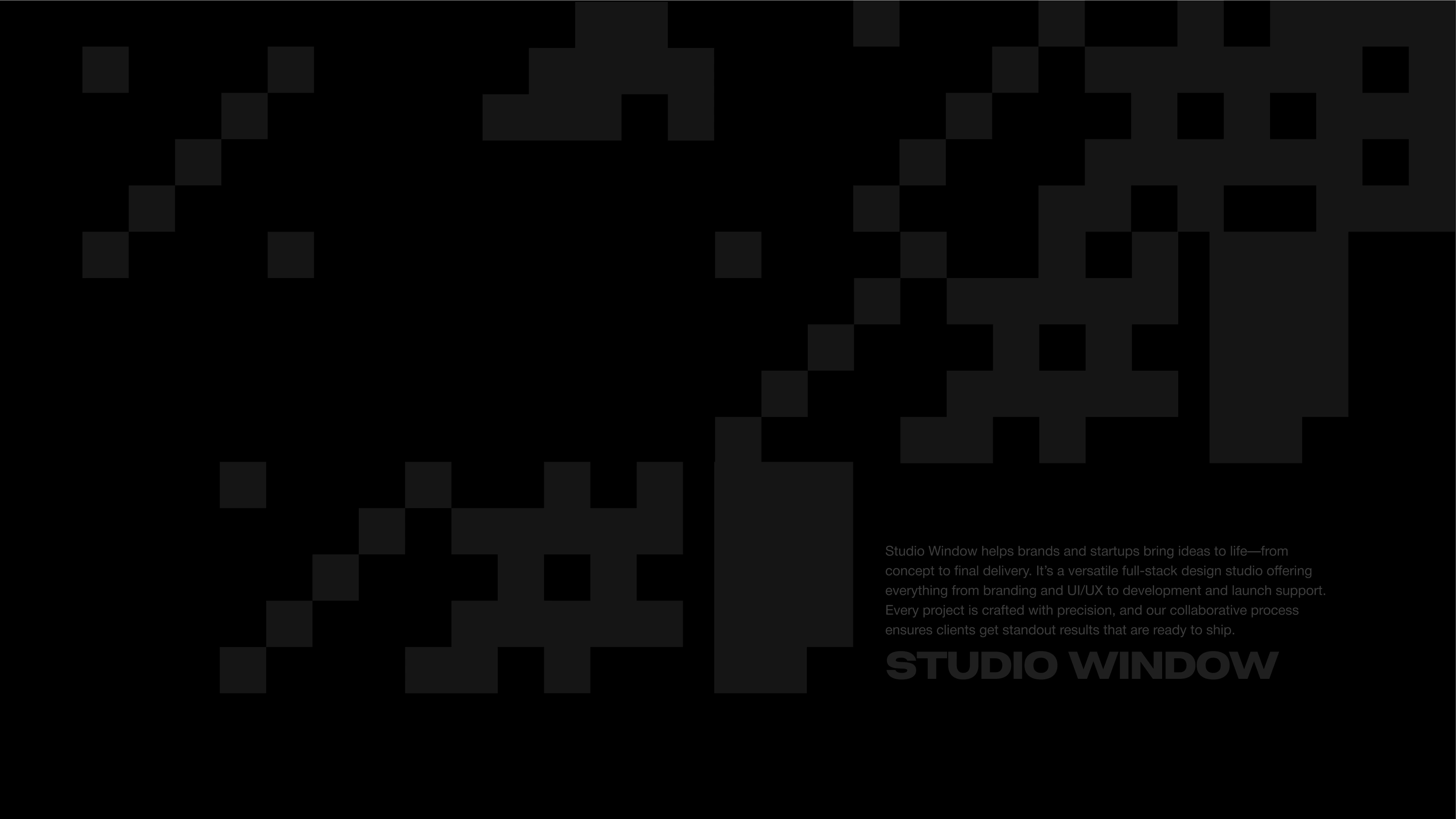
Studio Window is a full-stack design studio that transforms ideas into reality—guiding brands and startups from initial concept through to final delivery. I was brought on to design their core brand elements: a distinctive logo, typography system, and color palette that would position them as a premium design partner.
The project
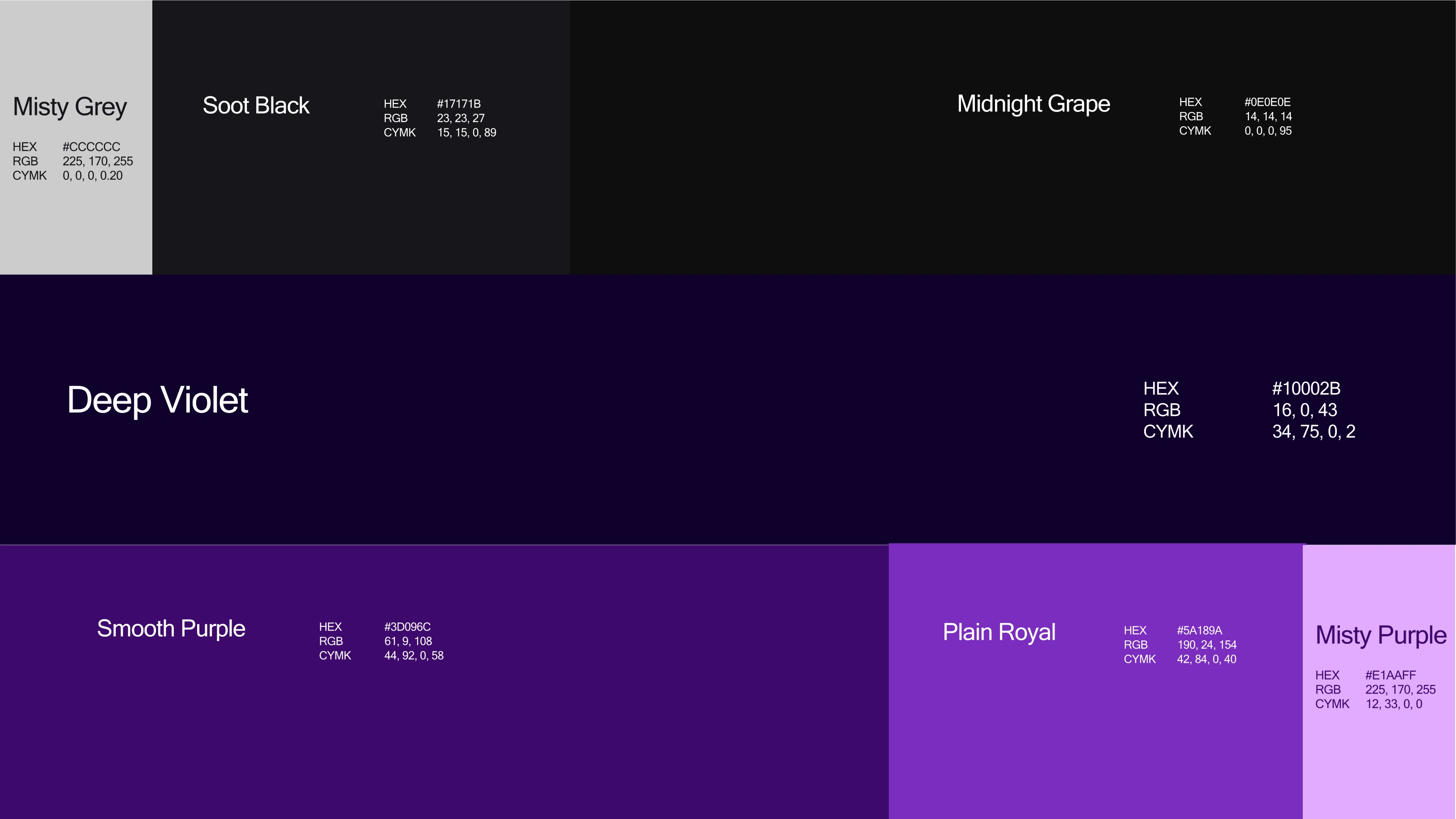
Studio Window needed a strong visual foundation to establish their presence in the competitive design studio space. My role focused on creating the essential brand building blocks—a versatile logo that could work across platforms, typography that balanced professionalism with approachability, and a color palette that would set them apart.
Design approach & exploration
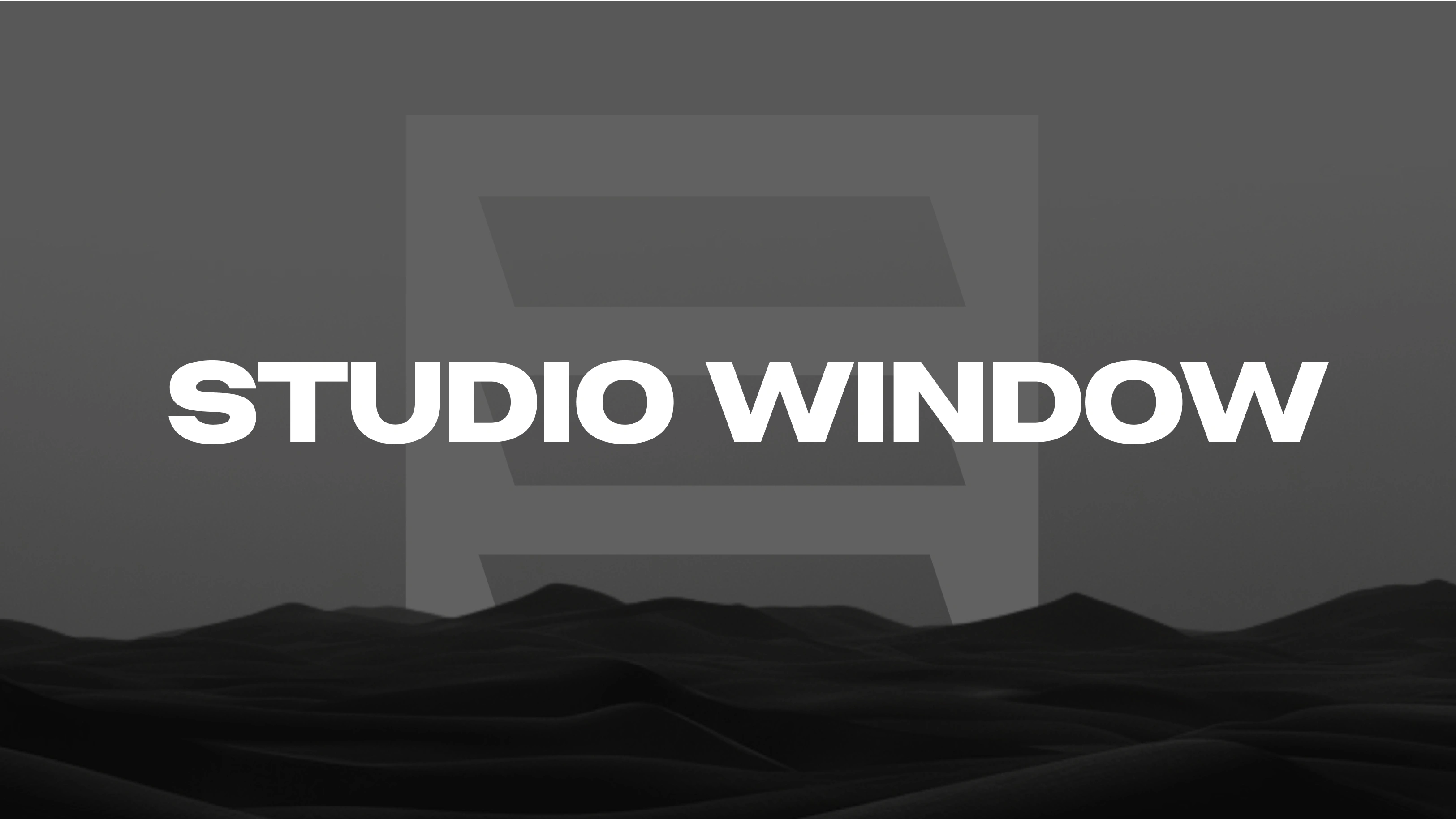
I started by exploring what "Studio Window" could represent visually. Rather than taking a literal approach, I focused on the conceptual meaning—a window as a portal, a framework for possibilities, and a structured opening that provides clarity and perspective.
Logo development
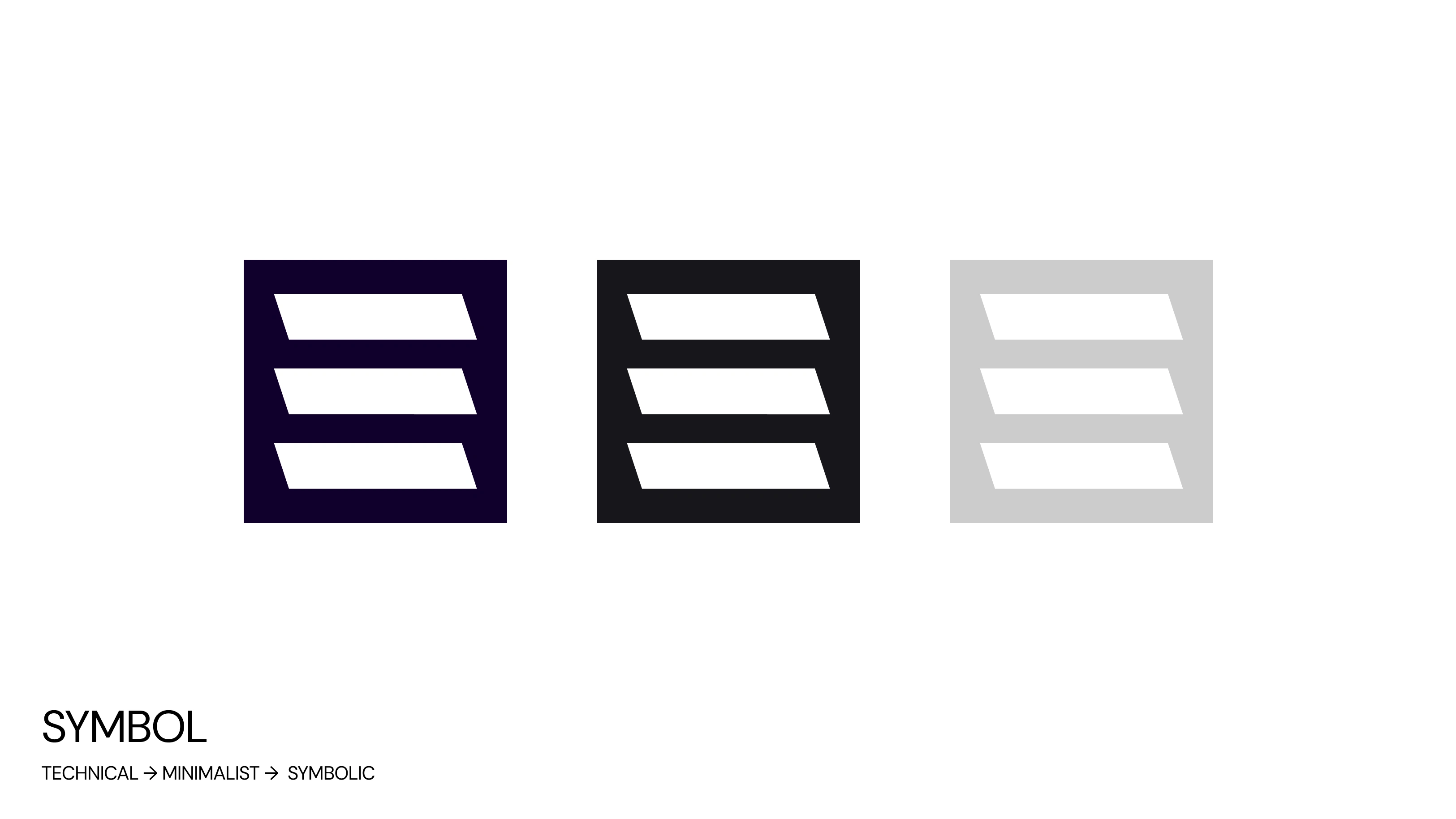
The logo evolved through multiple iterations, moving from technical and literal interpretations toward a more refined, symbolic mark:
Initial concepts explored window frames, architectural elements, and literal interpretations
Refinement phase focused on distilling the concept into a cleaner, more abstract symbol
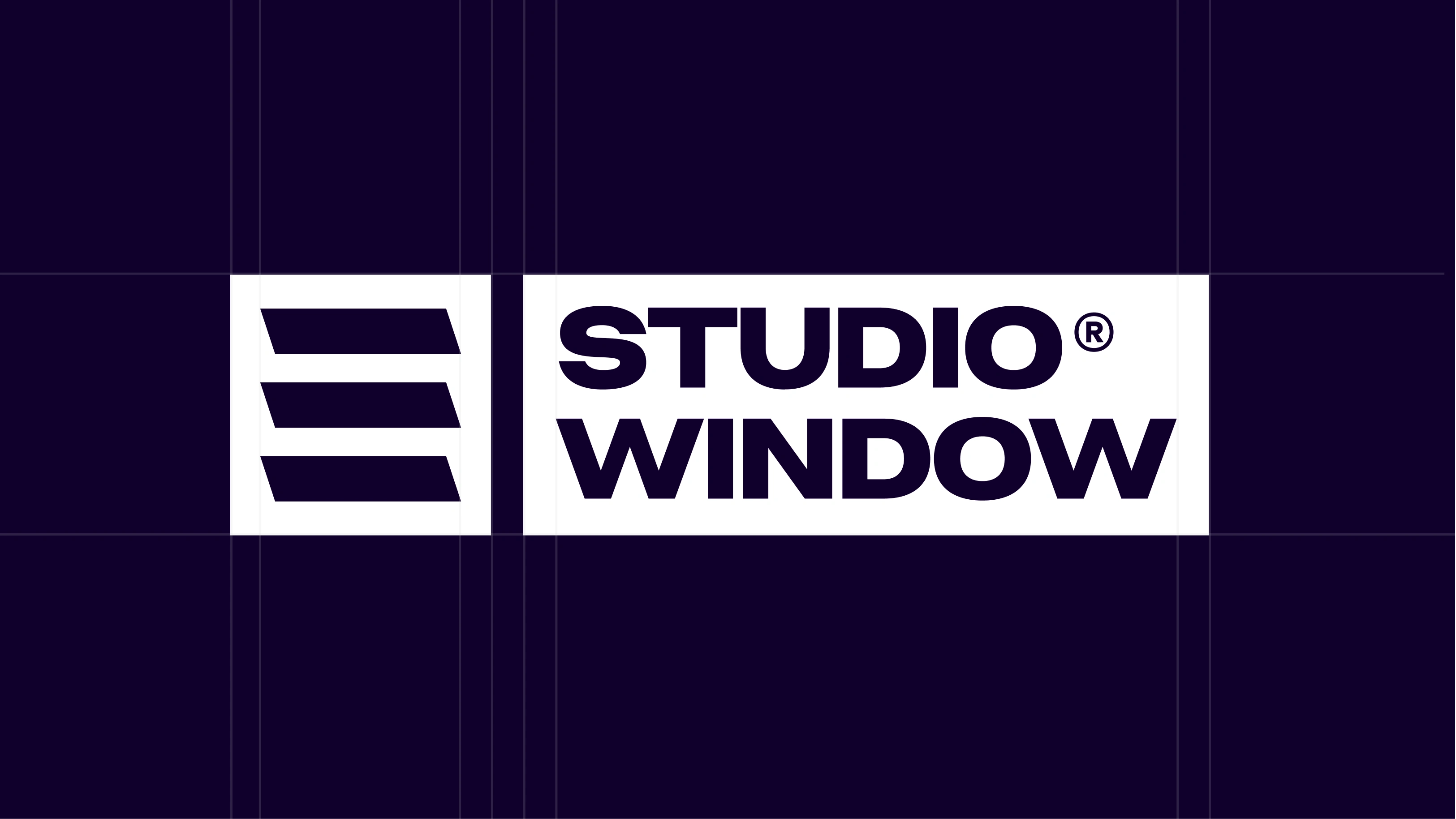
Final design landed on three dynamic slats with carefully calculated angles
The three-slat mark creates visual interest through its angled geometry while maintaining perfect alignment. This balance between dynamism and precision reflects Studio Window's philosophy—structured creativity that guides projects from concept to launch.
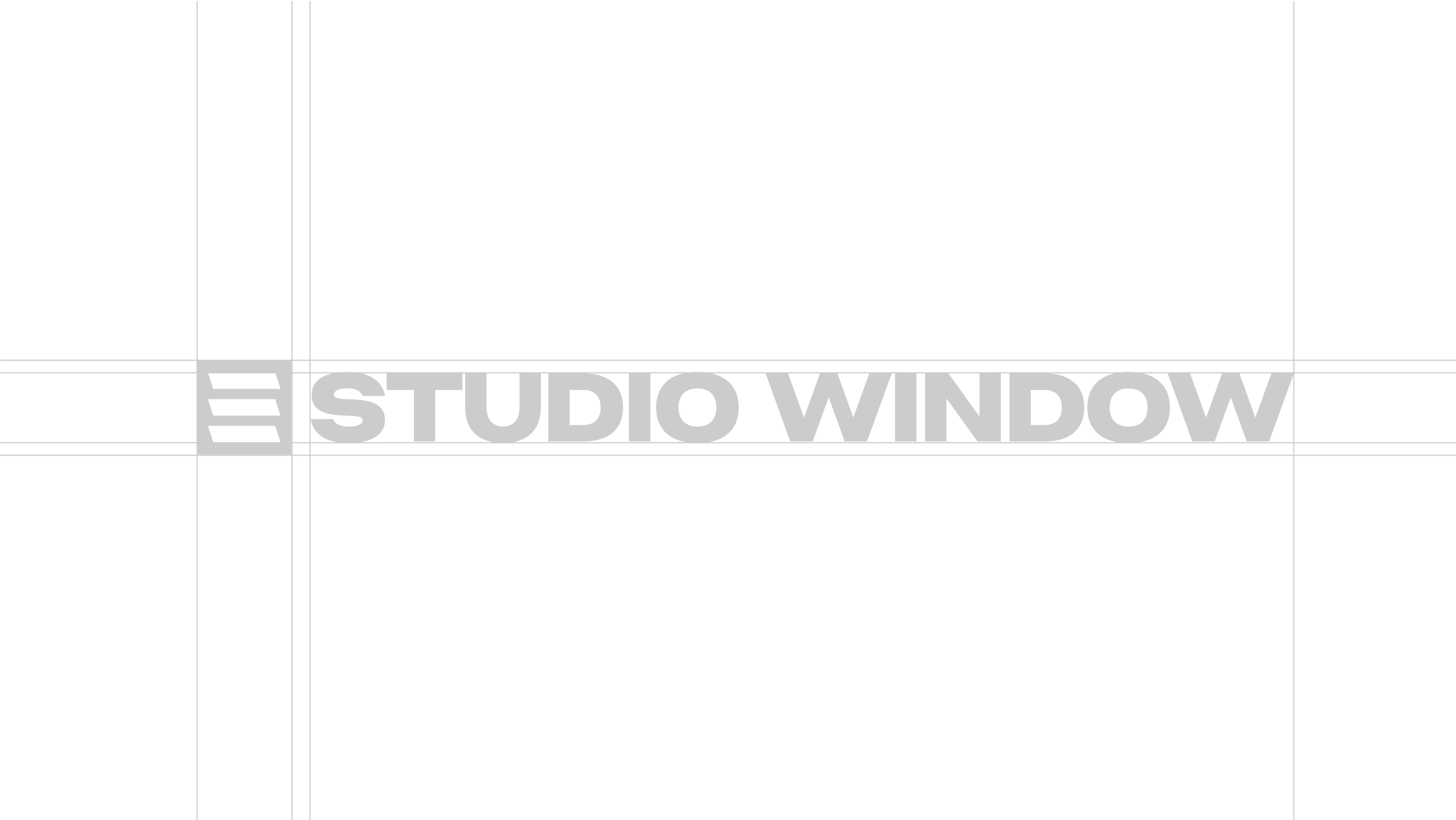
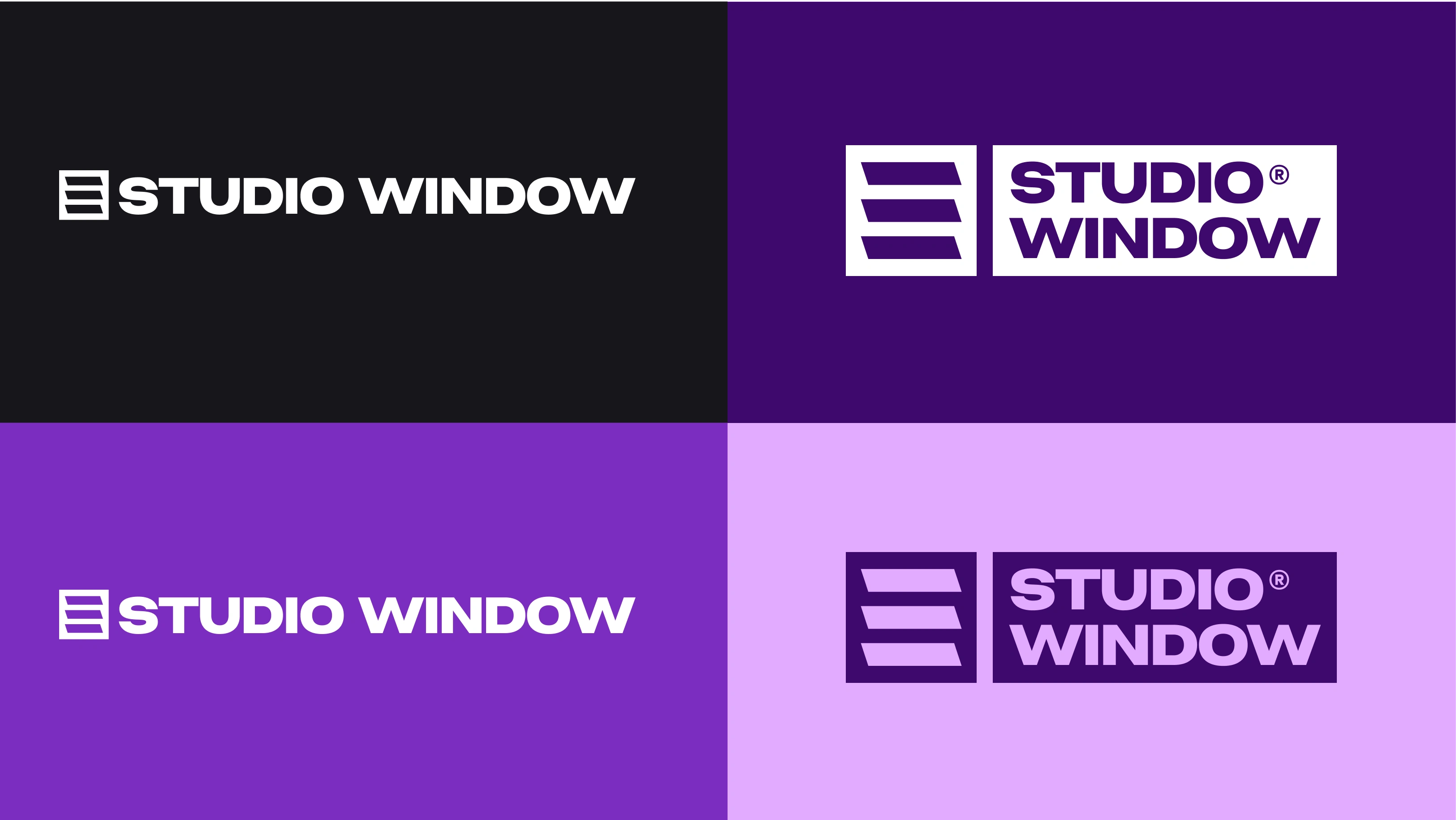
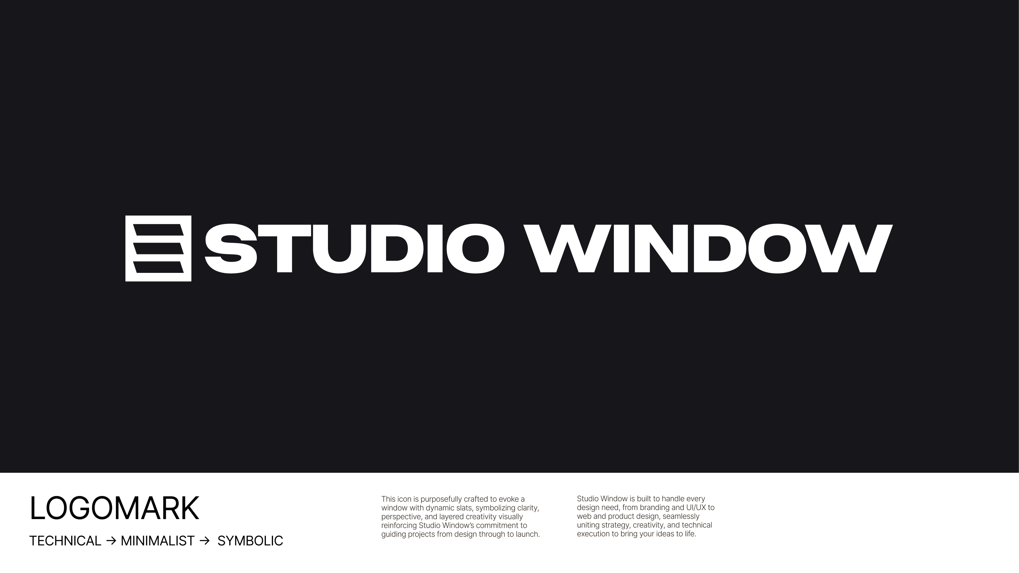
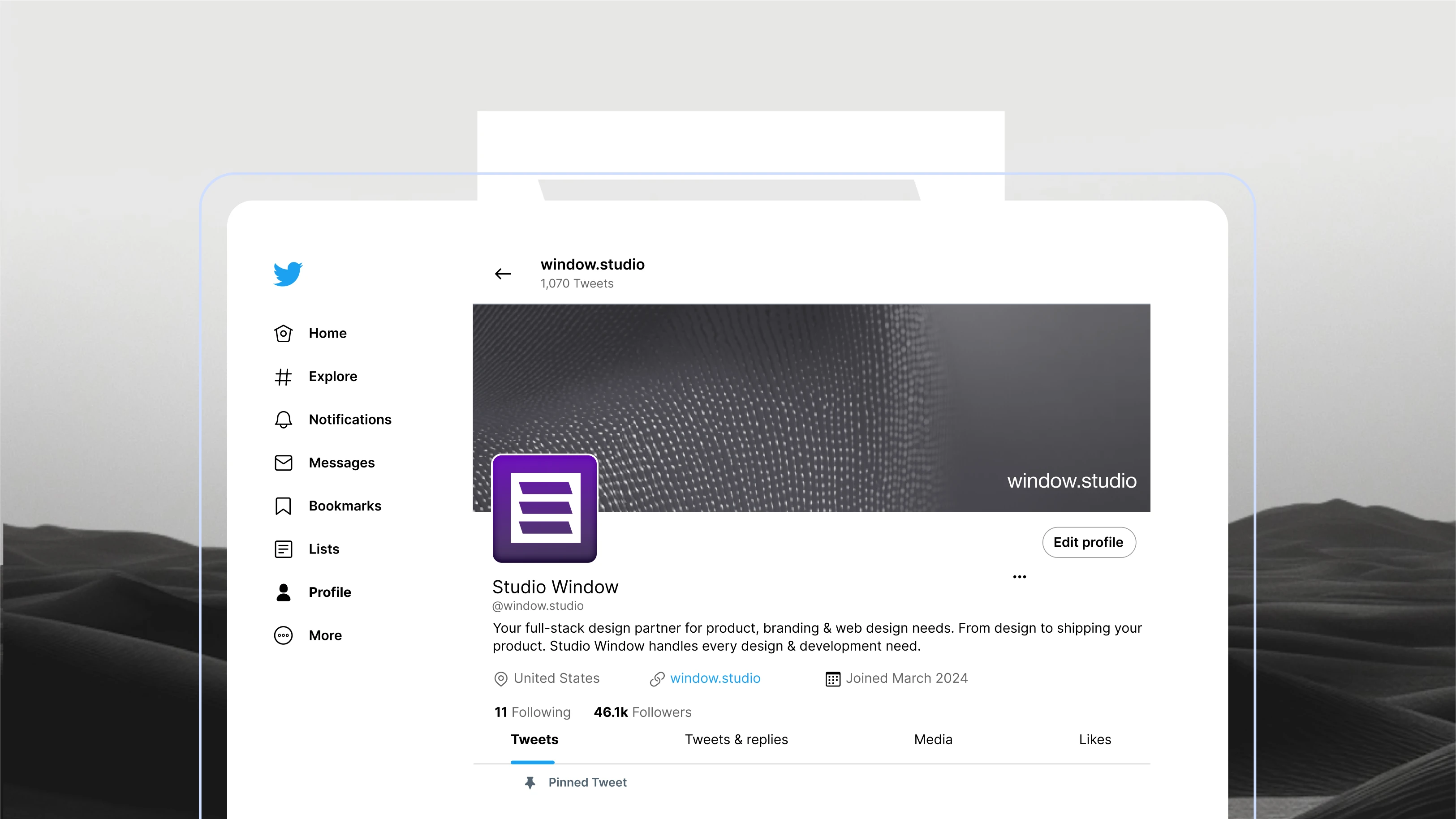
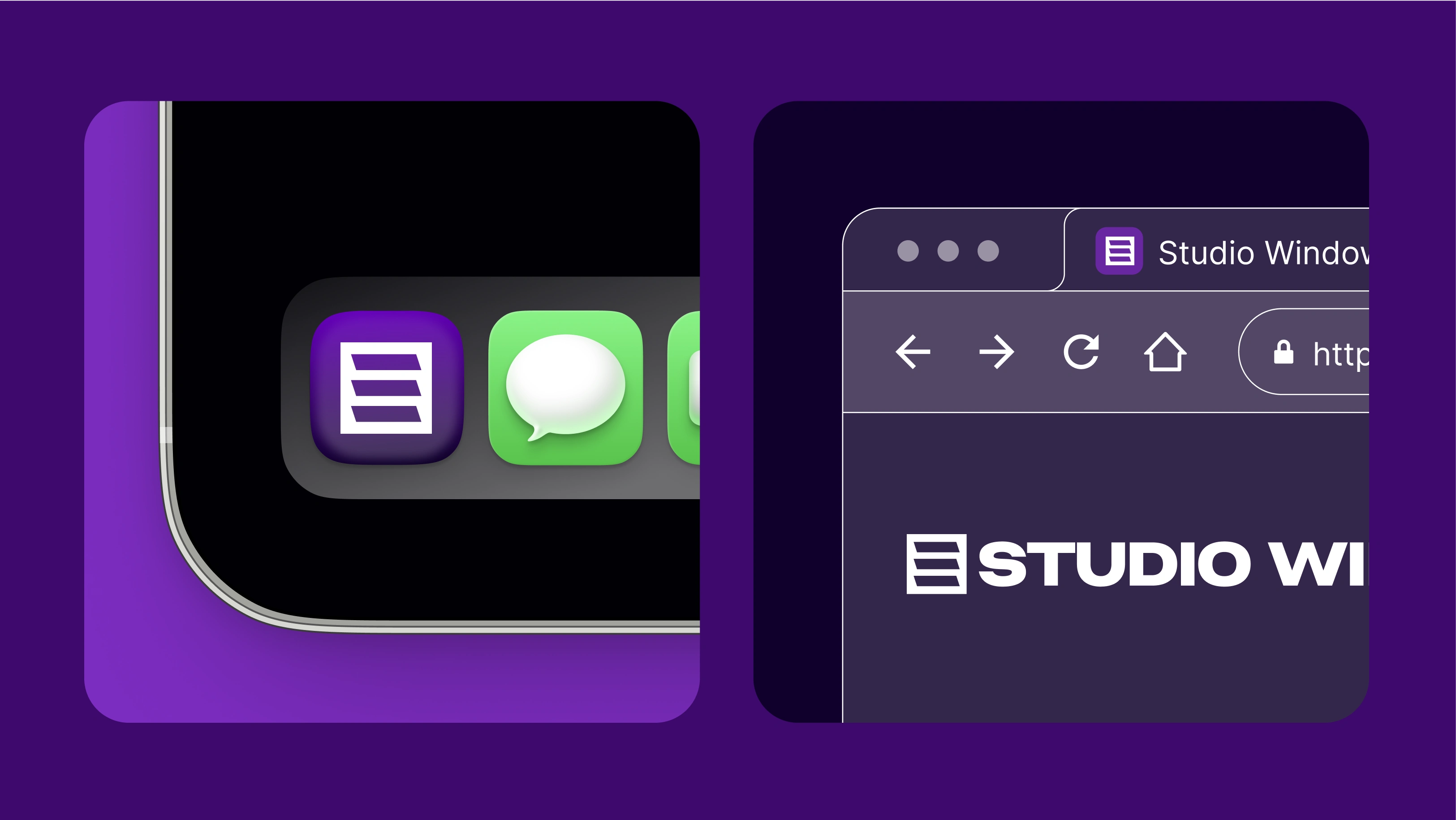
The logo functions in multiple formats:
Horizontal lockup with custom wordmark
Standalone symbol for app icons and social media
Monochromatic variations for versatility across different backgrounds
Pattern element that can be deconstructed for visual applications
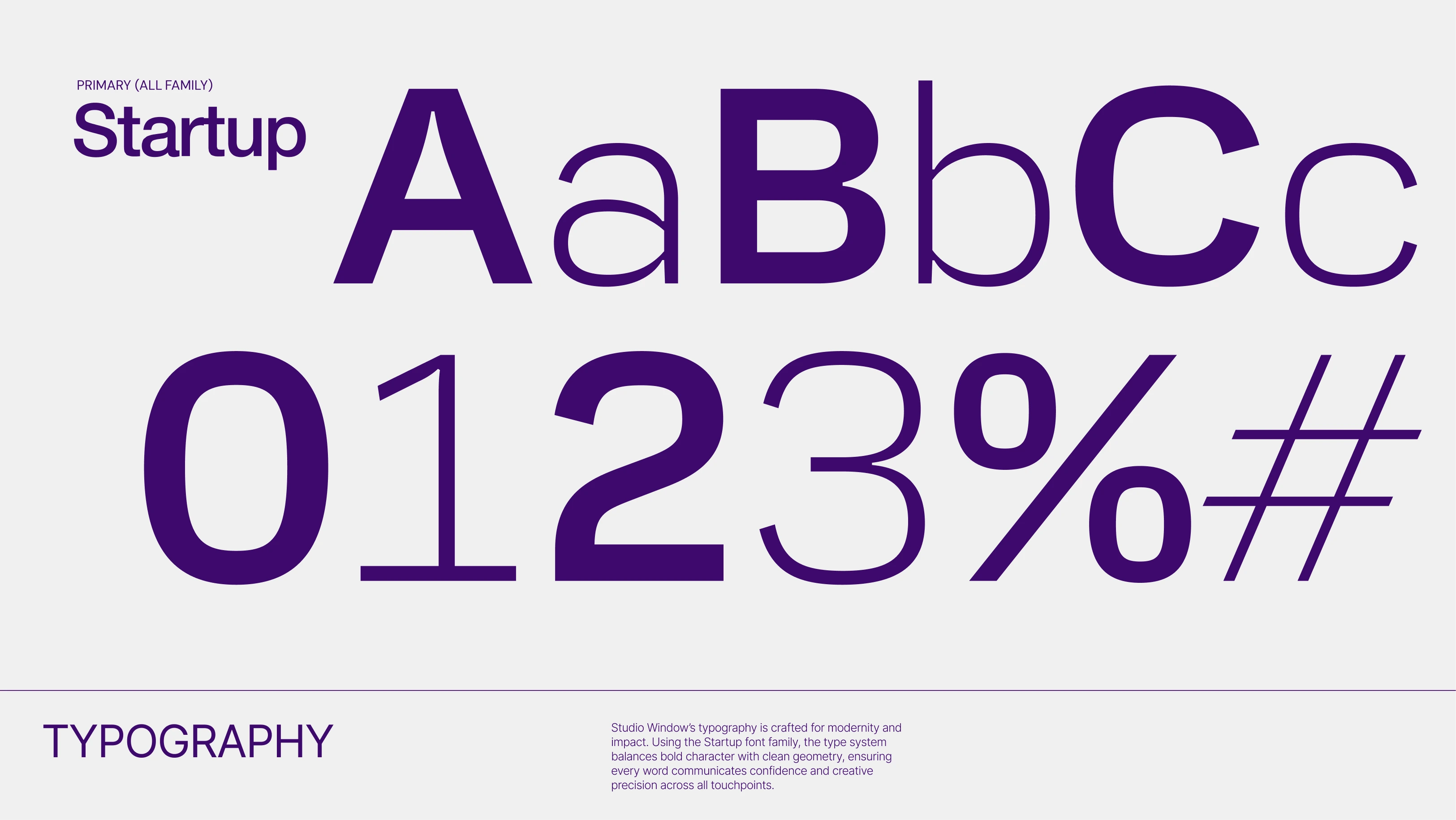
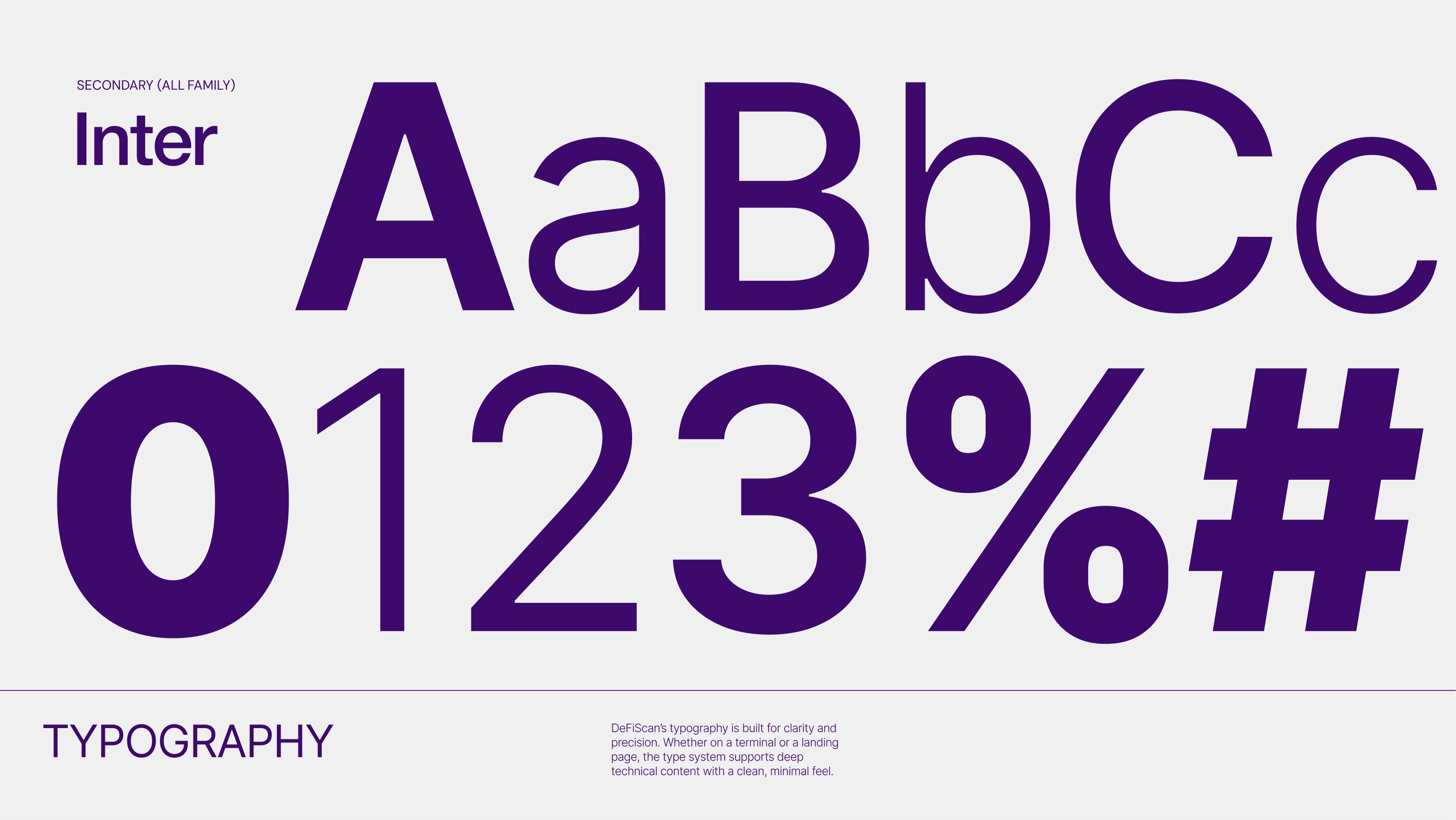
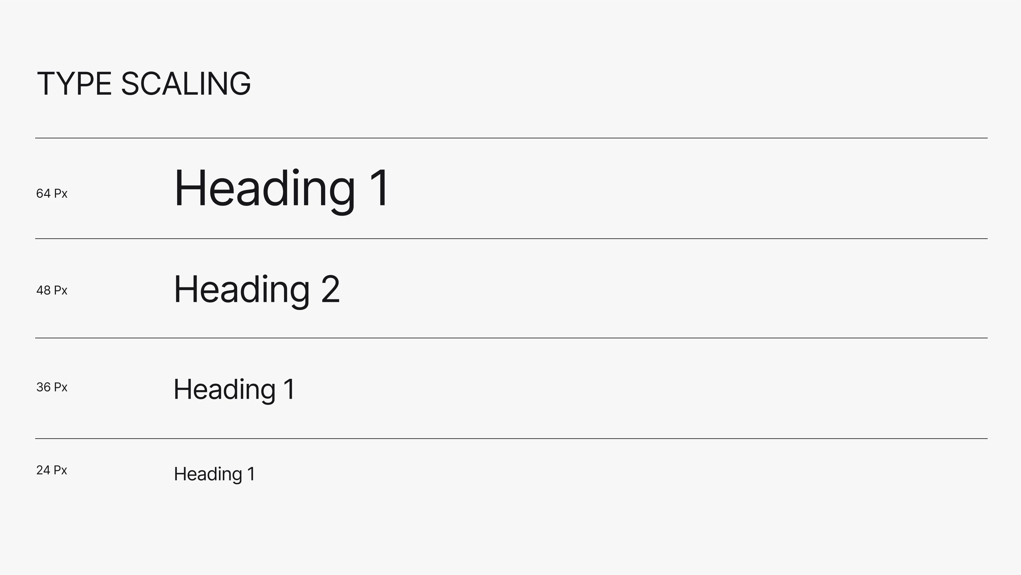
Typography selection
I selected Inter as the brand typeface for several strategic reasons:
Clarity and precision – The typeface's clean geometry complements the logo's angular forms
Modern technical feel – Reflects Studio Window's expertise in digital design and development
Exceptional versatility – Performs equally well in headlines, body copy, and UI elements
Professional credibility – Widely recognized as a quality choice in the design and tech industries
The secondary typeface system allows for distinction between brand communications and content hierarchy while maintaining visual cohesion.
Versatility & applications
The logo, typography, and color system were designed to work seamlessly across various contexts:
Digital platforms – Websites, social profiles, app interfaces
Marketing materials – Presentations, promotional graphics, advertising
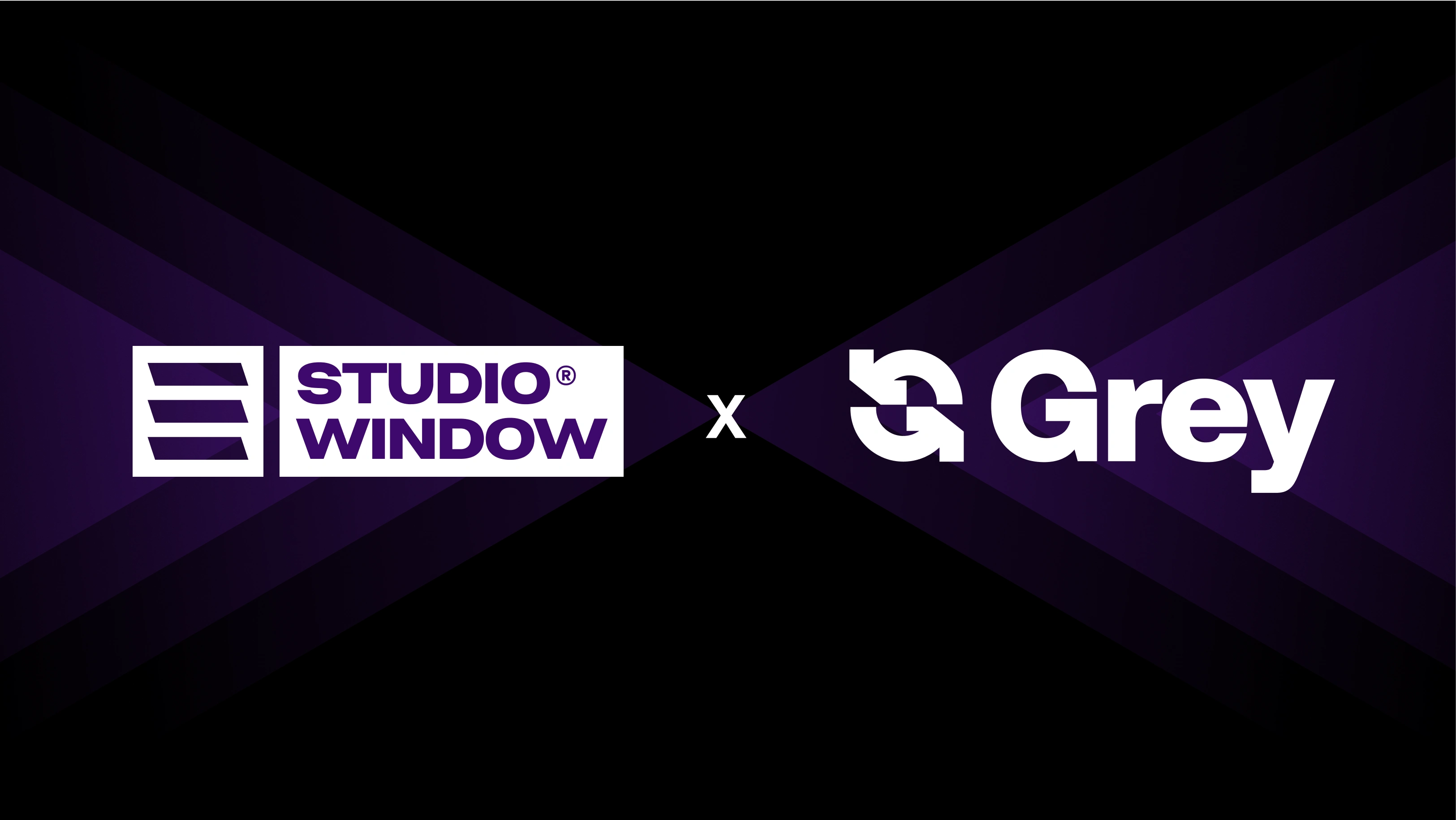
Partnerships – Co-branded applications (like the Grey collaboration)
Product touchpoints – App icons, loading screens, branded interfaces
Each element maintains consistency while adapting appropriately to different scales and media.
Design rationale
The final design system strikes a balance between technical precision and creative expression. The geometric logo feels intentional and structured, the typography reinforces clarity and professionalism, and the color palette injects personality and memorability—all working together to position Studio Window as a modern, capable design partner.
Like this project
Posted Aug 12, 2025
Worked on this project to design the brand identity, logo and brand guidelines for a design studio
Likes
1
Views
15
Timeline
Jul 29, 2025 - Aug 10, 2025