Case Study: Enhancing the User Experience of an Studet app
Chalice Prajwal
Honey Companion
The product: Project duration:The problem: The goal: Chalice role: Responsibilities: Divya role: Responsibilities: Understanding the userUser research: summaryUser research: pain pointsUser journey mapStarting the designPaper wireframes Digital wireframes Digital wireframes Low-fidelity prototypeUsability study: findingsRefining the designMockupsHigh-fidelity prototypeAccessibility considerationsTakeaways
The product:
Honey Companion is a Student centered app aming for Indian students.Honey Companion strives to provide good courses, tools to students for learning efficiently and keep their health in check. They offer a wide spectrum of competitive pricing. Honey Companion targets students who like to travel and mothers can work at home .
Project duration:
October 2021- November 2021
The problem:
Aiming a one stop solution for students with courses to learn , ensure their academics and their health .
The goal:
Design a Student centered app that allows users to easily select course they want to learn and schedule a health checkup for health issue in few clicks.
Chalice role:
UX Designer designing an app for Honey Companion with a concept of One stop app for students.
Responsibilities:
Conducting user research, paper wireframing, digital wireframing,prototyping, animate frame to frame,iterations on design.
Divya role:
UX Researcher conducting usability research on an app for Honey Companion with a concept of One stop app for students.
Responsibilities:
Conducting useability studies,competitive audits,Unmoderated usability study,
Conducting interviews and documenting.
Understanding the user
User research
Personas
Problem statements
User journey maps
User research: summary
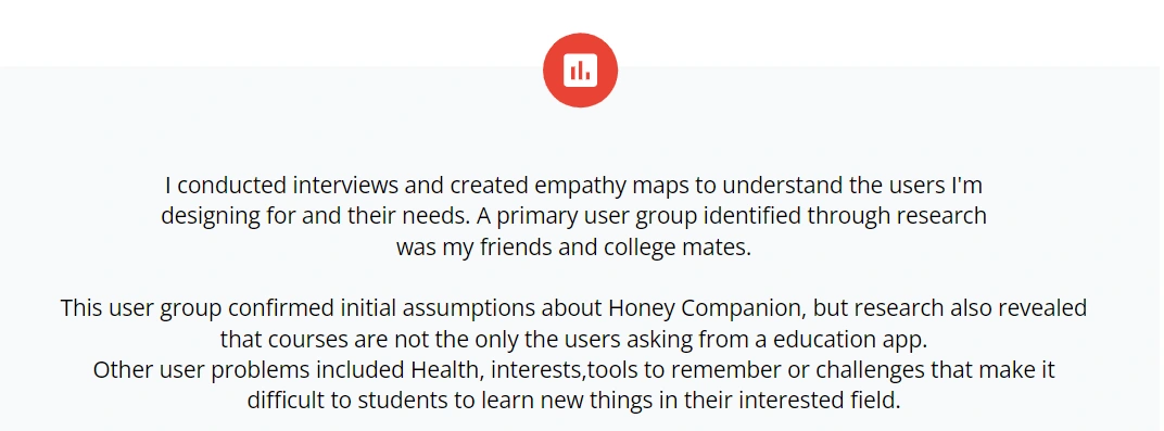
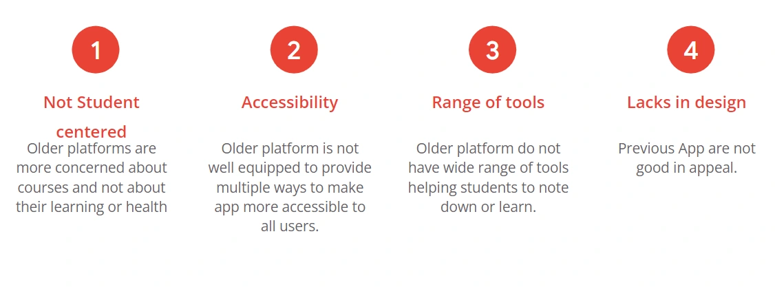
User research: pain points
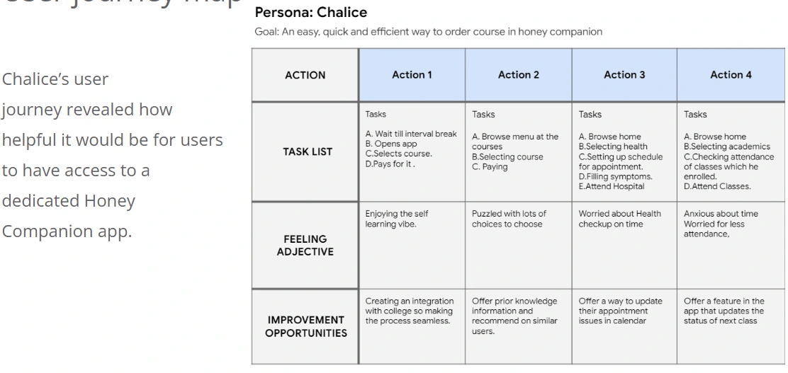
User journey map
Starting the design
Paper wireframes
Digital wireframes
Low-fidelity prototype
Usability studies
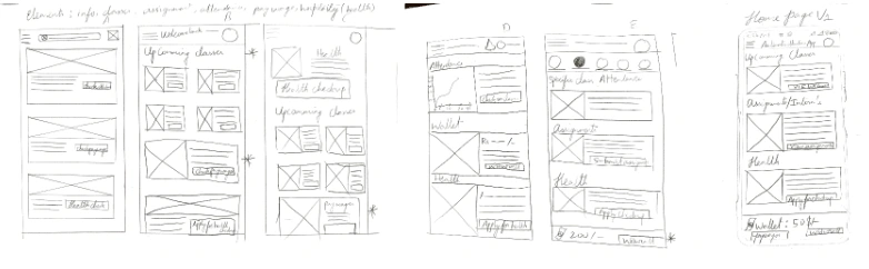
Paper wireframes
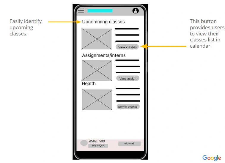
Taking the time to draft iterations of each screen of the app on paper ensured that the elements that made it to digital wireframes would be well-suited to address user pain points. For the home screen, I prioritized a quick and easy ordering process to help users save time.
Digital wireframes
As the initial design phase continued, I made sure to base screen designs on feedback and findings from the user research.
Digital wireframes
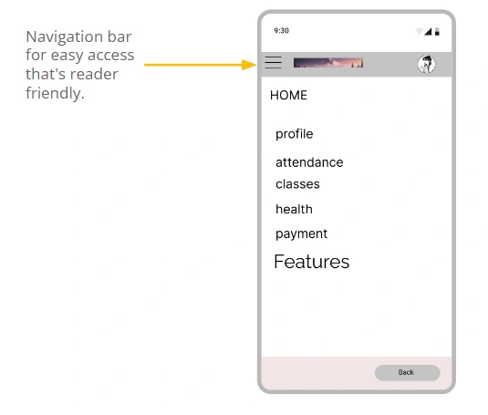
Easy navigation was a key user need to address in the designs in addition to equipping the app to work with assistive technologies.
Low-fidelity prototype
The low-fidelity prototype connected the primary user flow of building and ordering a pizza, so the prototype could be used in a usability study with users.
View the app Honey Companion at figma https://www.figma.com/file/d3dnCZe8DdTLlXfuyR61SF/Untitled?node-id=1%3A6
Usability study: findings
I conducted two rounds of usability studies. Findings from the first study helped guide the designs from wireframes to mockups. The second study used a high-fidelity prototype and revealed what aspects of the mockups needed refining.
Refining the design
Mockups
High-fidelity prototype
Accessibility
Mockups
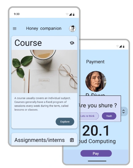
Early designs allowed for some own way to show information in small space, but after the usability studies, I added cards format to make users less cognitive. I also revised the design with more pleasant colour palette.
Early designs allowed for some own way by a image and list of options, but after the usability studies, I opted a list options and by drag down new options come up make users less cognitive. I also revised the design with more pleasant colour palette.
High-fidelity prototype
The final high-fidelity prototype presented cleaner user flows for student courses and checkout. It also meet user needs for a tools or health checkups with more student centered customization.
View the Honey companion
Accessibility considerations
Takeaways
Next steps
Takeaways
Like this project
Posted Sep 3, 2023
Revamped the interface of an e-student platform by analyzing user behavior and implementing intuitive design features. Improved conversion rates .
Likes
0
Views
11