Brand Portal Animation for Internal Walkthrough
Luis Andrey Ramirez Chavarria
Case Study: Brand Portal – Internal Walkthrough Animation
The Brand Portal animation was created as a visual anchor for an internal platform designed to centralize brand resources, guidelines, and assets. The goal was to produce a dynamic, polished animation that welcomed employees into the portal while reinforcing the company’s visual identity through motion and design. My role encompassed both visual design and 2D animation, ensuring the piece functioned not only as an introduction but also as a clear expression of the brand’s personality and creative standards.
Context & Challenge
Brand portals function as the internal heart of an organization’s identity system—places where teams rely on clarity, consistency, and inspiration. The challenge was to distill the company’s brand essence into a concise animation that could live on the homepage of the portal and instantly set the tone for users. It needed to feel professional, modern, and aligned with brand standards, while also being engaging enough to encourage exploration. Because the animation would be seen frequently by internal teams, it had to remain visually appealing over time and integrate seamlessly with the portal’s interface.
Insight
A strong brand portal is more than a repository; it is a creative environment that shapes how employees think about the brand. The animation therefore had to communicate identity, structure, and purpose in a way that felt intuitive and inspiring. Instead of overwhelming viewers with complexity, the piece needed to use motion as a guiding tool—introducing shapes, colors, and forms that visually echo the brand system. Through clarity of movement and thoughtful design choices, the animation could reinforce the brand’s style language every time someone accessed the portal.
Creative Concept
The creative direction centered on transforming brand elements into a living visual ecosystem. The animation showcased key motifs from the company’s identity—shapes, colors, patterns, typography—and used motion to highlight how these components interact cohesively. The concept expressed the idea that the brand is systematic yet dynamic, organized yet creative. Each movement was crafted to reflect harmony and precision, reinforcing the idea of a well-structured identity system while maintaining a sense of energy and rhythm.
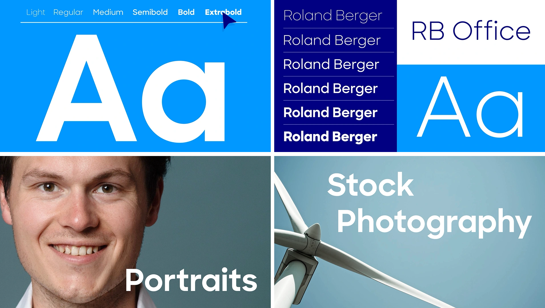
Styleframes created for the project
Production Approach
Leading both design and animation allowed for a fully integrated production process. The visual design began with constructing styleframes that established the core aesthetic: clean vector shapes, balanced compositions, and a palette faithful to the brand guidelines. From there, the animation process focused on creating smooth, purposeful transitions that felt both efficient and expressive. Shapes morphed, aligned, and assembled in ways that mirrored the logic of a brand system coming together. The timing was refined to keep the animation engaging while avoiding visual overload, making it appropriate for repeated viewing within an internal tool.
The animation embraced a minimal yet sophisticated 2D style, relying on carefully orchestrated motion to communicate identity with clarity. Color fields and geometric forms shifted and aligned to create a sense of structure, while subtle easing and pacing techniques added warmth and approachability. The tone was modern and professional, designed to evoke trust in the brand while also inspiring creativity. Every visual choice was tied back to the brand system, ensuring the animation became a natural extension of the organization’s visual language.
Results & Outcomes
The project succeeded in creating a cohesive, visually compelling animation that strengthened the brand portal’s role as a central identity resource. It enhanced the platform’s usability by giving it personality and movement without distracting from its functionality. The final piece established a strong foundation for future brand storytelling within the portal, setting a benchmark for internal visual communication.
Takeaways
This animation demonstrates the power of motion design in internal brand ecosystems. When design and animation work hand in hand, a brand portal becomes more than a tool—it becomes an extension of the brand itself. By interpreting brand guidelines through motion, the animation reinforced key identity principles, providing employees with a visual experience that is memorable, cohesive, and inspiring.
Like this project
Posted Nov 14, 2025
Motion is a great tool to communicate brand guidelines. In this project, I designed and animated a brand video showcasing the new look and feel of Roland Berger