Built with Rive
Rive Pokemon Pocket-style Interactive Card Pack Opening

Nikita Wibisono

Kitakuji is an Indonesian e-commerce platform where users open digital blind-boxes to win real, physical pop-culture collectibles. My role here is to audit and improve the end-to-end user experience, from first-touch brand perception to community engagement to the UX design of the app itself.
One critical part I focused on early was fixing the unboxing moment. Their original implementation was functional, but emotionally flat. It was a button with extra steps, where you swipe a flat image and it plays a canned animation. Wins felt uncelebrated, and losses felt extra disappointing.
My goal was to elevate that emotional build-up, which is why I designed this interactive pack-opening experience.
DELIBERATE FRICTION
There is a concept in UX design called Deliberate Friction. While common wisdom says to get your user from point A to point B as fast as possible, intentionally slowing things down can build trust, perceived value, and in our case, emotional weight.
Pokemon TCG Pocket is an excellent example of this. Instead of quickly tapping a button to reveal a prize, you interact with a digital card pack that you can inspect, flip, and tear open any way you want, mirroring the physical ritual of opening real-life card packs.
Pokemon Pocket is widely loved by our target audience, so bringing a similar level of polish also boosts the perceived quality of our platform.
THE CARD PACK ITSELF
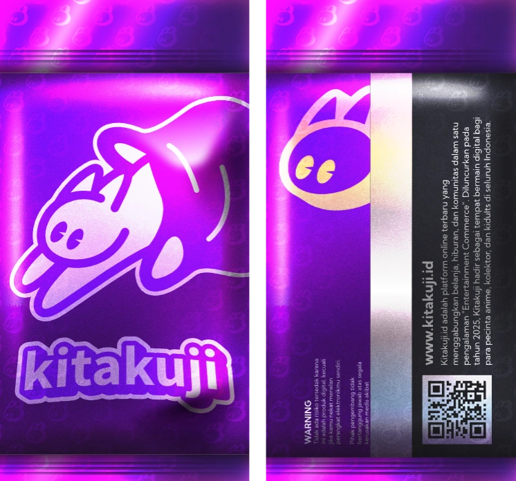
Compared to the existing flat graphics, the new pack design more closely mirrors real-world foil booster packs.
The pack artwork is applied as a masked image layer over the base shape. Because those images are data-bound, the card pack art can be dynamically updated from the backend, allowing us to use different art for different sets.
Using an image also allows us to use Mesh Deformation to more freely animate the image instead of having to animate a flat rectangle, increasing the 3D feel. This was especially helpful during the tear animations, where I could physically bend and twist the wrapper as it opens.
In the future, we plan to feature more detailed artwork of our new brand mascot, which I am also developing, to further align with the pack design conventions of popular TCGs like Pokemon or One Piece.
THE INFINITE CAROUSEL
Upon choosing your set in the app, the Rive file loads and presents you with an infinite carousel of card packs.
The carousel uses a List Property containing instances of a card pack Component, paired with a Scroll Constraint. We can tweak things like scrolling momentum, friction, and elastic snapping, making the carousel itself fun to play with.
I also brought over Pokemon Pocket's attention to detail. Some packs have a small chance to spawn with subtle anomalies, like appearing slightly bent or flipped over. These are purely cosmetic, but they break visual monotony and fuel fun user speculation about whether a bent pack holds better luck, which is what happened with Pokemon Pocket.
Initially, we allowed users to flip packs during this carousel scene, exactly like Pocket. However, it ended up being computationally expensive, so you flip over packs on the next screen instead.
There is also a countdown timer built using custom Scripting and data binding. It gives users a soft nudge so they do not get stuck endlessly scrolling, subtly signalling that it's time to make a choice.
TEARING INTO YOUR PACKS
Once the user taps a pack from the carousel, the camera zeroes in.
When this happens, it's actually a disguised match cut, changing the simpler Component used for the infinite scroll, with a more detailed Component with all the tearing behaviors. This is a common practice in video games, where you invisibly swap a low-res model with a high-res one when necessary. After all, good product design has to respect real-world hardware realities, and we want to make our product playable even for users with lower-end phones.
Users can swipe left or right to tear off the top wrapper, triggering different tearing animations. Look closely at the tearing animation itself, and see how the image is deformed to convey a better sense of depth.
Alongside a subtle on-screen text prompt, an automated gesture hint plays if the user hesitates for a few seconds. This wordless tutorial guides first-time users naturally without interrupting their flow.
[Half the cursor moving around, half the custom script being scrolled down]
To give touch swipes and cursor movements a physical sense of momentum, I added a dynamic cursor trail effect. I wrote a custom script that draws procedural vector paths directly to the canvas.
As the user drags across the screen, the script calculates pointer velocity and renders layered strokes of varying widths and opacities. This creates a responsive, tapered trail that visually anchors the user's gesture directly to the foil tear.
Admittedly it's a little choppy when slowed down, but hopefully as Rive technology develops, tapered strokes can be a built-in feature instead of something you have to finagle yourself.
YOU CAN DO IT FROM BEHIND, TOO
Tapping the pack itself instead of swiping flips it over, letting the user inspect the back and even tear it open from behind.
In game design, there is a popular tongue-in-cheek test called "Can You Pet the Dog?", where games that allow that level of non-essential, albeit fun interactivity is praised. Do you need to open it from the back? No. Is it fun that we let you? Yes.
The back-opening sequence is one of my favorite animations in the project because it showcases the metallic foil texture underneath. The tear uses frame-by-frame vertex animation and image deformation to mimic the satisfying peeling of physical foil packaging.
THE PRIZE REVEAL
After the tear, the card slides out to reveal the item. All prize data, including the card image, item name, and rarity tier, are injected dynamically from the backend. The background starbust element also changes to match the item's rarity.
The audio cue for rare pulls was a deliberate brand decision. The name Kitakuji combines "Kita" ("we" in Indonesian) and "Kuji" ("lottery" in Japanese, familiar from Ichiban Kuji). However, I pointed out that "Kitaaa!~" is also an excited Japanese exclamation meaning "It's here!" or "We got it!" which is exactly what a collector feels when landing a rare pull.
Further user testing also showed a fun moment where, when playing as a group, hearing the audio cue from your friend creates a hype moment where everyone in the room knows you pulled something rare. This is great for Kitakuji, as they also do live events sometimes.
Now's a good time to mention the sound design overall as well. Not just the "Kitaaa!~" audio cue, but the rustle of multiple packs moving together, the tear followed by a subtle audio sting, as well as the Japanese-inspired EDM track taken from the talented artists over at DOVA-SYNDROME.
CONCLUSION
Despite housing state machines, gesture tracking, custom scripts, and embedded audio, the entire Rive file compiles down to a lean 200KB.
This release represents a massive leap forward for Kitakuji's unboxing experience, but it is just the first iteration. As I continue auditing and upgrading other aspects in our end-to-end product experience, we'll surely come back to this major aspect of it.
If you are curious about any of the specific Rive rigs, state machines, or code setups used here, feel free to drop a Comment or reach out directly.
Like this project
Posted Aug 5, 2026
Interactive digital card pack opening for Kitakuji, and my attempt to replicate the polish of Pokemon Pocket. Inspect packs and swipe to tear them open.
Likes
2
Views
74