Brand System Development | Home-living
Great Minds Think Alike
Building a Complete Brand System for MUKO
MUKO is a home-living and furniture brand focused on comfort, softness, and modern organic form. The brand came to us with nothing but a raw idea:
“We want to feel warm, premium, and soft, like living inside comfort.”
They needed a full brand built from zero: identity, visual system, product storytelling, catalog direction, and digital presence.
📍Objective
To build a complete brand identity and visual world that communicates:
softness & comfort
modern organic aesthetics
premium lifestyle mood
warmth through color & texture
product-first storytelling
The goal: Create a brand that feels tactile, elegant, inviting, and ready to compete in the home-living and interior category.
📍Strategic Creative Thinking
Soft Geometry
Rounded forms, smooth typography, and product-inspired curves to express comfort and softness.
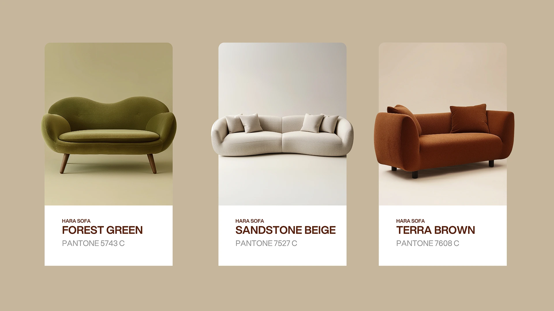
Earth-Toned Warmth
Warm neutrals, beige, terracotta, and muted taupe shades to evoke calm, grounding, and modern living.
Minimal Lifestyle Luxury
A clean, Scandinavian-influenced visual language that highlights shape, texture, and space.
Product-Driven Storytelling
Every visual centers on the sensorial experience: plush surfaces, rounded seats, cozy corners, and tactile fabrics.
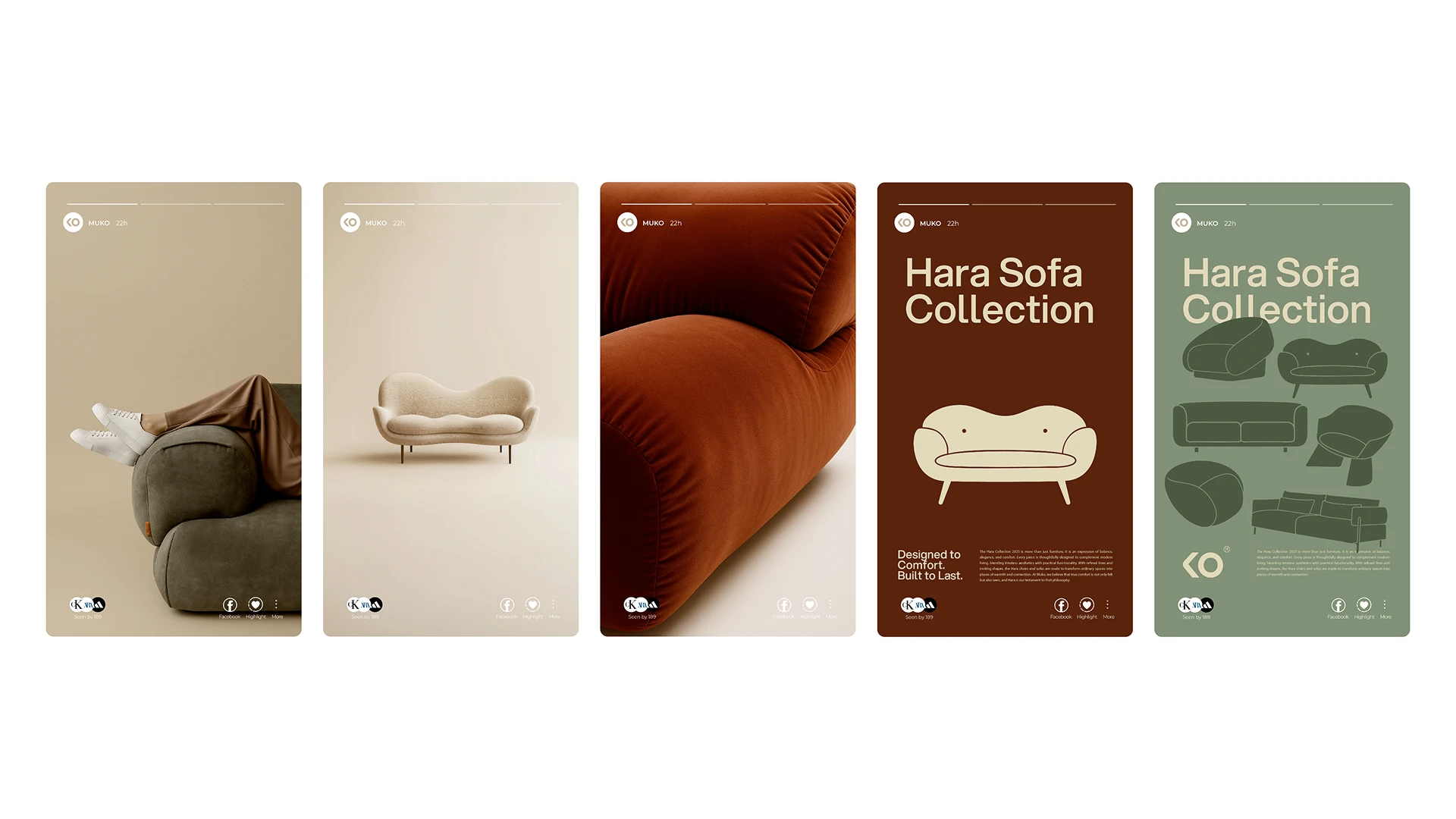
📍What We Built
Core Brand Identity
Primary logo (MUKO wordmark)
Secondary icon (soft geometric emblem)
Clear space & usage rules
Typographic system
Warm, organic color palette
Shape language inspired by furniture silhouettes
Visual System & Lifestyle Direction
Home-living brands succeed when the audience can feel the comfort through the visuals.
Like this project
Posted Dec 3, 2025
Brand identity, logo design, visual system, and lifestyle branding for MUKO, a modern home-living and furniture brand.