Flink Creative - Mobile Responsive The
Bearplus Fullstack Agency
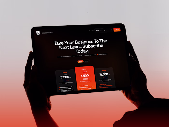
Flink Creative - Mobile Responsive
The mobile experience is crafted to feel premium yet effortless, with a bold hero, clear typography, and flow optimized for thumbs. Navigation tucks neatly into a compact menu, while primary CTAs stay highly visible, making it easy for busy founders to explore unlimited design, development, and marketing services on the go.
The layout keeps the signature branding and strong contrast intact, ensuring the visual identity remains instantly recognizable even on smaller screens.
Like this project
Posted Mar 22, 2026
Flink Creative - Mobile Responsive The mobile experience is crafted to feel premium yet effortless, with a bold hero, clear typography, and flow optimized fo...
Likes
0
Views
0