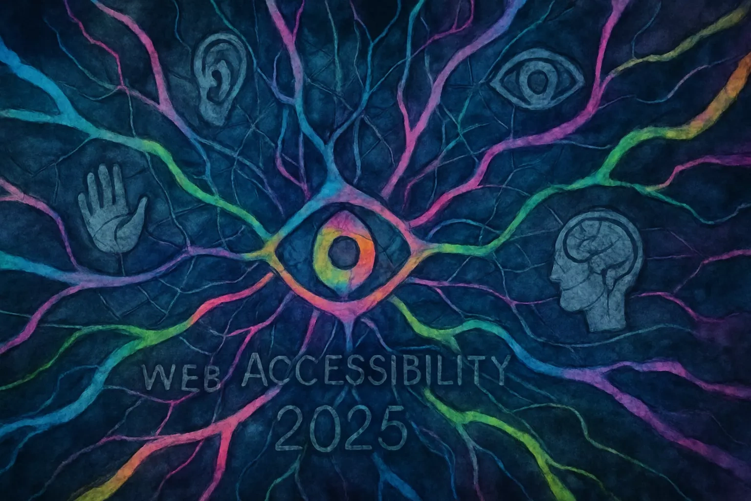
Web Accessibility in 2025: A Guide to Inclusive Design
Rebecca Person
Web Accessibility in 2025: A Guide to Inclusive DesignWhy Web Accessibility is CrucialProviding Equal Access and OpportunityImproving the User Experience for EveryoneExpanding Your Audience and Market ReachLegal and Compliance RequirementsUnderstanding WCAG: The Four Principles of AccessibilityPerceivableOperableUnderstandableRobustPractical Tips for Accessible DesignEnsure Sufficient Color ContrastUse Headings and Structure to Organize ContentDesign Forms with Clear Labels and InstructionsTools for Testing Web AccessibilityAutomated Checkers: WAVE and LighthouseScreen Readers: NVDA and VoiceOverManual and Professional AuditsConclusionReferences
Web Accessibility in 2025: A Guide to Inclusive Design
Web accessibility is the practice of ensuring websites are usable by everyone, regardless of disability. It's not just about checking boxes for legal compliance—it's about creating digital spaces where every person can participate fully. As we move deeper into 2025, accessibility has become a cornerstone of good design and social responsibility.
Think about how often you use the web each day. Now imagine if you couldn't see the screen, use a mouse, or process information the same way others do. For millions of people, this is reality. That's why understanding accessibility matters more than ever, especially as we integrate Conversational UI elements and explore the future of immersive web experiences. If you're ready to make your digital presence more inclusive, you can hire accessibility-focused web designers who specialize in creating barrier-free experiences.
Why Web Accessibility is Crucial
Creating accessible websites goes far beyond meeting minimum requirements. It's about recognizing the web as an essential service and ensuring everyone can use it effectively. When we build with accessibility in mind, we're not just helping people with disabilities—we're creating better experiences for everyone.
Providing Equal Access and Opportunity
The internet has become as essential as electricity or running water. We use it to apply for jobs, access healthcare, manage finances, and stay connected with loved ones. When websites aren't accessible, we're essentially locking people out of modern life.
Consider Sarah, a blind software developer who uses a screen reader. Without proper accessibility features, she can't apply for jobs on company websites, even though she's perfectly qualified. Or think about Marcus, who has cerebral palsy and relies on voice commands. If a website only works with mouse clicks, he's excluded from participating.
This isn't just unfortunate—it's a violation of basic human rights. The United Nations recognizes internet access as a human right, and that access means nothing if the content itself creates barriers. Every person deserves the chance to learn, work, and connect online.
Improving the User Experience for Everyone
Here's something that might surprise you: accessible design makes websites better for everyone, not just people with disabilities. It's like curb cuts on sidewalks. Originally designed for wheelchair users, they now help parents with strollers, delivery workers with hand trucks, and anyone pulling luggage.
The same principle applies online. Video captions help deaf users, sure. But they also help someone watching videos in a noisy coffee shop or a parent trying not to wake a sleeping baby. High-contrast text aids people with low vision, but it's also easier to read when you're outside on a sunny day.
Clear navigation structures benefit users with cognitive disabilities. They also help anyone who's multitasking or in a hurry. Simple, descriptive link text assists screen reader users while making content more scannable for speed readers. When we design for accessibility, we design for real-world use cases.
Expanding Your Audience and Market Reach
Let's talk numbers. Over one billion people worldwide have some form of disability. In the United States alone, that's about 61 million adults. These individuals control over $490 billion in disposable income annually. Yet many businesses unknowingly turn away these customers with inaccessible websites.
Think about it from a business perspective. If your physical store had steps but no ramp, you'd lose wheelchair-using customers. The same logic applies online. An inaccessible website is like hanging a "closed" sign for millions of potential customers.
Beyond direct purchasing power, consider the network effect. People with disabilities have families, friends, and colleagues. When they can't use your website, they'll tell others. When they have a great experience, they'll spread that word too. Accessibility isn't charity—it's smart business.
Legal and Compliance Requirements
While the moral and business cases for accessibility are compelling, there's also a legal imperative. In the United States, the Americans with Disabilities Act (ADA) increasingly applies to digital spaces. Courts have ruled that websites are places of public accommodation, just like physical stores.
The Web Content Accessibility Guidelines (WCAG) have become the international standard for digital accessibility. Many countries have adopted these guidelines into law. Non-compliance isn't just risky—it's expensive. Accessibility lawsuits have skyrocketed in recent years, with settlements often reaching six figures.
But focusing solely on avoiding lawsuits misses the point. Legal compliance should be the floor, not the ceiling. The real goal is creating genuinely inclusive experiences that welcome all users.
Understanding WCAG: The Four Principles of Accessibility
The Web Content Accessibility Guidelines might sound intimidating, but they're built on four simple principles. Think of them as POUR: Perceivable, Operable, Understandable, and Robust. Each principle addresses a different aspect of how people interact with web content.
Perceivable
Information must be presentable in ways users can perceive. This sounds obvious, but it's where many websites fail. Not everyone experiences content the same way.
For visual content, this means providing alternatives. Every image needs descriptive alt text that conveys its meaning or function. Videos require captions and audio descriptions. Color can't be the only way to convey information—think about forms that only use red to indicate errors.
Text needs sufficient size and contrast. Fancy fonts might look cool, but if people can't read them, they're useless. Background images or patterns can make text impossible to see for users with certain visual conditions. The key question: Can users perceive your content through at least one of their senses?
Operable
Users must be able to operate all interface components. This principle recognizes that not everyone uses a mouse or touchscreen. Some navigate entirely by keyboard. Others use voice commands or eye-tracking devices.
Every interactive element—links, buttons, forms—must work without a mouse. Users should be able to tab through options in a logical order. Focus indicators need to be visible so people know where they are on the page.
Timing matters too. If content disappears after five seconds, users with motor impairments might not have time to read it. Flashing content can trigger seizures in some users. Auto-playing videos can disorient users with cognitive disabilities. Give people control over their experience.
Understandable
Content and interfaces must be understandable. This goes beyond using plain language (though that's important too). It's about creating predictable, consistent experiences.
Navigation should work the same way across your entire site. If clicking a logo takes users home on one page, it should do that everywhere. Forms need clear labels and helpful error messages. Don't just say "Error" - explain what went wrong and how to fix it.
Language should be appropriate for your audience. Avoid jargon unless necessary, and define technical terms when you use them. Break complex information into digestible chunks. Use headings, lists, and white space to make content scannable.
Robust
Content must work reliably across different browsers, devices, and assistive technologies. This principle ensures your site remains accessible as technology evolves.
Clean, standards-compliant code is essential. When you use proper HTML elements for their intended purpose, assistive technologies can interpret them correctly. A button should be a button element, not a styled div with a click handler.
Test your site with various tools and technologies. What works in Chrome might break in Firefox. A site that's perfect on desktop might be unusable on mobile. Screen readers interpret code differently than visual browsers. Robust content works everywhere.
Practical Tips for Accessible Design
Making your website accessible doesn't require starting from scratch. Small changes can make a big difference. Here are practical steps you can implement today.
Ensure Sufficient Color Contrast
Color contrast might seem like a minor detail, but it's crucial for readability. Low contrast makes text difficult to read for everyone, but it's especially problematic for users with low vision or color blindness.
The WCAG provides specific contrast ratios: 4.5:1 for normal text and 3:1 for large text. These numbers might seem arbitrary, but they're based on extensive research. Meeting these standards ensures text remains readable in various conditions.
Free tools make checking contrast easy. The WebAIM contrast checker lets you test color combinations instantly. Browser extensions like WAVE flag contrast issues automatically. Many design tools now include built-in contrast checking.
Remember that contrast needs change with context. Text over images requires special attention. Mobile screens in bright sunlight demand higher contrast. Test your designs in real-world conditions, not just on your perfectly calibrated monitor.
Use Headings and Structure to Organize Content
Proper heading structure is like a table of contents for your web page. It helps all users scan and understand content quickly. For screen reader users, it's absolutely essential for navigation.
Start with one H1 that describes the page's main topic. Use H2s for major sections, H3s for subsections, and so on. Never skip levels—don't jump from H1 to H3. Think of it like an outline where each level nests under the previous one.
Good structure benefits everyone. Sighted users scan headings to find relevant information. Search engines use heading structure to understand your content. Screen reader users navigate by jumping between headings. Well-structured content is easier to read, understand, and navigate.
Don't use headings just for visual styling. If you want big, bold text that isn't a heading, use CSS to style a paragraph. Conversely, don't use bold paragraphs when you really mean headings. Semantic HTML matters.
Design Forms with Clear Labels and Instructions
Forms are where many accessibility efforts fall apart. Yet they're often the most important part of a website—how users sign up, make purchases, or contact you. Poor form design frustrates everyone but can completely block users with disabilities.
Every form field needs a label that clearly describes what information goes there. Don't rely on placeholder text alone—it disappears when users start typing. Labels should be visually associated with their fields and programmatically connected in the code.
Provide instructions before the form, not after. If a password needs specific requirements, say so upfront. Use clear error messages that explain what went wrong and how to fix it. "Invalid input" helps no one. "Password must be at least 8 characters" gives users actionable information.
Group related fields together. Use fieldsets and legends for sections like billing and shipping addresses. This organization helps all users but is especially valuable for screen reader users who hear the grouping announced.
Tools for Testing Web Accessibility
Testing accessibility doesn't require expensive consultants or complex setups. Many excellent tools are free and easy to use. Regular testing helps catch issues early when they're easier to fix.
Automated Checkers: WAVE and Lighthouse
Automated tools provide a great starting point for accessibility testing. They can quickly scan your pages and flag common issues like missing alt text, poor contrast, or improper heading structure.
WAVE (Web Accessibility Evaluation Tool) offers both a web interface and browser extension. It overlays icons on your page showing accessibility features and errors. The visual presentation makes it easy to see exactly where problems occur. It's particularly helpful for catching issues that are easy to miss, like empty links or missing form labels.
Google's Lighthouse comes built into Chrome DevTools. It runs accessibility audits alongside performance and SEO checks. The report includes specific suggestions for fixing issues and links to relevant documentation. Lighthouse also estimates how each fix will impact your accessibility score.
Remember that automated tools only catch about 30% of accessibility issues. They can't judge whether your alt text is actually descriptive or if your content makes logical sense. Think of them as spell checkers—helpful, but not a replacement for human review.
Screen Readers: NVDA and VoiceOver
Testing with actual screen readers gives you invaluable perspective on how users with visual impairments experience your site. It's often eye-opening (or ear-opening) to hear your content read aloud.
NVDA (NonVisual Desktop Access) is a free, open-source screen reader for Windows. It's used by many people who are blind or have low vision. Download it, turn off your monitor, and try navigating your site. Can you find what you need? Does the content make sense when read linearly?
Mac users have VoiceOver built into their system. Press Command+F5 to start it. VoiceOver includes excellent tutorials that teach you basic navigation commands. iOS devices also include VoiceOver, letting you test mobile accessibility.
Don't worry about becoming an expert screen reader user. Even basic testing reveals major issues. If you can't figure out how to navigate your own site with a screen reader, neither can your users.
Manual and Professional Audits
While tools are incredibly helpful, comprehensive accessibility requires human judgment. Manual testing catches issues automated tools miss and provides context for fixing problems effectively.
Start with keyboard-only navigation. Unplug your mouse and try using your site. Can you reach every interactive element? Is it clear where you are on the page? Do dropdowns and modals work properly? This simple test reveals many operability issues.
Consider hiring accessibility professionals for thorough audits. They bring expertise in assistive technologies and understand how different disabilities affect web use. Professional audits typically include detailed reports with specific recommendations and priority levels for fixes.
User testing with people who have disabilities provides the most valuable feedback. They use assistive technologies daily and can spot issues experts might miss. Many organizations specialize in connecting businesses with testers who have various disabilities. Their insights are worth the investment.
Conclusion
Web accessibility isn't a trend or a nice-to-have feature—it's fundamental to creating an inclusive digital world. As we've seen, accessible design benefits everyone, from users navigating in challenging conditions to businesses reaching broader markets.
The four WCAG principles—Perceivable, Operable, Understandable, and Robust—provide a solid framework for thinking about accessibility. But principles mean nothing without action. Start small. Check your color contrast. Add proper headings. Test with a keyboard. Each improvement makes your site more welcoming.
Remember, accessibility is a journey, not a destination. Technology evolves, standards update, and user needs change. What matters is starting now and continuing to improve. Your users—all of them—deserve nothing less.
The web has incredible power to connect, inform, and empower. By making our digital spaces accessible, we ensure that power reaches everyone. That's not just good design or good business. It's the right thing to do.
References
Like this project
Posted Jun 30, 2025
Accessibility is not optional. Learn about the latest WCAG standards, essential tools, and design principles to create websites that are inclusive and usable for everyone.