
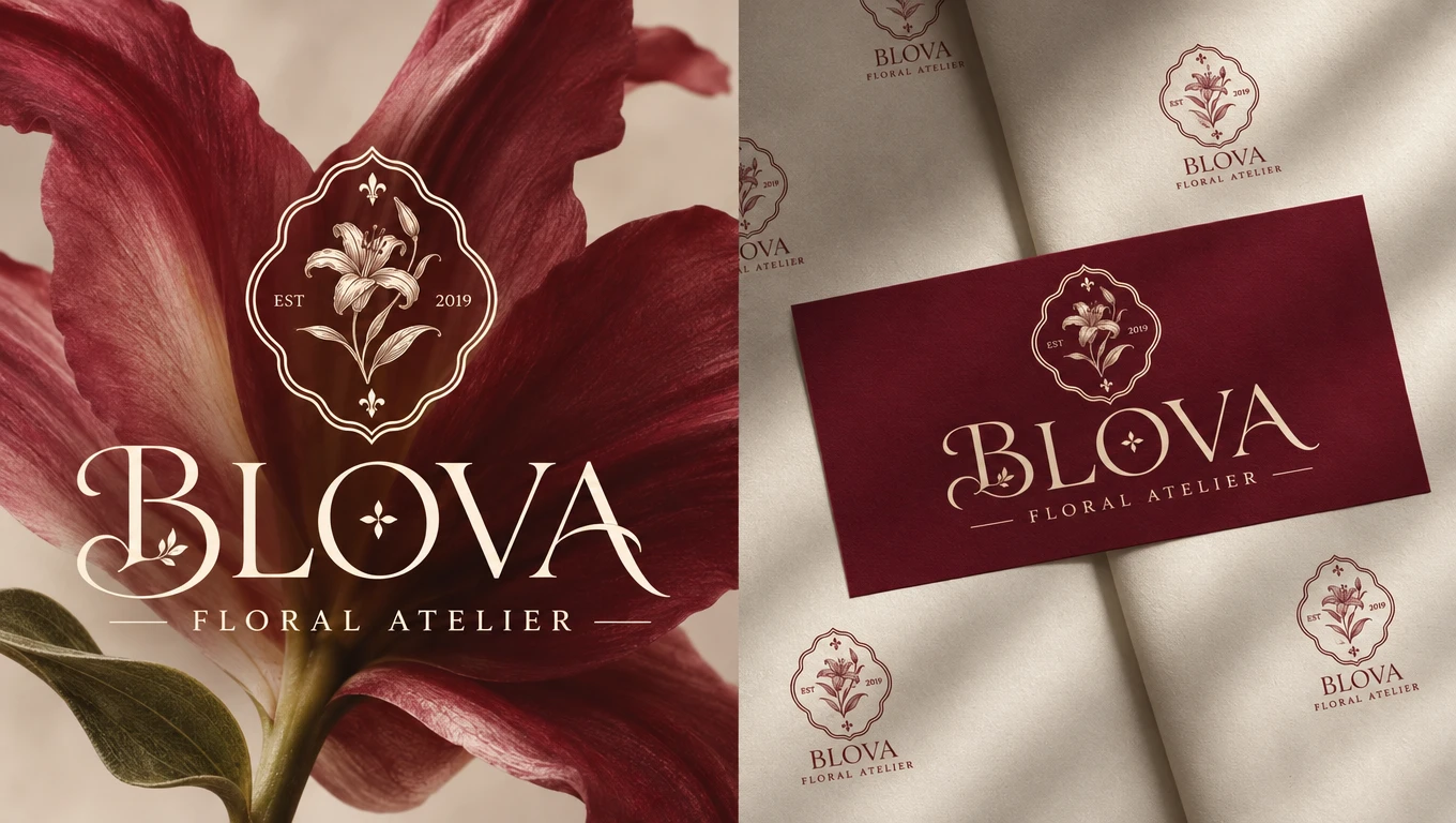
01 / About the Brand
BLOVA is a contemporary floral atelier built around the beauty of flowers, thoughtful arrangements, and meaningful gifting. The brand brings together the natural elegance of floristry with a refined boutique experience, offering floral creations that feel personal, expressive, and timeless.
The goal was to develop a distinctive brand identity that moves beyond traditional florist aesthetics. BLOVA needed a visual language that feels sophisticated and artistic while maintaining the warmth and emotion associated with flowers. Inspired by Italian elegance, botanical heritage, and the charm of independent floral boutiques, the identity was designed to give BLOVA a recognizable and memorable presence.
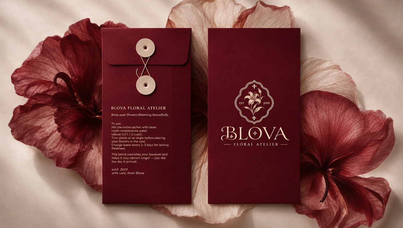
02 / The Strategy & Creative Direction
The creative direction focused on balancing botanical delicacy with a confident, sophisticated visual character. Rather than relying on predictable floral symbols or overly romantic styling, the approach explored decorative typography, ornamental details, and a more distinctive interpretation of floral identity.
Italian-inspired visual references, heritage-inspired design elements, and refined editorial compositions shaped the overall direction. The intention was to create a brand that feels established and timeless, yet contemporary enough to stand apart in the modern floral market.
A rich burgundy foundation introduces depth and character, while warm ivory softens the palette and creates visual balance. Together, these elements establish an atmosphere that feels intimate, elegant, and distinctly premium.
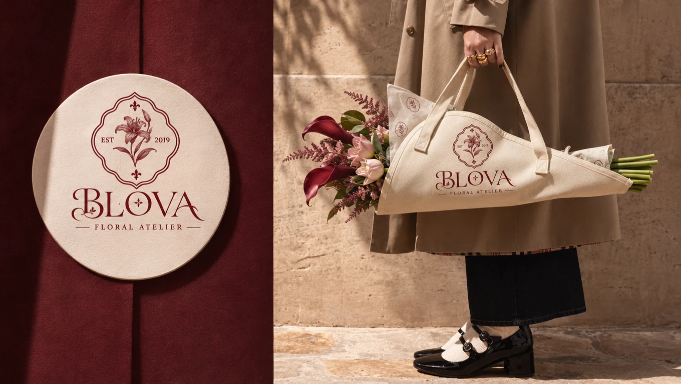
03 / The Visual Identity
At the center of the identity is a custom BLOVA wordmark, developed with expressive serif typography and distinctive decorative details. Its letterforms were designed to create a recognizable personality, combining the elegance of traditional typography with a contemporary boutique sensibility.
An original botanical emblem extends the identity beyond the primary logo, providing a secondary visual signature for smaller applications and brand details. Complementary logo arrangements create flexibility across different formats, while the FLORAL ATELIER descriptor reinforces the brand's positioning.
The typography system, ornamental elements, and logo variations work together to create a cohesive identity that feels artistic without becoming overly decorative.
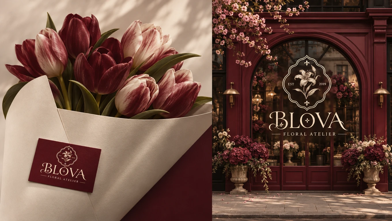
04 / The Color & Typography System
The color palette is built around deep burgundy, wine red, and warm ivory. Burgundy gives the brand its signature character, adding richness and a sense of heritage, while ivory introduces contrast and creates a softer, more tactile visual experience.
The typography follows the same balance between elegance and personality. Expressive serif lettering establishes the primary identity, supported by carefully selected complementary typography for secondary information, product details, and printed communication.
Together, the color and typography systems create a consistent visual language that can adapt across both minimal and more expressive brand applications.
05 / The Brand Applications
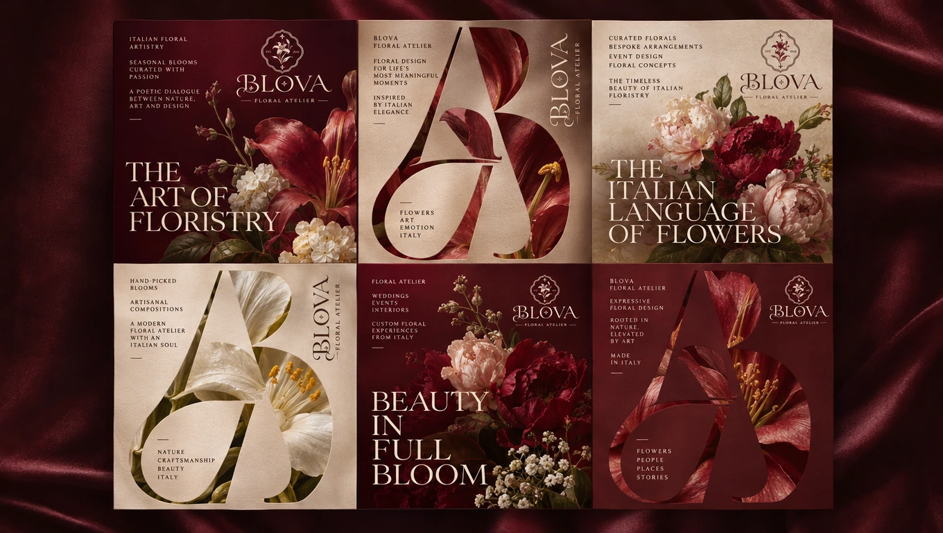
The identity was translated into a collection of branded applications designed to make the BLOVA experience recognizable beyond the logo itself.
Bouquet wrapping papers, custom ribbons, floral labels, stickers, and printed cards extend the visual language into the everyday experience of receiving and gifting flowers. Packaging and presentation materials bring together the brand's signature burgundy tones, refined typography, and botanical emblem.
Each application was considered as part of one connected system, ensuring that even the smallest details contribute to the overall brand experience.
06 / Art Direction & Brand Experience
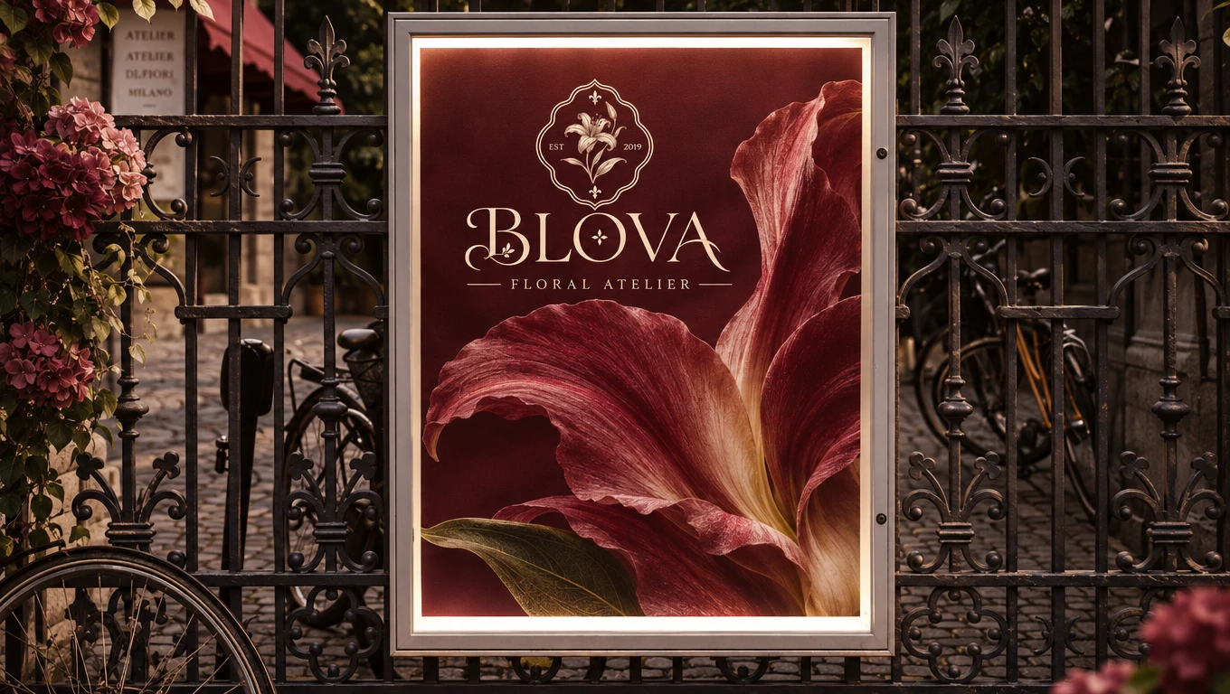
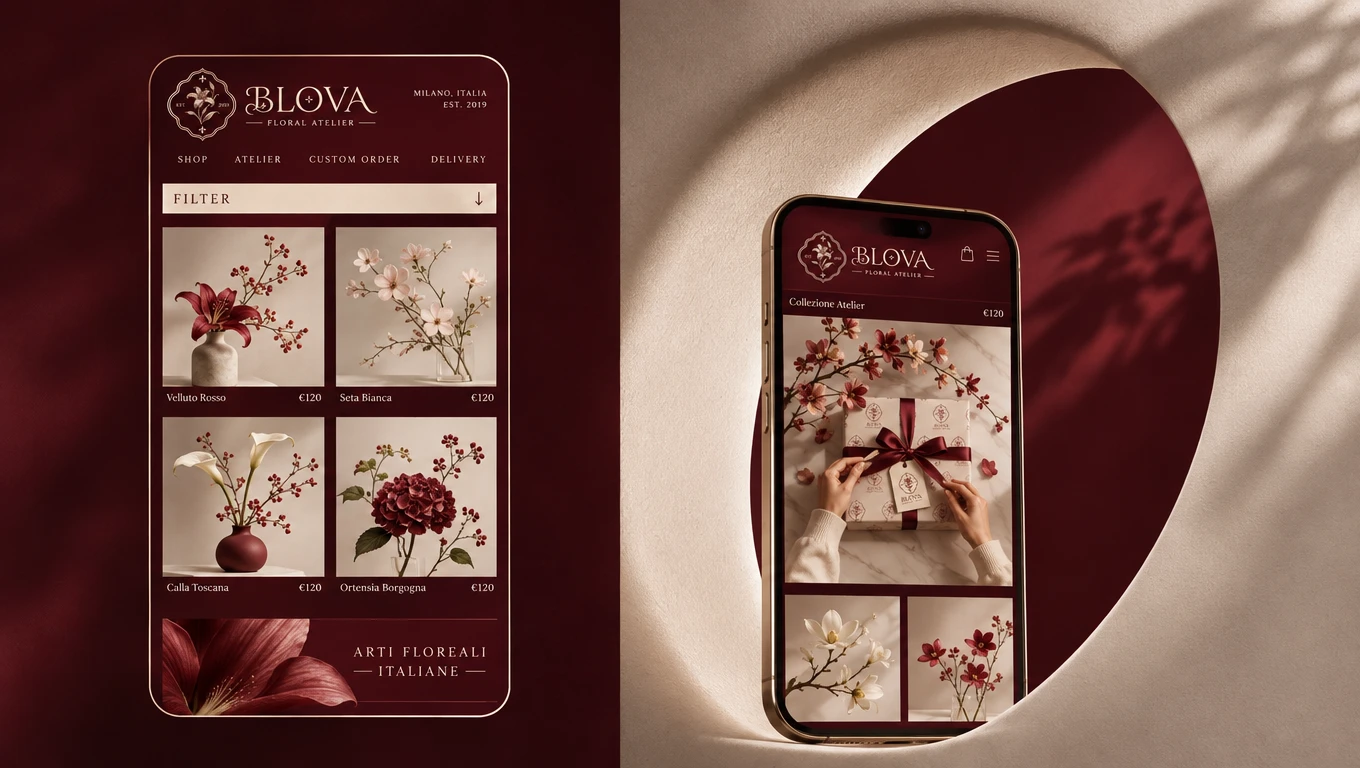
The visual world of BLOVA was developed around a distinctive Italian-inspired atmosphere. Rich burgundy settings, warm lighting, botanical details, tactile paper surfaces, and carefully composed floral arrangements create an editorial language that supports the identity.
Product presentations and brand imagery were designed to feel like an extension of the atelier itself: elegant, intimate, and naturally expressive. Rather than treating the mockups as separate objects, the art direction connects them through consistent colors, materials, compositions, and visual details.
07 / The Outcome
The result is a cohesive visual identity that gives BLOVA a distinctive position as a contemporary premium floral atelier.
From its custom wordmark and botanical emblem to bouquet packaging, printed materials, and editorial brand imagery, every element contributes to a recognizable visual experience.
BLOVA brings together botanical beauty, Italian-inspired elegance, and contemporary design to create a floral brand identity that feels timeless, expressive, and memorable.
Thank you for taking the time to explore BLOVA.
0 likes · 0 views · Nov 21, 2026
BLOVA is a premium floral atelier inspired by Italian elegance, botanical artistry and timeless design.