
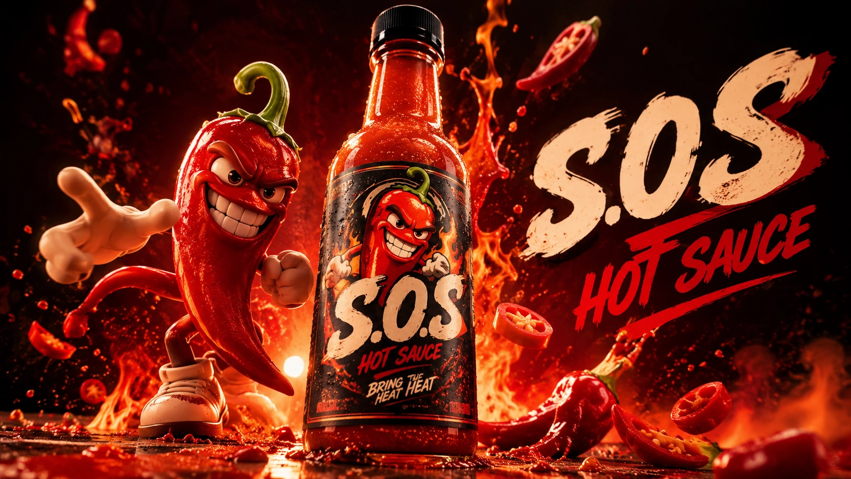
01 — About the Project
S.o.S was an emerging hot sauce brand preparing to enter the market. At the beginning of the project, the brand had a product idea and a clear ambition to launch, but its visual identity and overall brand direction had not yet been fully established.
There was no definitive answer to what S.o.S should look like, how it should communicate its personality, or how its products should stand out in a competitive hot sauce market.
Rather than immediately committing to a single visual direction, the first objective was to explore the brand's potential through different creative approaches.
The challenge was to build more than an attractive logo or a set of product labels. S.o.S needed a complete and recognizable brand world — one that could translate across its bottles, packaging, advertising, physical applications and future digital experiences.
02 — Exploring Three Different Brand Concepts
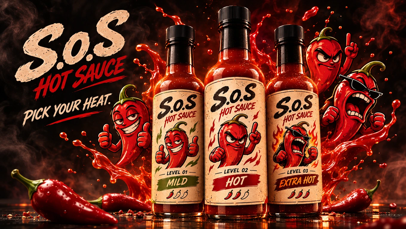
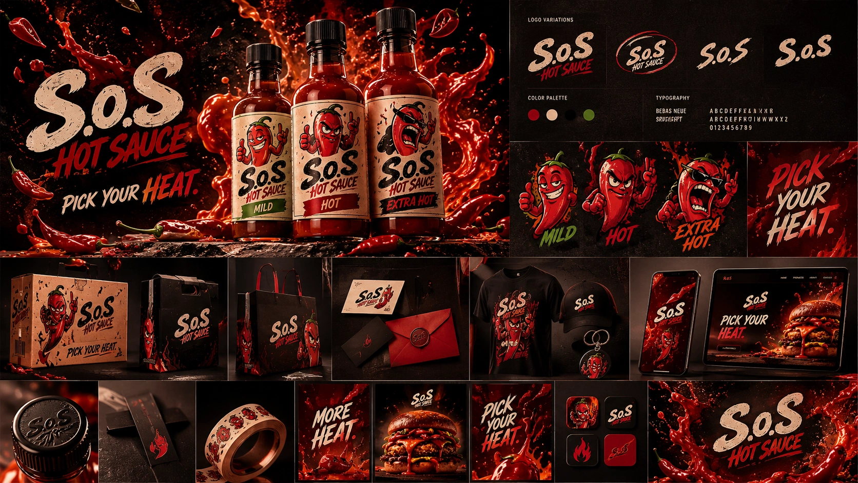
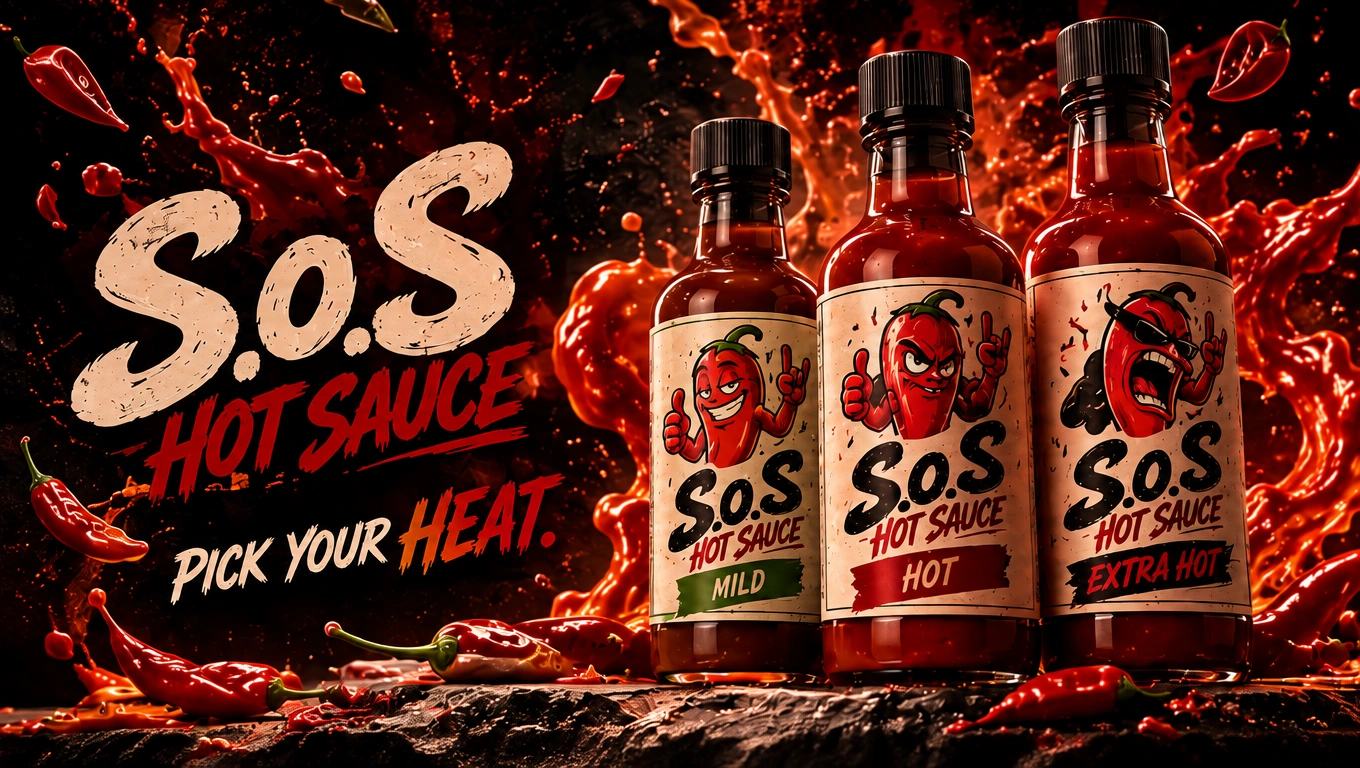
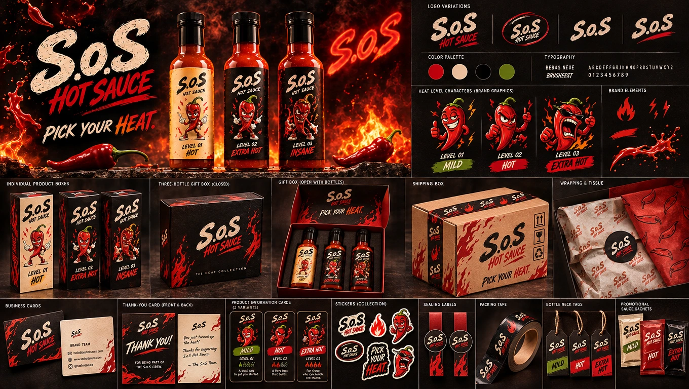
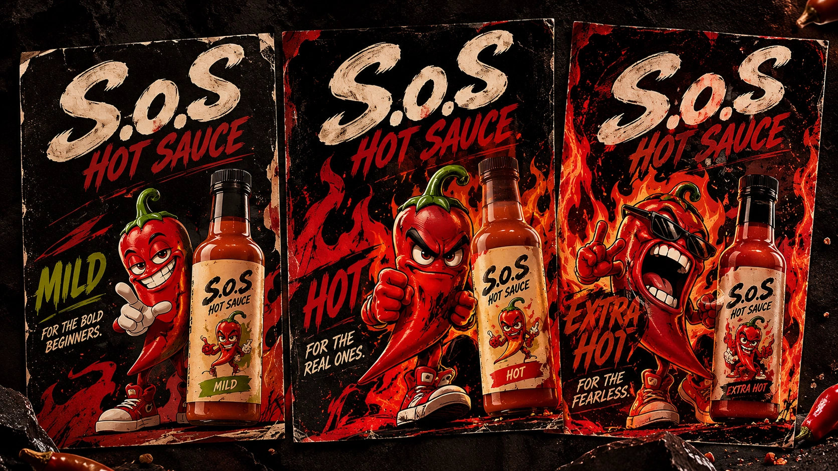
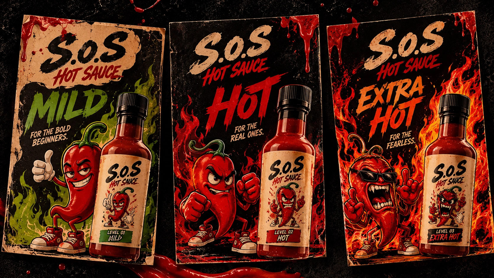
The creative process began with the development of three distinct brand concepts, each presented as an individual brand pack.
Instead of showing three isolated logo alternatives, each direction was explored as a broader identity system, allowing the brand to understand how a complete visual world could look and feel.
Each of the three concepts explored its own approach to:
Logo and visual identity.
Typography and graphic language.
Color palette and art direction.
Character and illustration style.
Hot sauce bottle and label design.
Packaging concepts and brand applications.
Overall brand personality and advertising potential.
The purpose of presenting three complete directions was to make the creative possibilities tangible.
We wanted to explore different answers to the same question:
What could S.o.S become as a brand?
Each brand pack offered a different interpretation of the brand's personality, giving us a foundation to evaluate what worked, what could be improved and which creative elements had the strongest potential.
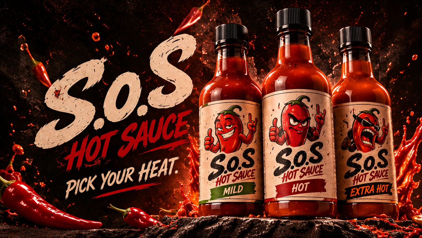
03 — Reviewing the Possibilities
Presenting the three concepts was only the beginning.
The next stage focused on examining each direction in greater detail. We evaluated the visual strengths of each concept, considered how the identity would translate to actual products and explored which elements could be developed further.
This was an important part of the process because a brand identity must work beyond a presentation board.
A logo needs to work on a bottle. An illustration needs to translate onto packaging. A color system needs to remain consistent across different materials. The visual language must also be recognizable in advertising and digital environments.
Through this exploration, we reviewed the possibilities offered by all three brand packs and used the feedback and revision process to move toward a more focused visual direction.
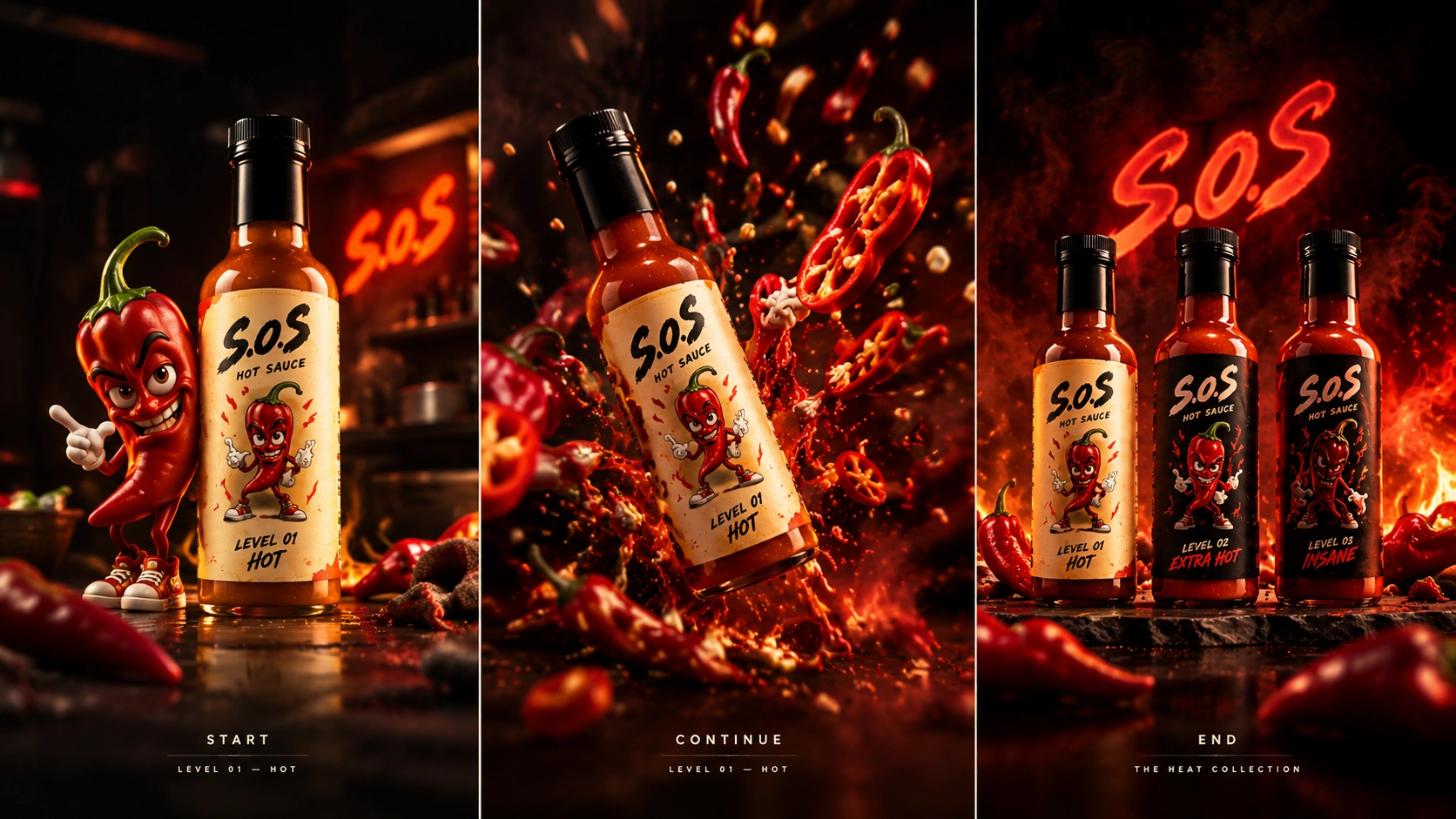
04 — Refinement & Creative Development
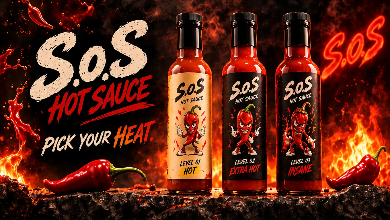
Once the preferred direction began to take shape, the focus shifted from exploration to refinement.
Rather than treating the first concepts as finished solutions, we continued developing the identity through multiple rounds of visual adjustments and design revisions.
This included refining the logo presentation, character illustrations, packaging structures, label compositions, typography and overall visual consistency.
Particular attention was given to the relationship between the three product variations:
MILD — Level 01
HOT — Level 02
EXTRA HOT — Level 03
The three products needed to feel different enough to communicate their individual heat levels while remaining part of one recognizable product family.
The goal was to create a visual system that could grow with the brand rather than a collection of disconnected packaging designs.
05 — Building the Final Brand Identity
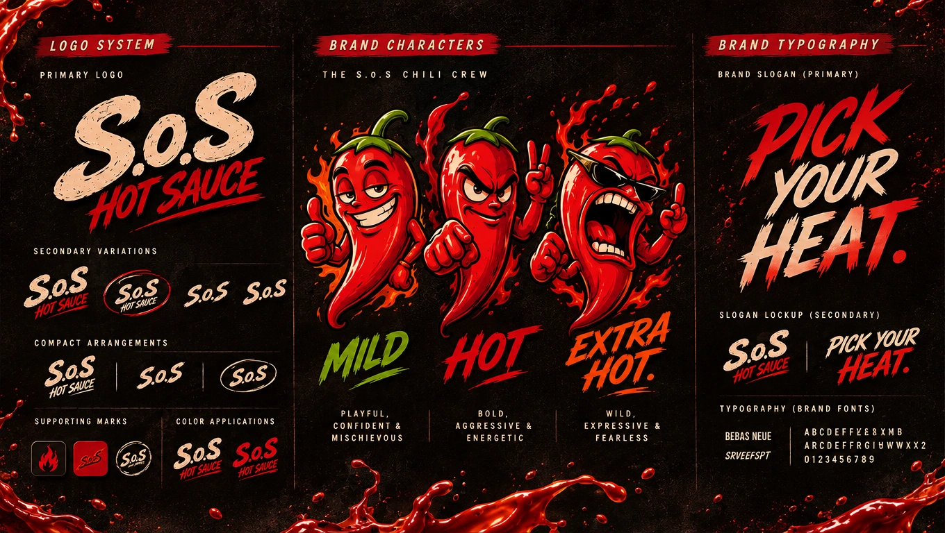
After the initial exploration and refinement stages, the final S.o.S identity evolved into a bold, expressive and character-driven hot sauce brand.
The established visual direction brings together distinctive typography, original chili character illustrations, strong colors and a coordinated packaging language.
The three heat levels became an important part of the brand's personality.
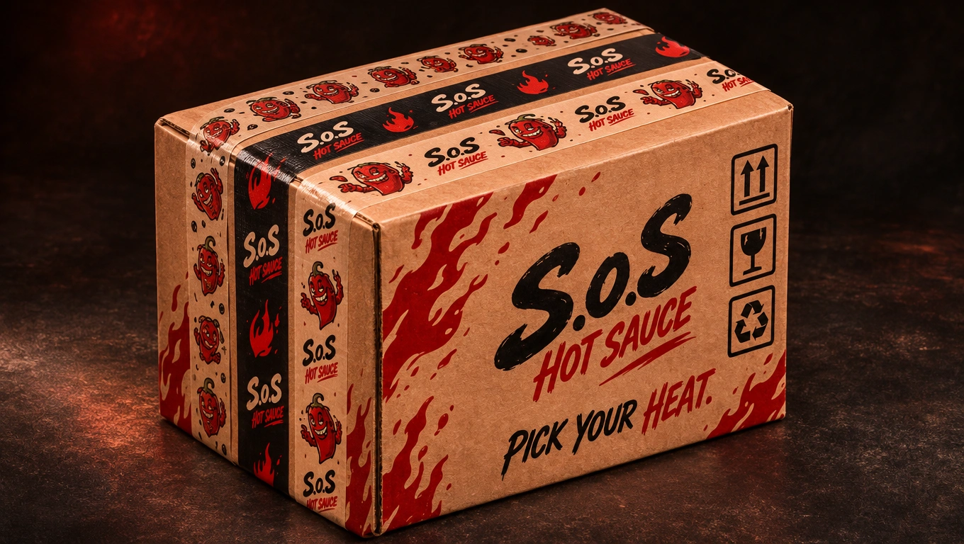
PICK YOUR HEAT.
This phrase became a natural expression of the product range and the overall attitude of S.o.S.
The final identity was developed to be recognizable across different scales and applications, from a small bottle label to large advertising compositions.
06 — Packaging & Product Applications
With the core identity established, the visual system was extended into a complete packaging collection.
The development included:
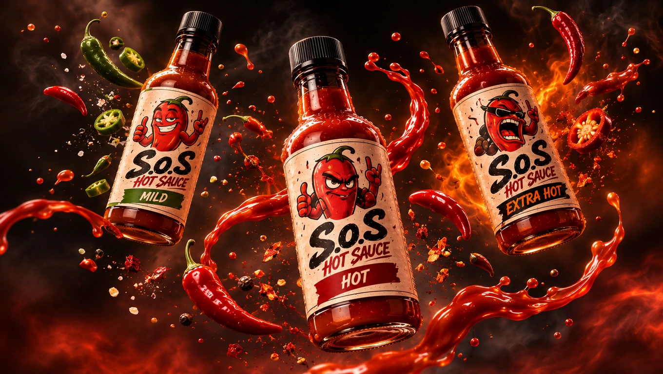
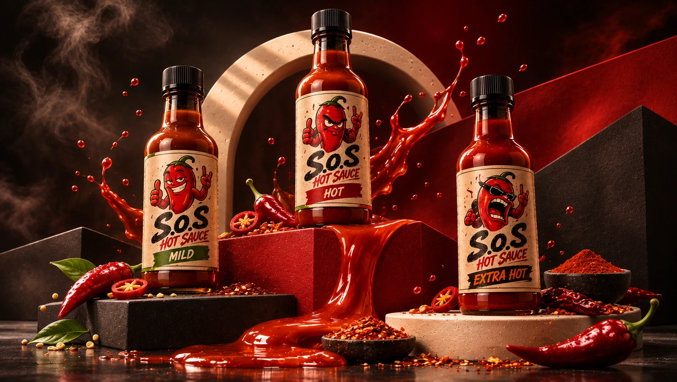
Individual MILD, HOT and EXTRA HOT bottle labels.
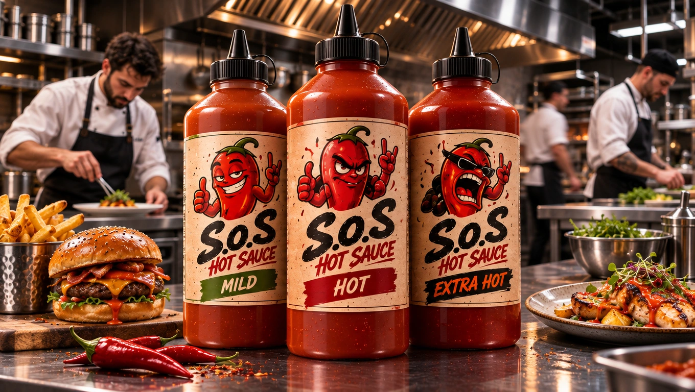
Standard and larger foodservice bottle concepts.
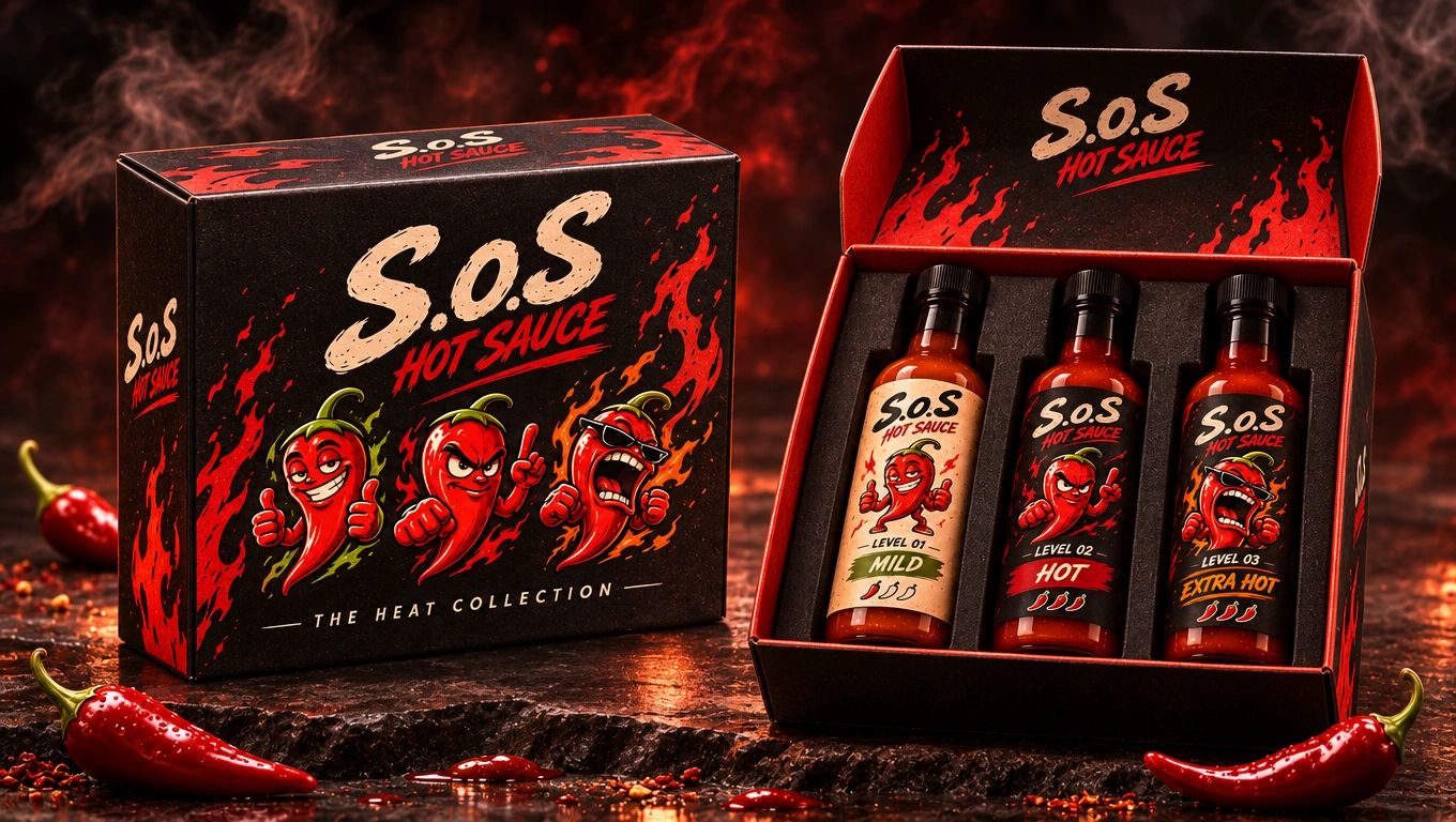
Three-bottle gift packaging. Open and closed gift box presentations.
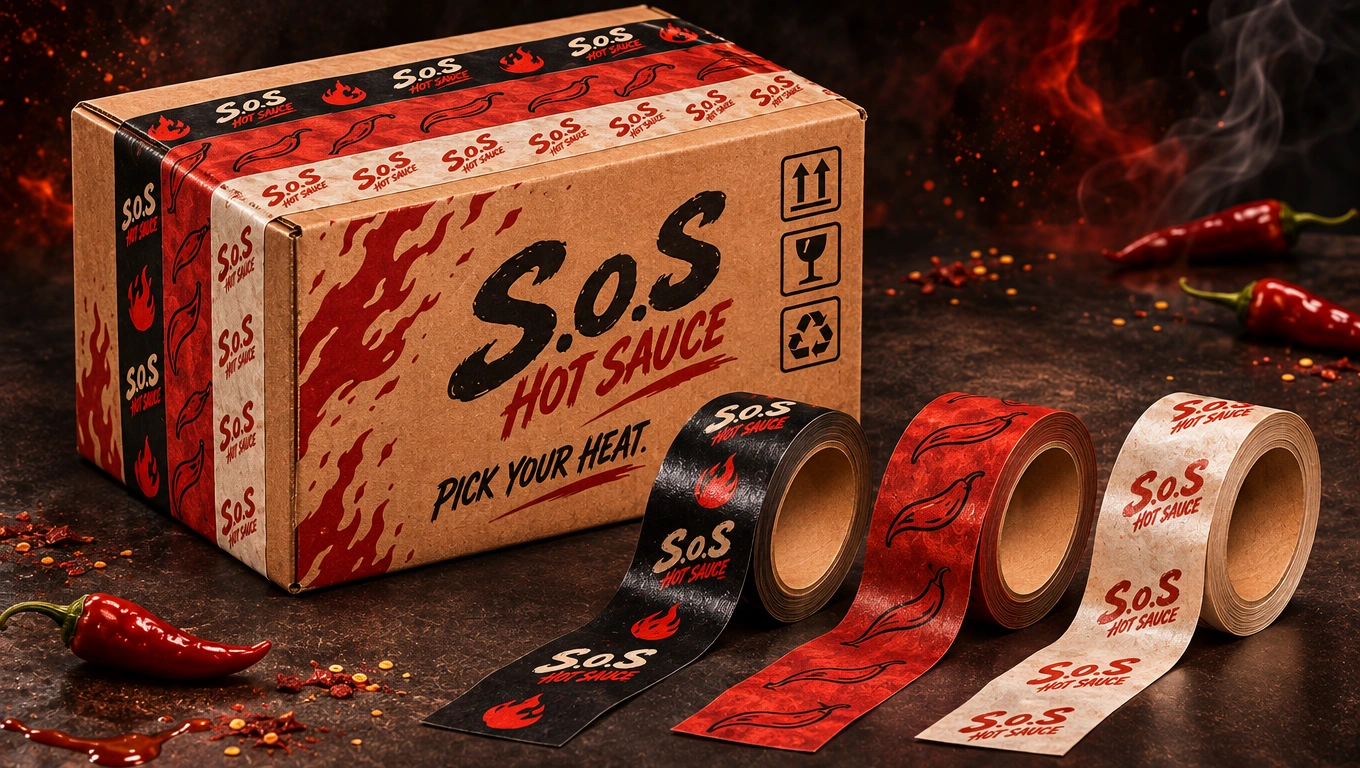
Shipping boxes and branded packing tapes.
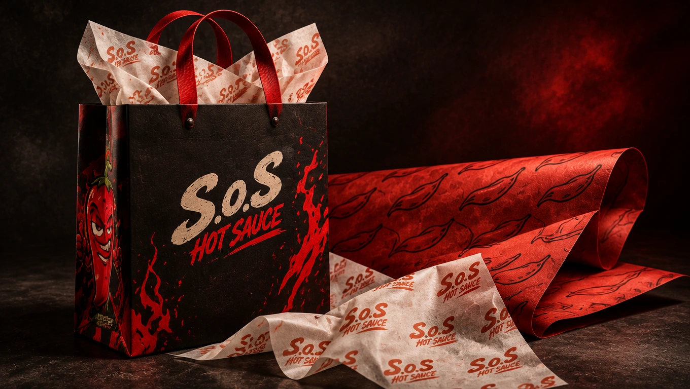
Shopping bags, wrapping paper and tissue paper.
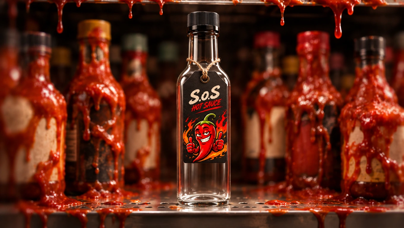
Standart bottle neck tag.
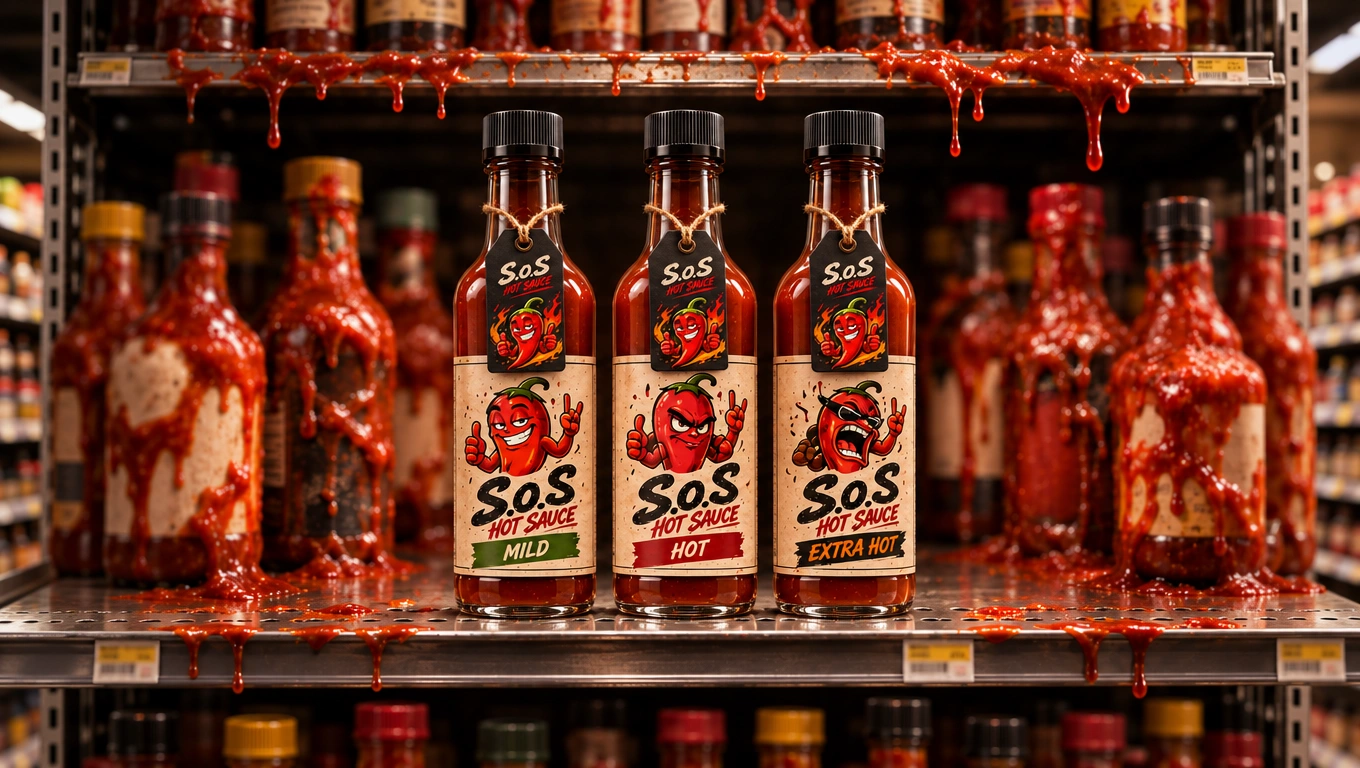
Standart bottle neck tag.
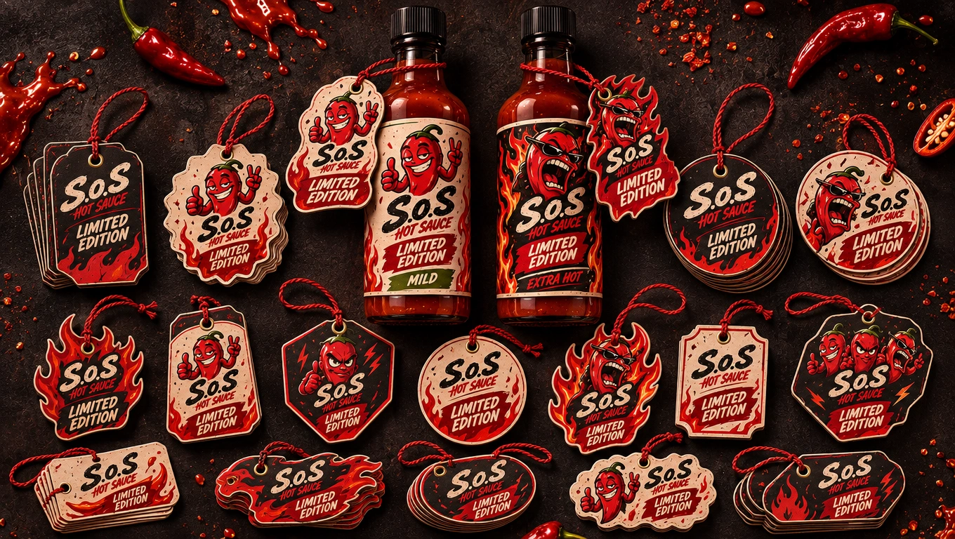
Limited bottle neck tags.
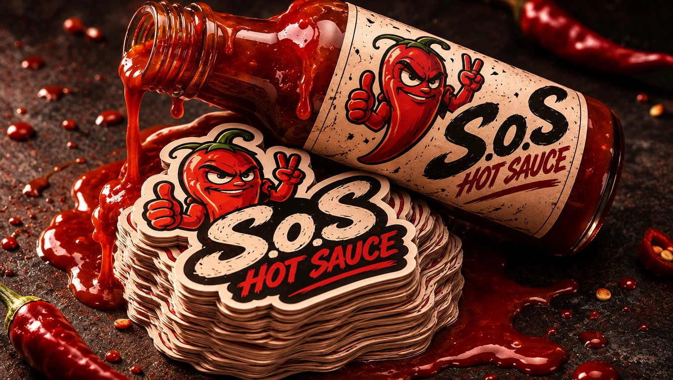
Standard brand stickers.
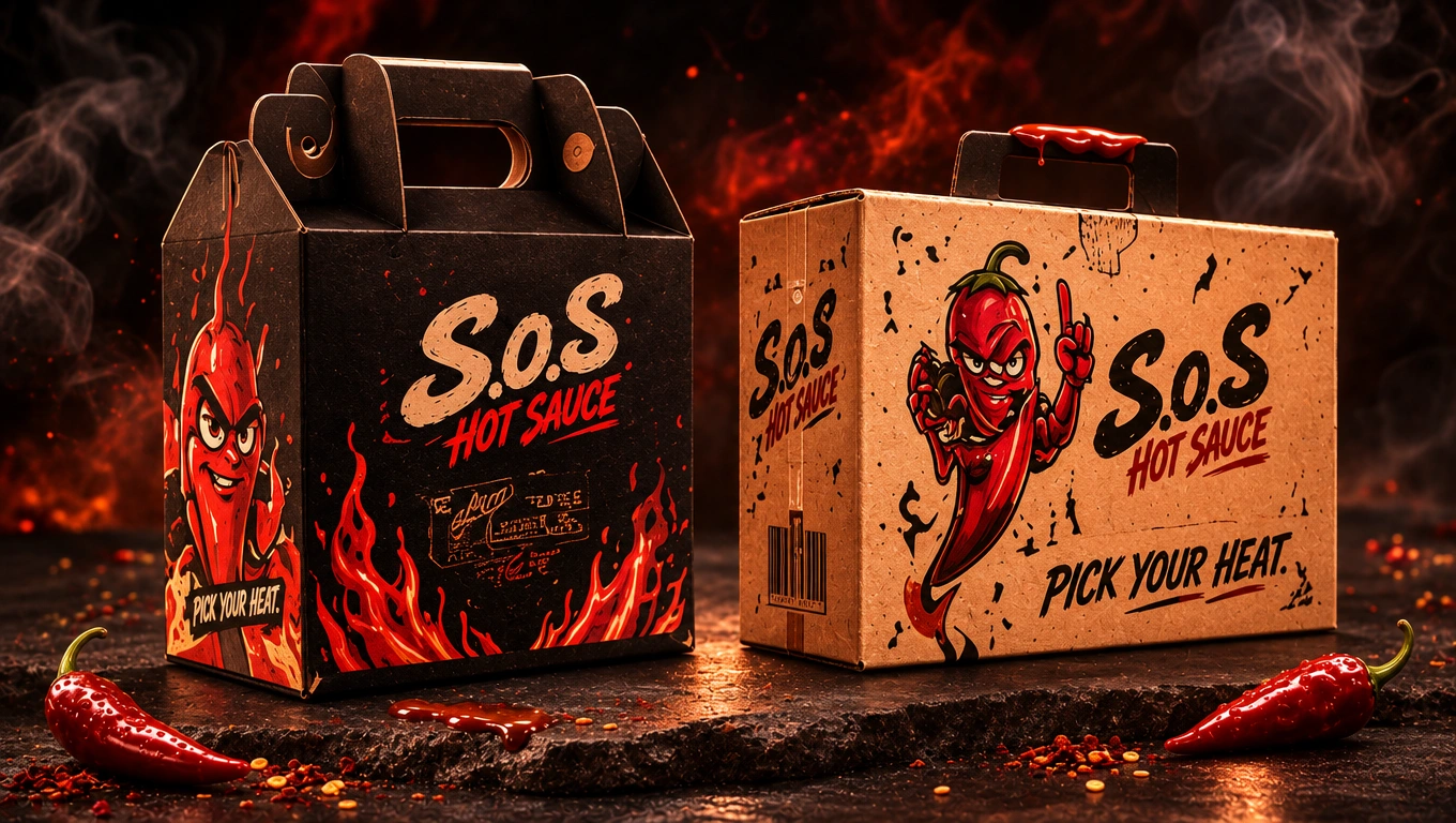
Limited-edition packaging concepts.
Mini sauce and promotional packaging.
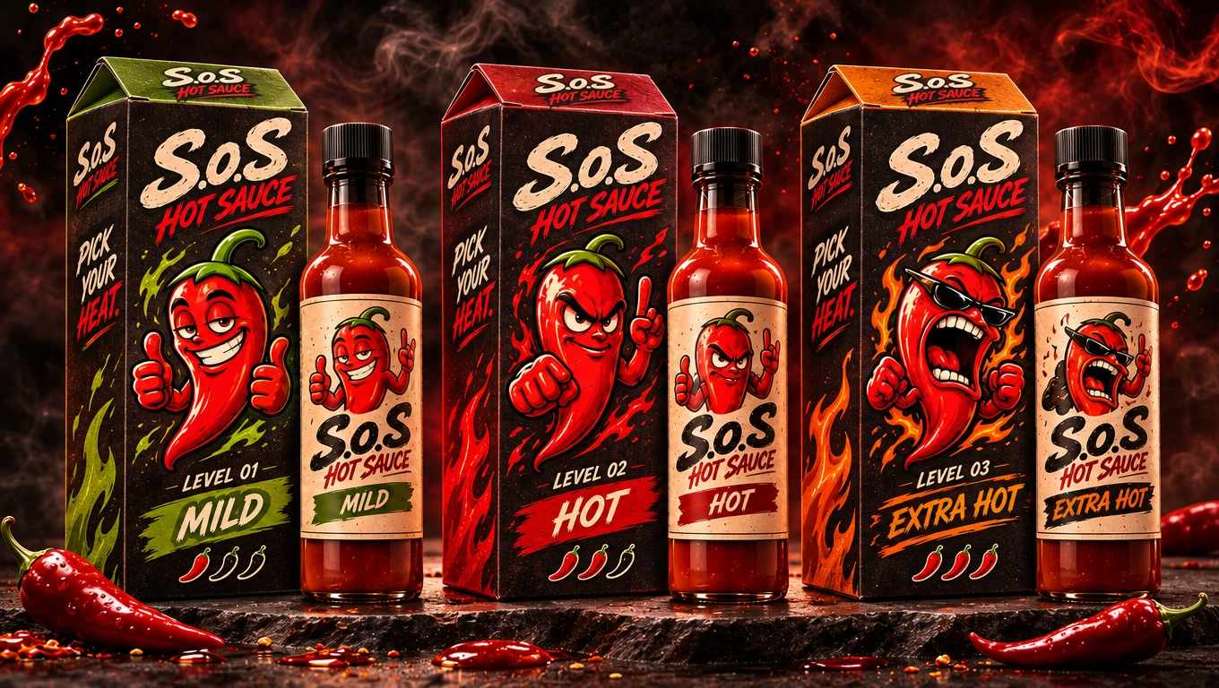
Individual product cartons.
Each application was designed to feel like a natural extension of the same brand identity.
The character illustrations and graphic elements became more than decorative assets; they helped differentiate products and create a recognizable visual connection throughout the packaging system.
07 — Brand Applications & Campaign
The identity was also explored beyond the packaging itself.
A series of additional applications demonstrated how S.o.S could appear in real-world environments and promotional campaigns.
These explorations included:
Business cards and thank-you cards.
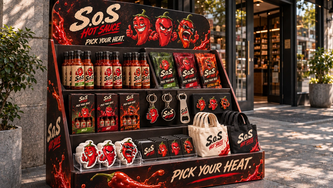
Tabletop promotional displays.
Staff T-shirts and caps.
Outdoor advertising and street posters.
Urban campaign photography.
Promotional product collections.
Retail shelf concepts.
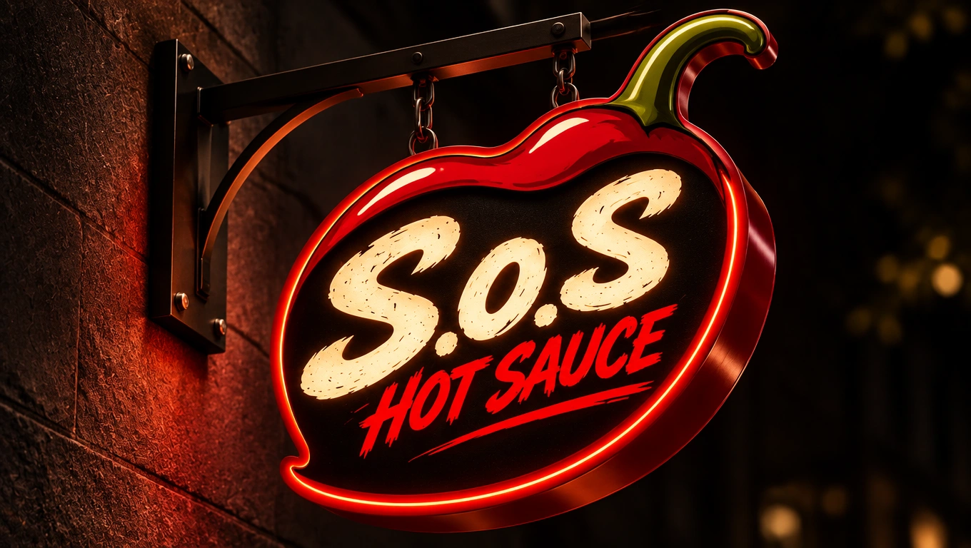
Illuminated exterior signage.
Delivery and packaging applications.
Professional foodservice bottle presentation.
The purpose was to show how the brand could maintain its personality across different physical touchpoints while remaining flexible and consistent.
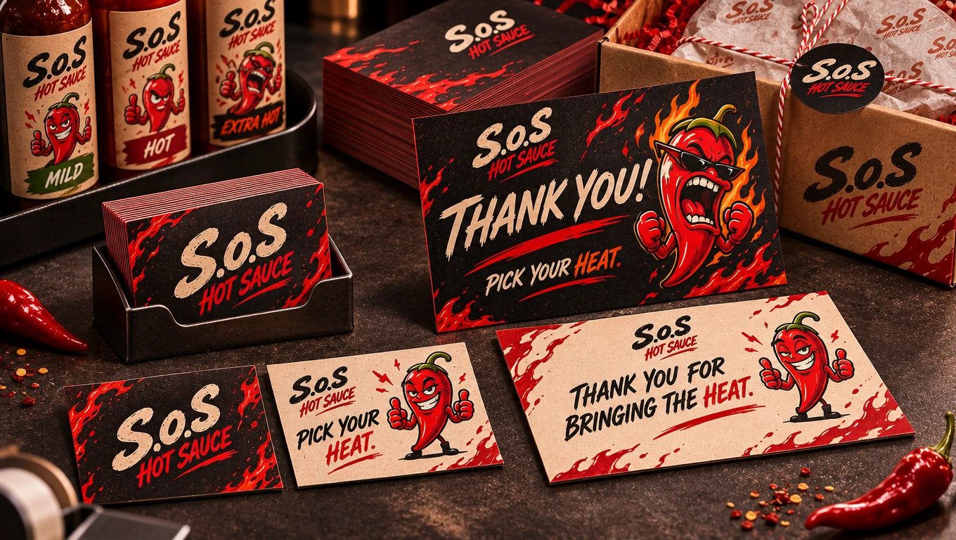
Business cards and thank-you cards.
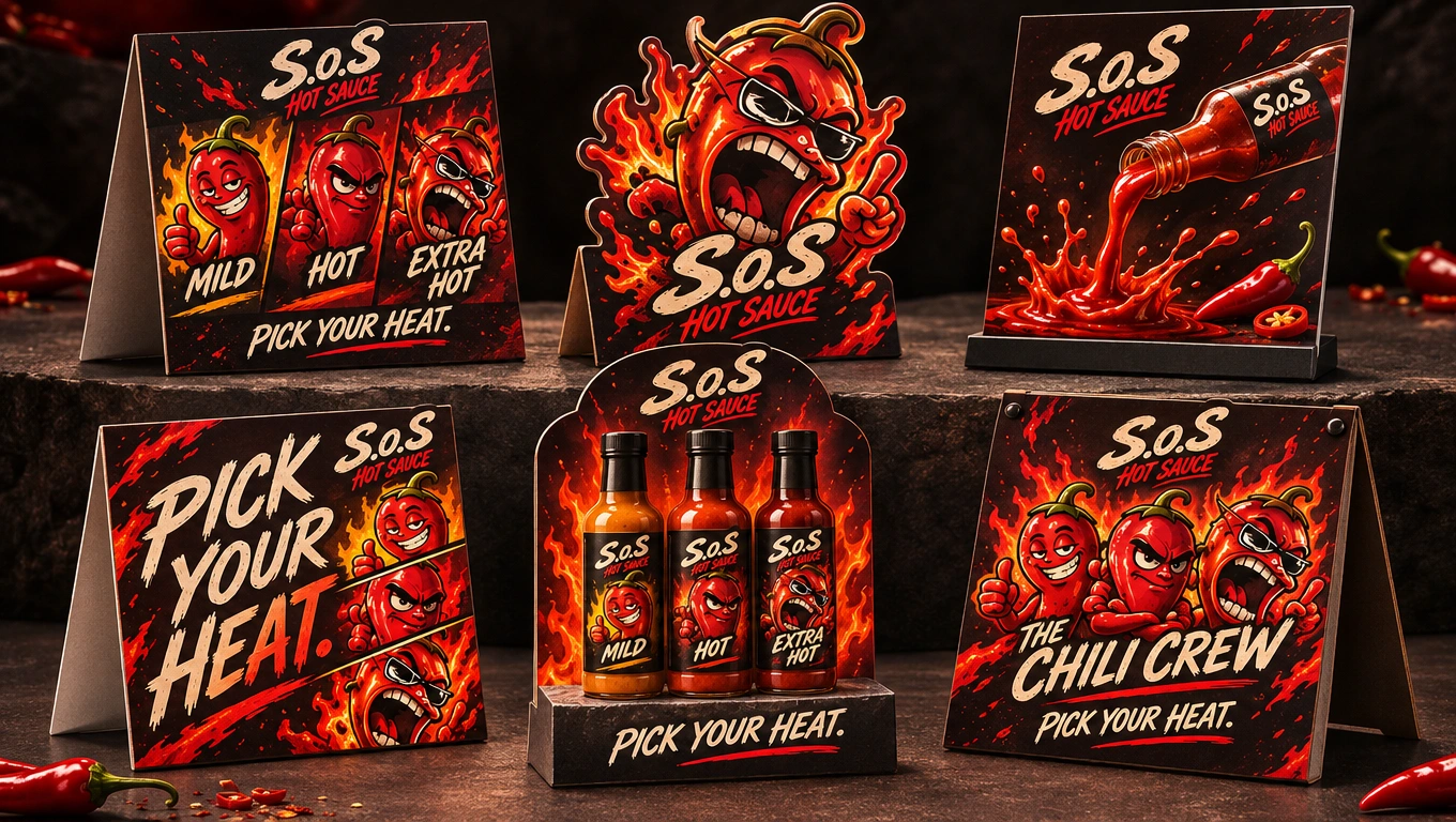
Tabletop promotional displays.
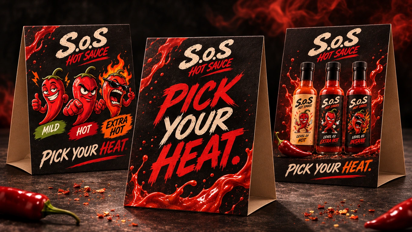
Tabletop promotional displays.
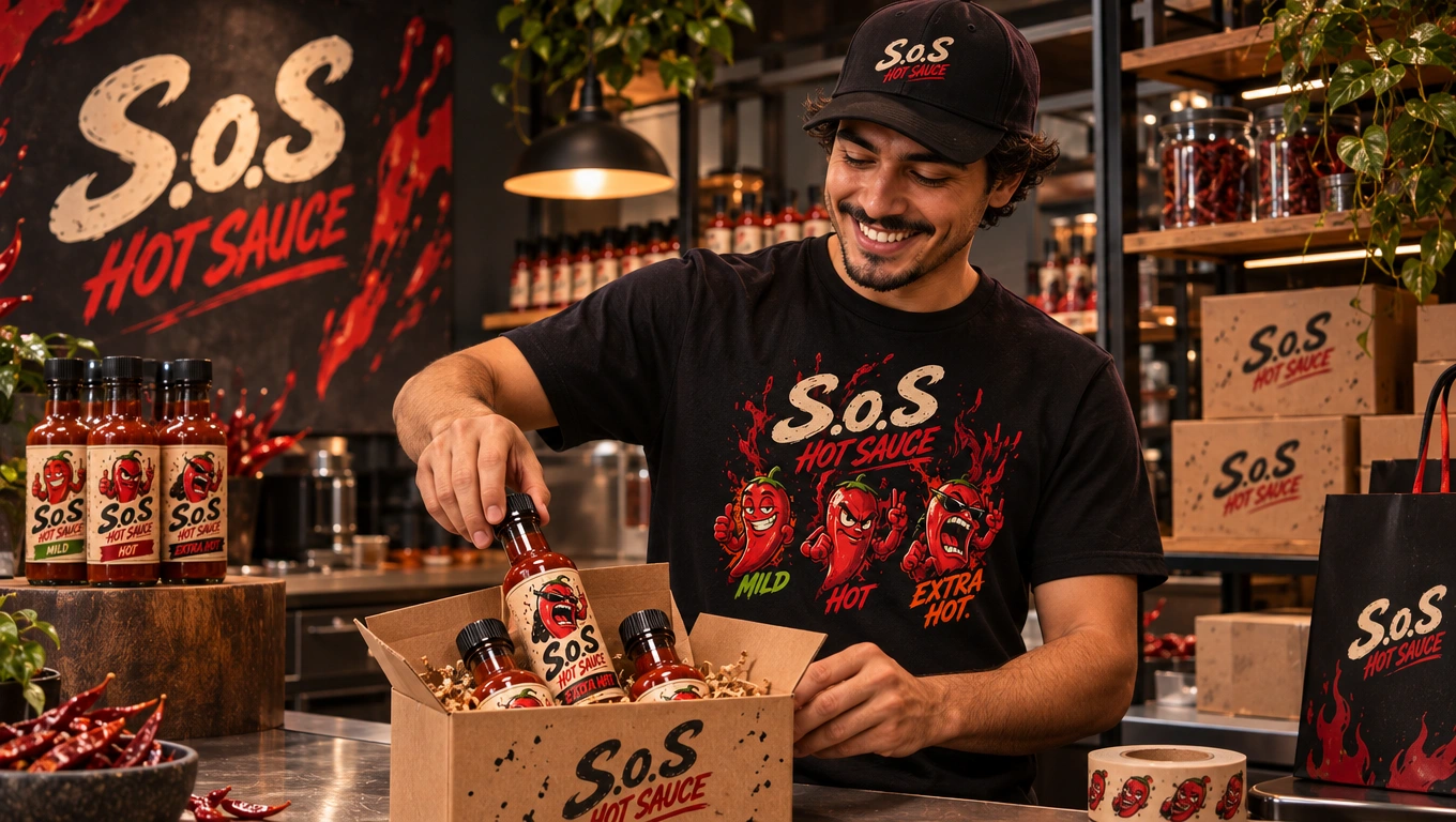
Staff T-shirts and caps.
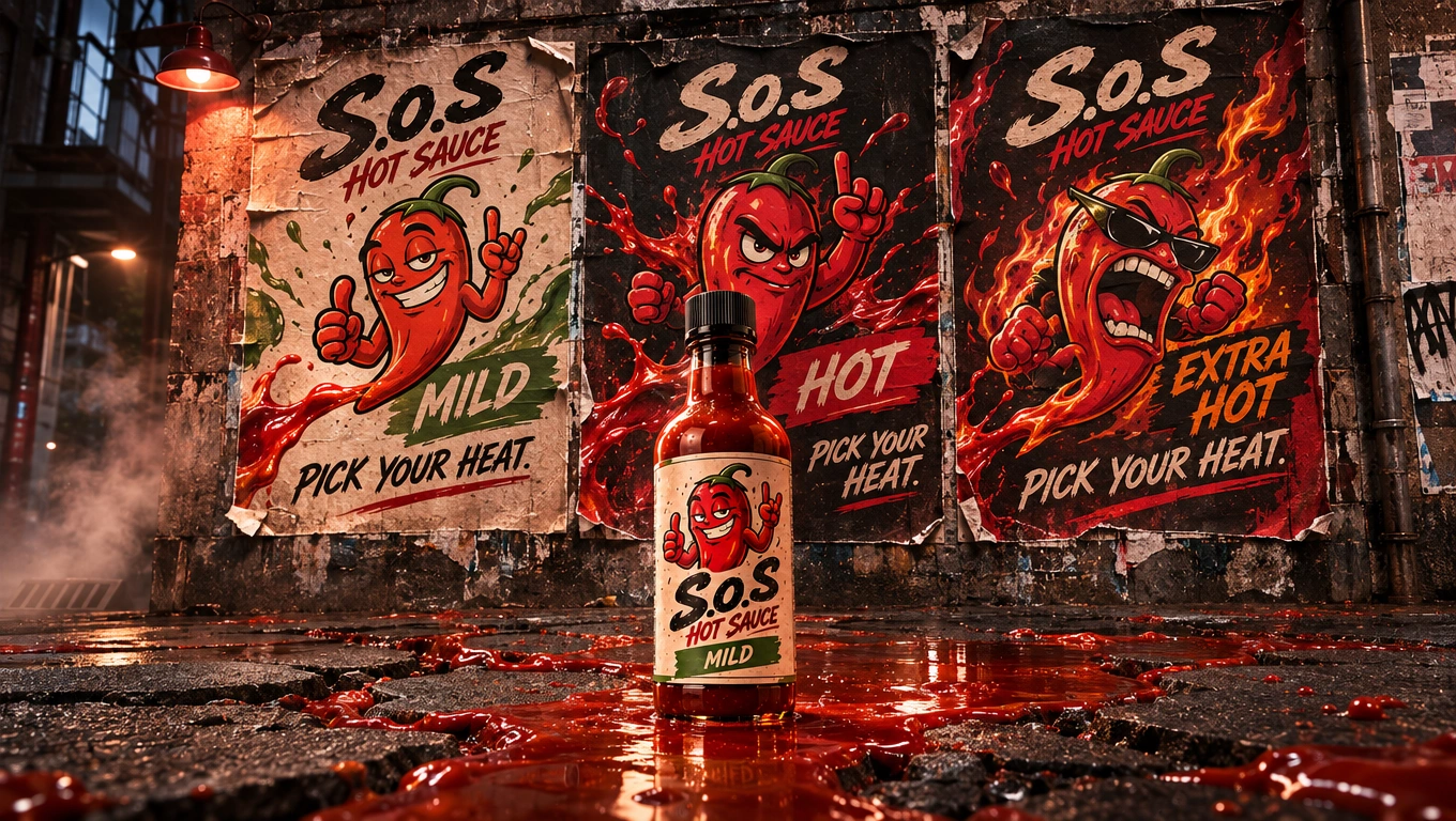
Outdoor advertising and street posters.
08 — Digital Brand Experience
The project also explored the future digital presence of S.o.S through website and mobile application concepts.
The website direction focused on presenting the three sauce varieties, communicating the brand personality and creating an accessible product discovery and shopping experience.
The mobile application identity was developed around a recognizable app icon and the wider S.o.S visual language.
Social media applications and digital campaign concepts were also explored to demonstrate how the brand could communicate consistently across online platforms.
These digital visuals represent the proposed brand experience and interface concepts.
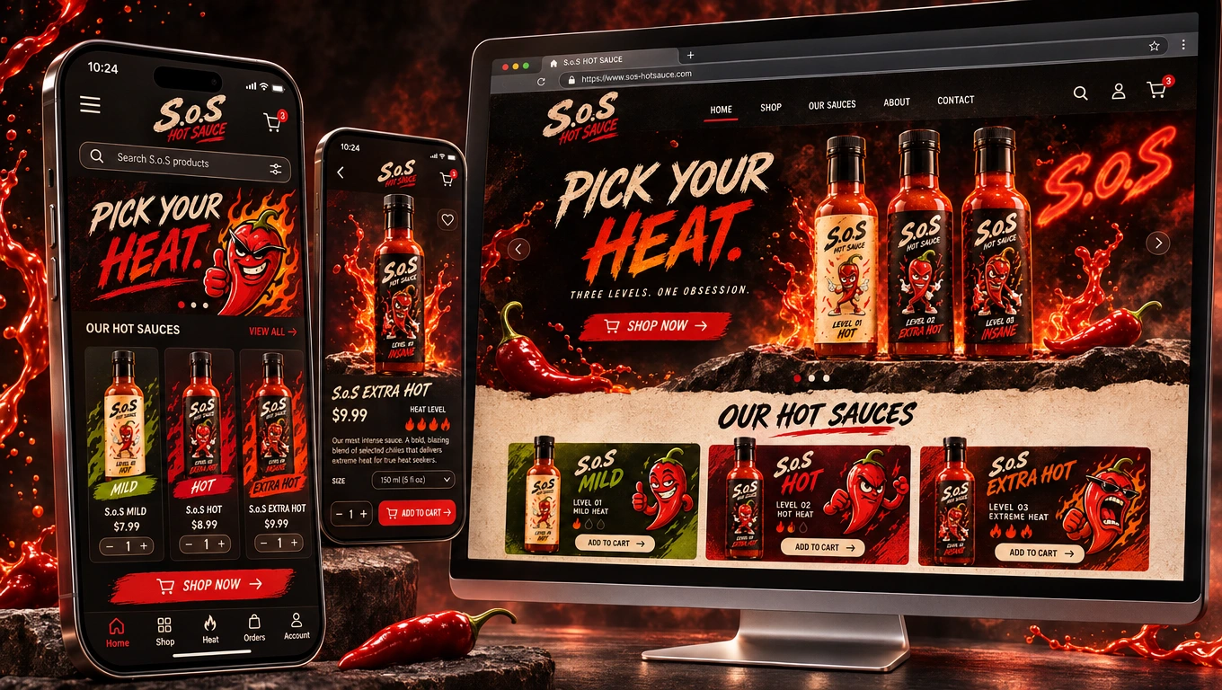
Website and Application design.
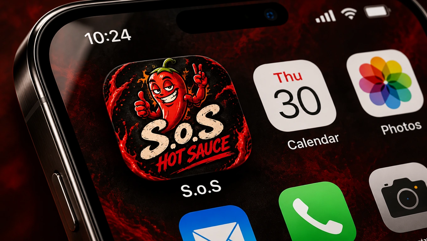
Mobile app icon design.
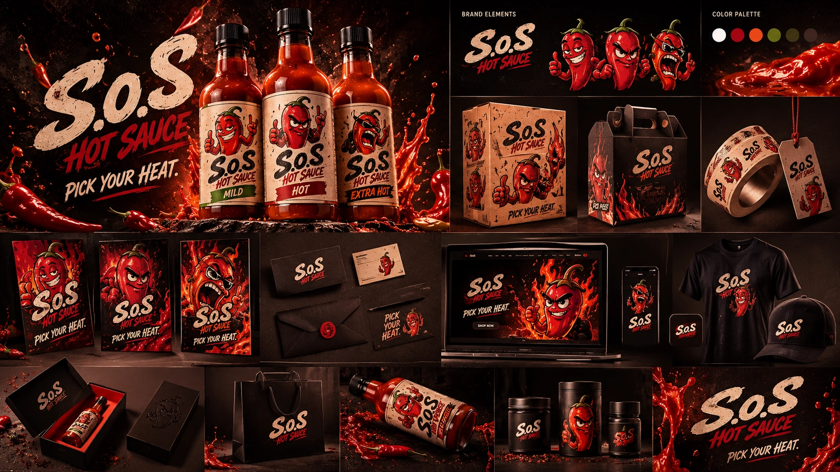
09 — The Final Brand Pack
The final stage brought together the strongest and most developed elements of the project into one cohesive S.o.S brand system.
What initially began as three different creative possibilities evolved through exploration, feedback and revisions into a more focused brand identity with a consistent visual language.
The final brand pack demonstrates how the identity can extend from the original logo and characters to product packaging, promotional materials, advertising, physical applications and digital experiences.
The intention was not simply to create a hot sauce label.
It was to explore and establish the foundations of a brand with a recognizable personality, a distinctive product family and room to grow.
Three initial directions. One evolving identity. One distinctive S.o.S brand.
Motion, Website & Additional Visual Explorations
Beyond the static brand applications, the project also extended into motion and digital storytelling.
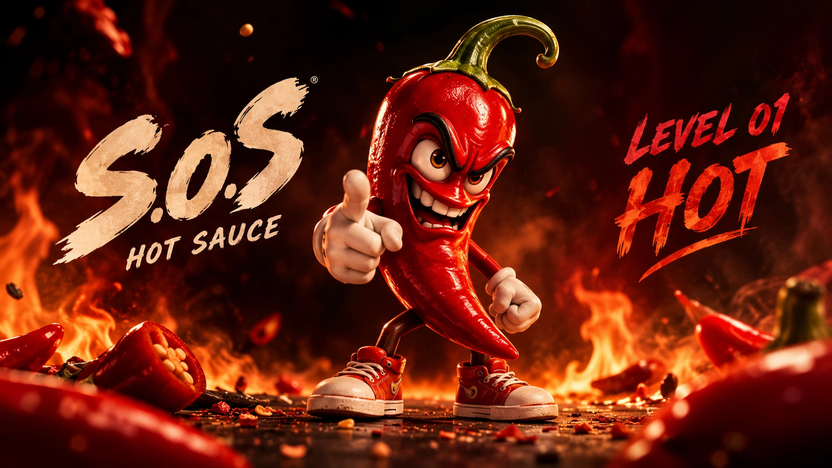
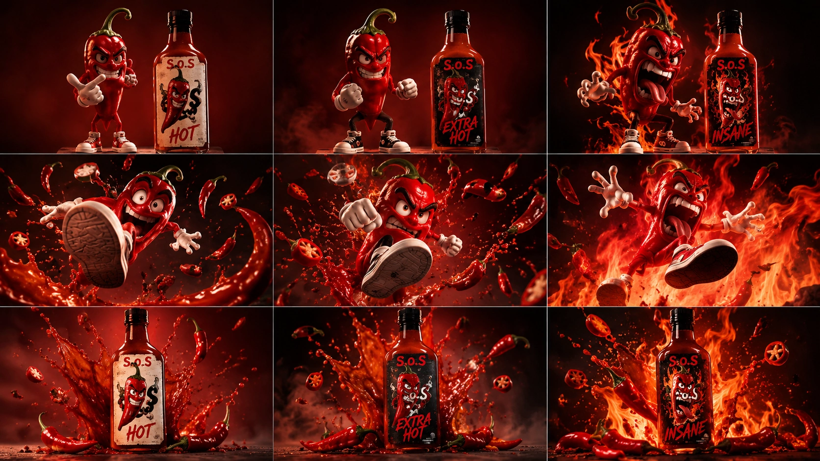
A dedicated S.o.S launch video was developed to bring the brand's personality to life through product-focused visuals, the three heat levels, original chili characters and dynamic sauce imagery. The film translates the visual identity into a more energetic advertising experience, giving the brand a stronger presence beyond printed applications.
Additional website design explorations were also developed to demonstrate how the S.o.S identity could translate into a digital shopping experience. These concepts explore the presentation of the product range, brand graphics and the overall visual direction of the website.
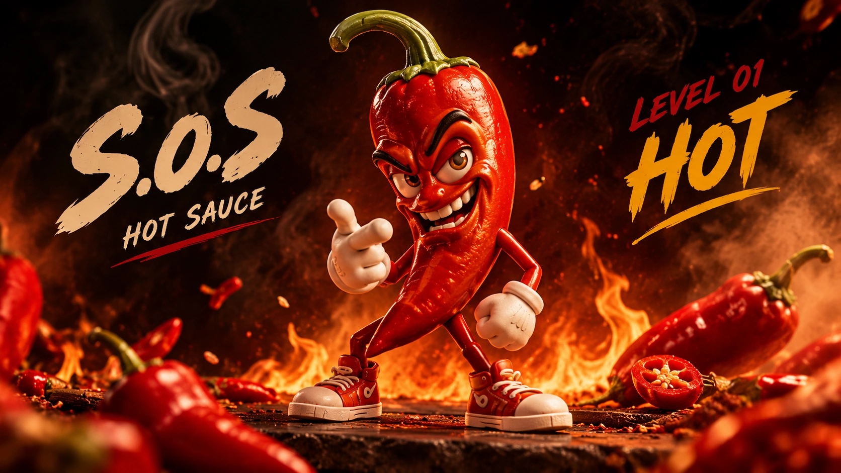
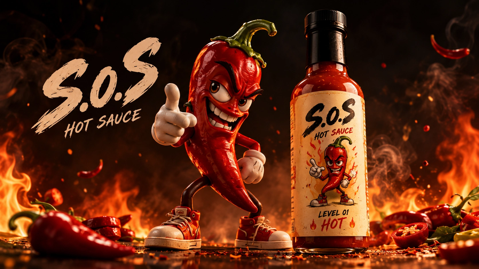
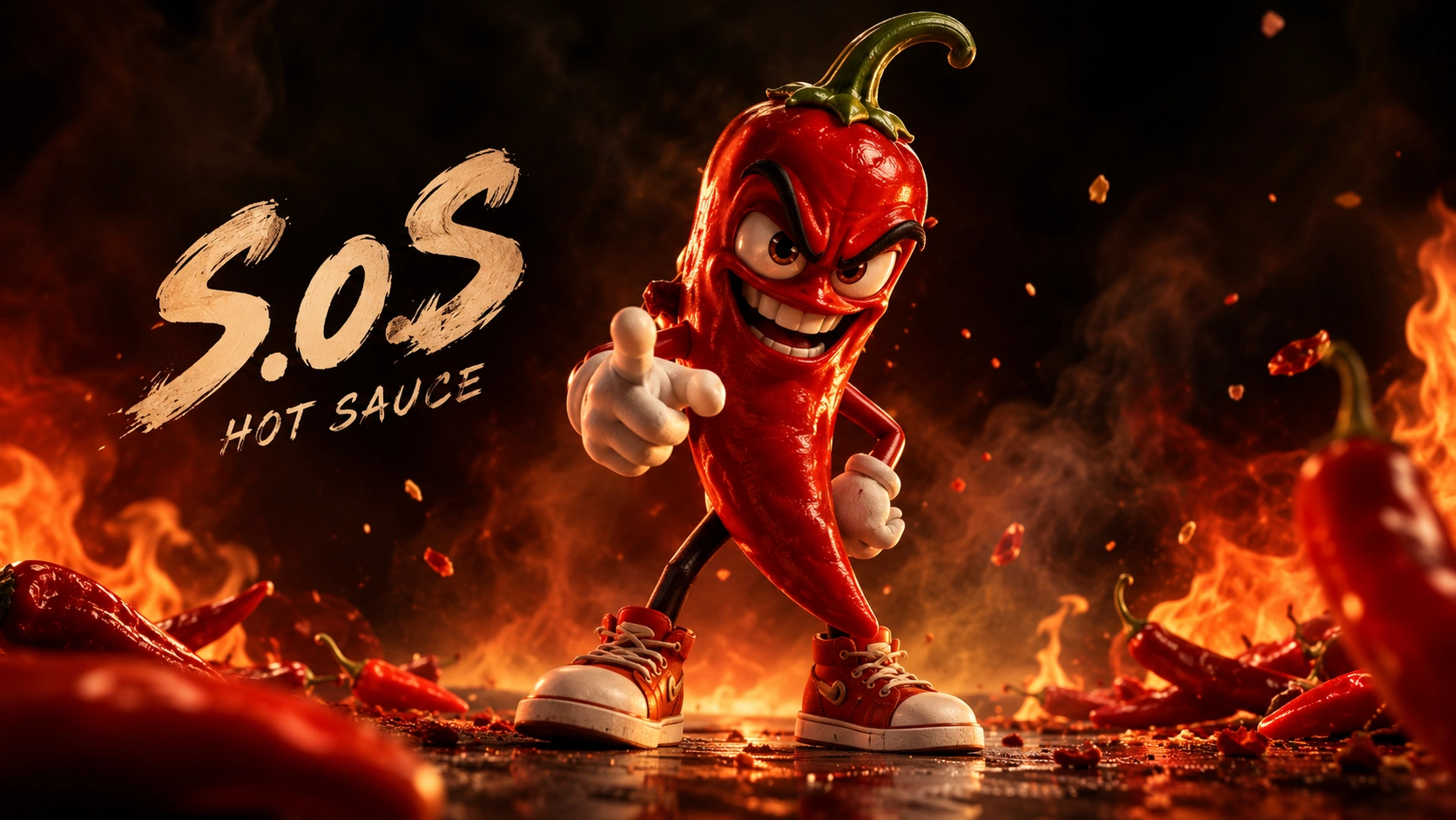
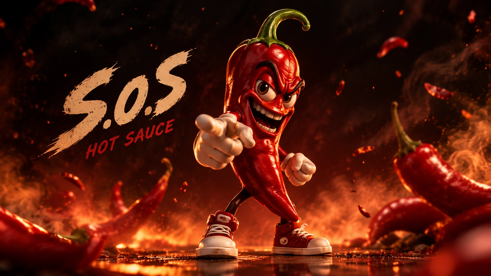
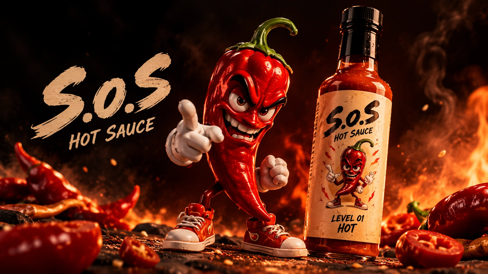
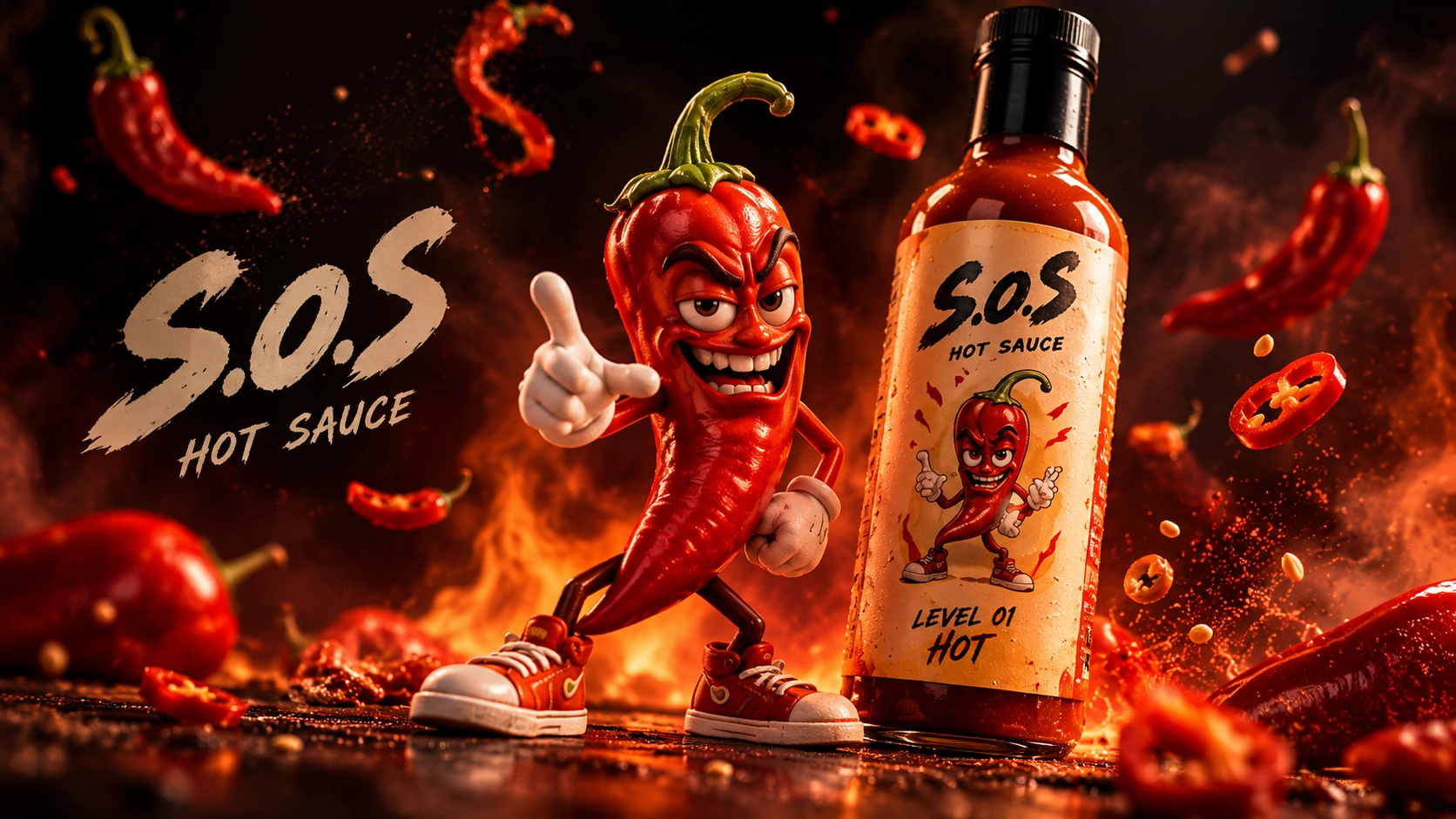
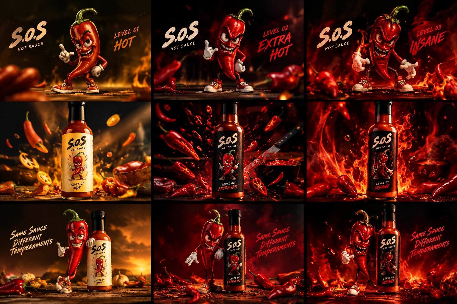
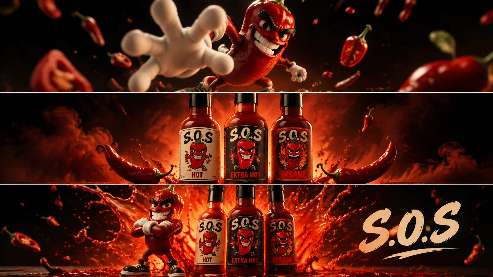
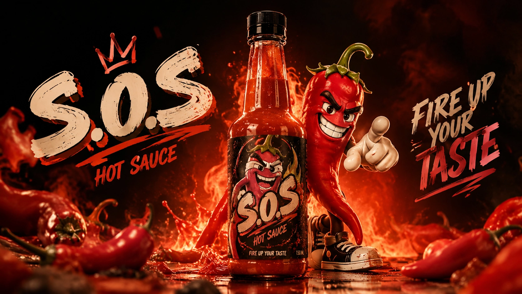
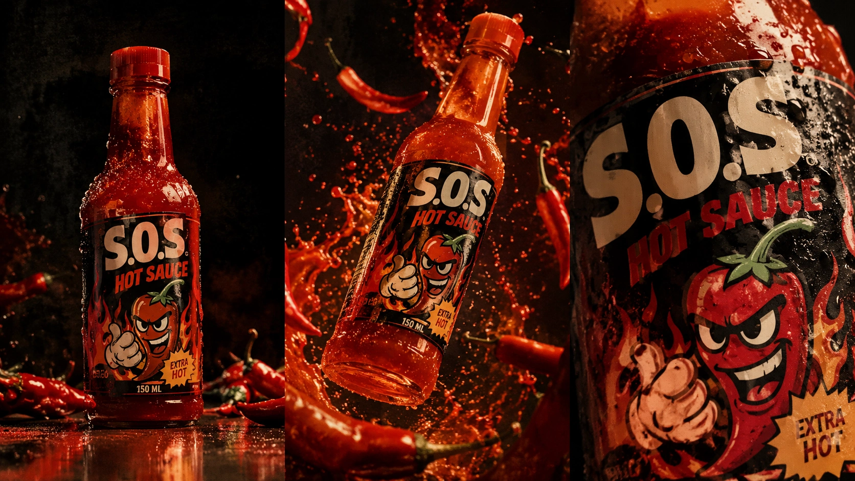
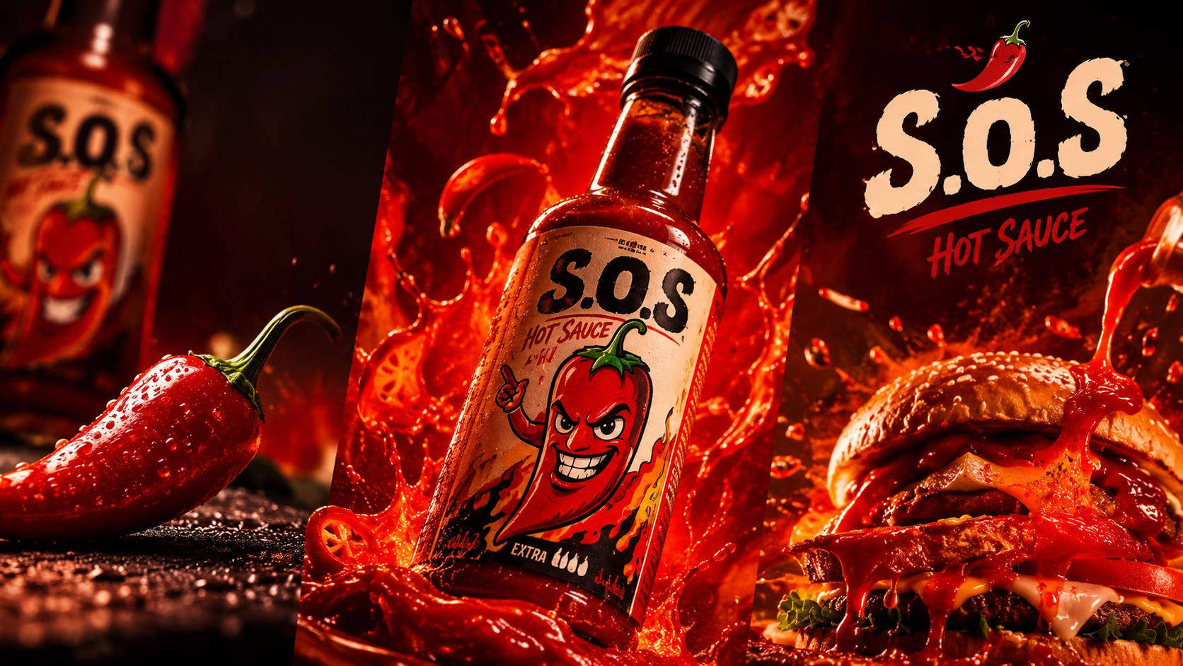
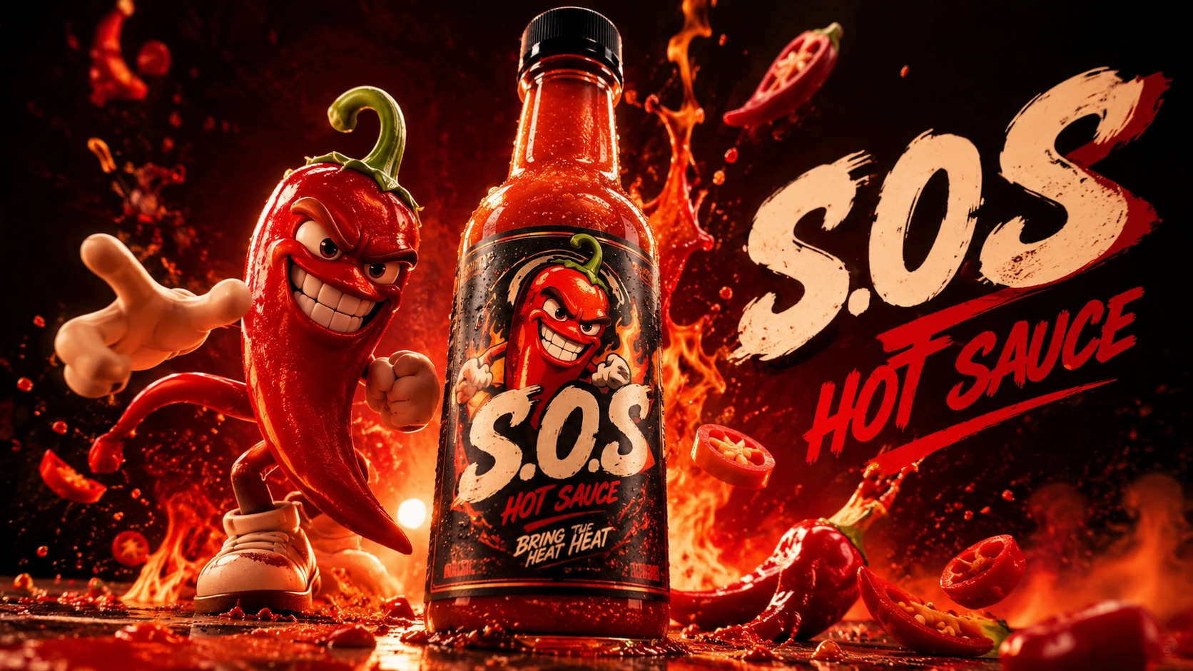
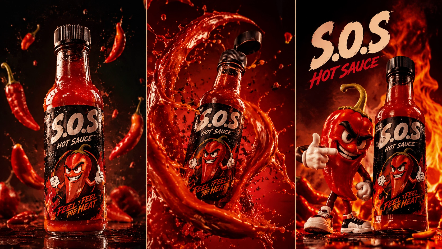
Alongside these main applications, several additional visual explorations and early creative developments are presented below. They include selected initial designs, alternative compositions, supporting graphics and other ideas explored throughout the process.
These additional materials offer a broader view of the creative journey behind S.o.S and show how the visual language evolved through experimentation, refinement and application development.
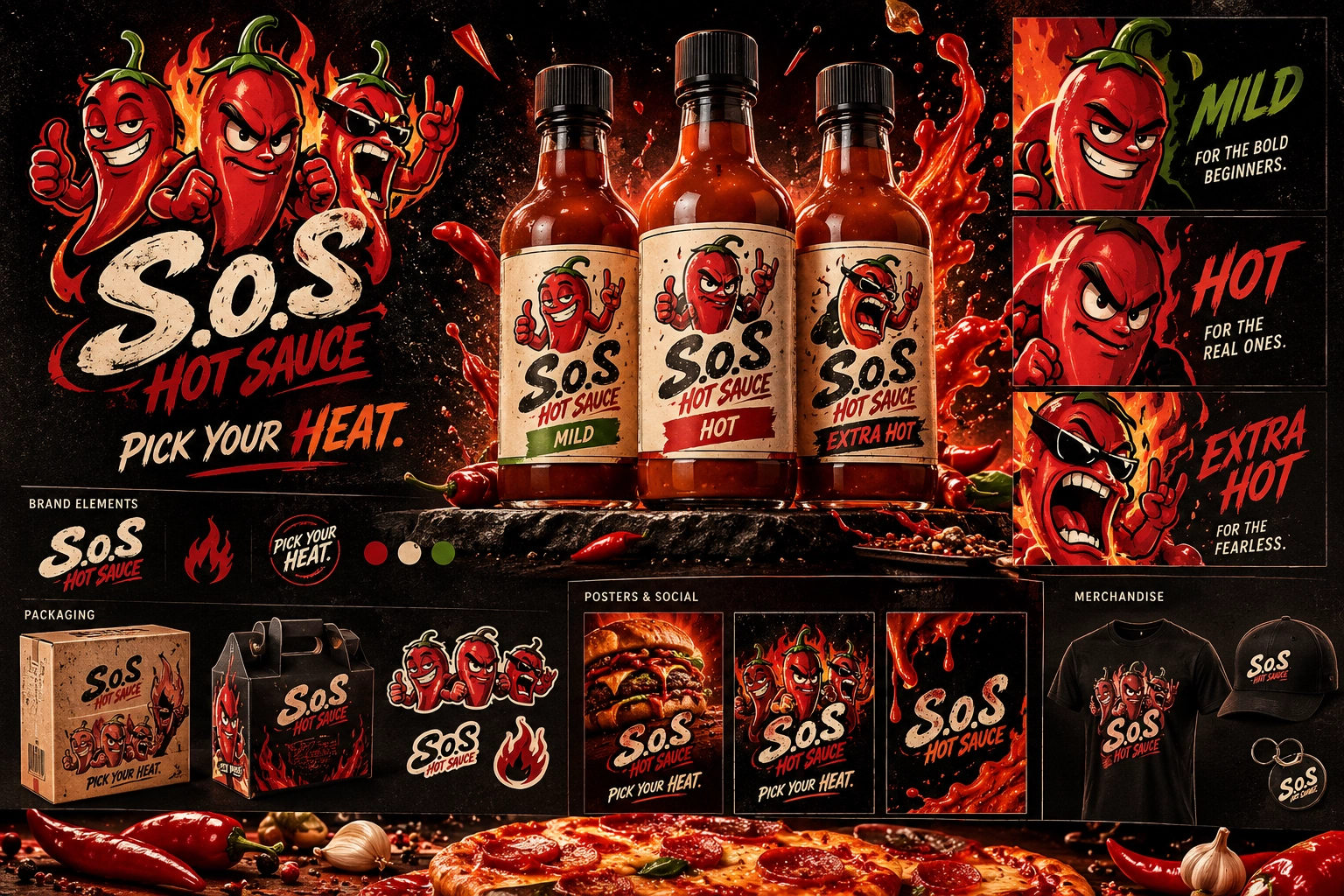
Final Note
S.o.S was approached as an emerging brand with an identity still waiting to be defined.
The three initial brand packs allowed us to explore different creative possibilities before moving into a more focused direction. Through continuous refinement and application testing, the final concept developed into a comprehensive brand identity and packaging system.
Not every concept or visual exploration was carried forward into the final brand identity. Some designs were set aside as independent creative explorations, while selected visuals and digital concepts were reserved for potential use across the brand's website and mobile application.
Some product, lifestyle and campaign visuals were created with AI-assisted visualization tools to demonstrate the proposed identity in realistic contexts. The visual direction, branding concepts, graphic applications and packaging explorations were developed as part of the creative project.
Thank You !
For taking the time to explore the S.o.S HOT SAUCE brand identity project.
From the first creative explorations to the final packaging and brand applications, this project was an opportunity to explore how a new brand could develop its own personality, visual language and experience.
PICK YOUR HEAT.
0 likes · 0 views · Nov 17, 2026
Developed three creative brand directions for S.o.S HOT SAUCE, refining the chosen identity across packaging, character design and digital applications.