1. The Goal of the

Fadare Caleb Timileyin


1. The Goal of the Project
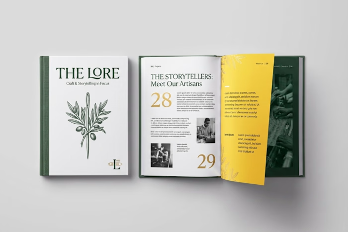
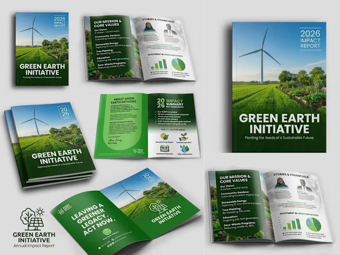
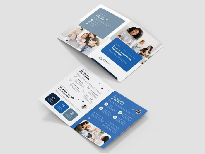
The goal was to transform an ordinary corporate book into a premium, modern, and visually engaging brand publication. I wanted the final design to communicate professionalism and sustainability while creating a strong visual identity that could remain consistent across the cover and interior pages.
The project was rebranded as SOLARA ATLAS – Impact by Design, with a visual direction centred on sustainability, innovation, and positive environmental impact.
2. The Challenges Faced
The original design had useful information but lacked a distinctive brand personality and stronger visual hierarchy. The main challenge was finding a way to present large amounts of text, statistics, images, and corporate information without making the pages feel crowded or repetitive.
Another challenge was maintaining consistency across different types of pages while still making every spread visually interesting. The design needed to work equally well for storytelling pages, statistics, corporate information, photographs, and infographic-style content.
3. Project Overview
SOLARA ATLAS is a premium sustainability-focused brand book designed to communicate a company's purpose, environmental initiatives, achievements, and impact.
I developed a complete visual direction using a sophisticated combination of terracotta orange, warm cream, charcoal, and natural photography. Elegant serif typography was paired with clean supporting fonts, minimalist line icons, strong numerical highlights, modular grids, and carefully selected renewable-energy imagery.
The final concept includes a distinctive book cover and multiple editorial page layouts, creating a cohesive publication that feels professional, contemporary, and premium.
4. The Solution I Brought to the Client's Problem
I redesigned the publication around a clear editorial system rather than treating every page as an individual design. I established a consistent colour palette, typography hierarchy, grid structure, icon style, photography direction, and visual language that could be applied throughout the entire book.
I used bold section introductions to improve navigation, large statistics to make important information immediately noticeable, modular layouts to simplify complex information, and high-quality imagery to create emotional and visual impact.
The result was a publication that transformed the client's information into a strong branded experience that is easier to read, more memorable, and visually capable of positioning the organisation as modern, credible, and premium.
Like this project
Posted Aug 9, 2026
1. The Goal of the Project The goal was to transform an ordinary corporate book into a premium, modern, and visually engaging brand publication. I wanted the...