The Mark — Miraculous Art Logo Evolution

Oluwajuwon Adediji


Posted May 26, 2026
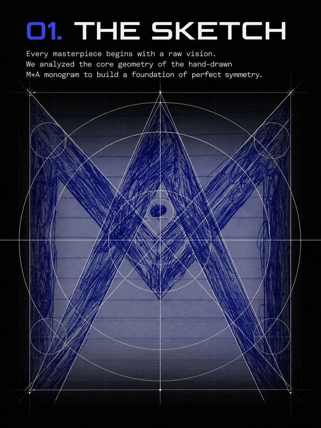
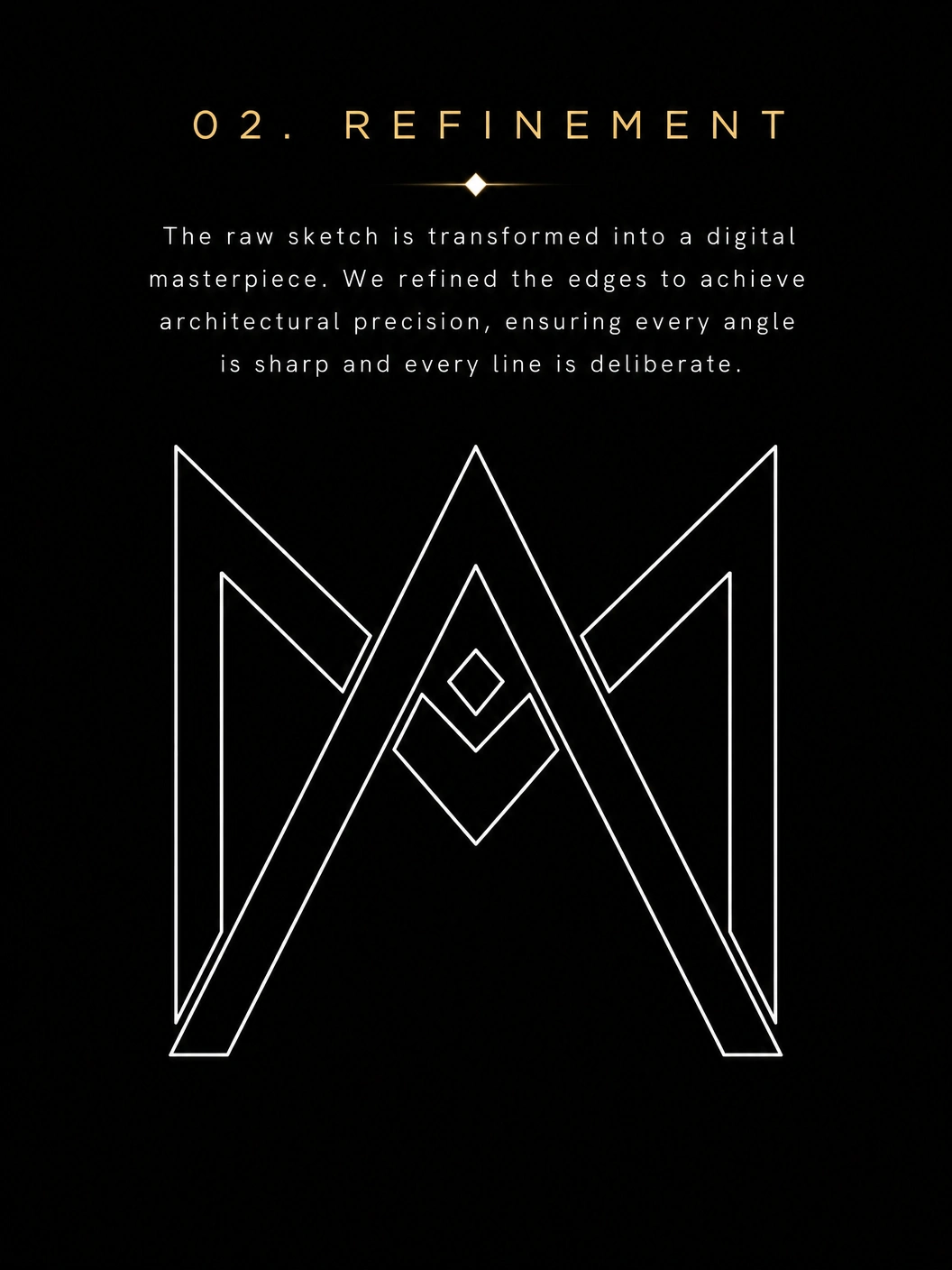
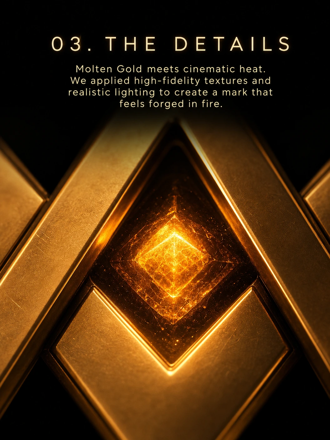
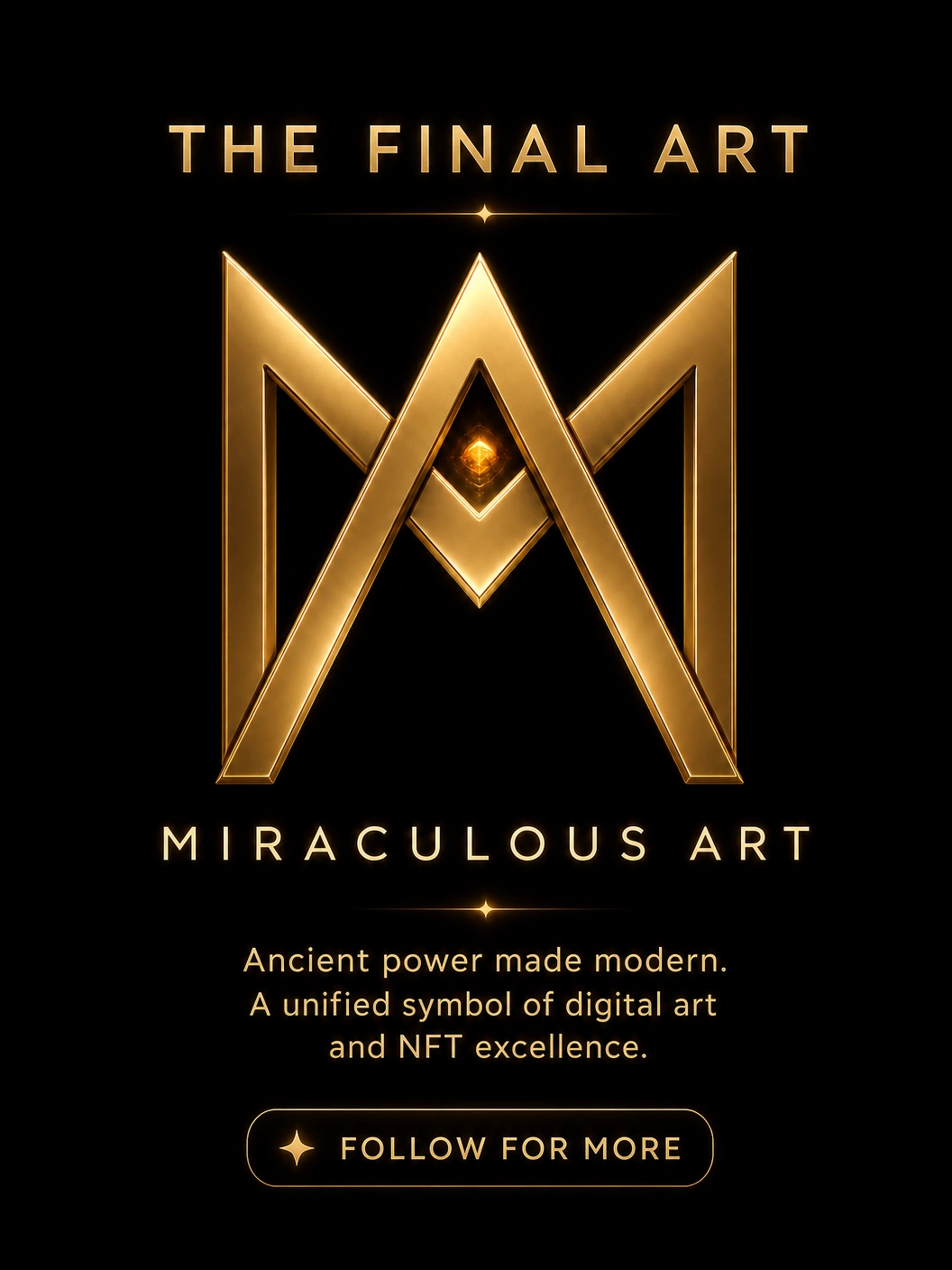
From geometric sketch to cinematic brand identity. This project documents the complete design process behind the Miraculous Art brand mark — from initial geometric construction through digital refinement to the final surface treatment. The goal was to produce a logo that functions as a premium visual asset rather than simply a functional identifier: something that carries weight, communicates craftsmanship, and holds its integrity across every context it appears in. The process was intentionally methodical. Aesthetic decisions were deferred until the structural foundation was fully validated, ensuring that the final mark is not just visually strong but geometrically sound at every scale. Module Copy (per slide/image section): Section 1 — The Construction: The logo began as a series of geometric studies. Proportion grids, symmetry axes, and angular ratios were tested before any stylistic direction was committed. This phase defines the mark's structural integrity. Section 2 — Digital Refinement: Once the sketch held at multiple scales, the mark moved into vector precision. Sharp architectural angles, consistent stroke weights, and clean negative space define this stage. Section 3 — Surface Detail: The final pass introduced a molten gold texture and heat shimmer treatment, applied to give the mark a tactile, physical quality uncommon in digital-native logos. Section 4 — Final Identity: The complete brand mark, production-ready across print, digital, NFT, and motion formats.