Conversion-Driven Web Design Reel
Mian Muhammad Umer Parvaiz
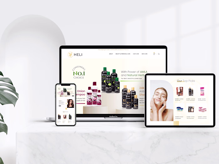
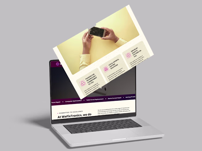
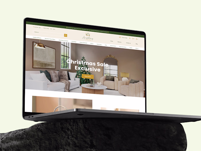
There’s a difference between websites that look polished and ones that actually guide users to take action.
This video brings together multiple website experiences designed across different projects, each built with a clear structure and purpose behind it.
The focus is not just on visuals. It’s on how users move through the experience.
Layouts are designed to direct attention naturally.
Sections are placed to remove confusion.
Interactions are kept simple so users don’t hesitate.
Different projects require different approaches, but the thinking stays consistent.
Clarity over noise.
Structure over randomness.
Decisions based on how people actually use websites.
If your website feels disconnected or isn’t performing the way it should, the issue is usually not traffic.
It’s how the experience is designed.
Like this project
Posted Apr 22, 2026
There’s a difference between websites that look polished and ones that actually guide users to take action. This video brings together multiple website exper...
Likes
0
Views
3
Timeline
Oct 1, 2025 - Dec 15, 2025