Branding & Product design for SOS MAT
⭐️ What is SOS Mat ?
SOS Mat is a mobile app focusing on simplifying the day-to-day of construction workers.
Their app allows construction workers to be delivered material directly to the construction site under an hour. This service will free up some time and enable construction workers to focus solely on their job in order to deliver their project on time with no disruptions.
🧠 My role ?
SOS Mat contacted me to help them redesign their app and work on their branding.
Here's my proposition ⬇️
RE-BRANDING :
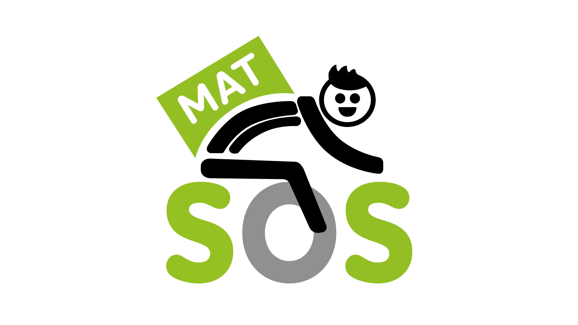
The current logo is not suitable for a mobile app.
Modern logos are designed to be more than just an image, they are the visual ambassadors of your brand, instantly transmitting your values, your identity and your commitment to innovation.
Here's why a logo change would be a wise strategic decision:
Adapting to trends: Design evolves quickly, and modern logos are clean, simple and easily memorable. An updated logo will ensure that your brand stays in line with current user expectations.
Competitive differentiation: A unique and contemporary logo will set you apart from your competitors. It will convey the image of a brand that knows how to evolve and stay at the forefront of its sector.
Simplicity and memorability: Simple logos are more memorable. A clean logo will allow your customers to quickly identify you, thus strengthening your recognition.
Audience Expansion: An outdated logo can unintentionally exclude parts of your target audience. A new logo can attract new customers and retain old ones.
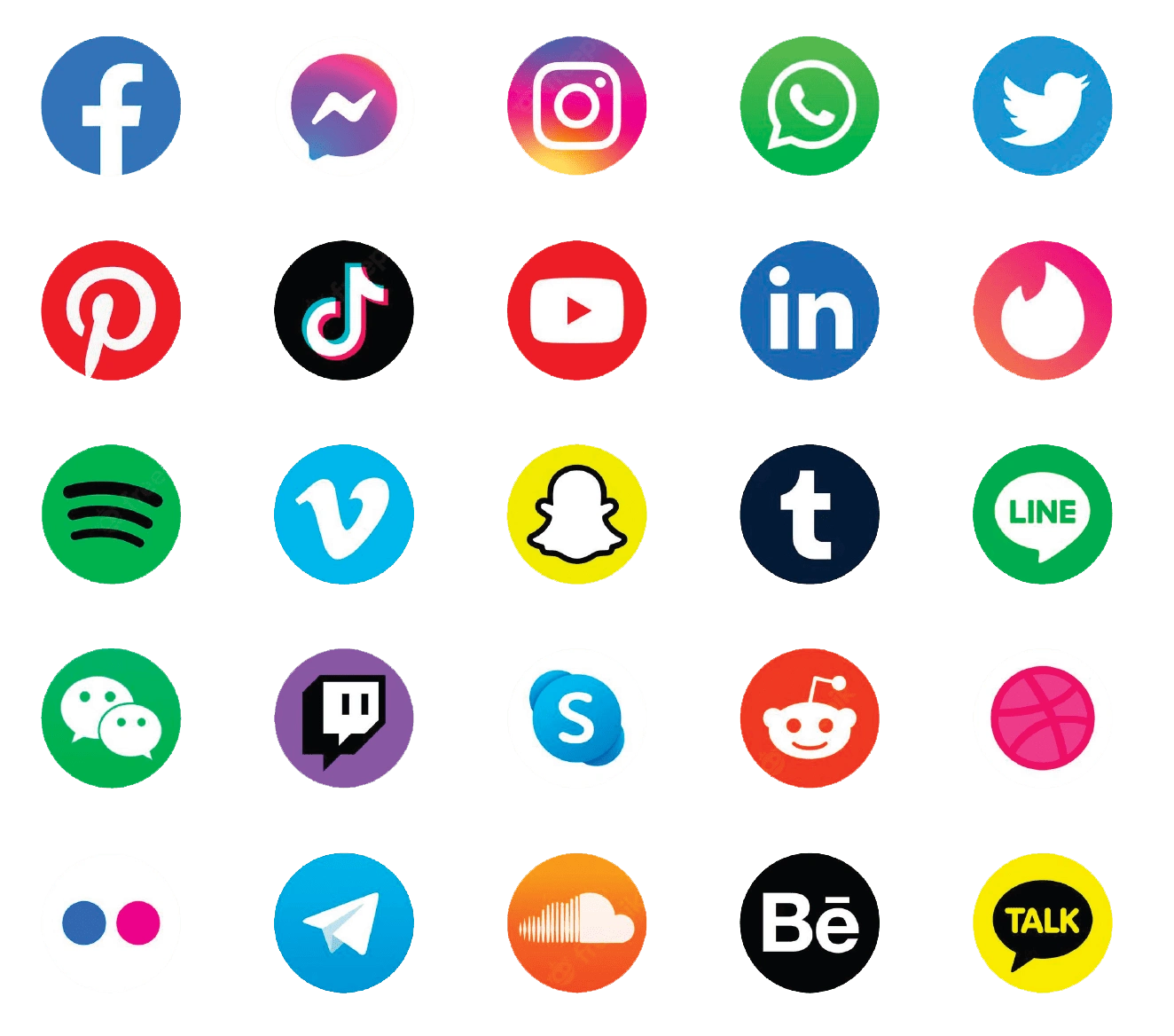
⬆️ Successful mobile app logos ⬆️
Successful mobile app logos are in majority designed iconographically for several important reasons related to design, functionality, and memorability. Iconographic logos tend to be simple, clean and free of complex details. This ensures optimal readability, even at reduced sizes, and allows users to quickly recognize the application. These logos aim to create a simple yet distinctive image that can be easily remembered by users. The constant repetition of this visual element reinforces its memorability, making the application easier to find and use.It is essential to create an iconographic logo for a mobile application.
All the big ones follow this rule, why not SOS Mat?
PROPOSITION #1 :

Indication of geographic scope: A location icon, usually represented by a marker, is a widely recognized symbol that immediately evokes the idea of geographic location. In the context of a delivery service, this suggests that the company operates in a specific geographic area and is willing to supply building materials to those locations.
Ease of understanding: Location icons are understandable and familiar, regardless of culture or language.
Customer orientation: A location icon can also suggest orientation. In the case of a building materials delivery service, it indicates that the company is ready to guide its customers to the right products and deliver them to the desired location.
Positive associations: Location icons are often associated with convenience, reliability and simplicity in the context of delivery. This can help create a positive perception of the company, suggesting that it offers a convenient and efficient service for sourcing building materials.
PROPOSITION #2 :
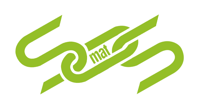
Strength and Connection: The chain is often seen as a symbol of strength, bonding and connection. In the context of construction materials, which are used to build and assemble structures, the chain icon could evoke the robustness of the materials as well as the reliable and strong connection that SOS Mat offers.
Security: The chain is also associated with security and stability. In the construction industry, material safety and reliability are key priorities.
Delivery Process: The chain can symbolize the delivery process itself, evoking the different steps involved in the movement and delivery of construction materials. This could suggest a smooth and well-coordinated service.
Supply Chain Metaphor: The chain can be interpreted as a visual metaphor for the supply chain. It represents the link between the supplier, the delivery service and the end customer, emphasizing the importance of each step in the efficient delivery of materials.
Differentiation: The channel icon could be unique and distinct from more common icons used in the delivery industry. This would allow the company to visually stand out from its competitors and attract the attention of potential customers.
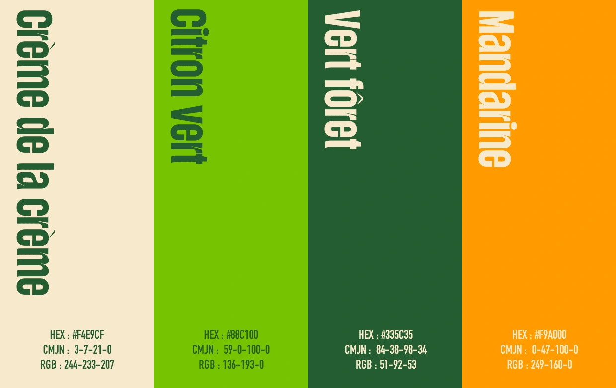
COLOR PALETTE
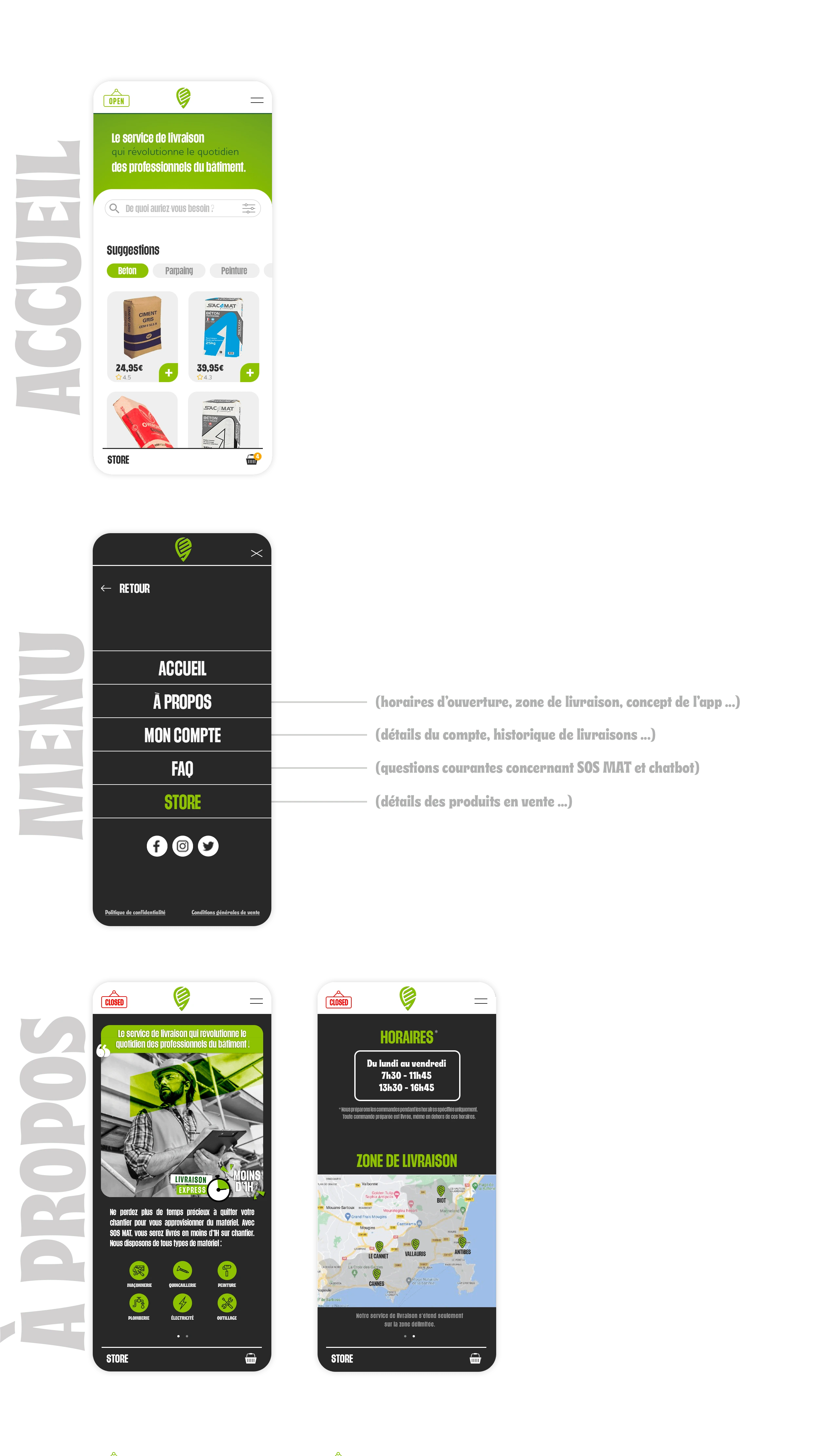
PRODUCT DESIGN :
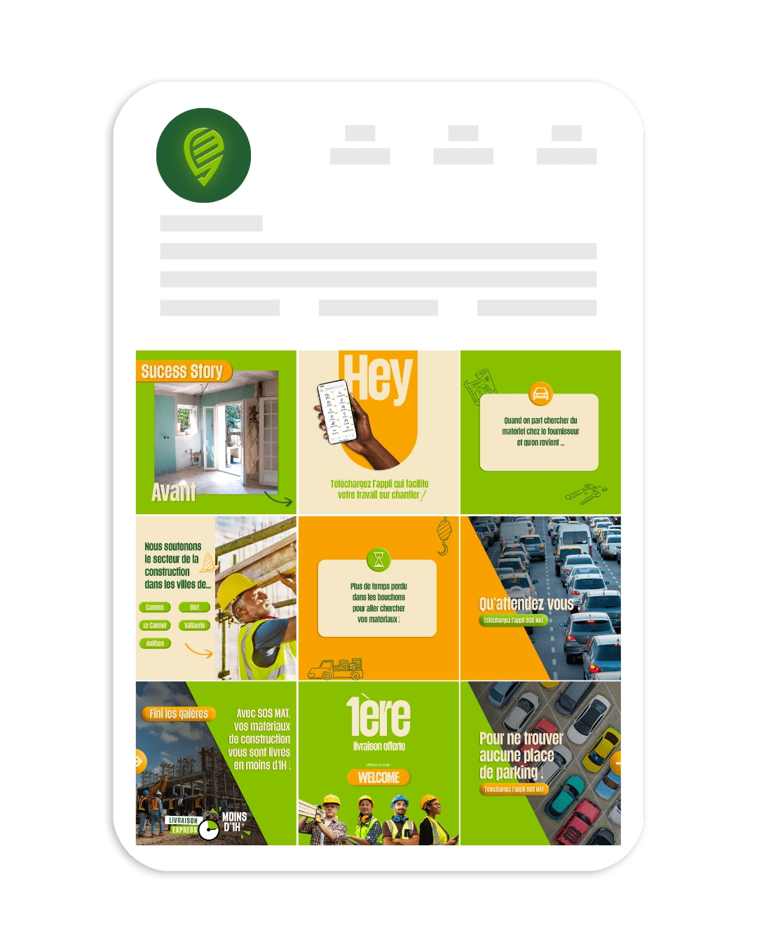
SOCIAL MEDIA POSTS :
Like this project
Posted Oct 15, 2023
SOS Mat hired for to work on their branding and redesign of their mobile app. The aim was to design a creative and compelling visual universe for the brand.

