Building a bold, industrial identity across every brand touchpoint.
Project overview
This identity brings ADAM Group’s advertising, print, workwear, and digital presence into one visual system. I refined the wordmark, defined the palette and pattern, and explored how they work across real brand applications.
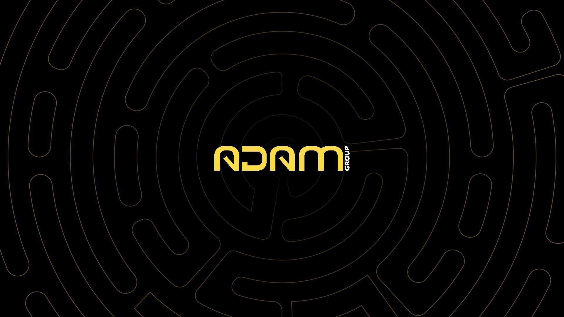
The ADAM wordmark against its custom pattern.
An animated reveal of the ADAM mark.
Logo refinement
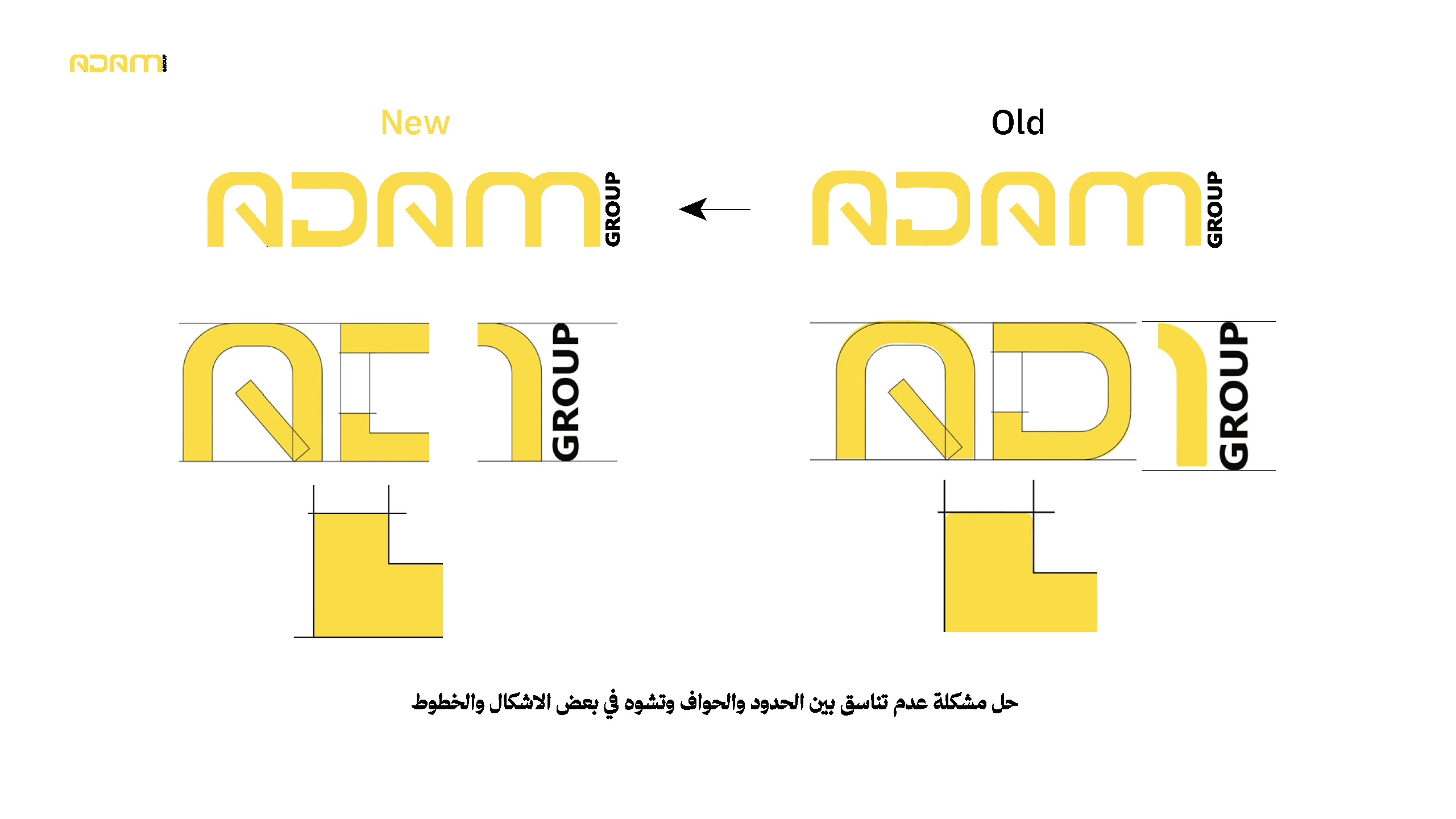
The wordmark was refined for cleaner edges and more consistent letterforms. The comparison below shows the original and updated construction.
Logo refinement: previous and updated letterforms with construction details.
Visual system
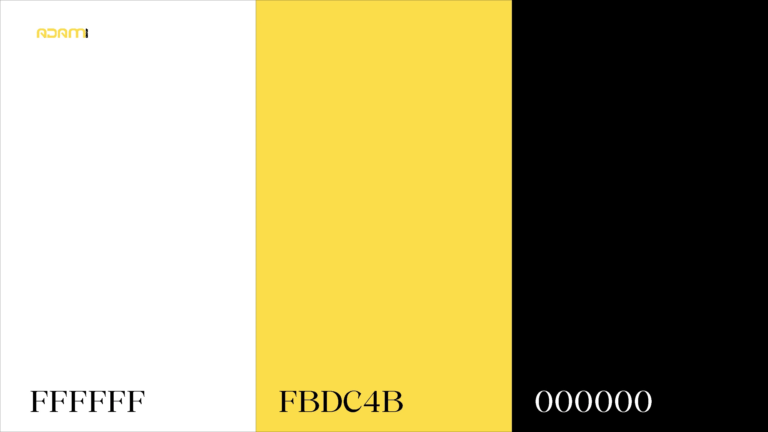
White space keeps the mark clear; ADAM yellow provides the accent, while black gives the system its industrial weight. The geometric pattern adds recognition without relying on the full logo in every placement.
Core palette: white (#FFFFFF), ADAM yellow (#FBDC4B), and black (#000000).

A repeatable pattern derived from the mark’s geometry.
Identity in use
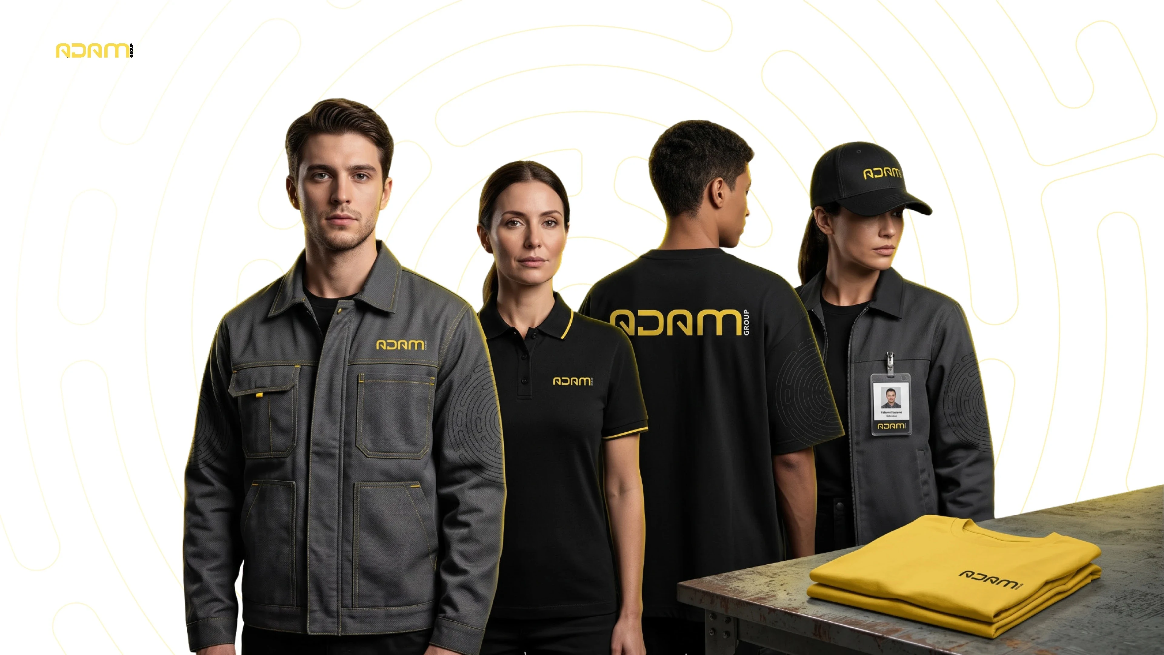
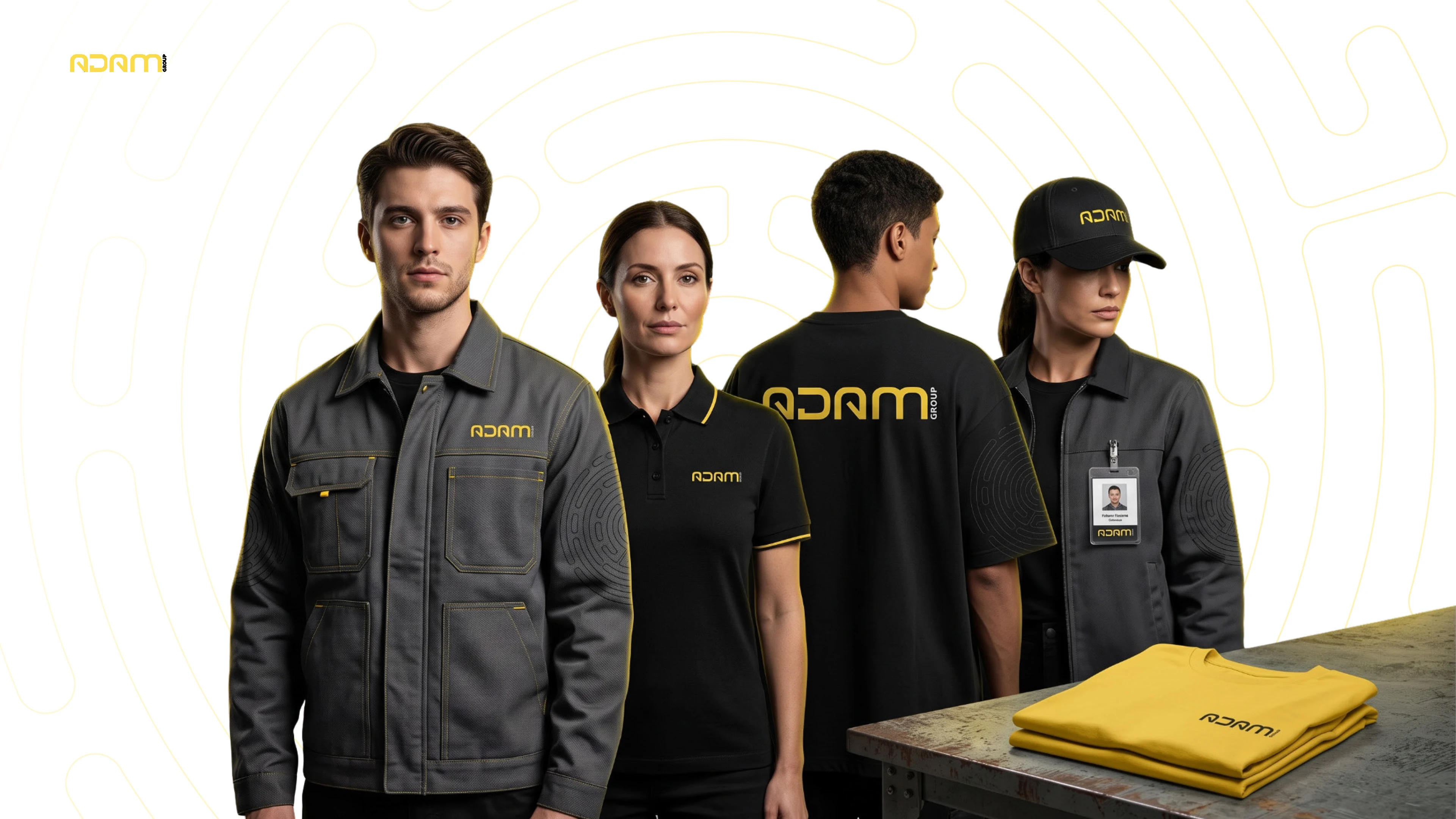
The identity was designed to remain legible on people and equipment as well as on the page. Uniforms, safety gear, and everyday items carry the same mark, palette, and pattern.
The identity applied across uniforms and workwear.
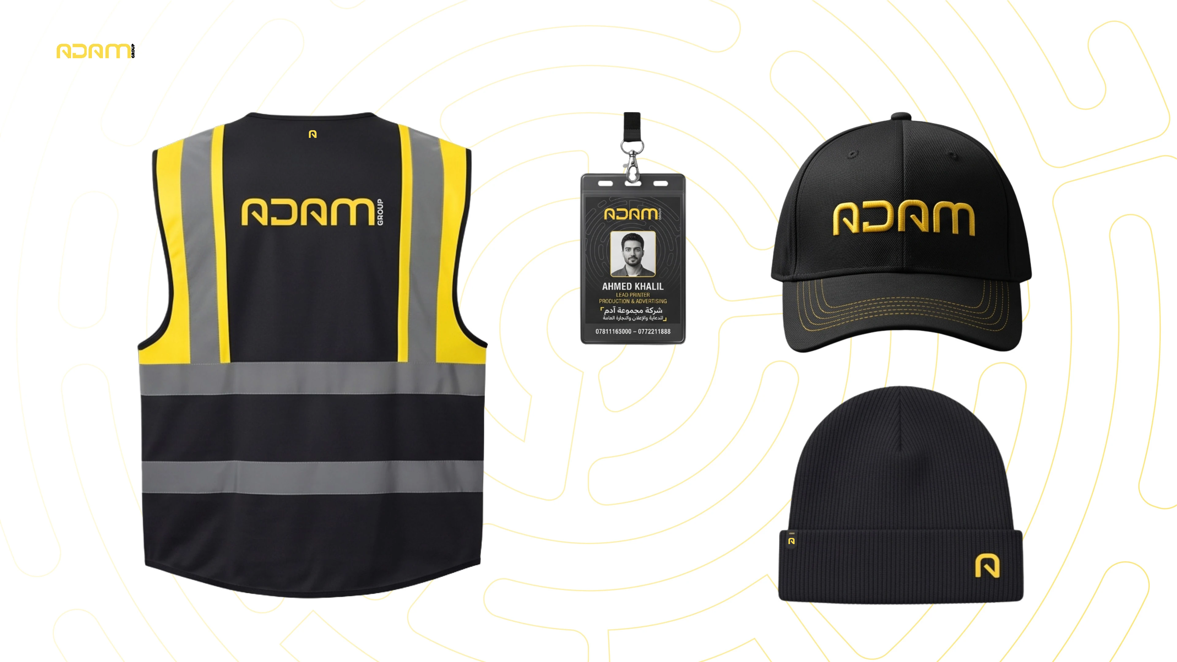
Safety vest, ID badge, cap, and knitwear applications.

Branded safety equipment for on-site work.

The system extends to bags, tools, and everyday accessories.
Digital presence
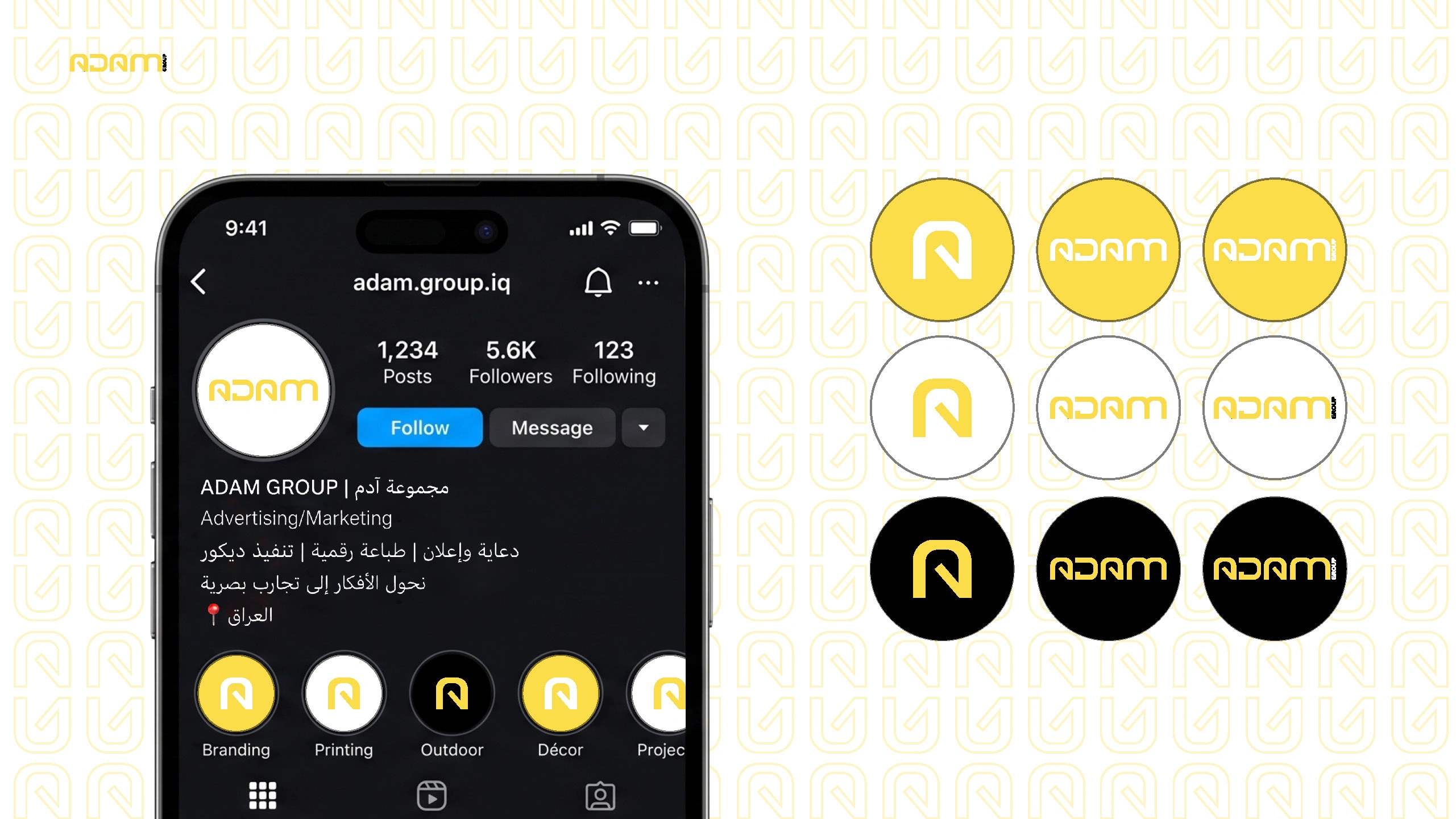
The profile system and social templates bring the same visual language online, connecting ADAM’s services with a recognizable color and pattern treatment.
Profile and highlight treatments for ADAM’s social channels.
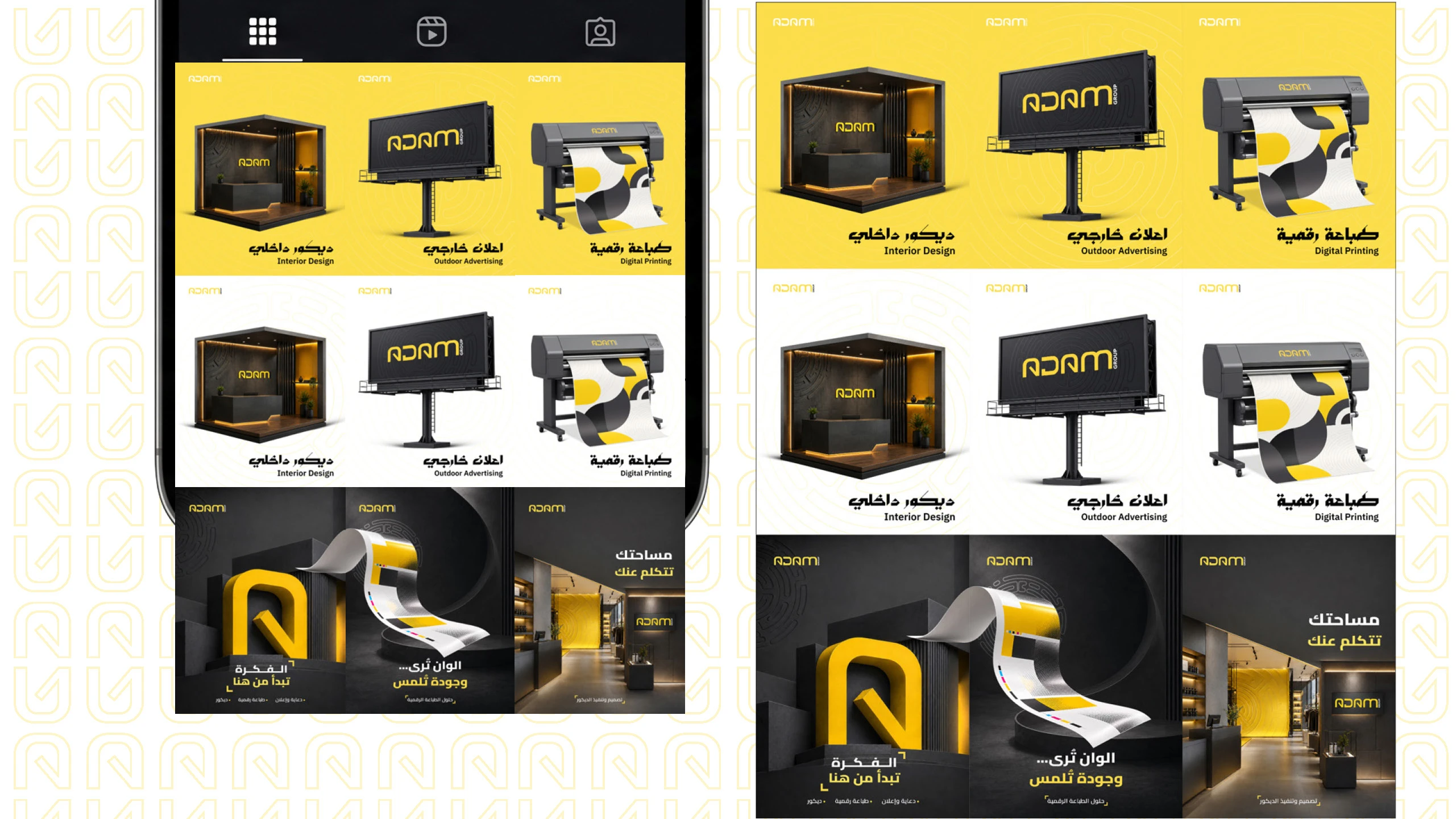
Social content for interior design, outdoor advertising, and digital printing.
One identity, many touchpoints
From the refined mark to workwear, equipment, and social content, the system keeps ADAM recognizable wherever it appears.
Like this project
Posted Oct 1, 2026
A bold visual identity for ADAM Group, built across advertising, print, uniforms, vehicles, social media, interiors, and outdoor applications.