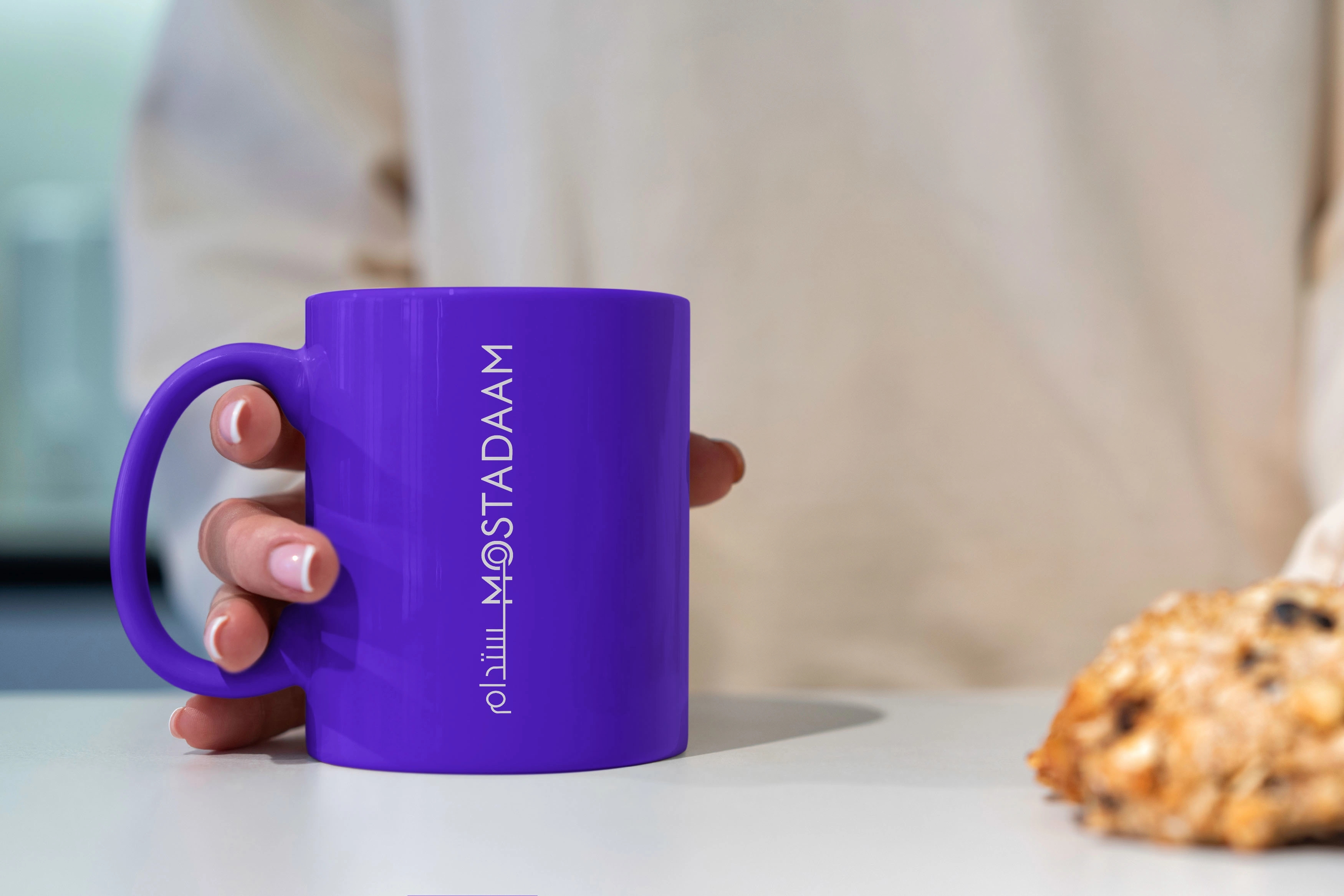
Mostadaam logo redesign and new brand identity
Peter Melad
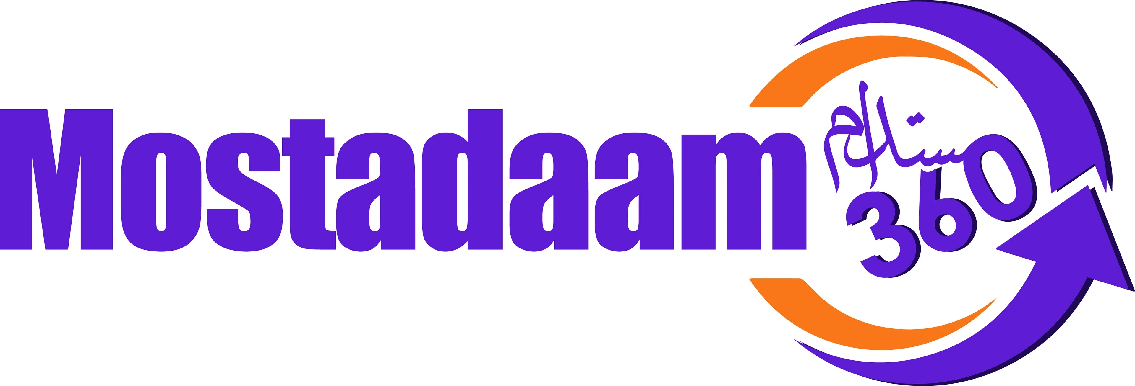
Let's delve deeper into the weaknesses of the Old Logo
Lack of Cohesion and Harmony:
Font Clash:
The "Mostadaam" font is very bold and blocky, conveying stability and perhaps even rigidity. This clashes with the fluidity of the circular arrow and the elegant flow of the Arabic script. These conflicting styles create visual tension and prevent the elements from working together harmoniously.
Disjointed Elements:
The three main components (text, circle, and Arabic script) feel like separate entities placed together rather than a unified design. There's no visual flow connecting them, making the logo appear fragmented and disjointed.
Weak Visual Connection:
The circular arrow feels detached from the brand name. There's no clear visual cue or connection that ties the symbol to the text, making it difficult to understand the intended message.
Arabic Script Challenges:
While incorporating Arabic is crucial for the target audience, the chosen script's thin strokes and intricate details might hinder legibility, especially at smaller sizes or when used in print with lower resolution.
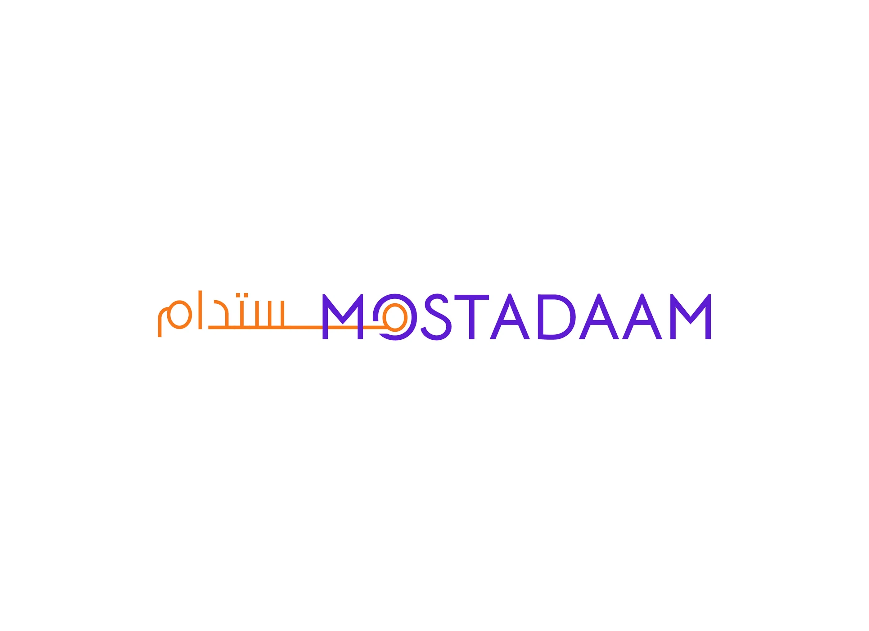

My goal was to create a visual identity that was both modern and rooted in their cultural heritage.
Here's how I transformed their logo:
Simplified Typography: I replaced the mismatched fonts with a strong, elegant Kufi-inspired typeface for "Mostadaam." This change instantly brought clarity and sophistication, reflecting the brand's ambition and stability.
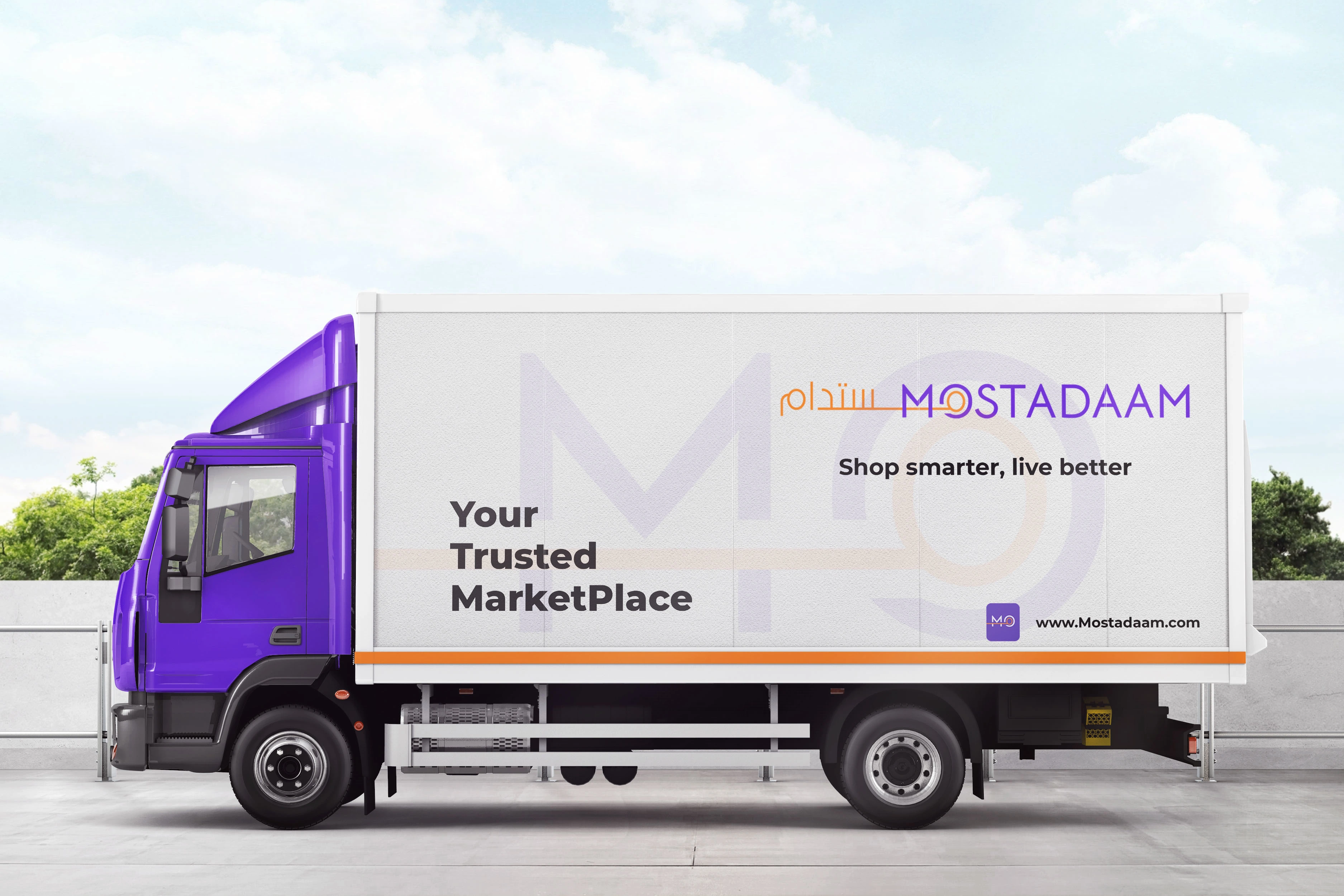
Meaningful Symbolism: Instead of the ambiguous circular arrow, I integrated a stylized "M" formed by converging lines. This symbolizes the diverse offerings and interconnectedness of the marketplace, while subtly echoing the Arabic letter "م" (meem) to bridge the two languages.
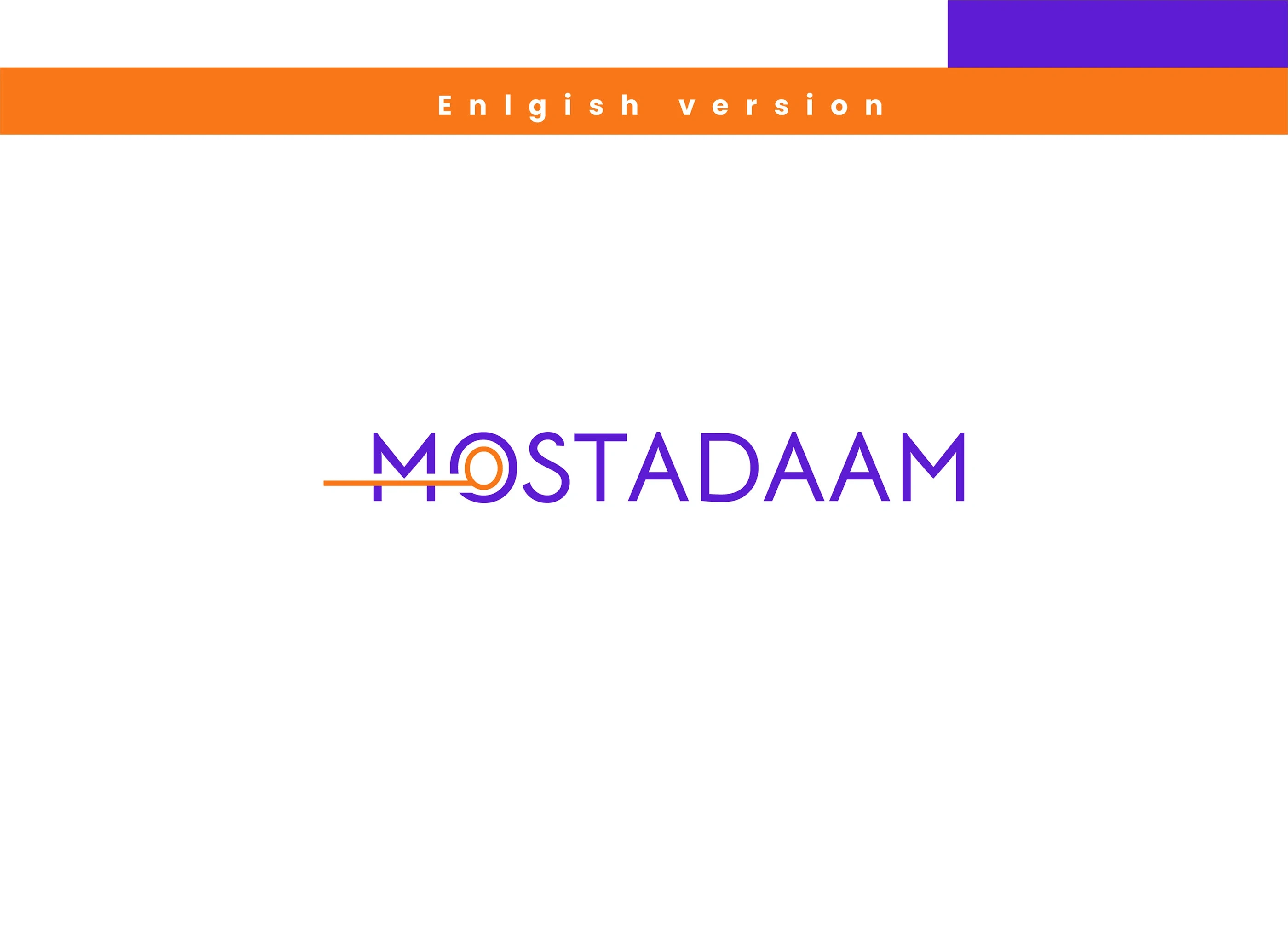
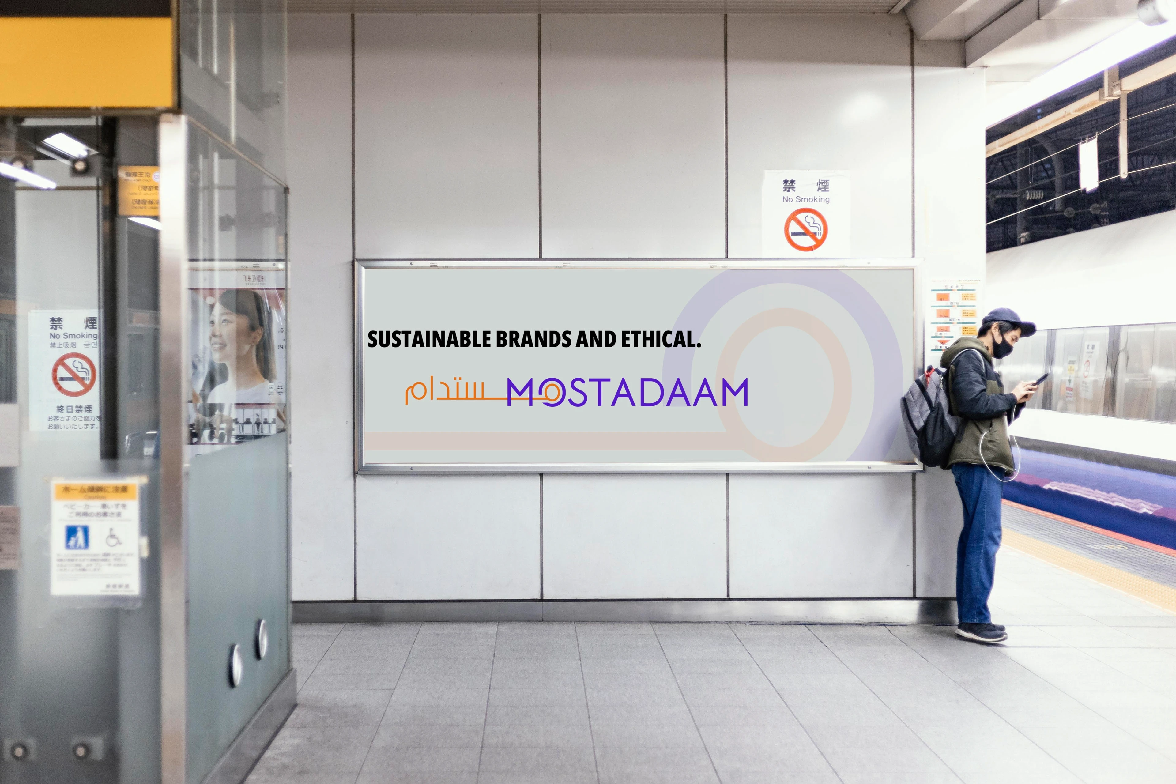
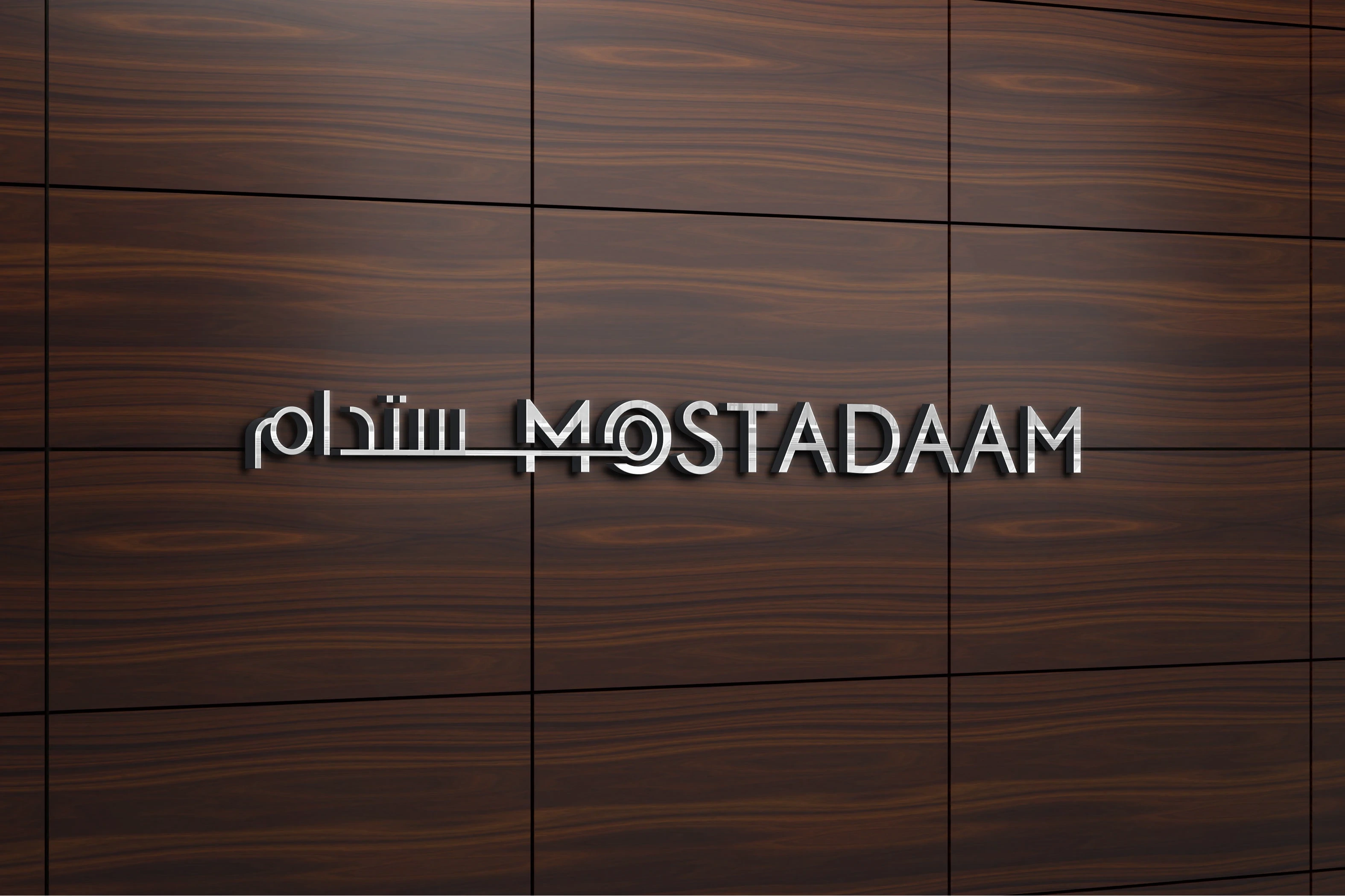
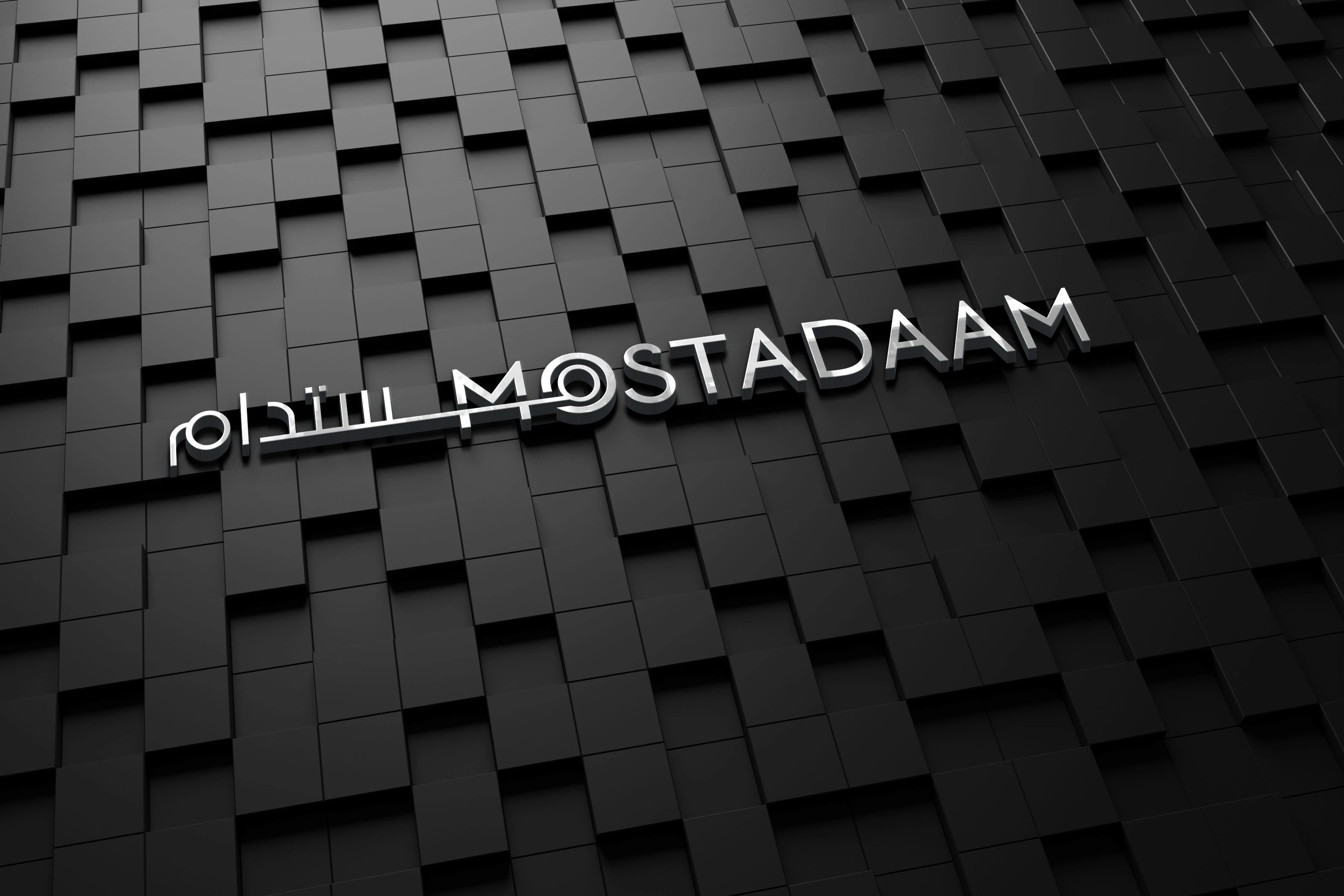
English Version: ( version 1 )
The English version features a clean, modern typeface for "Mostadaam," with a striking line bisecting the word. This line adds a dynamic element, suggesting movement and progress, while also subtly hinting at the concept of connection and bringing people together within the marketplace.
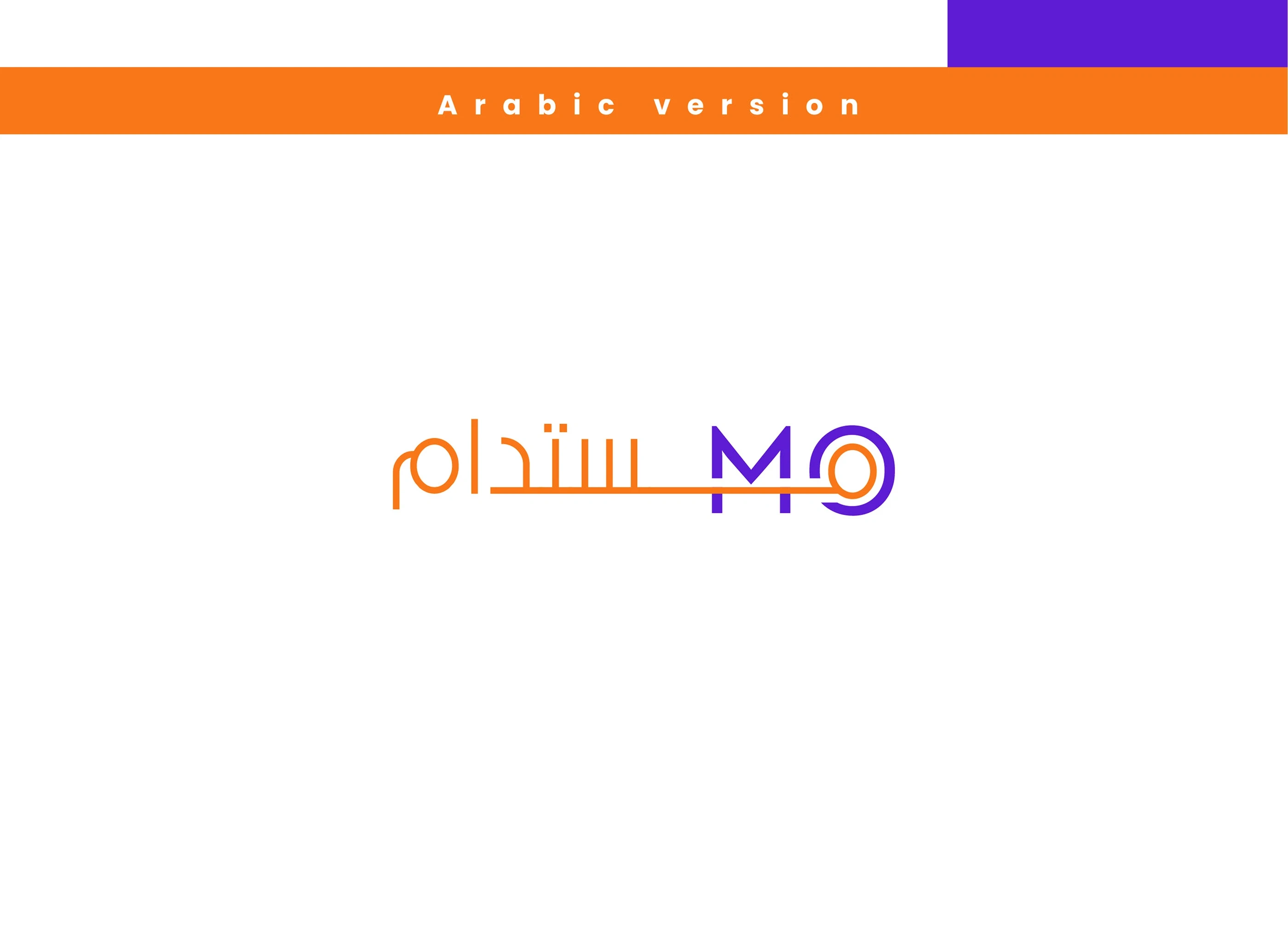
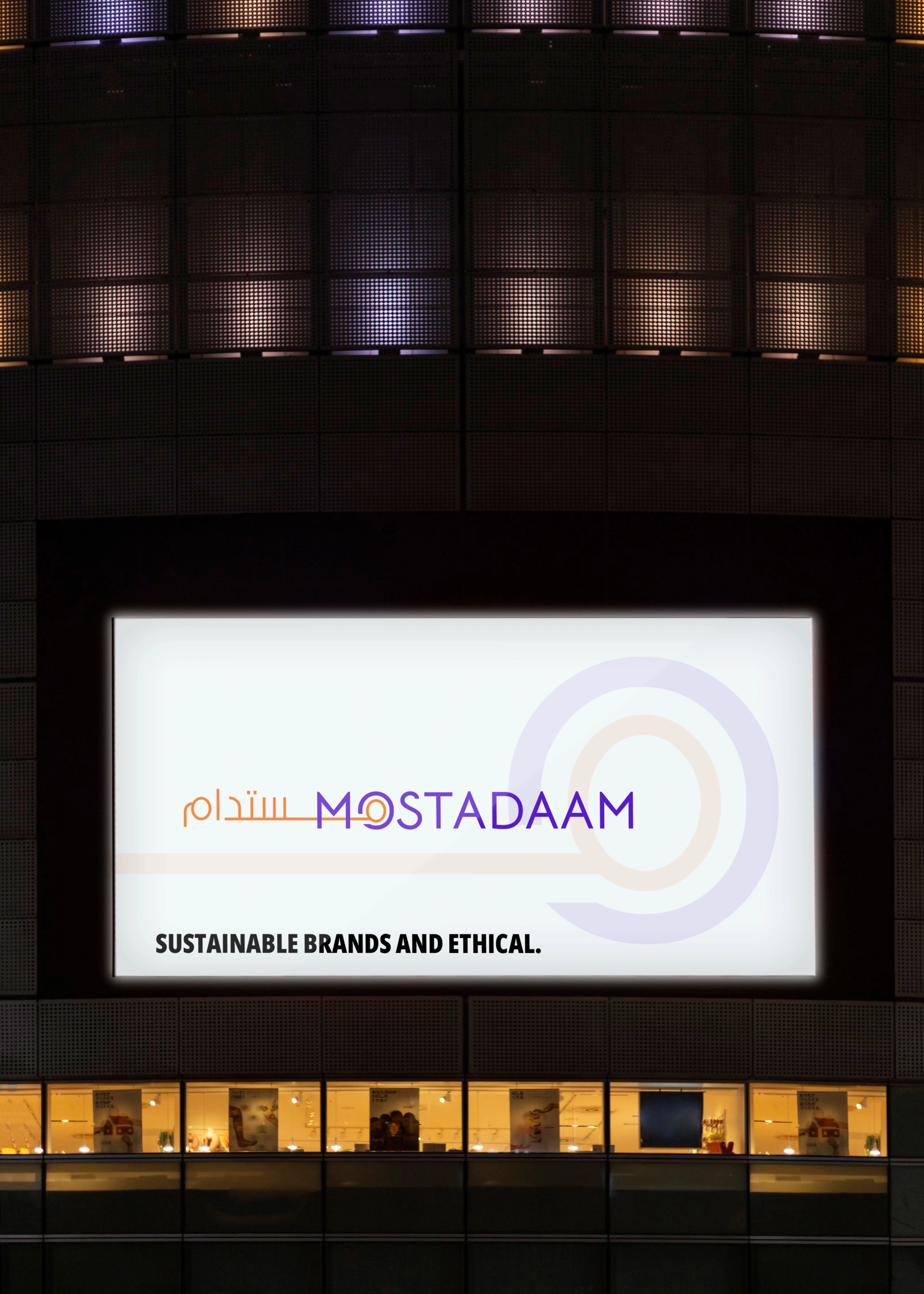
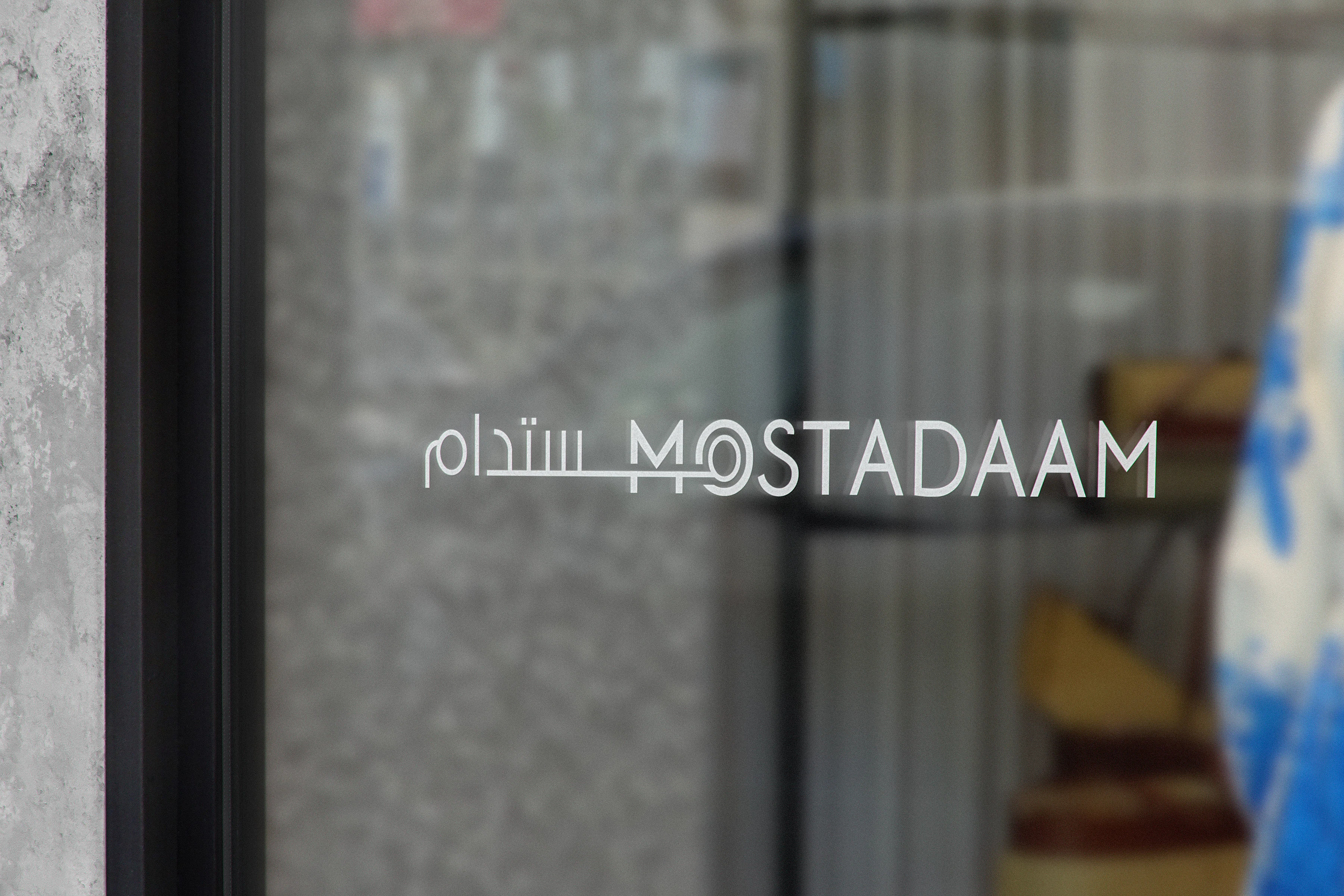
Arabic Version: ( version 2 )
The Arabic version beautifully integrates the brand name with a stylized "M." This "M" cleverly incorporates two circles, symbolizing wholeness and the all-encompassing nature of the Mostadaam marketplace.
The convergence of these circles at a central point reinforces the idea that customers can find everything they need within this platform. The Arabic calligraphy flows seamlessly with the "M," creating a harmonious and visually appealing design that resonates with the target audience.
Like this project
Posted Nov 14, 2025
Analysis of weaknesses in the old logo design.