The past 2 months, I’ve
Anees Adeyinka
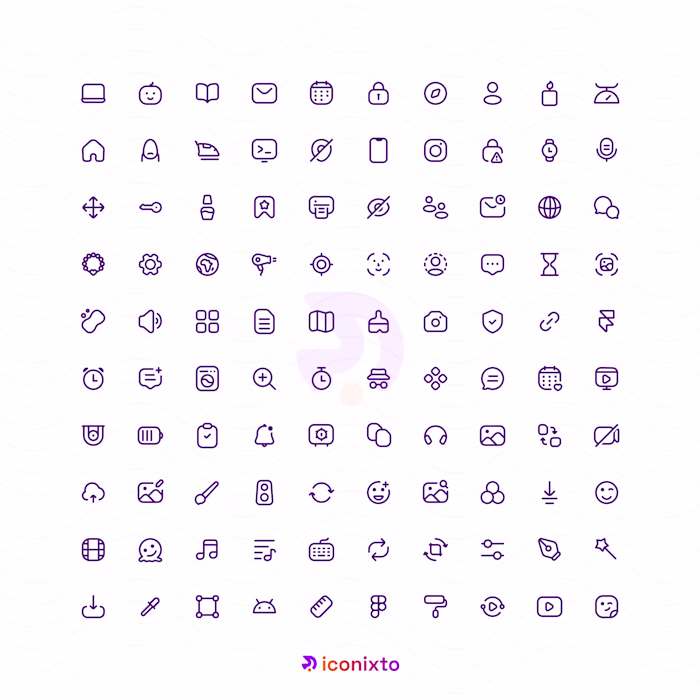
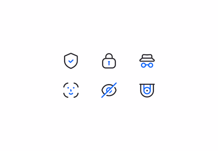
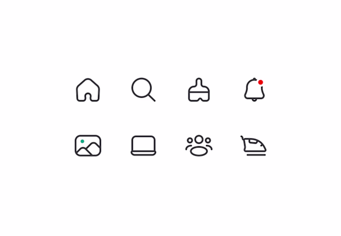
The past 2 months, I’ve been working on a redesign for Iconixto icons.
The focus has been on redefining and following clear, consistent guidelines which would improve scalability, visual cohesion, and predictability across various styles and use cases. Every decision is aimed at ensuring the icons integrate seamlessly into modern UI environments while maintaining clarity, cohesiveness and balance.
This phase is about elevating interface experiences through structure, consistency, and thoughtful detail so that teams can rely on Iconixto as a concrete foundation within their visual design systems.
Still iterating and testing out the system. More updates coming. Who else is excited to try them out?
Like this project
Posted Feb 2, 2026
The past 2 months, I’ve been working on a redesign for Iconixto icons. The focus has been on redefining and following clear, consistent guidelines which woul...
Likes
0
Views
2