Logo Rizz😏
As I have yet to land real clients for logo design, I went on a website for fake business briefs. Some briefs weren’t the most comprehensive but I still had fun playing with them.
Fuwa
I’m looking for someone that can make a good logo for my music production business. I think a combination mark will fit best with the business.
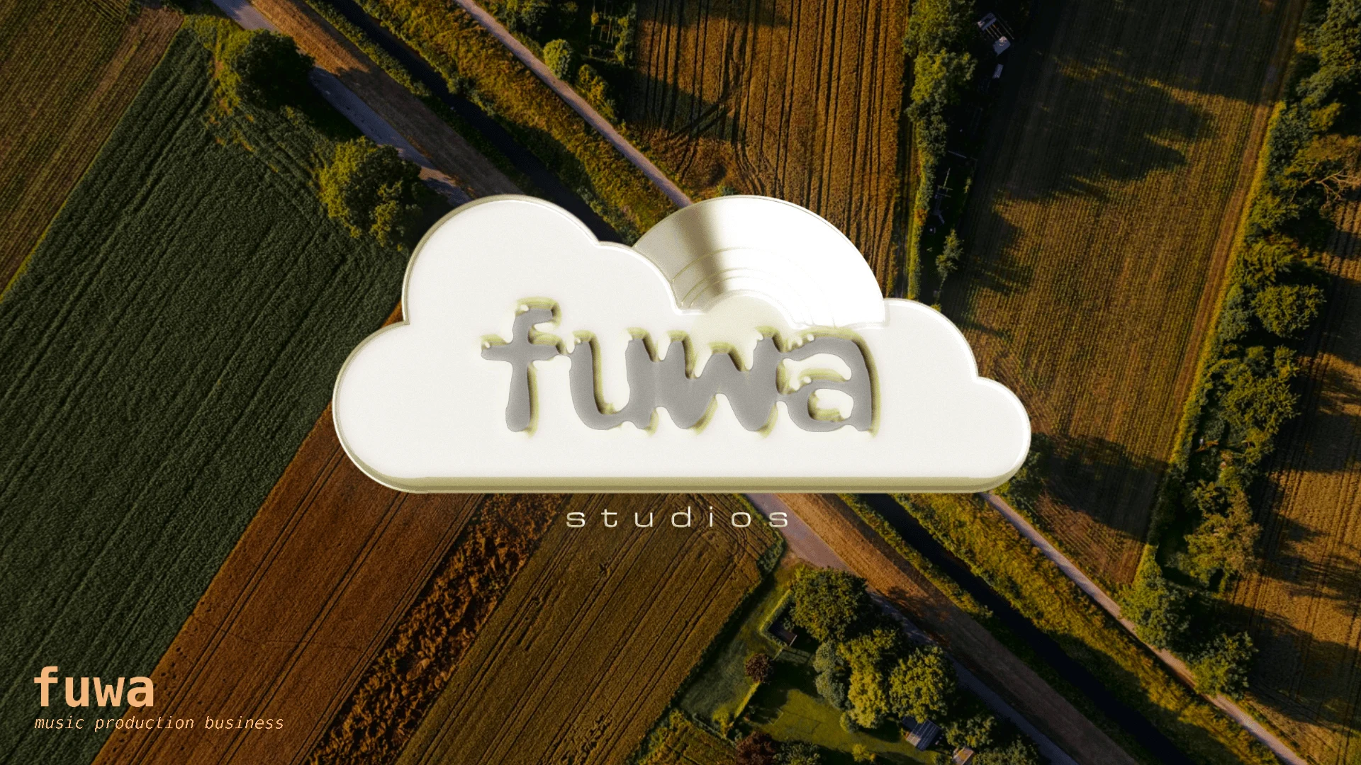
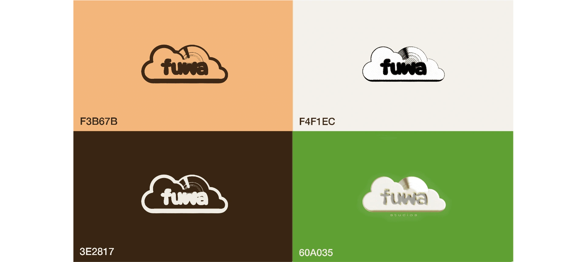
My methodology involved researching about the foreign word name, and we can find that fuwa is half of the Japanese word, fuwafuwa (ふわふわ), meaning airy, soft, fluffy. Music from a company called Fluffy would compel most people to initially imagine songs that are bright and rather sweet. That made me think to take it in the direction of clouds, snow, or donuts. All of them had elements I could twist into CDs or vinyl records, and I settled with clouds, with the sun and its rays as a CD/vinyl.
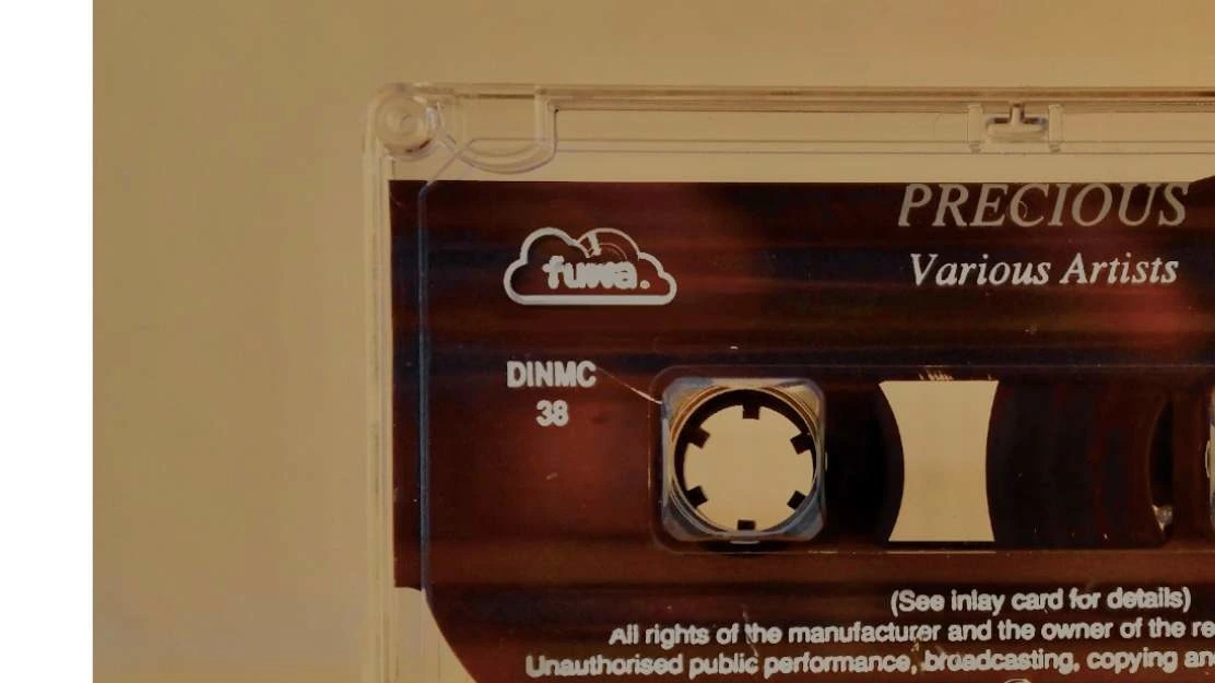
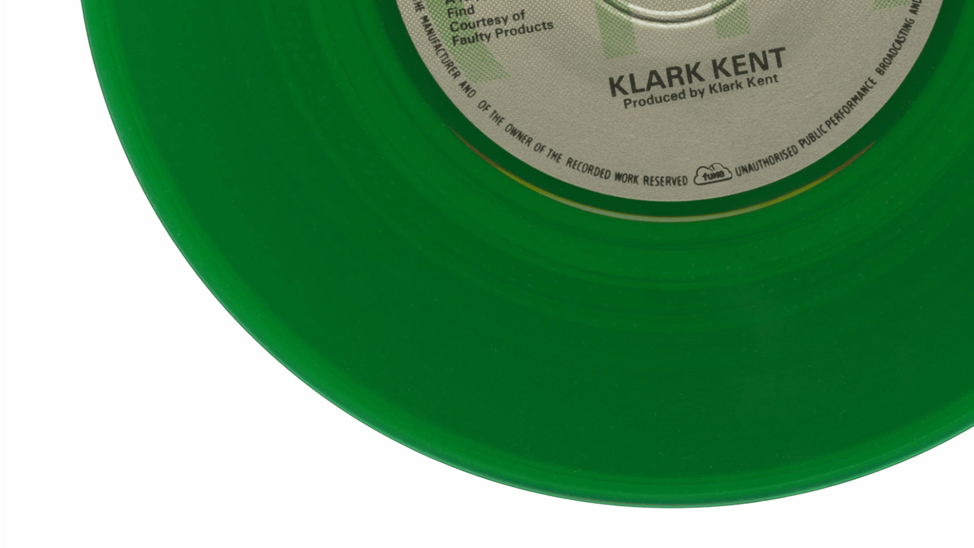
With the name of the business being Japanese makes sense for me to think the company itself is of Japanese origin. Now, the sun is a very significant figure in the country, with its Japanese name, nihon (日本), literally meaning “the sun’s origin.”
I understand clouds can have negative connotations as it usually marks the start of rain, and it blocks out the sun casting a shadow on us. But let’s think for a second. If I ask you about the most beautiful day of the sky, I wouldn’t be wrong to assume, for most people, the image that they conjured featured the sun peaking through clouds. The clouds, the sun, and at dusk? Now, we have a winner!
That said, the Japanese have a special relationship with light and shadow. Recently, I read “In Praise of Shadow” by Jun’ichirō Tanizaki which goes in depth about the philosophy of Japanese aesthetics, where he says “…we find beauty not in the thing itself but in the patterns of shadows, the light and the darkness… creates.” The collaboration of the sun and the clouds creates a timeless beauty unlike any other. I’m certain any music company would want to have the same impact of beauty and longevity, across all continents. And I think I successfully encapsulated that in this logo.
Michelle Gobeil
…I need a logo for my personal brand and was wondering if you could help me out with that. I don't have a very high budget so I would prefer it if you don't spend too much time on it. I'm a children's book illustrator and I need a logo of my own name for my website, social media and possibly to be used on my books. What I would like is my name, Michelle Gobeil, displayed like it was written with a pencil or brush or anything like that. It would be perfect if you could create the logo without using a font because I would like it to be unique.
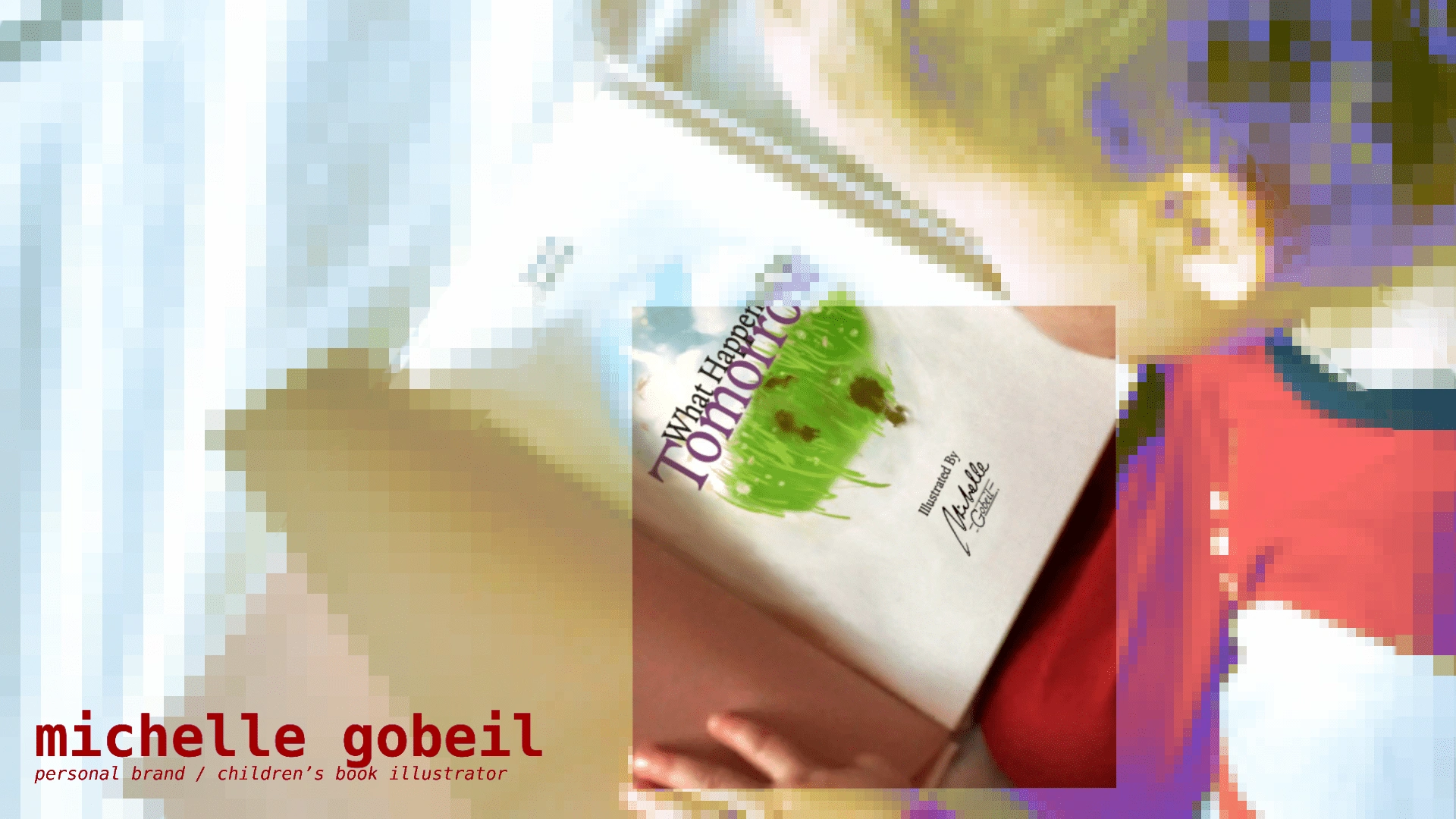
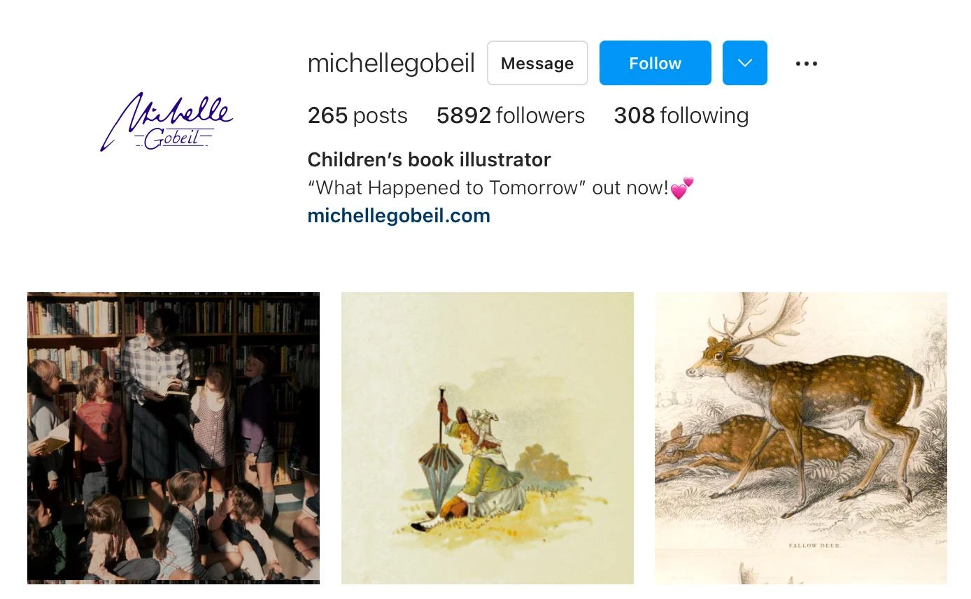
The objectives were laid out clearly for me this time: unique, handwritten, and quick! Her first name was simple—a more stylized version of my own personal handwriting and a cute little heart for the dot above the lowercase i. Now, with her surname, I thought doing them both in script looked too clunky, and I couldn’t shake away the urge to just use a serif font. Thankfully, along the way, I remembered the letter stencils that were on some of my elementary classmates’ rulers. Growing up, I thought those things were so cool, which is why I tried emulating them with the same pen brush I did with Michelle.
I challenged myself to only do 2 hours of perfecting the logo with what she she mentioned about budget. This logo is chic, and has an air of sophistication while still being playful to include her background of children’s book illustrations.
SoundRoom
We are looking for someone that can design a professional logo for our business. I would like the logo to be an abstract mark. We would love to work with you!
cquoic444 (C’est quoi ça?)
This one actually isn’t a brief from the brief generator website, rather it’s for my own brand to put on my art, like a signature. In French, it means “what is that?” only it’s immensely stylised. My art style is quite erratic, but in recent years I’ve been grounding it more in the conventions of the baroque period, often shrouded in shadow, making the detail in light all the more sweeter. It’s not by any means abstract art, but I’d like to invoke curiosity in my viewers, to have more eyes on my work. I wanted something abstract and organic.

We begin with the initials of the name, CQC4, left to right, top to bottom. We zoom out, tilt our heads to our right, and a body emerges. For some, it’s somebody in a shrug trying to figure something out. It could almost look as if it’s blurting out “c’est quoi ça?” For some it could look like me holding a brush and I’d just done an oh so gorgeous void(a dot). We zoom in just a little bit, and we can kind of make out curious eyes from rounds of the Q and the 4 from a 3/4 profile, with the slant of the 4 as its nose.
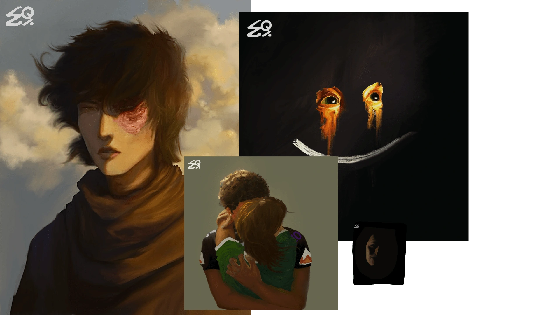
With all that said, I’d say I achieved my goals for this logo successfully.
Like this project
Posted Jul 21, 2024
Yuma developed logos for fictional businesses as he, so far, has been unemployed. Gorgeous logos tho
Likes
0
Views
19
