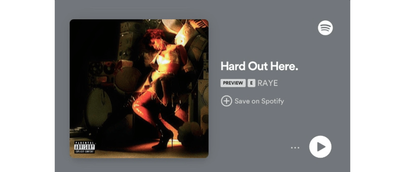
Alternative Cover Art for Raye’s “Hard Out Here.”
TW: mentions of sexual abuse, suicide, drug addiction
Song Context
The song’s lyrical content is summarised efficiently by the title. She describes herself as a young girl in the dungeon, a girl at the bottom of the tier, and she outlines everything she’s ever experienced for you to believe how hard it always has been for girls like her, from being drugged without her consent, being sexually exploited, being underestimated as a female artist, the natural consequences of the patriarchy, violence, suicidal ideation, near death experiences with addiction as a way to cope with her deep struggles. Thankfully, she was able to push through it all by her faith and rage. In the hook, we see her power, cockiness even, perhaps. A mantra:
Baby, I bounce back.
This single was her first ever independent release after severing ties with her former label. The success she’s earned ever since is so great, and so well deserved.
There’s something so holy about it with the choir-like background vocals, the grand space the reverb makes her vocals live in parts of the song, the mere fact that it starts with a church organ. All of that intertwined with a hiphop beat, a stuttering bass with a round fullness that adds to the bounciness of the groove. The strings acting as backlighting for her beautiful warm alto voice through the rapping, and the heart wrenching diva vocals she displays near the bridge. I could go on and on, but the main point is how well balanced the dark and bright elements are. It’s a masterclass in attention retention through dynamics without being erratic.
Design Decisions
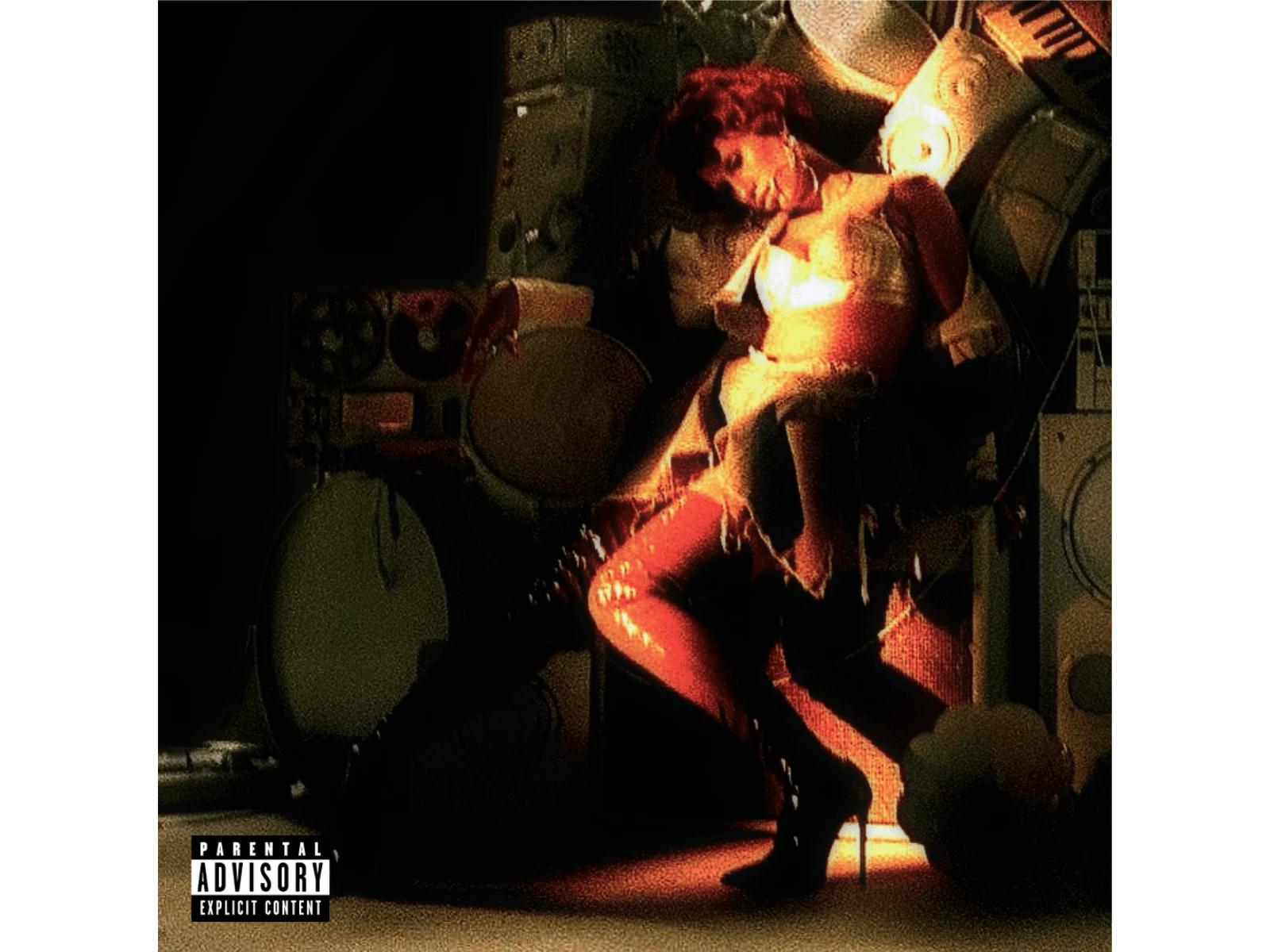
This alternative is a huge departure from the visual language of the official artwork. Most of the canvas was covered in white, except her head and the hands that surround her. In my opinion though, this looks more how the song sounds: dark, theatrical, striking, ethereal. It’s essentially a Caravaggio painting, the father of baroque painting. The church hired him back then to gain back the attention of the masses, within the context of counter reformation. His paintings caused emotions that made the Christian faith stronger. It is bold and real. I could say all the same with Raye’s work with this song, and several others in the LP that followed.
God, I am so grateful they took this photo from the time they were photographing for the album’s main cover art. I saw it in Pinterest, and then I was in a flow state. Originally, it was more or less a raw file, fresh from the camera’s memory card. It’s lit so perfectly for what I was imagining.
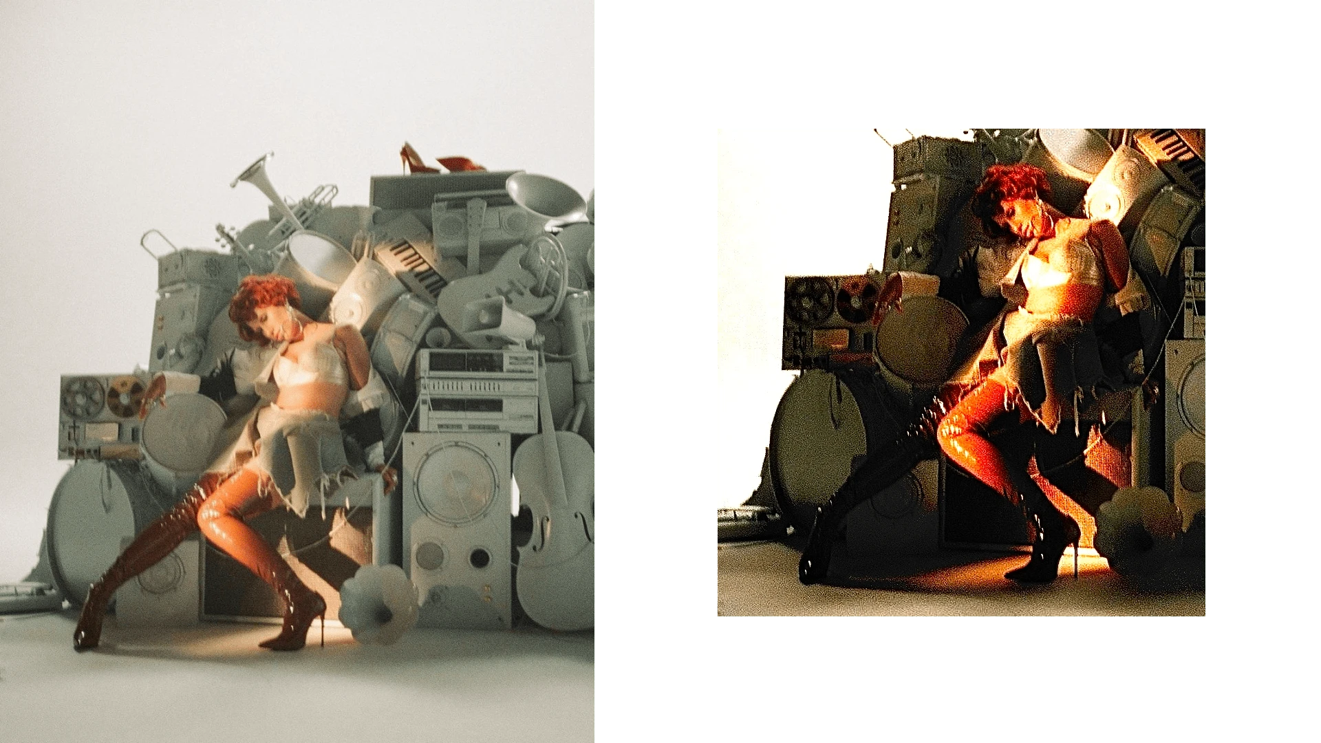
I cropped it in, played with the levels, saturation, vibrance, temperature, texture. Basically, I blew it up to excavate the contrast I was seeking. Afterwards, I painted the remaining corner of white to black, to further sell the baroque fantasy. Then, I added noise on the black patch to blend it in with the rest. I did a few more tweaks with the colours, and finally, the necessary Parental Advisory sticker on the bottom left corner to finish it all off.
Like this project
Posted Jul 30, 2024
Yuma bridges the parallels between Raye and Caravaggio.
Likes
0
Views
94
