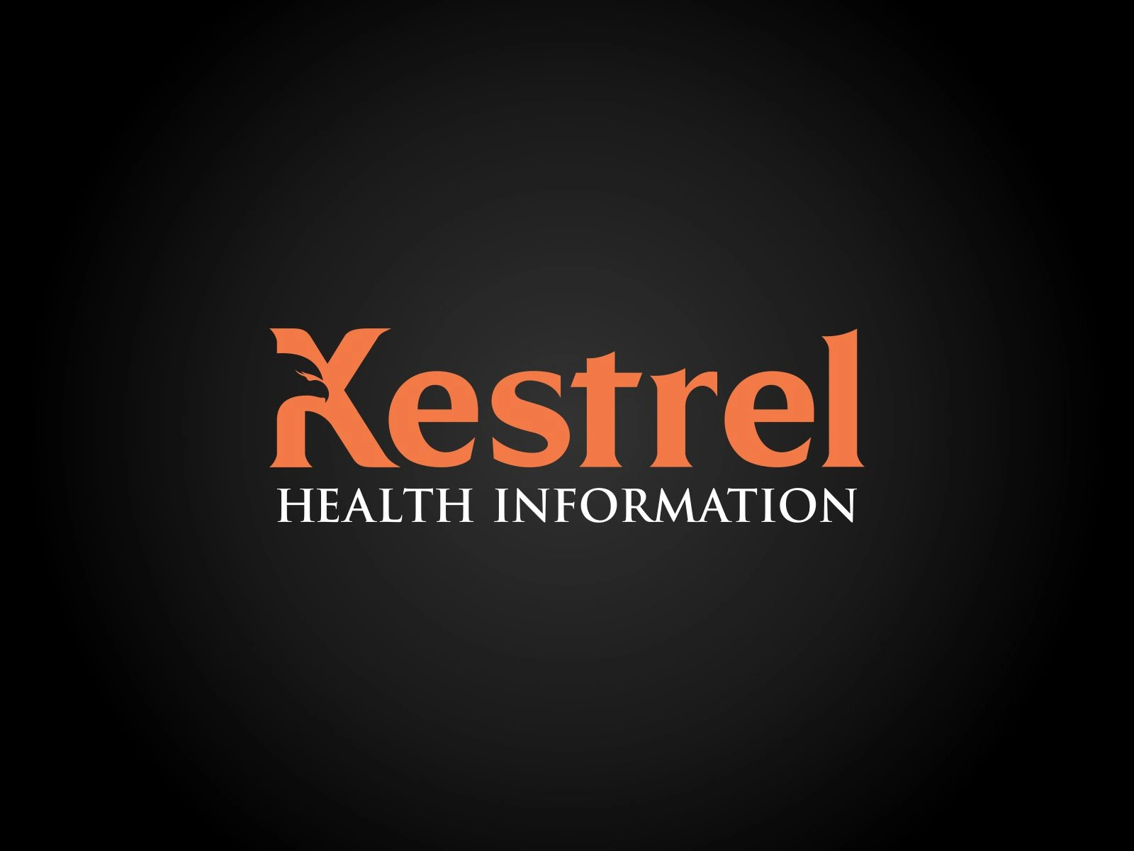
Kestrel Logo Upgrade design
Neptune Morales
Upgrade Logo Design

Kestrel Logo Before & After
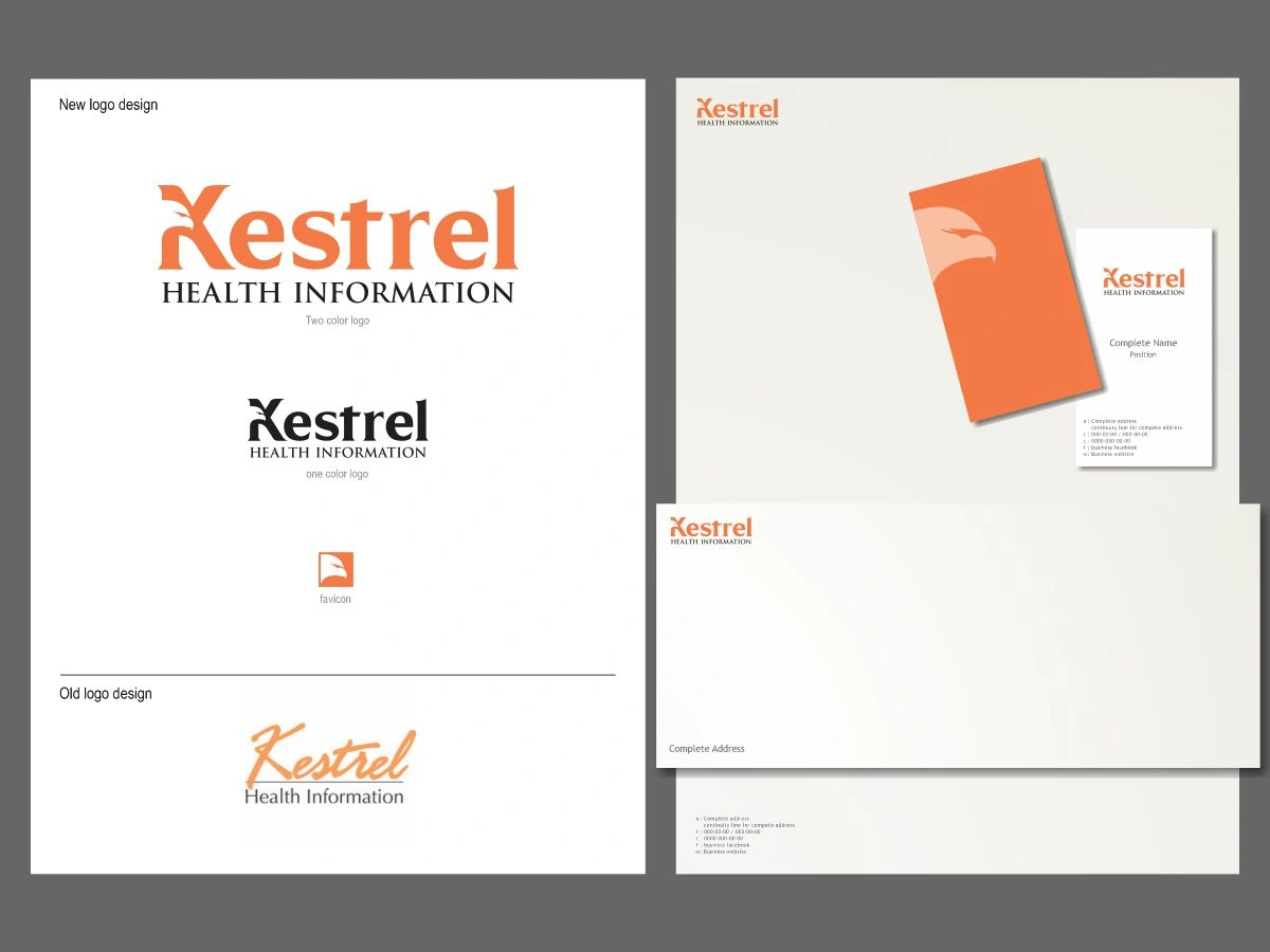
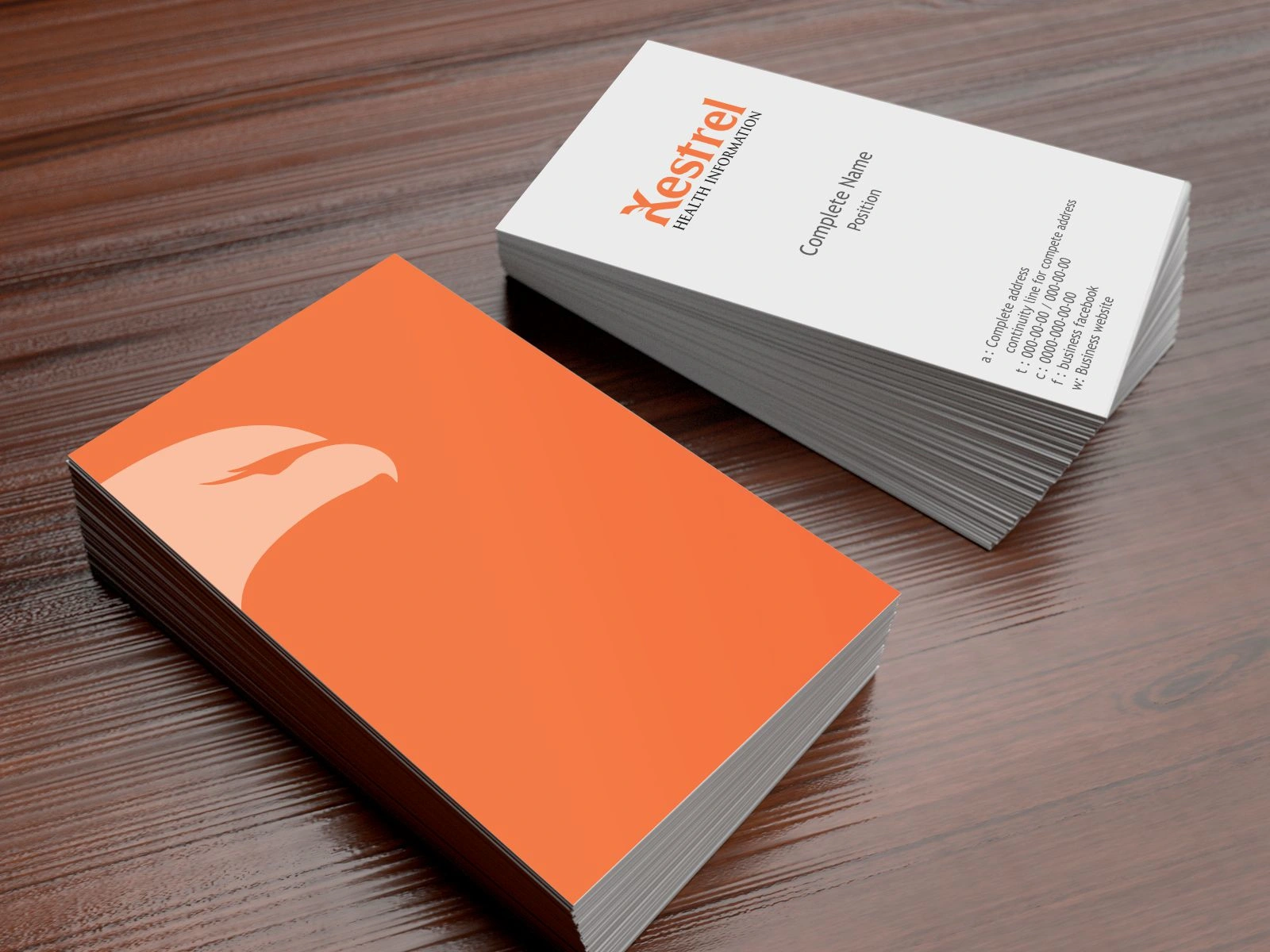
Business Stationaries
After two decades of relying on a minimalist script wordmark, this clinical review firm required a modern brand refresh that balanced medical precision with a new, authoritative visual identity. To meet this challenge, I fused a Kestrel silhouette—symbolizing sharp vision and agility—with clean, professional typography to create a "strong-yet-friendly" aesthetic. The final result bridges the gap between expert clinical analysis and approachable service, delivering a cohesive corporate identity that the client now carries with renewed pride and satisfaction.
Like this project
Posted Jan 29, 2026
I modernized a clinical firm’s 20-year brand by fusing a Kestrel silhouette with precise typography, balancing medical authority with a fresh, agile identity
Likes
0
Views
2