Balance Coffee Hero Section Design
🌱 About Brand
Balance Coffee, a health-focused coffee brand based in the UK, aspired to redesign its homepage, aiming to better echo its brand essence and voice.
🎯 Goal
The goal was to craft a captivating hero section for Balance's homepage, encapsulating the core essence of their health-centric coffee brand.

Previous Hero Section Design - The initial layout lacked the necessary visual impact to effectively communicate their message.
🎨 Creative Strategy
Our approach involved a comprehensive redesign of the hero section, accentuating the idea of healthy coffee. This comprised a captivating blend of imagery, font adjustments, and label design to emphasize Balance's unique offerings.
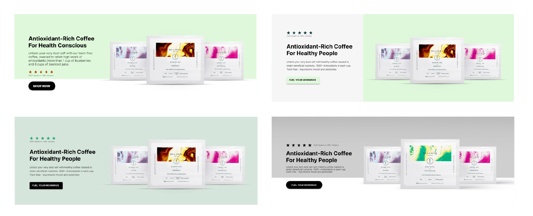
Layout options
📈Outcome:
The revitalized hero section now impeccably aligns with Balance's brand vision, significantly enhancing the homepage's overall appeal and message delivery. The visually captivating and informative design now accurately mirrors the brand's core values.
Key Highlights of the New Section:
Elevated Brand Messaging: Emphasized purposeful design to reinforce the brand's identity.
Strategic Brand Appeal: Encouraged the brand to stand out and make a lasting impression, fostering immediate action from the audience.
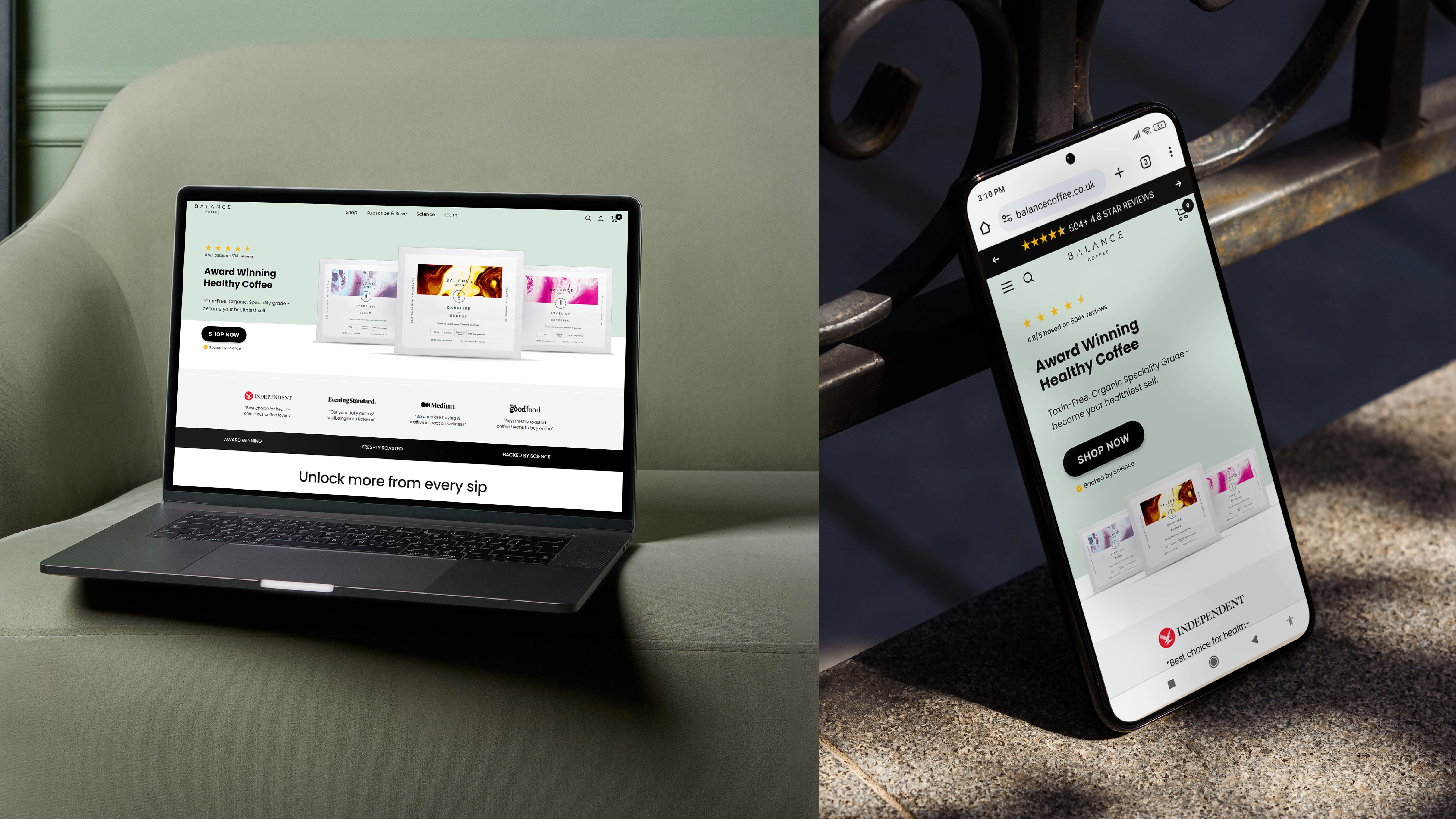
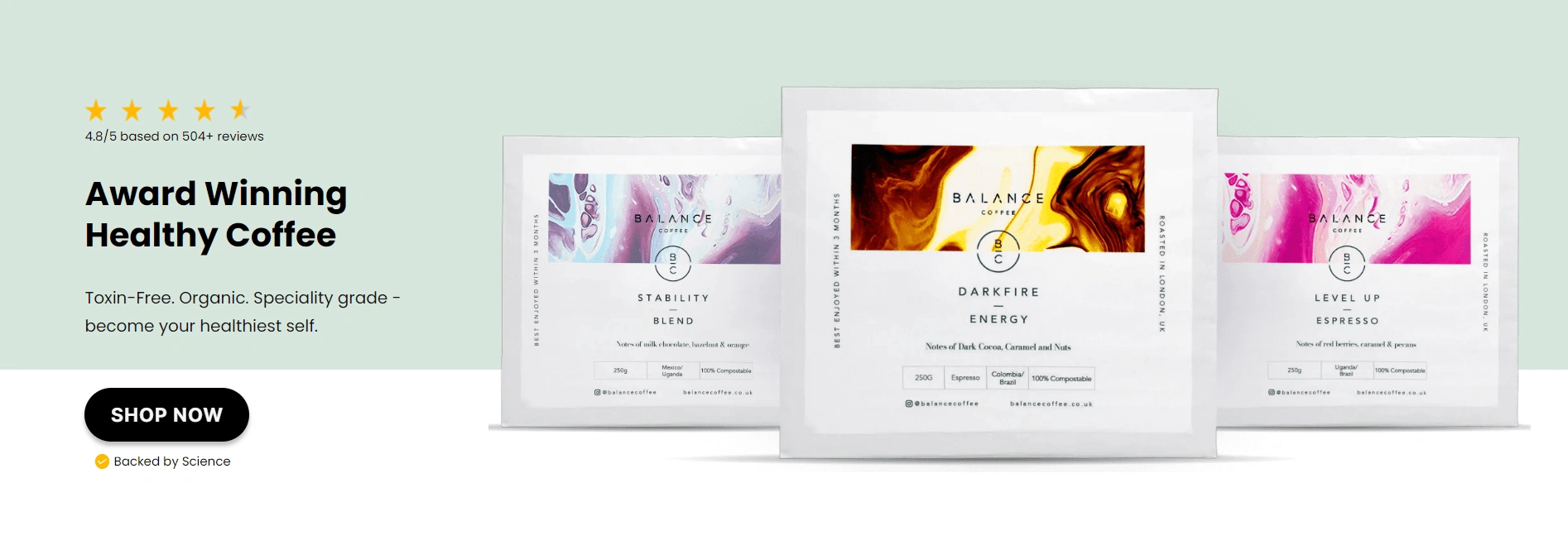
Final Hero Section Design
Elevate your brand with purposeful design.
Let's collaborate and bring your vision to life! Contact to discuss your project and take the first step towards creating a captivating brand identity.
Together, let's make your brand stand out and leave a lasting impression.
Get in touch now!
Like this project
Posted Nov 1, 2023
Revamped Balance Coffee's hero section, elevating brand messaging and enhancing visual appeal to reflect its health-conscious essence. ☕☘️

