Manscapers Redesign
My role: UX Design, UI Design, Branding
Timeline: 4 weeks
Client: Manscapers NY
Tools: Figma, Miro
To view the desktop prototype, please click here
To view the mobile prototype, please click here
The Problem
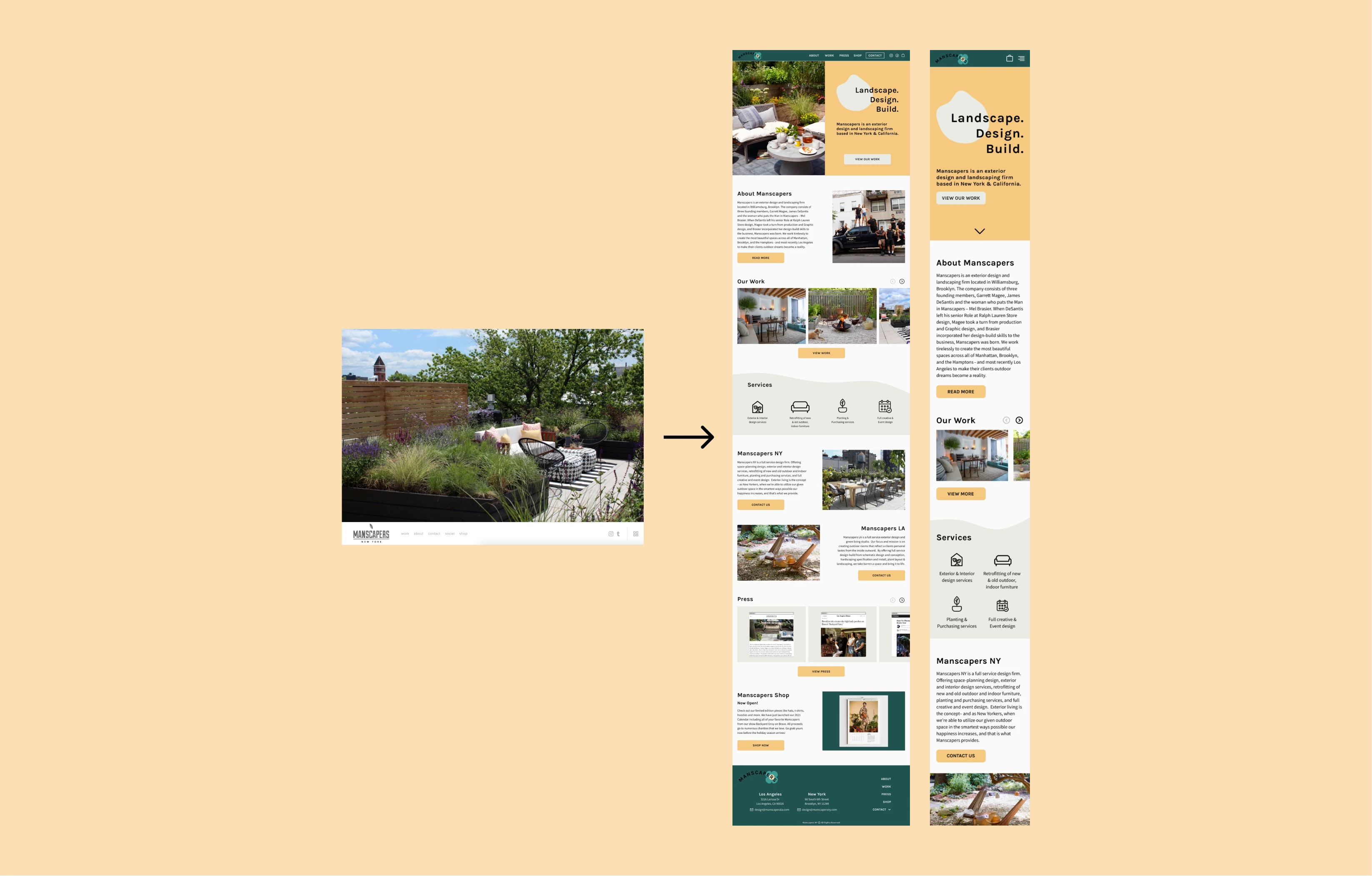
Manscapers is an exterior design firm based in New York & Los Angeles. They focus on exterior landscaping & design projects for homes, companies, hotels, and much more. When entering their website, you are brought to a page showing two options - New York or Los Angeles. New York's website has a fixed auto-play photo slideshow with a navigation bar on the bottom of the page. The Los Angeles page includes a long scrolling landing page with large photos and explanations of what Manscapers are passionate about. The problem with this is that information is scattered throughout both websites. This causes confusion for the user and through user research, I found that many users didn't even know what Manscapers as a company offered after their first visit to their websites.
My goal for this redesign was to combine both websites into one and make the overall experience much more user-friendly and informative. Users found the website difficult to navigate and unorganized. Another main point brought up was the navigation at the bottom of the page was frustrating and felt that they ended up at dead ends throughout the site.
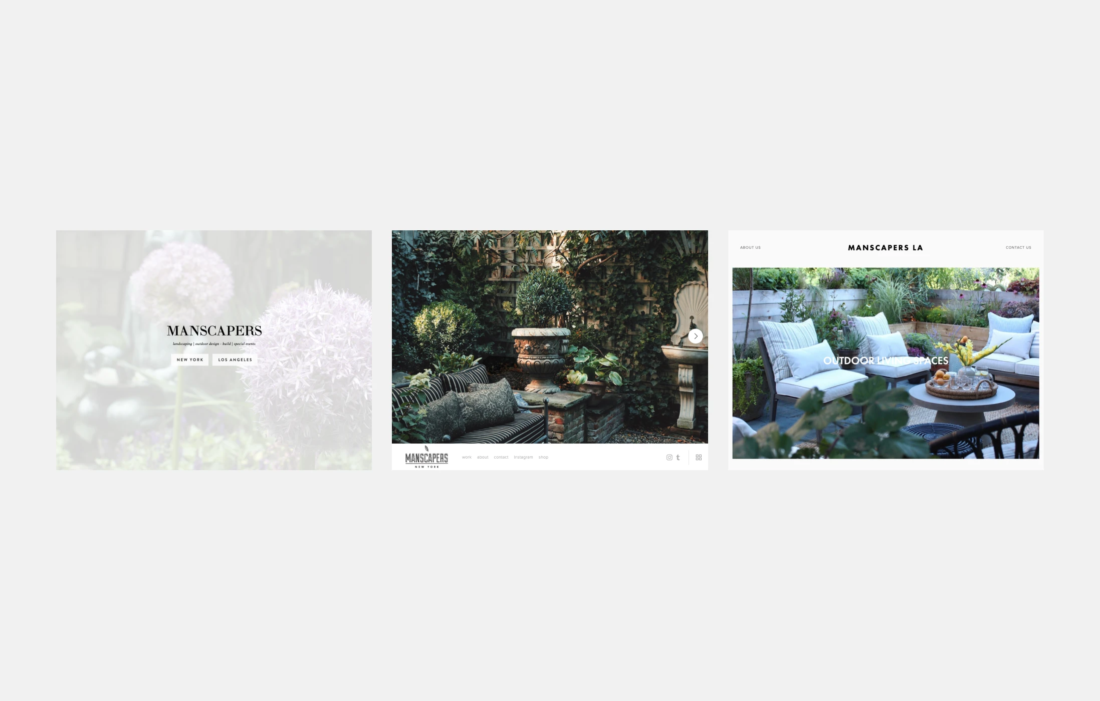
Screenshots of website before redesign
The Solution
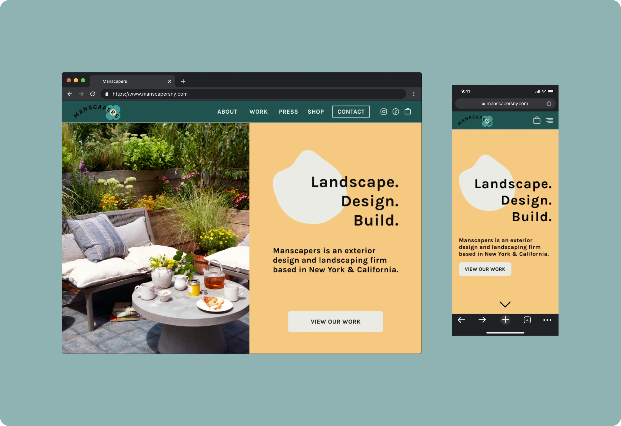
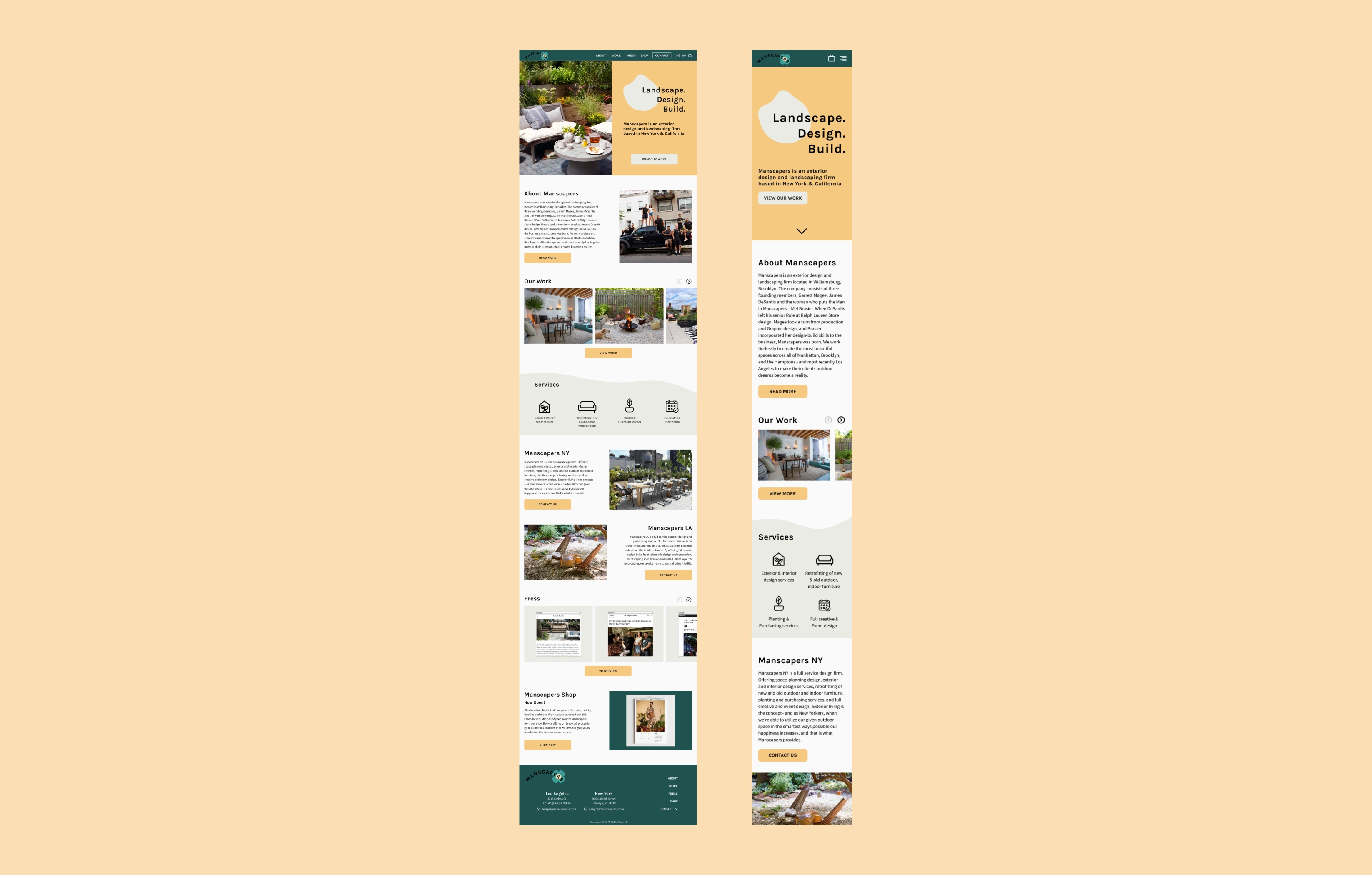
For the redesign, I focused on navigation, layout changes, and making sure important information was shown throughout the website. Instead of the homepage just having a photo slideshow, I added different sections which would then lead the user to different areas of the website - About, Work, Press, Shop & Contact sections are all visible at the very beginning of the website. Instead of the two cities having completely separate websites, I combined them and allowed the user to choose between Los Angeles & New York when reaching out to Manscapers or when viewing their projects on the Work page. Some users suggested their current website was a bit plain so I added a completely new color palette, icon set, and a new logo.
Another important change was bringing the navbar to the top of the page, and adding a footer which would be an extra way for users to get around the website without feeling lost. The bottom footer also gives extra information about contacting them which I found to be the most important factor of the website considering they are always looking for new projects to work on with clients.
User surveys
For user surveys, I surveyed 15 people and asked 10 questions via Typeform. I asked them to go through both websites (New York & Los Angeles) and answer the questions afterward. I found a lot of similar insights -
• Users found it frustrating that the navigation bar was on the bottom of the page.
• Users did not like how the site changed based on location and felt that they should be combined.
• There was no introduction to each project and users felt like the website lacked important information.
• Services provided were not clear
• Users loved the images of their work and a lot of users would book them just from seeing the photographs of their work.
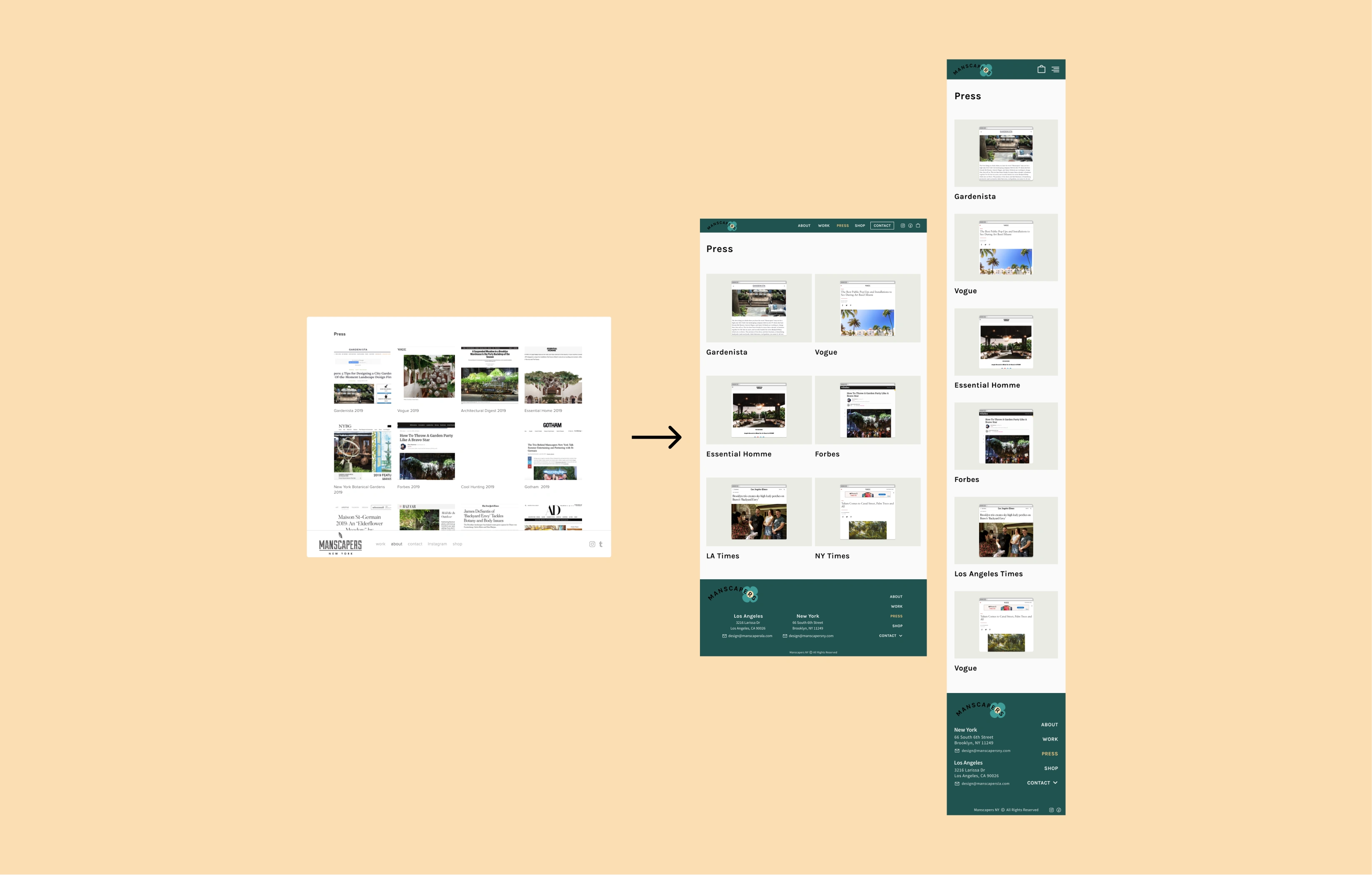
• Users didn’t understand why the Press section was inside of the About section, it felt hidden to them.
“I didn’t enjoy the different layouts between NY and LA. I also didn’t like that the two city sites were separate from the main page.”
- User quote
Competitive Analysis
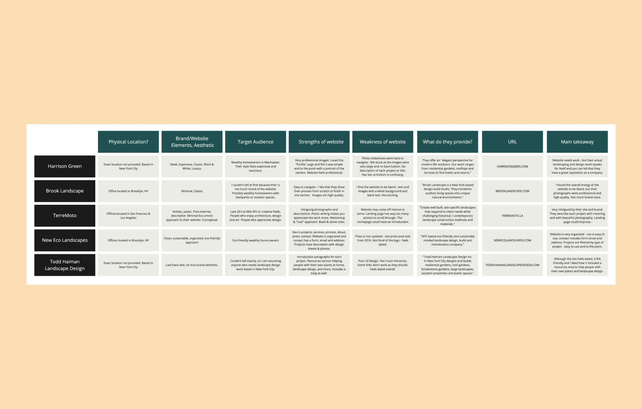
Through competitive analysis, I focused on looking at the websites of other firms in the industry and finding similarities and differences with the Manscapers website. The business of exterior design is a small one, so having a brand aesthetic and a clean website that is easy to navigate is important. I found that a few companies did not have a brand identity - but they had great work examples. What I did enjoy about TerreMoto & Todd Haiman was that they thoroughly explained their work while showing their projects. I feel as though this gives users and potential clients a background to what they do - and Manscapers was missing that on their website. This gave me the idea to have small introductions with each project that they present on their work page. For future versions, I’d love to include initial sketches and also photographs during the outdoor renovations.
User Persona, Empathy Map, Journey Map
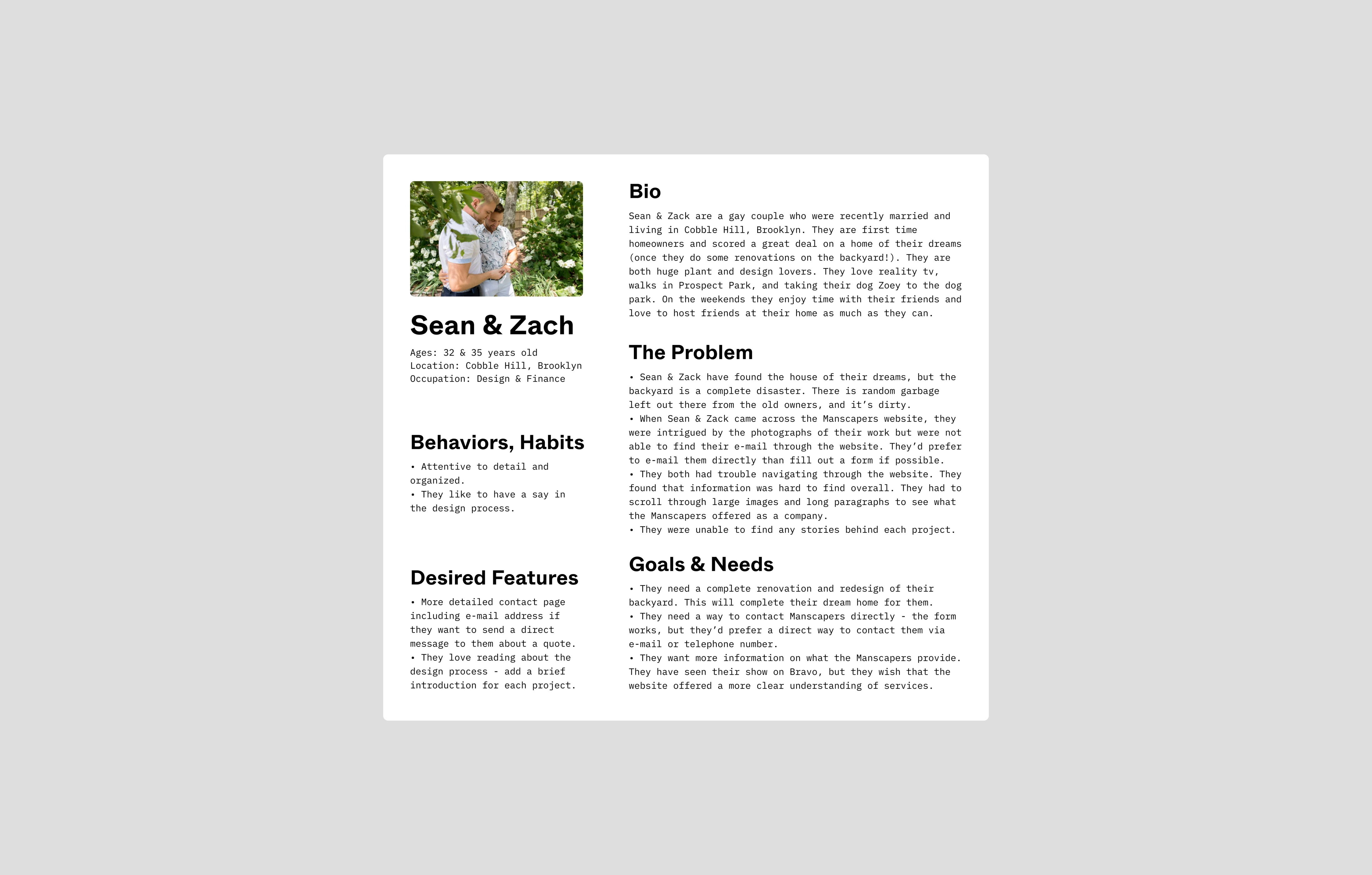
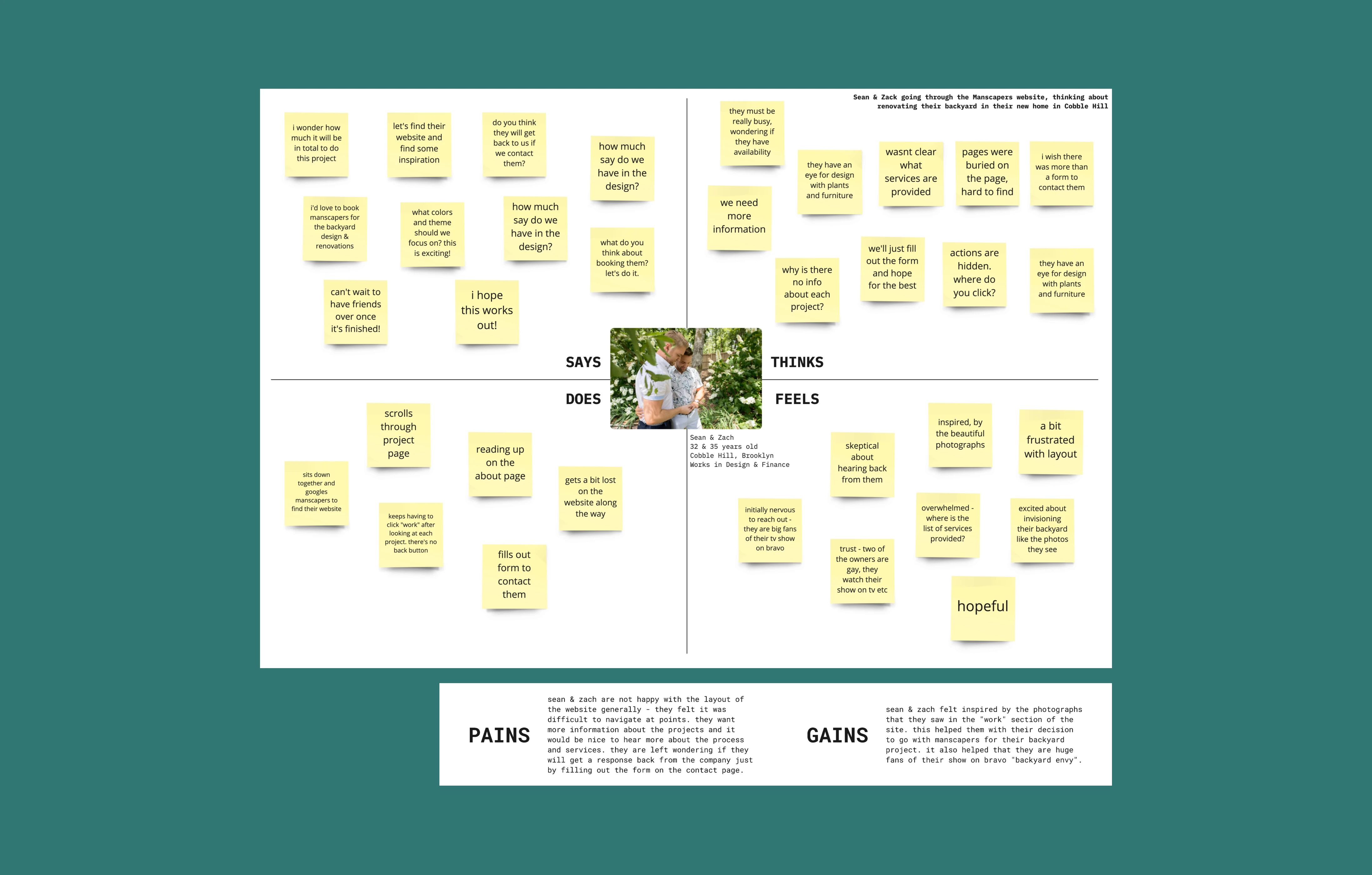
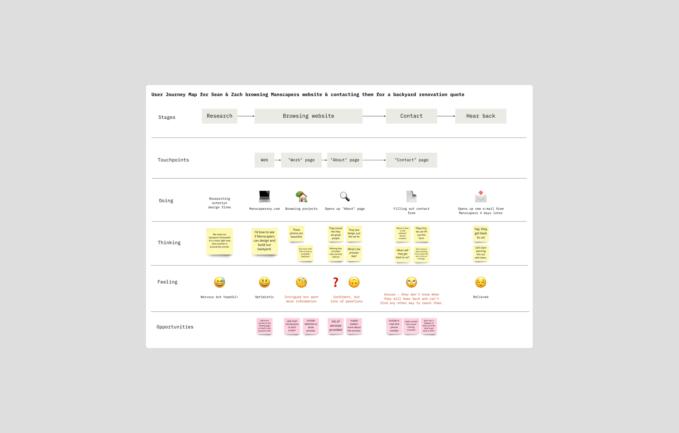
After building a user persona using user research, I created an empathy map to try to understand the user's mindset while using the Manscapers' website. The journey map helped me think about the current flow and any possible improvements.
Sketches
After completing MoSCoW method as well as a Sitemap, I began on sketches to think about the updated layouts for each page.
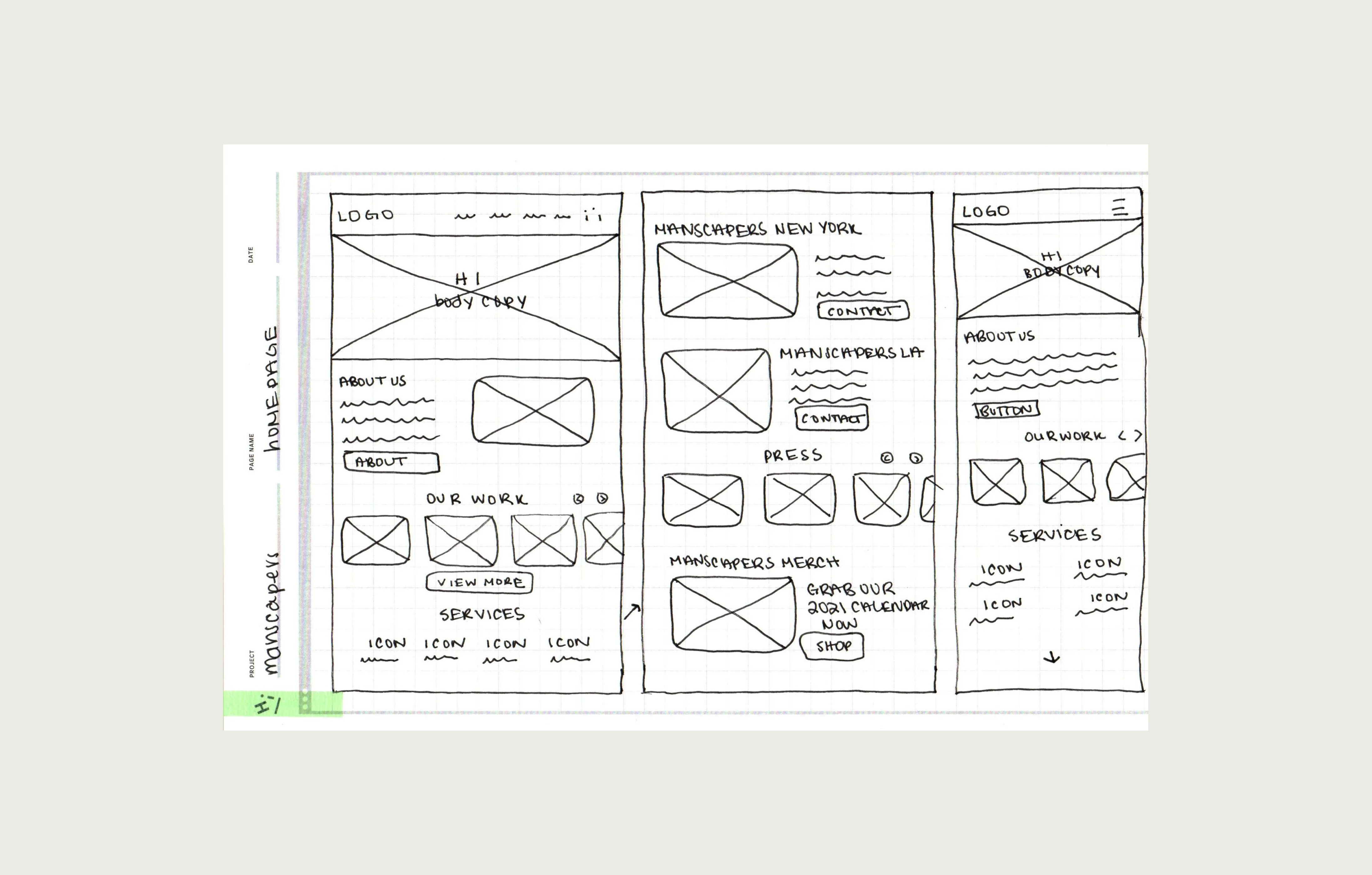

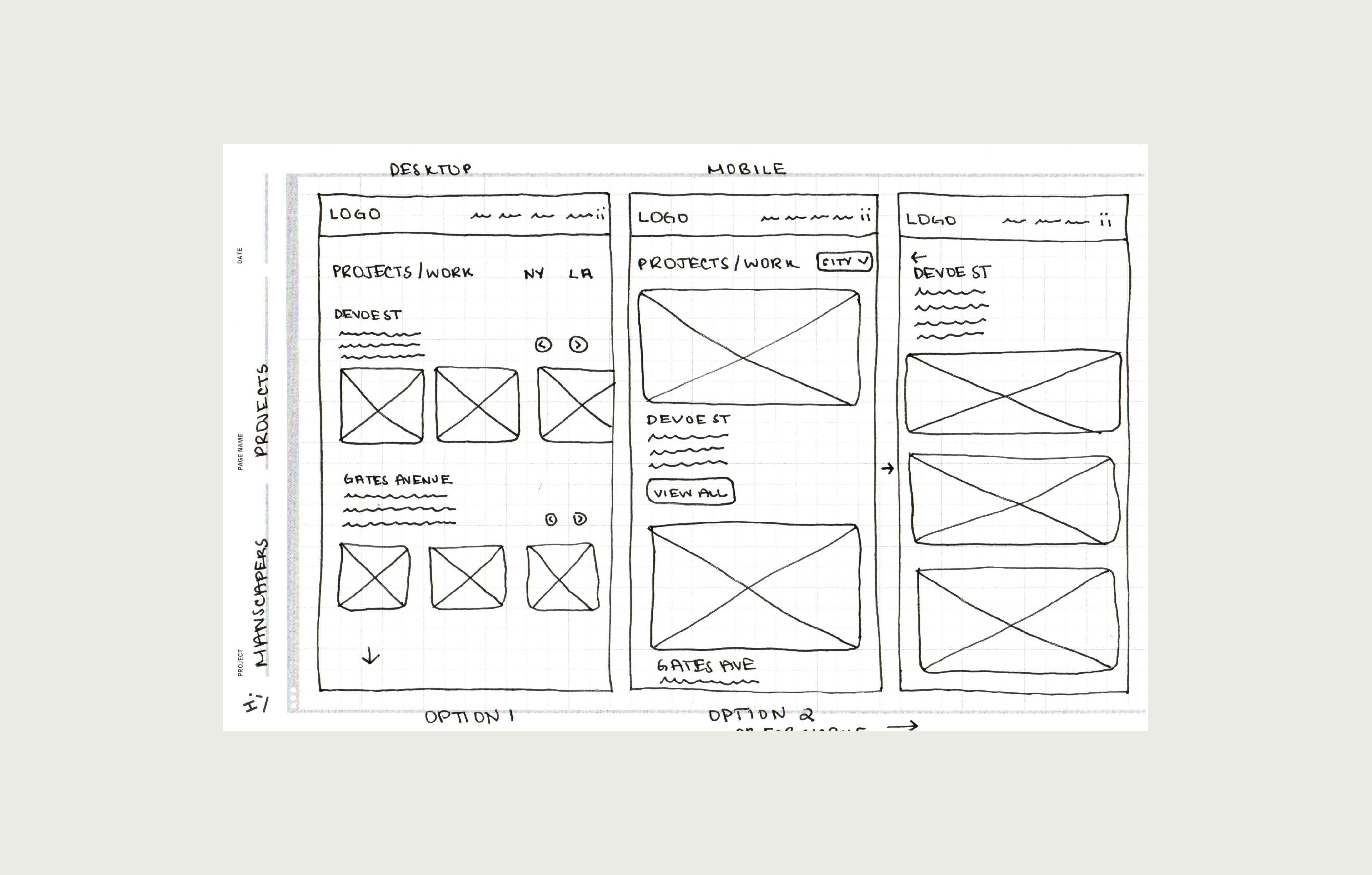
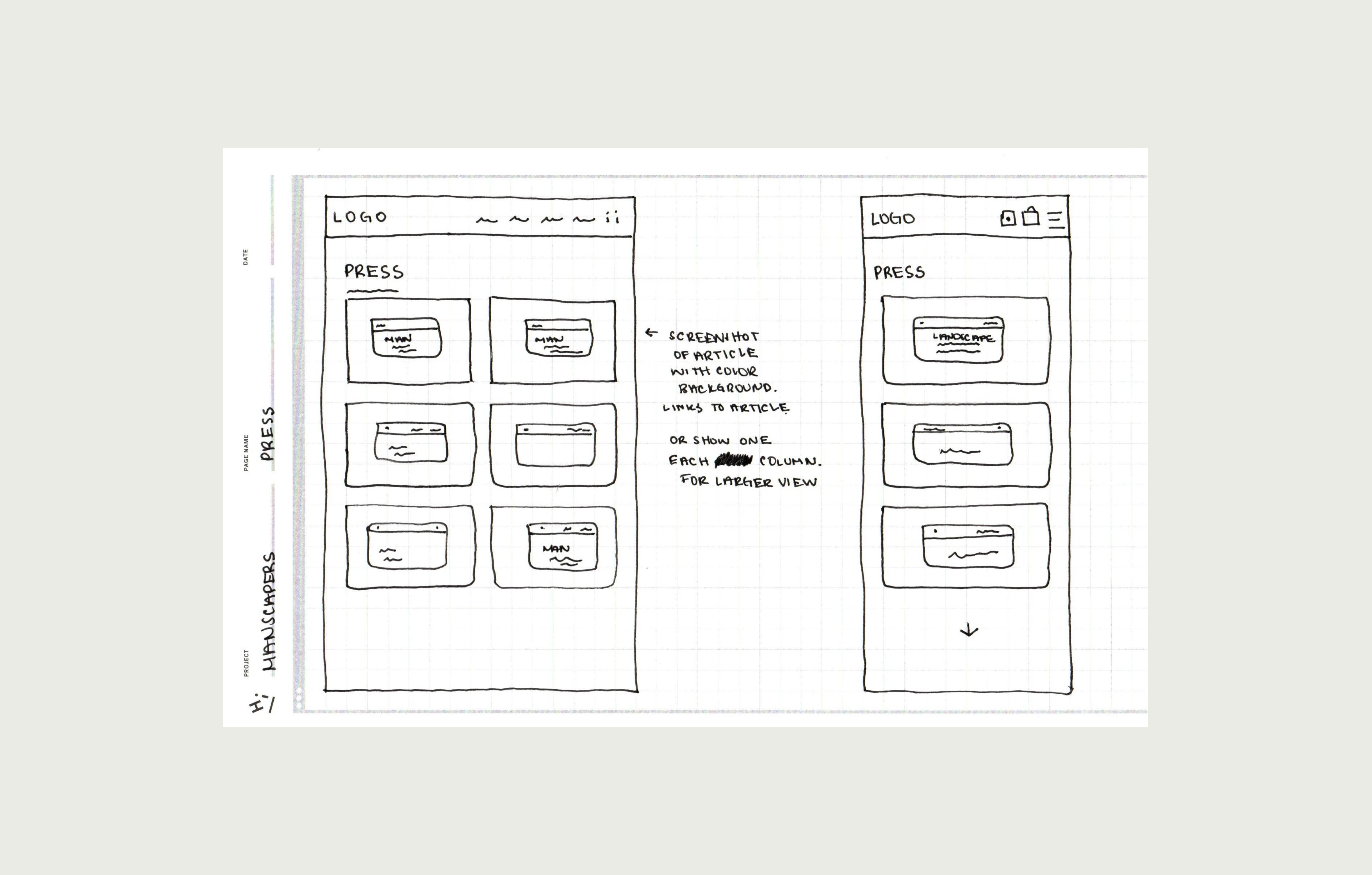
Wireframes
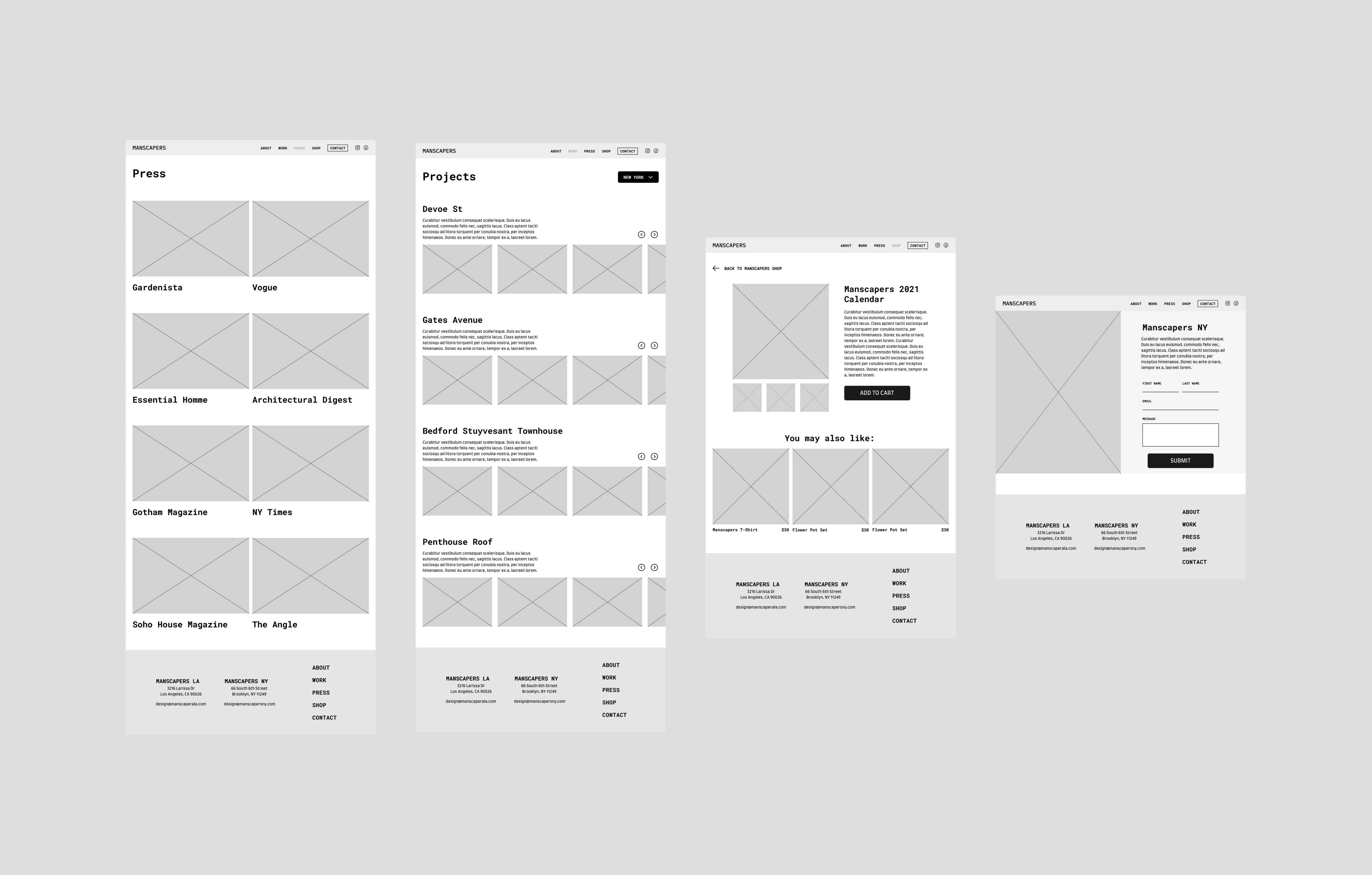
Examples of some of the wireframes (Press, Work page, Individual item, Contact)
Style Guide
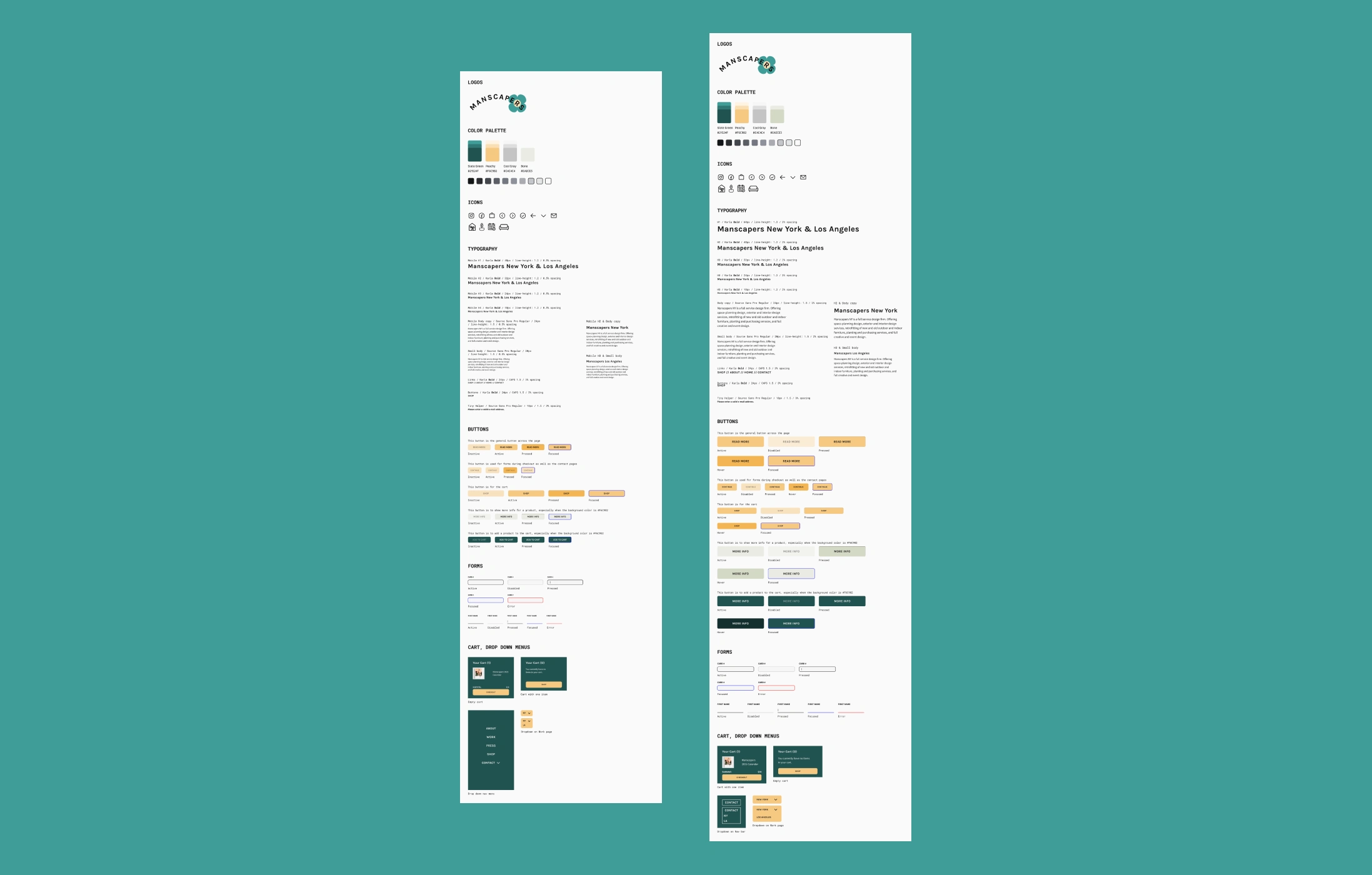
Style guides for desktop & mobile for dev handoff.
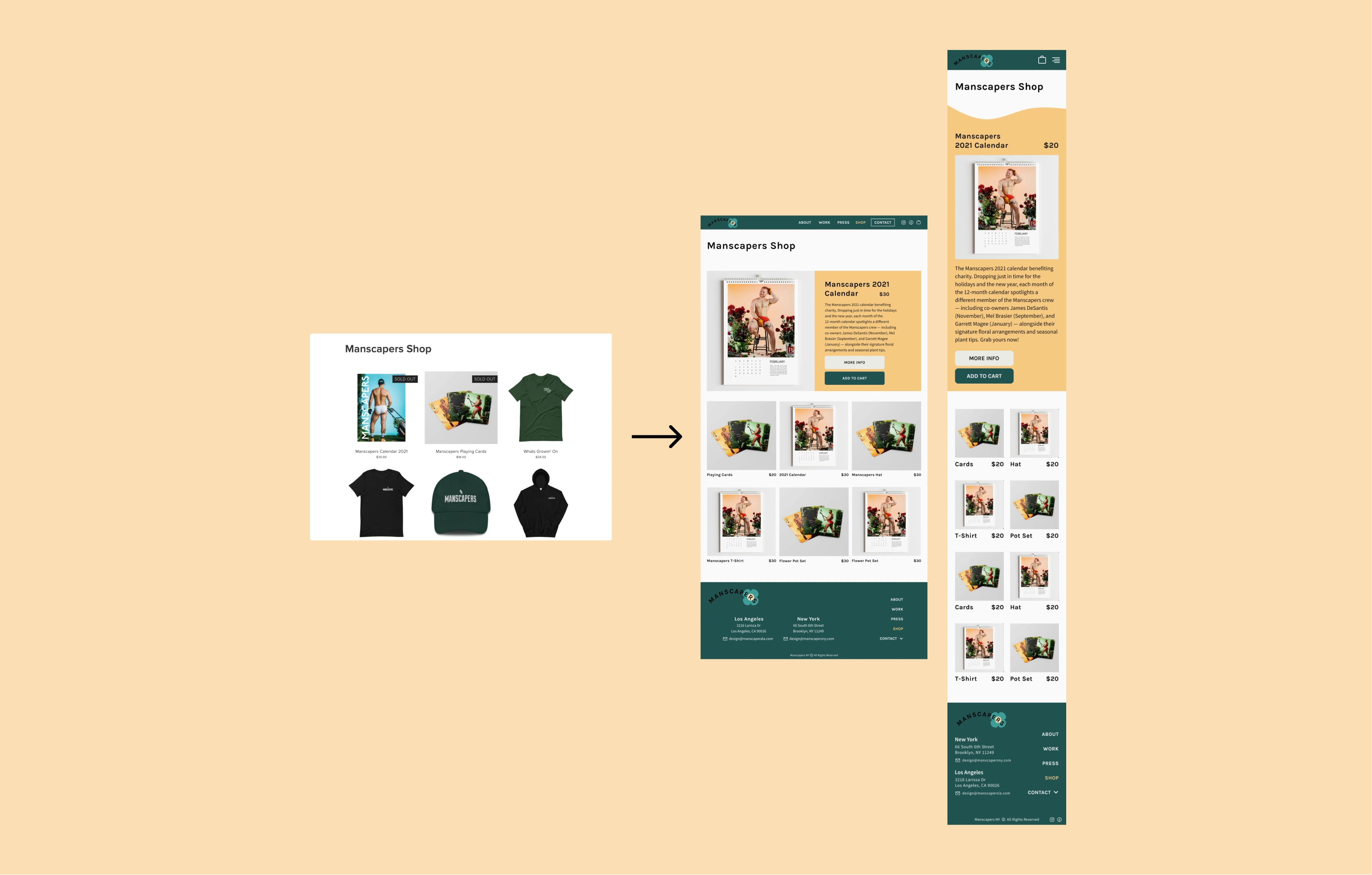
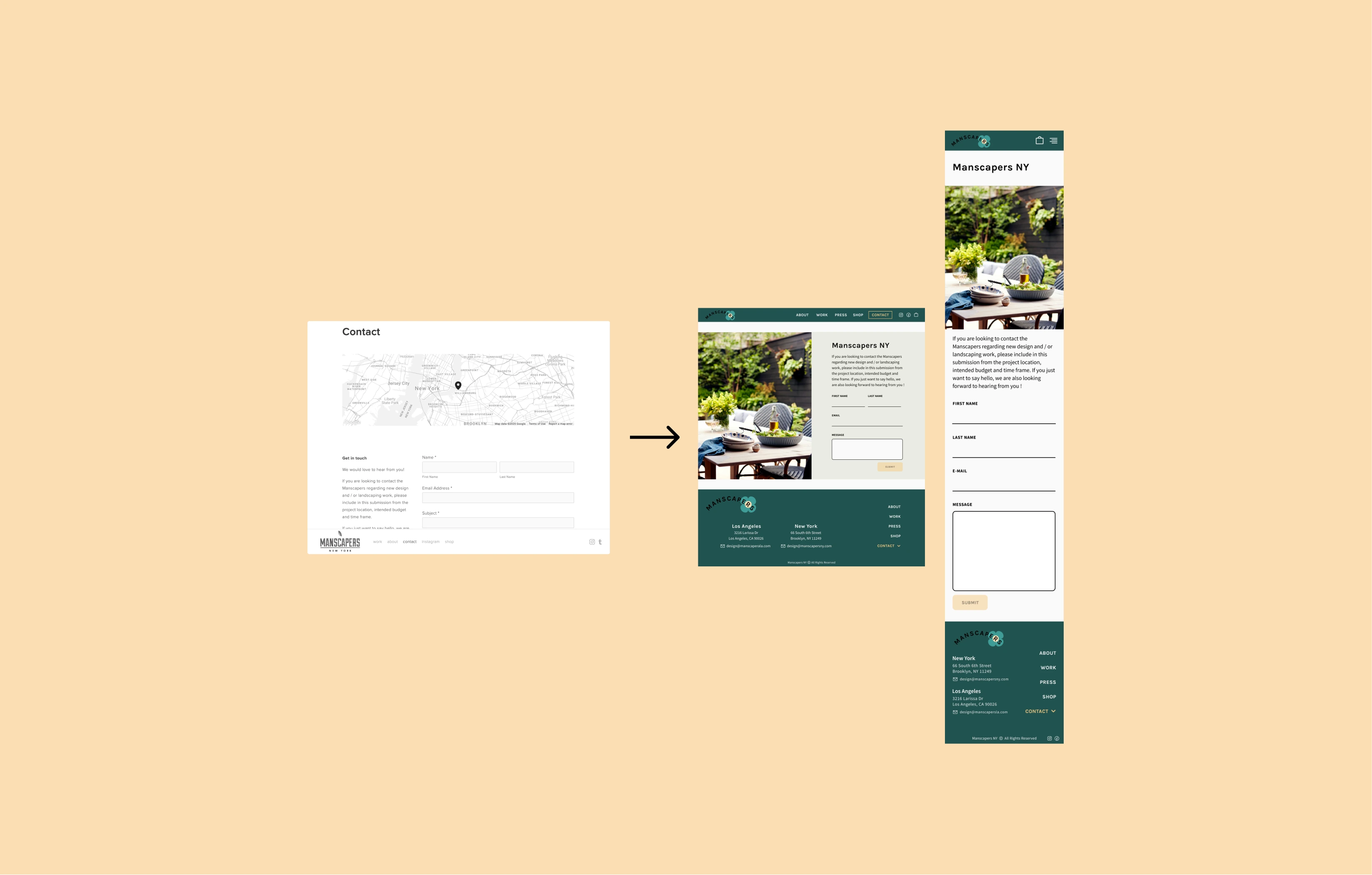
Before & After
To view the full desktop prototype, click here
To view the full mobile prototype, click here
To view the full case study, please click here
Like this project
Posted Apr 24, 2021
Likes
0
Views
53


