Revolution Ordering Website Redesign
Umme Imama
Case Study: Revolution Ordering
Website Redesign & Webflow Development
Overview
Revolution Ordering is an off-premise solutions platform helping hospitality and restaurant brands manage online ordering, integrations, and customer experience at scale.
The original website had strong content but lacked modern clarity, visual hierarchy, and conversion focus. My goal was to redesign and rebuild the site from scratch in Webflow, creating a cleaner, more structured, and conversion-driven experience — without losing the brand’s authority.
My Role
UI/UX Designer & Webflow Developer
UX restructuring
Visual redesign
Webflow development (from scratch)
Responsive optimization
Interaction & layout refinement
The Challenge
The existing website faced several UX and visual challenges:
Dense layouts with weak visual hierarchy
Overuse of dark sections, creating cognitive load
Content-heavy sections without scannability
Outdated interaction patterns
Limited emphasis on conversion paths (demo requests, CTAs)
The challenge was to modernize the experience while keeping it professional, trustworthy, and enterprise-ready.
👉 Old Homepage
The Solution
I redesigned the website with a clean, modular, and modern system, focusing on clarity, spacing, and storytelling.
Key Improvements:
Clear hero section with strong value proposition
Improved typography scale and spacing
Modular sections for better content digestion
Softer color balance while respecting brand identity
Clear CTA hierarchy throughout the page
Fully responsive Webflow build
Design & UX Highlights
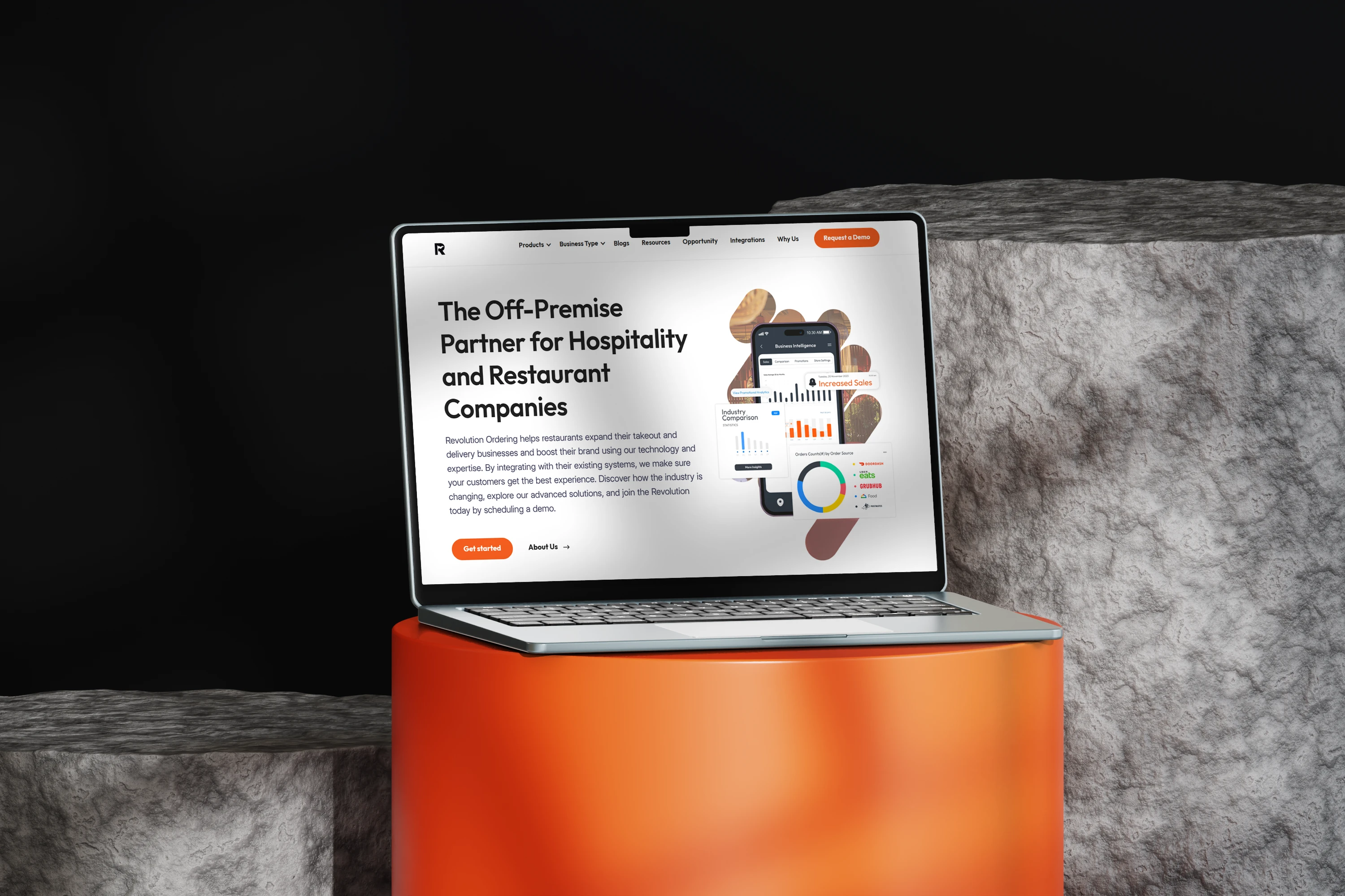
1. Hero Section Redesign
Simplified headline with clear positioning
Strong primary CTA (“Get a Demo”)
Product visuals used to support, not overpower, the message
👉Old vs New herosection comparison.
2. Improved Content Structure
Reorganized long paragraphs into scannable sections
Used cards, icons, and spacing to guide attention
Clear separation between informational and conversion sections
👉 Mid-page section before and after.
3. Visual Consistency & Hierarchy
Unified design system across sections
Consistent button styles and interaction states
Better alignment and rhythm across the page
4. Webflow Development (From Scratch)
Built entirely in Webflow without templates
Clean class naming and scalable structure
Fully responsive across desktop, tablet, and mobile
Optimized interactions and transitions
Before & After Comparison
This project is a clear example of how thoughtful UX and clean design can elevate a brand’s perception.
Before: Content-heavy, visually dense, outdated patterns
After: Clean, modern, conversion-focused, and scalable
👉 Before vs after homepage.
Outcome
Modernized brand presence
Improved readability and user flow
Clearer conversion paths
Scalable Webflow build ready for growth
This redesign positions Revolution Ordering as a premium, reliable off-premise partner in the hospitality space.
Live Website
Like this project
Posted Dec 22, 2025
Redesigned and rebuilt Revolution Ordering’s website from scratch in Webflow—transforming a dense layout into a clean, modern, conversion-focused experience UI.
Likes
0
Views
2