Quasar Systems Website Redesign

Quasar Systems — Website Redesign Case Study
Project Overview
Client: Quasar Systems
Project Type: Website Redesign
Scope: UI/UX, visual refinement, layout restructuring
Status: Live
🔗 Live Website: https://www.quasarsystems.tech/
Quasar Systems needed a more refined and professional website that clearly communicated their offerings while improving overall usability and visual clarity.
The Challenge
The existing website had:
Weak visual hierarchy
Inconsistent spacing and typography
Low contrast between headings and body text
A layout that didn’t guide users naturally through the content
As a result, the site felt cluttered and lacked the premium, trustworthy feel expected from a tech-focused brand.

👉 Full-page screenshot of the old homepage.
Goals & Objectives
Improve readability and content flow
Create a clean, modern, and professional UI
Establish strong visual hierarchy
Enhance user engagement without overusing animations
Maintain brand consistency while elevating the design quality
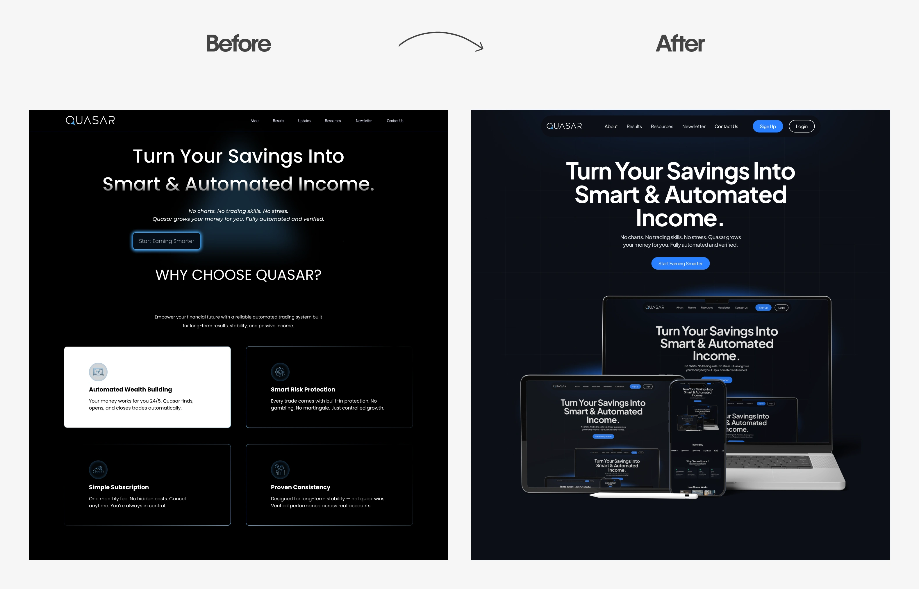
👉 Mood comparison image: Old hero section vs New hero section
My Approach
I approached the redesign with a clarity-first mindset:
Simplified layouts to reduce cognitive load
Improved spacing and line height for better readability
Refined typography choices to feel more professional
Reworked sections to create a logical scroll flow
Focused on subtle visual polish instead of heavy decoration
Every design decision was guided by usability and brand perception rather than visual trends.
Design Execution
Key improvements included:
Stronger heading hierarchy
Cleaner section separation
More consistent margins and padding
Improved contrast for accessibility
A calmer, more structured visual rhythm
The result is a website that feels modern, focused, and easier to navigate.

Hero Section
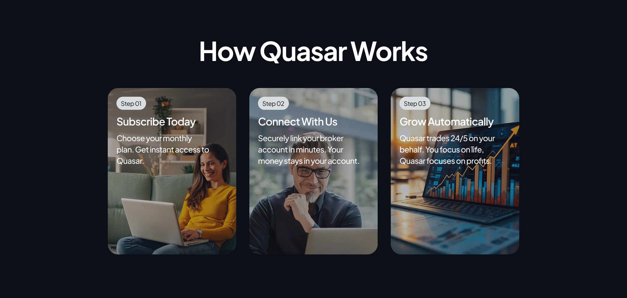
How Quasar Works Section
Results
Clearer communication of services
More professional brand presence
Improved readability across devices
A design that supports future scalability
The redesigned site now better represents Quasar Systems as a credible and forward-thinking technology brand.

👉 Full homepage screenshot of the final design.
Before & After
Before-and-after comparisons clearly show improvements in structure, spacing, and visual clarity.

👉 Before vs After of the full homepage.
Final Thoughts
This project highlights how thoughtful UI/UX refinement—without drastic rebranding—can significantly elevate a website’s impact and usability.
If you’d like to see a before & after breakdown, feel free to reach out.
Like this project
Posted Dec 22, 2025
Redesigned Quasar’s homepage to improve clarity and visual hierarchy through simplified layouts, refined typography, and a more modern, trustworthy experience.

