SUSNEO Website Design & WordPress Development
Yusra Shoaib
SUSNEO – Website Design & WordPress Development
Designing clarity in a world of complex sustainability data
SUSNEO is a sustainability intelligence platform focused on helping businesses understand, measure, and improve their environmental impact. I was brought in to design and develop a complete website experience in Figma and WordPress, translating a data-heavy, technical domain into something accessible, engaging, and visually intuitive.
The core objective was simple, but demanding:
turn complex sustainability metrics into an experience that feels clear, actionable, and human.
The Challenge
Sustainability platforms often struggle with the same problem, they are informative, but overwhelming. SUSNEO had strong data models, AI capabilities, and structured insights, but communicating that value clearly to users was a challenge.
The experience needed to:
Translate technical sustainability concepts into digestible visuals
Make data feel approachable rather than intimidating
Create a sense of trust and credibility for businesses
Guide users from curiosity to action without friction
Balance product explanation with marketing clarity
At its core, this was about turning complexity into confidence.
Strategic Direction
We positioned SUSNEO as a clarity-first platform.
Instead of presenting data as dense reports, the experience focuses on simplification, visualization, and guided understanding. Every section of the website was designed to feel like a step forward, helping users grasp concepts quickly while building trust in the platform.
The guiding principle was:
simplify the signal, amplify the insight.
The Solution
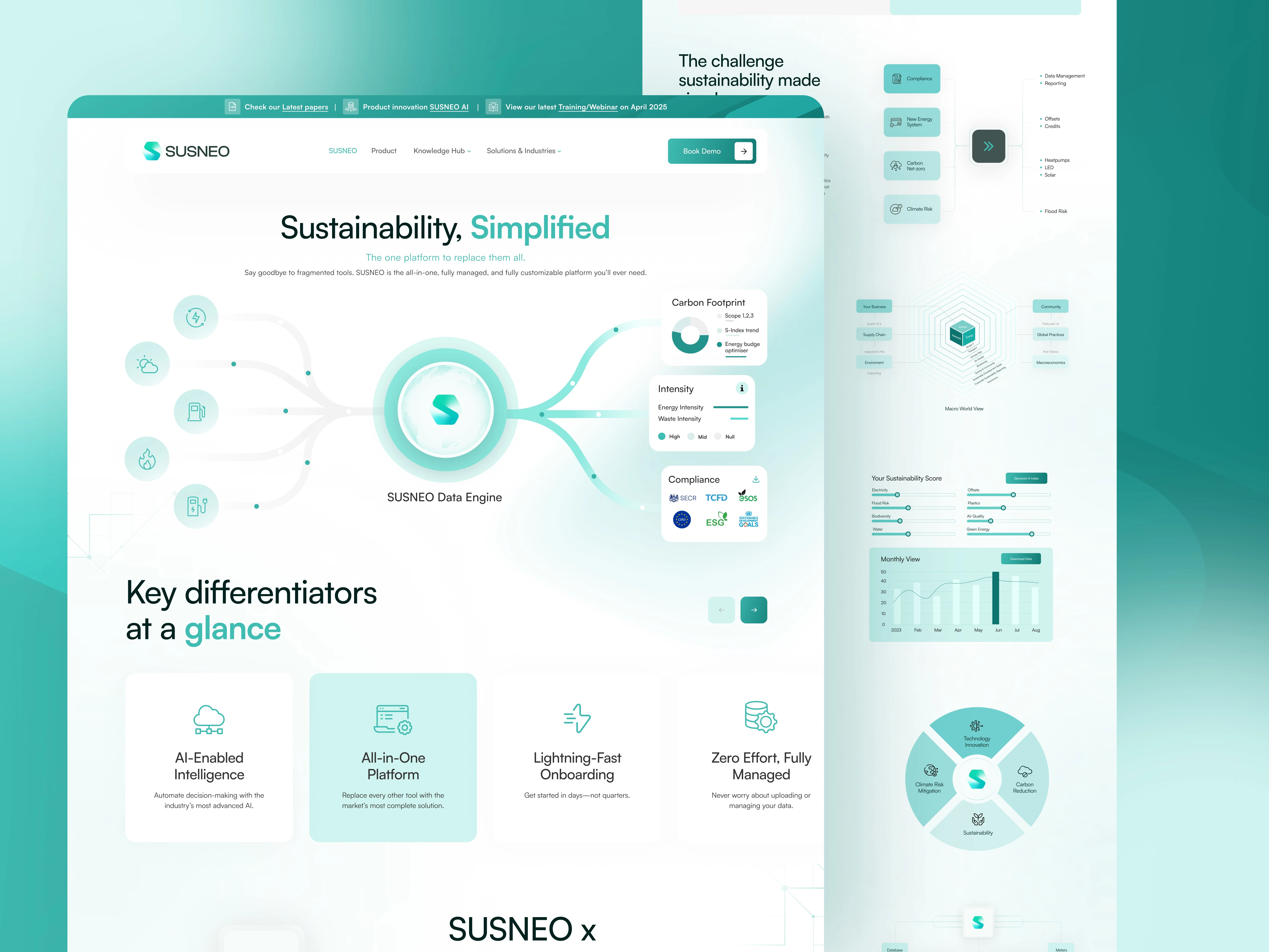
1. Structured, Story-Driven Homepage
The homepage was designed as a guided narrative rather than a static layout:
Clear hero messaging with immediate value proposition
Modular sections breaking down features into digestible blocks
Visual flows explaining how the system works
Balanced mix of product visuals and explanatory content
This creates a journey where users understand the product progressively, not all at once.
2. Data Visualization as a Core Experience
Instead of relying on text-heavy explanations, the design emphasizes visual clarity:
Custom UI components to represent sustainability scores and metrics
Graph-based layouts to show progress and insights
Simplified diagrams to explain systems and workflows
Clean card-based structures for key differentiators
The goal was to make data feel visual, not technical.
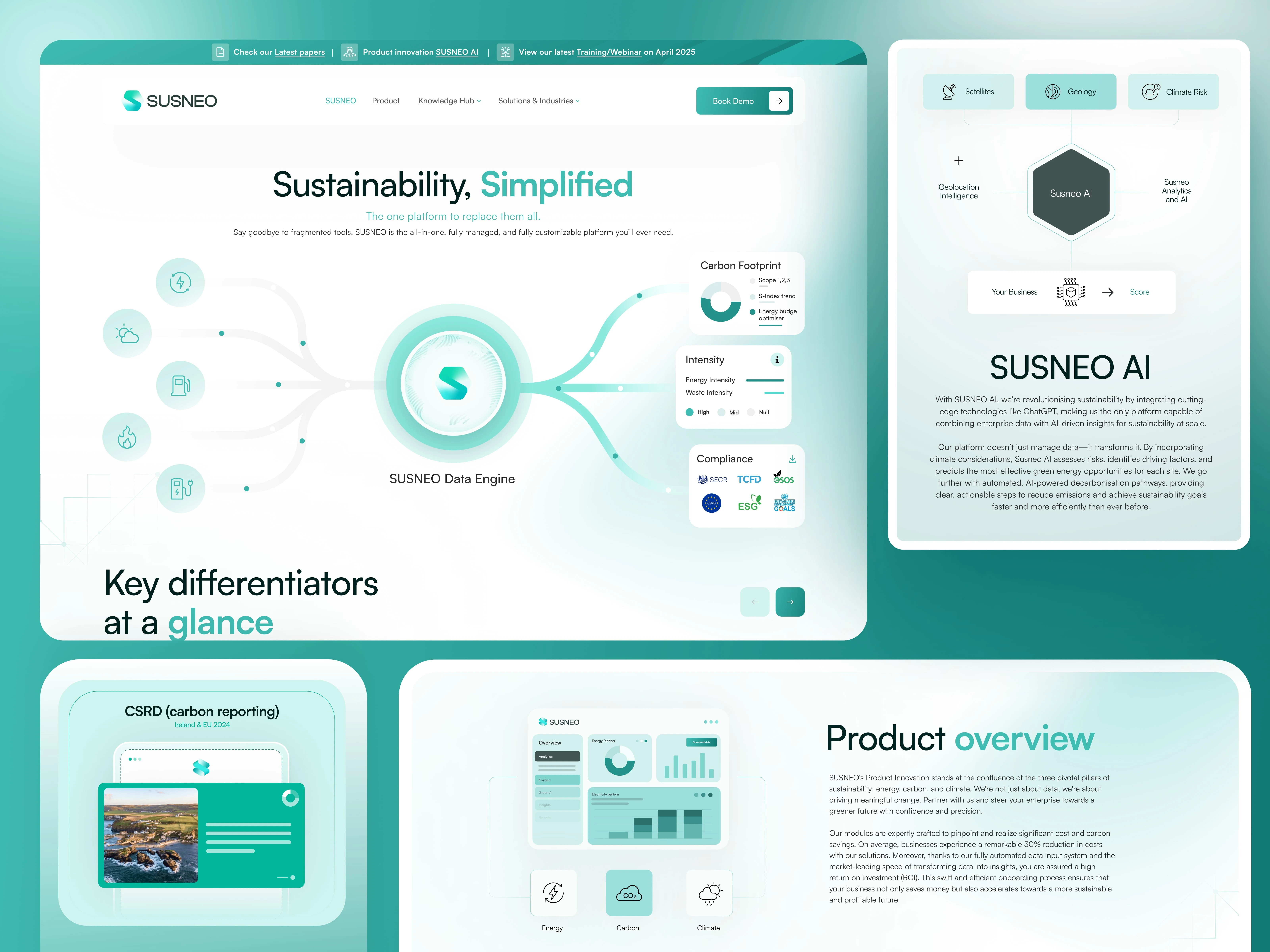
3. AI & Product Positioning
SUSNEO AI is a central part of the platform, and its presentation needed to feel intelligent yet approachable:
Minimal, clean layouts to avoid cognitive overload
Subtle visual hierarchy to guide focus
Clear separation between features, benefits, and outcomes
Visual cues that reinforce automation and intelligence
This helped position the product as advanced without feeling complicated.
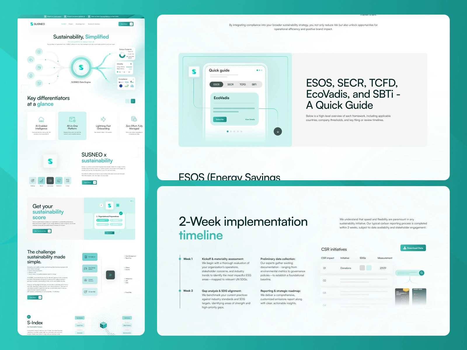
4. Conversion-Focused Sections
Key conversion touchpoints were strategically placed throughout:
Sustainability score call-to-action
Training and educational content previews
Client testimonials for trust building
Benefits section highlighting measurable impact
Each section was designed to reduce hesitation and encourage action.
5. WordPress Development (Scalable & Clean Build)
The development phase focused on translating the design with precision while ensuring flexibility:
Pixel-perfect implementation of Figma designs
Component-based structure for reusability
Fully responsive across devices
Optimized performance and clean code structure
Easy-to-manage backend for content updates
The result is a scalable system, not just a static website.
The Process
Research & Understanding
I explored sustainability platforms and ESG tools to identify common UX challenges. The key insight:
users don’t need more data, they need better understanding.
This shaped the entire design approach.
Information Architecture
The content was restructured into a clear flow:
Introduction → Differentiation → Product → Data → Trust → Action
This ensured users always know where they are and what to do next.
Design System & UI Language
The visual system was built to reflect clarity and trust:
Soft, neutral color palette with sustainability tones
Consistent spacing and modular grids
Clean typography for readability
Subtle UI elements to maintain focus on content
Every element was designed to reduce noise and increase comprehension.
Development & Optimization
During development:
Layouts were optimized for responsiveness
Performance was kept lightweight
Reusable sections were created for scalability
Content editing was simplified for the client
The goal was long-term usability, not just launch readiness.
The Impact
Improved Clarity: Complex sustainability concepts became easy to understand
Stronger Engagement: Visual storytelling increased time spent on site
Higher Trust: Clean, structured design reinforced credibility
Scalable Foundation: WordPress build allows easy expansion and updates
Most importantly, users don’t feel overwhelmed by sustainability data,
they feel empowered by it.
Deliverables
Full website UI/UX design (Figma)
Homepage and core page layouts
Design system and reusable components
Custom data visualization UI
WordPress development (fully responsive)
CMS structure for easy content management
Final Reflection
This project wasn’t about adding more information, it was about removing friction from understanding.
By focusing on clarity, structure, and visual communication, SUSNEO became more than a platform.
It became a tool that helps businesses see, understand, and act with confidence.
Like this project
Posted May 12, 2026
Designed and developed a clean sustainability platform, turning complex ESG data into a clear, engaging, and user-friendly experience using Figma and WordPress.