Brand Identity Development
Katy Spore
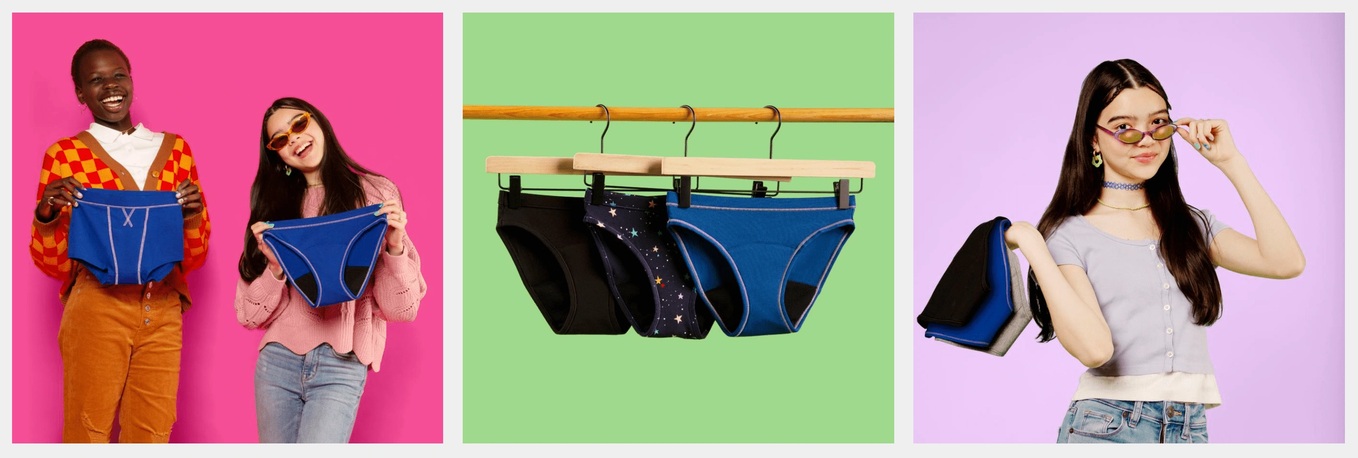
From Thinx (BTWN) to Thinx Teens
After much thought Thinx Inc. decided to sunset it’s beloved tween period underwear line, BTWN, and create a more teen focused brand called Thinx Teens. This new brand would be relatable, playful, yet straightforward for teens around the world to feel more comfortable during their periods.
shape language & color palette
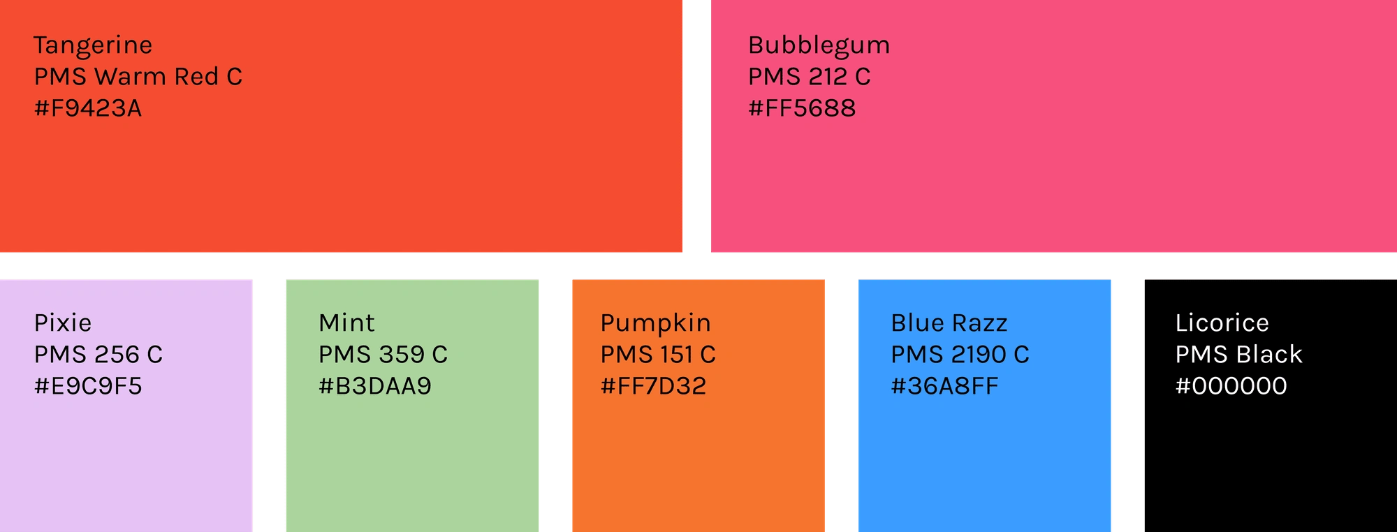
The library of shapes below were create to be used universally across all platforms — social, packaging, website, and other brand touchpoints. The shapes were intented to represent different bodies, sustainable products, and the current generation. Vibrant and fresh would be a goodway to describe the color palette. Leveraging Tangerine, Thinx for All’s brand color, but in a new context. Reimagining hot pink so that it feels bold and un-gendered.

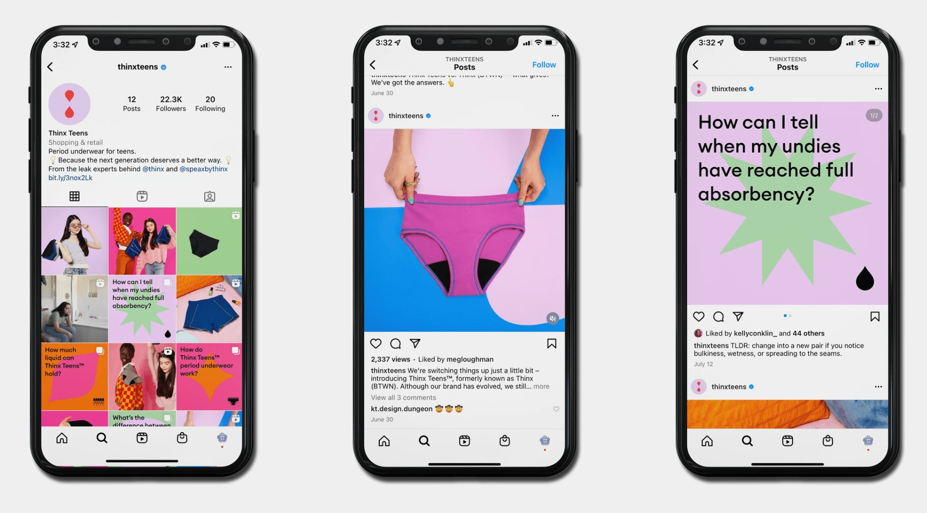
social channels
The Thinx Teens socials feature various how it works content, evergreen, as well as some text FAQs. The graphic FAQs are formated with text over top our signature shape language in a contrasting way. The Thinx Teens social platforms serve as a safe place where teens and parents can come for more information on the product.
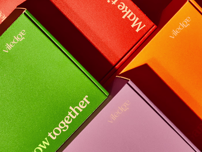
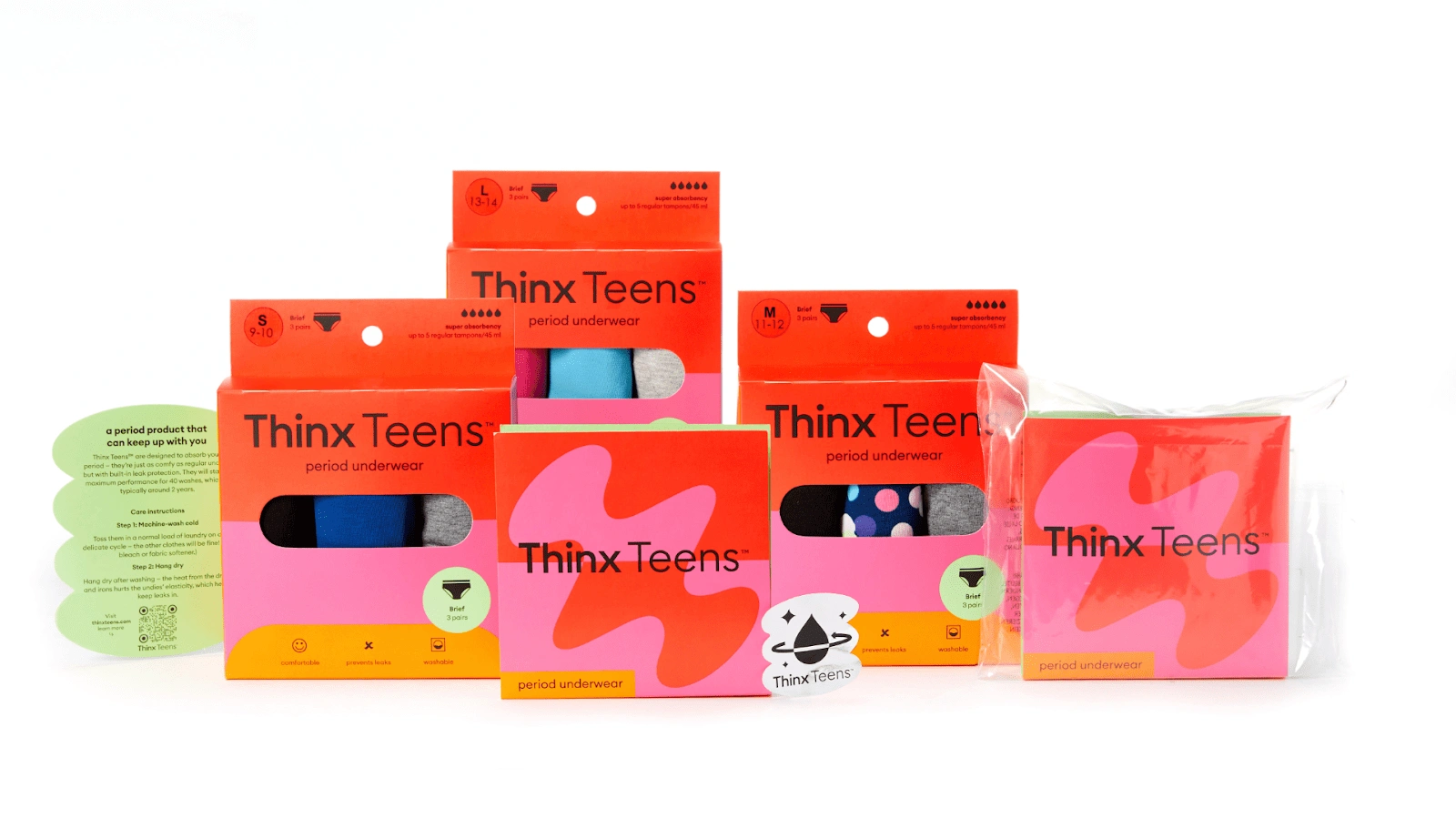
packaging
We designed packaging for the 3 Pack assortment bundles and a direct to consumer packaging as well. Both pieces of packaging came with an insert and a holographic sticker.
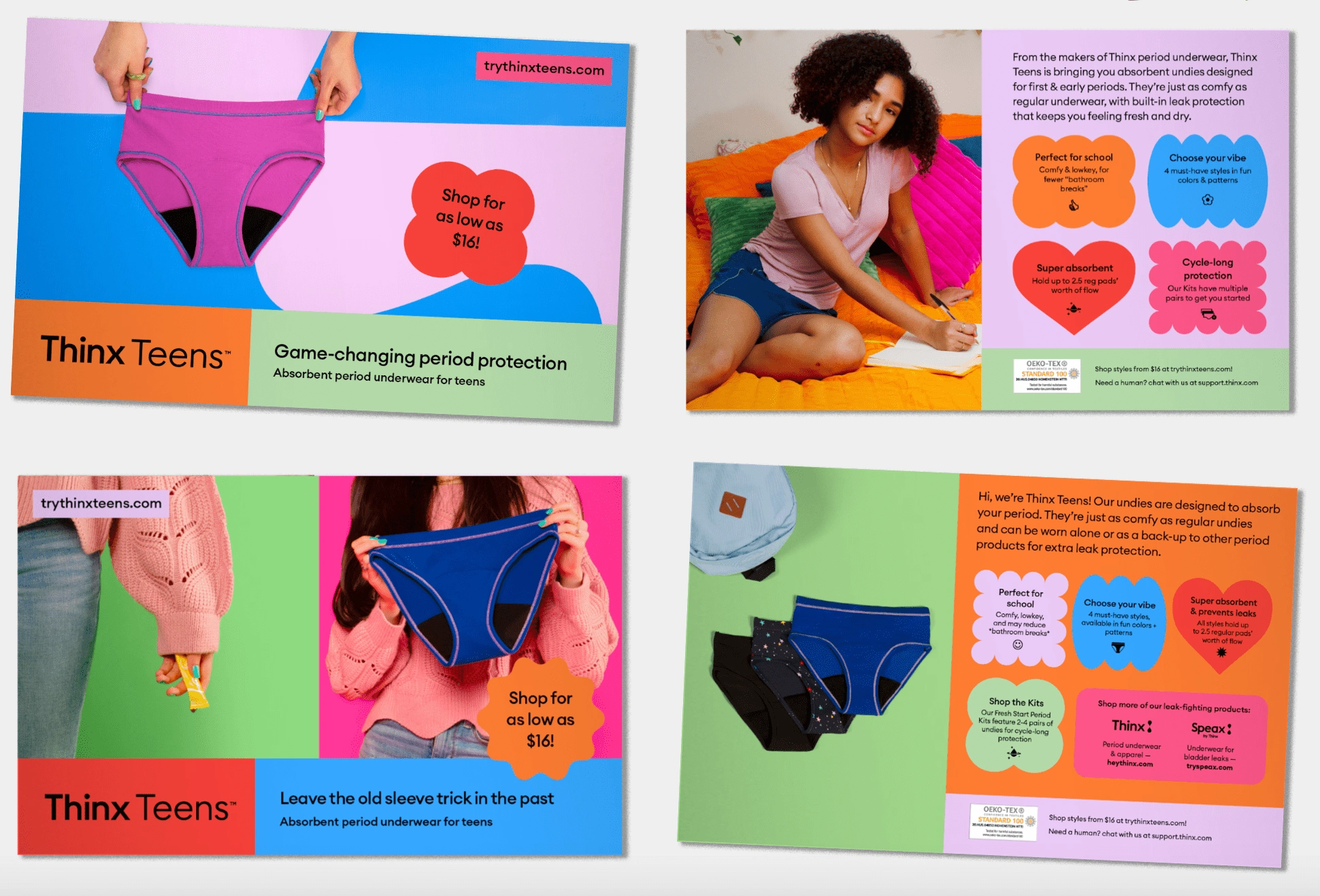
direct mailers
Direct mailers across the Thinx brands are full of product education and FAQS. A fun way to present this information in the teens channel was to make use of our shapes. Doing this made the mailers fun, engaging, and easy to consume.
Like this project
Posted May 12, 2023
Developed a brand identity system for Thinx Teens including logo design, typography and color palette resulting in increased brand recognition and market share.