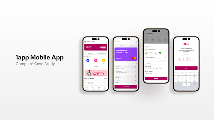
1app Fintech Dashboard Redesign
1app Fintech Dashboard Redesign
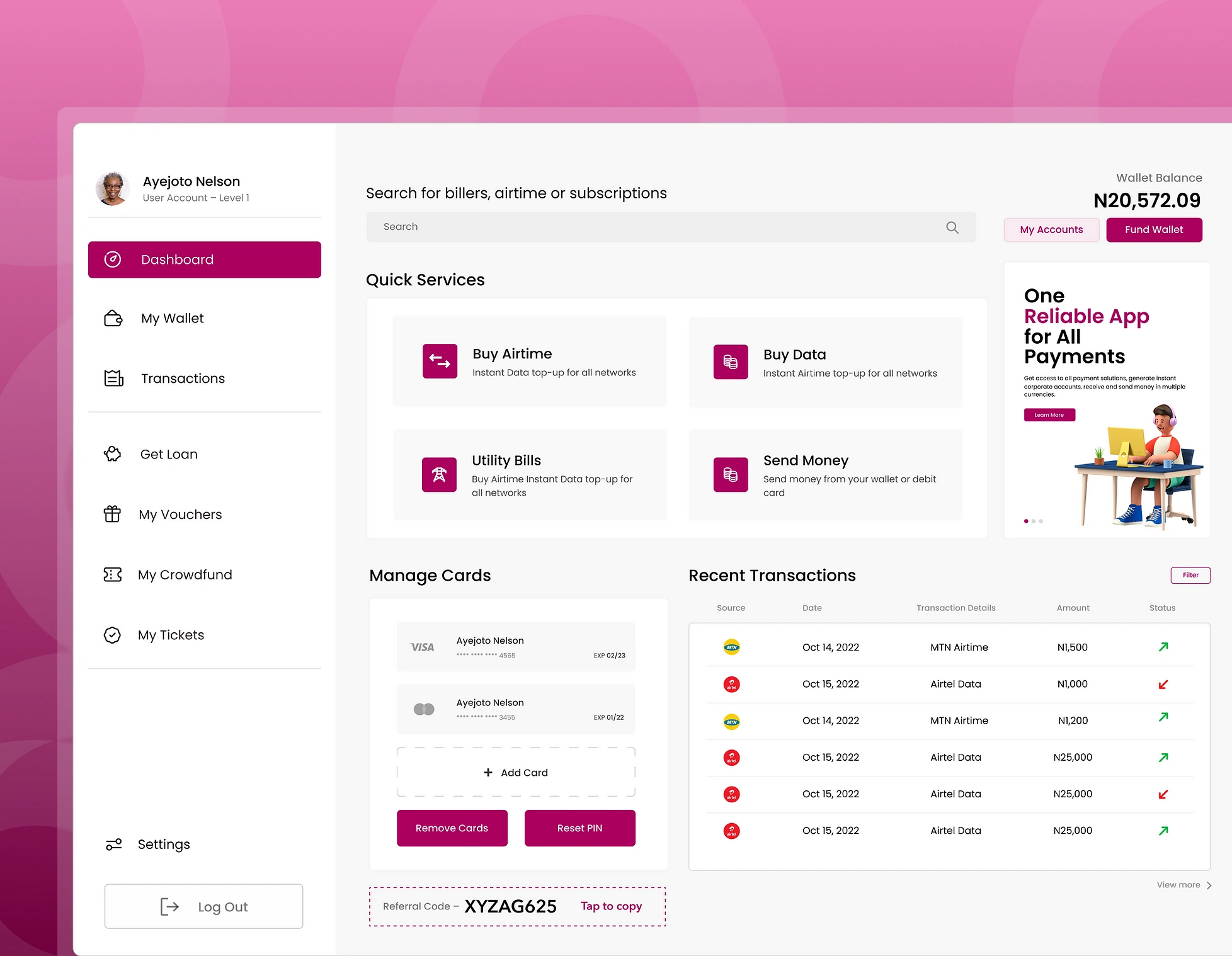
Project Overview
1app is a popular mobile payment app in Nigeria. Many people use it because it has many helpful services in one place. Right now, many people are using digital ways to manage their money, and 1app is one of the best options for them. We wanted to make the app even better, so we decided to change its design. I was the main designer for this job. My task was to make the app look good and work even better for our users.
The Challenge
People often tell us how they feel about an app. For 1app, even though many people like and use it, some suggested we could make it better. Some users said the main screen, or "dashboard", could be easier to use. They felt that while it works okay, some parts could be clearer or simpler to navigate.
Project Scope
The main thing we looked at was the website's main screen, where users do most of their activities. We had two big tasks. First, we wanted to make the screen better but without changing things too much for the people who were used to it. Second, we wanted our new design to last and stay good for a long time.
My Role
I was really hands-on from the start. I tried to figure out what problems users were facing, thought of ways to solve them, made rough designs, and then polished them. My main goal was always to think about the user first and make sure the changes were helpful for them.
Working with the Team
Even though I was leading the design, I couldn't have done it without the product managers and the tech team. The product manager helped connect what the company wanted with what we were designing. They also made sure we were always thinking about the user's feedback. The tech team was great because they told us what could and couldn't be done technically. We all worked online using a tool called Figma. It was great because we could all see and talk about the design in real-time, no matter where we were.
What We Wanted to Achieve
Changing the look of the dashboard was more than just making it look nice. We wanted to help users find what they needed easily, get their tasks done quickly, and understand their money activities better. Here's what we aimed for:
For the Users: Make the dashboard simple and easy to use. We wanted to remove any confusion and make sure the main features are just a click away.
Easy to Move Around: We wanted users to find what they need without getting lost. So, we tried to make things straightforward and quick to find.
Keep Things Tidy: We wanted to make the history of money activities clear and easy to read.
Thinking Ahead: We designed the dashboard so that in the future, if we want to add new things, it won't be too hard.
With all these goals, we started our work, hoping to make the 1app dashboard a shining example for other money apps.
User Research Process
When thinking about changing the 1app dashboard, it was super important for us to really understand our users. We wanted to make sure that what we built was truly helpful for them. We wanted to hear directly from our users about what they liked, what was tricky for them, and what they wished for.
User Interviews and how we did it:
Choosing Who to Talk To: We made sure to include people of different ages, those who are super good with tech and those who aren't, and both regular and occasional users.We picked 20 different 1app users.
Where We Met: We wanted our users to feel relaxed and open when talking to us. So, we picked quiet places to chat. Some people we met in person, and for others who were far away, we talked online.
What we learnt
Many users felt there was too much going on the main page
While people thought seeing their past transactions was important, they felt it was messy.
Users hoped for a sidebar that was easier to understand and better sorted.
I conducted a survey to better understand user behaviors and preferences on the 1app dashboard. The questionnaire included a variety of questions, such as frequency of dashboard use and feature rankings. After sharing the survey through various channels like email and social media, I analyzed the collected data. Key findings revealed that a majority of users accessed the dashboard daily, with "Transaction History" being a commonly used feature. Importantly, nearly three-quarters of respondents expressed a desire for a more streamlined and organized dashboard.
Problem Statements
During the "Define" phase, our goal was to move from a general understanding of the 1app dashboard to identifying specific user challenges. To achieve this, we used Affinity Mapping, a tool that allowed us to visually organize the vast feedback collected from user interviews and surveys. Feedback was written on individual sticky notes and grouped based on similar themes, such as 'Transaction History' or 'User Experience & Interface'. This process highlighted key patterns and insights, helping to pinpoint the main challenges users faced with the dashboard.
Low Fidelity Wireframes
In the "Prototype" phase, our goal was to transform our ideas into actual designs that users could see and engage with. We aimed to visualize and try out the solutions we'd thought of earlier. For this, we chose Miro for the Lo-Fi prototypes because of its ease of use. Starting with low-fidelity prototyping, our main goal was to understand the basic flow and structure of our new design, without getting into detailed design elements like colors or fonts.
High Fidelity Prototypes
I sketched the main screens and pathways of the 1app dashboard redesign in Figma to allow for back-and-forth where we made changes and improvements on the go, always keeping user needs and technical aspects in mind.


Like this project
Posted Jul 15, 2024
Changing the look of the dashboard was more than just making it look nice. We wanted to help users find what they needed easily & get their tasks done quickly
