Built with Framer
Film Producer portfolio website
Victoria Price-King
Project Goal
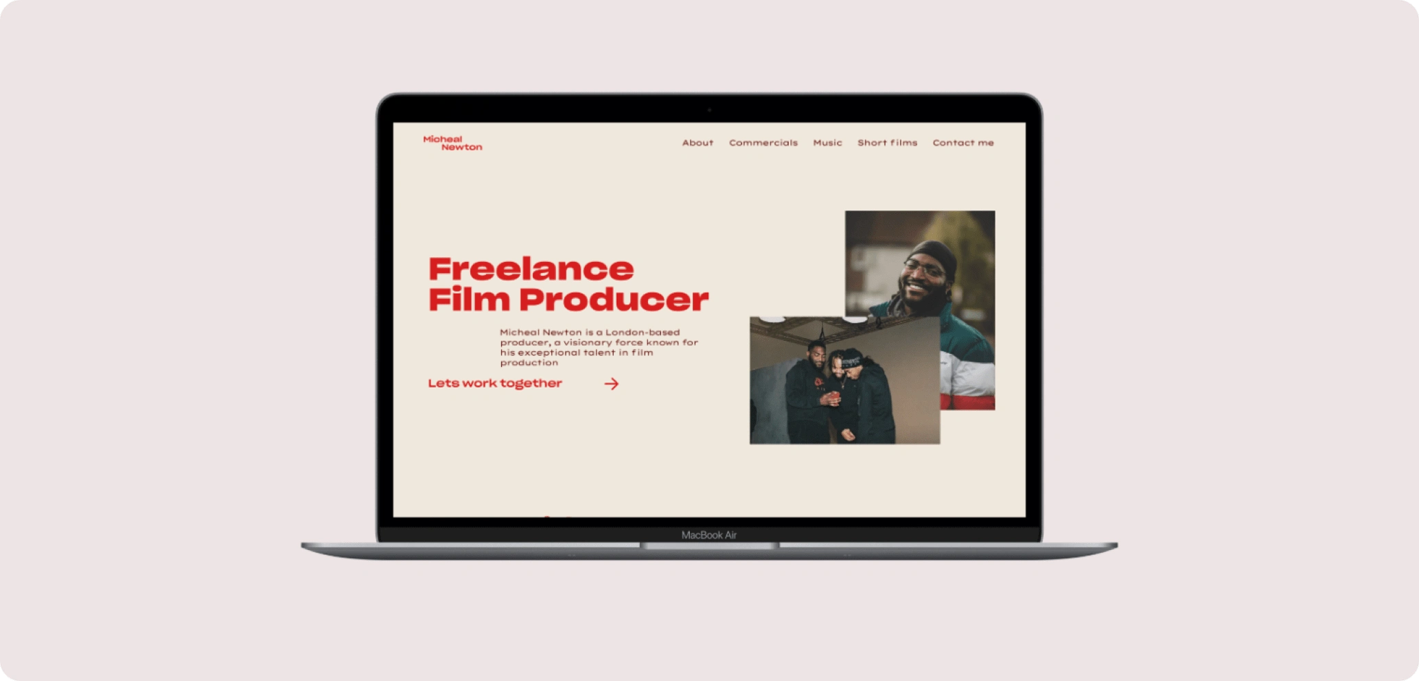
Micheal wanted a website to showcase his production work. His requirements included a clean, minimalist design with subtle animations to add depth. I worked closely with Michael to ensure all his needs were met, allowing him to present his work in a polished and effective way.
The Design
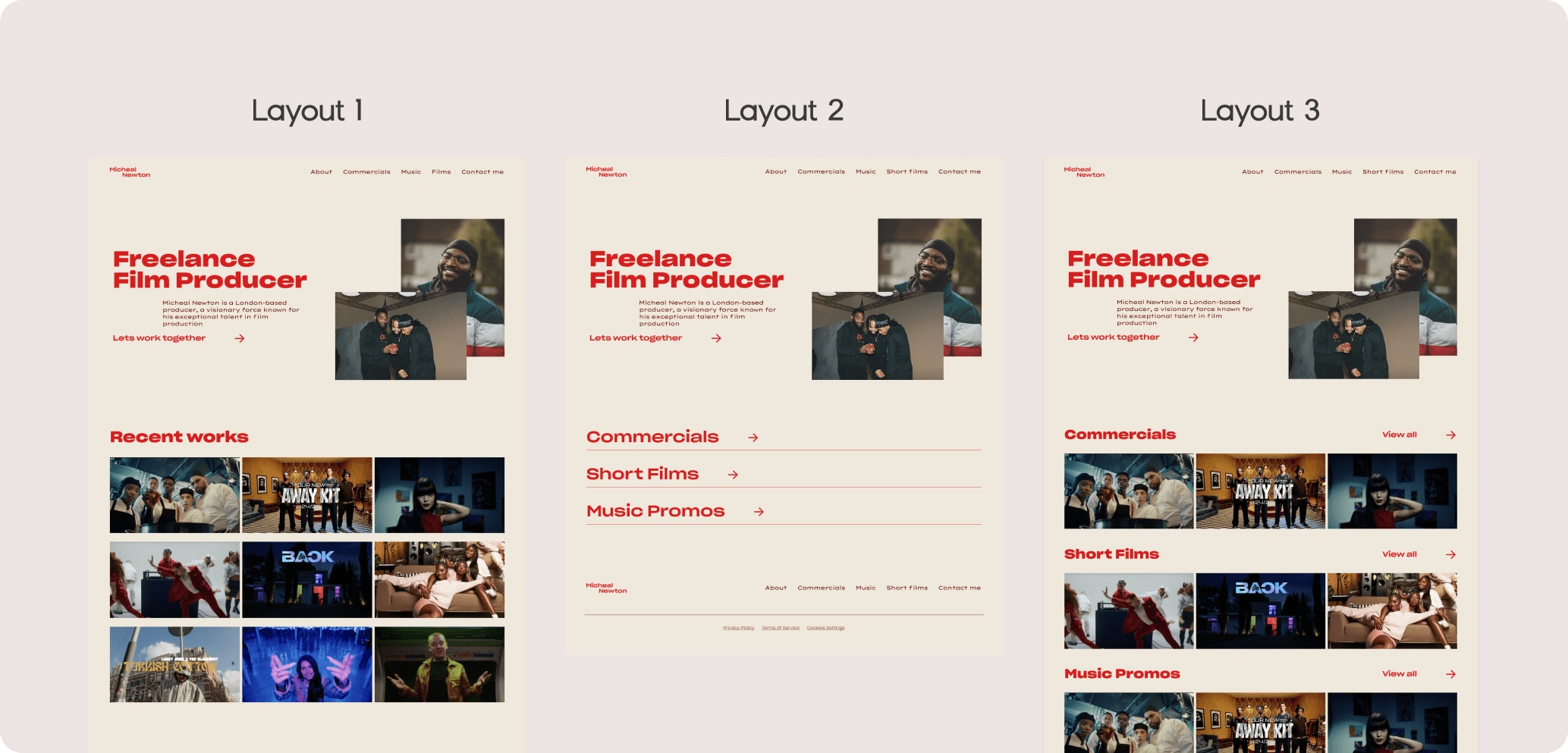
Michael works on films, music videos, and adverts, so I needed to develop concepts for the best way to present his work. I provided him with several design options and layouts to consider:
Layout 1: A 3x3 grid on the homepage displaying a selection of work, with a button linking to a separate page to view more.
Layout 2: An accordion-style layout with dropdowns for each category, showing a selection of work from that category, along with a button to view more on another page.
Layout 3: A heading for each category, followed by a 3x1 grid displaying a selection of work from that category.
Ultimately, we chose Layout 3 for several reasons. Displaying the work upfront, rather than hiding it within an accordion, created a better user experience and was more visually appealing. Additionally, organising the work by category made navigation easier, as most users visiting the site would likely be interested in a specific category and would benefit from being able to access it directly.
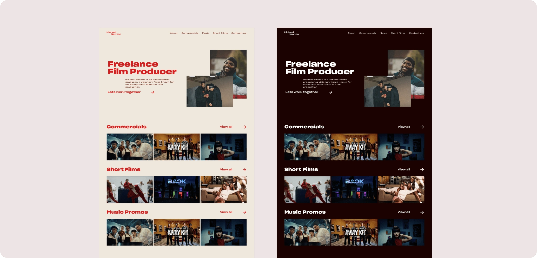
Initially, I designed the site using a cream background combined with Michael’s primary colour, red. After reviewing the design, Michael expressed interest in seeing a dark mode version. I then created an alternative design using a deep burgundy in place of the cream, paired with white. Since Michael found it difficult to choose between the two, I suggested implementing a dark/light mode toggle, allowing users to switch between both versions for a more flexible experience.
Animation & Effects
To enhance the website, I incorporated animations to add depth and engagement. Upon entering the site, images smoothly drop down from the top of the page. Additionally, I implemented a parallax effect, where images move at a different pace while scrolling, creating a dynamic visual experience. I experimented with various animation styles before finalising this approach.
For the buttons, I opted for a text-based design rather than traditional button styles. When hovered over, the arrow subtly pulls in toward the text, providing a clear visual cue that the element is clickable.
Like this project
Posted Dec 19, 2024
Micheal wanted a website to showcase his production work. His requirements included a clean, minimalist design with subtle animations to add depth.
Likes
0
Views
9