Funding a Design System to Jurafuchs
Gabriel Lohmann
Jurafuchs • Funding a Design System
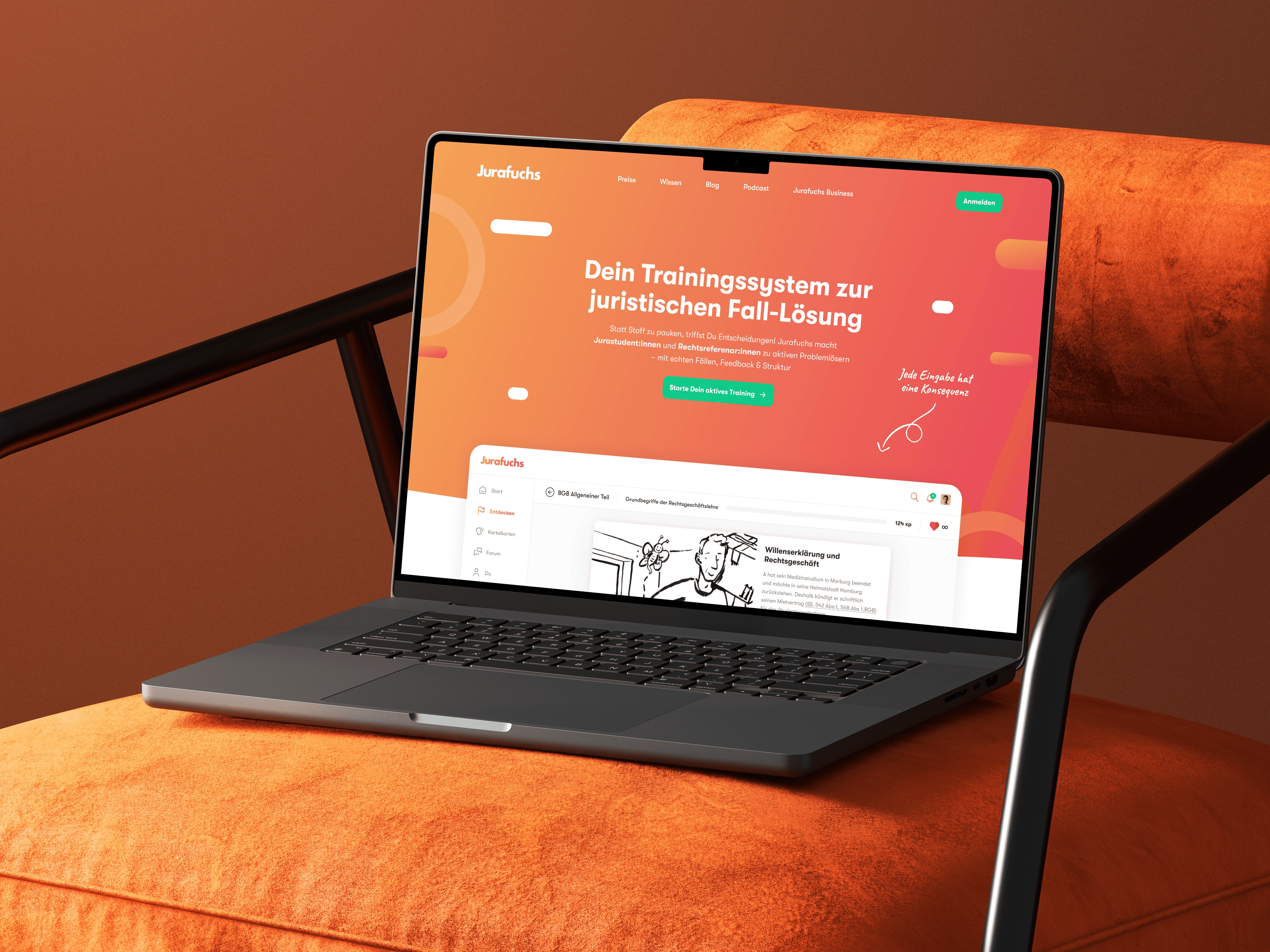
Building a scalable design system for Germany’s leading legal education app.
Overview
Challenge
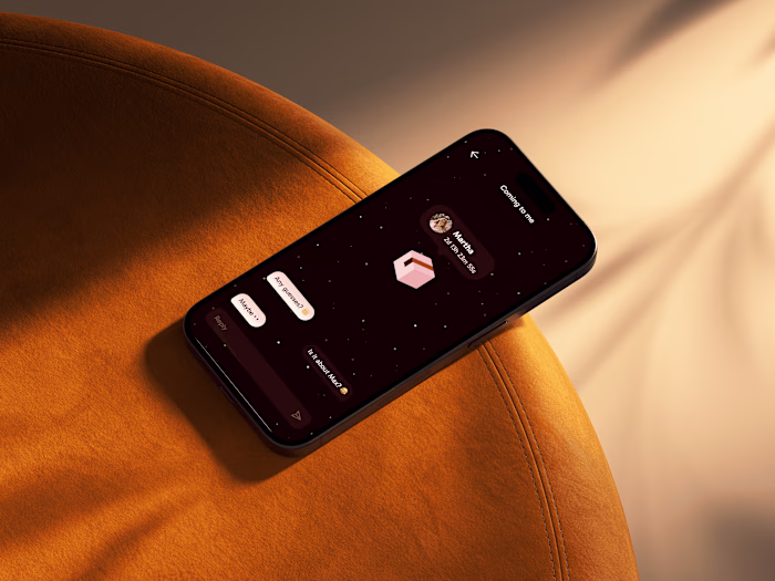
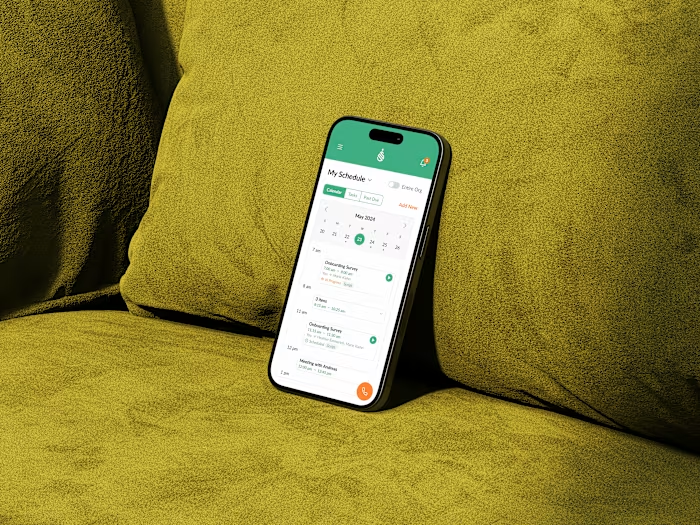
Jurafuchs was expanding fast, shipping new features continuously. But there was no unified design standard. Similar components were being built differently across the app, creating inconsistency for users and rework for the team.
Goal
Create a single source of truth: a robust, scalable design system that would unify the user experience, eliminate redundant work, and speed up how the team ships new features.
Result
A living component library and set of guidelines that became the foundation for 25+ new features, contributing to a 93.46% user satisfaction score.
Process
UI Audit & Inventory
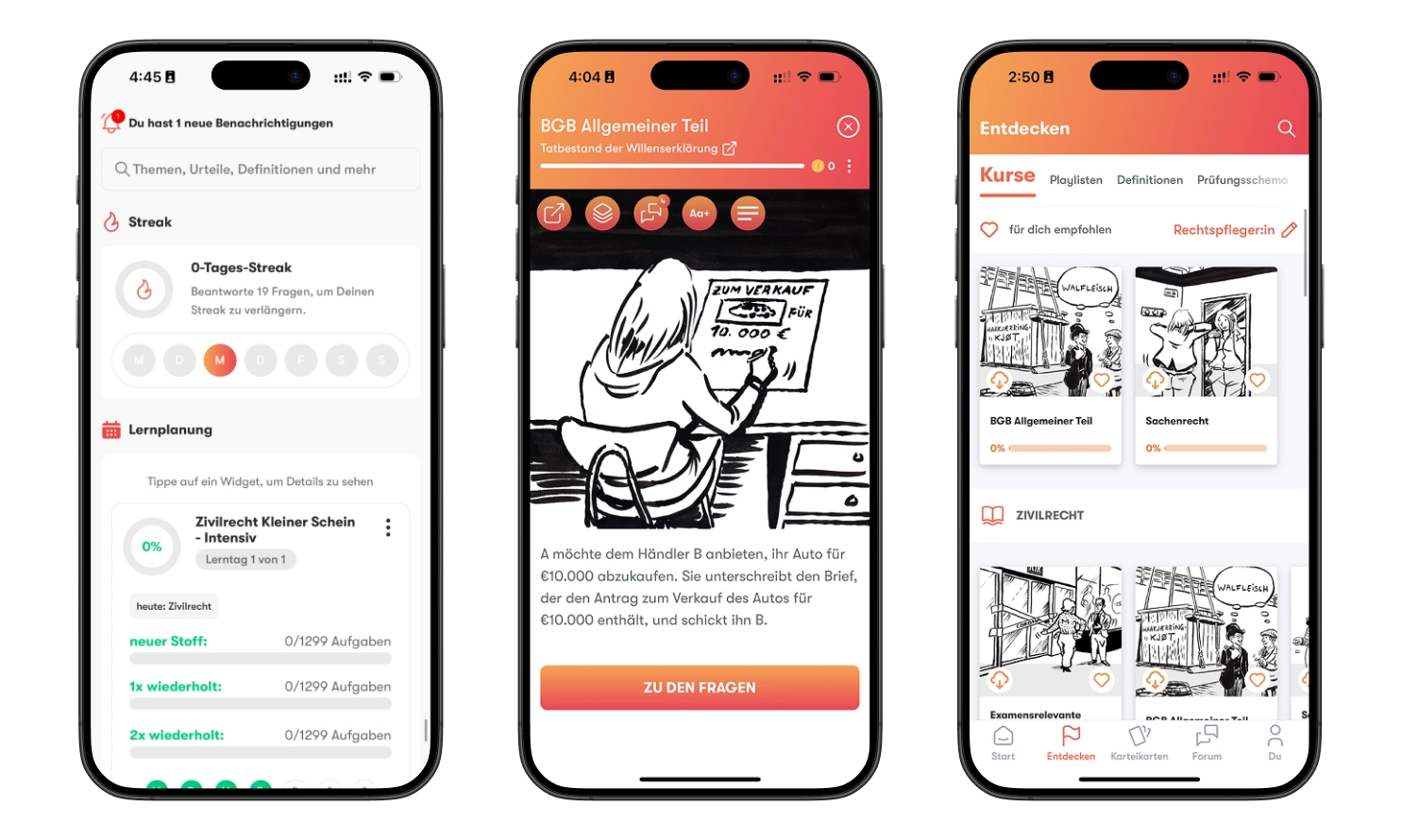
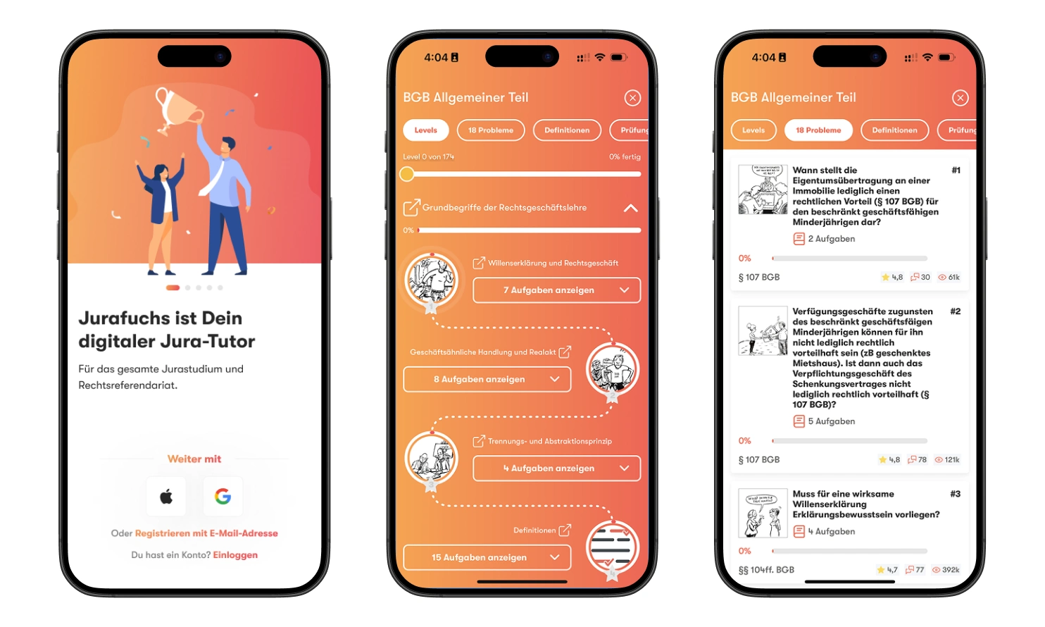
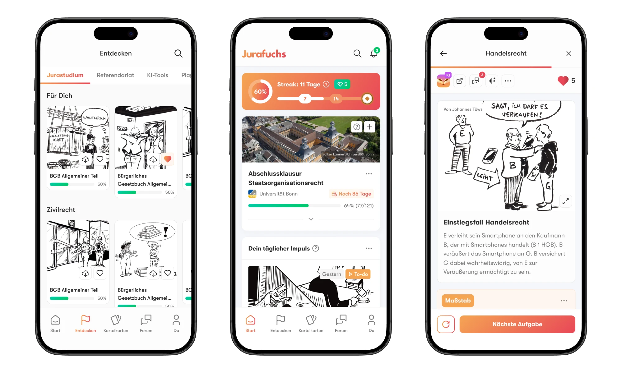
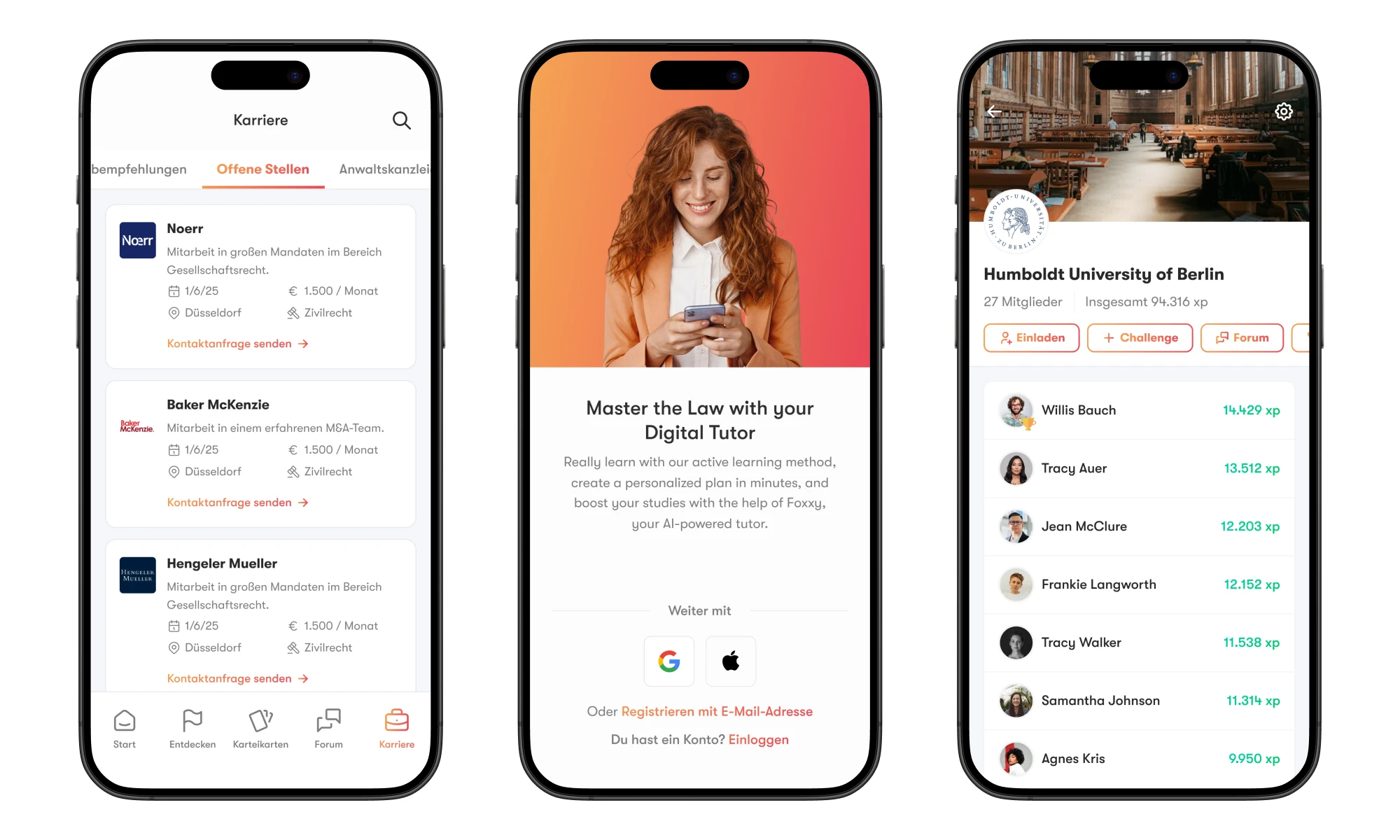
The first step was mapping everything that existed. I conducted a full inventory of all UI components in the application — buttons, form fields, modals, cards, navigation elements — and categorized them by type and usage. This visual audit revealed the scale of the inconsistency problem: the same component had been designed multiple different ways across the app. It gave us a clear picture of where to focus and what to prioritize.
Defining Foundations: Tokens & Styles
With the inconsistency map in hand, we established the system’s foundations. This included defining design principles for voice, tone, and accessibility, standardizing design tokens for colors, typography, spacing, and grids, and adopting a unified icon library aligned with the brand. These foundations became the DNA of every component built afterwards. Getting them right was critical — they had to be clear enough for designers and developers to apply without ambiguity.
Component Building & Documentation
This was the core of the project. I developed a full set of reusable components in Figma, structured from atoms (buttons, inputs) to complex organisms (content cards, navigation patterns). Each component was built to be versatile, accessible, and well-documented. Documentation was as important as the components themselves. Every piece included usage guidelines, states, variants, and do’s/don’ts — making the system self-explanatory for anyone on the team.
Implementation & Developer Collaboration
A design system only works if developers adopt it. I collaborated closely with the engineering team to ensure every component translated accurately into code. This meant aligning on naming conventions, reviewing implementation together, and iterating on components that didn’t work well in development. This close collaboration turned the design system from a Figma file into a real, functional tool that both sides of the team relied on daily.
Results & Impact
The design system transformed how Jurafuchs builds products. New features that once required components to be created from scratch could now be assembled from existing, tested parts. The consistency this brought was a key driver behind the high user satisfaction scores — users experienced a cohesive product regardless of which feature they used.
Insights
This project reinforced that design systems should be established early in a product’s life. Defining standards after a platform has already expanded creates significant challenges — both in building the system and in retrofitting it across existing features. It also highlighted how critical designer-developer communication is. A design system isn’t just a Figma library — it’s a shared language. Its success depends on both sides understanding and adopting it. The closer the collaboration, the more functional and lasting the system becomes.
Like this project
Posted Jun 11, 2026
Building a scalable design system for Germany’s leading legal education app.
Likes
1
Views
2