
Overview
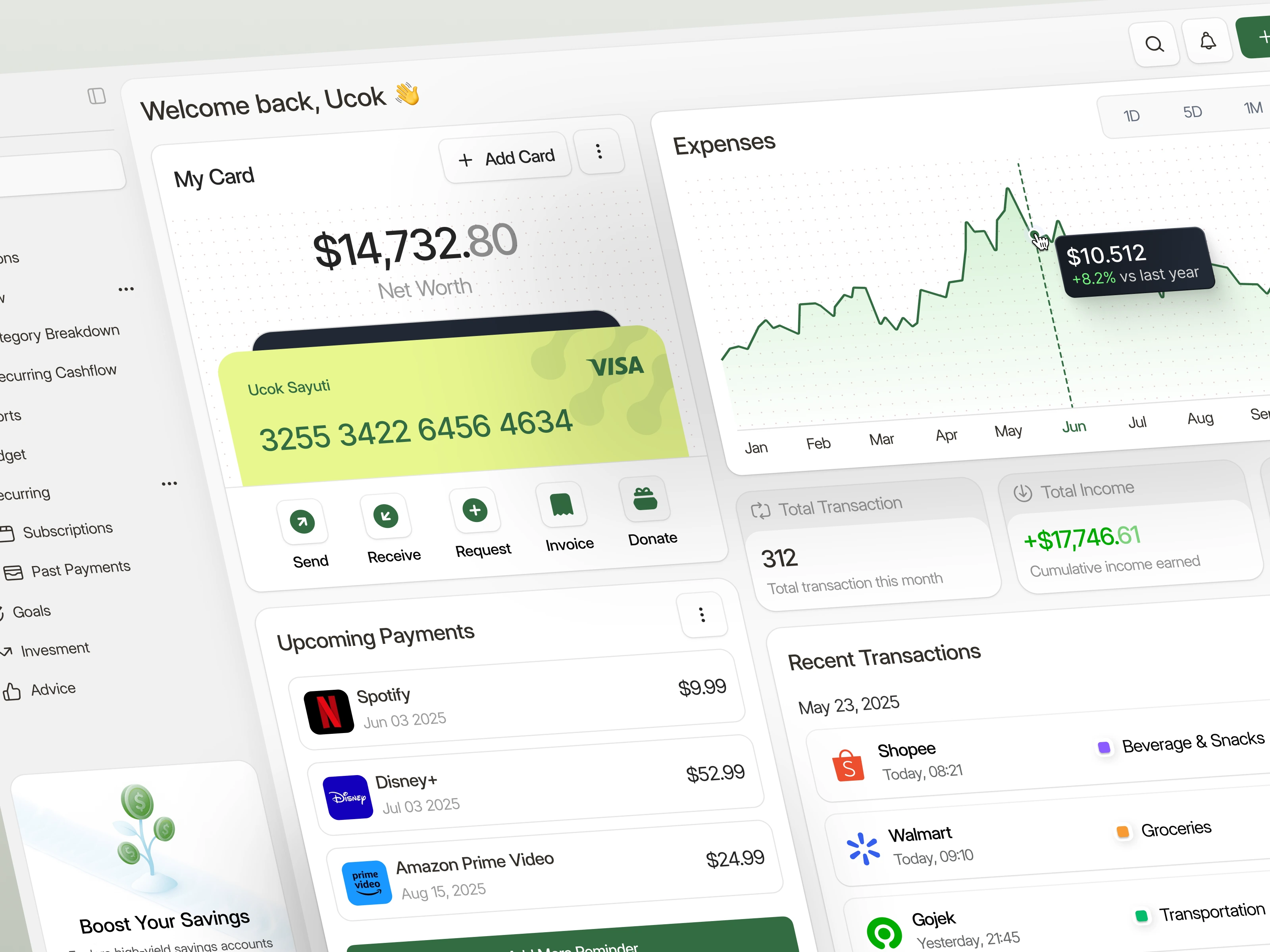
This case study highlights the UI/UX design of Dooit, a modern finance management dashboard that helps users take control of their expenses, income, and recurring payments. The primary focus of this project was to create a clean, intuitive, and responsive layout that simplifies financial oversight for both casual and frequent users.
The Problem
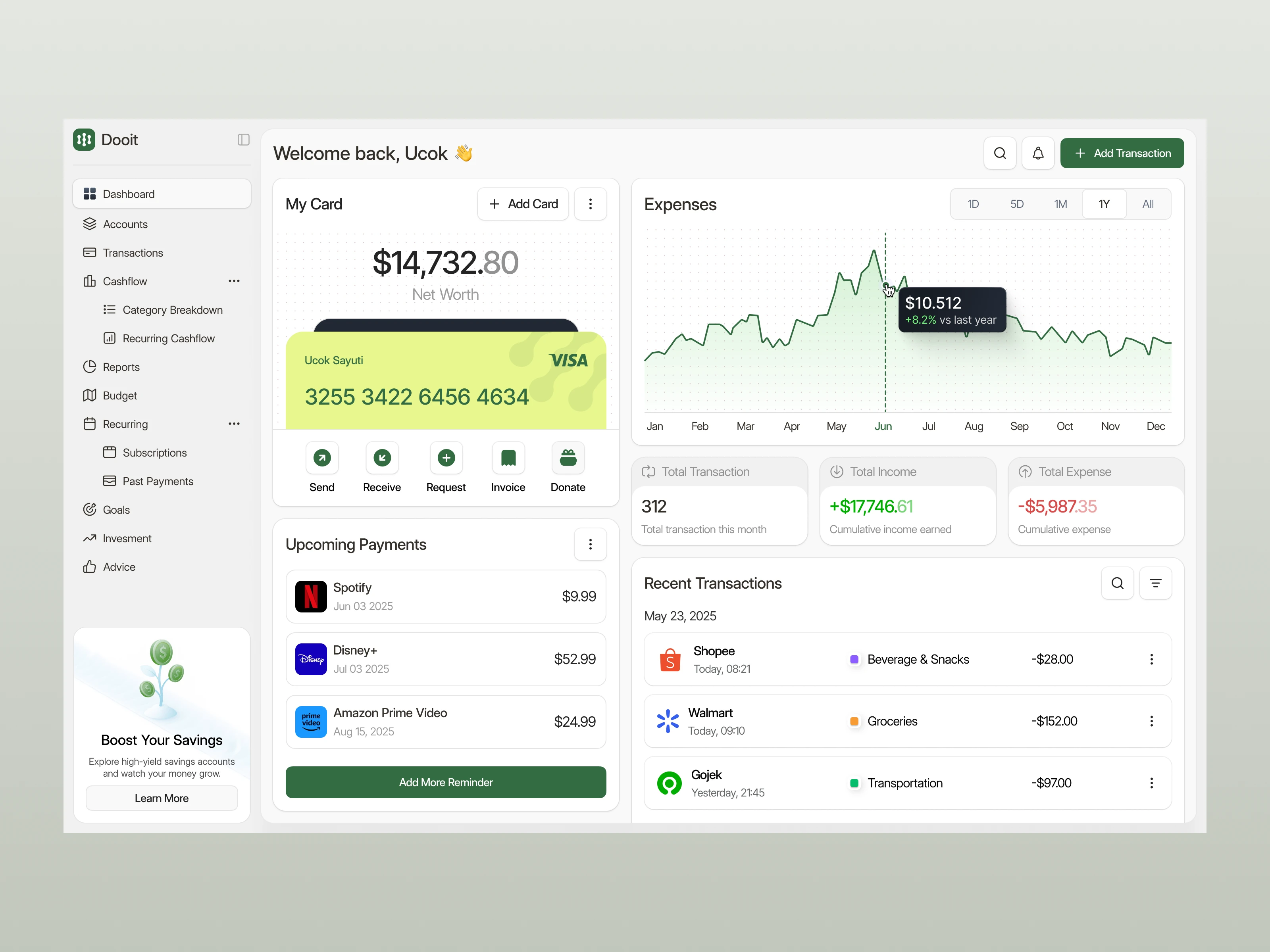
Many personal finance tools overwhelm users with complex interfaces, unclear categorization, or disconnected financial features. Users often struggle to track subscriptions, visualize their net worth over time, or quickly access past transactions. Dooit needed a streamlined dashboard that could unify key actions—monitoring spending, planning budgets, and managing recurring costs—all in one place.
The Solution
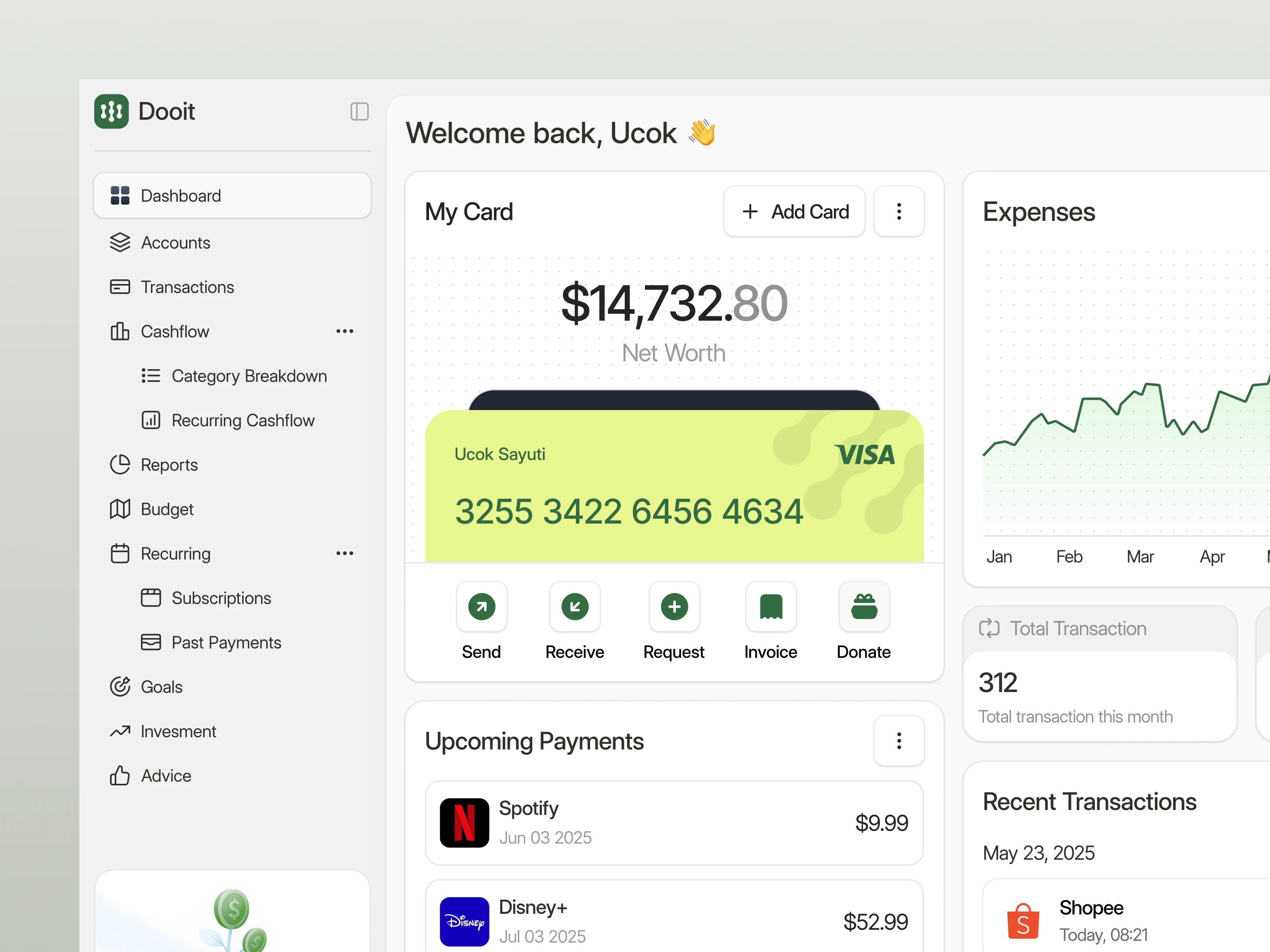
The dashboard was designed with clarity, hierarchy, and consistency at the core. We used a modular layout system that allows easy scanning of financial data, paired with actionable components such as “Add Transaction” and “Boost Savings.” A balanced color palette with green for earnings and red for expenses reinforces data interpretation without cognitive overload. The system enables users to track income trends, receive reminders for upcoming bills, and manage payments—all with minimal clicks.
Result
The Dooit dashboard delivers a user-friendly, data-driven, and emotionally satisfying financial experience. It empowers users to visualize their financial behaviors, stay on top of their budget, and take timely actions with confidence. From color psychology to interaction flow, every detail was crafted to make money management feel less stressful and more actionable.
0 likes · 25 views · Jul 25, 2025
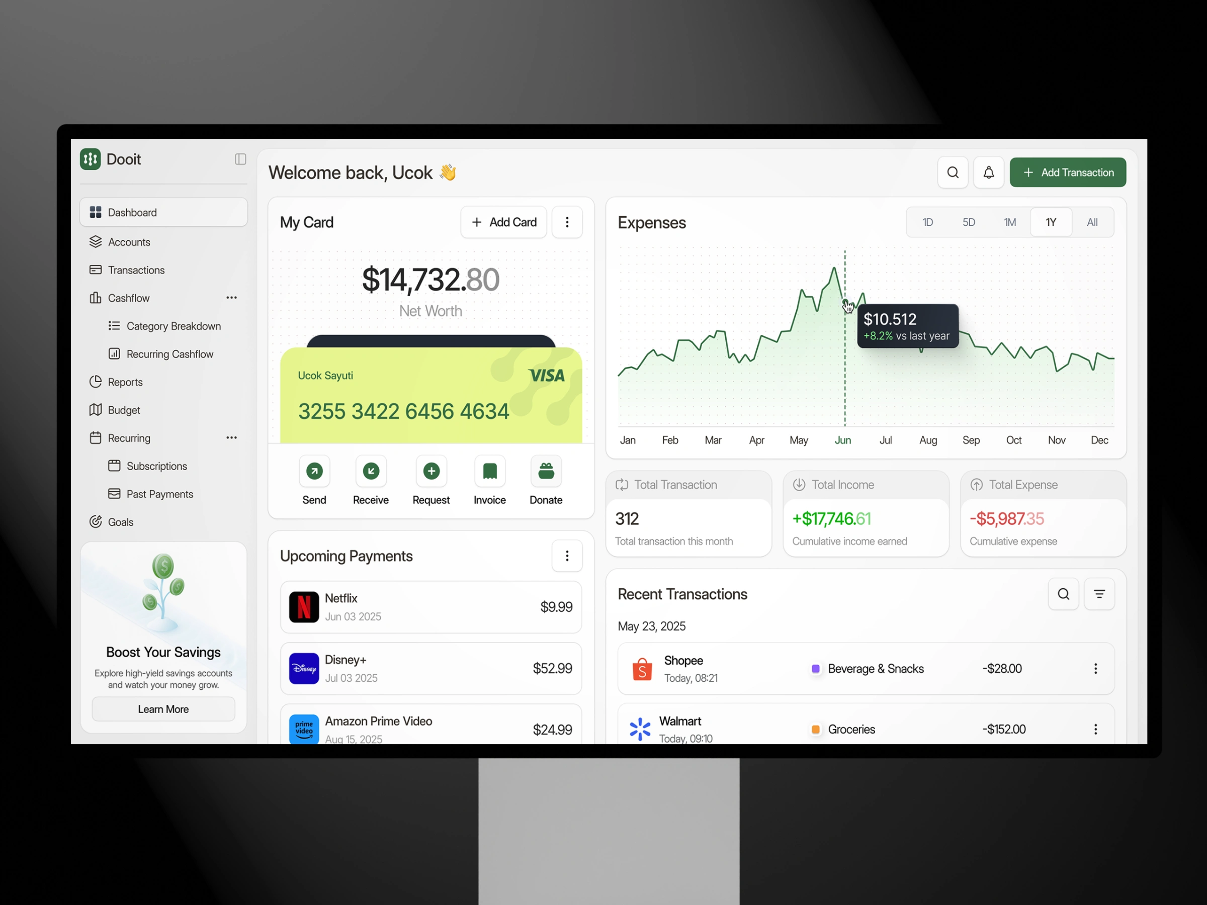
This personal finance dashboard brings clarity to your cashflow with a sleek, organized layout that’s both powerful and easy to use.
