Design system uplift for an online laundry service
Introduction
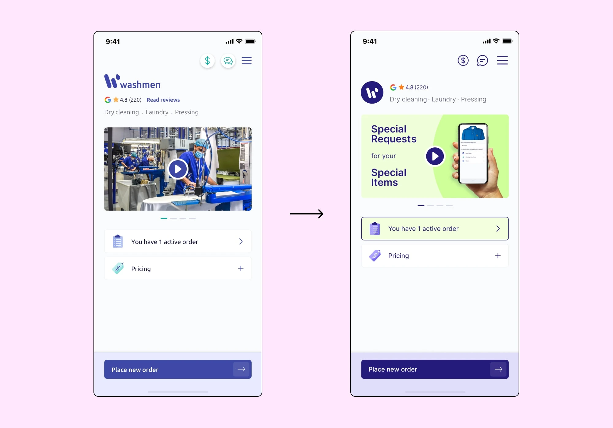
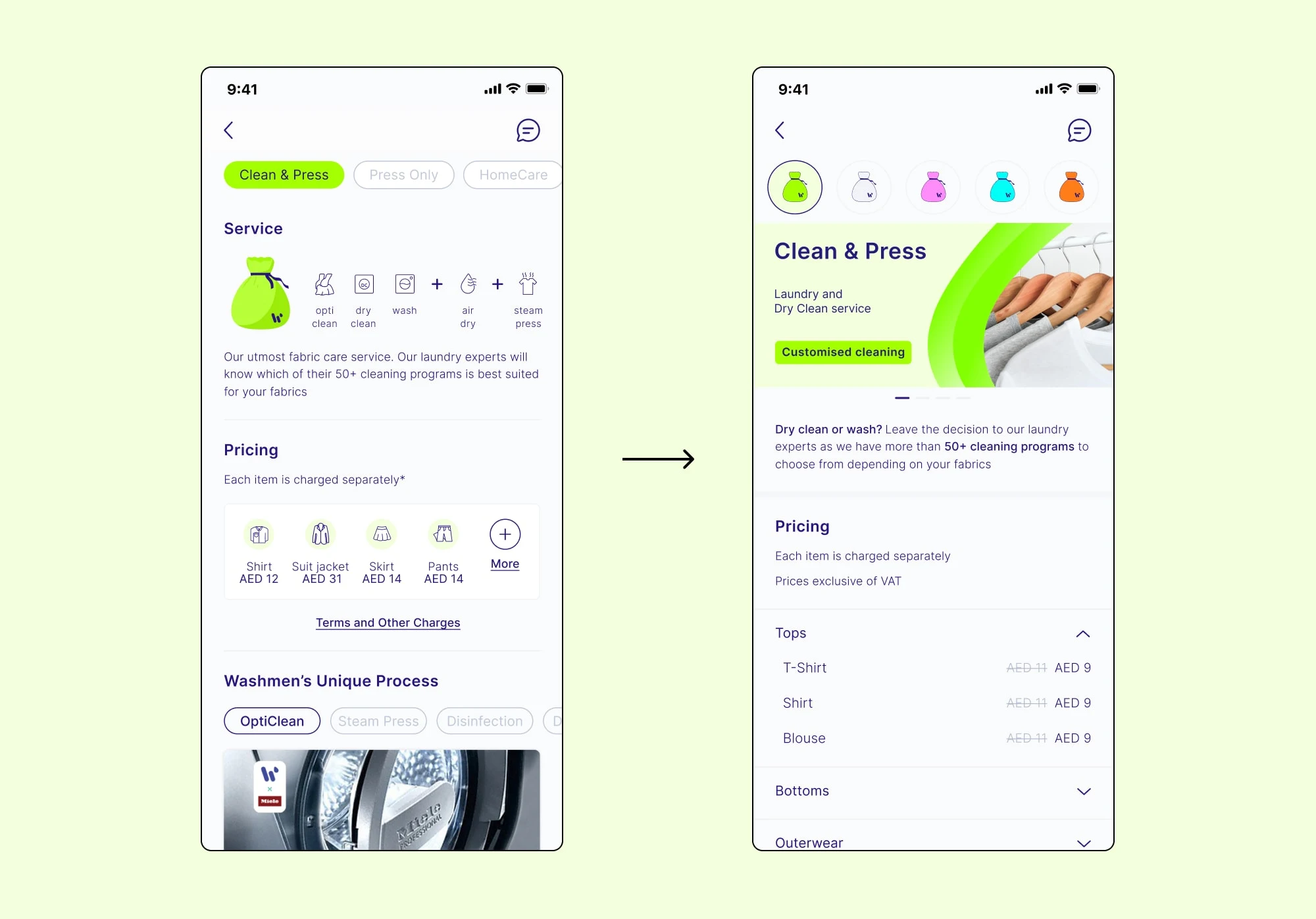
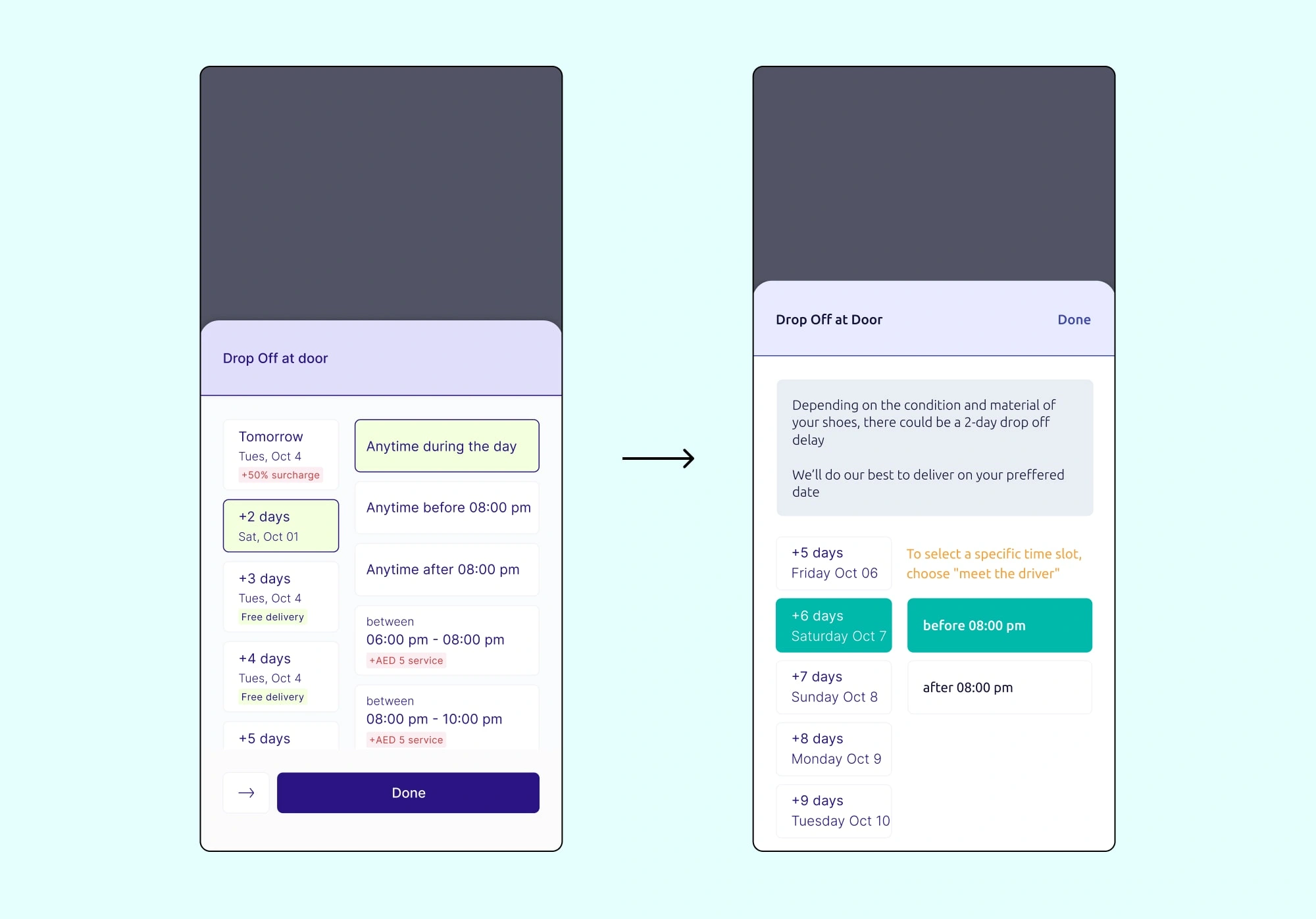
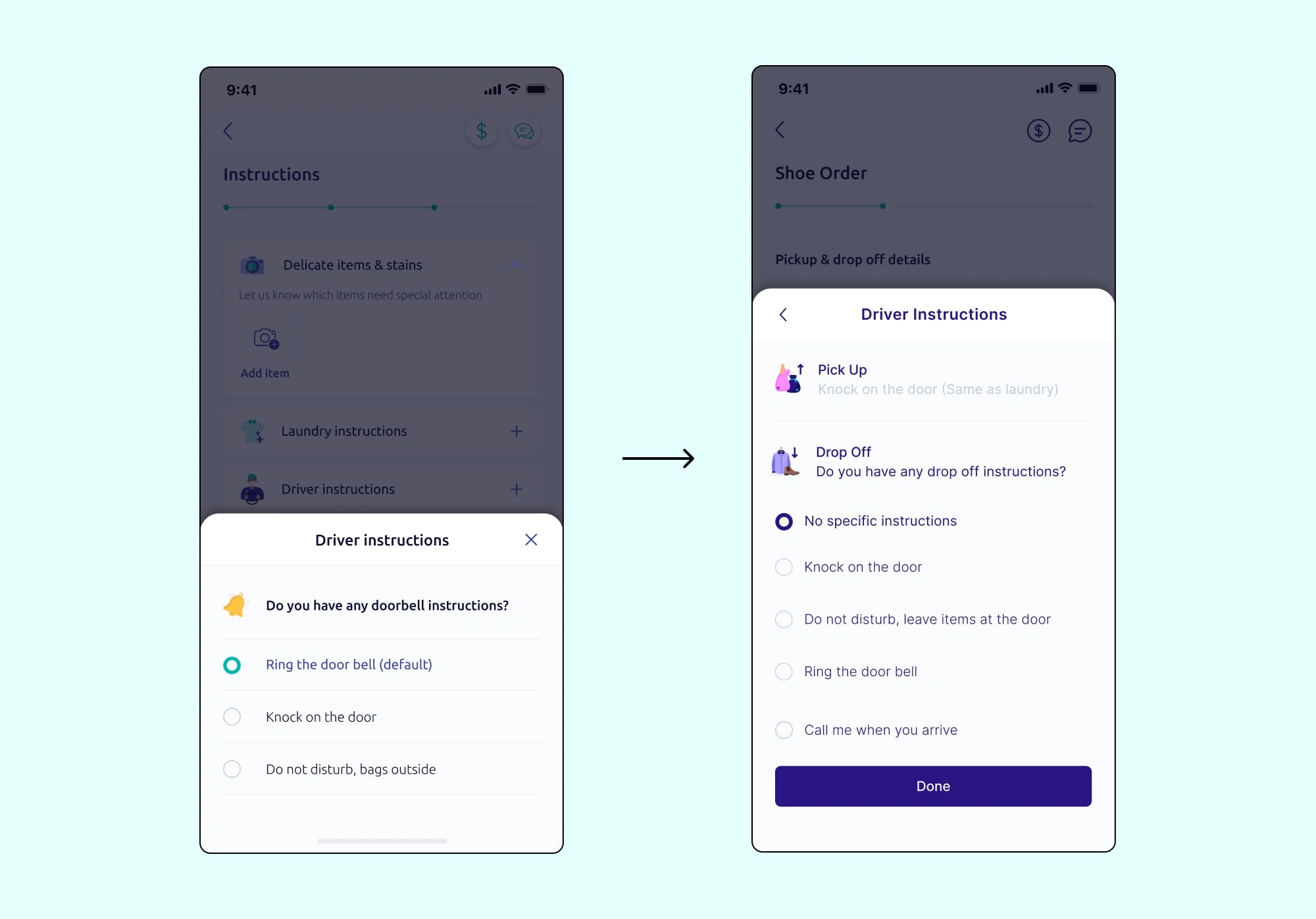
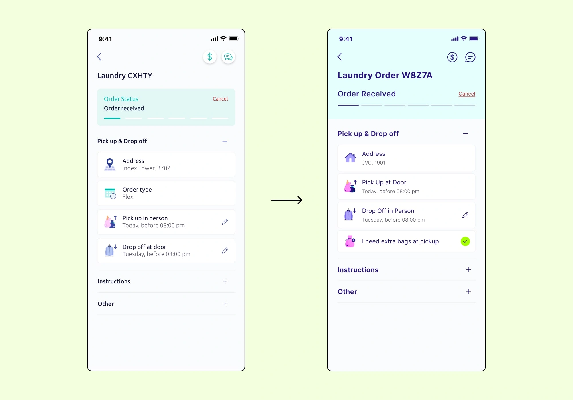
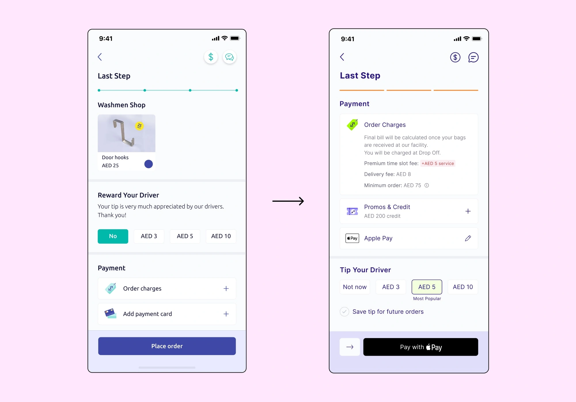
This recap highlights the successful design system uplift of Washmen's mobile app, enhancing visual appeal, usability, and user experience. The project involved rethinking the color palette for a vibrant and memorable design. The font was changed for a more professional and versatile appearance. Key screens were redesigned to improve usability, and UX/UI improvements were made to the stylesheet and iconography. The previous design style, while initially effective, became dull and lacked professionalism, hindering the company's goal of market leadership.
Uplifting a brand and design system for a more serious and established look and feel
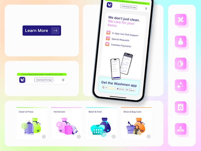
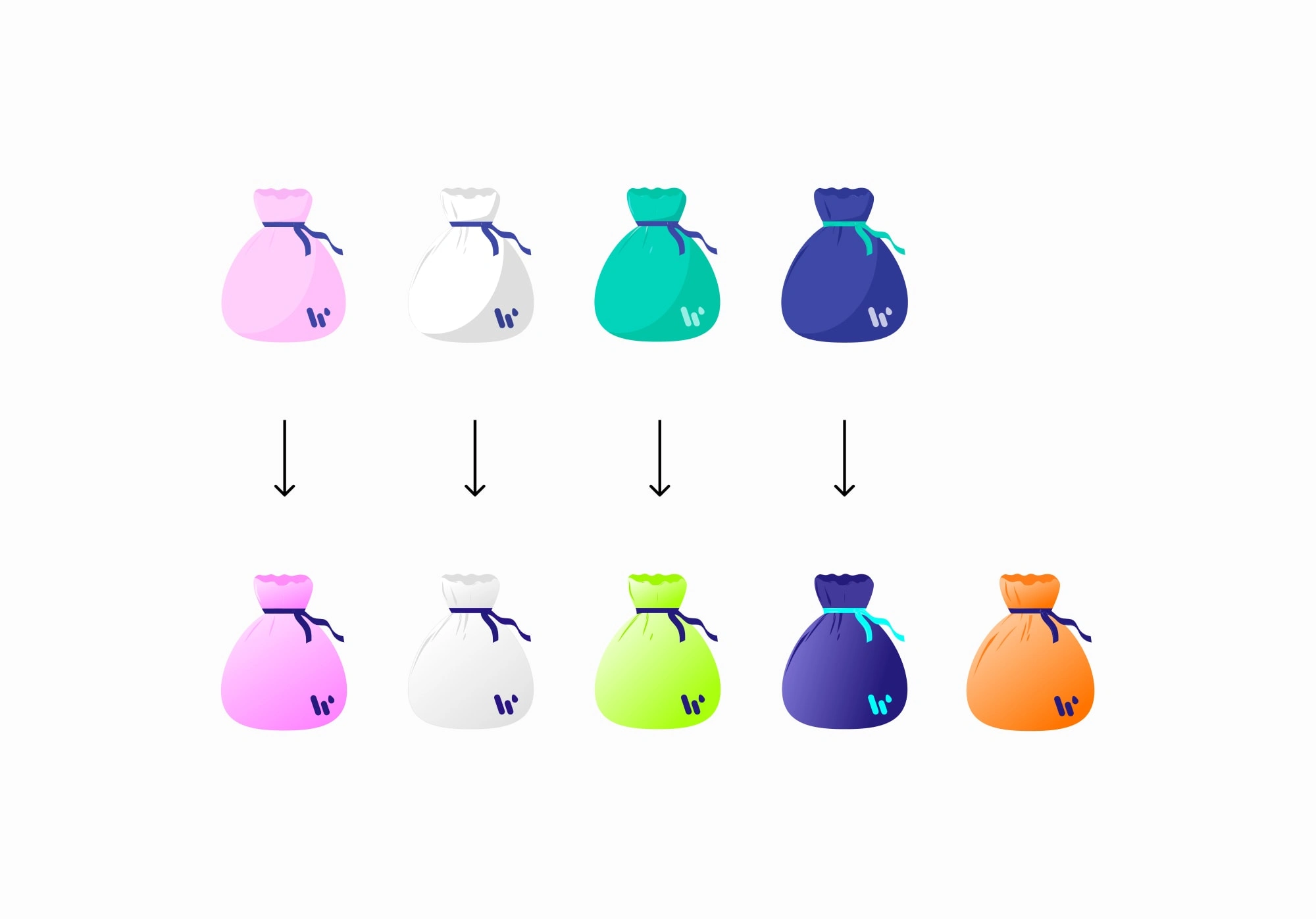
Vibrant and Memorable Color Palette: The objective was to reimagine the color palette to infuse energy and create a lasting impression on users, departing from the previously perceived dull and washed-out appearance.
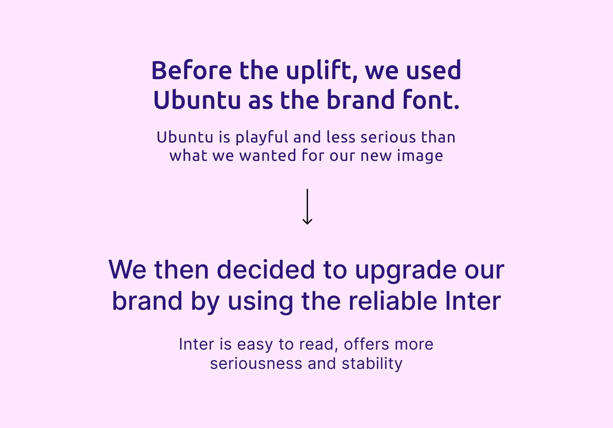
Professional and Versatile Typography: The project aimed to select a font that exuded professionalism and versatility, aligning with Washmen’s goal of establishing themselves as market leaders.
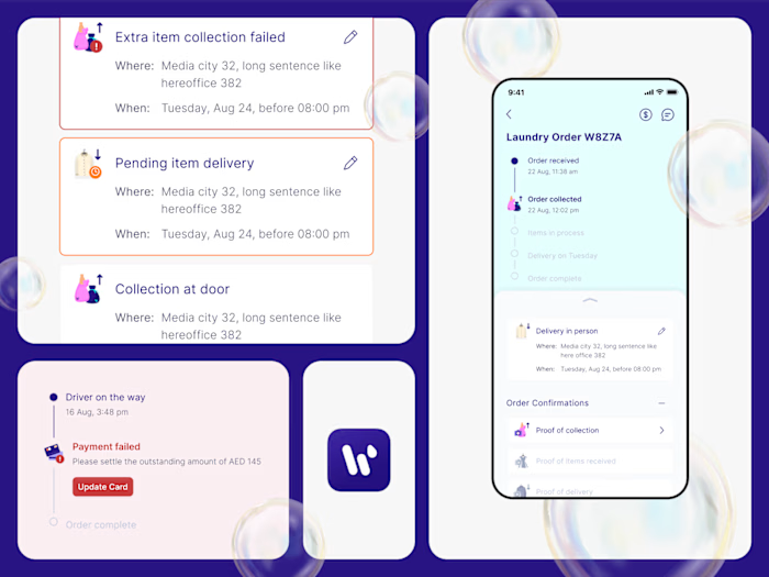
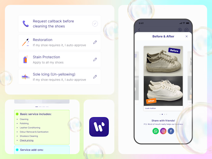
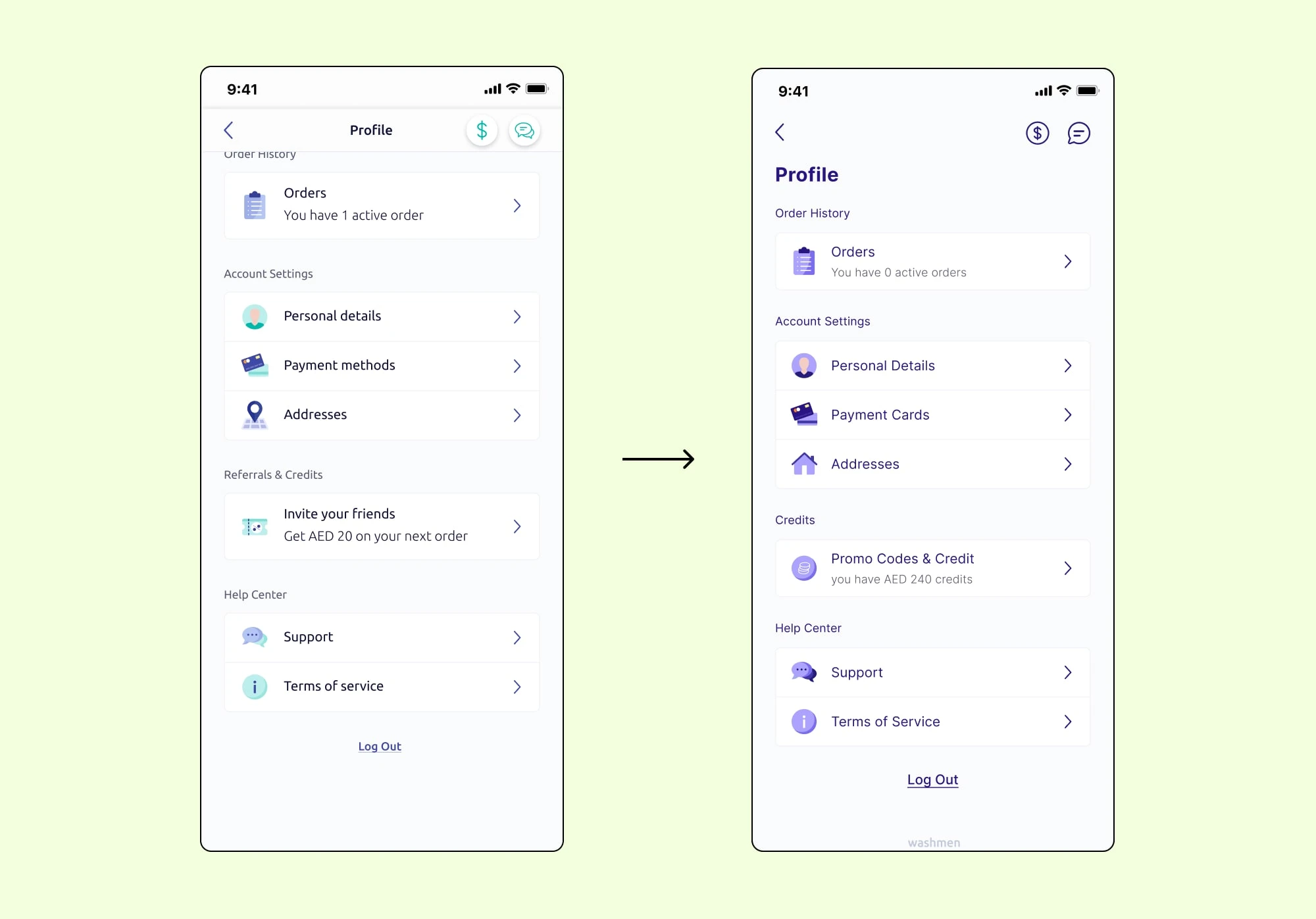
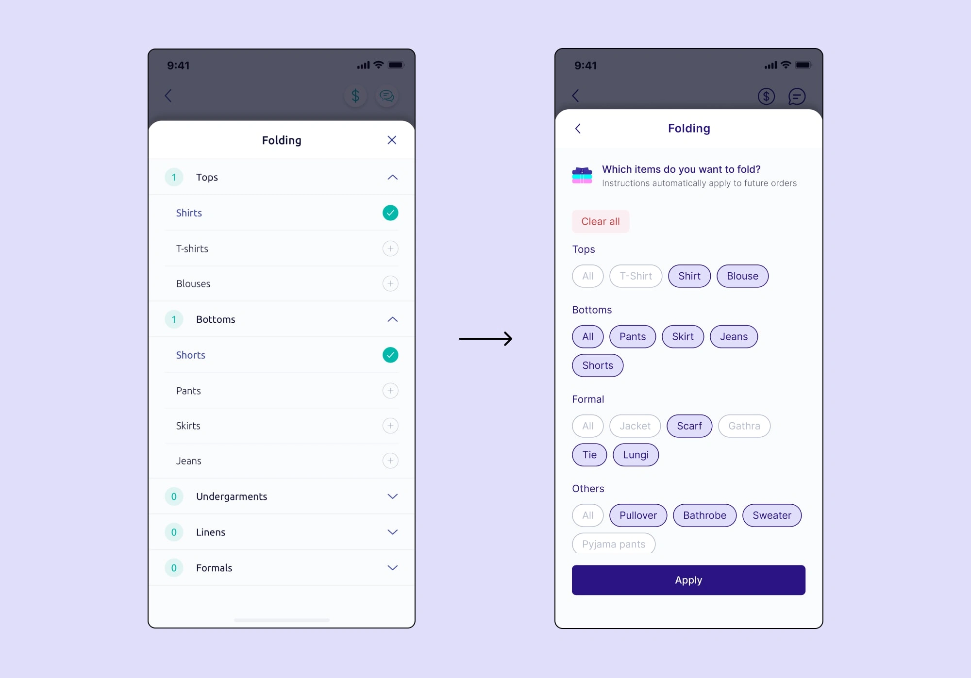
Improved Usability and User Experience: Key screens underwent a redesign to enhance usability, streamline user flow, and improve the overall user experience.
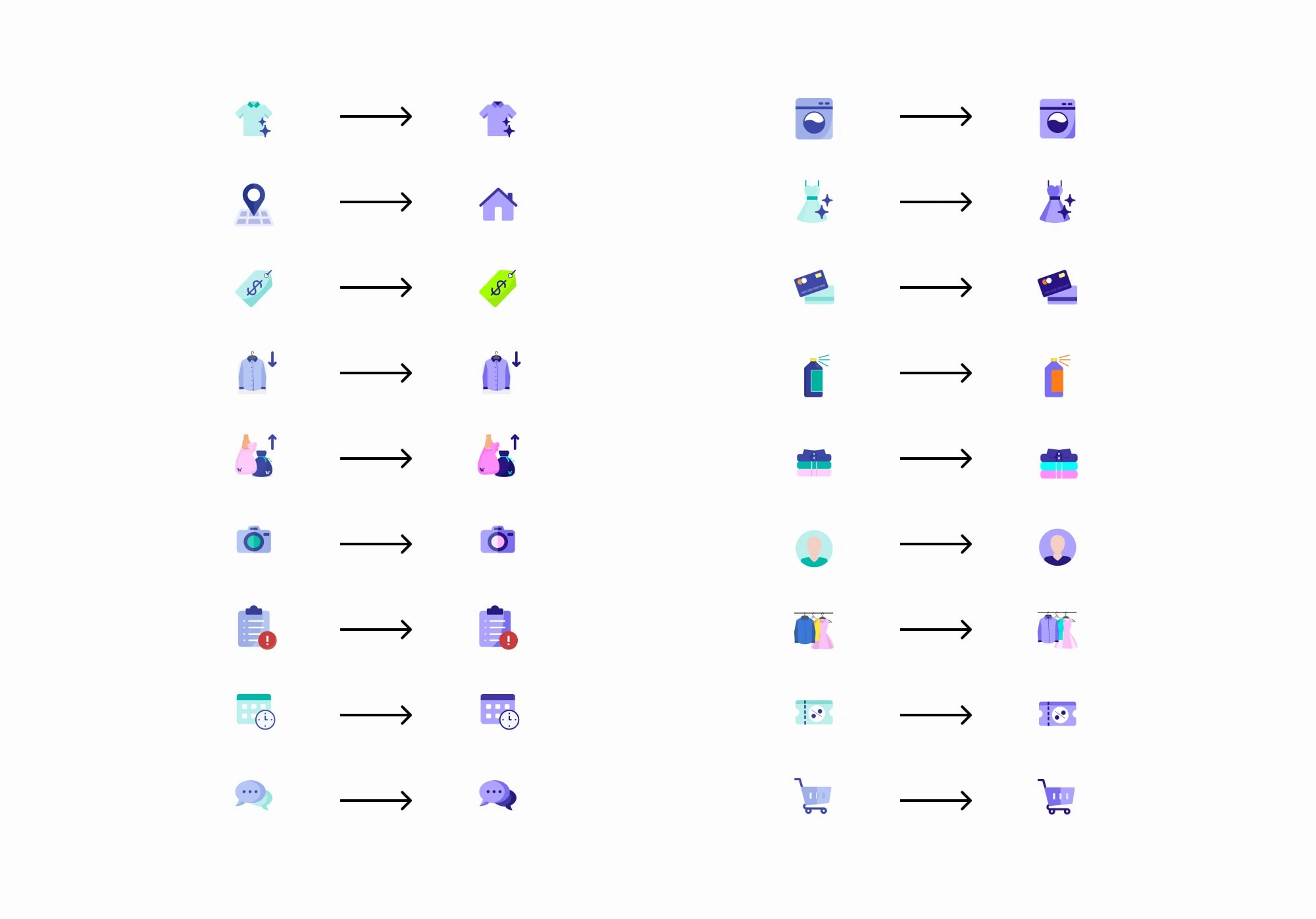
UX/UI Enhancements: Additional improvements were made to the stylesheet and iconography to ensure a cohesive design language and address any existing design inconsistencies.
Rethinking the Color Palette
Extensive research and exploration were conducted to develop a more vibrant and memorable color palette that rejuvenated the app's visual identity, addressing the previous perception of dullness.
Font Selection
A comprehensive review of font options was undertaken to find a professional and versatile typeface that aligned with the company's market leadership aspirations
UX/UI Refinements
The app's stylesheet and iconography received comprehensive refinements, ensuring consistency, clarity, and a cohesive design language throughout the app.
Research shows users have more trust and confidence in the business
The mobile app design system uplift successfully achieved its goals of creating a more vibrant and memorable user experience. The revamped color palette added energy and visual impact, making the app more engaging. The adoption of a professional and versatile font improved readability and reinforced a polished appearance. The redesigned key screens enhanced usability and user flow, resulting in an improved overall experience. The refined stylesheet and iconography contributed to a cohesive and visually appealing design system.
Like this project
Posted Dec 8, 2023
Improved execution speed by creating, designing and maintaining 2 complete design system libraries across multiple domains

