Swirled Peace- Brand Identity & Packaging Design
Rakesh Khilare
Swirled Peace – Ice Cream Brand & Packaging
Brand Identity & Packaging Design
The Challenge
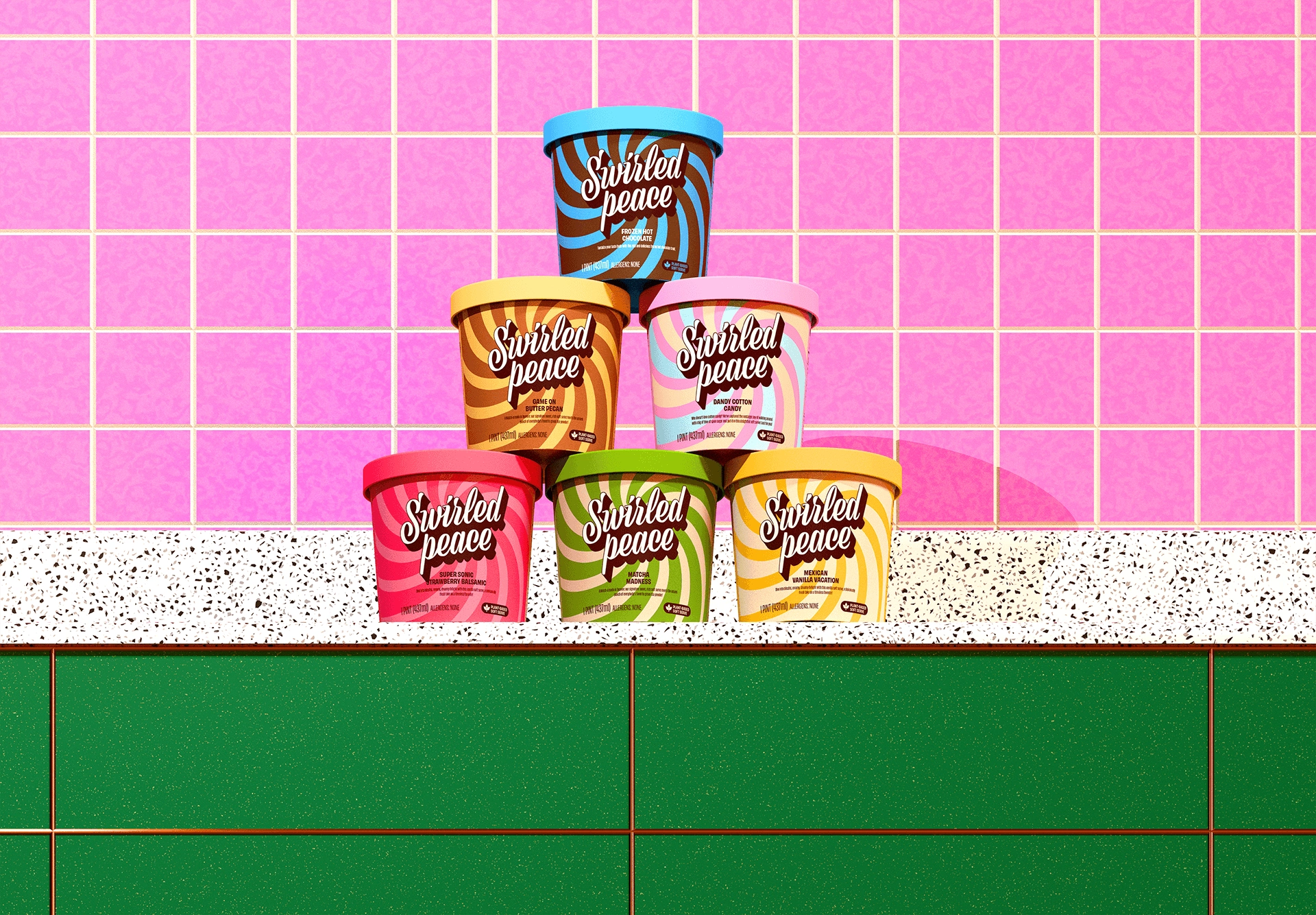
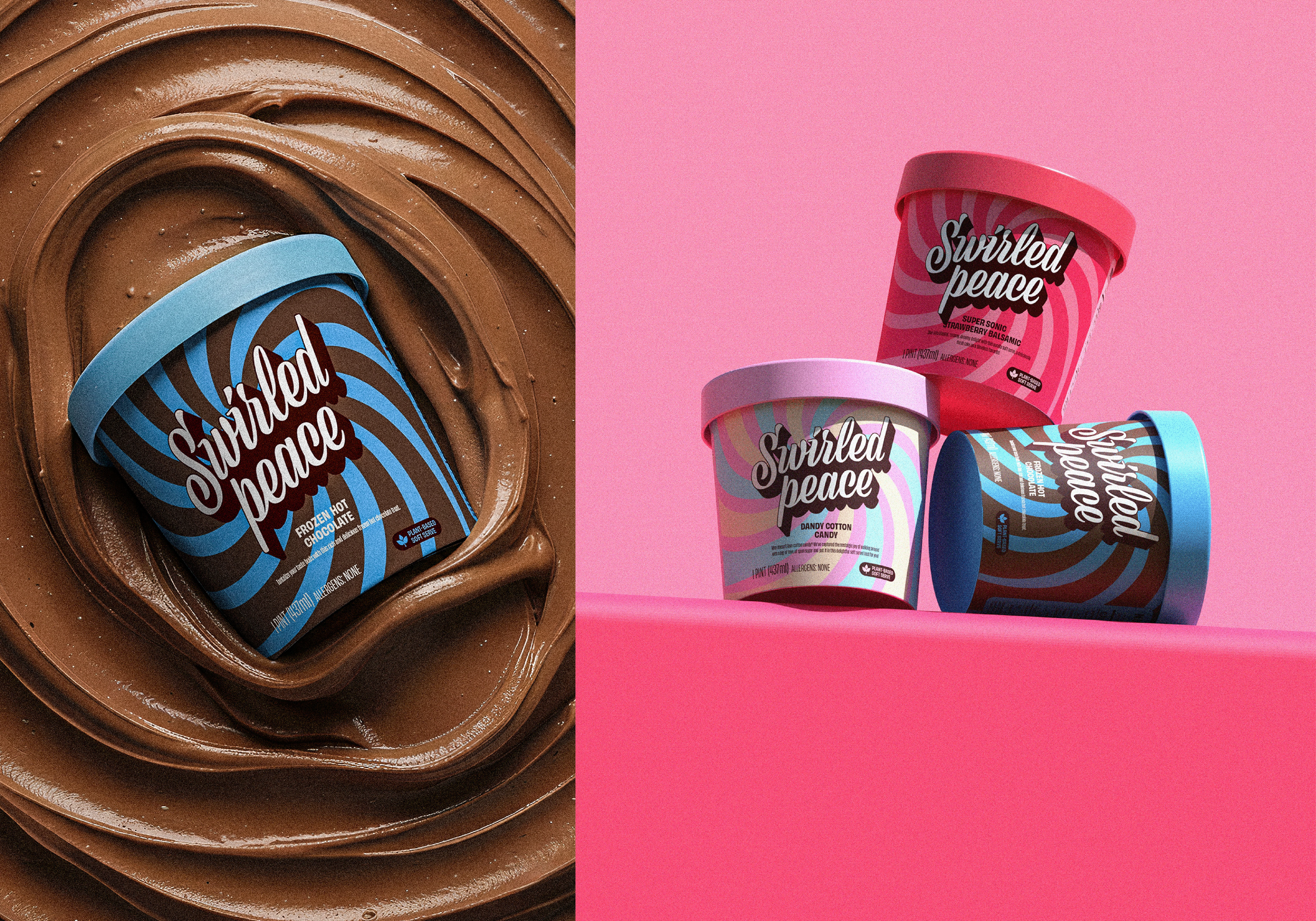
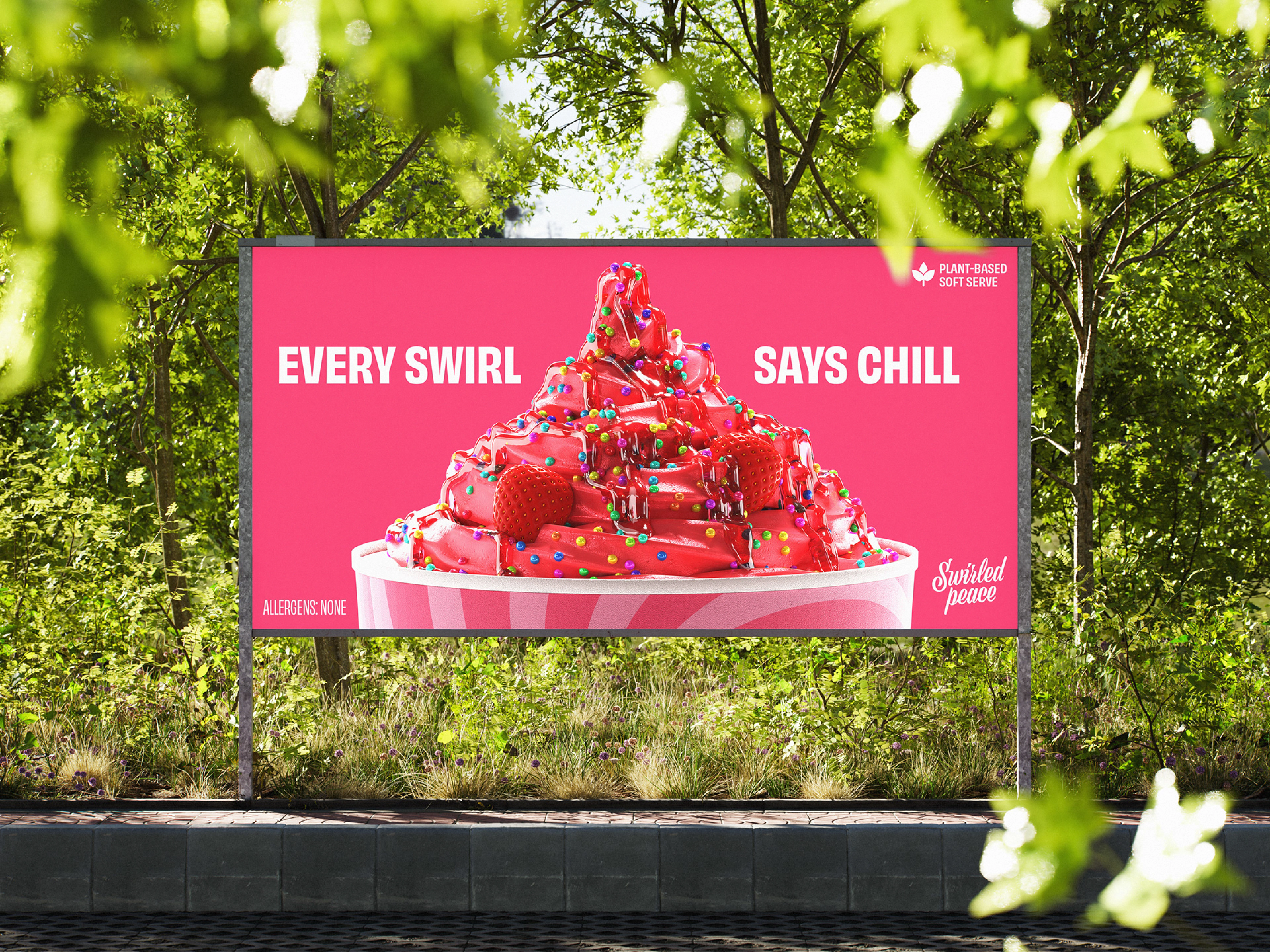
Swirled Peace is a community-first soft-serve ice cream brand with a heart — founded on childhood nostalgia, inclusivity, and plant-based joy. The challenge was translating that warmth into a visual identity that could compete on shelf, connect emotionally with customers, and scale across packaging, apparel, and out-of-home.
The Approach
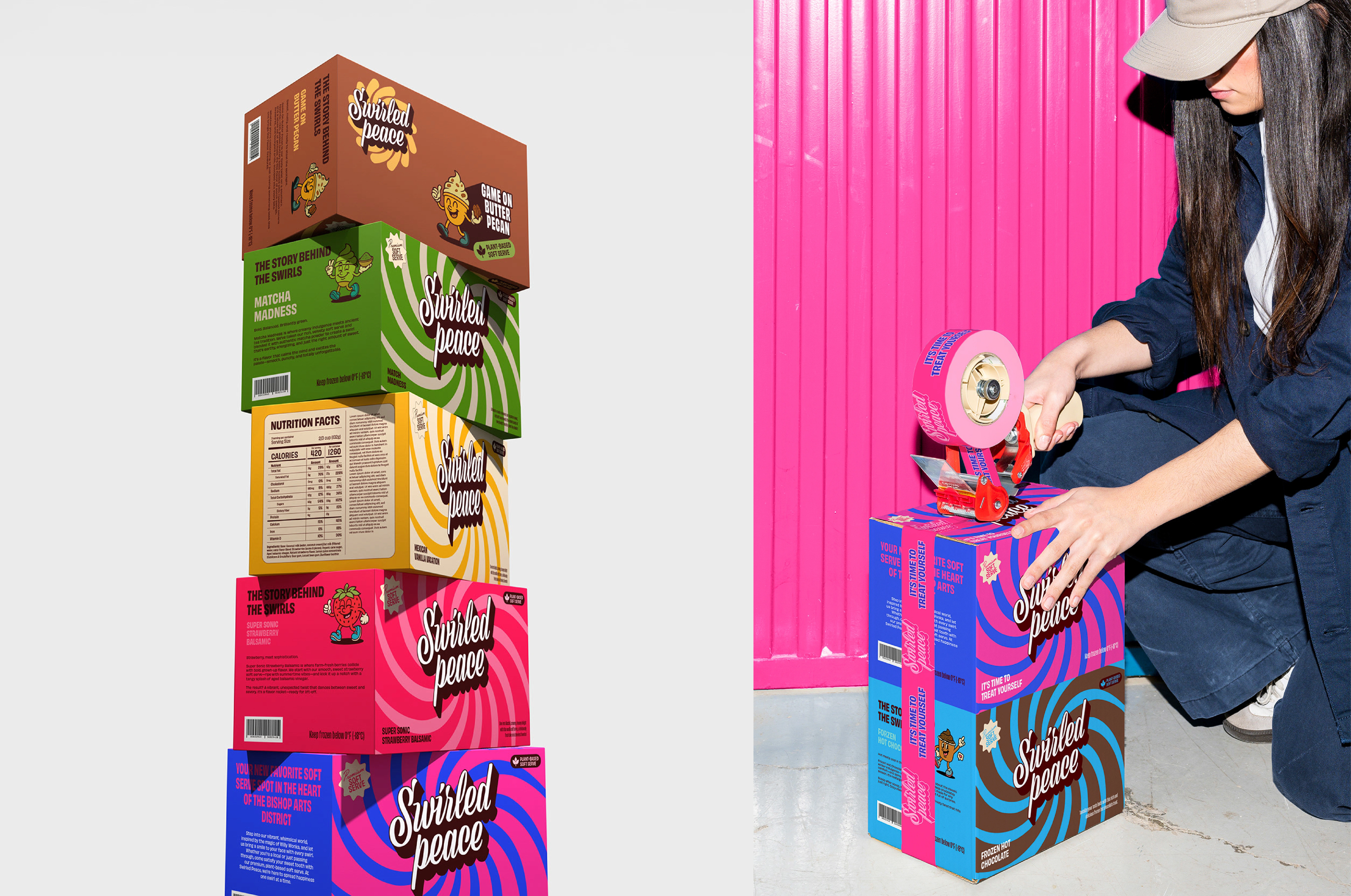
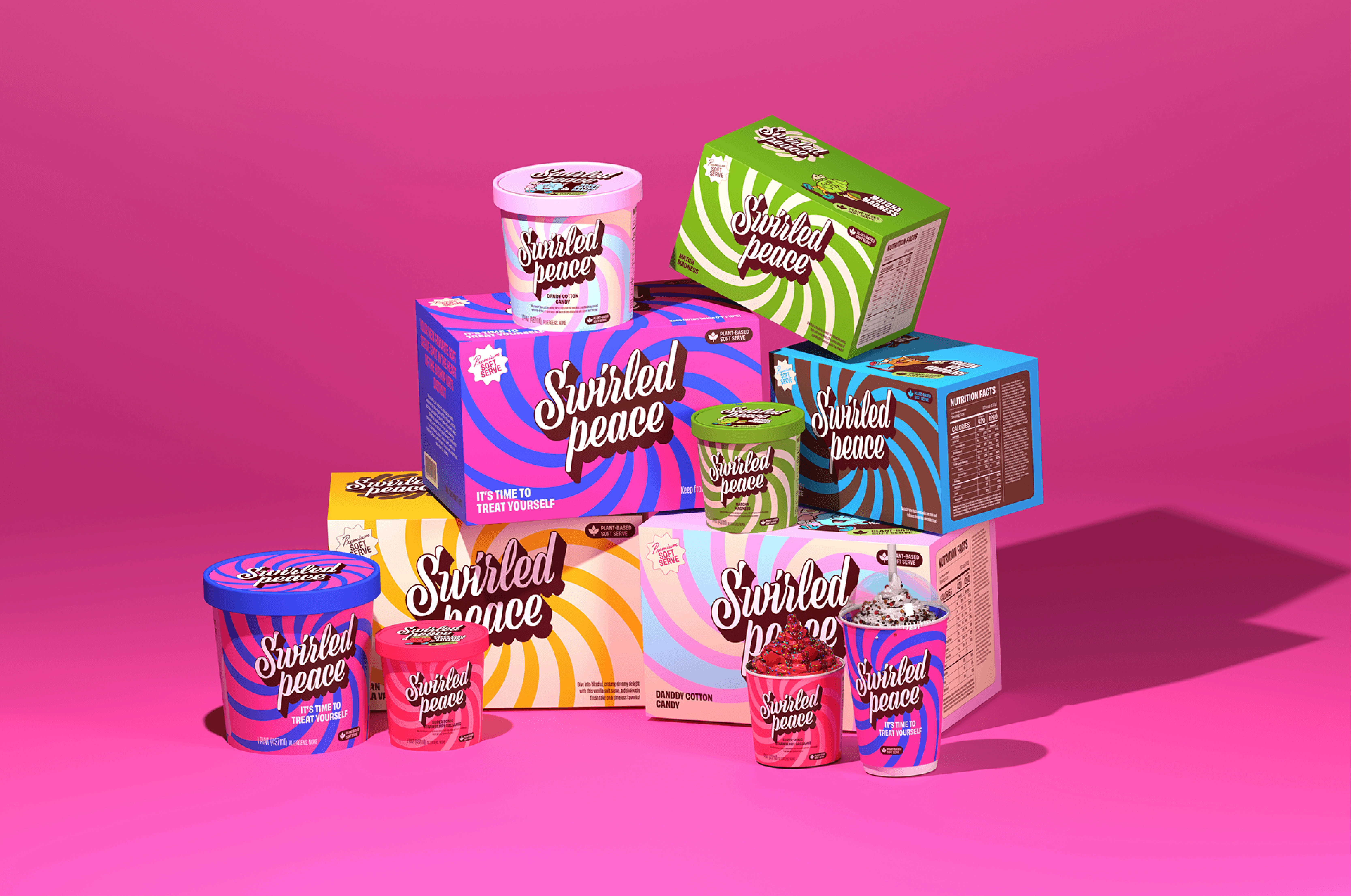
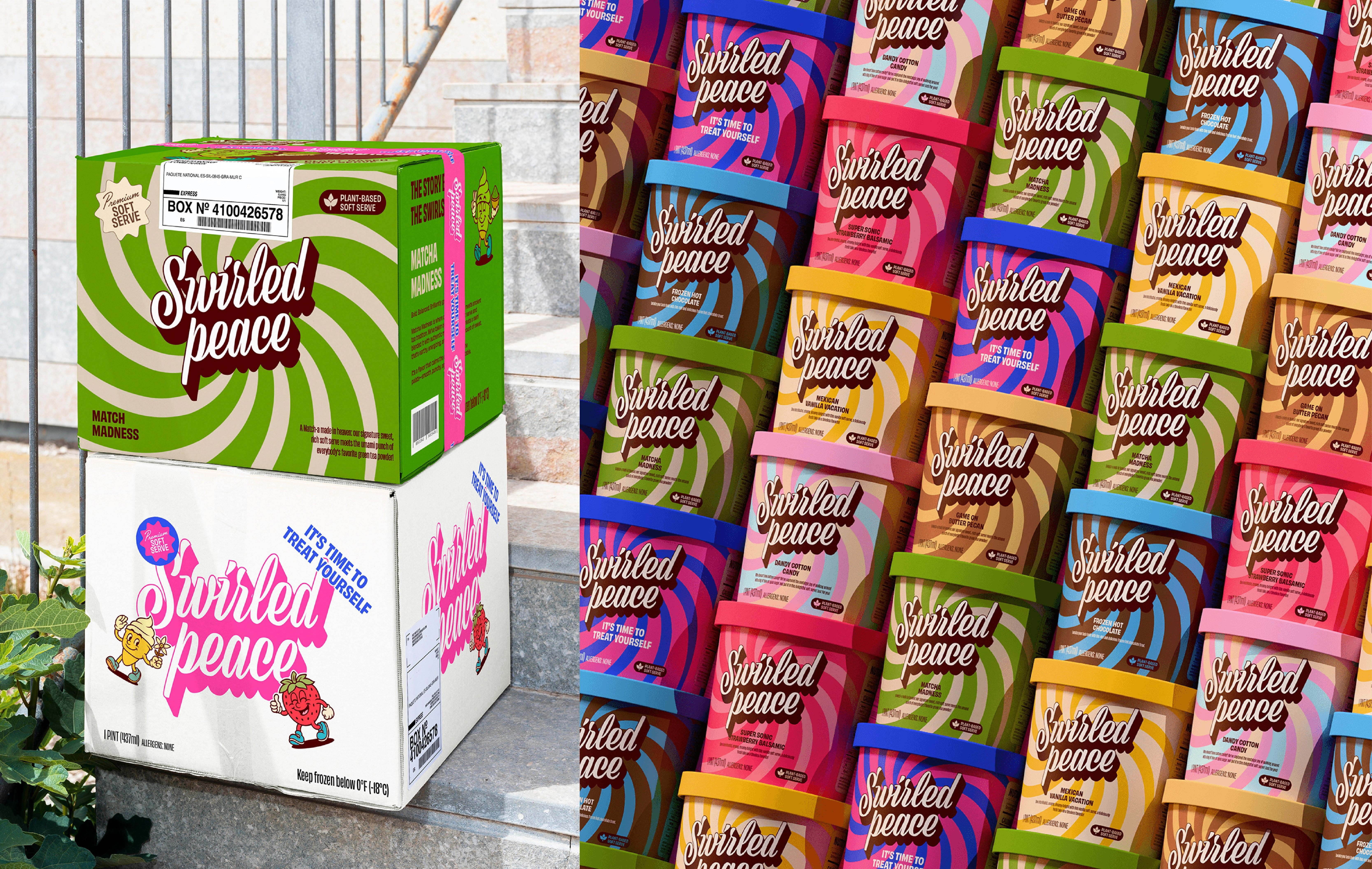
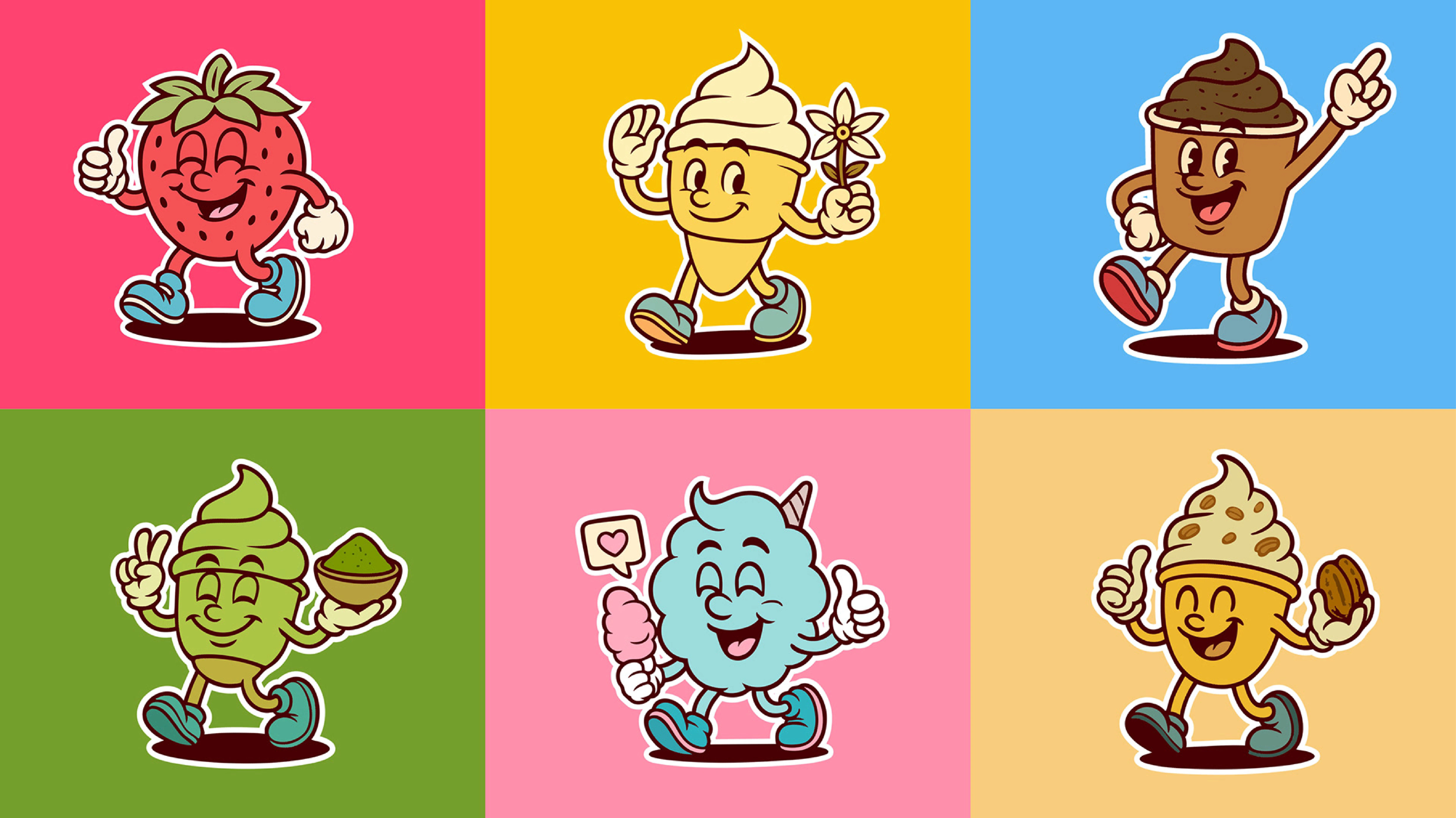
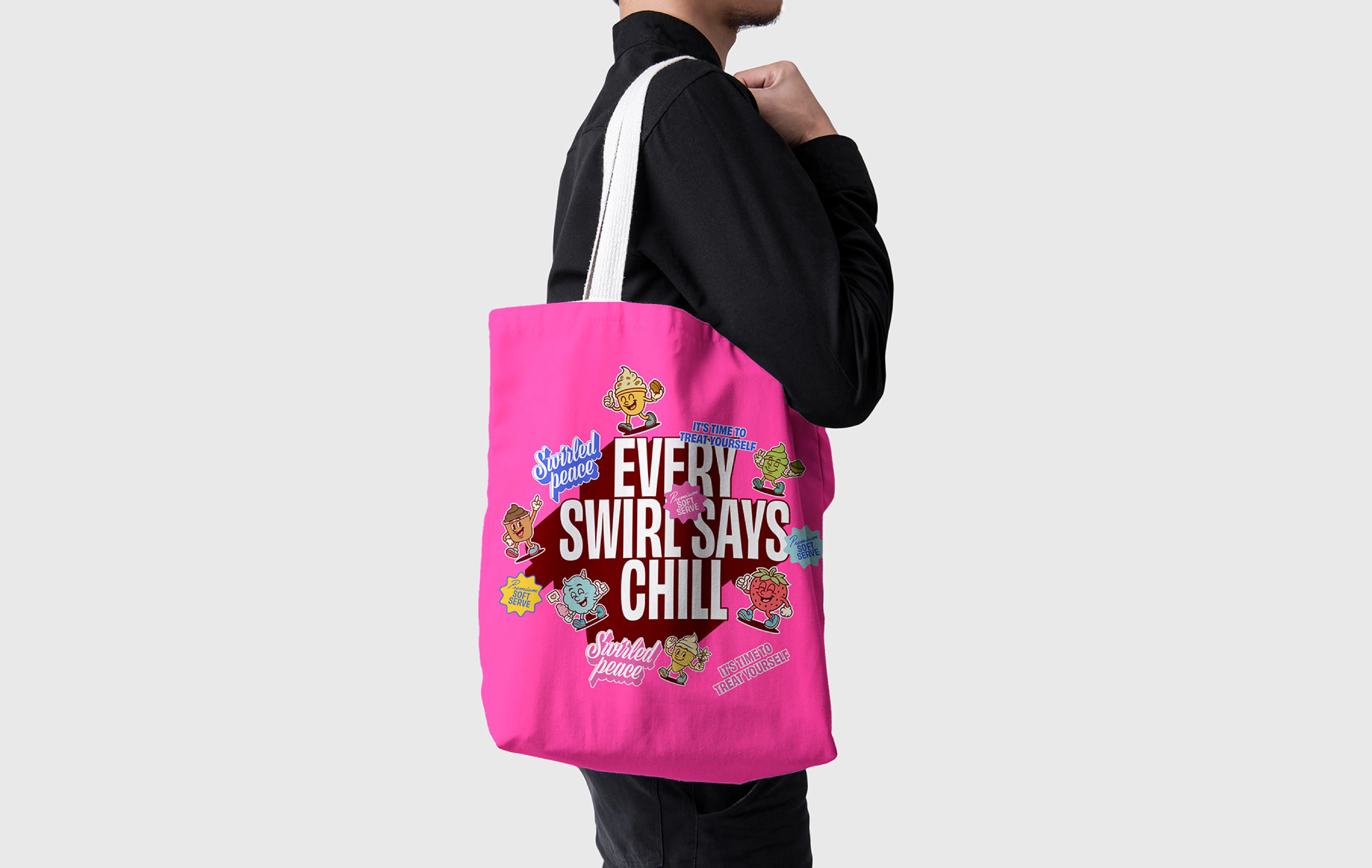
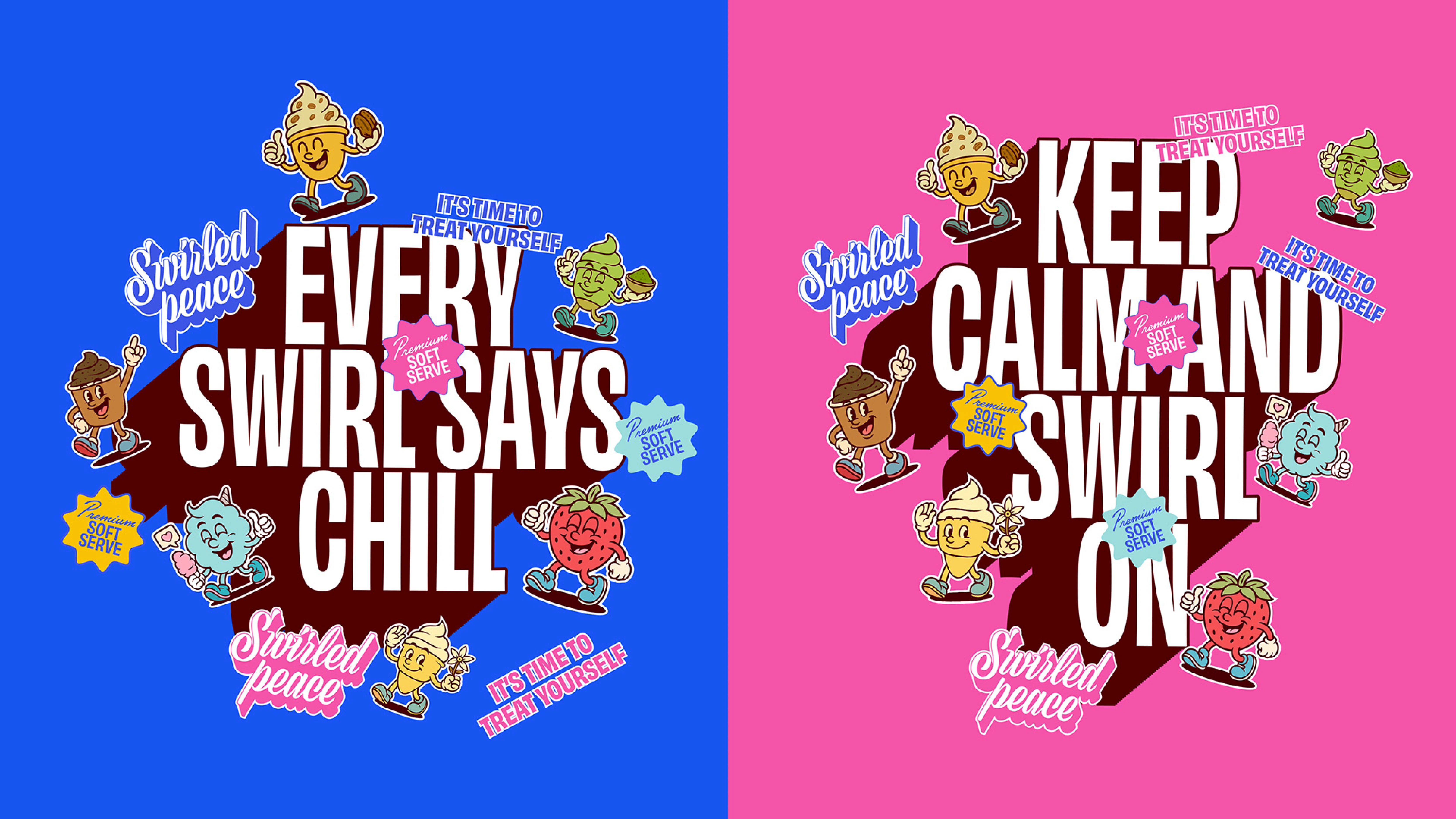
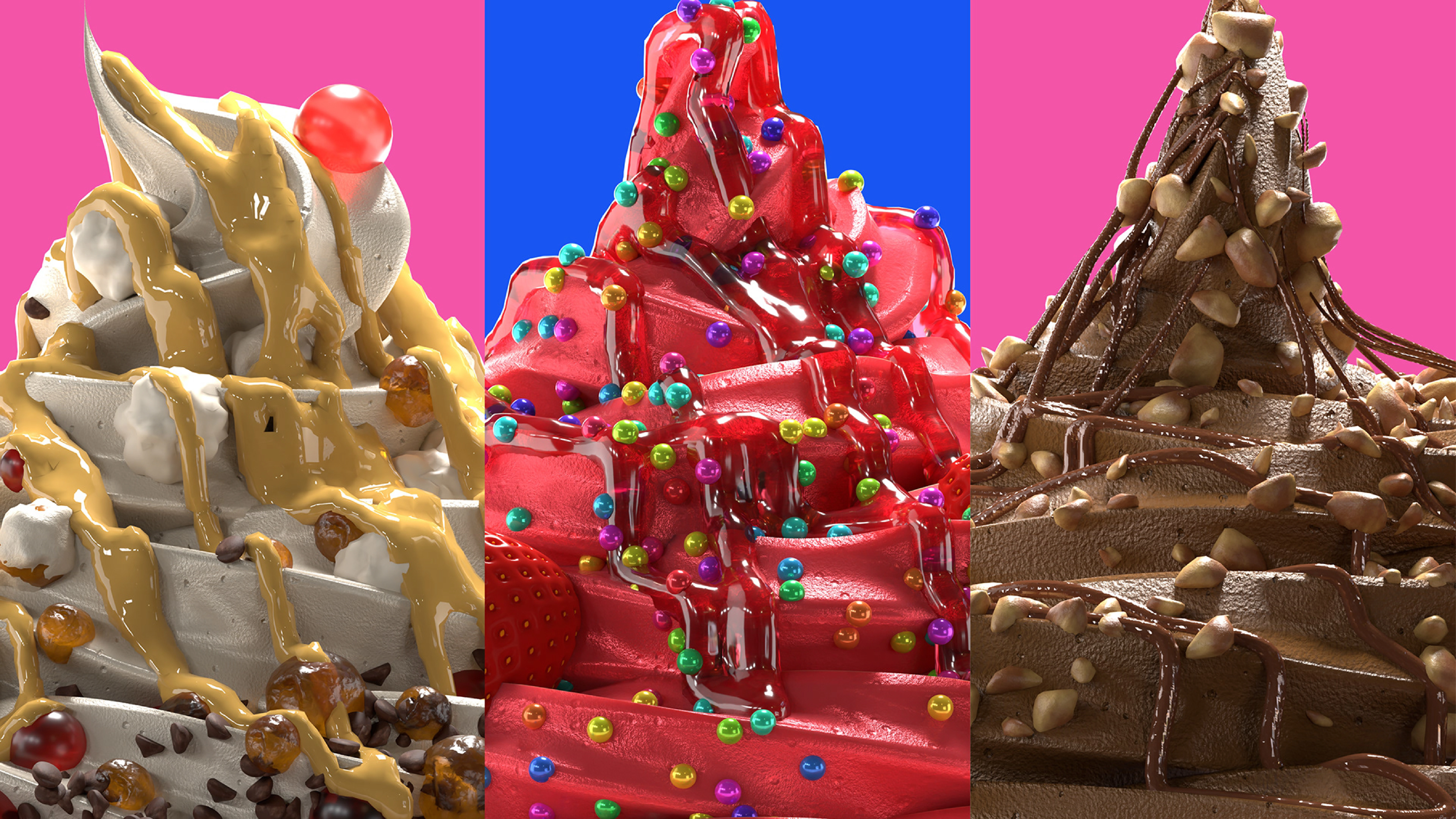
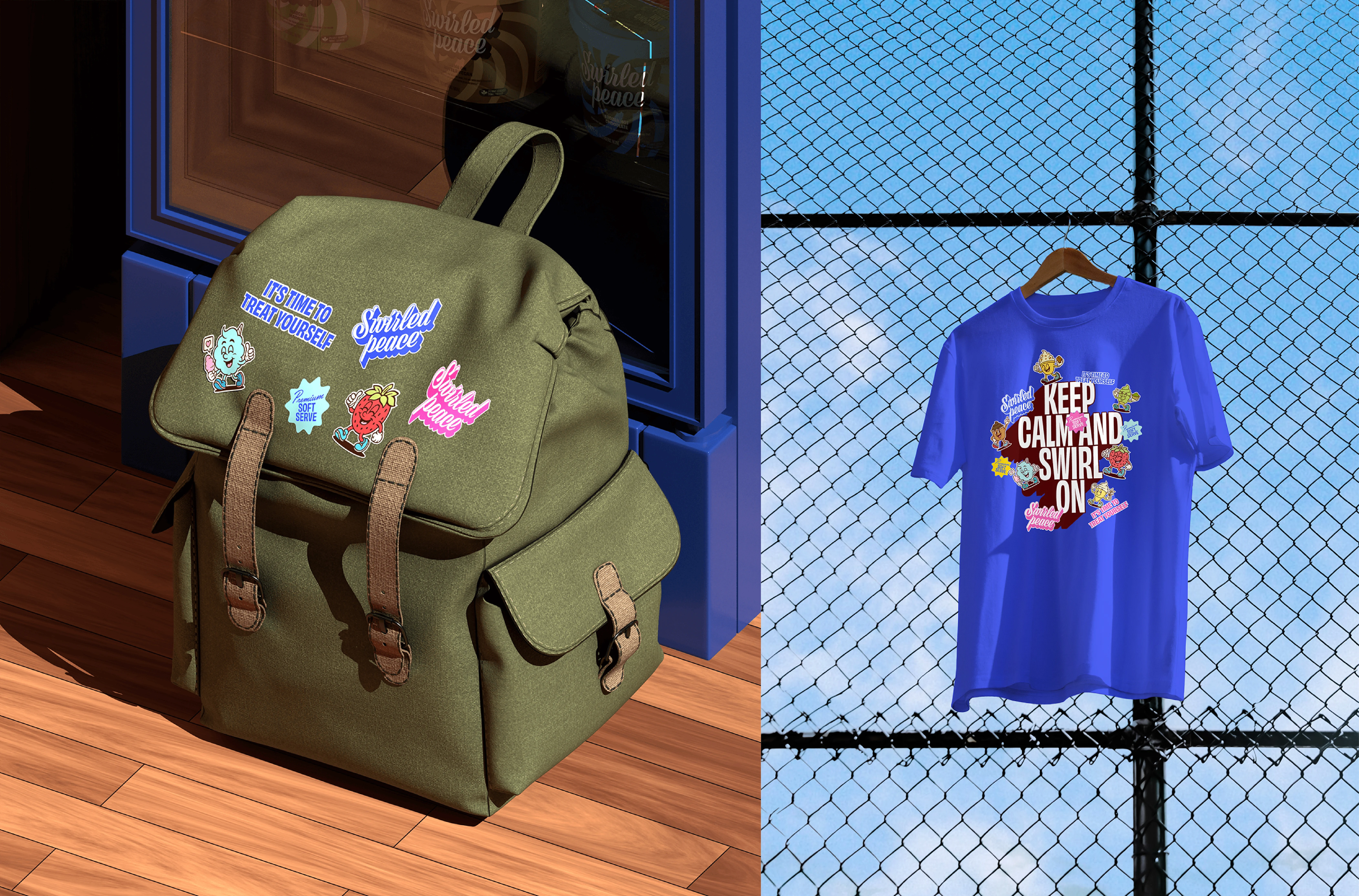
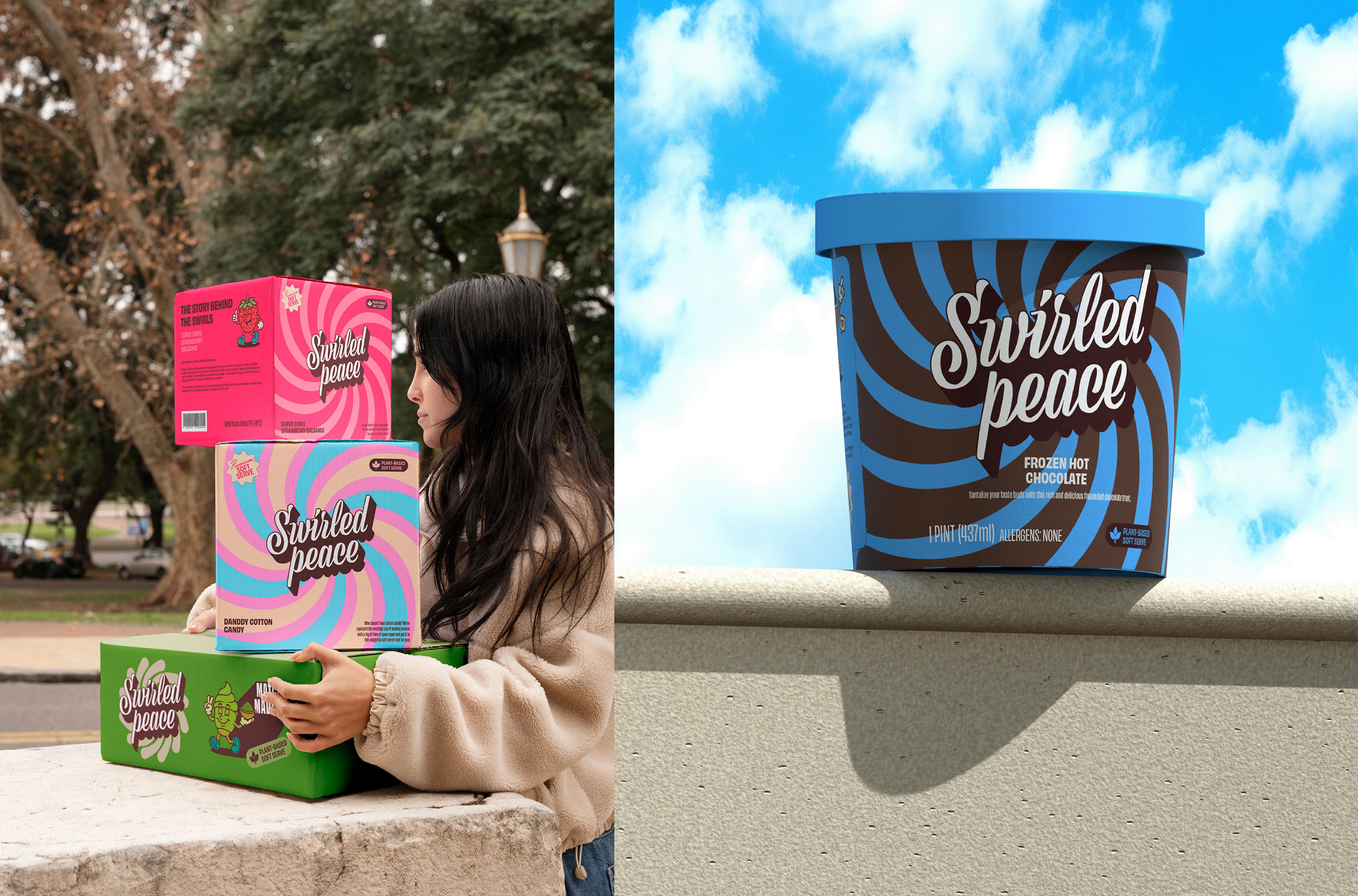
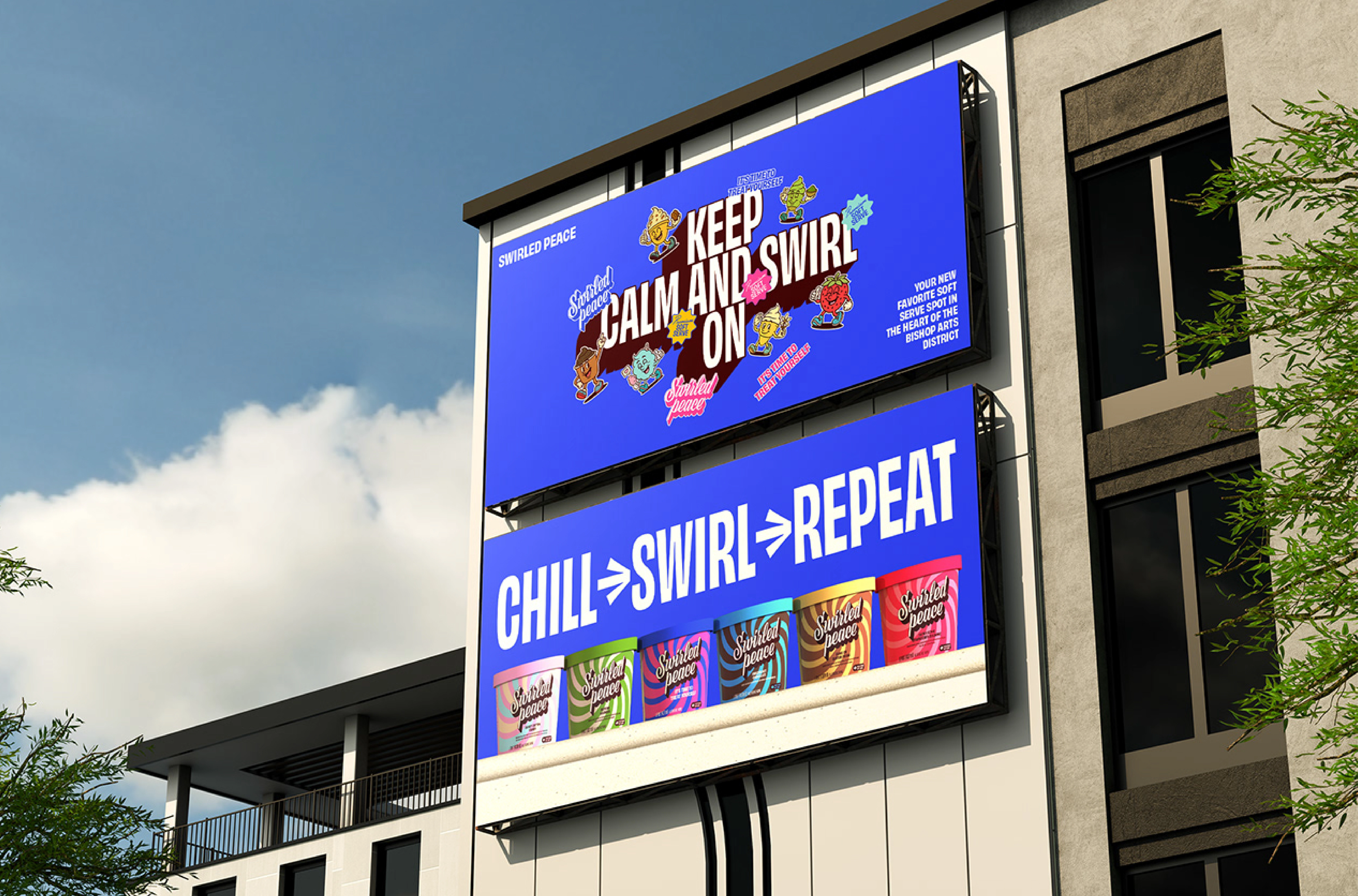
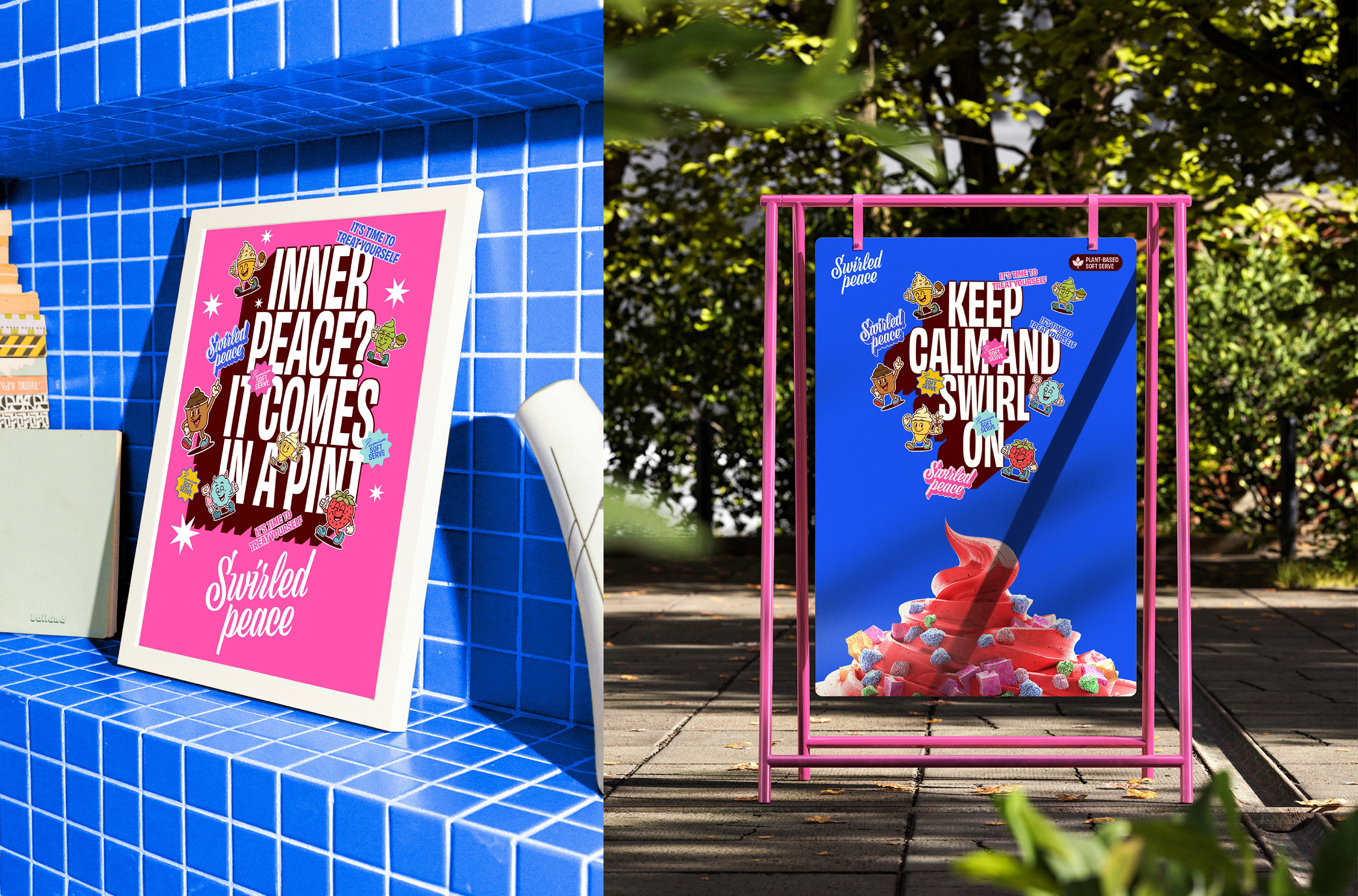
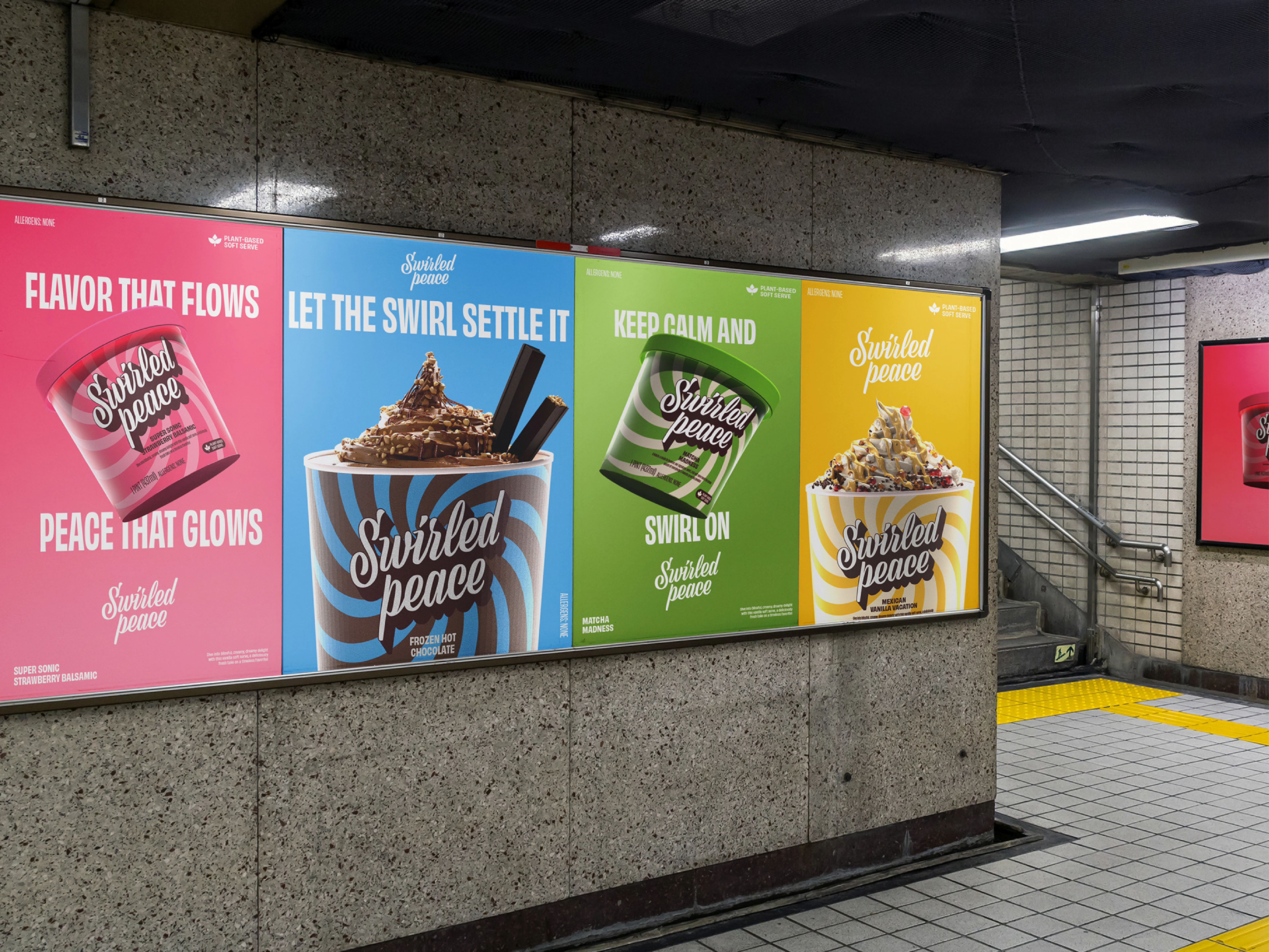
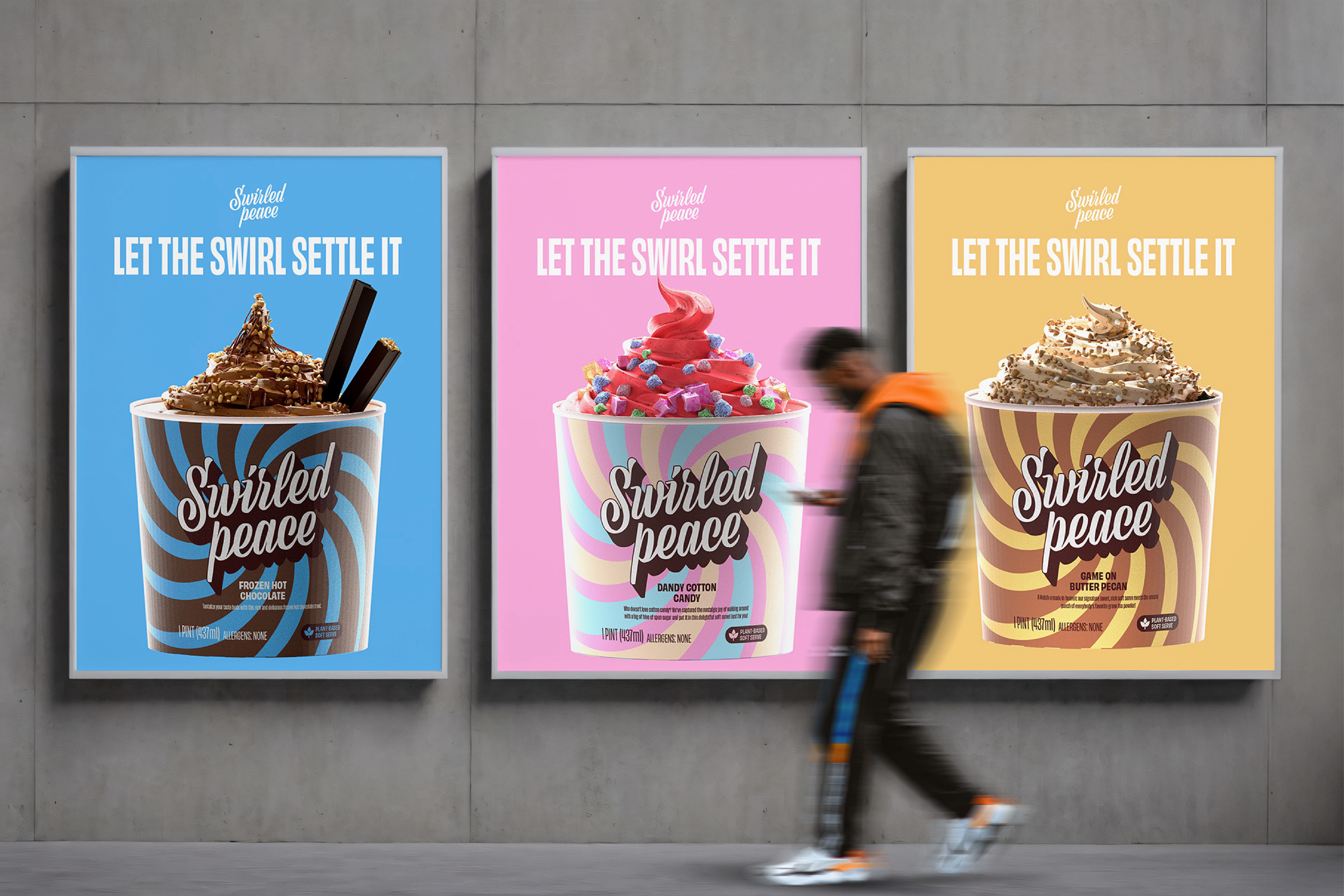
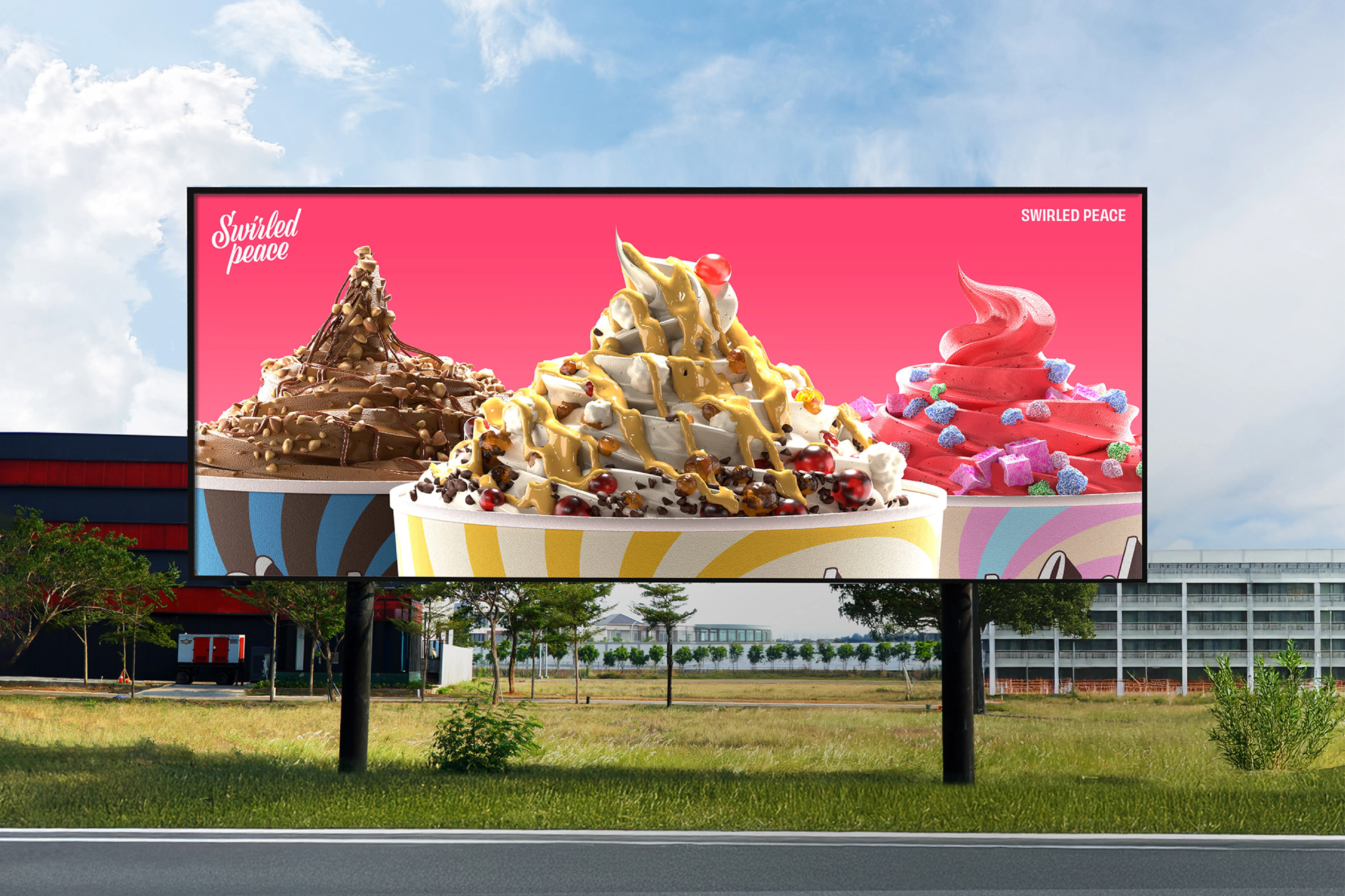
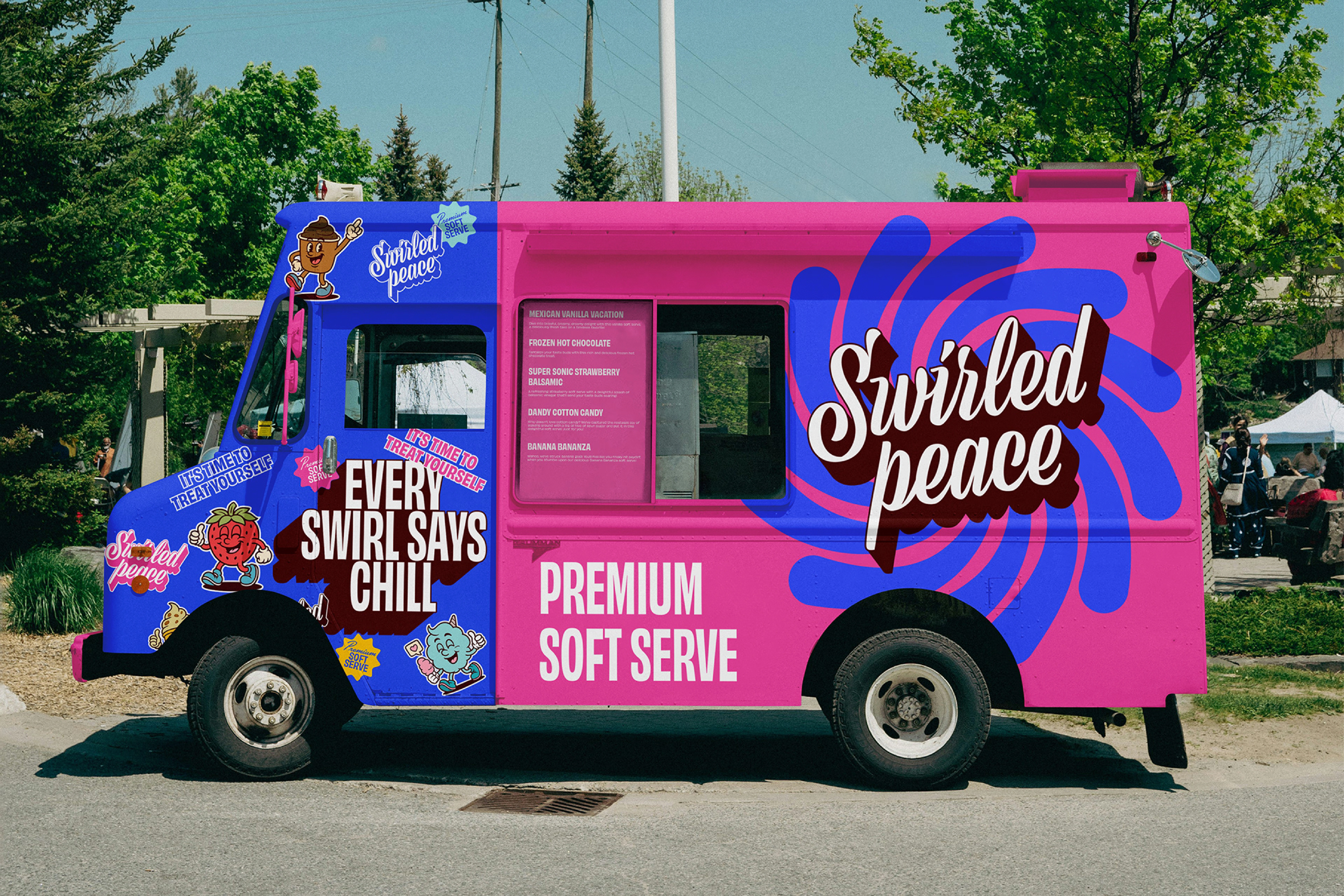
The identity is built around vintage cartoon aesthetics with a modern edge. Each flavor got its own anthropomorphic mascot — a character that embodies the personality of the product, from the carefree "Dandy Cotton Candy" to the bold "Frozen Hot Chocolate." Bold, bouncy hand-lettered typography and swirling patterns in contrasting color palettes mirror the energy of the product itself — playful, indulgent, in motion.
The Result
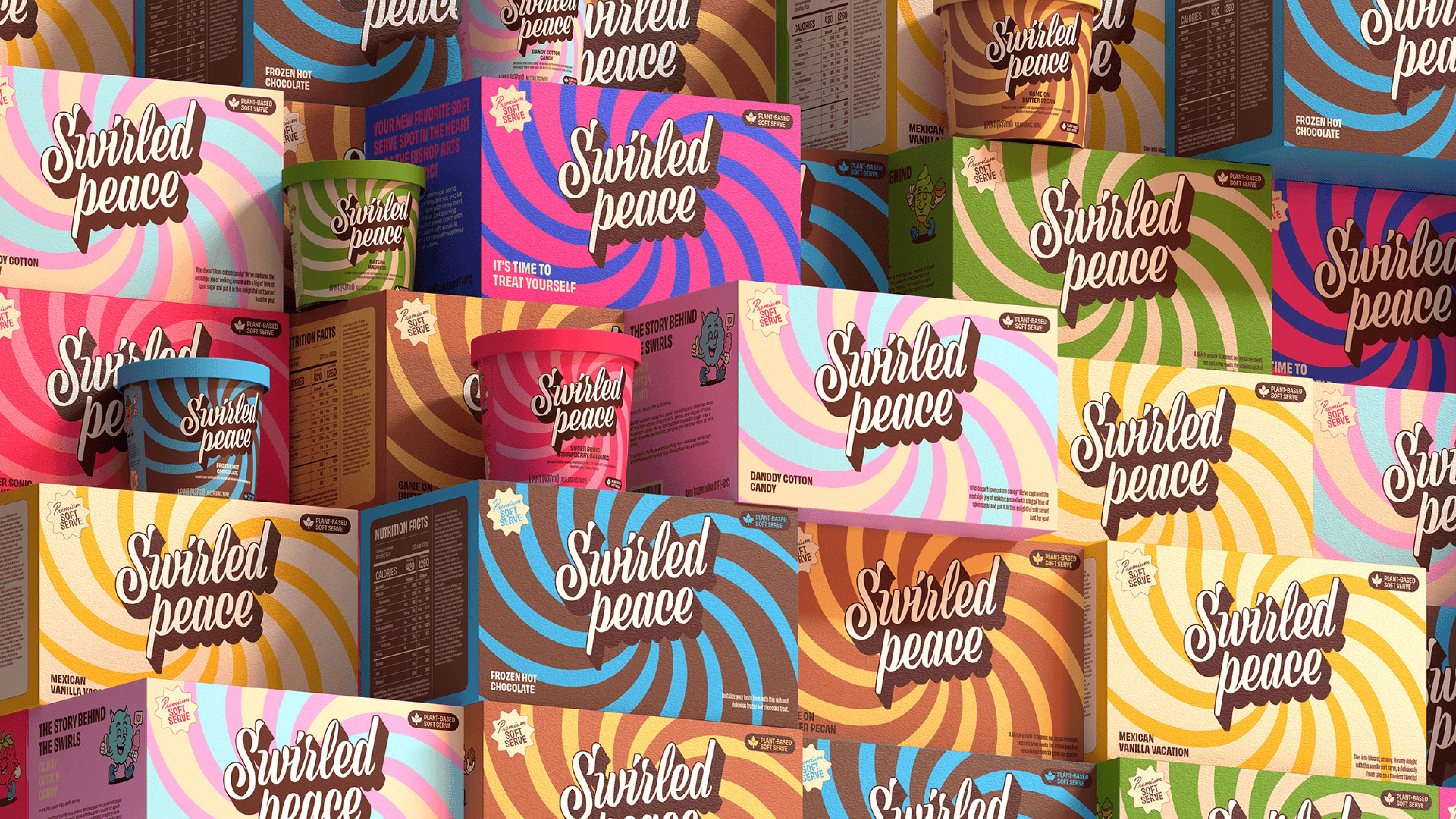
A cohesive, vibrant brand system that stands out on shelf and across every touchpoint — pint packaging, apparel, and promotional formats. A brand that immediately says: it's time to treat yourself. Featured on Packaging of the World.
Deliverables: Brand identity · Mascot design · Packaging system · Typography · Color system · Brand applications
Like this project
Posted Mar 17, 2026
Playful ice cream brand identity with flavor mascots, bold typography, and vibrant packaging designed to stand out on the shelf and delight at every touchpoint.