Designing for Motion: A Safer Motorcycle Cluster Experience

Daisy Pham
Designing for Motion: A Safer Motorcycle Cluster Experience

Overview
Designing a motorcycle cluster that simplifies rider interaction while maintaining safety and clarity at speed
This project focuses on reducing cognitive load at speed by aligning the interface with how human vision works in motion.
AUTOMOTIVE DESIGN
INTERACTION FLOWS
SYSTEM BEHAVIOR
Role:
Interactive Designer
Team:
Project Manager,
UI /UX Designers, and Front-end Developers
Client:
Timeline:
Mar - Jun 2023
The Problem
At 60mph, you don't read. You glance.
A motorcycle rider moving at speed has miliseconds, not seconds, to process information: their eyes are on the road. Their hands are on the handlebars. Their attention is already consumed by speed, traffic, and balance.
Most HMI systems are designed like compressed phone screens. Information is grouped by feature, not by how vision actually works. Everything is visible, but nothing is immediately understood.
The brief introduced physical constraints: limited processing power, fixed memory, and a relatively small 800x480 display screen. However, the real constraint was human. Peripheral vision cannot read text. Foveal focus covers only a narrow 2 to 5 degree field. Under stress, attention narrows even further.
The problem was not how to fit more onto the screen. It was how to make information legible within a fraction of a second.
Expected Outcomes
Critical information recognized in under
300 milliseconds
Navigation completed without sustained attention
Color contrast exceeding WCAG's contrast ratio 7:1
Consistent interaction patterns requiring
no relearning
User Research
Starting with Vision, Not Interface
Before designing the interface, I researched how human vision functions under riding conditions. Specifically the relationship between foveal focus, peripheral awareness, and attention under cognitive load.
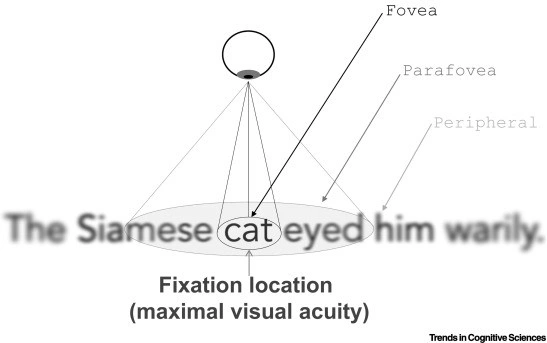
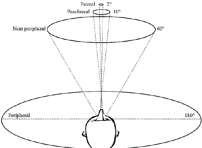
The foveal zone (sharp focus) is narrow: High-resolution vision covers only about 2 degree of the visual field. When a rider glances at the display, their sharp focus lands on a small area for a very short time. Information outside that landing zone needs to be readable through constrast and shape (not detail).
Parafoveal vision detects change, not content: The edges of our visual field are highly sensitive to motion and contrast shifts, but cannot resolve text or fine detail. This means the outer zones of a displat can communicate state changes, but not data.
Stress narrows attention further: Under physical and cognitive load, the brain deprioritizes detail processing and relies more heavily on learned patterns and visual shortcuts. Familiar layouts and consistent patterns become processing aids, not just aesthetic choices.
=> These three findings became the lens for every decision that followed.
Objectives
Defined Through Vision Science
The project's five objectives aren't just good design principles. Each one maps directly to a constraint of human perception in motion.
Clarity and readability
Because foveal focus time is under 300ms, essential information must be
instantly recognizable.
Minimal distraction
Because attention is limited and narrows under stress, anything that
competes for focus actively works against the rider.
User-friendly interactions
Because cognitive load is already high while riding, interactions must match learned mental models. Nothing should require the rider to think about how to use the interface.
Adaptability and customization
As riders have different preferences and contexts, the system needs to be flexible. But this flexibility must never introduce complexity in the moment of use.
Safety
Because the display is secondary to the road, every design decision should reduce interaction time and allow focus to return to riding as fast as possible.
Information Architecture
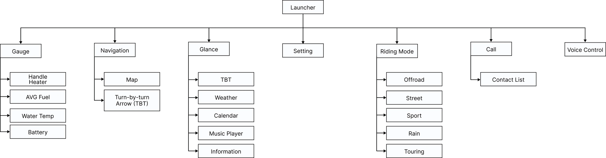
The Information Architecture (IA) for this HMI cluster design is structured to provide riders with quick, intuitive access to essential information. Each screen is organized with clear labels and simple controls for easy navigation. This IA prioritizes readability and minimizes interaction complexity, enhancing user experience and safety by making key features accessible at a glance.
Wireframe
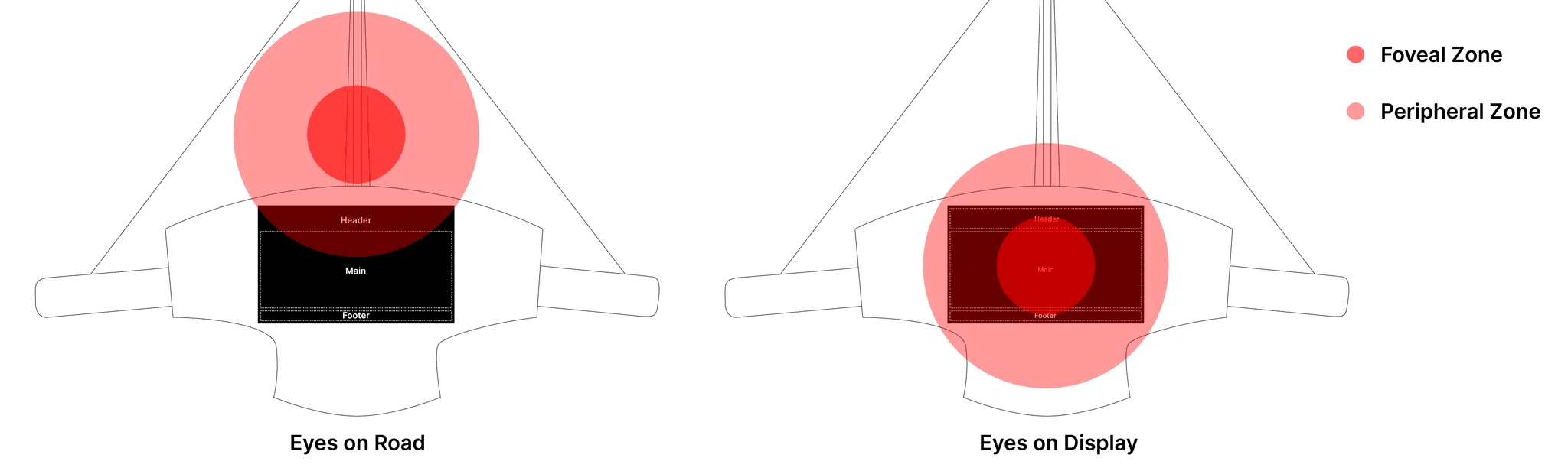
The display is structured into 3 clear sections: header, main, and footer; each aligned with different levels of visual attention.
When riding, the display is never the rider's primary focus. The road is. Most of the time, the screen sits within peripheral vision, where only general layout and position are perceived. In this state, the header. This makes important information visible with only a slight eye movement without drawing attention away from the road.
In brief moments, the rider glances down at the display. At that point, visual focus shifts to the center of the screen. The main section becomes the focal point, presenting critical information like gauge and engine status for immediate recognition. Meanwhile, the footer remains in the lower visual field, carrying secondary data that can be checked when needed without interrupting focus.
This hierarchy of attention directly informs the final wireframe below, where all elements are arranged to support rapid perception, reduce visual load, and match the rider's real-world viewing behavior.
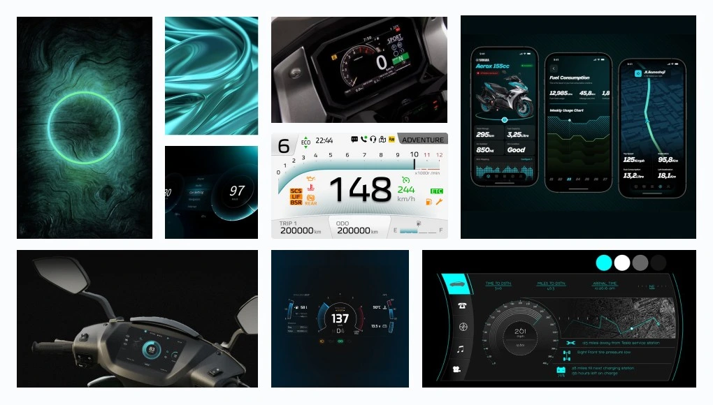
Moodboard
The layout translates vision science into spatial structure.
Color Standards
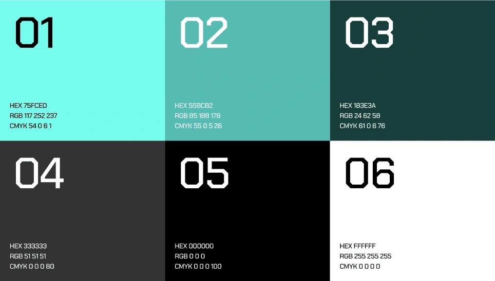
In automotive design, it is important to ensure the information is quickly and clearly readable, even in varying lighting conditions. Consequently, the color contrast ratio between design elements and the background should exceed 7:1. This ratio also enhances driver safety by minimizing distractions and cognitive load, while ensuring accessibility for all users. The primary color will be turquoise, which not only conveys futuristic and technology but also has a high contrast ratio (9:1).
Typography
Final Design
ANALOG GAUGE
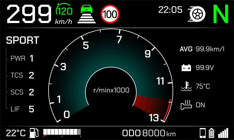
The final design applies the layout strategy by placing speed, TSR, and riding mode in the header for quick parafoveal awareness, while the main section centers a large speed gauge for immediate recognition during brief glances. The footer holds stable, secondary information such as battery level, odometer, connectivity, and temperature, minimizing visual change and reducing distraction.
GLANCE
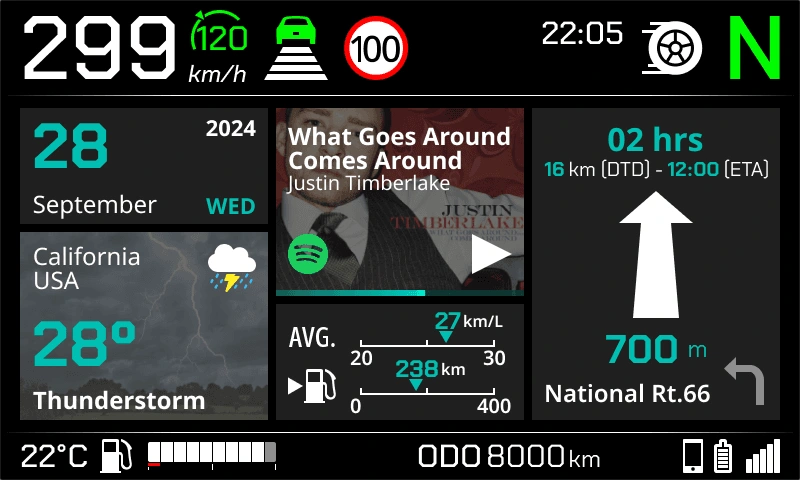
The glance screen design delivers all essential information instantly, ensuring quick and effortless readability for users.
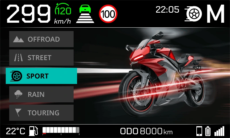
RIDING MODE
The riding mode screen offers clear, customizable settings to enhance the motorcycle's performance.
USER INTERACTION
A quick video to show the interaction between users and HMI screen.
ANALOG GAUGE
The final design applies the layout strategy by placing speed, TSR, and riding mode in the header for quick parafoveal awareness, while the main section centers a large speed gauge for immediate recognition during brief glances. The footer holds stable, secondary information such as battery level, odometer, connectivity, and temperature, minimizing visual change and reducing distraction.
GLANCE
The glance screen design delivers all essential information instantly, ensuring quick and effortless readability for users.
RIDING MODE
The riding mode screen offers clear, customizable settings to enhance the motorcycle's performance.
USER INTERACTION
A quick video to show the interaction between users and HMI screen.
ANALOG GAUGE
The final design applies the layout strategy by placing speed, TSR, and riding mode in the header for quick parafoveal awareness, while the main section centers a large speed gauge for immediate recognition during brief glances. The footer holds stable, secondary information such as battery level, odometer, connectivity, and temperature, minimizing visual change and reducing distraction.
GLANCE
The glance screen design delivers all essential information instantly, ensuring quick and effortless readability for users.
RIDING MODE
The riding mode screen offers clear, customizable settings to enhance the motorcycle's performance.
USER INTERACTION
A quick video to show the interaction between users and HMI screen.
ANALOG GAUGE
The final design applies the layout strategy by placing speed, TSR, and riding mode in the header for quick parafoveal awareness, while the main section centers a large speed gauge for immediate recognition during brief glances. The footer holds stable, secondary information such as battery level, odometer, connectivity, and temperature, minimizing visual change and reducing distraction.
GLANCE
The glance screen design delivers all essential information instantly, ensuring quick and effortless readability for users.
RIDING MODE
The riding mode screen offers clear, customizable settings to enhance the motorcycle's performance.
USER INTERACTION
A quick video to show the interaction between users and HMI screen.
What I Learned
This project changed how I think about interaction design.
Designing for real riding conditions meant designing for human limitations rather than ideal scenarios: Time is limited. Attention is fragmented. Perception operates within strict boundaries. Effective design does not attempt to overcome these constraints, it aligns with them. It also reinforced the discipline of reduction. Each added element increases cognitive demand, and in a high speed context, even small inefficiencies matter. The real challenge is deciding what not to include. Ultimately, the success of this interface is measured by how much it shows and its design, but by how little the rider needs to think about it.
Like this project
Posted Jul 8, 2026
Redesigned a motorcycle HMI cluster to reduce cognitive load and ensure critical information is recognized within 300ms.
Likes
0
Views
7