Designing the #1 Shopping App (140k+ Positive Reviews)
Get the full portfolio here with larger images and detail: https://bit.ly/Preston-IC-Contra
Project Spoilers: Increased new user acquisition by over 50% and ranked #1 in Apple App store in the highly competitive Shopping category. Still holds 4.9 star rating with 84.2K ratings.
Context
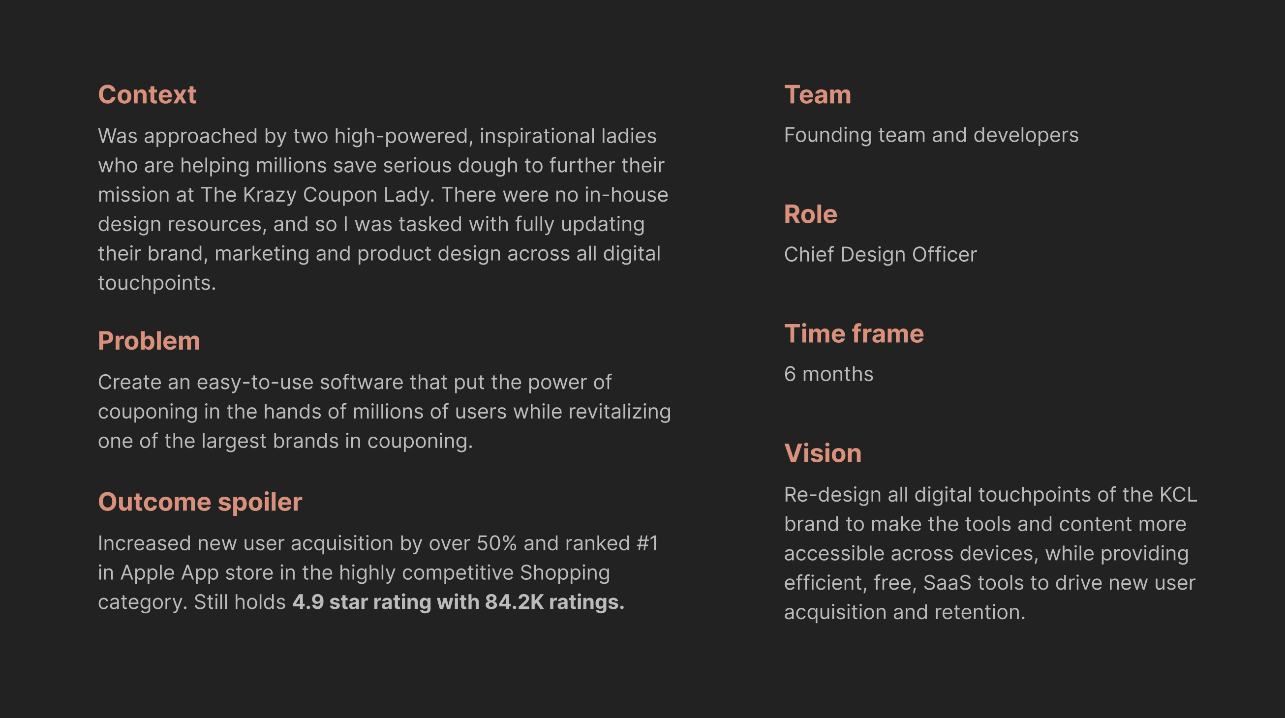
Was approached by two high-powered, inspirational ladies who are helping millions save serious dough to further their mission at The Krazy Coupon Lady. There were no in-house design resources, and so I was tasked with fully updating their brand, marketing and product design across all digital touchpoints.
Problem
Create an easy-to-use software that put the power of couponing in the hands of millions of users while revitalizing one of the largest brands in couponing.
Outcome spoiler
Increased new user acquisition by over 50% and ranked #1 in Apple App store in the highly competitive Shopping category. Still holds 4.9 star rating with 84.2K ratings.
Team
Founding team and developers
Role
Chief Design Officer
Time frame
6 months
Vision
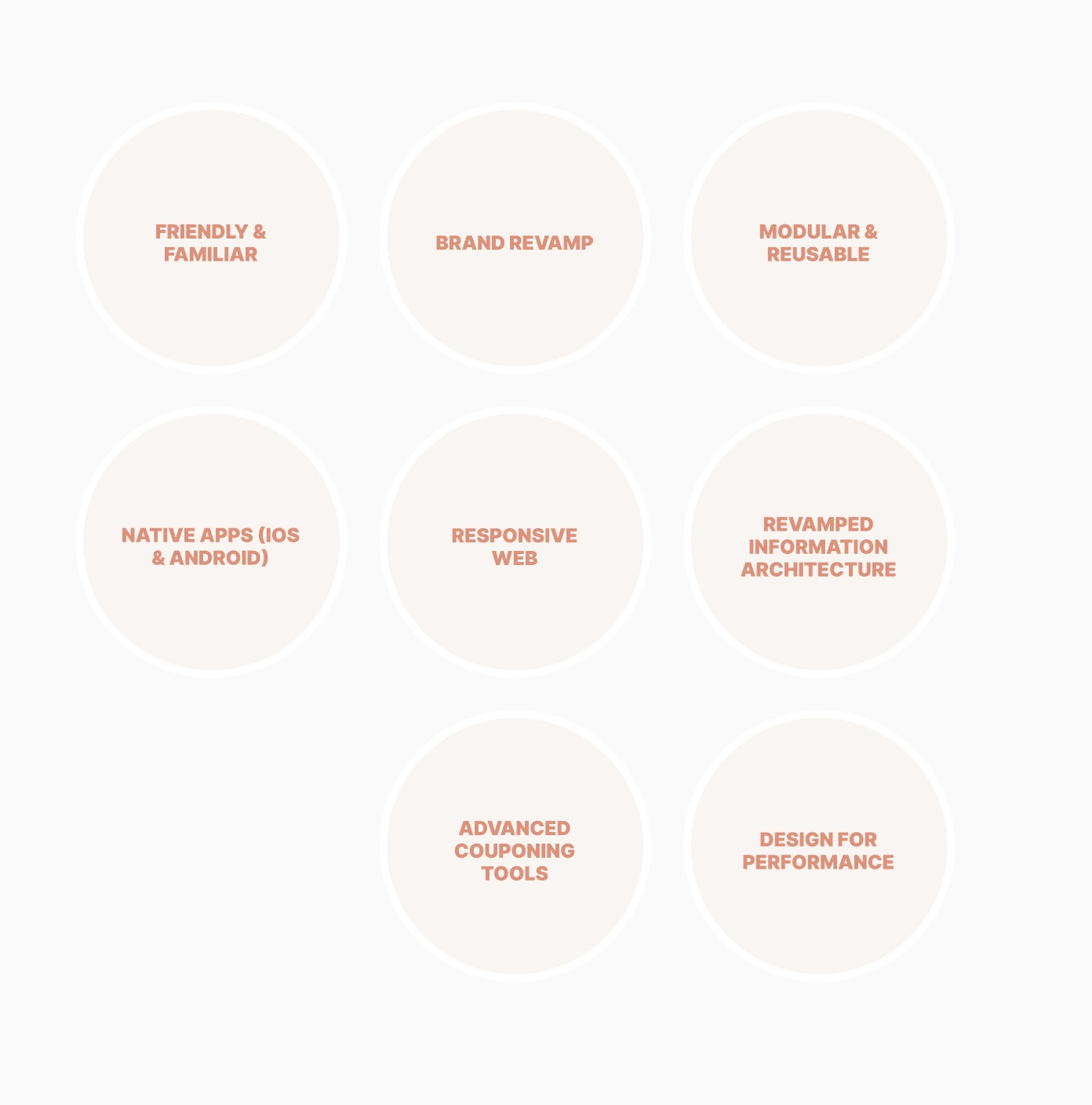
Re-design all digital touchpoints of the KCL brand to make the tools and content more accessible across devices, while providing efficient, free, SaaS tools to drive new user acquisition and retention.
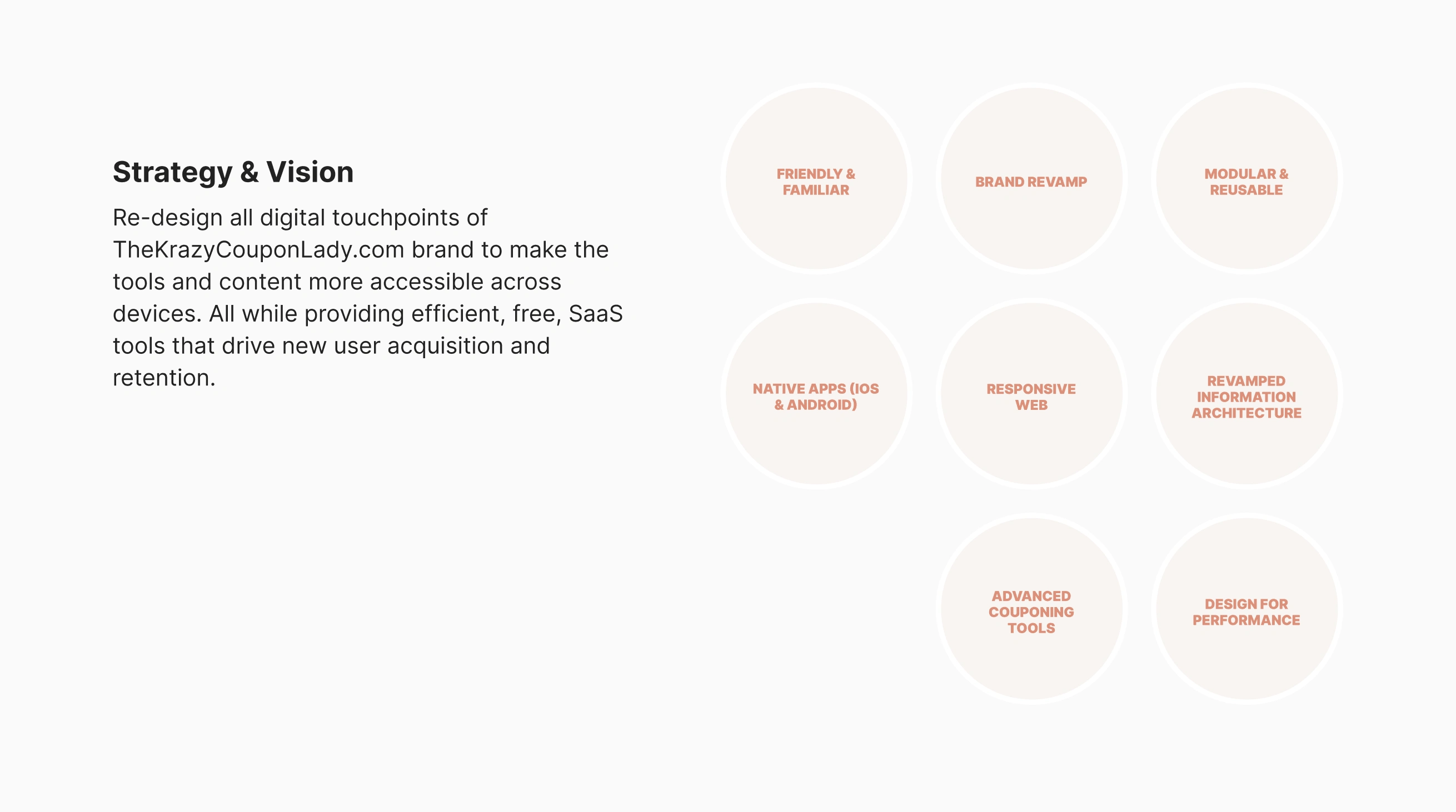
Strategy & Vision
Re-design all digital touchpoints of TheKrazyCouponLady.com brand to make the tools and content more accessible across devices. All while providing efficient, free, SaaS tools that drive new user acquisition and retention.
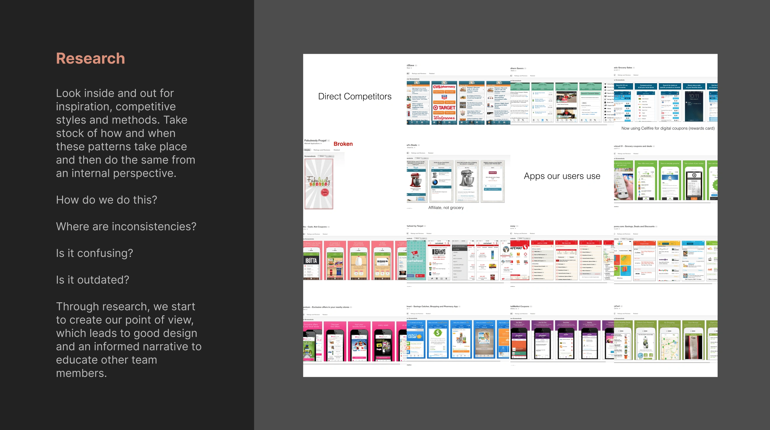
Research
Look inside and out for inspiration, competitive styles and methods. Take stock of how and when these patterns take place and then do the same from an internal perspective.
How do we do this?
Where are inconsistencies?
Is it confusing?
Is it outdated?
Through research, we start to create our point of view, which leads to good design and an informed narrative to educate other team members.
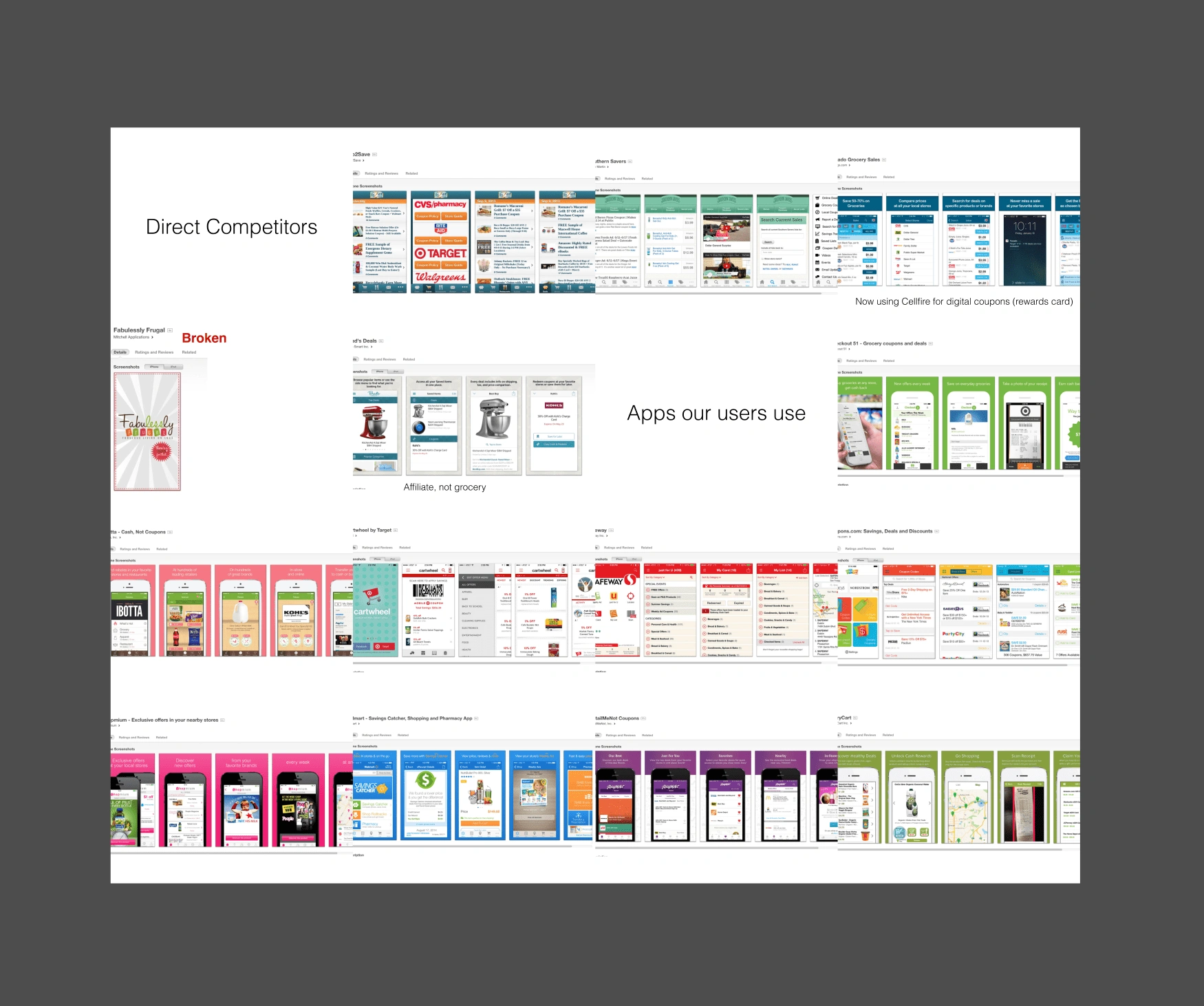
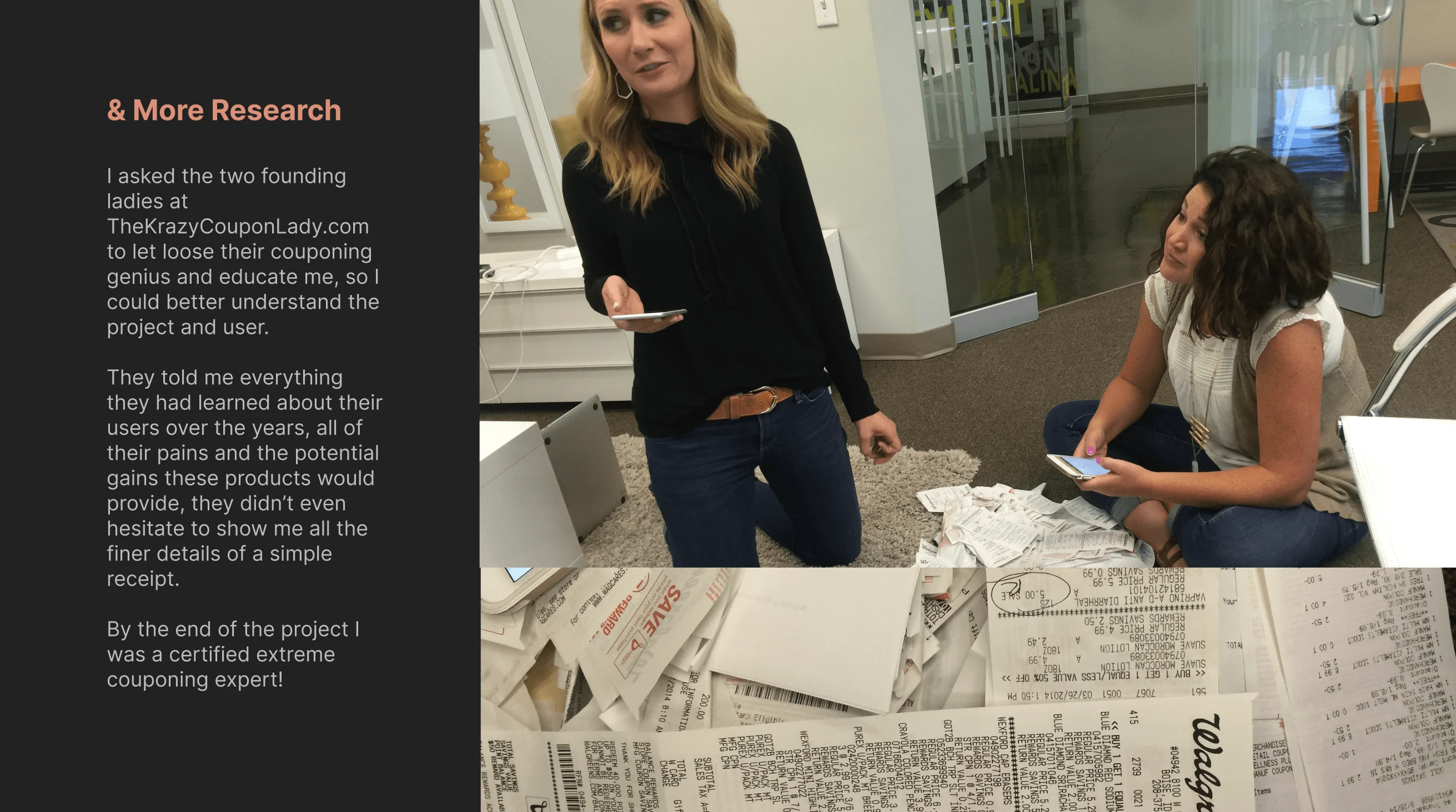
& More Research
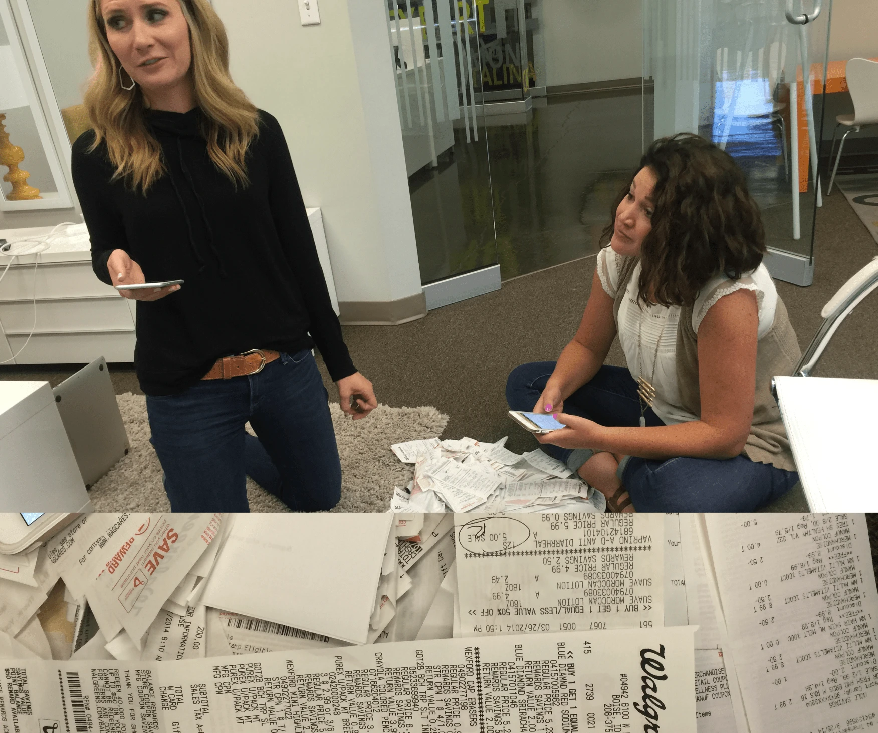
I asked the two founding ladies at TheKrazyCouponLady.com to let loose their couponing genius and educate me, so I could better understand the project and user.
They told me everything they had learned about their users over the years, all of their pains and the potential gains these products would provide, they didn’t even hesitate to show me all the finer details of a simple receipt.
By the end of the project I was a certified extreme couponing expert!
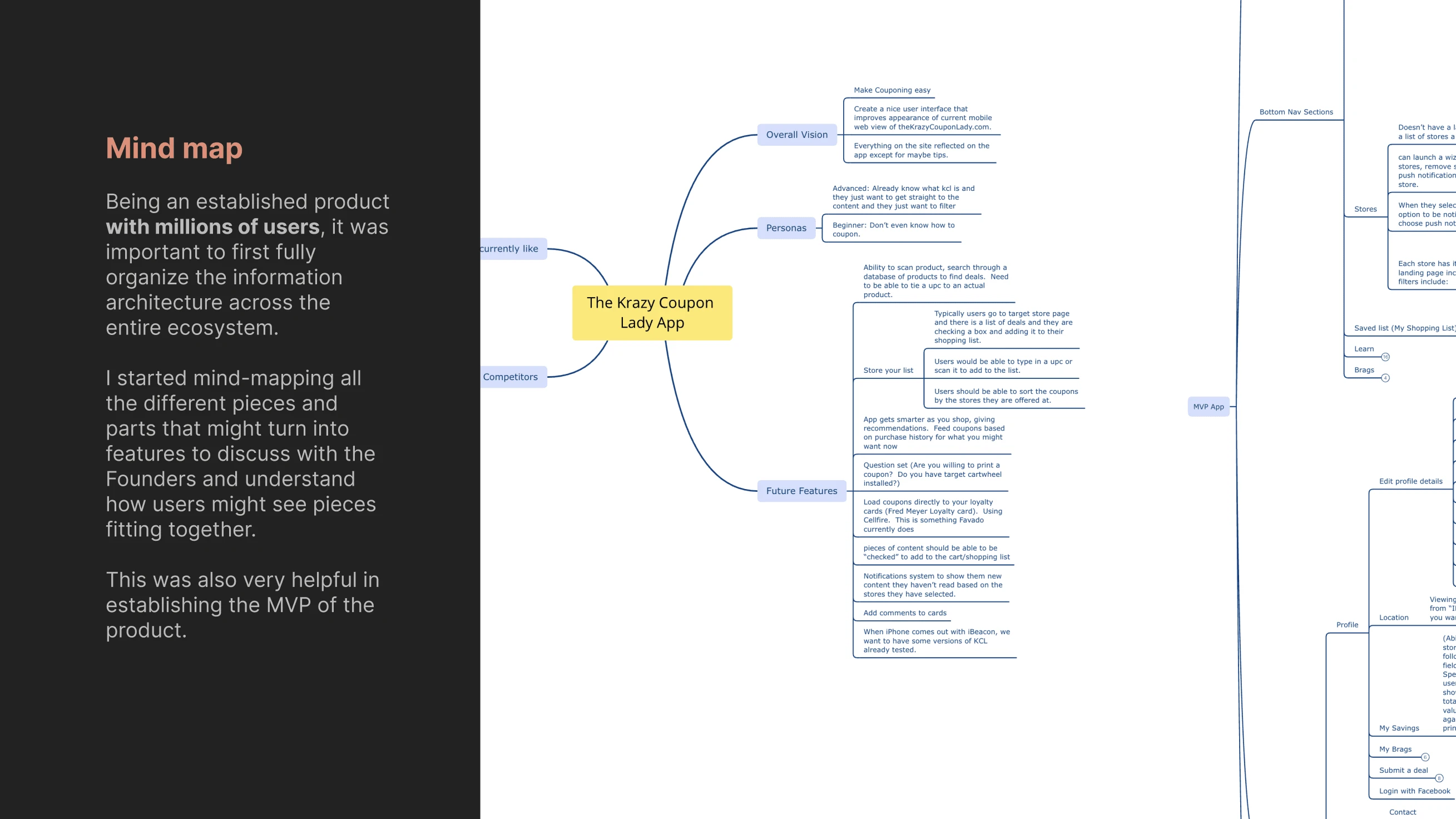
Mind map
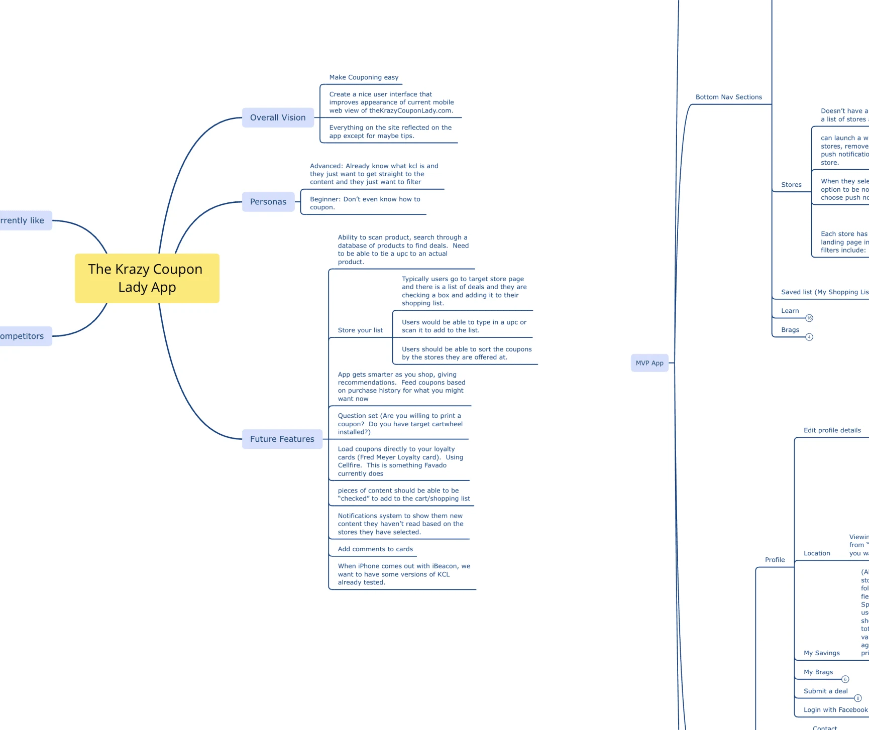
Being an established product with millions of users, it was important to first fully organize the information architecture across the entire ecosystem.
I started mind-mapping all the different pieces and parts that might turn into features to discuss with the Founders and understand how users might see pieces fitting together.
This was also very helpful in establishing the MVP of the product.
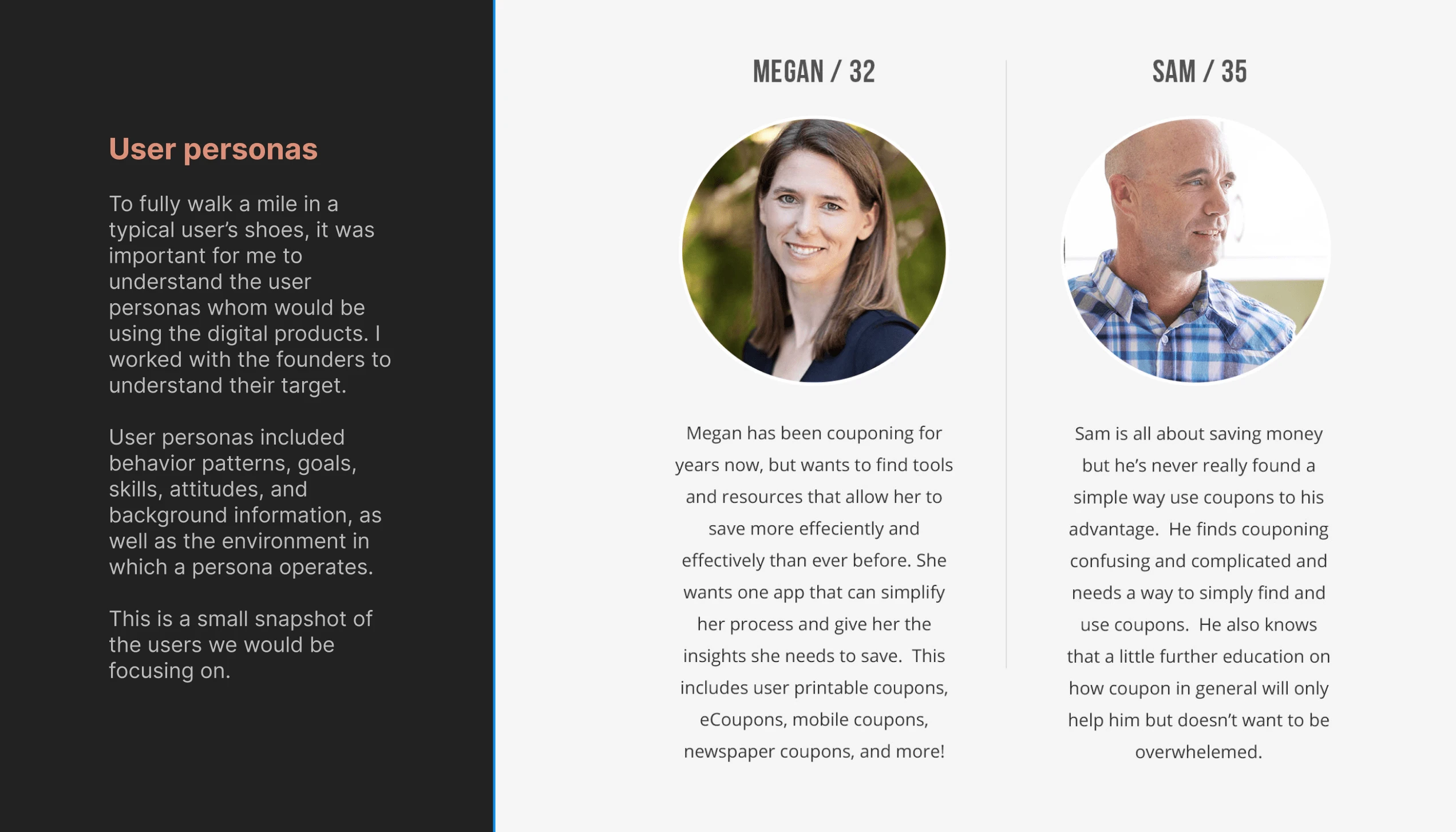
User personas
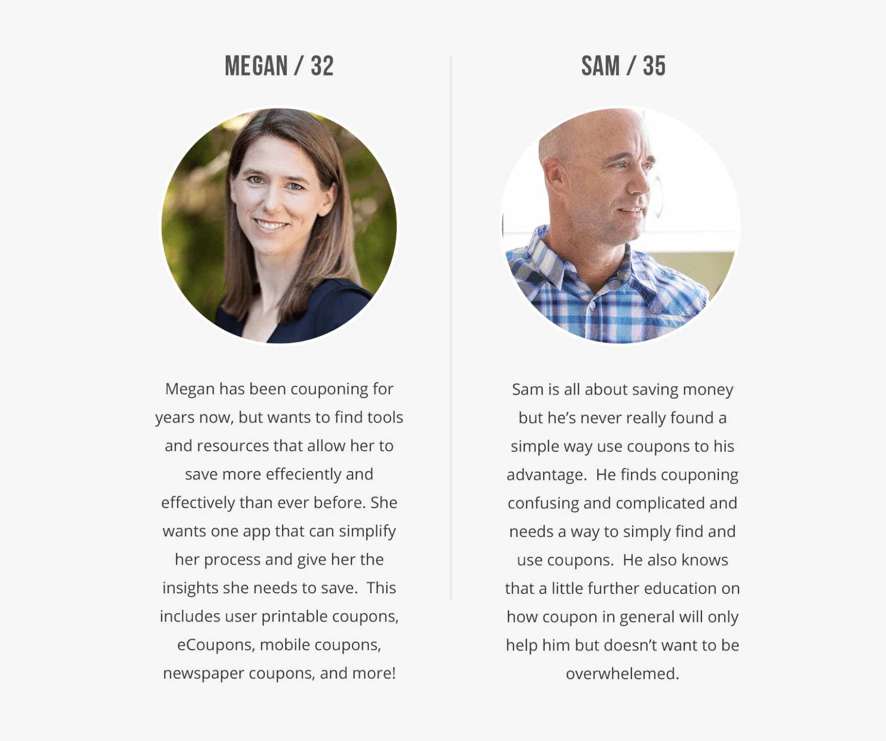
To fully walk a mile in a typical user’s shoes, it was important for me to understand the user personas whom would be using the digital products. I worked with the founders to understand their target.
User personas included behavior patterns, goals, skills, attitudes, and background information, as well as the environment in which a persona operates.
This is a small snapshot of the users we would be focusing on.
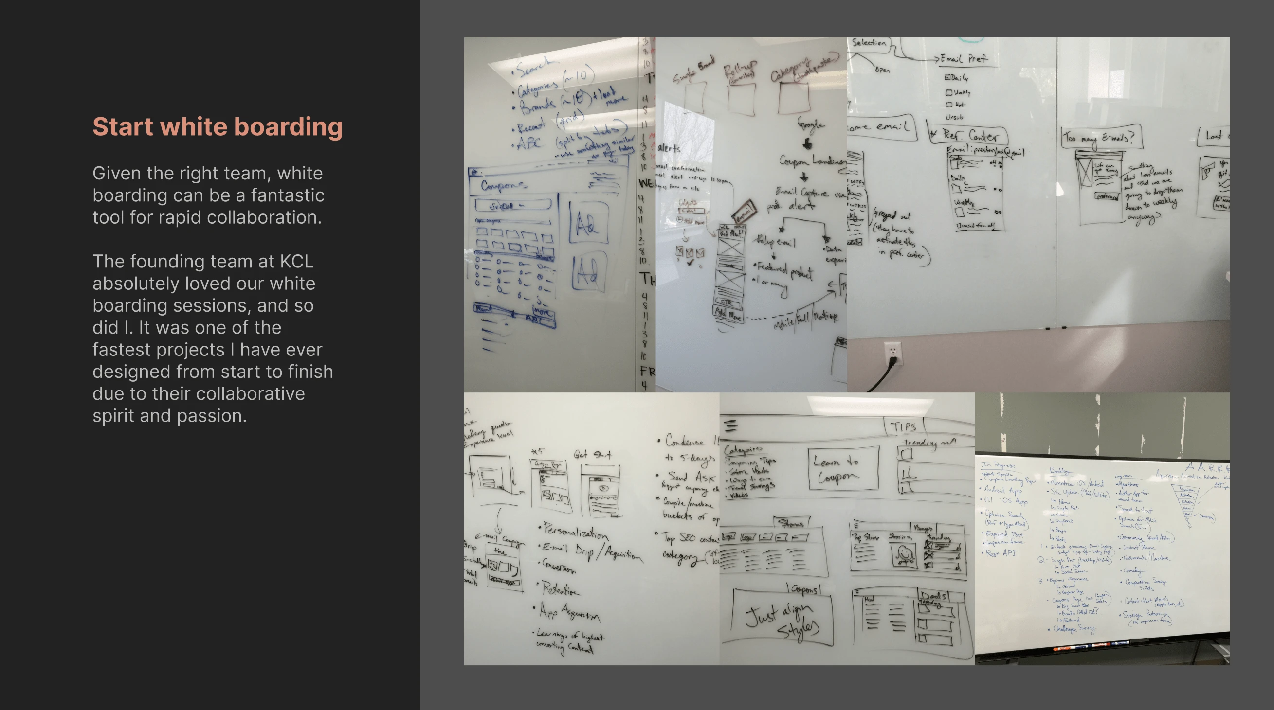
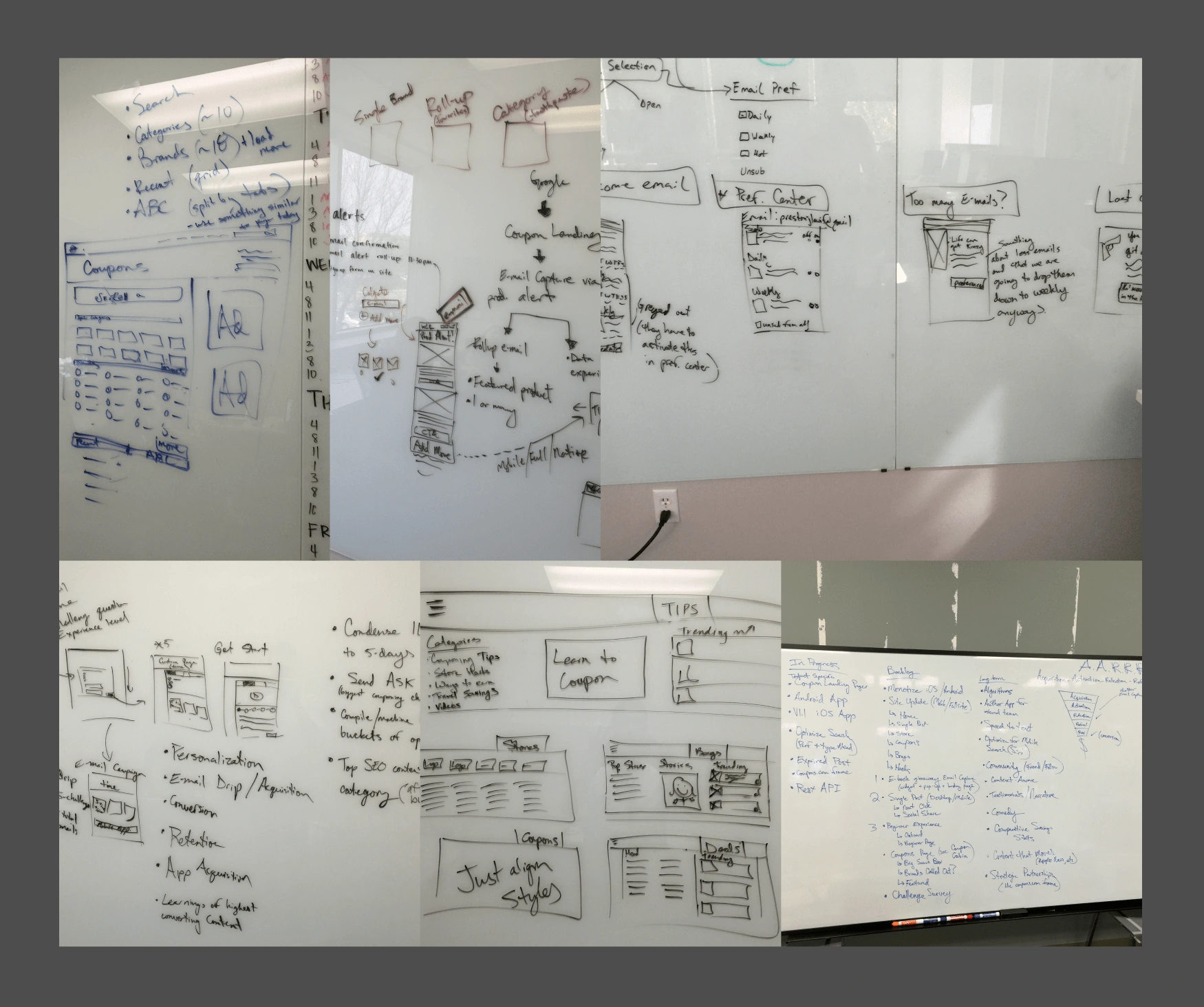
Start white boarding
Given the right team, white boarding can be a fantastic tool for rapid collaboration.
The founding team at KCL absolutely loved our white boarding sessions, and so did I. It was one of the fastest projects I have ever designed from start to finish due to their collaborative spirit and passion.
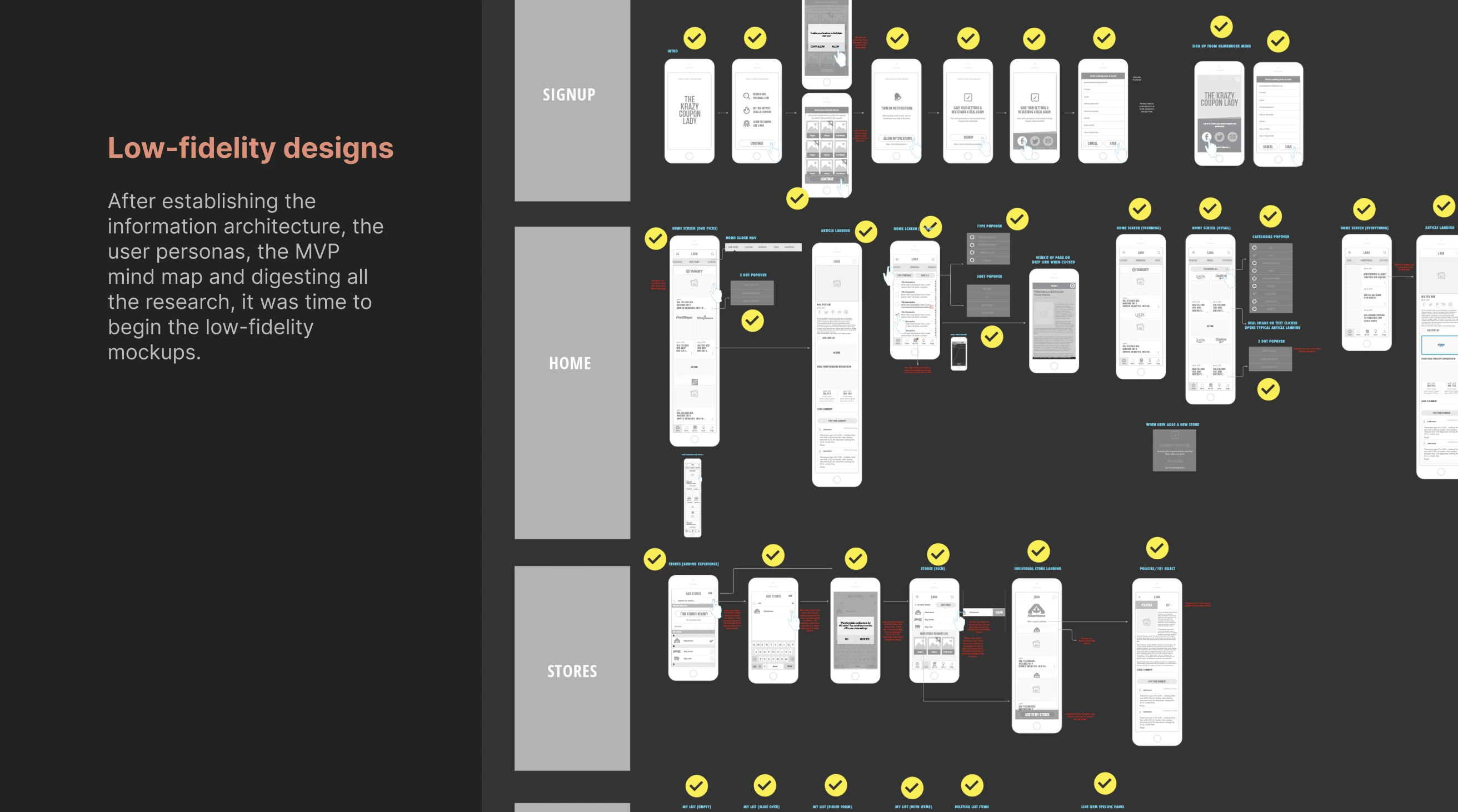
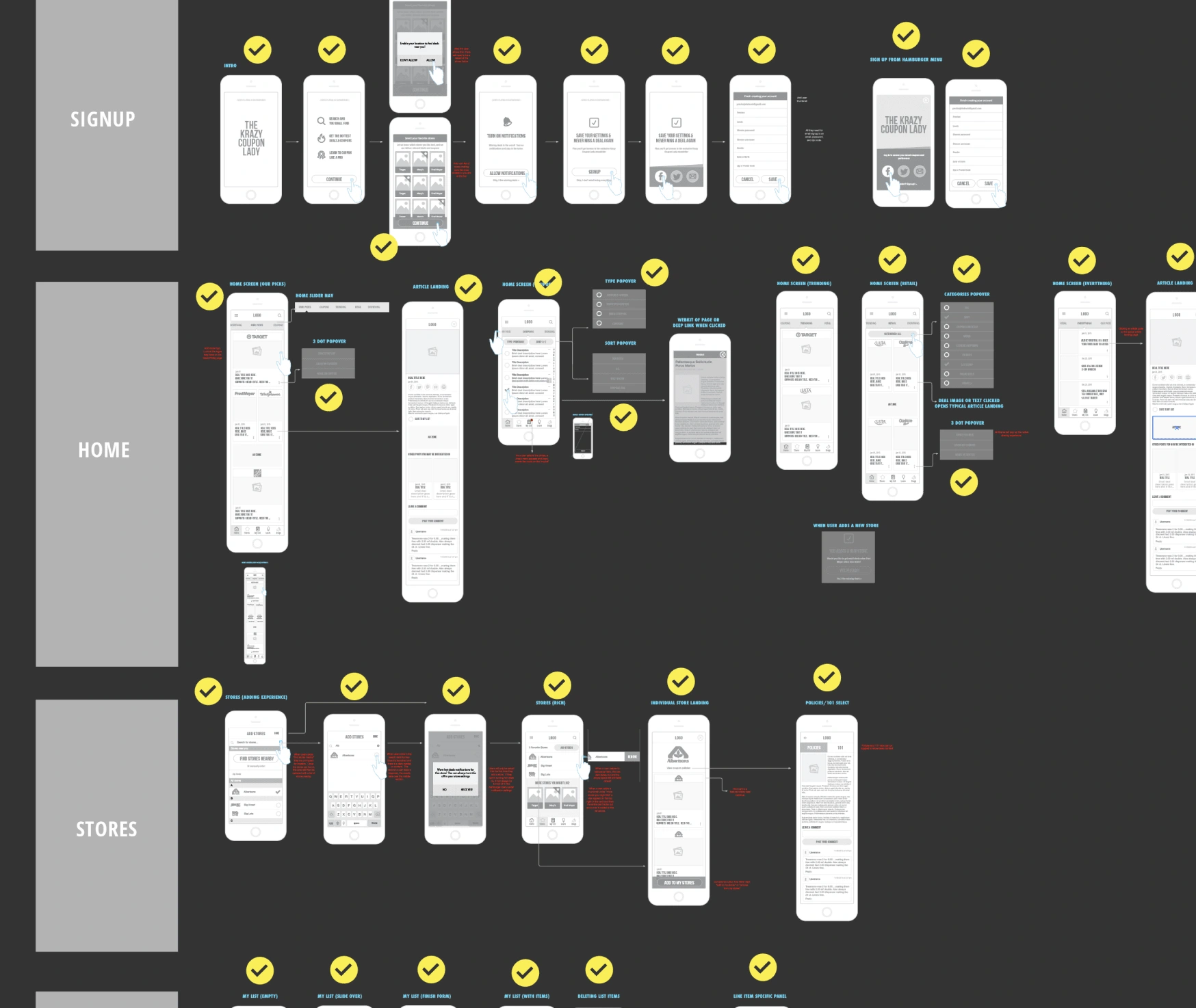
Low-fidelity designs
After establishing the information architecture, the user personas, the MVP mind map and digesting all the research, it was time to begin the low-fidelity mockups.
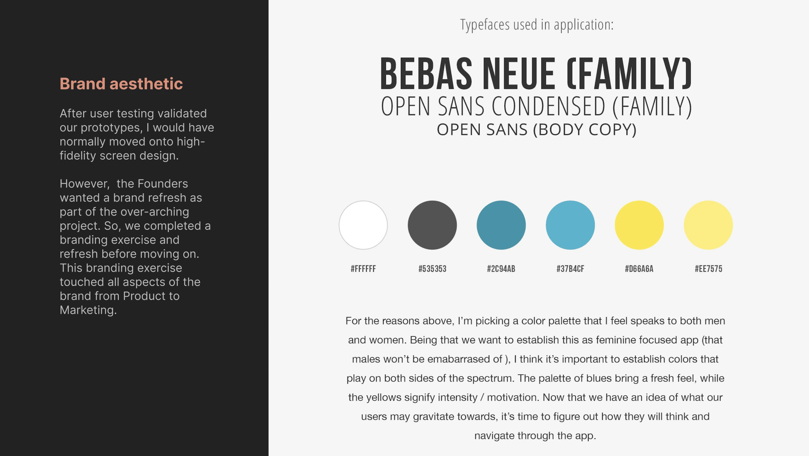
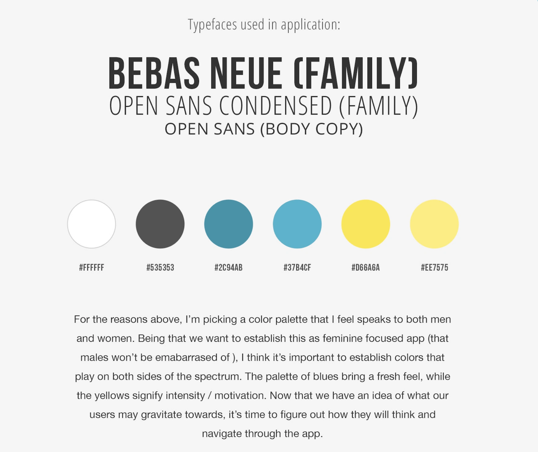
Brand aesthetic
After user testing validated our prototypes, I would have normally moved onto high-fidelity screen design.
However, the Founders wanted a brand refresh as part of the over-arching project. So, we completed a branding exercise and refresh before moving on. This branding exercise touched all aspects of the brand from Product to Marketing.
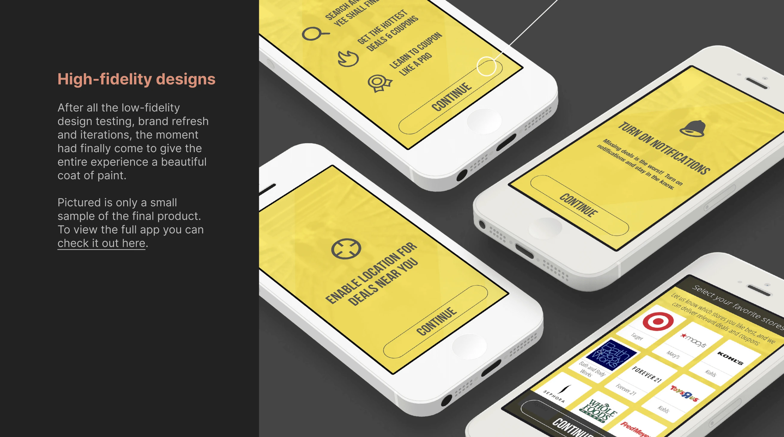
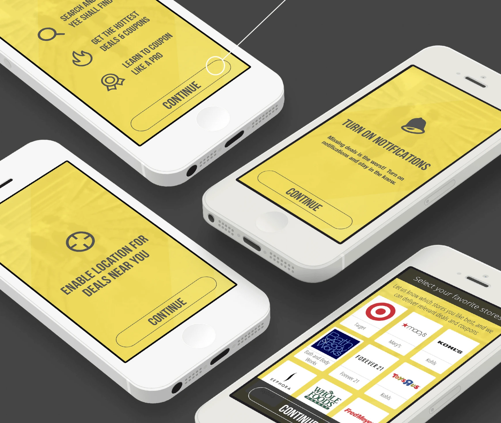
High-fidelity designs
After all the low-fidelity design testing, brand refresh and iterations, the moment had finally come to give the entire experience a beautiful coat of paint.
Pictured is only a small sample of the final product. To view the full app you can check it out here.
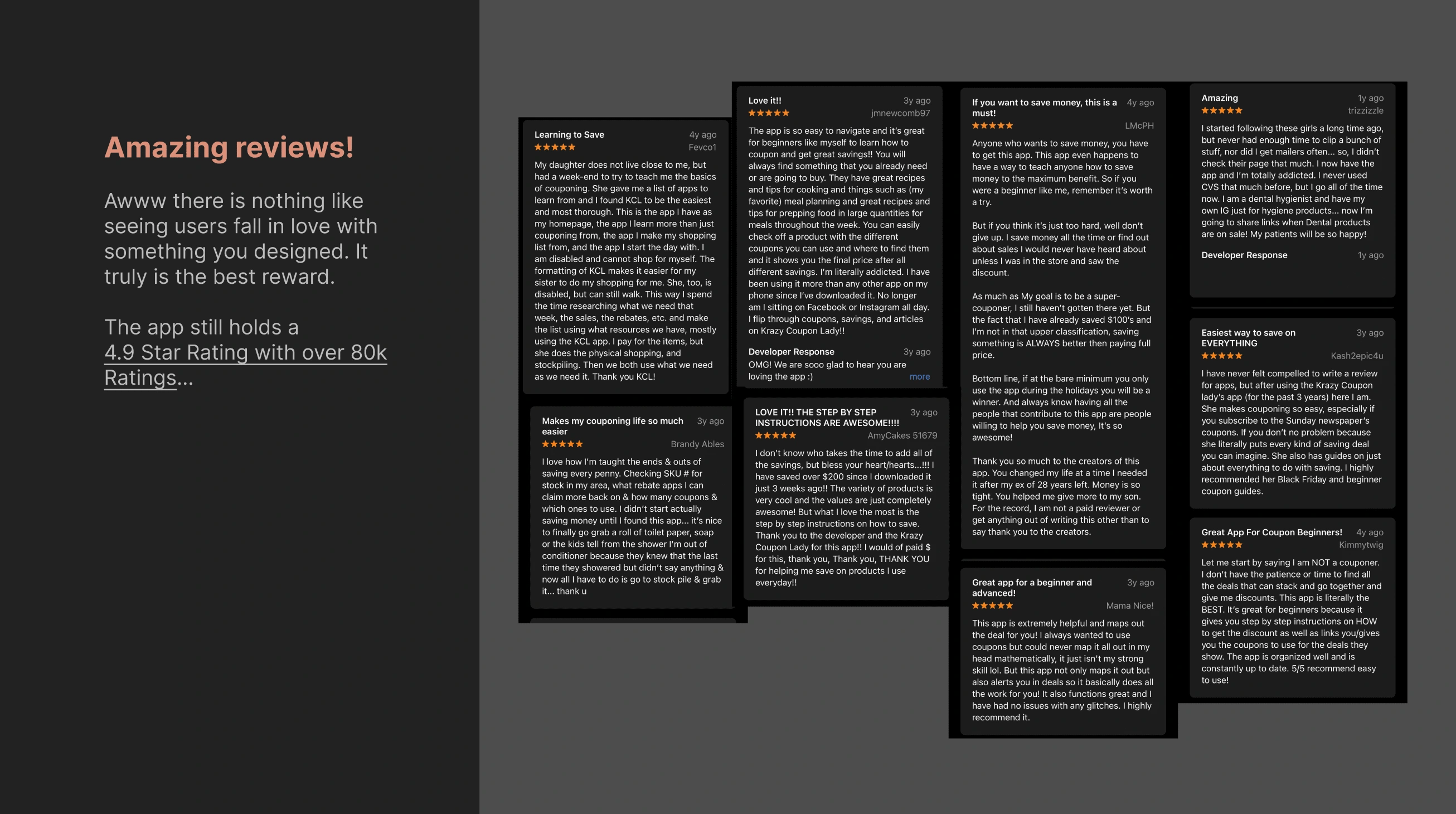
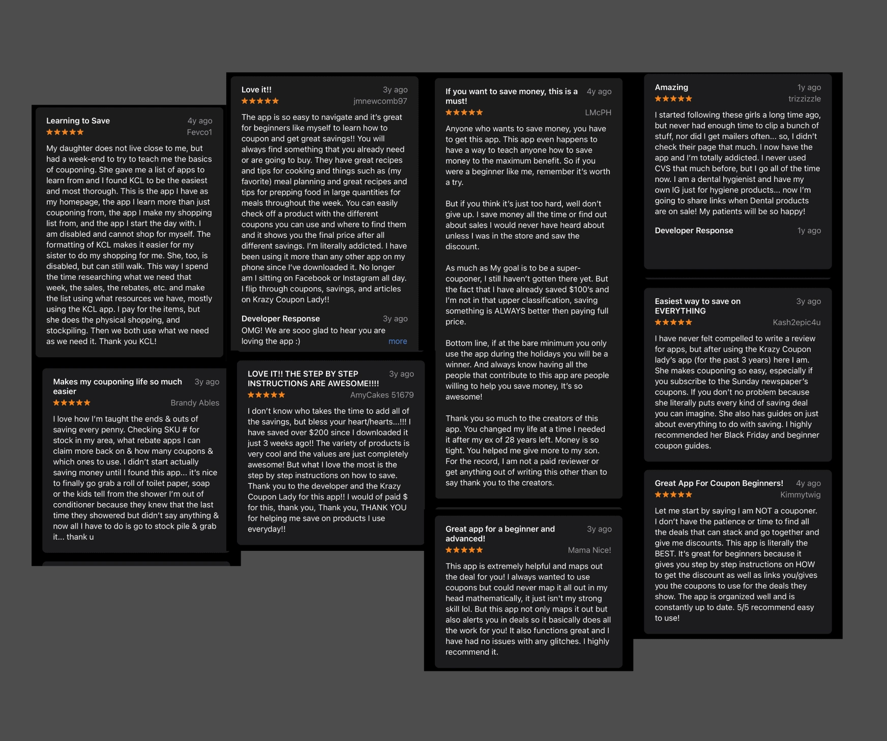
Amazing reviews!
Awww there is nothing like seeing users fall in love with something you designed. It truly is the best reward.
The app still holds a 4.9 Star Rating with over 80k Ratings...
Project Outcome
This is only a small sample of the project as it included hundreds of various states, a full Design System, screens and experiences across native (iOS & Android) as well as designs for responsive web. It was a complete redesign of a multi-million dollar and multi-million user website that continues to be trusted to help people save money.
As the sole designer on the project, it was a challenge but the founding team made it an absolute joy of a process. Creating this app and watching it rapidly reach the #1 spot on the Apple App Store (and get featured by the Today Show) was one of my favorite moments as a designer.
Even more powerful than the apps ranking success was reading the heart-felt stories from users whom were struggling with finances, disabilities and other hardships that found this app to be a “life-saver” that helped them get through tough times.
Learnings
The project really taught me just how important the attitude of a team is to the overall success of a product and the enjoyment of the creation journey.
You don’t need to have a gigantic development or design team to make magic. When you work with a team that is responsive to collaboration and deeply skilled in the art of empathy, you truly can create products that change the world of your users, even if it’s one coupon at a time!
Like this project
Posted Nov 14, 2023
Designed #1 ranked shopping app in Apple App store in the highly competitive Shopping category. Still holds 4.9 star rating with 80k+ positive reviews.
Likes
0
Views
12
Clients
Krazy Coupon Lady

